Climate Science Glossary

Term Lookup

Enter a term in the search box to find its definition.

Settings

Use the controls in the far right panel to increase or decrease the number of terms automatically displayed (or to completely turn that feature off).

Term Lookup

Settings


All IPCC definitions taken from Climate Change 2007: The Physical Science Basis. Working Group I Contribution to the Fourth Assessment Report of the Intergovernmental Panel on Climate Change, Annex I, Glossary, pp. 941-954. Cambridge University Press.

Home Arguments Software Resources Comments The Consensus Project Translations About Support

Bluesky Facebook LinkedIn Mastodon MeWe

Twitter YouTube RSS Posts RSS Comments Email Subscribe


Climate's changed before
It's the sun
It's not bad
There is no consensus
It's cooling
Models are unreliable
Temp record is unreliable
Animals and plants can adapt
It hasn't warmed since 1998
Antarctica is gaining ice
View All Arguments...


Username
Password
New? Register here
Forgot your password?

Latest Posts

Archives

A detailed look at Hansen's 1988 projections

Posted on 20 September 2010 by dana1981

Hansen et al. (1988) used a global climate model to simulate the impact of variations in atmospheric greenhouse gases and aerosols on the global climate.  Unable to predict future human greenhouse gas emissions or model every single possibility, Hansen chose 3 scenarios to model.  Scenario A assumed continued exponential greenhouse gas growth.  Scenario B assumed a reduced linear rate of growth, and Scenario C assumed a rapid decline in greenhouse gas emissions around the year 2000.

Misrepresentations of Hansen's Projections

The 'Hansen was wrong' myth originated from testimony by scientist Pat Michaels before US House of Representatives in which he claimed "Ground-based temperatures from the IPCC show a rise of 0.11°C, or more than four times less than Hansen predicted....The forecast made in 1988 was an astounding failure." 

This is an astonishingly false statement to make, particularly before the US Congress.  It was also reproduced in Michael Crichton's science fiction novel State of Fear, which featured a scientist claiming that Hansen's 1988 projections were "overestimated by 300 percent." 

Compare the figure Michaels produced to make this claim (Figure 1) to the corresponding figure taken directly out of Hansen's 1988 study (Figure 2).
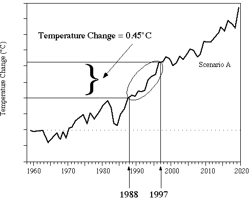
 

Figure 1: Pat Michaels' presentation of Hansen's projections before US Congress
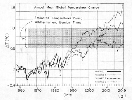
 

Figure 2: Projected global surface air temperature changes in Scenarios A, B, and C (Hansen 1988)

Notice that Michaels erased Hansen's Scenarios B and C despite the fact that as discussed above, Scenario A assumed continued exponential greenhouse gas growth, which did not occur.  In other words, to support the claim that Hansen's projections were "an astounding failure," Michaels only showed the projection which was based on the emissions scenario which was furthest from reality. 

Gavin Schmidt provides a comparison between all three scenarios and actual global surface temperature changes in Figure 3.
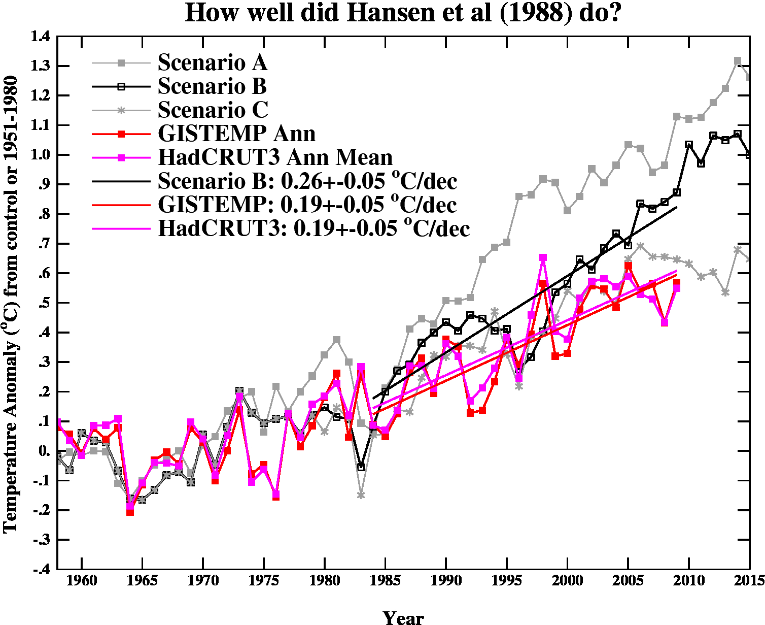
 

Figure 3: Hansen's projected vs. observed global temperature changes (Schmidt 2009)

As you can see, Hansen's projections showed slightly more warming than reality, but clearly they were neither off by a factor of 4, nor were they "an astounding failure" by any reasonably honest assessment.  Yet a common reaction to Hansen's 1988 projections is "he overestimated the rate of warming, therefore Hansen was wrong."   In fact, when skeptical climate scientist John Christy blogged about Hansen's 1988 study, his entire conclusion was "The result suggests the old NASA GCM was considerably more sensitive to GHGs than is the real atmosphere."  Christy didn't even bother to examine why the global climate model was too sensitive or what that tells us.  If the model was too sensitive, then what was its climate sensitivity?

This is obviously an oversimplified conclusion, and it's important to examine why Hansen's projections didn't match up with the actual surface temperature change.  That's what we'll do here.

Hansen's Assumptions

Greenhouse Gas Changes and Radiative Forcing

Hansen's Scenario B has been the closest to the actual greenhouse gas emissions changes.  Scenario B assumes that the rate of increasing atmospheric CO2 and methane increase by 1.5% per year in the 1980s, 1% per year in the 1990s, 0.5% per year in the 2000s, and flattens out (at a 1.9 ppmv per year increase for CO2) in the 2010s.  The rate of increase of CCl3F and CCl2F2 increase by 3% in the '80s, 2% in the '90s, 1% in the '00s, and flatten out in the 2010s. 

Gavin Schmidt helpfully provides the annual atmospheric concentration of these and other compounds in Hansen's Scenarios.  The projected concentrations in 1984 and 2010 in Scenario B (in parts per million or billion by volume [ppmv and ppbv]) are shown in Table 1.

Table 1: Scenario B greenhouse gas (GHG) concentration in 1984, as projected by Hansen's Scenario B in 2010, and actual concentration in 2010


GHG 

1984 

Scen. B 2010 

 Actual 2010

CO2  344 ppmv  389 ppmv  392 ppmv
N2O  304 ppbv  329 ppbv  323 ppbv
CH4  1750 ppbv  2220 ppbv  1788 ppbv
CCl3F  0.22 ppbv  0.54 ppbv  0.24 ppbv
CCl2F2  .038 ppbv  0.94 ppbv  0.54 ppbv


We can then calculate the radiative forcings for these greenhouse gas concentration changes, based on the formulas from Myhre et al. (1998).

dF(CO2) = 5.35*ln(389.1/343.8) = 0.662 W/m2

dF(N2O) =  0.12*(N - N0) - (f(M0,N) - f(M0,N0))

= 0.12*(329 - 304) - 0.47*(ln[1+2.01x10⁻⁵ (1750*329)0.75+5.31x10⁻¹⁵ 1750(1750*329)1.52]-ln[1+2.01x10⁻⁵ (1750*304)0.75+5.31x10⁻¹⁵ 1750(1750*304)1.52]) = 0.022 W/m2

dF(CH4) =0.036*(M - M0) - (f(M,N0) - f(M0,N0))

= 0.036*(2220 - 1750) - 0.47*(ln[1+2.01x10⁻⁵ (2220*304)0.75+5.31x10⁻¹⁵ 2220(2220*304)1.52]-ln[1+2.01x10⁻⁵ (1750*304)0.75+5.31x10⁻¹⁵ 1750(1750*304)1.52]) = 0.16 W/m2

dF(CCl3F) = 0.25*(0.541-0.221) = 0.080 W/m2

dF(CCl2F2) = 0.32*(0.937-0.378) =  0.18 W/m2

Total Scenario B greenhouse gas radiative forcing from 1984 to 2010 = 1.1 W/m2

The actual greenhouse gas forcing from 1984 to 2010 was approximately 1.06 W/m2 (NASA GISS).  Thus the greenhouse gas radiative forcing in Scenario B was too high by about 5%.

Climate Sensitivity

Climate sensitivity describes how sensitive the global climate is to a change in the amount of energy reaching the Earth's surface and lower atmosphere (a.k.a. a radiative forcing).  Hansen's climate model had a global mean surface air equilibrium sensitivity of 4.2°C warming for a doubling of atmospheric CO2 [2xCO2].  The relationship between a change in global surface temperature (dT), climate sensitivity (λ), and radiative forcing (dF), is

dT = λ*dF

Knowing that the actual radiative forcing was slightly lower than Hansen's Scenario B, and knowing the subsequent global surface temperature change, we can estimate what the actual climate sensitivity value would have to be for Hansen's climate model to accurately project the average temperature change.

Actual Climate Sensitivity

One tricky aspect of Hansen's study is that he references "global surface air temperature."  The question is, which is a better estimate for this; the met station index (which does not cover a lot of the oceans), or the land-ocean index (which uses satellite ocean temperature changes in addition to the met stations)?  According to NASA GISS, the former shows a 0.19°C per decade global warming trend, while the latter shows a 0.21°C per decade warming trend.  Hansen et al. (2006) – which evaluates Hansen 1988 – uses both and suggests the true answer lies in between.  So we'll assume that the global surface air temperature trend since 1984 has been one of 0.20°C per decade warming.

Given that the Scenario B radiative forcing was too high by about 5% and its projected surface air warming rate was 0.26°C per decade, we can then make a rough estimate regarding what its climate sensitivity for 2xCO2 should have been:

λ = dT/dF = (4.2°C * [0.20/0.26])/0.95 = 3.4°C warming for 2xCO2

In other words, the reason Hansen's global temperature projections were too high was primarily because his climate model had a climate sensitivity that was too high.  Had the sensitivity been 3.4°C for a 2xCO2, and had Hansen decreased the radiative forcing in Scenario B slightly, he would have correctly projected the ensuing global surface air temperature increase.

The argument "Hansen's projections were too high" is thus not an argument against anthropogenic global warming or the accuracy of climate models, but rather an argument against climate sensitivity being as high as 4.2°C for 2xCO2, but it's also an argument for climate sensitivity being around 3.4°C for 2xCO2.  This is within the range of climate sensitivity values in the IPCC report, and is even a bit above the widely accepted value of 3°C for 2xCO2.

Spatial Distribution of Warming

Hansen's study also produced a map of the projected spatial distribution of the surface air temperature change in Scenario B for the 1980s, 1990s, and 2010s.  Although the decade of the 2010s has just begun, we can compare recent global temperature maps to Hansen's maps to evaluate their accuracy.

Although the actual amount of warming (Figure 5) has been less than projected in Scenario B (Figure 4), this is due to the fact that as discussed above, we're not yet in the decade of the 2010s (which will almost certainly be warmer than the 2000s), and Hansen's climate model projected a higher rate of warming due to a high climate sensitivity.  However, as you can see, Hansen's model correctly projected amplified warming in the Arctic, as well as hot spots in northern and southern Africa, west Antarctica, more pronounced warming over the land masses of the northern hemisphere, etc.  The spatial distribution of the warming is very close to his projections.
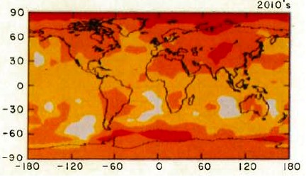
 

Figure 4: Scenario B decadal mean surface air temperature change map (Hansen 1988)
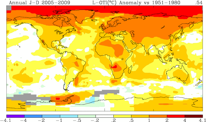
 

Figure 5: Global surface temperature anomaly in 2005-2009 as compared to 1951-1980 (NASA GISS)

Hansen's Accuracy

Had Hansen used a climate model with a climate sensitivity of approximately 3.4°C for 2xCO2 (at least in the short-term, it's likely larger in the long-term due to slow-acting feedbacks),  he would have projected the ensuing rate of global surface temperature change accurately.  Not only that, but he projected the spatial distribution of the warming with a high level of accuracy.  The take-home message should not be "Hansen was wrong therefore climate models and the anthropogenic global warming theory are wrong;" the correct conclusion is that Hansen's study is another piece of evidence that climate sensitivity is in the  IPCC stated range of 2-4.5°C for 2xCO2.

This post is the Advanced version (written by dana1981) of the skeptic argument "Hansen's 1988 prediction was wrong". After reading this, I realised Dana's rebuttal was a lot better than my original rebuttal so I asked him to rewrite the Intermediate Version. And just for the sake of thoroughness, Dana went ahead and wrote a Basic Version also. Enjoy!


0 0

Printable Version  |  Link to this page

Comments

Prev  1  2  3  

Comments 101 to 108 out of 108:

  1. Of note in regards to the Douglass et al 2007 paper BP referred to is the rebuttal by Santer et al 2008, which states: "Our results contradict a recent claim that all simulated temperature trends in the tropical troposphere and in tropical lapse rates are inconsistent with observations."
    0 0
  2. Suggestion - further posts regarding the tropospheric hot spot should move to the appropriate threads, such as There's no tropospheric hot spot, as it's off topic here.
    0 0
  3. I can recall so many previous instances of BP unambiguously accusing scientists of fraud without any evidence (for instance see Ocean acidification, when such accusation stemmed from his misintepretation of the papers), it's becoming obvious that this has become an obsession of his. As for discussing scientific evidence: in the interest of the discussion, I advocate for the the moderator to strike any and all future posts that even remotely suggests fraud if there is no supporting evidence, not only that the accused scientists/papers actually are wrong, but that they deliberately are so with an intent to deceive. Skeptics like to talk about burden of proof but it's something they gladly dispense of on too many occasions.
    0 0
  4. The "fraud" thing is a magical incantation, a clumsy way of wishing away facts, not scientific.
    0 0
  5. Philippe @104, "I advocate for the the moderator to strike any and all future posts that even remotely suggests fraud if there is no supporting evidence" I'll second that. The blog policy currently states that: "No accusations of deception. Any accusations of deception, [fraud], dishonesty or corruption will be deleted. This applies to both sides. Stick to the science. You may criticise a person's methods but not their motives." Humble suggestion is in square brackets.
    0 0
    Response: Fraud was implicit (doesn't that equate to deception, dishonesty and/or corruption?). Nevertheless, I've updated the Comments Policy to include fraud, just to make it explicit.
  6. Hi John, Thanks. Yes, I agree it was implicit, but best to be clear I guess.
    0 0
  7. I know this is a bit off topic, although it is in context of the present discussion.My own accusation of BP's possible engagement in scientific dishonesty or incompetence is based on data he's presented on this site. He could make the problem magically go away if he just responded to the problem, but so far he seems reluctant to do so. I don't feel particularly inclined to let this go until he does come up with the goods, as his credibility as a commentator on this site hinges on it.
    0 0
  8. #107 kdkd at 14:20 PM on 24 September, 2010 My own accusation of BP's possible engagement in scientific dishonesty or incompetence is based on data he's presented on this site. He could make the problem magically go away if he just responded to the problem Your perception of a "problem" is rather odd. I thought we are here to learn and understand what's going on in climate science, not to make our egos fatter. Therefore if you keep accusing me of engagement in scientific dishonesty or incompetence or even scientific fraud it is your problem, not mine. And it would not go away, magically or otherwise, no matter if I took up the gauntlet or not. What about doing some work yourself? I have shown you the data sources used (SEDAC/GPWv3 and GHCNv2) and also described the basic method, enough for a hint. Rest assured I know how to use and abuse statistical tests, but the thing is statistics is worthless in establishing facts until the underlying processes are understood properly. For example I have just realized the easy-to-understand tidbit there is a hysteresis between local population density and UHI effect. That is, increasing density has a more or less immediate warming effect while decreasing density shows up in a delayed manner (man made structures do not go away immediately as people move out). It is not lack of statistics that makes an argument unscientific but mistreatment of concepts. So, if you are not willing to work, at least please stop whining. As I have shown you a sizable UHI effect is almost inevitable in the surface temperature record while global population keeps increasing on a finite surface. How to quantify it, is another question. If you could uncover a good reason why the UHI effect should not be ergodic, that would be a true contribution (as opposed to empty accusations and talk about credibility). Debugging is not done by accusing others, but actually uncovering specific errors and supplying a patch that removes it. I think you need a thorough understanding of the open source development cycle which is much closer to what is possible in the blogosphere than the old-fashioned scientific publication cycle with its closed peer review system. At least in software development this method is proven to be competitive with more traditional quality assurance procedures. Of course before this kind of publication process can get useful in exchanging ideas at least some revision control infrastructure has to be put in place, but that's another story. Anyway, if you do not do it yourself, you have to wait some more for a meaningful and transparent analysis of UHI along these lines with all the statistics you may wish for, as unfortunately I don't have much time to do it for free. While we are at it, the inconsistency between models and observations in the tropical troposphere can be resolved in a simple way if we assume the surface temperature trend has a long term warming bias (a.k.a. UHI). As the selection criterion of models included in Douglass 2007 was their consistency with the surface record and the "hot spot" has no any direct relation to CO2, just to surface temperatures whatever the cause behind them happens to be, if surface temperature trends are adjusted sufficiently downward, they can get consistent with both tropospheric trends and with a different set of models, selected to conform to reduced surface trends. In this case one would select the models that somehow avoid increasing overall IR opacity between 20N and 20S in spite of some increase in opacity in the CO2 band. These are precisely the models with a negative water vapor feedback in the tropics.
    0 0
  9. BP #108. That's a very long winded attempt at justifying why you won't give me the raw data that you used to make the graph you presented. I want this so that I can assess the validity of your claim statistically. It's not possible to do so without it. Just do it, I'll report back and then we can let it go. I don't intend to let it go otherwise, and it should be a simple job for you to release the data as it was processed by you. Your attempt at justifying why you won't do so is very poor. Isn't this the very kind of defensive behaviour that you claim is unacceptable among the professional climate scientists?
    0 0
  10. BP: By the way, I think you'll find that I'm extremely familiar with the open source development model. I endorse it and support it for a number of uses, and argue for its use wherever possible with my colleagues, frequently quite vigorously. I'm also familiar with the problems surrounding scientific computing and the issues which cause a divergence from more traditional allegedly more rigorous software engineering practices. I am just finishing the reviews for a paper I wrote that argues strongly for the use of an open source model, and revision control protocols (using git for what it's worth) in social science research which will hopefully be published in the Australasian Journal of Information Systems next year. Anyway this is becoming increasingly off topic. Take home message: put up, or continue to have your credentials and motivations questioned.
    0 0
  11. BP writes: What about doing some work yourself? I have shown you the data sources used (SEDAC/GPWv3 and GHCNv2) and also described the basic method, enough for a hint. The link in BP's post is to this comment. In the immediately following comment I showed that even granting all your assumptions, the UHI effect would explain around 6% to 9% of recent observed warming over land, and around 3% globally. The analysis that kdkd has been repeatedly challenging you on was described in this other comment. Unfortunately, it is not replicable by anyone else, because you wrote in the very first sentence "I have selected 270 GHCN stations worldwide with a reasonably uniform distribution over land [...]" without identifying the specific stations. In that comment, you wrote: But the most important finding is that there is a (not very strong) correlation between these two parameters, so a regression line can be computed. What kdkd has been bugging you about is simply the statistical significance (or lack thereof) of that regression. You said it was "the most important finding". You also stated that the correlation was "not very strong", so it's understandable why kdkd would assume that you'd looked at the statistics for your model. If you had saved the results of that analysis, it would be exceptionally simple to just post the F-test result or 95% confidence interval or whatever. Thus, my assumption is that you probably did the analysis in a hurry, wrote up that comment, and then didn't bother saving it. Personally, I don't see this as a really big deal. My thoughts on BP's analysis were given here and here. My guess is that: (1) The significance of BP's model was probably very low (low enough to make it all meaningless). (2) The hand-picked set of stations seems to be very unrepresentative of the overall population of land stations, as I noted in the linked comments. I don't mean to suggest that this was deliberate, just that it's hard to get a representative sample. (3) I don't think the quality of either the coordinate information in the GHCN metadata or the spatial resolution of the population density data are sufficient to actually support the type of analysis described. Thus, I was and am still skeptical.
    0 0
  12. Dana#85 Scenario C is not irrelevant. On the contrary, it is relevant because it matches actual temperatures better than the other scenarios. It may help to think of Scenario C as a “black box” that gets the right answers. I enclose Figure 2 as explanation (click here for a high resolution image). Figure 2: Scenarios B and C Compared with Measured GISS LOTI Data (after Hansen, 2006) It should be noted that the emissions in Scenarios B and C are similar until 2000. Thereafter they diverge. Scenario C emissions are curtailed at their 2000 level whist Scenario B emissions continue to increase. Dana has shown that the Scenario B emissions are quite close to reality. Nevertheless, the following points are evident from Figure 2:
    1. Scenario C provides a better prediction of real temperatures than Scenario B.
    2. The Scenario C warming trend for 1984-2009 is 0.24 °C/dec. This is near to the measured rate of 0.19 °C/dec and is significantly closer to reality than the Scenario B rate of 0.26 °C/dec.
    3. The Scenario C prediction for 2000-2019 is nearly zero at 0.01 °C/dec. Furthermore, for the ten years that have elapsed since 2000, it appears to be “on the money.”
    CONCLUSIONS Hansen and his 1988 team are to be commended for producing models that are close to reality. Scenario C in particular has shown significant skill in predicting actual temperatures. Additionally, Hansen’s (2006) comments on the 1988 models that,“… a 17-year period is too brief for precise assessment of model predictions, but distinction among scenarios [B & C] and comparison with the real world will become clearer within a decade [2015].” I concur, let us wait until 2015 to see which scenario is correct. Will the “black box" that is Scenario C be right or will the real world move closer to Scenario B?
    0 0
  13. @angusmac: Scenario C is not relevant because it is based on CO2 emmissions that do not accurately represent actual, real-world emmissions. Scenario B, however, uses figures that are close to real-world emmissions, and thus offer the same basic parameters (except for climate sensitivity). The fact that Scenario C is closer is irrelevant, because it uses does not use real-world emmission values. Do you understand your mistake?
    0 0
  14. angusmac @112 Scenarios A, B and C all represent the same "black box" - just with a different input value; the CO2 emissions for future years (his future, our past). Scenarios A B and C could be said (perhaps somewhat crudely) to correspond to predictions of different CO2 concentrations in the atmosphere in the future. Since we are now in Hansens future, we can look at the current actual CO2 concentration in the atmosphere and determine that emissions have most closely followed Hansens scenario B. Thus scenario C (and A) is irrelevant because it was a prediction for a course of action the world did not take
    0 0
  15. RE: comments from myself, kdkd, and BP above: It's off-topic for this thread, but I've just posted a lengthy "reanalysis and commentary" over in the appropriate thread (Urban Heat Islands: serious problem or holiday destination for skeptics?).
    0 0
  16. angusmac, I'll try one more time to explain to you. The temperature change is based primarily on 2 factors, radiative forcing (which depends heavily on emissions scenarios) and climate sensitivity (which is a product of the climate model). Regarding the first factor, Scenario B has been quite close to reality. There is no point in comparing to Scenario C, which has not. It doesn't matter if the temps follow closer to C, because the real-world emissions do not. Since the real-world emissions and forcing have been close to B, we can then examine the second factor - climate sensitivity. As I showed in the article, we can then determine that the real-world sensitivity has been around 3.4°C for 2xCO2. Notice my use of the term "real-world". You're obsesing with Scenario C, which is a hypothetical world which does not match the real world. Both of the factors mentioned above are incorrect in Scenario C. One is too high and one is too low. The problem is that in Scenario C, the forcing flattens out, whereas that will not happen in reality. There is simply no chance that Scenario C will continue close to reality because it does not reflect real-world emissions or radiative forcings.
    0 0
  17. #102 archiesteel. Scenario B is also incorrect – it uses the right emissions but over-predicts current temperatures. #105 Dana, you don't need to explain. I already understand the theory (hypothesis?) of AGW. The point that I am trying to make and that you, and some others, are ignoring is that the real world is not following Scenario B. This is a case of right emissions in - wrong (too high) temperatures out. My Figure 2 clearly shows that Scenario C is tracking the real world temperatures much better than Scenario B. This is a case of wrong emissions in - right answer out What is required is a model that gives real world emissions in - real world temperatures out. I have not seen one yet, probably because this would mean revising radiative forcings and/or temperature sensitivity downwards from currently accepted norms. Your statement that, "There is simply no chance that Scenario C will continue close to reality because it does not reflect real-world emissions or radiative forcings" is extremely brave. I prefer Jim Hansen's stance to wait until 2015 to differentiate between the outcomes of Scenarios B and C. This would enable us to assess whether or not current assumptions are correct. If Scenario C still gives correct predictions then the assumed radiative forcings and/or climate sensitivity would need to be revised downwards.
    0 0
  18. angusmac #117: "The point that I am trying to make and that you, and some others, are ignoring is that the real world is not following Scenario B. This is a case of right emissions in - wrong (too high) temperatures out." Actually, 'scenario B' emissions were slightly higher than actual emissions have been... and the temperature divergence is of such short duration (5 years) as to be meaningless. This should be obvious from the fact that there are divergences that great between the scenario B temperature line and actual temperatures in the years BEFORE the paper was published.
    0 0
  19. CBDunkerson #118 see angusmac #101 in which I concur with, Hansen's (2006) comments on the 1988 models that,"… a 17-year period is too brief for precise assessment of model predictions, but distinction among scenarios [B & C] and comparison with the real world will become clearer within a decade [2015]." What Hansen was saying in 2006 is that "within a decade" means 2015 - 1988 = 27 years which is a reasonable time period to compare the scenarios. The start date is from 1988 not 2010 and therefore is significantly longer than the 5 years mentioned in your post.
    0 0
  20. angusmac #119: "The start date is from 1988 not 2010 and therefore is significantly longer than the 5 years mentioned in your post." Yes, but from 1988 through 2005 actual temperatures were consistent with scenario B. Ergo... 5 years of divergence (2006 - 2010).
    0 0
  21. @angusmac: "The point that I am trying to make and that you, and some others, are ignoring is that the real world is not following Scenario B. This is a case of right emissions in - wrong (too high) temperatures out." We understand your point, it is simply wrong. We perfectly understand that Scenario B is a case of right emmissions in - wrong temps out. What the article tries to explain is how wrong (and how right) Hansen 1988 was. The only way to find out the divergence between his predictions and reality is to pick the scenario that uses parameters that are closer to reality. That scenario is scenario B. The fact that scenario C looks closer to reality is that it contains *two* erroneous components that cancel each other out and make it appear similar to real-world outcomes (for a while, at least). It is a curiosity, a coincidence, nothing more. "What is required is a model that gives real world emissions in - real world temperatures out. I have not seen one yet, probably because this would mean revising radiative forcings and/or temperature sensitivity downwards from currently accepted norms." Did you even read the article? The reason Scenario 2 (near real-world emmissions in) gave inaccurate results was because of a wrong climate sensitivity value (4.2C instead of 3.4C).
    0 0
  22. Archiesteel#102 "The fact that scenario C looks closer to reality is that it contains *two* erroneous components that cancel each other out and make it appear similar to real-world outcomes (for a while, at least). It is a curiosity, a coincidence, nothing more." As an experienced modeller, I am aware that models can sometimes apparently give the right results due to erroneous components cancelling each other out. Do you mean model sensitivity and radiative forcing are the erroneous components? Model sensitivity at 4.8 °C for 2xCO2 is the same for all scenarios. Therefore, I would be pleased if you would explain the other "erroneous" component in Scenario C that cancels out the error to give the correct real-world results. "Did you even read the article? The reason Scenario 2 (near real-world emissions in) gave inaccurate results was because of a wrong climate sensitivity value (4.2C instead of 3.4C)." Yes I did read the article. I note that you could use a similar sensitivity correction and substitute Scenario C for Scenario B (at least until 2000) and write an almost identical article using Scenario C. This article would be slightly better because it would more accurate than Scenario B for this period. Scenario C has similar forcings to B up until 2000 and diverges thereafter with lower emissions. It is interesting to note that when the scenarios diverge at 2000, the real-world follows Scenario C and not Scenario B. Happenstance? Perhaps.
    0 0
  23. The other erroneous component is that "C" was based on a leveling off/rapid decline of CO2 emissions in 2000 (as the article states). This appears to highlight the "skeptic" tactic of looking at the pretty pictures (Scenario C is closest to actual temperatures) and never taking the time to understand why. In reality, it is a visual expression of the fact that we are seeing mild heating in a La Nina (tends to cooling), solar minimum (tends to cooling) and a PDO cooling regime. In the past, these items pointing towards cool would mean global cooling. We have no global cooling. We have global warming, and occasionally, global treading water. One has to wonder - what happens when any of these turns towards warming?
    0 0
  24. Could I make a request to dana1981 ? Could the Scenario A and C projected emissions for 2010 also be included in Table 1 in the main article ? This might help clarify what, inexplicably, is causing so much confusion.
    0 0
  25. @angusmac: "Do you mean model sensitivity and radiative forcing are the erroneous components?" No, the climate sensitivity *and* the CO2 emmissions are the erroneous components in Scenario C. "Model sensitivity at 4.8 °C for 2xCO2 is the same for all scenarios. Therefore, I would be pleased if you would explain the other "erroneous" component in Scenario C that cancels out the error to give the correct real-world results." Sure, I'll repeat it once more, even though it's been explained many times in this thread. The other erroneous component in Scenario C is CO2 emmissions.
    0 0
  26. Archiesteel#125, have you ever thought of an alternative scenario that the reason why Scenario C matches the temperature record so well is not coincidence or serendipity? It is simply that it matches the actual forcings correctly? This would mean that we have not accounted for all of the forcings from actual emissions in the 1988 scenarios and that some mechanism would be required to bring the forcings in Scenario B down to near-zero after 2000. Fortunately, Hansen 2000 gives us a clue for a possible explanation for the reduced warming post-2000 and thus a mechanism for reducing the forcings that would otherwise be caused by Scenario B (see Figure 3). Figure 3: A scenario for additional climate forcings between 2000 and 2050. Reduction of black carbon moves the aerosol forcing to lower values (Hansen et al, 2000) The 1988 scenarios only consider CO2, CH4, N2O, CFC11 and CF12. However, it is evident from Figure 3 that the largest anthropogenic climate forcing (due to CO2) could be cancelled out by negative forcings from CH4 and aerosols. Perhaps this is the reason why Scenario C gives good results? If we plugged the negative forcings from Figure 3 into Scenario B it would result in similar forcings to Scenario C. Consequently, Scenario B would be able to simulate the post-2000 temperature flattening that is so well modelled by Scenario C.
    0 0
  27. @angusmac: "It is simply that it matches the actual forcings correctly?" No, it isn't. You're trying to find meaning in coincidence, and I'm beginning to wonder where this is really heading to. Are you repeating this fallacious hypothesis over and over again in order to later claim that temperatures are going to level off, as Scenario C suggests? In any case, you've been repeatedly shown why you were wrong, and making unlikely hypotheses isn't going to change that fact. As for me, I've said I needed to say on the subject.
    0 0
  28. I see a lot of people claiming Scenario A is the one. What would be very helpful is if you would do a similar table on concentrations under A, and broader discussion of NET greenhouse gas forcings to date, which I believe is why Scenario A is not the one.
    0 0
  29. Some of your graphics are innacurate. Here is Hansen's model compared to actual temperatures:


    IPCC prediction and reality:


    Taken from here: https://mises.org/daily/5892/The-Skeptics-Case

    0 0
  30. Wow, that's quite an iulluminating comment, applebloom.

    First, you graph a prediction of surface temperature agains satellite data, which is not a surface temperature. Strike 1.

    Then you use a graph that shifts the prediction up to match a high spike from 1988 in noisy data, to maximize the chance that later data will fall below the prediction. Strike 2.

    Then you provide a graph that looks like it has taken a 100-year IPCC scenario result and treated the value is if it is linear over the period, and claim it's too high. Strike 3.

    Did you apply any skepticism to that source at all? Or did you just accept it hook, line, and sinker?

    0 0
  31. Bob Loblaw @130, you missed the outragious claim that Scenario A was what "actually occurred".  Given that CO2 concentrations, as indeed all other GHG concentrations were still below the Scenario B values in 2010, and the total GHG forcing was less than that in scenario B, such a claim cannot have been honestly made.  It was either made in ignorance of the data, and hence what actually happened, and is dishonest in implicitly claiming that knowledge, or it is more directly dishonest in that the person making the claim knew it to be false when they made it.  As you say, very illuminating.

    0 0
  32. "Some of your graphics are innacurate". That would be one of the funnier comments we have seen.

    0 0
  33. And add that he used UAH satellite data rather than the results from RSS that show nerly twice as much warming.

    Sometimes ya just gotta luv how creative some skeptics can be with data. Cherry farmers every single one of them.

    0 0
  34. I would like to see these graphs updated to 2015 and have the discussion again.

    1 0
  35. I too would like to see an update of this topic, afterall comparing the 'guess' with observation is the foundation of the scientific method.

    0 0

Prev  1  2  3  

You need to be logged in to post a comment. Login via the left margin or if you're new, register here.


The Consensus Project Website

THE ESCALATOR

(free to republish)


© Copyright 2024 John Cook
Home | Translations | About Us | Privacy | Contact Us