


 Arguments


The Y-Axis of Evil
Posted on 28 December 2012 by Rob Honeycutt
Very recently a comment popped up on the WUWT site that caught my attention. It was a comment similar to many I've seen before and one that needs addressing. The comment was from someone named D Böehm, saying,
"The alarmist crowd likes to use 0.1ºC increments because it makes the y-axis look scary, when it is just a small temperature fluctuation.
Here is a chart with a normal y-axis. Not so scary, eh?"
This is an interesting misrepresentation of the science, not so much because D Böehm is using it, but because the very same misinformation gets presented by Dr Richard Lindzen on his blog in February of this year.
This is the chart D Böehm presented:
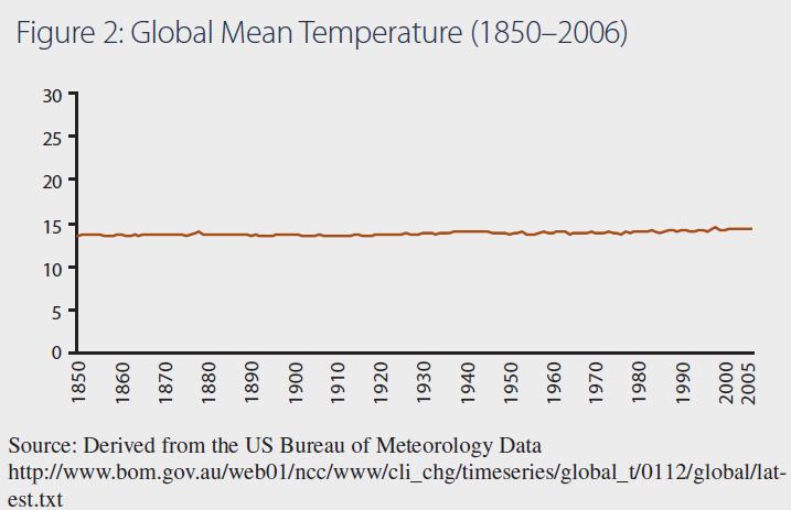
Fig:1 - Böehm's graph with a "normal" Y axis.
Confusing weather and climate
There is, of course, an element of truth here. You might define "normal" as the temperature range we experience on an annual basis at most locations around the planet. In fact, the annual temperature range can be greater than this in most mid-latitude locations. Anyone who has been following climate issues would instantly recognize this as yet another act of confusing weather with climate. Weather is what we experience on a day-to-day basis. Climate is what weather is doing over longer periods of time.
So, let's give some context to D Böehm's chart. Let's first put this chart in context of the past 500 million years.
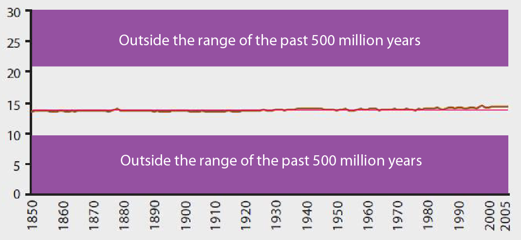
Fig: 2 - Limiting the Y axis to the past 500 million years (click for larger image)
This is taking us back to the Precambrian Explosion. This is the full range of global mean temperature seen on our planet that allowed the evolution of complex life. Anything outside of this +8°C to -6°C we just don't know. That's a range of just 14°C. In "normal Y-axis" terms (i.e., weather) this is laying on a sunny beach or a chilly hike in the mountains. In terms of climate these are the boundaries of the existence of life as we understand it on this planet. On the lower bounds we know it's a planet in deep glaciation. At the upper bounds we have tropical conditions near the poles.
Deep glaciation and ice free arctic
Let's now add some additional context: The glacial-interglacial cycles of the past 5 million years or so.
These global mean temperatures range from possibly +2°C to -6°C relative to current global mean temps. At the lower boundary we are talking about a mile high glacier covering Manhattan and near ice free conditions at the Arctic for the upper bounds. That mere 8°C change in global average temp means a vastly different planet.
Remember, in terms of weather, 8°C is only the difference between wearing a t-shirt or a sweater when you go outside. In terms of climate it's a mile of ice.
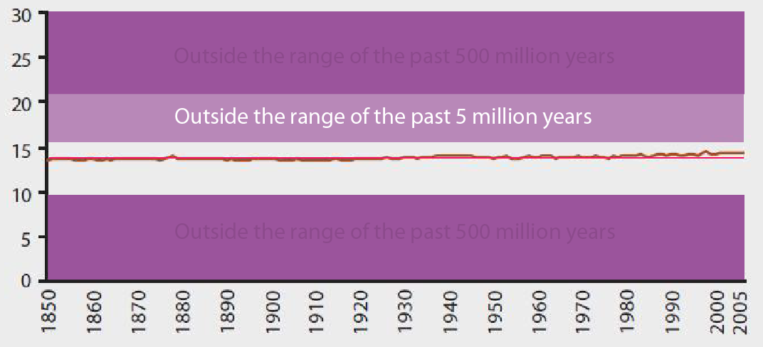
Fig: 3 - Limiting the Y axis to the past 5 million years (click for larger image)
The Holocene, our stable warm period
Now let's look at the Holocene. The Holocene is the period of the past 10,000 years which has given rise to human civilization. This narrow range of global average temperature is, in part, what has allowed us to prosper the way we have as a species. As we work our way up toward a global population of 10 Billion, we are very reliant upon this narrow stable climate to sustain the global agriculture that can support such a vast population of humans.
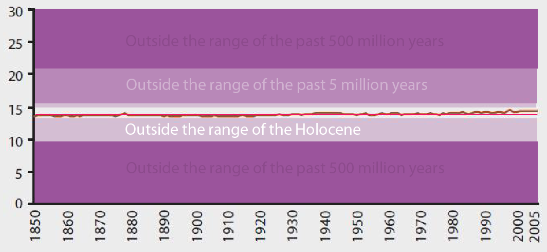
Fig: 4 - Limiting the Y axis to the Holocene (click for larger image)
Business as usual implications
IPCC estimates suggest that Business As Usual (BAU) use of fossil fuels will drive global average temperature up by 1.4—6.4°C by 2100 (IPCC AR4, Figure SPM.6, A1 scenarios).
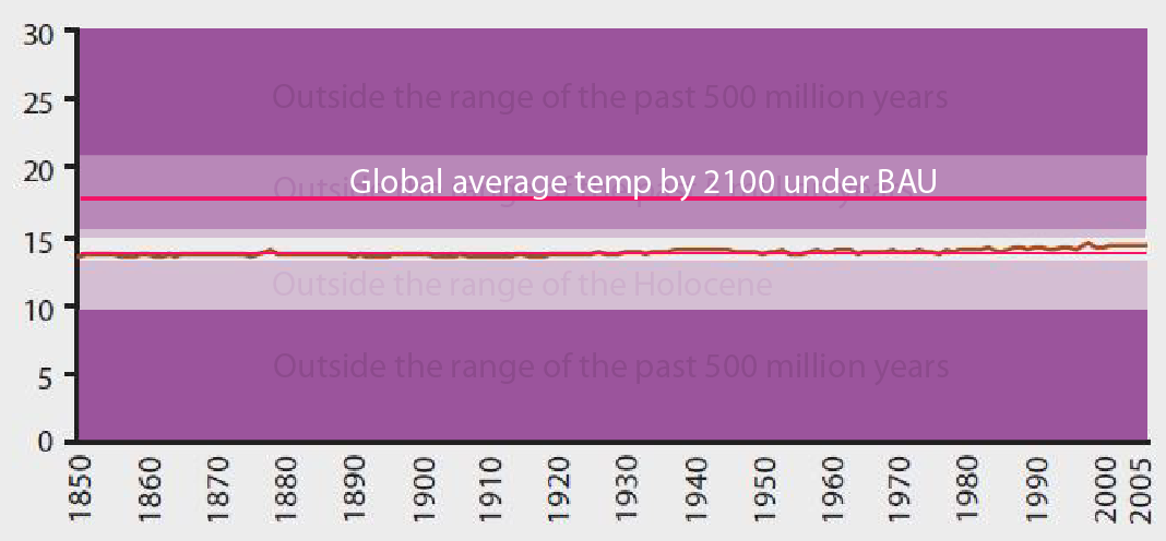
Fig: 5 - Projected temperature by 2100 with Business As Usual emissions (click for larger image)
The bigger question – the larger and more immediate concern – is where is the upper boundary for large scale sustainable agriculture necessary to feed the coming 10 Billion humans? We are certainly headed into new territory, well beyond the "normal" range of the Holocene, regardless of what we do. BAU use of fossil fuels will certainly drive global average temperature outside the range of the past 5 miliion years. If we do nothing we will likely see such conditions within the next 100 years.
Scary now, D Böehm?
How far are we going to push it? Exactly where on the Y-axis will things get evil?


There's a new Y-Axis of Evil graph up - over at WUWT Willis Eschenbach has just graphed Greenland ice loss over the next century (without, notably, considering acceleration from present rates) on a zero based scale. Which is just about as useful and deceptive as temperature anomalies graphed in Kelvin, not to mention completely neglecting the effect of that ice loss on sea level - which will eventually hit ~70 feet if the Eemian Period data on cryosphere response is accurate.
Just more of the same... sigh.
Regarding my comment number 49. I must correct and apologise to Lord Monckton for attributing to him a comment he did not make. This was due to a failure of another comnentator tot indicate correct punctuation with regard to his comment which I took to be Monckton's:
“Today’s high CO2 levels – the 97% natural and the 3% human-released”
Philip,
I'm afraid that at this point in time, with all that has transpired and everything the man has said and done, no one owes any sort of apology to Monckton.