


 Arguments


Statistics says the long-term global warming trend continues
Posted on 3 August 2015 by John Abraham
A new study has just been prepared for an upcoming climate meeting of the US Climate Variability and Predictability Program. This group has an annual summit and this year will have a special science session with papers and presentations devoted to the so-called “hiatus”. The “hiatus” has taken many meanings. In the popular press, it is often used to falsely claim that global warming stopped. As I’ve written many times, global warming has not stopped; the Earth has been continuing to gain energy because of human emissions of greenhouse gases.
In other cases, the “hiatus” refers to a reported slowdown in temperature increases. This too is not seen in the ocean data or in sea level rise. It is only seen in surface temperatures (temperatures of the surface of land and ocean regions).
What my colleague and I wanted to know was, is this slowdown real or not? Specifically, we wanted to know whether it passed mathematical tests for statistical significance. My colleague, who is an expert is statistics, and operates a climate website, downloaded the surface temperature data from NASA and detrended it (removed the long term increase in temperatures). The difference between the red trendline and the black dots is called the residual. We wanted to increase the odds that we would find a “hiatus” by stopping our analysis in 2013 (omitted the hottest year on record, 2014).
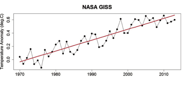
NASA temperature anomalies from Foster and Abraham, 2015.
If you plot the residual over this time period, it looks like the image below.
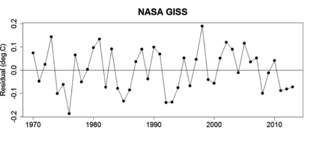
NASA temperature residuals from Foster and Abraham, 2015.
We wanted to know whether there is any trend in these residuals. If the global warming trend had slowed recently, you would expect residuals to become more negative. We found that there was no statistically significant change to the residuals since 1970.
Next, we grouped years together into groups that ranged from 3 years long to 20 years long and searched for changes to the residuals in those groups. Again, we found no significant change. Our findings are best summarized by our concluding paragraphs.


H'mmm. Competently done statistics never suggested otherwise. Tamino, among others, has pointed this out on many occasions.
Cherrypicking is always incompetent whether done by deniers or physicists not well trained in statistical inference.
Grant Foster (Tamino) is the coauthor on this paper. Much of the data in the paper have been posted on Open Mind, Tamino's blog.
It is interesting to see how the other papers presented address the question of what a "haitus" is and how it can be measured. Hopefully after 2015 the haitus will be resolved in the popular press, but the "skeptics" will probably keep it going as long as they get traction.
Tamino's blog post is much richer in details rather than this Guardian article. The original blog is dated 30 Apr, so 2 months before the paper by Foster & Abraham. Essentially the paper is the "polished out" version of the blog. I enjoyed reading the blog not only for Tamino's expert teachings but also for his juicy comments re those who deny the science
I think the Arctic sea ice looks like it's disintegrating. My rationale is that stagnation is close to death and sinusoidal waves seem to be forming around the lower 2-standard-deviation boundary in the Arctic sea-ice extent graphs.
You get a slightly smaller warming trend with the RSS satellite data, but there it is a lot easier to "cherrypick" and claim no warming at all the past 20 years. I do think any article like this needs to at least address the difference, because I know a lot of deniers definitely point to it.
knaugle,
The main point about the UAH and RSS history is that neither of them represent to surface temperature. They represent the temperature higher in the atmosphere where there is less effect of increased CO2, hence a smaller trend.
Mind you, the higher elevation values have shown much more response to a strong El Nino such as the 1997/98 one. If the current El Nino builds to a similar level then the sattelite data may cease to be a favorite denier reference, at least until several years after this inconvenient event when they can once again claim "there has been no warming since 2016 so all of the science is wrong".
A good source of links to explanations of issues with satellite temperature measurements is a comment by Christopher Hogan on RealClimate.
The have tested for departures from linearity by fitting change point models and polynmial models. What I wish they had also done was fit a generalized additive model including a smoothing spline or something similar and test its departure from linearity. This gives a smooth curve not of a predetermined form. It is something that I would have tried on such a data set.
I'm curious: how do they test for departure from sinusoidality?
You fit piecewise splines joined together with constraints on their parameters. You make a tradeoff between smoothness and fit when doing this. The smoother the fit the fewer parametes you use to make that fit. You calculate the degrees of freedom that you use to make the fit. You calculate the change in the log of the likelihood and use it and the degrees of freedom to carry out a chi-squared test of the effect of the non linear smoother terms.
..cool, cheers!