Climate Cherry Pickers: Falling sea levels in 2010
Posted on 3 October 2010 by John Cook
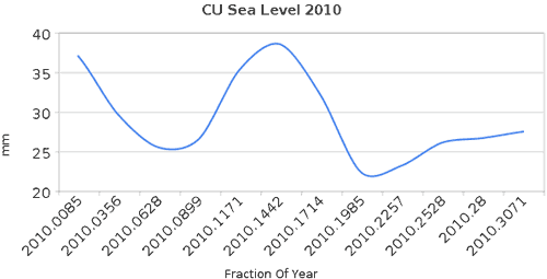
A proper understanding of climate requires we consider all the data, the full body of evidence. A common rhetorical technique used to portray a skewed picture is the technique of cherry picking. This involves choosing just the select pieces of data that paint a certain picture, even if the full body of evidence gives the completely opposite result. A vivid example of this is a recent post by Steve Goddard which casts doubt on the fact that we've experienced record hot temperatures over the last year, citing falling sea levels in 2010. This is based on the following graph showing satellite measurements of sea levels over 2010:

The satellite data comes from the University of Colorado - you can download the data directly. This data goes back to 1992. Here's what the full body of evidence looks like:

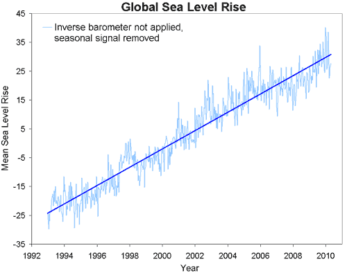
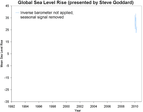
Early in 2010, global sea levels hit the highest levels on record. Realising this fact is not possible when the only data presented is the following:

Of course, there's a lot more that can be picked apart in Goddard's blog post (and readers are welcome to contribute to this process). There's no discussion of why sea levels might be dropping this year (I suspect it has something to do with the switch from El Nino conditions in early 2010 to La Nina conditions in the middle of the year). There is no exploration of what other factors besides air temperature contribute to glacier ice loss - Robert has explained the complexities of why glaciers loss mass here, here and here.
Instead all we are presented with is strong conclusions drawn from a very short piece of climate data. This is taken from a noisy signal showing many ups and downs throughout the long-term trend of sea level rise. A proper understanding of climate deserves much more than this.

Arguments


Rhetorical techniques are described at another site, http://rhetoric.byu.edu/ -- in addition to in the classic book I keep mentioning, Aristotle's On Rhetoric.
A very quick look at the second figure shows 8 previous "sea level falls" similar to the drop since early 2010, over the last 28 years. So something like this happens about once every 3 years. This is so not news.
His sample consists of only twelve data points (apparently not grasping that his data set only amounts to less than one third of calendar one year,) further he felt obliged to artificially smooth the twelve data points thereby implying a data set with higher resolution.
The Pacific Ocean has been turning colder recently as part of a regular cycle that has probably been going on since the ocean came into existence. A simple Google search tends to verify your suspicion. Here are just a few websites that came up near the top; take your pick.
Adios El Niño, Hello La Niña?
Children of the Tropics: El Niño and La Niña
El Niño and La Niña
Adios El Niño, Hello La Niña?
NOAAWatch El Nino / La Nina Headlines
I have to object to you objecting to the description of cherry picking as a "rhetorical technique".
Does Aristotle's "On Rhetoric" have a section on nitpicking? :-)
He's not only cherrypicking data, he's cherrypicking explanations, too.
By the way, even the x axis label is wrong.
In which case, it makes sense that sea levels might fall, even whilst sea _surface_ temperatures rise, because the heat is being transferred from lower down.
I have no idea if this is correct, I'll check it out...
Agreed; sadly this will not change, as the contrarians consider anything that waste the time of those working against them as a win.
Ah, but with such a sample, the graph above and a ruler, one can see the new trend: sea level is falling by 30 mm/yr! Clearly, Goddard must now be considered an alarmist!
An yet, he goes on to throw a stone at our own John Cook, observing
Current sea level rise rates are much lower than the average for the last 15,000 years. Current trends are more than an order of magnitude lower than Hansen’s forecast.
In the-world-according-to-Goddard, trends can simultaneously be both smaller and larger.
You can see the drop graphically here, and see the indices here.
The only snags to these two ideas is that I have no idea what data points they use to measure the sea level from outer space and whether the expansion/contraction actually is that massive to give a observable change in sea levels.
On the issue of graphs you can make them look even more impressive by simply changing the scales on the x or y axis to heighten the point you wish to make. Take a 1 degree temperature rise over 30 years. If you shorten the x axis and lengthen the y axis you will produce a graph that looks like the Himalayas. Do the opposite and it becomes a flat line which appears to show nothing. Depends on who you want to convince of the facts and how gullible the listeners are I suppose.
And, of course, the 15,000-year period he uses includes almost all of the sea level rise resulting from the end of the last ice age. The vast majority of this rise was finished by about 7,000 years ago.
This is like saying that the four pounds Harry has gained since last year is meaningless because it's less than his average annual weight gain since birth.
Goddard has to compare the current rate to the rate over the entire post-glacial period rather than to the rate over the last ~5,000 years because then he'd have to change "much lower than" to "much higher than". That wouldn't be helpful to his position.
FYI.
If true, double fail for Goddard.
This is about sea levels. Can ENSO cycles really have any long term effect on sea level? They are, after all cycles, which tend to average out to small change.
Switching now to the ENSO thread.
I like the comment on Goddard's thread from the guy who's against the metric system. Hilarious. It reminds me of a thread on another denier site where they were arguing that ice sheets like Greenland's must be able to come and go in the relative blink of an eye because the earth is only 6000 years old, after all. It shows you the mindset that science and reason are up against.
It´s almost 8 pm here. Global Warming has stopped for at least 5 hours...
It's like a commentator on a car race. Oh, my goodness, that last lap was 3 hundredths of a second slower than the previous lap. The fact that the driver in question is lapping the field is irrelevant - because the race is actually won.
So we have to find -something- to talk about.
Not so. In a time series such as this, small variations do not have a significant impact on the long term trend. Those variations are called noise: In signal processing or computing it can be considered unwanted data without meaning.
If you look at the overall trend lines in the long term data shown in the comment 18 you reference, you can see clearly the upward rise in sea levels, despite the noisy seasonal variations present in the signal.
A clear analogy would be to maintain that the sun no longer exists because it disappeared over the horizon at the end of the day.
Someone intelligent enough to do data research, construct a graph & post it online as part of a blog would know that to focus on such a short-term variation is meaningless. Except for, apparently, Goddard.
The Yooper
I love that analogy...very good.
I am no expert but i believe you are reading the graph @18 incorrectly. The rate of change is indicated by the slope of that line, 3.2mm/year over the last 17 years. To get the rate for the last 3 years you would have to draw another line from your start point (Jan 2007) to the end. It appears from eyeballing this that it is almost exactly on the same 3.2mm/year trend. If you start from mid 2007 then the slope (rate of change) is actually greater.
Someone please correct me if it is I who am misreading the above graph.
You are reading the graph correctly. Be careful about eyeballing though, best to calc. the OLS line. But, yes, it does seem that if one cherry-picked mid 2007, one could argue that SL rise was accelerating. It may be, but that is way too short a time frame for the trend to be statistically significant, and to draw that conclusion based on such a short window would be misleading.
Interesting how you and I and the scientists do not make that mistake, but that the 'skeptics' do repeatedly identify short term windows to find trends (no matter how statistically insignificant) to support their misguided claims.
I honestly cannot believe to what lengths some people will go to rationalize their belief that global sea level rise is slowing. Even some very smart people like Pielke Snr have made the same mistake.
Sorry if I was not clear. Your position on this was evident to me, I was not criticizing you :)
So to the question of why raw sea levels dropped this year, it seems to be combination of the seasonal signal (see the seasonal signal removed graph and note the smaller drop), the failure to apply the inverse barometer adjustment, and la Nina developing (not also the 1998 drop), resulting in a short-term downward trend of global average ocean temperatures (thermal expansion component is therefore downward trending).
With la Nina firmly in place, expect the "global cooling" meme to return, as 2011 will almost certainly be off record levels.
http://www.sciencedaily.com/releases/2010/10/101004151700.htm
"What we're seeing is exactly what the Intergovernmental Panel on Climate Change predicted -- that precipitation is increasing in the tropics and the Arctic Circle with heavier, more punishing storms."
(shakes head, wanders away)
The Yooper
My favourite Steve 'Pixelcounter' Goddard piece is his declaring Hansen's Antarctic ice predictions a failure based on recent trends. On closer examination the Hansen prediction in question appears to be for equilibrium at 2x CO2, i.o.w. somewhere around 2070. We're now in 2010.
The completely uncritical reception of this story at WUWT is jaw dropping and very revealing.
It can only say one thing...the earth is as warm as it should be. Maybe even warmer than it should be. Anthropogenic CO2 isn't heating it right now.
Its ironic that the author should be criticising cherry picking so agressively and yet in the very same breath mention record hot temperatures.
Where exactly will the heat to drive the next el Nino come from? El Ninos don't create heat, they only redistribute it. Whatever process has a La Nina like the current one showing lower temperatures is the other side of the el Nino coin. After this La Nina there **will** be an el Nino. Maybe straight away, maybe 3 years. Either way, the heat released will not come from nowhere. Just because we can't identify it now doesn't mean we won't see it then.
Yeah, except Sea Levels aren't dropping. That itsy bisty fact kinda demolishes your whole argument, doesn't it?
I am continually astonished by people's misunderstanding of the energy flow associated with the earth. The earth receives about 385 x 10^22 Joules of energy every year. We had been accumulating somewhere between 5 and 10 x 10^22 Joules every year in our oceans. Not recently though.
You can easily see that the earth receives from the sun and radiates away to space many, many times that which it accumulates even at the best of times.
In answer to your question or rather to put it into perspective, the heat you speak of could accumulate in a matter of days if not hours.
So to answer scaddenp, the "mechanism" is a single sunny day puts more energy into the upper ocean than is "accumulated" all year.
On the same day the same energy is radiated out to space minus that tiny portion that accumulates. But the point is that you wondered where the energy comes from ands the answer is that its well and truely there.
So where is it coming from, how is it sustained for such a long period, why is it sustained for so long?
Notice, sea level sort of bounces along, upward
The satellite record shows otherwise. If it goes on like this, in 2100 sea level would be below its present day value by 27.5 cm. Nothing scary, really, although it may kill off some shallow coral reefs by exposing them to air. However, by the year 3000 it would drop by 56.6 m, which is deep ice age. In this case I guess Canada should join the Estados Unidos Mexicanos as soon as practicable, then reclaim Texas, New Mexico, Arizona, California, Nevada and Utah along with parts of Oklahoma, Wyoming, Kansas and Colorado.
It's very poor form to show data without properly attributing the source of the raw data (there's something in the graph title but this is not really good enough). Also poor form is to show a curve fit without explaining the methodology used to fit the curve.
I'm happy to do some regression diagnostics to see if the curve fit is justified if you point to the location of the raw data (it's not terribly easy to find from a google search of the graph title).