


 Arguments


Global Warming is Accelerating, but it's Still Groundhog Day at the Daily Mail
Posted on 17 April 2013 by Rob Painting
- Global warming has accelerated, however most of this warming (over 93%) has gone into the ocean - the Earth's largest heat reservoir. An important development has been the uprecedented warming of the deep ocean in recent years.
- Most of the remaining global heat reservoirs also exhibit the same accelerated warming, and this accelerated warming is consistent with the observed acceleration in planet-warming greenhouse gas emissions from fossil fuel burning in the last two decades (Raupach [2007]).
- The rate of surface air temperature warming during the last decade has been small however, and is slower than the previous decade. But this is consistent with at least one climate model which predicts this behaviour when anomalous heat is being deposited into the deep ocean during periods dominated by La Niña (Meehl [2011]).
- If this is demonstrated to be the case with other climate models then we would expect the rate of surface warming to be at the lower end, or perhaps even drop below the 5-95% range, of climate model projections, even while the Earth is strongly warming.
- Non-expert opinion in the mainstream media, such as the Daily Mail, often demonstrates a poor understanding of climate science, and conveniently omit the relevant points raised above.
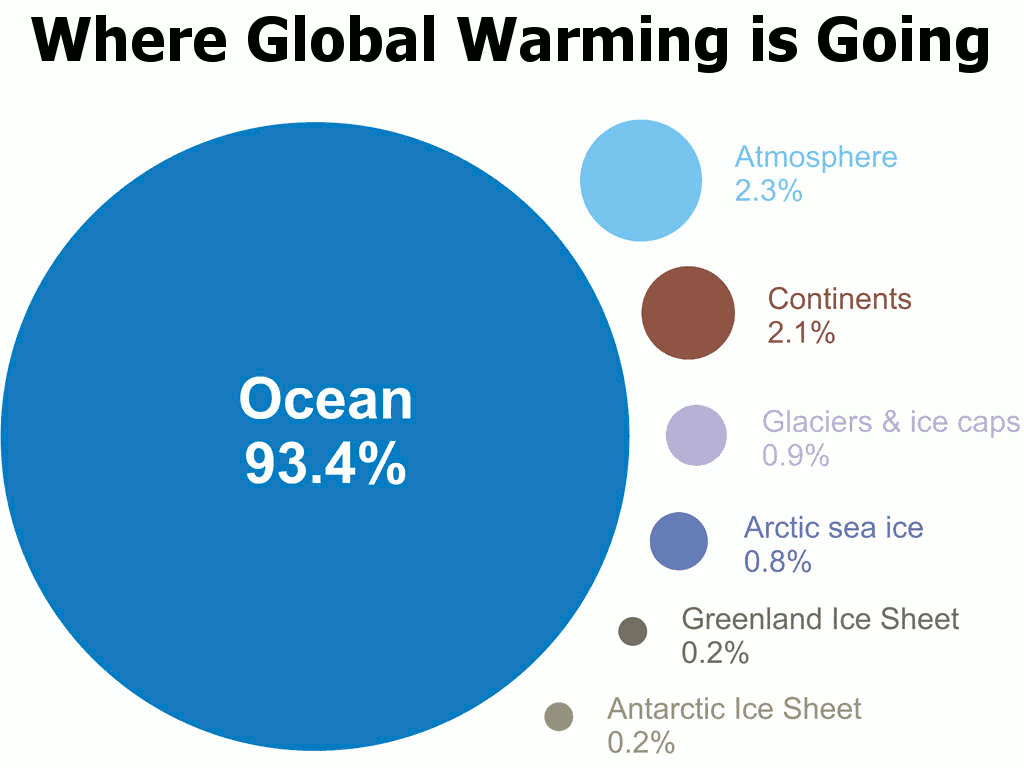
Figure 1 - A visual depiction of how much global warming heat is going into the various components of the climate system for the period 1993 to 2003, calculated from IPCC AR4 5.2.2.3 versus where skeptics/contrarians seem to think it's going. Note the graphic totals 99.9%, so 0.1% is unaccounted for.
This has Happened Before and Will Happen Again
In the 1993 comedy Groundhog Day actor Bill Murray portrayed an arrogant and self-absorbed individual who was forced live the same day over and over again until he learnt the error of his ways. David Rose of the tabloid The Daily Mail seems to be living in his own personal version of Groundhog Day. Unlike Bill Murray's character, however, David Rose's climate-based Groundhog Day is a committed personal choice.
Skeptical Science has already debunked his previous claims about global warming over the last 16 years, here, here and here. But rather than learn from the scientific literature, or reputable climate scientists, Rose has instead chosen to once again to repeat many of the same bogus claims. Every day may be Groundhog Day at the Daily Mail, but as we'll see the world is warming faster than ever.
Where is Global Warming Going?
Living and working on the Earth's surface it is very easy to get the wrong idea about global warming. Global surface air temperatures are indeed relevant to us surface-dwellers, but over 70% of the Earth's surface is actually ocean, and around 93.4% of global warming has gone into heating the oceans (See Figure 1). Global warming is therefore the story of ocean warming. Only by focusing on the 2.3% of global warming that goes into warming the atmosphere over a short time frame, and ignoring the remaining 97.7%, can David Rose maintain the illusion of little, or no, warming. In other words, this is an obvious cherry pick - one of the 5 characteristics of scientific denialism.
A Warming Ocean Warms the Atmosphere Too.....Eventually
Since most of global warming goes into the ocean, and the ocean is the main source of atmospheric warming, it's clearly the first place we should check to see what's going on. A number of scientific publications, (Von Shuckmann & Le Traon [2011], Levitus [2012], Nuccitelli [2012] & Balmaseda [2013]) show the oceans, and notably the deep oceans (depths below 700 metres), have warmed. More importantly, the last three of these papers have demonstrated that not only have the oceans continued to warm, but an unprecedented warming in the deep ocean has contributed to an acceleration of overall ocean warming.
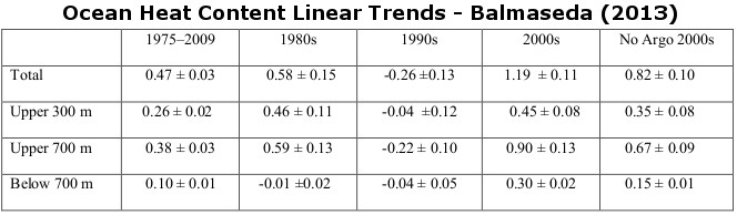
Table 1 - linear trends in ocean heat content. Values are per unit area of the global ocean plus and minus 1 standard error (in watts per square metre [W/m2]). To obtain the equivalent heat flux per unit areas of the total earth surface multiply by 0.708. Image adapted from Balmaseda (2013).
Clearly the last 16 years have seen much greater warming than the preceding 16 years, an observation which is broadly consistent with scientific expectations, given that planet-warming greenhouse gas emissions from industrial activity have accelerated over this period too. This should have led to an accelerated rate of global warming and indeed it has, it's just that much of this heat has gone into the ocean.
It is interesting to note that 'hiatus' decades (decades of little or no warming in surface air temperatures) are predicted in one climate model (Meehl [2011]) when anomalous heat is being deposited into the deep ocean during periods dominated by La Niña. We don't yet know whether other climate models exhibit the same behaviour, but if so the diminished surface warming observed over the last decade would be expected, because the latter part of the noughties has been dominated by La Niña.
So does this mean we'll see less surface warming in the future because more heat is going into the ocean than before? No. Global surface air temperature variations are simply short-term fluctuations (weather) about a long-term warming trend (climate).
Warming Everywhere
So far I've concentrated on the main heat reservoir of the climate system, the ocean. If that is accelerating, then we should expect to see that reflected in the trends of the other heat reservoirs - and that is generally what we observe. The melt of the Arctic summer sea ice has greatly accelerated (0.8% of global warming based on the Intergovermental Panel on Climate Change (IPCC) assessment in Figure 1). The world's glacier and ice cap retreat (0.9%) has accelerated. Ice loss from the Greenland ice sheet (0.2%) has accelerated (Shepherd [2012]). Ice loss from the Antarctic ice sheet (0.2%) has accelerated (Shepherd [2012]). Heat uptake by the land surface (2.1%) has accelerated (up to 2004 at least - Huang [2006]).
In fact, all of the Earth's heat reservoirs have seen substantial warming, all that is apart from surface air temperatures (2.3% of global warming). Global surface air temperatures have warmed, but only slightly - which is why contrarians focus on them. Diminished surface warming is only temporary however.
Punxsutawney Phil Would do soooo Much Better
With the relevant background context out of the way, it's time to look at the two main flawed claims made by David Rose. For instance he writes:
"We disclosed that although highly influential computer models are still estimating huge rises in world temperatures, there has been no statistically significant increase for more than 16 years."
As explained above, there is no mismatch between observations and theoretical expectations. Most of the heat has gone into the oceans, which is to expected. Indeed, as the emission of planet-warming greenhouse gases has accelerated so too has the rate of global warming. Rose is simply cherry-picking here. Although air temperatures do indeed track ocean temperatures over the long-term, they can deviate over short intervals due to ENSO (La Niña/El Niño). But this is only temporary, and is unlikely to persist much longer.
He further writes:
"Despite our revelation earlier this month, backed up by a scientifically researched graph, the Committee on Climate Change still clings to flawed predictions"
Rose is referring to the graph reproduced in Figure 3, which is based upon a graph by Ed Hawkins, a climate scientist at the University of Reading.
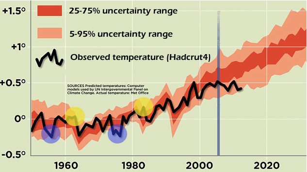
Figure 3 - Adapted image from the Daily Mail, an image itself adapted from work by Ed Hawkins. Orange-shaded areas are the range of climate model surface temperature projections (CMIP3) with the uncertainty range as indicated. Black line is the observed temperature (HADCRUT4) and the vertical blue line indicates when the simulations were carried out. Blue-shaded circles indicate when (hindcasted) temperatures were below the 5-95% range, and yellow-shaded circles indicate when it was above the 5-95% range.
Rose makes a big deal out the observed surface air temperatures (black line) about to drop out of the modelled range (light orange), but if you look at the hindcasts (model simulations of the past), that's not exactly new. There are two periods in the hindcast (circled in blue) where the temperatures do in fact fall below the range. This is what we should expect. The 5-95% interval (light orange) means this should happen 5% of the time (5% below and 5% above, giving 10% of the time outside the 5-95% interval). Notably, on both occasions, this occurs during multiple years of strong La Niña's - which is again consistent with the modelling of Meehl (2011). This suggests that the other climate models may simulate anomalous heat being deposited into the ocean during these dominant La Niña intervals, but perhaps not necessarily the deep ocean in this instance.
But why don't observed temperatures follow the centreline of the projections? The darker orange-shaded area represents the (25%-75%) average of the model runs - when they all have been aggregated together. If the Earth was able to run the same year over-and-over-again, like the models, it would probably do the same. But the Earth only gets one shot at this. One roll of the dice. So rather than being smoothed out - like the average of all the climate model runs - actual surface temperatures yoyo up-and-down - exhibiting large year-to-year variability. As they would if only one climate model run was carried out.
The point here, is that the graph which Rose reckons supports his claims, does nothing of the sort. If temperatures drop outside of the orange-shaded band and remain there, he would have a point that something might be amiss. But at the moment the graph simply reveals that the climate models used are demonstrating good skill - a point illustrated by Ed Hawkins himself.
Global Warming Picks Up the Pace while the Daily Mail Lives the Same Day over and Over
When we look at the Earth as a complete system, considering all the reservoirs where heat goes, it is glaringly obvious that not only has global warming continued, but it has accelerated - along with accelerated fossil fuel emissions.
The surface temperature warming trend over the last 16 years has been small predominately due to natural variation in the rate of discharge of heat from the ocean, although other factors may have played a part. Based on past observations of this natural oscillation, however, we would not expect this to last much longer.
And finally, if David Rose truly wanted to understand the ramifications of climate model simulations presented by Ed Hawkins, he should have consulted Ed Hawkins himself. Had he done so, he would have been corrected.
Undoubtedly David Rose will have more to write about this in the future. But don't be surprised if he, and the Daily Mail, are still endlessly repeating the same myths over and over - forever wilfully stuck in their own version of Groundhog Day.


I'm interested to know what specific thermodynamic mechanism is being utilized by the amounting atmospheric CO2 to restrain the release of the absorbed solar heat from the ocean so as to raise the OHC without warming the troposphere and the surface first ...?
Also, you should drop the term 'unprecedented' in your first key point. There are absolutely no other historical periods prior to the last ~8 years to compare with when it comes to deep ocean heat content (data coverage).
The post doesn't make clear why Rose is off again on his tour of Punxsutawny. (It's probably not so relevant as Rose usually doesn't need an excuse.) He is reacting to a Parliamentary select committee.
"The official watchdog that advises the Government on greenhouse gas emissions targets has launched an astonishing attack on The Mail on Sunday – for accurately reporting that alarming predictions of global warming are wrong."
Yet his latest article isn't quite Groundhog Day. He demonstrates the veracity of his case by mentioning the Economist article (which isn't that supportive of denialist twits) and two denialist twits who entirely agree with him and the Economist article again.
If you like a bit of fun, it should be noted that Rose has himself now entered the climate prediction business by telling the sad fools who read the Daily Rail in his previous article (on the graph - it is absent on the version use for this latest article) that HadCRUT4 is "about to crash out" of the shaded zone. Thus he appears to be predicting an annual HadCRUT4 anomaly for 2013 (the graph is of such data) of less than 4.5 °C.
Kayell @1.
The specific mechanism is the way those devious heat fluxes always seem to flow from hot places to cold places.
Here is a question or two for you to mull over. With the average surface temperature of the planet some 14 °C (and rising) and the Earth's core over 5000 °C, what is the average temperature of the world's ocean waters? Remember here that 90% of that is usually described as "deep", a useful term to include if you consider a web search would be helpful. And why is that?
Kayell - If you think there is an inconsistency in the chain of reasoning, then point it out explicitly, stating your assumptions. It is generally rather more likely that you are labouring under some misaprehension regarding the science than that the scientists whose work is reported here are wrong. It will be much easier to answer your concerns if you actually articulate your own line of reasoning, so we can see why you think there is an inconsistency. Also asking vague questions as you have done, without stating your own position, gives the impression of trolling, which I trust is not your intention.
Perhaps this RealClimate article may be of some help: http://www.realclimate.org/index.php/archives/2006/09/why-greenhouse-gases-heat-the-ocean/
Kayell, if you want the textbook outline of the thermodynamics of GHG heating of ocean, then please see the rather exhaustive series at Science of Doom, that begins with this.
Here you say "A number of scientific publications, (Von Shuckmann & Le Traon [2011], Levitus [2012], Nuccitelli [2012] & Balmaseda [2013]) have shown the oceans, and notably the deep oceans (depths below 700 metres), have warmed." Yet in your post on April 15th you wrote "Interestingly, Guemas et al. find that most of the recent slowed surface warming can be attributed not to the accelerated deep ocean warming, but to the accumulation of heat in the relatively shallow oceans (to 700 meters). They note that their results are consistent with Loeb (2012), in that most of the global energy imbalance is absorbed by the upper 700 meters of oceans, although the deeper ocean heat accumulation cannot be neglected"
Looking at the table from Balmaseda (2013) it looks as if the warming of upper 700 metres is very significantly more than warming below 700 metres
This variable reporting is very confusing and does lead to scepticism that climate scientists really understand what is happeing in the oceans
Ray- as stated on the thread on the Guermas (2013) paper, I have not read that paper. Exactly why they disregard the warming of the deep ocean is not clear. Perhaps worth looking into at some point, but differing opinions on cutting edge research is simply par for the course. They can't both be right, so one idea will fall by the wayside.
Yes, the bulk of the warming occurs in the upper ocean. My apologies if that wasn't clear. The important feature of table 1 is that the very recent deep ocean warming is unprecedented in the admittedly short period of observations (the last 50 years - see Levitus [2012]). This has obvious implications, as discussed in the post, because it is a large part of the reason for the acceleration in ocean heating.
Ray wrote: "This variable reporting..."
I don't see the variation. Both of the following are true;
These two findings are in no way contradictory of each other. Warming below 700 meters has gone up significantly... but is still less than warming down to 700 meters.
My congratulations to Rob or whomever created the animated gif showing the difference between the reality of global warming and how pseudoskeptics present it. It really highlights the intellectual paucity of the pseudoskeptic case in a clear, visually compelling way.
Is AGW affecting La Nina years? Perhaps someone can be of help- first of all correct me where I am wrong.
La Nina is when the oceans warm and the air cools- switching to a cooling ocean and heat transfering to atmosphere.
The cycle is now in more la Nina or neutral stage.
In a El Nino cycle that heat will be dumped into the atmosphere increasing temperatures back to those predicted [I know models are not predictions just tools!]
Clearly any fool can see that ocean heat is melting arctic ice [except blind fools]
My question- is a warming ocean preventing cooling?
Are there any papers that suggest that the lack of El Nino activity is related to the amount of heat being absorbed?
Outcomes- will the next ocean cooling cycle be big like 1998 or bigger? or are we likely to see atmospheric temperatures 'stabilise' in a slow increase but for the energy to be transfered into weather like storms/drought/ general weather disruption?
thanks J
Kayell @ 1,
The total energy balance of the Earth is positive, thanks mostly to humans. The extra CO2 is continuing to heat the atmosphere and the surface as usual, keeping us warmer than we'd be otherwise.
At the same time, we've recently seen much more common La Ninas (Meehl et al 2011) and changing wind patterns (Balmaseda et al 2013) which have shunted heat to the deeper ocean.
This sort of thing happens naturally, but without human CO2 to warm the atmosphere/surface then we can be pretty sure that temperatures would have gone lower without human activity.
Awesome graphic! I will use it often!
In this paragraph Rob made a point that in my opinion is vastly underpublicized and appreciated:
"But why don't observed temperatures follow the centreline of the projections? The darker orange-shaded area represents the (25%-75%) average of the model runs - when they all have been aggregated together. If the Earth was able to run the same year over-and-over-again, like the models, it would probably do the same. But the Earth only gets one shot at this. One roll of the dice. So rather than being smoothed out - like the average of all the climate model runs - actual surface temperatures yoyo up-and-down - exhibiting large year-to-year variability. As they would if only one climate model run was carried out."
When Tamino pointed this out on Dec. 20, 2012, he regraphed the actual temperature trend so its 1990 starting point was vertically at the mean trend as of 1990, instead of at the 1990 point mean. Scroll to the last three graphs of his post. Maybe somebody could combine those graphs into an animated Skeptical Science graph....
Kayell - "...you should drop the term 'unprecedented' in your first key point. There are absolutely no other historical periods prior to the last ~8 years to compare with when it comes to deep ocean heat content (data coverage)."
That would be incorrect - see Levitus et al 2012, Fig. 1:
The vertical bars show 2x the standard error (SE) of the pentadal mean, working from ARGO and the XBT data that have sufficient metadata for depth corrections, with extrapolation via observed anomaly correlations. The lower section of the chart shows the global percentage of 1-degree squares that have at least four pentadal data points for each year.
The fact that some data is less certain that others does not justify claiming that data doesn't exist. If you feel Levitus et al have made mistakes in their SE calculations, please point them out or give references you feel support such claims - but again, you can't justify claiming that data isn't available.
And note that the deep ocean warming is, indeed, unprecedented in the data we have available.
It's a bit like not seeing the forest because you are so caught up looking at one interesting tree.
I think we should also note that, when the implications of Chaos Theory are taken into consideration, there may well be some alarming, as yet not understood, implications for the circulation patterns currently seen and documented by scientists in the earth's oceans and atmosphere in the way the oceans are warming. For example, as far as I can see, the current ENSO-neutral conditions were not predicted by most of the models with the expected accuracy or margin of error. At least a year ago, I believe, the projections were fairly consistent in saying we would be in El Nino conditions this year. And yet it looks to me that only two of the models in the graph I found here LINK are predicting an El Nino in the near future--by the end of this year.Yet the heat keeps flowing into the oceans.
The larger point is this: Chaos Theory as I understand it (I'm not a trained scientist) tells us that something like ENSO is quite sensitive to initial conditions. The particular circulation patterns we have labeled El Nino and La Nina may have been around for hundreds or millions of years, though I'd guess they don't persist all the way into the last glaciation, but that is no guarantor that the cycle will continue as it has in the past as any of the important variables change over time. And I'd say the amount of heat in the system is a very important variable which is changing quite dramatically. The worrying thing in my mind is that the oceans may be about to give up their excess heat in new and hence potentially worse ways.
Those ways include, I suppose, the possibility of a long and intense El Nino, of disasterous proportions, but, as the heat is going into all the oceans, they also include many other undesirable possibilities. We are already seeing one arguably show up in this season's predictions for the Atlantic hurricane season. The projections all are pointing to a very active season. Everything, from the ice at the poles to agricultural droughts, comes into play.
I guess I'm simply saying that the unprecented heating of the oceans is likely to be the harbinger of other unprecented events and processes. More severe weather. More chaos.
[RH] Updated link that was breaking page formatting.
I think I take some issue with the sentence "where the skeptics think it's going". Maybe the verb should be "claim"? Or maybe the whole sentence could be altogether changed to something like "this is the bit 'skeptics' want to confuse you with" or maybe "desperately want to overblow".
It's just nitpicking, I know...
It could be just the resolution of the chart in figure 3, but it looks you circled two dips outside the range with one blue circle, the one between 1970 and 1980. That would make it 3 dips outside.
And it looks like the observed temp dipped outside the 90% confidence interval at year1970 and possibly 1979, which weren't circled. That would make it 4 or 5 dips outside which is at least double the 2 peaks that occured outside the range. If we dip outside in the present that would be 6 dips outside. It might be just the resolution of the chart, but I was hoping for an explanation. Thanks.
I just noticed that it also looks like it dipped outside near year 1990. Again, it might be just the resolution of the chart, but I was hoping for an explanation. Thanks.
engineer,
I think you're getting confused by the thickness of the line for observed temperatures, but you're also missing the point. In a chaotic system, the observed values will wiggle in and out of the range of values from time to time, even in and out of the 95% range.
Kayell - "I'm interested to know what specific thermodynamic mechanism is being utilized by the amounting atmospheric CO2 to restrain the release of the absorbed solar heat from the ocean soas to raise the OHC without warming the troposphere and the surface first ...?"
There's an excellent discussion over at RealClimate titled Why greenhouse gases heat the ocean, and another with rather more detail here at SkS under How Increasing Carbon Dioxide Heats The Ocean. Greenhouse gases slow radiation to space from the atmosphere, (relatively) warmer atmosphere warms the viscous ocean skin layer via downward IR, the decreased thermal gradient slows energy loss from the oceans.
Under La Nina conditions (such as recently) the oceans and atmosphere are both cooler than under neutral conditions, but the gradients are still less, and ocean warming more, than they would be without the increased GHGs. John Nielson-Gammon has a very interesting post showing that El Nino, La Nina, and ENSO-neutral years are all trending upwards at ~0.16 C/decade - due to increased GHGs.
---
I will note that both of these items (ocean skin layer and John N-G's analysis) were discussed in some detail on a previous El Nino thread that you extensively participated in. I am disappointed that you (apparently) did not fully follow that thread.
@sphaerica
"In a chaotic system, the observed values will wiggle in and out of the range of values from time to time, even in and out of the 95% range." Yes I get that part, but a 5%-95% interval should also have close to the same number of overshoots and undershoots, which is also what the author stated.
"I think you're getting confused by the thickness of the line for observed temperatures."
I figured that was probably the case. I think you guys should probably make that figure 3 chart clearer because the current chart looks like it has a lot more dips outside the interval than peaks outside the interval. Just a suggestion.
For further information on how The Mail "con" their readers on climate change please see:
http://econnexus.org/the-strange-tale-of-the-mail-and-the-snow-dragon/
Amongst other things, they "conveniently omit" relevant comments
Sorry if I'm being stupid here, but I don't understand how the uncertainty ranges on figure 3 are supposed to work.
At the blue line, the average value looks to be (approx) +0.6°, with the "25-75% uncertainty range" going from +0.5 to +0.7, and "5-95% uncertainty range" going from +0.3 to +0.9.
So, the outer band is both more uncertain (95% > 75%) *and* less uncertain (5% < 25%) than the inner band? That doesn't make any sense to me.
Surely if your average value is +0.6, you might be 50% certain that the value will be between +0.5 and +0.7, and 90% certain that the value will be between +0.3 and +0.9. But that would make your inner band "50-100% uncertain" (0-50% certain), not 25-75%, and your outer band "10-50% uncertain" (50-90% certain), not 5-95%.
I mean, I'm pretty sure I understand what the graph is telling me. I think the graph, and the bands, make sense. It's just the labelling that I can't figure out. The Y axis is measuring temperature, not certainty. Certainty is an expected deviation from a value, with zero uncertainty being zero deviation. Zero uncertainty is not as far as you can go below the expected value, it *is* the expected value.
Isn't it?
Clearly, everyone else has no problem with this graph, and is reading it differently from me, but presumably you're all reading it the same way as each other. Therefore, the most obvious conclusion is that I'm the one reading it wrong. But how?
Can someone please tell me which angle I need to tilt my head at, in order to look at this in the right way so it actually makes sense for me?
Karellen@21
My layman's understanding is that the uncertainty ranges are also called "confidence intervals." The 5-95% range is saying that the value being tracked will fall within the wider band 95% of the time. Similarly, the 25-75% uncertainty range is saying that there is a 75% confidence that the value will fall within the narrower band. I'm sure someone with more technical expertise will chime in with a better explanation. That said, between you and me and everyone else, I would like to see the Climate Science Glossary under the Resources tab get a bit better about explaining this kind of thing.
@ karellen
The 25-75% uncertainty range, means that the actual temperature is expected to be within that range 50% of the time (75-25=50). The 5-95% uncertainty range means that the actual temperature is expected to be within that range 90% of the time (95-5=90).
Another way to think about it is that the actual temperature has a 50% probability of landing in the dark red region and a 90% probability of landing in the red or lighter red region.
I should add that the 5-95% uncertainty range is the dark red region and lighter red region combined.
Karellen @21,
the key point is that a confidence bound is a line that the observed value is expected to fall below a certain percentage of the time. The confidence interval is then the interval between the lower and upper confidence bounds.
Thus, the way to read the uncertainty interval is that, for the lower bound (5%), the observed value is expected to fall below that value 5% of the time. The upper (95%) bound is the limit such that the observed value is expected to fall below that value 95% of the time. Similarly you can have 25% and 75% bounds, which the observed value would be expected to fall below 25% and 75% of the time respectively. The predicted value (the central line) is in fact just the 50% confidence bound, ie, the line that the observed value is expected to fall below 50% of the time. You will also sometimes come across 33% and 66% confidence intervals, which the observed value is expected to fall below respectively 33% and 66% of the time.
When the observed values minus the predicted value, which is called the residual, is normally distributed the confidence interval is often expressed in terms of Standard Deviations (SD), or Standard Error (SE). With a normally distribued residual, the two SD confidence interval is approximately a 95% confidence interval, ie, the lower bound is such that the observed value is expected to fall below it 2.5% of the time and the upper value is expected to fall below it 97.5% of the time. For the one Standard Deviation (or Standard Error) confidence intervals, the lower bound is such that the observed value is expected to fall below it approximately 16% of the time, while the observed value is expected to fall below the upper bound approximetely 84% of the time. These bounds are often designated by the mathematical symbol for a Standard Deviation, ie, a lower case greek letter sigma (σ) which is eqivalent to "s" in the English alphabet. Likewise it will sometime be reffered to simply as one or two "sigma".
Thank you Rob for that excellent article.
Good enough to Repost:
http://whatsupwiththatwatts.blogspot.com/2013/04/examining-david-roses-no-warming-daily.html
Thank you SkepticalScience.com for your generous Reposting policy !
Peter
@TomCurtis #25:
*click*! Yup, that's all I needed. Thanks!
(BTW, what is up with the stupid edit box on this site, and it's inability to let me copy/paste text into it? Whenever I try, I just get "undefined".)