Latest GRACE data: record ice loss in 2010
Posted on 29 January 2011 by John Cook
The GRACE satellites continue to measure the change in gravity around the Greenland ice sheet. Here is the latest data showing the record amount of ice loss Greenland experienced in the 2010 summer. H/T to Tenney Naumer from Climate Change: The Next Generation and Dr John Wahr at the University of Colorado who analysed the GRACE data and granted permission to reproduce it here.
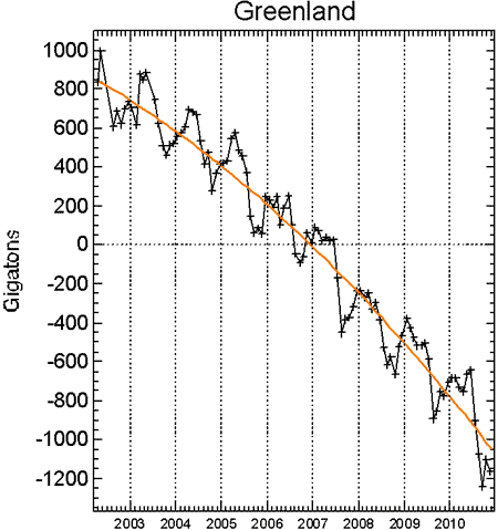
Figure 1: Greenland ice mass anomaly - deviation from the average ice mass over the 2002 to 2010 period. Black line shows monthly values. Orange line shows long-term trend.
As we get into strife everytime I display this graph, I will stress that this graph shows "Ice Mass Anomaly" - the deviation from the average value over the 9 years. So when values are positive from 2002 to 2006, this doesn't mean the ice sheet is gaining ice - quite the contrary as the curve is headed downwards. It means the ice mass is above the average value over 2002 through 2010.
It's interesting to compare this data to previous blog posts in May 2010 and November 2010. The ice loss in 2010 is the greatest in the satellite record - around 600 billion tonnes of ice mass loss over the 2010 summer. More importantly, the rate of ice loss continues to increase, more than doubling since 2002.
The GRACE satellites only started recording observations in 2002. A more long-term picture is available by combining GRACE data with a range of other estimations of Greenland ice loss which give us a 50 year picture as well as a range of independent measurement techniques:

Figure 2: Rate of ice loss from Greenland. Vertical lines indicate uncertainty, horizontal lines indicate averaging time. Blue circles are from altimetry, red squares are from net accumulation/loss and green triangles are from GRACE. The black line is a straight-line (constant acceleration) fit through the mass balance data for the period 1996–2008 with a slope of 21 gigatonnes/yr2 (Jiang 2010).

Arguments


Thank you for updating the data.
Is it possible to compare the formula for the quadratic fit and see if the slope increased, decreased or stayed the same over the past year? Perhaps if the fit equation were shown that could be determined.
It has been unusually hot over most of Greenland this winter. How will that affect the ice melt this year?
Any news on Antarctic GRACE data?
Maybe he will question how changes in gravity as measured by satellites could possibly give an accurate estimation of changes in the Greenland ice mass. Actually I find it amazing myself but, then, I never ceased to be amazed by what can be achieved by scientists.
Something a bit odd about the other data too. The current ice loss, from the graph, is not "over 200" but seems to be over 300. And the zero figure seems to be in 1975 - 35 years ago, not "2 decades". But prior to that, "some time before" "two decades", the figures are not also zero but again are over 100 in 1965-70. Do we know the reason for that? I would have expected the figures in those years to be zero. Are the measurements less accurate for those early years? Was there a difference in accumulation rates for some reason, or loss rates for some other reason?
However, it's not alarming, because:
(1) 200 Gigaton is only 0.007% of the total Greenland mass, so we can go on for 14,000 years before the whole sheet disappears;
(2) the sea level rise is not accelerating. This is what can be deduced from satellite measurements.
Disclaimer: I'm not a doubter. However, I want to have something strong to show people, and this doesn't fit yet, simply because showing the ice mass anomaly rather than actual ice mass data looks deceptive.
Astute analysis, fydijkstra! Except for the observation in the post that "the rate of ice loss continues to increase, more than doubling since 2002." As if that wasn't clear enough, the graph in Fig 2. has a distinctly negative slope, visually describing the increasing rate of loss.
Doubling in 8 years represents a 9% annual rate of change. So your calculation that we can go on for 14000 years misses by several thousand years. But the damage is done long before Greenland is completely ice-free.
Amsterdam's airport is how far above sea level? Or is the 'elevation' given here a negative number?
Why do I get the feeling that you have been in the cherry orchard?
http://sealevel.colorado.edu/
Info on GRACE is here. Ideally, the range of ice mass measurements is shown to increase the accuracy of the next measurement: the anomaly.
Climate scientists use anomalies instead of absolutes because they are interested in the change from a known reference point. This allows any signal in the data to emerge (time series of absolute measurements such as temperatures, or in this case: ice mass loss, tend to be very noisy with much variation).
I also would be interested in seeing the deviation anomaly from just 2002 as a reference point. Not that it would change the graph any.
The Yooper
The reference you linked only measures surface melting. The 310 GT number you mention is the surface mass balance. Since they only estimated surface melt you would expect the total loss to be much greater. Ice melt from warm ocean water melting the glaciers is expected to melt more ice than surface melt in the long run. The GRACE data measures melt from all sources. Your reference supports the GRACE data claims of record melt. Your claim that these are dueling estimates is incorrect.
Why does your second graph not have the data from 1993 and 1994 on it like the graph above it? It appears that the graph is incomplete.
Aside from the clarification that Michael has attached to the data the fydijkstra supplied, I can see something totally different in the second graph that fydijkstra posted in #7. You see I perceive things differently, so I have different perspective, and obviously fydijkstra drew the downward slope because that is how he perceives things and thus it gives him a different perspective.
I can filter out the slope that fydijkstra drew in the graph, and from my perspective I can imagine an upward sloping line that is on the order of 25-30 degrees starting from 1995 to the end of graph, because that's how I perceive things.
So for me the issue becomes whether it's a simple case of difference of perspective, or whether fydijkstra is trying to deliberately deceive by manipulating the data to serve a biased perception.
What about GRACE ocean mass related sea level rise?
Sqeptics say we don't need to worry since it is so small it will be 1000 years to rise a meter. Dr. Hansen describes how with the current doubling rates for ice loss (doubled since 2002 in Greenland as shown above) that could lead to 5 meters sea level rise by 2100. Dr. Hansen's estimate is the highest that I know of for scientists, but he has usually been right in the past. Other scientific estimates range from about 1-2 meters. The IPCC estimate is smaller but does not include Greenland and the Antarctic. Contrast that with Fydijkstra who asserts that there is no problem, cites a paper that documents record increasing ice melt in Greenland to support his denial of a problem, and has a funny graph with some missing data. Choose who you believe.
"Why does your second graph not have the data from 1993 and 1994 on it like the graph above it?"
Perhaps the cherries were exceptionally sour in those years?
(To moderator: thanks for the link, but it is difficult to find the right dataset)
I think Professor Cliff Ollier might support your view. In a recent article (http://www.onlineopinion.com.au/view.asp?article=11212&page=2)
he states that “There is no melting in the interior of ice sheets - it is far too cold. The centres of the ice sheets, occupying basins, flow only at the base, warmed by geothermal heat and driven by the weight of the overlying ice. There is no direct flow of the near-surface ice in the centre of an ice sheet to the outflow glaciers. It is fanciful to conclude kilometres of ice can suddenly melt when the records show no melting whatsoever in the ice sheet accumulation areas.
After considering the evidence of three quarters of a million years of documented continuous accumulation, how can we rationally accept that right now the world's ice sheets are collapsing? Johannessen and colleagues analysed satellite data on the Greenland Ice Sheet from 1992 to 2003. They found an increase of 6.4 ± 0.2 centimetres per year in the vast interior areas above 1500 metres, in contrast to previous reports of high-elevation balance.”
So, are we to believe that peripheral ice melt has any effect on the Greenland ice sheet and if so, what? Does an accelerating rate of loss presently 200-300 Gt per annum matter and if so why?
John Price
Cliff Ollier is a geologist, not a climate scientist. Linking to an opinion piece by a geologist is not a scientific way to support your position. Try to find a peer reviewed paper, I suggest you look at material that is at least 10 years old. The IPCC AR3 might support that position. It is wrong. Scientists used to think that it would take centuries for the ice to respond to increasing temperatures, but that has been proven incorrect in the past 5 years. The ice has responded much faster than expected. That is the point of this post. See my link at #19. Fydijkstra's link at 7 shows substantial surface melt above 1500 meters, which was not expected yet. At 1500 meters they lost 50 cm of ice last year. It is now known that the ice responds rapidly to hot ocean water around the pheriphery of the ice sheet. Scientists are trying to determine how strong the response will be.
There is more CO2 in the air than at any time in the past several million years. Why would you expect the ice to respond the same? Only 100,000 years ago, within your 750,000, sea level was 6-9 meters higher. Good bye Bangladesh and Florida. We are hotter now so we expect the sea to rise higher. How much and how fast is still to be determined. Pray James Hansen (who IS a climate scientist whose work is peer reviewed) is wrong this time and the rise is not 5 meters by 2100.
It is not yet known how to extrapolate melt rates into the future. Will melt increase 100 Gt per year or will melt continue to double every 8 years? That is the difference between 0.5 meters of melt by 2100 and 5 meters of melt. There is no consensus of what will happen. Some scientists believe that there is a maximium rate of melt (about 2 meters/century) while others think the ice could disintegrate by a rapid wet process (5-10 meters/century). That is why this data is so important. The West Antarctic ice sheet is especially vulnerable to rapid disintegration. Stay tuned for updates!
Thank you but the position of Ollier is in my view and that of his peers (http://www.geolsoc.org.uk/gsl/geoscientist/features/page7523/html)
nonsense. In quoting him, I wanted to get a reaction from professionals to what he has to say on ice loss in Greenland.
At present, my view is akin to that of Dr Hansen, though I think sea level rise due to WAIS and Greenland ice melt will result in sea level rise of around 1m. by 2050 and 2 – 2.5m. by 2100, about half the level he predicts.
However, the article “Say goodbye to Greenland ice” (New Scientist, page 8, 8/1/11, does suggest that Dr Hansens views may be prescient. Either way, we are in trouble and what GRACE now tells us seems to confirm that view and a disturbing acceleration in Greenland ice loss.
Do we know if the current estimate is corrected for this?
See here
http://www.skepticalscience.com/Ice-Sheet-mass-loss-melting.htm
for discussion of your question.
On top of that, since Greenland is directly under the influence of Canada's post-glacial rebound (the extra mass to compensate for the Canada's elevation is "found" around, aka Greenland), there should be a compensation.
Nothing quantified in my thoughts, so it must be modelled. Anyone ? :)
Do you (or someone else) also have the updated graph for the Antarctic available?
http://www.iup.uni-bremen.de:8084/amsr/ice_ext_s.png
Peter
Well, the 2010 melt season went from "end of April" to "mid September", by one account I found. So, taking 30 April to 15 September, that's 138 days. A bit of simple arithmetic comes up with a number of about 50,000 m3 per second average rate of loss (yikes!).
The flood here peaked at around 9,500 m3 per second, I believe. This means that Greenland was losing ice at an average rate more than five times greater than the 2011 Brisbane flood. Except instead of lasting three or four days, it went on for four and a half months...
Yes, I know I'm comparing an island more than a quarter the size of Australia with one river catchment, so the comparison is largely meaningless, but it helps put it into perspective!
I wonder if the hydrostatic sinking of Greenland has been factored into the calculations. This will offset some of the sea level rise from Greenland's sea destined meltwater.
[DB] Henry, I think you mean isostatic rebound. The edges of Greenland are actually rebounding upward slightly as the overburden of ice dwindles, lightening its downward load on the basement rock. Think cork bobbing up in the water (buoyant). But it's not much. And yes, it's been factored into the calculations.