


 Arguments


Greenland ice mass loss after the 2010 summer
Posted on 1 November 2010 by John Cook
The National Oceanic and Atmospheric Administration (NOAA) recently released the Arctic Report Card. The report contains a wealth of information about the state of climate in the Arctic circle (mostly disturbing). Especially noteworthy is the news that in 2010, Greenland temperatures were the hottest on record. It also experienced record setting ice loss by melting. This ice loss is reflected in the latest data from the GRACE satellites which measure the change in gravity around the Greenland ice sheet (H/T to Tenney Naumer from Climate Change: The Next Generation and Dr John Wahr for granting permission to repost the latest data).

Figure 1: Greenland ice mass anomaly - deviation from the average ice mass over the 2002 to 2010 period. Note: this doesn't mean the ice sheet was gaining ice before 2006 but that ice mass was above the 2002 to 2010 average.
The ice sheet has been steadily losing ice and the rate of ice loss has doubled over the 8 year period since gravity measurements began. The accelerating ice loss is independently confirmed by GPS measurements of uplifting bedrock. The GRACE data gives us an insight into why Greenland is losing ice mass at such an accelerating rate - ice loss has spread from the south east all the way up the west coast:
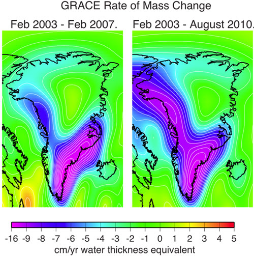
Figure 2: rate of mass change from Greenland over 2003-2007 and 2003-2010 periods. Mass loss rate has spread up the north western ice margin over the last few years.


- strength of the relationship, measured by correlation
- significance of the relationship, measured by the t-test of the correlation
If you use this calculator, you will see that a correlation of 0.9 (very strong relationship) is also highly significant (p = 0.0073) with as few as 6 data points (the smallest number the calculator accepts). You use a one-tailed test a scenario where only a positive or negative correlation is meaningful, not both. On the other hand a correlation of 0.2 with so few data points is not significant (p = 0.352), whereas the same correlation with 100 data points is (p = 0.023). It is not quite this simple: you need to worry about issues like autocorrelation, and your trust in a statistical test is higher if you have a well-tested causal model, but the basic principle is if you have a p-value < 0.05 (95% chance the effect isn't random) your confidence that you have a real effect should be high, and it consequently becomes more interesting to demonstrate why the effect is not real, rather than the converse. You also cannot apply this kind of correlation (Pearson's) to data sets with very different statistical properties, or where the two data sets have different scale intervals (e.g. one is a log scale and the other isn't and you don't expect an exponential relationship).