Climate Science Glossary

Term Lookup

Enter a term in the search box to find its definition.

Settings

Use the controls in the far right panel to increase or decrease the number of terms automatically displayed (or to completely turn that feature off).

Term Lookup

Settings


All IPCC definitions taken from Climate Change 2007: The Physical Science Basis. Working Group I Contribution to the Fourth Assessment Report of the Intergovernmental Panel on Climate Change, Annex I, Glossary, pp. 941-954. Cambridge University Press.

Home Arguments Software Resources Comments The Consensus Project Translations About Support

Bluesky Facebook LinkedIn Mastodon MeWe

Twitter YouTube RSS Posts RSS Comments Email Subscribe


Climate's changed before
It's the sun
It's not bad
There is no consensus
It's cooling
Models are unreliable
Temp record is unreliable
Animals and plants can adapt
It hasn't warmed since 1998
Antarctica is gaining ice
View All Arguments...


Username
Password
New? Register here
Forgot your password?

Latest Posts

Archives

On Statistical Significance and Confidence

Posted on 11 August 2010 by Alden Griffith

Guest post by Alden Griffith from Fool Me Once

My previous post, “Has Global Warming Stopped?”, was followed by several (well-meaning) comments on the meaning of statistical significance and confidence. Specifically, there was concern about the way that I stated that we have 92% confidence that the HadCRU temperature trend from 1995 to 2009 is positive. The technical statistical interpretation of the 92% confidence interval is this: "if we could resample temperatures independently over and over, we would expect the confidence intervals to contain the true slope 92% of the time."  Obviously, this is awkward to understand without a background in statistics, so I used a simpler phrasing. Please note that this does not change the conclusions of my previous post at all. However, in hindsight I see that this attempt at simplification led to some confusion about statistical significance, which I will try to clear up now.

So let’s think about the temperature data from 1995 to 2009 and what the statistical test associated with the linear regression really does (it's best to have already read my previous post). The procedure first fits a line through the data (the “linear model”) such that the deviations of the points from this line are minimized, i.e. the good old line of best fit. This line has two parameters that can be estimated, an intercept and a slope. The slope of the line is really what matters for our purposes here: does temperature vary with time in some manner (in this case the best fit is positive), or is there actually no relationship (i.e. the slope is zero)?  

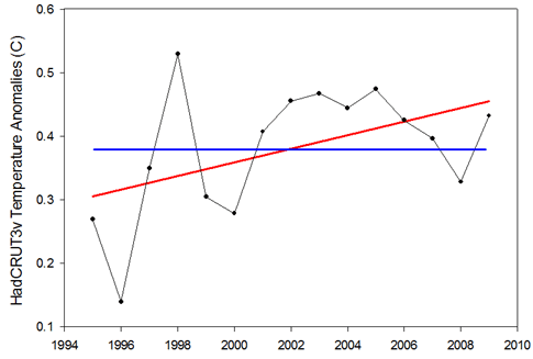
Figure 1: Example of the null hypothesis (blue) and the alternative hypothesis (red) for the 1995-2009 temperature trend. 

Looking at Figure 1, we have two hypotheses regarding the relationship between temperature and time:  1) there is no relationship and the slope is zero (blue line), or 2) there is a relationship and the slope is not zero (red line). The first is known as the “null hypothesis” and the second is known as the “alternative hypothesis”. Classical statistics starts with the null hypothesis as being true and works from there. Based on the data, should we accept that the null hypothesis is indeed true or should we reject it in favor of the alternative hypothesis? 

Thus the statistical test asks: what is the probability of observing the temperature data that we did, given that the null hypothesis is true?

In the case of the HadCRU temperatures from 1995 to 2009, the statistical test reveals a probability of 7.6%. Thus there’s a 7.6% probability that we should have observed the temperatures that we did if temperatures are not actually rising. Confusing, I know…  This is why I had inverted 7.6% to 92.4% to make it fit more in line with Phil Jones’ use of “95% significance level”.

Essentially, the lower the probability, the more we are compelled to reject the null hypothesis (no temperature trend) in favor of the alternative hypothesis (yes temperature trend). By convention, “statistical significance” is usually set at 5% (I had inverted this to 95% in my post). Anything below is considered significant while anything above is considered nonsignificant. The problem that I was trying to point out is that this is not a magic number, and that it would be foolish to strongly conclude anything when the test yields a relatively low, but “nonsignificant” probability of 7.6%. And more importantly, that looking at the statistical significance of 15 years of temperature data is not the appropriate way to examine whether global warming has stopped (cyclical factors like El Niño are likely to dominate over this short time period).

Ok, so where do we go from here, and how do we take the “7.6% probability of  observing the temperatures that we did if temperatures are not actually rising” and convert it into something that can be more readily understood?  You might first think that perhaps we have the whole thing backwards and that really we should be asking: “what is the probability that the hypothesis is true given the data that we observed?” and not the other way around. Enter the Bayesians!

Bayesian statistics is a fundamentally different approach that certainly has one thing going for it: it’s not completely backwards from the way most people think!  (There are many other touted benefits that Bayesians will gladly put forth as well.)  When using Bayesian statistics to examine the slope of the 1995-2009 temperature trend line, we can actually get a more-or-less straightforward probability that the slope is positive. That probability?  92%1. So after all this, I believe that one can conclude (based on this analysis) that there is a 92% probability that the temperature trend for the last 15 years is positive.

While this whole discussion comes from one specific issue involving one specific dataset, I believe that it really stems from the larger issue of how to effectively communicate science to the public. Can we get around our jargon?  Should we embrace it?  Should we avoid it when it doesn’t matter?  All thoughts are welcome…

1To be specific, 92% is the largest credible interval that does not contain zero. For those of you with a statistical background, we’re conservatively assuming a non-informative prior.

0 0

Printable Version  |  Link to this page

Comments

1  2  Next

Comments 1 to 50 out of 61:

  1. I would appreciate some more background on how you computed the Bayesian credible interval. For example, what exactly do you mean my non-informative prior? Uniform? And how did you deal with auto-correlations if at all? (I realize that I am asking for the complexity you seek to simplify--fair enough, but a 'technical appendix' might be helpful for those more conversant with statistics.)
    0 0
  2. Good post, Alden. Communicating anything to the public does indeed require a minimal usage of jargon; but as we all know, there exist those who live to be contrarians, for whom no level of clear explanations exist that cannot be obfuscated. Thanks again! The Yooper
    0 0
  3. Thanks for this, you have a great website. btw, did you check out the Bayes factor relative to the "null"?
    0 0
  4. Another interesting way to look at it is to look at the actual slope of the line of best fit, which I get to be 0.01086. Now take the actual yearly temperatures and randomly assign them to years. Do this (say) a thousand times. Then fit a line to each of the shuffled data sets and look at what fraction of the time the shuffled data produces a slope of greater than 0.01086 (the slope the actual data produced). So for my first trial of 1000 I get 3.5% as the percentage of times random re-arrangement of the temperature data produces a greater slope than the actual data. The next trial of 1000 gives 3.5% again, and the next gave 4.9%. I don't know exactly how to phrase this as a statistical conclusion, but you get the idea. If the data were purely random with no trend, you'd be expecting ~50%.
    0 0
  5. I hate to admit this -- I'm very aware some will snort in derision -- but as a reasonably intelligent member of the public, I don't really understand this post and some of the comments that follow. My knowledge of trends in graphs is limited to roughly (visually) estimating the area contained below the trend line and that above the trend line, and if they are equal over any particular period then the slope of that line appears to me to be a correct interpretation of the trend. That's why, to me, the red line seems more accurate than the blue line on the graph above. And this brings me to the problem we're up against in explaining climate science to the general public: only a tiny percentage (and yes, it's probably no more than 1 or 2 percent of the population) will manage to wade through the jargon and presumed base knowledge that scientists assume can be followed by the reader. Some of the principles of climate science I've managed to work out by reading between the lines and googling -- turning my back immediately on anything that smacks just of opinion and lacks links to the science. But it still leaves huge areas that I just have to take on trust, because I can't find anyone who can explain it in words I can understand. This probably should make me prime Monckton-fodder, except that even I can see that he and his ilk are politically-motivated to twist the facts to suit their agenda. Unfortunately, the way real climate science is put across, provides massive opportunities for the obfuscation that we so often complain about. Please don't take this personally, Alden; I'm sure you're doing your best to simplify -- it's just that even your simplest is not simple enough for those without the necessary background.
    0 0
  6. The data set contains two points which are major 'outliers' - 1996 (low) and 1998 (high). I appreciate 1998 is attributable to a very strong El Nino. Very likely, the effect of the two outliers is to cancel one another out. Nevertheless, it would be an interesting exercise to know the probability of a positive slope if either or both outliers were removed (a single and double cherry pick if you like) given the 'anomalous' nature of the gap between two temperatures in such a short space of time.
    0 0
  7. As has been mentioned elsewhere by others, given that the data prior to this period showed a statistically significant temperature increase, with a calculated slope, then surely the null hypothesis should be that the trend continues, rather than there is no increase? I guess it depends on whether you take any given interval as independent of all other data points... stats was never my strong point - we had the most uninspiring lecturer when I did it at uni, it was a genuine struggle to stay awake!
    0 0
  8. John Brooks: yes, this is definitely one way to test significance. It's called a "randomization test" and really makes a whole lot of sense. Also, there are fewer assumptions that need to be made about the data. However, the reason that you are getting lower probabilities is that you are conducting the test in a "one-tailed" manner, that is you are asking whether the slop is greater instead of whether it is simply different (i.e. could be negative too). Most tests should be two-tailed unless you have your specific alternative hypothesis (positive slope) before you collect the data. -Alden p.s. I'll respond to others soon, I just don't have time right now.
    0 0
  9. John Russell If it is any consolation, I don't think it is overly contraverisal to suggest that there are many (I almost wrote majority ;o) active scientists who use tests of statistical significance every day that don't fully grasp the subtleties of underlying statistical framework. I know from my experience of reviewing papers that it is not unknown for a statistican to make errors of this nature. It is a much more subtle concept that it sounds. chriscanaris I would suggest that the definition of an outlier is another difficult area. IMHO there is no such thing as an outlier independent of assumtions made regarding the process generating the data (in this case, the "outliers" are perfectly consistent with climate physics, so they are "unusual" but not strictly speaking outliers). The best definition of an outlier is an observation that cannot be reconciled with a model that otherwise provides satisfactory generalisation. ABG Randomisation/permutation tests are a really good place to start in learning about statistical testing, especially for anyone with a computing background. I can recommend "Understanding Probability" by Henk Tijms for anyone wanting to learn about probability and stats as it uses a lot of simulations to reinforce the key ideas, rather than just maths.
    0 0
  10. "While this whole discussion comes from one specific issue involving one specific dataset, I believe that it really stems from the larger issue of how to effectively communicate science to the public. Can we get around our jargon? Should we embrace it? Should we avoid it when it doesn’t matter? All thoughts are welcome…" More research projects should have metanalysis as a goal. The outcomes of which should be distilled ala Johns one line responses to denialist arguments and these simplifications should be subject to peer review. Firtsly by scientists but also sociologists, advertising executives, politicians, school teachers, etc etc. As messages become condensed the scope for rhetoricical interpretation increases. Science should limit its responsability to science but should structure itself in a way that facilitates simplification. I think this is why we have political parties, or any comitee. I hope the blogsphere can keep these mechanics in check. The story of the tower of babylon is perhaps worth remembering. It talks about situation where we reach for the stars and we end up not being able to communicate with one another.
    0 0
  11. I'm going to have a go at explaining why the 1 - the p-value is not the confidence that the alternative hypothesis is true in (only) slightly more mathematical terms. The basic idea of a frequentist test is to see how likely it is that we should observe a result assuming the null hypothesis is true (in this case that there is no positive trend and the upward tilt is just due to random variation). The less likely the data under the null hypothesis, the more likely it is that the alternative hypothesis is true. Sound reasonable? I certainly think so. However, imagine a function that transforms the likelihood under the null hypothesis into the "probability" that the alternative hypothesis is true. It is reasonable to assume that this function is strictly decreasing (the more likely the null hypothesis the less likely the alternative hypothesis) and gives a value between 0 and 1 (which are traditinally used to mean "impossible" and "certain"). The problem is that other than the fact it is non-decreasing and bounded by 0 and 1, we don't know what that function actually is. As a result there is no direct calibration between the probability of the data under the null hypothesis and the "probability" that the alternative hypothesis is true. This is why scientists like Phil Jones say things like "at the 95% level of significance" rather than "with 95% confidence". He can't make the latter statement (although that is what we actually want to know) simply because we don't know this function. As a minor caveat, I have used lots of "" in this post because under the frequentist definition of a probability (long run frequency) it is meaningless to talk about the probability that a hypothesis is true. That means in the above I have been mixing Bayesian and frequentist definitions, but I have used the "" to show where the dodgyness lies. As to simplifications. We should make things a simple as possible, but not more so (as noted earlier). But also we should only make a simplification if the statement remains correct after the simplification, and in the specific case of "we have 92% confidence that the HadCRU temperature trend from 1995 to 2009 is positive" that simply was not correct (at least for the traditional frequentists test).
    0 0
  12. Alden # Original Post We can massage all sorts of linear curve fits and play with confidence limits to the temperature data - and then we can ask why are we doing this? The answer is that the temperatures look like they have flattened over the last 10-12 years and this does not fit the AGW script! AGW believers must keep explaining the temperature record in terms of linear rise of some kind - or the theory starts looking more uncertain and explanations more difficult. It it highly likely that the temperature curves will be non-linear in any case - because the forcings which produce these temperature curves are non-linear - some and logarithmic, some are exponential, some are sinusoidal and some we do not know. The AGW theory prescribes that a warming imbalance is there all the time and it is increasing with CO2GHG concentration. With an increasing energy imbalance applied to a finite Earth system (land, atmosphere and oceans) we must see rising temperatures. If not, the energy imbalance must be falling - which either means that radiative cooling and other cooling forcings (aerosols and clouds) are offsetting the CO2GHG warming effects faster that they can grow, and faster than AGW theory predicts.
    0 0
  13. Ken Lambert #12 wrote: "The answer is that the temperatures look like they have flattened over the last 10-12 years and this does not fit the AGW script!" This is fiction. Temperatures have not "flattened out"... they have continued to rise. Can you cherry pick years over a short time frame to find flat (or declining!) temperatures? Sure. But that's just nonsense. When you look at any significant span of time, even just the 10-12 years you cite, what you've got is an increasing temperature trend. Not flat. "With an increasing energy imbalance applied to a finite Earth system (land, atmosphere and oceans) we must see rising temperatures." We must see rising temperatures SOMEWHERE within the climate system. In the oceans for instance. The atmospheric temperature on the other hand can and does vary significantly from year to year.
    0 0
  14. Since we are at the basis of statistics. I studied a “long three years” statistics in ecology and agriculture. Why exactly 15 years? I have written repeatedly that the counting period for the trend may not be in the decimal system, because in this system is not running type noise variability: EN(LN) SO, etc. For example, trends AMO 100 and 150 years combined with the negative phase of AMO positive "improving "results. The period for which we hope the trend must have a deep reason. While in the above-mentioned cases (100, 150 years), the error is small, in this particular case ("flat" phase of the AMO after a period of growth for 1998 - an extreme El Nino), the trend should be calculated from the same phase of EN(LN)SO after a period of reflection after the extreme El Nino, ie after 2001., or remove the "noise": extreme El Nino and the "leap" from cold to warm phase AMO. This, however, and so may not matter whether you currently getting warmer or not, once again (very much) regret tropical fingerprint of CO2 (McKitrick et al. - unfortunately published in Atmos Sci Lett. - here, too, went on statistics, including the selection of data)
    0 0
  15. Stephan Lewandowsky: I used the Bayesian regression script in Systat using a diffuse prior. In this case I did not specifically deal with autocorrelation. We might expect that over such a short time period, there would be little autocorrelation through time which does appear to be the case. You are right that this certainly can be an issue with time-series data though. If you look at longer temperature periods there is strong autocorrelation. apeescape: I'm definitely not a Bayesian authority, but I'm assuming you're asking whether I examined this in more of a hypothesis testing framework? No - in this case I just examined the credibility interval of the slope. Ken Lambert: please read my previous post -Alden
    0 0
  16. Discussing trends and statistical significance is something that I attempt to do - with no training in statistics. All I have learned from various websites over the last few years is conceptual, not mathematical. I would appreciate anyone with sufficient qualifications straightening out any misconceptions re the following: 1) Generally speaking, the greater the variance in the data, the more data you need (in a time series) to achieve statistical significance on any trend. 2) With too-short samples, the resulting trend may be more an expression of the variability than any underlying trend. 3) The number of years required to achieve statistical significance in temperature data will vary slightly depending on how 'noisy' the data is in different periods. 4) If I wanted to assess the climate trend of the last ten years, a good way of doing it would be to calculate the trend from 1980 - 1999, and then the trend from 1980 - 2009 and compare the results. In this analysis, I am using a minimum of 20 years of data for the first trend (statistically significant), and then 30 years of data for the second, which includes the data from the first. (With Hadley data, the 30-year trend is slightly higher than the 20-year trend) Aside from asking these questions for my own satisfaction, I'm hoping they might give some insight into how a complete novice interprets statistics from blogs, and provide some calibration for future posts by people who know what they're talking about. :-) If it's not too bothersome, I'd be grateful if anyone can point me to the thing to look for in the Excel regression analysis that tells you what the statistical significance is - and how to interpret it if it's not described in the post above. I've included a snapshot of what I see - no amount of googling helps me know which box(es) to look at and how to interpret.
    0 0
  17. #13 CBDunkerson at 00:09 AM on 12 August, 2010 We must see rising temperatures SOMEWHERE within the climate system. In the oceans for instance. Nah. It's coming out, not going in recently.
    0 0
  18. John Russell: You're not alone! Statistics is a notoriously nonintuitive field. Instead of getting bogged down in the details, here's perhaps a more simple take home message: IF temperatures are completely random and are not actually increasing, it would still be rather unlikely that we would see a perfectly flat line. So I've taken the temperature data and completely shuffled them around so that each temperature value is randomly assigned to a year: So here we have completely random temperatures but we still sometimes see a positive trend. If we did this 1000 times like John Brookes did the average random slope would be zero, but there would be plenty of positive and negative slopes as well. So the statistical test is getting at: is the trend line that we actually saw unusual compared to all of the randomized slopes? In this case it's fairly unusual, but not extremely. To get at your specific question - the red line definitely fits the data better (it's the best fit, really). But that still doesn't mean that it couldn't be a product of chance and that the TRUE relationship is flat. [wow - talking about stats really involves a lot of double negatives... no wonder it's confusing!!!] -Alden
    0 0
  19. I bet you can get low-ish significance trends in any short interval in the last half century. There's nothing special in the "lack of significance" of this recent period. One could claim forever that "the last x years did not reach 95% significance".
    0 0
  20. Ken Lambert @12: No scientist who studies climate would use 10 or 12 years, or the 15 in the OP, to identify a long-term temperature trend. For reasons that have been discussed at length many times, here and elsewhere, there is quite a bit of variance in annualized global temperature anomalies, and it takes a longer period for reliable (i.e., statistically significant) trends to emerge. Phil Jones was asked a specific question about the 15-year trend, and he gave a specific answer. Alden Griffith was explaining what he meant. Neither, I believe, would endorse using any 15-year period as a baseline for understanding climate, nor would most climate scientists. The facts of AGW are simple and irrefutable: 1. There are multiple lines of direct evidence that human activity is increasing the CO2 in the atmosphere. 2. There is well-established theory, supported by multiple lines of direct evidence, that increasing atmospheric CO2 creates a radiative imbalance that will warm the planet. 3. There are multiple lines of direct evidence that the planet is warming, and that that warming is consistent with the measured CO2 increase. One cannot rationally reject AGW simply because the surface temperature record produced by one organization does not show a constant increase over whatever period of years, months, or days one chooses. The global circulation of thermal energy is far too complex for such a simplistic approach. The surface temperature record is but one indicator of global warming, it is not the warming itself. When viewed over a period long enough to provide statistical significance, all of the various surface temperature records indicate global warming.
    0 0
  21. BP @17: Nice. That level of disingenuousness must be applauded. Using a plot of localized ENSO-related temperature anomaly to suggest that the oceans are losing heat is pure genius. Anyone interested in the source and significance of BP's plot is directed here. See, in particular, the "Weekly ENSO Evolution, Status, and Prediction Presentation."
    0 0
  22. ABG at 01:29 AM on 12 August, 2010 Thanks, Alden. I actually understood exactly what you're getting at. Whether I can remember and apply it in future is another matter!
    0 0
  23. #14 Arkadiusz Semczyszak, "Why exactly 15 years?" Good question. The answer is that the person asking the question of Phil Jones used the range 1995-2009, knowing that if he used the range 1994-2009, Dr. Jones would have been able to answer 'yes' instead of 'no'.
    0 0
  24. #12 Ken Lambert, It is well known that CO2 is not the only influence on the earth's energy content. As temperature has a reasonably good relationship with energy content (leaving out chemical or phase changes), it is reasonable to use air temperatures to some extent. (Ocean temps should be weighed far more heavily than air temps, but regardless...) If you pull up any reputable temperature graph, you will see that there have been about 4 to 6 times in the past 60 years where the temperature has actually dipped. So, according to your logic GW has stopped 4 to 6 times already in the last 60 years. However, it continues to be the case that every decade is warmer than the last. What I find slightly alarming is that, despite the sun being in an usually long period of low output, the temperatures have not dipped.
    0 0
    Moderator Response: Rather than delve once more into specific topics handled elsewhere on Skeptical Science and which may be found using the "Search" tool at upper left, please be considerate of Alden's effort by trying to stay on the topic of statistics. Examples of statistical treatments employing climate change data are perfectly fine, divorcing discussion from the thread topic is not considerate. Thanks!
  25. Alden, it looks like Bayes Factors are not applicable in this case, so never mind about my previous comment. FWIW, I got a 95.5% probability that the slope > 0 using Bayesian methods with non-informative priors. The following are the frequentist, Bayesian and HPD 95% intervals respectively (w/ 91.3, 91.0, 94.1 highest two-sided interval that doesn't include 0): ## 2.5 % 97.5 % ## [1,] -0.001850243 0.02358596 ## [2,] -0.002304537 0.02224490 ## [3,] -0.001311965 0.02317616
    0 0
  26. OK, but because climate data is fuzzy, it is all statistics whether you phrase it in mathematical terms or terms less mathematical. It's all means, standard deviations, variances, variance of the variances, etc. I could just as easily have said that Ken is applying a linear test for a positive slope over the most recent 10-12 year period, and, yes, it is failing. If that were the only period where that test failed, his inferences from the statistics would have more merit. However, that same test would also have failed for multiple periods in the past. Despite these deviations from the longer term slope, the longer term trend has continued. The current deviation of the slope from the 60- or 100-year mean slope is within the range of deviations we have seen over that same time period. So, there is little chance that the deviation of the slope in the last 10-12 years from the mean of the slope over the last 60 years represents something we haven't seen before, rather than a deviation induced by other factors, which we have seen before, and in the past have been short term effects. Ken is saying, 'See this difference in the characteristics of the data; it means something important has changed.' I'm saying, 'The difference you are pointing out is less than or equal to differences that have been observed in the past; there's no reason to believe anything important has changed.' To me, it all means the same thing.
    0 0
  27. BTW, you can see more of Alden's excellent exposition on http://www.fool-me-once.com/. I enjoyed it a lot.
    0 0
  28. apeescape@25 I'm sure that Bayes factors are appropriate, I think the problem is in your calculation of the marginal likelihood for the H1 model (the prior doesn't exclude negative values for the slope AFAICS). If this is correct, you have basically performed a test that shows that the need for a slope is "conclusive" (on the usual interpretation scale), but that may be because negative slopes have a non-negligible likelihood (which is quite possible as the data are noisy). Chris G@26 - don't use the F-word when there are statisticians about!!! the data are "noisy" not "f****y". ;o)
    0 0
  29. ChrisG #26 "Ken is applying a linear test for a positive slope over the most recent 10-12 year period, and, yes, it is failing." It's only failing if you take that data out of context and pretend that the most recent 10-12 period is independent of the most recent 13-50 year period. If you look at the trend of the last decade in context, it's no different to what we observe over the last 50-odd years. I've asked Ken elsewhere quite a few times what's so special about the last decade or so to make him reach his conclusion, but he can't or won't answer the question.
    0 0
  30. kdkd@29 Indeed, Ken should read the paper by Easterling and Wehner (< \ href="http://dx.doi.org/10.1029/2009GL037810">here) which explains why we should expect to find occasional decadal periods with non-significant positive (or even negative) trends, even if there is a genuine consistent warming of the Earth. This is because things like ENSO shift heat between the oceans and atmosphere, creating year to year variability that masks the underlying trend and the trend is small in comparison to the magnitude of the variation. The shorter the period, the more likely you are to see a cooling trend. These are observed in the data, and they are reproduced in the models (although the models can't predict when they will happen, they do predict that they will happen every now and then).
    0 0
  31. Barry @16 Although I'm no expert with stats I'll try to help a little. Q1 & 2 - Yes, sounds like you have got the gist of it. As for ANOVA, multiple regression etc I would suggest trying to get your head around these tests, what they do and what you tell you before being let loose with them. Not necessarily mathematically but certainly conceptually. Can anyone recommend some introductory material accessible via the web?
    0 0
  32. ABG #18 Your plots of random data points are very useful illustrations of what is and is not significant in curve fitting. The issue might be that we don't have 1000 sets of independent land and ocean temperature data to do the experiment. In fact the surface temperature data is obtained from basically only one raw data source (GCHN) with several software processors giving results and the RSS and UAH satellite data. Chris G #26 Useful points Chris. Indeed the temperature slopes in the past 60-100 years have been higher (through the 1920-1940 period perhaps?)and lower (1950-1980?). The issue remains that CO2GHG warming forcing is rising logarithmically with CO2 concentration; aerosols and cloud cooling has no representative Equation which I have seen (aerosol forcing strangely flatlines on the IPCC graphs); WV warming feedback is highly contentious with no agreed relationship I know of; radiative cooling is exponential with T^4; and the sun has many overlapping cycles, the shortest being the 11 year sinusoidal cycle which equates to about 25% of the claimed warming imbalance. My point is that the sum of all these warming and cooling forcings is highly likely to be non-linear - so the polynomial curve fit seems to make good sense of a complex relationship between energy imbalance and measured global temperatures. Now this might not suit the tidy linear world of the statistician - but it sure fits the highly non-linear real world. The polynomial fit from "Has Global Warming Stopped" looks like a flattening to me. Could I dare suggest that it looks cyclical - if not a bit sinusoidal?? As for the argument that models predict a noisy period where temperatures don't increase - well that defies the first law which dictates that the energy gained by the earth system from a warming imbalance must show up as a temperature increase somewhere in the system - and we have fought out long and hard elsewhere on this blog ("Robust warming of the Upper Oceans etc") - to show that it is not being measured in the oceans; and the overall energy budget is not anywhere near balanced for the claimed AGW imbalances. Obviously the place to look is at each warming and cooling forcing and see how 'robust' they really are.
    0 0
  33. #32: "the sum of all these warming and cooling forcings is highly likely to be non-linear - so the polynomial curve fit seems to make good sense of a complex relationship between energy imbalance and measured global temperatures." A single polynomial is just as arbitrary as a single straight line. The question remains -- what is the meaning of any curve fit, other than as a physical descriptor of what has already taken place? Look back at this graph from On Statistical Significance. It is certainly reasonable to say 'the straight line is a 30 year trend of 0.15 dec/decade'. But this straight line is about as good a predictor as a stopped clock, which is correct twice a day. Superimposed on that trend are more rapid cooling and warming events, which are clearly biased towards warming.
    0 0
  34. Sorry, that should have been Look back at this graph from Confidence in climate forecasts.
    0 0
  35. Barry @16, Check up a book on linear regression. There is a good book called "Data Analysis and Decision Making with Microsoft Excel" by Albright, Wilson & Zappe. The result of an F-test is in the Excel output (cell F12). This is a hyposthesis test with the null hypothesis that the linear co-efficient = 0. As you can see, a probablity = 0.48 suggests this is not an unusual outcome under such an assumption of a "null model" - basically no linear fit. So the null hypothesis is not rejected in this case. To evaluate small datasets, permutation tests are much more effective, such as John Brookes did in #4.
    0 0
  36. Ken @ 34: Statisticians are perfectly happy to fit non-linear functions to data, and to suggest otherwise is to admit a lack of knowledge about statistical practice. Fitting a more complicated function to data involves two important issues, however: First, a polynomial or other non-linear function adds additional degrees of freedom to the fit, and while those functions may improve the overall fit, tests are required to determine if the additional degrees of freedom are justified. There are various ways to do this, but the Akaike and Bayesian information criteria are illustrative. One could, for example, perfectly fit any timeseries using the Lagrange Interpolation Formula, but the additional degrees of freedom would never be justified under any useful criterion (not to mention the function is essentially useless for extrapolation). Second, the function one selects to fit the data makes an implicit statement about physical processes. Fitting a function is assuming a model. In an extremely complicated system like the global climate, no simple model will be likely to adequately summarize the multiple interacting processes. Using a straight line makes the fewest assumptions, and allows one to answer the questions: Is there a trend? and, What is the approximate magnitude of the trend? Finally, all of the forcings you mention, and many other factors, are included in the global climate models. The effects of varying the magnitude and functional relationships of the various forcings have been (and continue to be) systematically explored, and are informed by real-world data and experimental results in an ongoing process of improvement. The models are not, and never will be perfect, but I can assure you that no one is ignoring solar input or the T^4 factor in thermal radiation. But modeling the climate is a completely different animal than looking for a trend in the annualized surface temperature record.
    0 0
  37. I workd in Statistical Process Control for many years and it gave me a feel for evaluating time series, with rules of thumb if necessary or with more substantial analysis if the means was available. One rule of the Western Electric Rules for control charts is "if there are 8 points in succession on one side of the mean line through the process indicators", it indicates a shift in the process mean upwards. The logic behind the rule is this: a single point has a probability of being on one side of the mean of 0.5. The probability of two points in succession is 0.5 x 0.5 = 0.25. Three points is 0.5 x 0.5 x 0.5 = 0.125. At what point is the sequence less than 1%? The first number is 7 points, and the rule goes for 8. But if the blue line in Figure 1 is the mean, then there is a "run" of 7 points above the mean. Assuming a widget process in which "high" is "bad", that should have a good engineer or production manager looking more closely at the process to find out was it raw material, equipment or operators that were the source of the disimprovement. Not much help to climate scientists, maybe, but perhaps of use in explaining to the public what the indicators are saying.
    0 0
  38. Ken's response at #32 is instructive - it shows that he does't understand the statistical concepts properly, as nicely explained by CBW at #36 :). Recall my comment at #29: "I've asked Ken elsewhere quite a few times what's so special about the last decade or so to make him reach his conclusion, but he can't or won't answer the question." It's very clear that he still won't or can't answer that question.
    0 0
  39. Could I dare suggest that it looks cyclical - if not a bit sinusoidal?? It has pleasingly smooth curves superimposed on it because of the mathematical treatment and visualization, combined with varying slope. Suggesting it's sinusoidal is indeed daring, some might say even reckless.
    0 0
  40. Temperature anomaly distribution is usually very far from a Gaussian. Therefore one has to be extremely cautious when applying standard statistical methods. I show you an example: This is the distribution of monthly temperature anomalies in a 3×3° box containing South-East Nebraska and part of Kansas. There are 28 GHCN stations there which have a full record during the five years long period 1964-68. 42572455002 39.20 -96.58 MANHATTAN 42572458000 39.55 -97.65 CONCORDIA BLO 42572458001 39.13 -97.70 MINNEAPOLIS 42572551001 40.10 -96.15 PAWNEE CITY 42572551002 40.37 -96.22 TECUMSEH 42572551003 40.62 -96.95 CRETE 42572551004 40.67 -96.18 SYRACUSE 42572551005 40.90 -97.10 SEWARD 42572551006 40.90 -96.80 LINCOLN 42572551007 41.27 -97.12 DAVID CITY 42572552000 40.95 -98.32 GRAND ISLAND 42572552001 40.10 -98.97 FRANKLIN 42572552002 40.10 -98.52 RED CLOUD 42572552005 40.65 -98.38 HASTINGS 4N 42572552006 40.87 -97.60 YORK 42572552007 41.27 -98.47 SAINT PAUL 42572552008 41.28 -98.97 LOUP CITY 42572553002 41.77 -96.22 TEKAMAH 42572554003 40.87 -96.15 WEEPING WATER 42572556000 41.98 -97.43 NORFOLK KARL 42572556001 41.45 -97.77 GENOA 2W 42572556002 41.67 -97.98 ALBION 42572556003 41.83 -97.45 MADISON 42574440000 40.10 -97.33 FAIRBURY, NE. 42574440001 40.17 -97.58 HEBRON 42574440002 40.30 -96.75 BEATRICE 1N 42574440003 40.53 -97.60 GENEVA 42574440004 40.63 -97.58 FAIRMONT It looks like this on the map (click on it for larger version):
    0 0
  41. BP I don't think it would fit in the topic of this thread but it would be fun to see what happens if you paint a color spectrum across the distribution and then superimpose those colors as blobs on the station locations. Maybe at the Are surface temperature records reliable? thread (I have no idea what this says about reliability, just seems like the right place to develop more visualization).
    0 0
  42. BP #40 "Temperature anomaly distribution is usually very far from a Gaussian. Therefore one has to be extremely cautious when applying standard statistical methods" This is only partly true. For reasonable sample sizes parametric statistics are usually good enough. You can assess this with a rule of thumb. If the p value for a parametric test is less than that for the equivalent nonparametric test you can almost always conclude that the pRametrkc test is a reasonable approximation. This is because you are indirectly assesing the response to I formation loss caused by using a nonparametric method
    0 0
  43. Sorryast bit should be "response to information loss"
    0 0
  44. Alden, I wonder if you could discuss the choice of null hypothesis? I ask because yesterday I read this paper. For them they are comparing the observed trend in the last two decades with the Hansen 1988 modelled trend. They investigate two possible null hypothesis, either the temperature is a continuation of the trend from the previous two decades or is a continuation of the average for the previous two decades (read the paper it's explained better there!). They suggest the average of the previous two decades is a better null hypothesis, I understand how they come to that conclusion. It struck me that while one null hypothesis might be better than another, both might still be bad. Put simplistically the hypotheses could be good and bad, or they could be bad and very bad. In a reference to the real world the question might be does one years temperature have any strong relationship to the previous or next years temperature? On a crude level it might be true because we roughly have the same sun and earth but in terms of understanding the fine variability of the system is there any relation? If something like CO2 dominates the movement in temperature, which is meant to be a linear trend then maybe the null hypotheses choosen are good. But if the climate is dominated by cycles or is simply chaotic then these null hypothesis that depend on the temperature of the previous 20 years may not be very good choices. There appears to be a subjective aspect to the choice of a null hypothesis which then influences the outcome of what are posited as objective facts.
    0 0
  45. Thanks for the replies above. I'll endeavour to follow up the suggestions. One last question, then I'll refrain from interrupting with my naive experiments. Curious about the effects of decadal temps on the centennial trend, I plotted linear regressions from 1900 - 1979, and then to 1989, 1999 and 2009 at the woodfortrees site. With each additional ten years, the trend rate increases, and each time it increases by more than the last. Figures below are per century. 1900 to 1979 - 0.53 1900 to 1989 - 0.57 1900 to 1999 - 0.64 1900 to 2009 - 0.73 Would I be over-interpreting the results to suggest that the rate of warming has increased with each decade over the last 30 years? (I'm trying to think of simple and effective ways to respond to the memes about global temperatures for last 10 - 12 years)
    0 0
  46. #44 HumanityRules, the choice of null hypothesis depends on what you are trying to test -- you seem to be saying that the choice is completely subjective, which then "influences the outcome of what are posited as objective facts". That's jumping to conclusions, to put it mildly. The null hypothesis you test against always depends on what you are trying to test. The result of a statistical test is to accept or reject that hypothesis. In the case of the paper you reference, "best performance" is not explicitly defined, but it appears that what they are saying is that if you look at the historical record, taking the average temperature over a <30 year period does a better job of predicting the next 20 years than extrapolating the trend. (Is this also what you interpret it to be?). What they do next is to compare the Hansen model predictions to determine if the model predicted the future better than the null hypothesis. For this question, it is especially important to choose the best possible predictor as the null hypothesis, because you want to see if the model can out-do that to a significant degree. If you chose a poor predictor as the null hypothesis, you could get a false positive, in which you conclude the model has significant predictive power ("skill") when it really does not. What I think you are doing here is you are interpreting the authors' careful discussion of what is the most skillful null hypothesis as evidence that everything is subjective, which is pretty much the opposite of what you should have concluded here. Far from choosing a subjective null hypothesis to falsely "prove" something, the authors are actually showing that they have been careful to avoid a false positive result.
    0 0
  47. #45 barry, I think you are close. What you can say from this is that the *best estimate* of the rate of warming has increased with each decade over the last 30 years. What you don't get from this analysis is whether the increase in the rate is significant, or whether it could plausibly be explained by random chance. To determine that you need to work out the uncertainties in your trend estimates, and then apply an appropriate test for significance of the change.
    0 0
  48. Jeff Freymueller #47 Classical (null hypothesis based) significance tests for the regression slopes are very low power, so it will take a long time for any increase in trend to be statistically significant. It's really a limitation of the correlation based methodology.
    0 0
  49. I'm not sure I agree with the argument that having additional degrees of freedom beyond the one degree in the linear model "has to be justified". How is the single degree of freedom justified? That it allows us to answer an arbitrarily chosen question (linear trend hypothesis for CO2-based warming) does not seem like a strong justification considering that natural temperature cycles can last for years, decades, centuries, or longer.
    0 0
  50. #42 kdkd at 09:54 AM on 13 August, 2010 For reasonable sample sizes parametric statistics are usually good enough. Yes, but you have to get rid of the assumption of normality. Temperature anomaly distribution does get more regular with increasing sample size, but it never converges to a Gaussian. The example below is the GHCN stations from the contiguous United States (lower 48) from 1949 to 1979, those with at least 15 years of data for each month of the year (1718 locations). To compensate for the unequal spatial distribution of stations, I have taken average monthly anomaly for each 1×1° box and month (270816 data points in 728 non-empty grid boxes). Mean is essentially zero (0.00066°C), standard deviation is 1.88°C. I have put the probability density function of a normal distribution there with the same mean and standard deviation for comparison (red line). We can see temperature anomalies have a distribution with a narrow peak and fat tail (compared to a Gaussian). This property has to be taken into account. It means it's way harder to reject the null hypothesis ("no trend") for a restricted sample from the realizations of a variable with such a distribution than for a normally distributed one. Bayesian approach does not change this fact. We can speculate why weather behaves this way. There is apparently something that prevents the central limit theorem to kick in. In this respect it resembles to the financial markets, linguistic statistics or occurrences of errors in complex systems (like computer networks, power plants or jet planes) potentially leading to disaster. That is, weather is not the cumulative result of many independent influences, there must be self organizing processes at work in the background, perhaps. The upshot of this is that extreme weather events are much more frequent than one would think based on a naive random model, even under perfect equilibrium conditions. This variability makes true regime shifts hard to identify.
    0 0

1  2  Next

You need to be logged in to post a comment. Login via the left margin or if you're new, register here.


The Consensus Project Website

THE ESCALATOR

(free to republish)


© Copyright 2024 John Cook
Home | Translations | About Us | Privacy | Contact Us