Climate Science Glossary

Term Lookup

Enter a term in the search box to find its definition.

Settings

Use the controls in the far right panel to increase or decrease the number of terms automatically displayed (or to completely turn that feature off).

Term Lookup

Settings


All IPCC definitions taken from Climate Change 2007: The Physical Science Basis. Working Group I Contribution to the Fourth Assessment Report of the Intergovernmental Panel on Climate Change, Annex I, Glossary, pp. 941-954. Cambridge University Press.

Home Arguments Software Resources Comments The Consensus Project Translations About Support

Bluesky Facebook LinkedIn Mastodon MeWe

Twitter YouTube RSS Posts RSS Comments Email Subscribe


Climate's changed before
It's the sun
It's not bad
There is no consensus
It's cooling
Models are unreliable
Temp record is unreliable
Animals and plants can adapt
It hasn't warmed since 1998
Antarctica is gaining ice
View All Arguments...


Username
Password
New? Register here
Forgot your password?

Latest Posts

Archives

Watts Up With That's continued ignorance regarding Antarctic sea ice

Posted on 15 March 2010 by John Cook

Steve Goddard at Watts Up With That has it fixed in his mind that increasing Antarctic sea ice is caused by cooling. When I pointed out that the Southern Ocean where the sea ice forms is actually warming, Steve responded by labelling Skeptical Science a "scummy blog" and a partaker of "intellectual sloppiness". On a more positive side, he also dropped by to clearly articulate why he thinks the Southern Ocean is cooling. So let's examine what the empirical data has to say about temperature trends in the waters around Antarctica.

Steve's basis for Southern Ocean cooling comes from an NSIDC webpage, A brief look at Antarctic sea ice, which makes the following comment:

"A recent report (Turner, et. al., 2009) suggests that the ozone hole has resulted in changes in atmospheric circulation leading to cooling and increasing sea ice extents over much of the Antarctic region."

The NSIDC quote is unclear on whether the changes over "much of the Antarctic region" refer just to sea ice extent or to both sea ice and cooling. The next logical step is to examine the referred paper, Non-annular atmospheric circulation change induced by stratospheric ozone depletion and its role in the recent increase of Antarctic sea ice extent (Turner 2009). This paper uses climate modelling to explore how falling ozone in the stratosphere affects Antarctic climate and in particular, sea ice. The climate models find that falling ozone levels cause cyclonic winds which expose more surface water, leading to increased sea ice production. The only reference to temperature is where the models simulate cooler temperatures in one region of the Southern Ocean, the Ross Sea.

In Steve's defense, you can see how the NSIDC quote could lead one to think Turner 2009 had found cooling has occured "over much of the Antarctic region". However, a little investigation reveals that the paper doesn't offer empirical data on Southern Ocean temperature trends. What it does present is model simulated cooling in one region of the Southern Ocean.

So what do empirical observations tell us? Steve also cites a NASA map of temperature trends from 1981 to 2004. This map shows strong cooling over the East Antarctic continent. However, and more pertinent to sea ice trends, it also shows a strong warming over the Southern Ocean where sea ice forms.

 
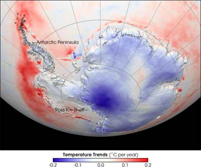
Figure 1: An older NASA image of temperature trends over Antarctica and the Southern Ocean. This image was first published on April 27, 2006 and was based on data from 1981-2004. A more recent version was published on November 21, 2007 (see Figure 2 below). The new version extended the data range through 2007, and was based on a revised analysis that included better inter-calibration among all the satellite records that are part of the time series.

Unfortunately this map is no longer available on the NASA website but before the page went offline, Update: the page wasn't deleted, it was moved to this location (h/t to Robert Simmon). NASA posted a note stating that the temperature map had been updated with new data including better inter-calibration among all the satellite records (see Figure 2 below). The updated data showing more warming over the Antarctic continent. However, as far as sea ice is concerned, both maps shows a warming trend over the Southern Ocean.

Antarctic temperature trends 1981 to 2007
Figure 2: Antarctic surface temperatures as observed by satellites between 1981 and 2007 (NASA).

Perhaps Steve was distracted by the continental cooling in Figure 1 and didn't notice the warming over the ocean. In that case, I recommend the following figure from Increasing Antarctic Sea Ice under Warming Atmospheric and Oceanic Conditions (Zhang 2007) as it displays trends only over the ice-covered Southern Ocean - this is the region where Antarctic sea ice forms.

Antarctic Southern Ocean surface temperature trends
Figure 3: Linear trend (1979–2004) of surface air temperature over the ice-covered areas of the Southern Ocean (Zhang 2007).

We see strong warming over most of the ice-covered Southern Ocean although there is also some cooling. What is the average trend over the whole region? The overall surface temperature trend over the ice-covered regions of the Southern Ocean shows a warming trend:

Southern Ocean surface temperature trends
Figure 4: Annual mean surface air temperature averaged over the ice-covered areas of the Southern Ocean. Straight line is trend line (Zhang 2007).

Oceanographic data also find that the waters in the Southern Ocean are warming. The waters of the Southern Ocean's Antarctic Circumpolar Current have warmed more rapidly than the global ocean as a whole. From 1960 to 2000, water temperature increased by 0.068°C per decade at depths between 300 and 1000 metres. This warming trend has increased to 0.098°C per decade since the 1980s (Boning 2008).

Hopefully, when presented with the full array of empirical data, Steve Goddard will no longer continue the false assertion that Antarctic sea ice is growing because of cooling. Observations clearly state otherwise - the Southern Ocean where sea ice forms is warming. By fixing on a simple yet incorrect interpretation, Steve is depriving himself and his readers of the opportunity to explore the complex and fascinating question of Antarctic sea ice.

0 0

Printable Version  |  Link to this page

Comments

1  2  Next

Comments 1 to 50 out of 88:

  1. Typo.
    On a more positive side, he also dropped by to clearly articulate why he thinks the Southern Ocean is warming.
    0 0
  2. Gildor and Tziperman (2003) has an interesting box-model where sea ice actually triggers major deglaciation for the pleistocene 100ky cycles by capping precipitation to the accumulation zone of the ice sheet. It could therefore easily be the case that increased sea ice near Antarctica will accelerate ice loss from the continent.
    0 0
  3. "It could therefore easily be the case that increased sea ice near Antarctica will accelerate ice loss from the continent". In which case, this could also be a contributory factor in the mass loss now discovered in the EAIS, which took me rather by surprise since, like everyone else, I thought it was stable compared to the WAIS.
    0 0
  4. #2 and #3 You are getting carried away with the amount of sea ice change. It is true you could starve an ice sheet for moisture, however, the actual precipitation rates in Antarctica have not been declining. Bromwich Monaghan Further the amount of sea ice increase is insignificant in terms of moisture transport distances. Focus on the actual air temps in the region during the sea ice formation period. Temp map
    0 0
  5. This recent paper highlights the fact that sea ice increase varies for the seas around antarctica. JOURNAL OF GEOPHYSICAL RESEARCH, VOL. 113, C07004, doi:10.1029/2007JC004564, 2008 Antarctic sea ice variability and trends, 1979–2006 D. J. Cavalieri and C. L. Parkinson It shows the greatest increase in sea ice in the Ross Sea. And the smallest (in fact a decrease in ice) in the Bellingshausen/Amundsen seas. Your Fig2 seems to show strongest sea warming in the B/A seas (the dark red along the west coast). And some of the lowest temp increases in the Ross Sea (the pink/blue area below the Ross Ice shelf). Just to summarize that because it seems counter-intuitive to the counter-intuitive Zhang theory. B/A Sea - Strongly warmer sea temp. Lowest (reduced) ice trend increase. Ross Sea - Weakly warmer/cooler seas. Highest ice trend increase. Does it matter that this seems the opposite to the Zhang theory?
    0 0
  6. HumanityRules, I see nothing in Zhang which suggests that ice production should be inversely proportional to local sea temperature. Rather the opposite in fact. Zhang argues (amongst other things) that the GLOBAL increase in temperature has caused a GLOBAL increase in water vapor and thus greater precipitation. That increased precipitation would act to increase ice formation throughout Antarctica... but would be hampered in doing so in areas where the oceans have warmed significantly. This is one of the reasons most researchers expect the Antarctic sea ice trend to reverse... as the oceans continue to warm (and the ozone hole to close) the balance of forces will tip back. The flaw in your argument here is the same as with the common 'skeptic' argument that increased temperatures will not lead to drought because there will be more precipitation... both ignore that the extra precipitation will not fall in perfect proportion on the locations of increased evaporation.
    0 0
  7. The Boning 2008 paper seems to be covering an area of the Southern Ocean outside the range of the antarctic sea ice (30oS to 60oS). I don't think this should be included in "the full array of empirical data"
    0 0
  8. 6.CBDunkerson at 00:53 AM on 16 March, 2010 From Zhang's abstract "The model shows that an increase in surface air temperature and downward longwave radiation results in an increase in the upper-ocean temperature and a decrease in sea ice growth, leading to a decrease in salt rejection from ice, in the upper-ocean salinity, and in the upper-ocean density. The reduced salt rejection and upper-ocean density and the enhanced thermohaline stratification tend to suppress convective overturning, leading to a decrease in the upward ocean heat transport and the ocean heat flux available to melt sea ice.The ice melting from ocean heat flux decreases faster than the ice growth does in the weakly stratified Southern Ocean, leading to an increase in the net ice production and hence an increase in ice mass. This mechanism is the main reason why the Antarctic sea ice has increased in spite of warming conditions both above and below during the period 1979–2004 and the extended period 1948–2004." and from section d "This indicates that the increasing P [precipitation] is not the main cause of the simulated increase of Antarctic sea ice cover. Zhang is all about increasing sea/surface air temp leading to increasing ice extent. Precipitation is of minor importance to his theory.
    0 0
  9. Having said all that I don't see how Zhang's system can lead to a trend. It should produce a dymanic situation where the ocean upwelling should alternate between being switched on and off.
    0 0
  10. It is also interesting to look at the Ice Mass loss of the Antarctic Ice sheet which has been accelerating noticeably. http://www.columbia.edu/~mhs119/IceSheet/Velicogna.pdf http://www.agu.org/pubs/crossref/2009/2009GL040222.shtml
    0 0
  11. "Perhaps Steve was distracted by the continental cooling in Figure 1 and didn't notice the warming over the ocean. " It defintely seemed odd to me that Goddard was using that map to support his assertion that cooling was leading to sea ice increases. It could also be that he's confusing sea ice and continental ice. Many serious readers of WUWT seem likely to make that mistake.
    0 0
  12. Yes, clearly, "Steve is depriving himself and his readers of the opportunity to explore the complex and fascinating question of Antarctic sea ice." But that IS what some people out there want. Scientists may be interested in "complex and fascinating quesitions", but neither the general public nor the politicians manipulating them care. They prefer a simple answer even if it is clearly wrong.
    0 0
  13. The trends in figures 1 and 2 cannot be trusted. They are from Satellite AVHRR skin temperature measurements. This instrument is easily confused by cloud contamination, well documented by Comiso. The problem is the key reason that Steig 09 was required to combine surface trend information with satellite spatial information to determine a trend for the antarctic. The AVHRR data is biased warm.
    0 0
  14. Jeff Id at 07:44 AM on 16 March, 2010 I would hope then that Steig 2009 can be trusted, and on the NASA webpage Satellites Confirm Half-Century of West Antarctic Warming we get a 2009 update on the images in this post. “The new analysis shows that Antarctic surface temperatures increased by an average of 0.22°F (0.12°C) per decade between 1957 and 2006. That's a rise of more than 1°F (0.5°C) in the last half century. West Antarctica warmed at a higher rate, rising 0.31°F (0.17°C) per decade. The results confirm earlier findings based on limited weather station data and ice cores”.
    0 0
  15. Although not stated espicitly, it is customary to report clear sky skin temperature. As far as i know the latter correlates quite well with in situ measurements (see for example Scambos et al. 2006, Annal. Glaciol. 44,345)
    0 0
  16. We're mostly talking about sea surface temperatures around Antarctica, right? AVHRR is very widely used for producing SST. I haven't looked into the source for fig. 1 and fig. 2, but the claim that you can't get reliable SST measurements from AVHRR is a new one to me.
    0 0
  17. #14, Steig et al is also flawed. They chose two few PC's for their analysis which caused the oversampled peninsula warming to be spread around the continent. There are a lot of stations in the peninsula. When the number of eigenvectors is increased or a regridding of surface station data is used, the trend drops to about 0.06C/Decade with some cooling since 82.
    0 0
  18. Jeff Id at 07:44 AM on 16 March, 2010 To say "the AVHRR data is biased warm" is a rather gross oversimplification, isn't it Jeff? Any readers wondering why or how or especially if yet another instrumentation record should prove faulty should be sure to use Google scholar to get the full story on Jeff's assertion. The raw accuracy of the data product is excellent. See: Validation of AVHRR and MODIS ice surface temperature products using in situ radiometers Meanwhile, the scatter of AVHRR derived temperature data against drifting buoy measurements has remained constant or even decreased slightly over the past two decades, is now in the range of 0.5 degree C, meaning that even if this data proved to have a warm bias that bias is not for some mysterious reason increasing. In turn this implies that temperature trends can in fact be extracted with reasonable confidence from AVHRR results. "AVHRR is biased warm" seems to be a variation of the famous "Watts' Fallacy" regarding surface station records. or numerous other articles on this topic.
    0 0
  19. #18, I've recently been part of a group that submitted for publication on the subject, the raw instrument is quite accurate as you correctly assert. Where you go wrong is in misunderstanding that the readings are contaminated by cloud data. Comiso has spent years trying to correct for clouds. If you're really interested, half of my blog work was on the topic. If the data were good for trend the surface/sat data combining methods would not be required. The total length of the data is biased warm but it's caused by noise, there are subsections which were biased cold. AVHRR consists of several satellites, with different instruments that drifted in different directions over time, there were statistically measurable steps and trends between sat and surface at several points.
    0 0
  20. Antarctica is a curious heat engine. There is about a 100 W m-2 deficit in average annual insolation relative to outgoing longwave radiation to space. The difference is supplied by dry air sucked in from milder latitudes 500-1000 m above the ice sheet surface. Ice is highly reflective in the short wave portion of em spectrum, but it is pitch black in thermal IR, so emissivity is high. Radiative surface cooling is very strong, especially because of low atmospheric water vapor. Air close to surface gets cold and heavy, starts to roll downhill, more air is sucked in from above. Even the low moisture contents of air is deposited on surface as floating ice needles and hoarfrost. As air gets to ever lower levels, its pressure increases. Normal reaction would be adiabatic warming, but contact with surface keeps cooling it. Due to high elevation of Antarctica, gravitational pull on dense cold air accelerates it, at shores this katabatic wind reaches gale force. Blows sea ice north, coastal polynyas open up. Sea surface cooled by strong cold winds, excess sea ice production, deep water formation facilitated by salt rejection in sea ice. Works in high gear during winter. Significant fall sea ice area increase in last four decades indicates this heat sink getting more efficient. Wind speed and pressure trends would tell more than temperature alone.
    0 0
  21. Jeff Id at 11:08 AM on 16 March, 2010 If you can identify an error, quantify it, why can it not be removed? If you cannot quantify the error, by what means do you assess the amount of error and for that matter how do you ascribe the error at all? Why does scattering of the AVHRR temperature error record against buoy data not show an error trend and not show an overall bias? Finally, where is data showing an overall trend upward in this purported uncorrected error? Many more people than Comiso have worked on cloud correction, successfully as it turns out.
    0 0
  22. So many questions. Lessee. We quantified it from a dataset released by Comiso and the NSIDC. I've not worked with ALL other peoples data. However the errors in trend are actually visible in your figures. In Fig 2, you can see the red band encircling the entire continent with a blue center. There is considerably more variance in the center vs the edges which you would expect from ocean dampening, however expecting a long term trend difference in a ring shape is a different story. Certainly, you can claim it's reasonable as some have, but in reality it's just a symptom of the noise problem. The center of the continent varies many times greater and because of the difficulties that creates, it has substantially more trend error. It turns out that in the case of the Comiso dataset when the AVHRR data was compared to the surface stations at the same points, statistically significant differences were discovered. Steig would not be surprised by this, nor would Comiso. The error cannot be removed easily because the satellites have considerably more spatial information than a hundred individual temp stations with intermittent readings. On a daily spatial basis, it's easy to imagine that cloud contamination would create problems on a variable basis. One could simply correct the average slope, but that just makes it into surface information so that doesn't make sense. I've not investigated the difference between buoy data but again, it's not as simple as an average trend check.
    0 0
  23. #22 Jeff Id: "In Fig 2, you can see the red band encircling the entire continent with a blue center." Sorry, but I don't see this. Are you referring to Figure 2 of this posting, or of some paper? In Figure 2 of the posting, the brightest red spots are indeed at the edge of the continent, but labeled "former site of Larsen B ice shelf" and so on. The "trend" here is presumably due to the loss of the ice shelf revealing the unfrozen ocean beneath. Admittedly, this is probably a step function change in time rather than a trend, but the result hardly seems unreasonable. The blue vs. red patterns I see on the continent bears some resemblance to high vs. low elevation at least for East Antarctica, although that is just eyeballing. Most of West Antartica is red, so there is no simple relationship between trend on the figure and distance from the coast, pole, or anything else. The "ring" you suggest is quite distorted -- why are you convinced that this particular shape is a clear symptom of the "noise problem"? If you are really talking about some other figure, can you post that one? As for removing the error, it is certainly true that sometimes you can put bounds on the errors but not remove them. Can you be more specific about what bounds you estimate on errors in trend here?
    0 0
  24. And, again, the focus of this posting is on sea ice and sea surface temperature. So while I am interested in hearing more about the questions of the previous comment, they are relevant to questions about sea ice only if the actual sea surface temperature measurements here are in error. For that question, the changes on the continent don't really matter.
    0 0
  25. 1. As a result of weakening of the THC on SH (= strengthening of NH), warm air does not reach as far south as before. Reflects their energy earlier. Hence the current warming of the southern ocean. Warms, however, only one of its zone. On N and S from it we have a cooling. This is typical of Bond's event. For a better understanding I recommend to work: "Quaternary glacial and climate history of Antarctica" Ó. Ingólfsson, 2004. Steve Goddard - he is absolutely right, that the anger. 2. "The new analysis shows that Antarctic surface temperatures increased by an average of 0.22°F (0.12°C) per decade between 1957 and 2006." - "ScienceDaily (May 8, 2008) — Computer analyses of global climate have consistently overstated warming in Antarctica, concludes new research by scientists at the National Center for Atmospheric Research (NCAR) and Ohio State University.", "While the observed Antarctic temperatures rose by about 0.4 degrees Fahrenheit (0.2 degrees Celsius) over the past century, the climate models simulated increases in Antarctic temperatures during the same period of 1.4 degrees F (0.75 degrees C). The error appeared to be caused by models overestimating the AMOUNT OF WATER VAPOR in the Antarctic atmosphere, the new study concludes. The reason may have to do with the cold Antarctic atmosphere handling moisture differently than the atmosphere over warmer regions." - http://www.sciencedaily.com/images/2008/05/080507132855-large.jpg - "This map of Antarctica shows the approximate boundaries of areas that have warmed or cooled over the PAST 35 YEARS. The map is based on temperatures in a recently-constructed data set by NCAR scientist Andrew Monaghan and colleagues."
    0 0
  26. "The out-flowing undersea of cold and salty water makes the sea level of the Atlantic slightly lower than the Pacific and salinity or halinity of water at the Atlantic higher than the Pacific. This generates a large but slow flow of warmer and fresher upper ocean water from the tropical Pacific to the Indian Ocean through the Indonesian Archipelago to replace the cold and salty Antarctic Bottom Water. This is also known as Haline forcing (net high latitude freshwater gain and low latitude evaporation)." (Wikipedia).
    0 0
  27. Jeff Id at 10:36 AM on 16 March, 2010 Jeff is referring to the significant amount of detailed analysis done on Antarctic weather station and satellite derived temperature trends by Ryan O et al which has been trumpeted as “falsifying” Steig 2009 on WUWT and elsewhere. Ryan O adds “I should have said that all reconstructions yield a positive trend, though in most cases the trend for the continent is not statistically significant”. I perhaps oversimplify, but Ryan is claiming that the temperature rise averaged over the whole of Antarctica is about half of the overall temperature rise Steig published. A measured response from Steig, and discussion is to be found on RealClimate. At the end of the day I will direct people at published papers, data, and results. if Jeff or Ryan do publish, and after independent review the science does move forwards, then great, I’ll point to this as “more recent work” etc, (at least until the next results or updates are published…) Now, back to the Antarctic Ocean and sea ice...
    0 0
  28. #23 That's an interesting observation about the ice shelf. There is indeed sea contamination of edge pixels in the data. Maybe you're right. Yes I was referring to Fig 2 here. There is a red loop all around the continent. This is caused for reasons other than a smooth continuous temp trend. Once you look at the data you realize that it is extremely noisy, not just a little and that's why there is a need for other methods. As far as sea ice, the continental trend was part of your point above. My understanding of the region is that there isn't nearly as much warming as some say when simply looking at actual surface temp data. What you have is basically a stable (slightly rising) temp over 50 years with some trend in the peninsula region. http://noconsensus.wordpress.com/2009/08/31/area-weighted-antarctic-offset-reconstructions/ I do agree that this isn't what determines sea ice from year to year. Tenths of a degree don't matter much. The same is true for the Arctic, the loss of sea ice was due to currents. There is a video at this post which is interesting. You should ignore the significance calcs. in the post as they aren't of good quality. -- too much autocorrelation. http://noconsensus.wordpress.com/2009/12/09/sea-ice-copenhagen-update/ The plots were made by summation of the NSIDC data. In the video, you can see the ice flowing, rotating around the Antarctic and pushing along landmasses in the Arctic. Some cloud cover is visible in the data and it shows that the low in 2007 was created by high speed winds pushing ice out of the drain. This explains the rapid recovery we've seen in the Arctic and makes the claims of sea ice loss by global warming far less likely. Most scientists I've read or discussed with, seem to agree with this being the mechanism for ice level change. #25, even your point 2 is about two times higher than the actual surface data shows. It's the same trend that Steig et al came up with. We're not alone with the lower trends BTW, several older papers (basically pre AGW hype) had the same trends as shown in the first link in this comment.
    0 0
  29. Jeff, your argument that sea ice changes in the Arctic are due to currents rather than warming is a false dichotomy... they are clearly due to currents AND warming. Without warming the ice does not break up as much and thus forms greater bottlenecks at the 'drain' points. Further, the marked decline in Arctic sea ice volume and thickness (which has continued since 2007) indicates that ice growth is not keeping pace with ice loss... a situation which only the measured warming explains as there has been no marked ongoing change in Arctic currents.
    0 0
  30. Jeff Id at 00:03 AM on 17 March, 2010 Nice animations! Winds causing anonalous 2007 minimum: the same scientists might also add that this may not have have been possible if the ice was not significantly thinner. You have done enough work on Arctic ice extent to appreciate that the 2007 values and subsequent "recovery" are against a significant multi-decadal background trend of reducing ice extent and thickness (as well as a significant regional warming trend over the same period).
    0 0
  31. #29, I don't agree. The warm water from the south would have made no difference with a half degree C either way. The thickness argument is also false in my opinion. The thicker ice just got pushed out. The weather pattern change in 2007 is very much visible in the video linked in my last comment and there has been a recovery in multi-year ice since the 2007 minimum.
    0 0
  32. Global Sea Ice (kudos to the Air Vent) Notice ice dynamics around Antarctica.
    0 0
  33. Berényi Péter makes some good comments. Think about the mechanism of ice formation and the heat balances involved. Phase change in frezing ice on water involves liberating the latent heat which is 80 times the amount to change the temperature of liquid water by 1 degC. Applying cold air at sub-zero temperatures to the sea surface liberates the latent heat as the water freezes. Heat has to go somewhere - it slightly warms the air. More ice = warmer air immediately surrounding the water-ice phase change.
    0 0
  34. Jeff, do you have a source for your claim that multi-year ice has recovered since 2007? It contradicts every study I've seen on the matter. For instance; As to your view that warming had nothing to do with thick multi-year ice breaking up and being exported out of the Arctic... I suppose we'll just have to agree to live on different planets.
    0 0
  35. Ken Lambert at 01:39 AM on 17 March, 2010 I fear energy and temperature are being a bit confused. Ponder that word "Latent". Melt/freeze Phase change involves energy, certainly, but no temperature change. Agree though that latent heat plays a role in all this.
    0 0
  36. #28 Jeff Id, cool video. Worth the 2 days of processor time! As far as the temperature trends on the continent go, you are basically handwaving here. All data have noise. Why would the data noise cause a particular pattern of (slight) positive and negative temperature trends? Why do you think that the makers of this figure did not understand the level of noise in the data and compute adequate error bars? Why, other than your opinion that the pattern seems unlikely, should we think that the pattern is not actually correct if it is larger than the uncertainties? I'd also add that in terms of where impacts of warming are observed in Antartica, the figure seems about right -- only small changes over most of the continent, but significant changes on the Antarctic Peninsula. I'm not sure what other claims some people are making, but your figures seem to be pretty consistent with Figure 2, and this pattern of temperature change seems quite consistent with the observed impacts. I'm curious why you would refer to the loss of the ice shelves as "contamination". There are two questions here: (1) is the measurement of delta-T over time accurate? (2) is a linear trend an adequate representation of the changes? As far as the ice shelves go, they certainly call into question the use of a linear model with time (2), but unless spatial smoothing is applied they will not "contaminate" anything. Suppose that the same figure with the same colors simply had the numbers next to the color bar multiplied by 26 y, and the title changed to Change in Temperature, 1981-2007? Given that most of the ice shelves were labeled, it seems pretty clear to me that the labeling was applied so that people would not misinterpret the changes as some kind of oceanic "hot spot".
    0 0
  37. #34, First, we're discussing the recovery since 07. Your first graphs show the drop to 09 from 1980-2000 mean so it's not evidence. In the last graph you show the 07 minimum seems to be reflected in 08. Probably due to some filtering or something. We know very well that 07's minimum was not a typical year right? Your grpah shows very little drop from 06. You can see the slight recovery in 09 in your graph, and in the video, perhaps this is 08 because 09 minimum was better. Enough so that some NSIDC guys are even admitting it. As to the warming argument, the net energy transfer from a slightly warmer yet mostly well below freezing environment is small in comparison to even a very slight flow change of water. Stir a glass of ice cubes and you can see the effect. The melting arctic ice situation is far more related to currents than the small warming in my opinion.
    0 0
  38. Jeff Id (AirVent), I have to vehemently disagree with the following misleading statements made by you: "The same is true for the Arctic, the loss of sea ice was due to currents." And "there has been a recovery in multi-year ice since the 2007 minimum." Of course winds and ocean currents play a role, but they are not the sole players in modulating Arctic sea ice. To suggest otherwise is being anything but honest. These are the same myths that keep getting trotted out by those in denial and blog commentators like Watts. I have to agree with CBDunkerson and Peter Hogarth, and the NSIDC. There has been no recovery in MY Arctic ice since 2007, the overall negative trend in Arctic sea ice extent in the late summer is accelerating (from the NSDIC site, look at trends up until 2003, then trends up until 2009). Anyhow, this thread is about Antarctic Sea ice and Goddard's misinterpretation of the in-situ data, and his erroneous hypothesis as to what is modulating Antarctic sea ice. Jeffery (Id) if you have any thoughts on that, then I and others would be interested to hear them. Humanity Rules @8 re the impact of precip. on Antarctic sea ice, look carefully at the flow chart (conceptual model) shown in Figure 10 in Zhang.
    0 0
  39. #35 Peter Hogarth at 02:04 AM on 17 March, 2010 Ken Lambert at 01:39 AM on 17 March, 2010 "Phase change involves energy, certainly, but no temperature change" No temperature change of water, of course. But the air above, that does the freezing, warms up. Energy should go somewhere. As its winter temperature is way below freezing even at coast, there is room for an inrease. Katabatic winds are not fun, wind speed can reach 320 km/h, that of (non-existent) category 6 hurricanes. --- Thinking about it atmospheric carbon dioxide should have a wintertime cooling effect over Antarctica. Air 1 km above ice sheet is warmer (-50°C) than both surface (-70°C) and space (-270°C). Due to Kirchoff's law as IR absorptivity of air increases, so should emissivity. As there is no warmer heat reservoir in sight, this air mass radiates more than it absorbs, net cooling is called forth. In extremely dry Antarctic air carbon dioxide dominates over water vapor. More CO2, more cold air production, stronger winds, more polynyas, more sea ice. Looks like a heat sink controlled by a negative feedback loop, i.e. thermostat.
    0 0
  40. #36, Sorry for the lazy posting. See figure 3 in this post. http://noconsensus.wordpress.com/2009/05/20/antarctic-coup-de-grace/ Error bars, as you may know, do not account for instrument drift or offset. They only account for scatter of measurements. If you look at Fig 3, you can see why the trends are different. However the data is more complicated than that, there are regional effects where one area had cloud and others didn't. This creates a situation which is very difficult to correct for. I'm sorry but I won't have more time for this fun thread until later tonight.
    0 0
  41. #38, No time now, but I assure you that I won't waste time giving opinions which aren't correct as I understand them.
    0 0
  42. Jeffrey, @ 37 you are off topic, and "#34, First, we're discussing the recovery since 07. Your first graphs show the drop to 09 from 1980-2000 mean so it's not evidence." I am speechless. Wow, just where does one begin? And "The melting arctic ice situation is far more related to currents than the small warming in my opinion." "Small warming"? Wow again. Any thoughts on Goddard's latest blunder regarding the state of the cryosphere Jeffrey?
    0 0
  43. Jeffrey @41 "but I assure you that I won't waste time giving opinions which aren't correct as I understand them." Sorry, you are too late with that statement...
    0 0
  44. Jeff, no the graph is not off a year. The extent of Arctic sea ice was slightly higher in 2008 than 2007, but the thickness and volume of the ice decreased sharply. You might want to read up a bit on this because you obviously have no idea at all what you are talking about. ICESat results up to Winter of 08/09 Sumary of why 2008 was worse than 2007 Latest findings
    0 0
  45. CBDunkerson @44, Careful there CB, Jeffrey thinks that he is very well informed, more so than most scientists it seems in fact. He is well known in the denialosphere and has a loyal following cheering him on. Thanks for the links @ 44 CB. Will look at them now.
    0 0
  46. #44, I see the problem, the big loss occurred in the late melt season of 07 whereas your graph shows it in Feb 07 and doesn't include the 09 minimum. What I was calling 07 the graph has as Feb 08, we are talking about the same event. If you look at more up-to-date data you recognize that the multi-year ice has recovered for the last two years in a row. #45, It may annoy you to know that most scientists wouldn't disagree with me. Of course, you have to be an open minded reader to be able to understand them. So no, I don't claim to know more than them, only to agree with some of them. It's funny how the less studied always assume, first that things which go against their impressions are anti-science or denial, and second that it's all because of warming. The NSIDC has made statements regarding the recovery this year as well as the fact that the 07 minimum (not February) was due primarily to currents. There was a hint of the weather pattern in 06 and 08 as well. If it's a long term change, perhaps you can blame that on global warming.
    0 0
  47. Jeff, I've looked at the up to date data. Indeed, I provided links to it. The ICESat link above clearly shows Winter 2008/09 multi-year ice below 2007/08... as did the previous graph from the NSIDC. I haven't seen similar results for 2009/10 yet, and we may not as ICESat was failing by that point, but the study linked under 'Latest findings' shows that multi-year ice decreased again. Your claim that multi-year ice has recovered the past two years remains at odds with all available data... which might explain your continued failure to cite a source. If you can't BACK the claim with evidence of any kind, why do you keep making it?
    0 0
  48. Arctic sea ice minimum extent for 2002-2009 2007-09-24 4,254,531 km2 2008-09-09 4,707,813 km2 2009-09-13 5,249,844 km2 2005-09-22 5,315,156 km2 2002-09-09 5,646,875 km2 2006-09-14 5,781,719 km2 2004-09-11 5,784,688 km2 2003-09-18 6,032,031 km2 Looks like rotten ice extent is steadily increasing since 2007. Also, last time I've checked it took at least 2 years for ice to get more than two years old.
    0 0
  49. #47, I don't have time to find a source for you. I have looked at the NSIDC data in great detail though. Your "latest findings" link indicated that it was about the Beaufort Sea whereas we're talking about the whole Arctic. Certainly you can see the difference. Being someone with the wherewithal to actually study the data myself it is pretty obvious that we again have more multi-year ice than we had at the 07 minimum. I really don't need someone else to tell me. Keep in mind that when you write 'has recovered' it means has increased, nothing else. You write that you haven't seen the winter results, the multi-year ice level is determined primarily by the minimum as that's when the ice breaks up and flows from the region. It melts as it travels southward. Once refreezing begins there isn't much ice leaving the center of the pack. Therefore, you can answer your own question by comparing the sea ice extent minimums in 07,08 and 09. Simple.
    0 0
  50. Jeffrey @46, This discourse is quite revealing. I am not annoyed at all :) I, and other non D-Ks, know for a fact that the scientists who are experts in the cryosphere (Barber, ICESAT, NSDIC etc.) do not agree with your unsubstantiated comments made here and elsewhere concerning the "health" and long term trends in Arctic sea ice. I, and others, also know (as should you) that three points (2007, 2008, 2009) cannot be used to make any assertions (certainly not statistically significant assertions)concerning the trend of any variable, never mind being so bold as to claim that there has been a "recovery" in Arctic MY ice. Anyhow, I find it rather odd that you seem to avoid speaking to the topic at hand here. Do you have anything to say about the Antarctic sea ice puzzle and Goddard's latest campaign of misinformation on Antarctic sea ice? Thanks.
    0 0

1  2  Next

You need to be logged in to post a comment. Login via the left margin or if you're new, register here.


The Consensus Project Website

THE ESCALATOR

(free to republish)


© Copyright 2024 John Cook
Home | Translations | About Us | Privacy | Contact Us