


 Arguments


Comparing models to the satellite datasets
Posted on 9 May 2016 by Guest Author
This is a re-post from Gavin Schmidt at RealClimate
How should one make graphics that appropriately compare models and observations? There are basically two key points (explored in more depth here) – comparisons should be ‘like with like’, and different sources of uncertainty should be clear, whether uncertainties are related to ‘weather’ and/or structural uncertainty in either the observations or the models. There are unfortunately many graphics going around that fail to do this properly, and some prominent ones are associated with satellite temperatures made by John Christy. This post explains exactly why these graphs are misleading and how more honest presentations of the comparison allow for more informed discussions of why and how these records are changing and differ from models.
The dominant contrarian talking point of the last few years has concerned the ‘satellite’ temperatures. The almost exclusive use of this topic, for instance, in recent congressional hearings, coincides (by total coincidence I’m sure) with the stubborn insistence of the surface temperature data sets, ocean heat content, sea ice trends, sea levels, etc. to show continued effects of warming and break historical records. To hear some tell it, one might get the impression that there are no other relevant data sets, and that the satellites are a uniquely perfect measure of the earth’s climate state. Neither of these things are, however, true.
The satellites in question are a series of polar-orbiting NOAA and NASA satellites with Microwave Sounding Unit (MSU) instruments (more recent versions are called the Advanced MSU or AMSU for short). Despite Will Happer’s recent insistence, these instruments do not register temperatures “just like an infra-red thermometer at the doctor’s”, but rather detect specific emission lines from O2 in the microwave band. These depend on the temperature of the O2 molecules, and by picking different bands and different angles through the atmosphere, different weighted averages of the bulk temperature of the atmosphere can theoretically be retrieved. In practice, the work to build climate records from these raw data is substantial, involving inter-satellite calibrations, systematic biases, non-climatic drifts over time, and perhaps inevitably, coding errors in the processing programs (no shame there – all code I’ve ever written or been involved with has bugs).
Let’s take Christy’s Feb 16, 2016 testimony. In it there are four figures comparing the MSU data products and model simulations. The specific metric being plotted is denoted the Temperature of the “Mid-Troposphere” (TMT). This corresponds to the MSU Channel 2, and the new AMSU Channel 5 (more or less) and integrates up from the surface through to the lower stratosphere. Because the stratosphere is cooling over time and responds uniquely to volcanoes, ozone depletion and solar forcing, TMT is warming differently than the troposphere as a whole or the surface. It thus must be compared to similarly weighted integrations in the models for the comparisons to make any sense.
The four figures are the following:
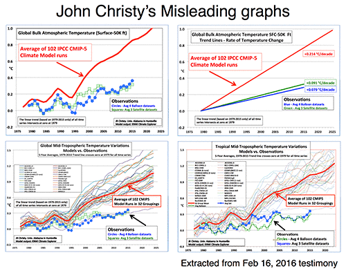
There are four decisions made in plotting these graphs that are problematic:
- Choice of baseline,
- Inconsistent smoothing,
- Incomplete representation of the initial condition and structural uncertainty in the models,
- No depiction of the structural uncertainty in the satellite observations.
Each of these four choices separately (and even more so together) has the effect of making the visual discrepancy between the models and observational products larger, misleading the reader as to the magnitude of the discrepancy and, therefore, it’s potential cause(s).
To avoid discussions of the details involved in the vertical weighting for TMT for the CMIP5 models, in the following, I will just use the collation of this metric directly from John Christy (by way of Chip Knappenburger). This is derived from public domain data (historical experiments to 2005 and RCP45 thereafter) and anyone interested can download it here. Comparisons of specific simulations for other estimates of these anomalies show no substantive differences and so I’m happy to accept Christy’s calculations on this. Secondly, I am not going to bother with the balloon data to save clutter and effort; None of the points I want to make depend on this.
In all that follows, I am discussing the TMT product, and as a shorthand, when I say observations, I mean the observationally-derived TMT product. For each of the items, I’ll use the model ensemble to demonstrate the difference the choices make (except for the last one), and only combine things below.
1. Baselines
Worrying about baseline used for the anomalies can seem silly, since trends are insensitive to the baseline. However there are visual consequences to this choice. Given the internal variability of the system, baselines to short periods (a year or two or three) cause larger spreads away from the calibration period. Picking a period that was anomalously warm in the observations pushes those lines down relative to the models exaggerating the difference later in time. Longer periods (i.e. decadal or longer) have a more even magnitude of internal variability over time and so are preferred for enhancing the impact of forced (or external) trends. For surface temperatures, baselines of 20 or 30 years are commonplace, but for the relatively short satellite period (37 years so far) that long a baseline would excessively obscure differences in trends, so I use a ten year period below. Historically, Christy and Spencer have use single years (1979) or short periods (1979-1983), however, in the above graphs, the baseline is not that simple. Instead the linear trend through the smoothed record is calculated and the baseline of the lines is set so the trend lines all go through zero in 1979. To my knowledge this is a unique technique and I’m not even clear on how one should label the y-axis.
To illustrate what impact these choices have, I’ll use the models in graphics that use for 4 different choices. I’m using the annual data to avoid issues with Christy’s smoothing (see below) and I’m plotting the 95% envelope of the ensemble (so 5% of simulations would be expected to be outside these envelopes at any time if the spread was Gaussian).
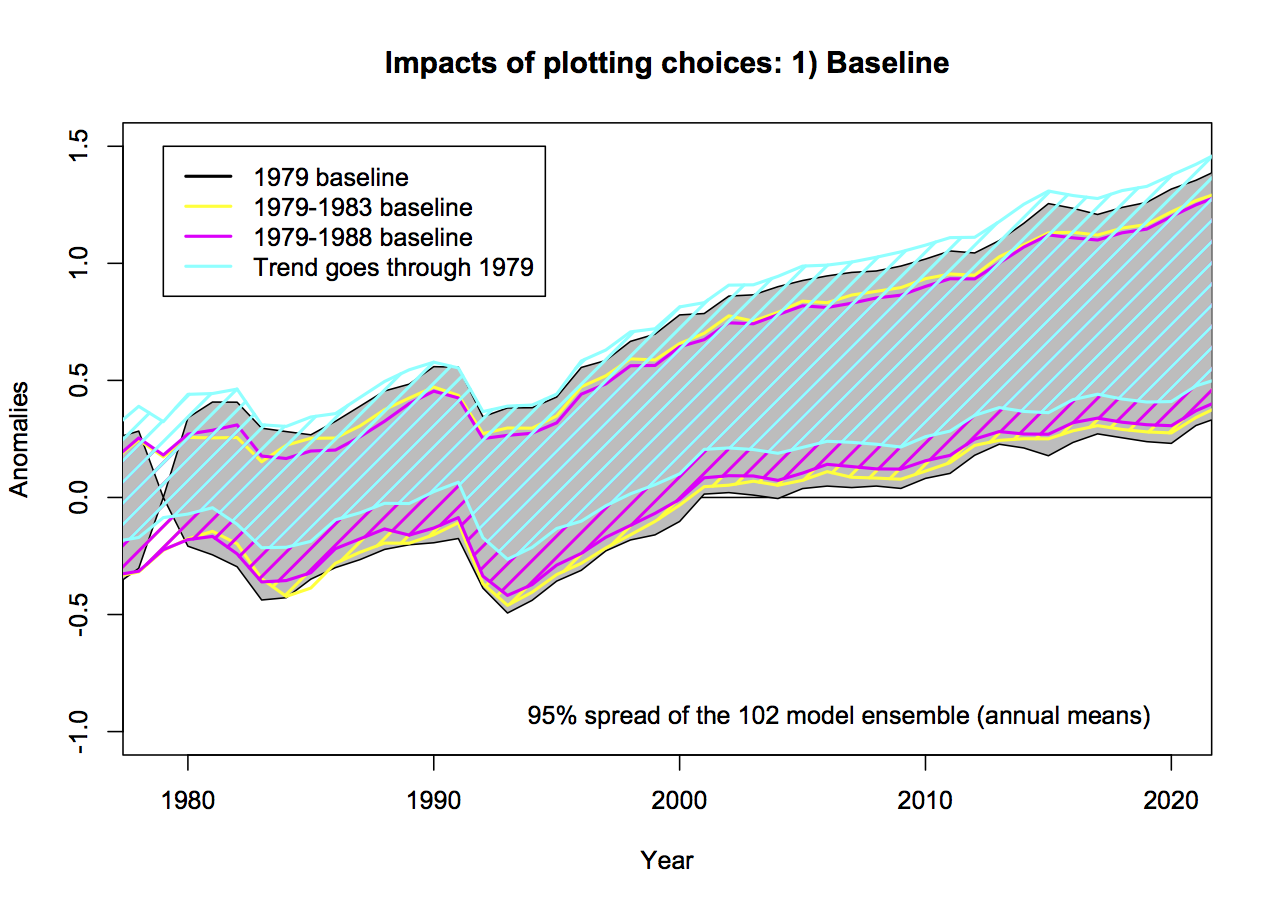
Using the case with the decade-long baseline (1979-1988) as a reference, the spread in 2015 with the 1979 baseline is 22% wider, with 1979-1983, it’s 7% wider, and the case with the fixed 1979-2015 trendline, 10% wider. The last case is also 0.14ºC higher on average. For reference, the spread with a 20 and 30 year baseline would be 7 and 14% narrower than the 1979-1988 baseline case.
2. Inconsistent smoothing
Christy purports to be using 5-yr running mean smoothing, and mostly he does. However at the ends of the observational data sets, he is using a 4 and then 3-yr smoothing for the two end points. This is equivalent to assuming that the subsequent 2 years will be equal to the mean of the previous 3 and in a situation where there is strong trend, that is unlikely to be true. In the models, Christy correctly calculates the 5-year means, therefore increasing their trend (slightly) relative to the observations. This is not a big issue, but the effect of the choice also widens the discrepancy a little. It also affects the baselining issue discussed above because the trends are not strictly commensurate between the models and the observations, and the trend is used in the baseline. Note that Christy gives the trends from his smoothed data, not the annual mean data, implying that he is using a longer period in the models.

This can be quantified, for instance, the trend in the 5yr-smoothed ensemble mean is 0.214ºC/dec, compared to 0.210ºC/dec on the annual data (1979-2015). For the RSS v4 and UAH v6 data the trends on the 5yr-smooth w/padding are 0.127ºC/dec and 0.070ºC/dec respectively, compared to the trends on the annual means of 0.129ºC/dec and 0.072ºC/dec. These are small differences, but IMO a totally unnecessary complication.
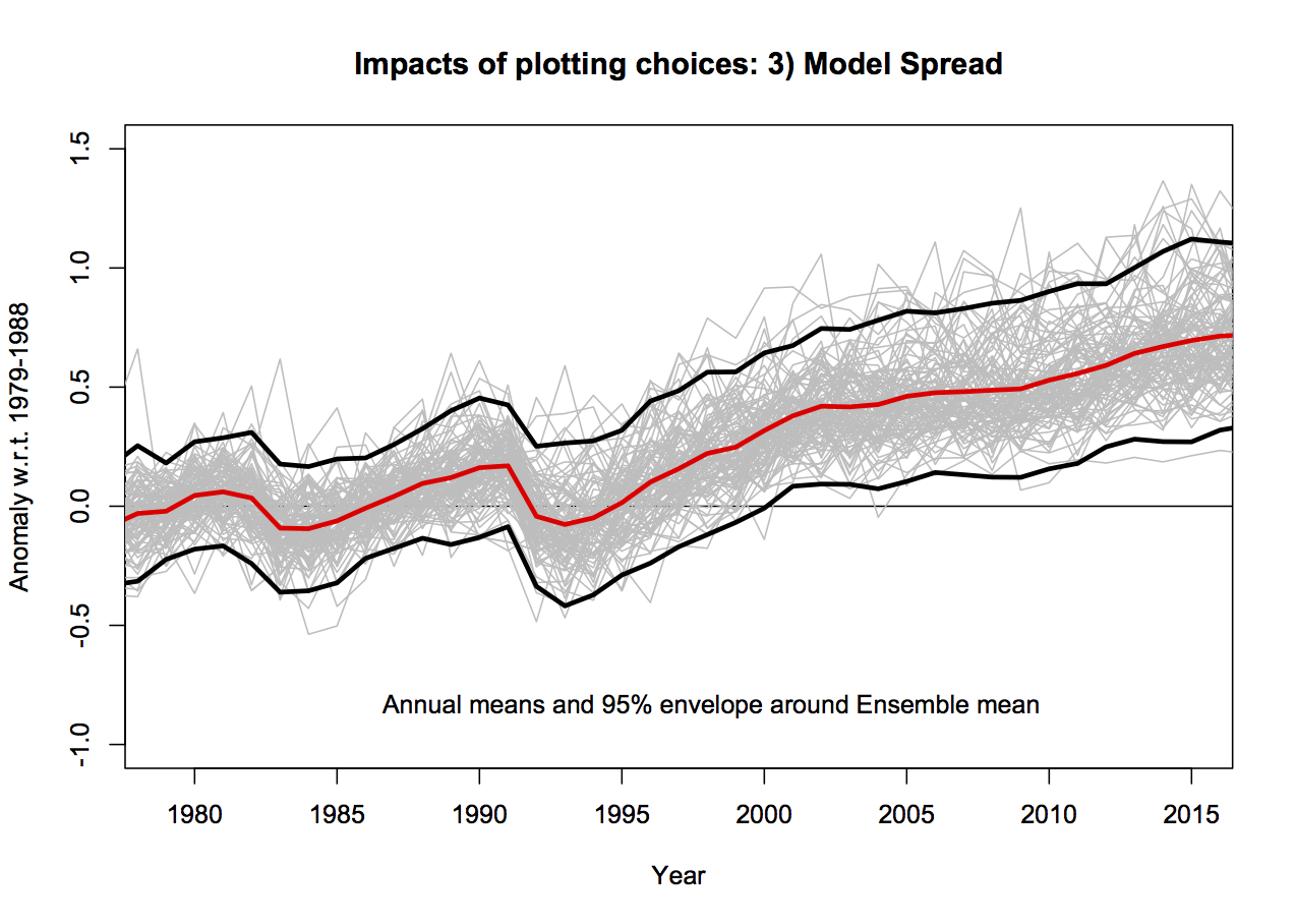
3. Model spread
The CMIP5 ensemble is what is known as an ‘ensemble of opportunity’, it contains many independent (and not so independent) models, with varying numbers of ensemble members, haphazardly put together by the world’s climate modeling groups. It should not be seen as a probability density function for ‘all plausible model results’, nonetheless, it is often used as such implicitly. There are three sources of variation across this ensemble. The easiest to deal with and the largest term for short time periods is initial condition uncertainty (the ‘weather’); if you take the same model, with the same forcings and perturb the initial conditions slightly, the ‘weather’ will be different in each run (El Niño’s will be in different years etc.). Second, is the variation in model response to changing forcings – a more sensitive model will have a larger response than a less sensitive model. Thirdly, there is variation in the forcings themselves, both across models and with respect to the real world. There should be no expectation that the CMIP5 ensemble samples the true uncertainties in these last two variations.
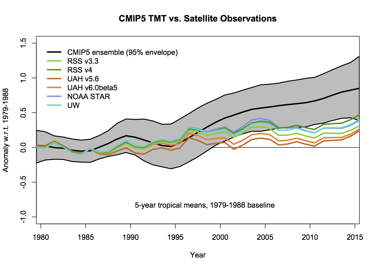
Plotting all the runs individually (102 in this case) generally makes a mess since no-one can distinguish individual simulations. Grouping them in classes as a function of model origin or number of ensemble members reduces the variance for no good reason. Thus, I mostly plot the 95% envelope of the runs – this is stable to additional model runs from the same underlying distribution and does not add to excessive chart junk. You can see the relationship between the individual models and the envelope here:
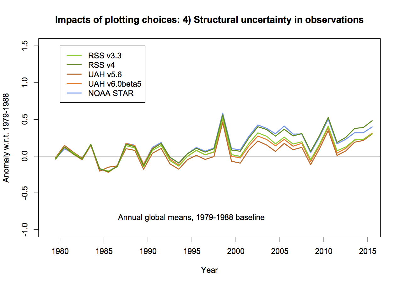
4. Structural uncertainty in the observations
This is the big one. In none of the Christy graphs is there any indication of what the variation of the trend or the annual values are as a function of the different variations in how the observational MSU TMT anomalies are calculated. The real structural uncertainty is hard to know for certain, but we can get an idea by using the satellite products derived either by different methods by the same group, or by different groups. There are two recent versions of both RSS and UAH, and independent versions developed by NOAA STAR, and for the tropics only, a group at UW. However this is estimated, it will cause a spread in the observational lines. And this is where the baseline and smoothing issues become more important (because a short baseline increases the later spread) not showing the observational spread effectively makes the gap between models and observations seem larger.
Summary
Let’s summarise the issues with Christy’s graphs each in turn:
- No model spread, inconsistent smoothing, no structural uncertainty in the satellite observations, weird baseline.
- No model spread, inconsistent trend calculation (though that is a small effect), no structural uncertainty in the satellite observations. Additionally, this is a lot of graph to show only 3 numbers.
- Incomplete model spread, inconsistent smoothing, no structural uncertainty in the satellite observations, weird baseline.
- Same as the previous graph but for the tropics-only data.
What then would be alternatives to these graphs that followed more reasonable conventions? As I stated above, I find that model spread is usefully shown using a mean and 95% envelope, smoothing should be consistent (though my preference is not to smooth the data beyond the annual mean so that padding issues don’t arise), the structural uncertainty in the observational datasets should be explicit and baselines should not be weird or distorting. If you only want to show trends, then a histogram is a better kind of figure. Given that, the set of four figures would be best condensed to two for each metric (global and tropical means):
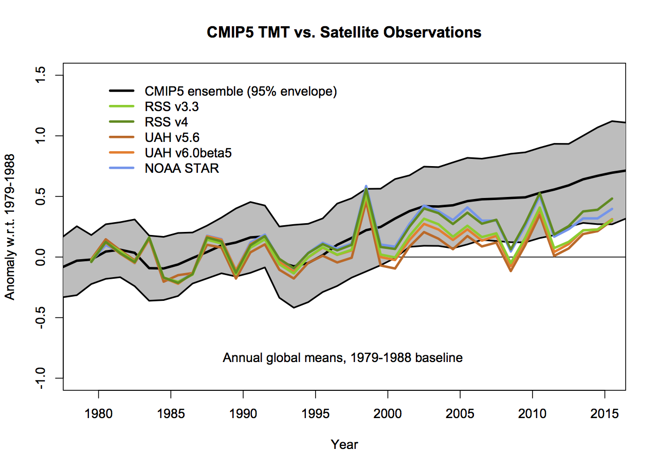

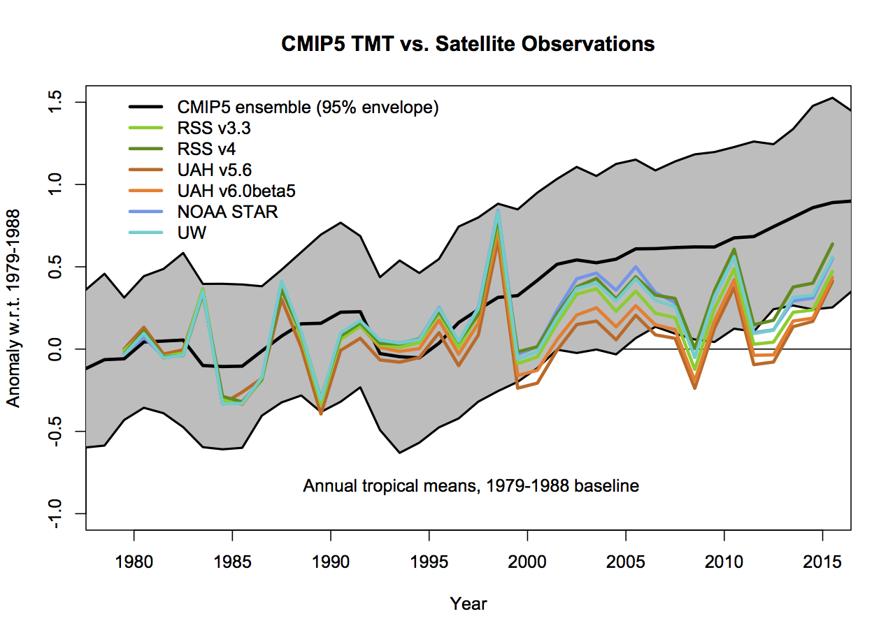
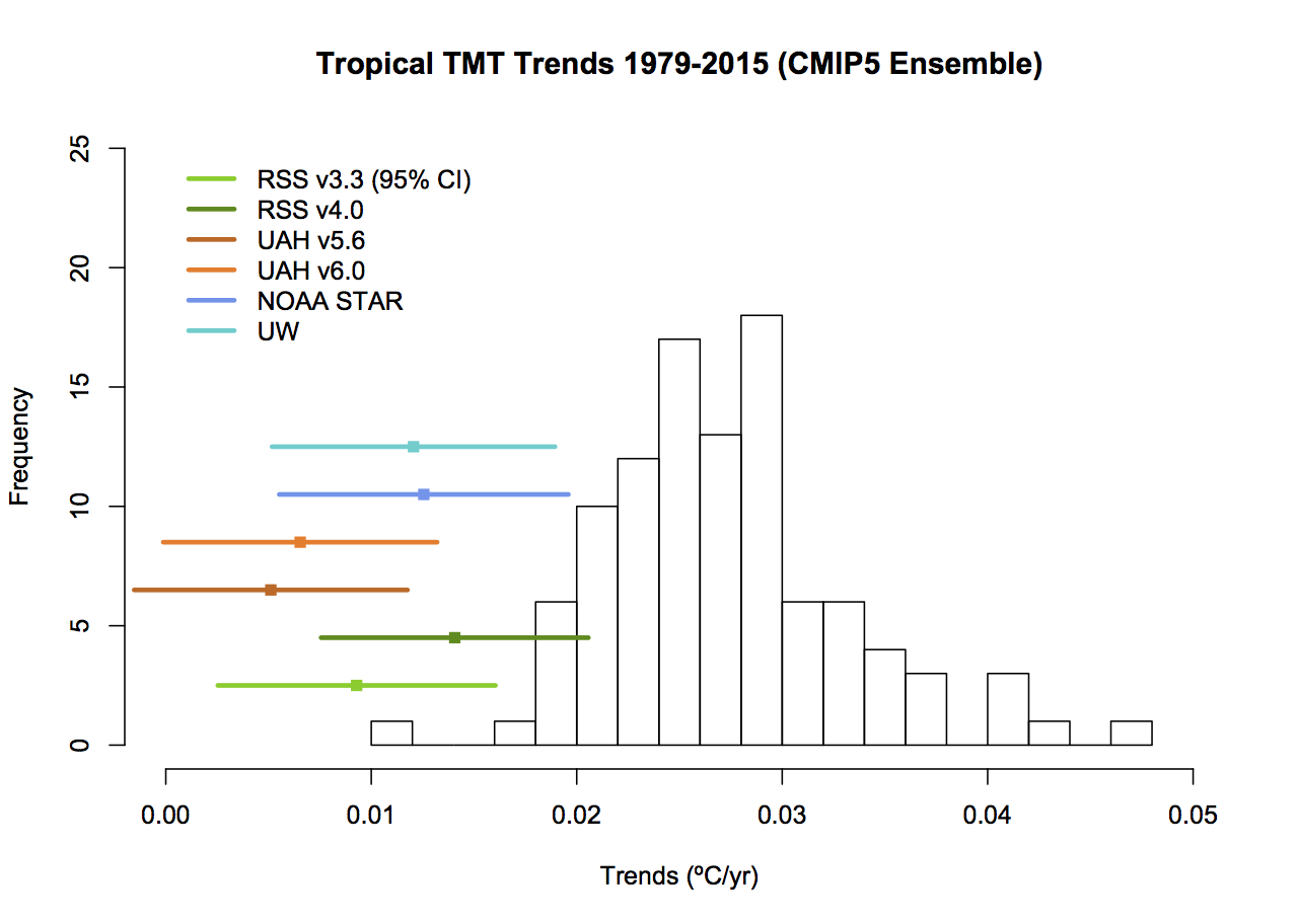
The trend histograms show far more information than Christy’s graphs, including the distribution across the ensemble and the standard OLS uncertainties on the linear trends in the observations. The difference between the global and tropical values are interesting too – there is a small shift to higher trends in the tropical values, but the uncertainty too is wider because of the greater relative importance of ENSO compared to the trend.
If the 5-year (padded) smoothing is really wanted, the first graphs would change as follows (note the trend plots don’t change):
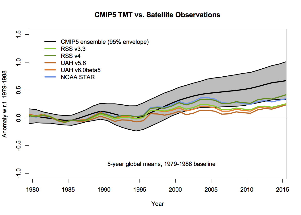
but the last two years will change as new data comes in.
So what?
Let’s remember the point here. We compare models and observations to learn something about the real world, not just to score points in some esoteric debate. So how does a better representation of the results help? Firstly, while the apparent differences are reduced in the updated presentation, they have not disappeared. But understanding how large the real differences actually are puts us in a better position to look for plausible reasons for them. Christy’s graphs are designed to lead you to a single conclusion (that the models are too sensitive to forcings), by eliminating consideration of the internal variability and structural uncertainty in the observations.
But Christy also ignores the importance of what forcings were used in the CMIP5 simulations. In work we did on the surface temperatures in CMIP5 and the real world, it became apparent that the forcings used in the models, particularly the solar and volcanic trends after 2000, imparted a warm bias in the models (up to 0.1ºC or so in the ensemble by 2012), which combined with the specific sequence of ENSO variability, explained most of the model-obs discrepancy in GMST. This result is not simply transferable to the TMT record (since the forcings and ENSO have different fingerprints in TMT than at the surface), but similar results will qualitatively hold. Alternative explanations – such as further structural uncertainty in the satellites, perhaps associated with the AMSU sensors after 2000, or some small overestimate of climate sensitivity in the model ensemble are plausible, but as yet there is no reason to support these ideas over the (known) issues with the forcings and ENSO. Some more work is needed here to calculate the TMT trends with updated forcings (soon!), and that will help further clarify things. With 2016 very likely to be the warmest year on record in the satellite observations the differences in trend will also diminish.
The bottom line is clear though – if you are interested in furthering understanding about what is happening in the climate system, you have to compare models and observations appropriately. However, if you are only interested in scoring points or political grandstanding then, of course, you can do what you like.
PS: I started drafting this post in December, but for multiple reasons didn’t finish it until now, updating it for 2015 data and referencing Christy’s Feb 16 testimony. I made some of these points on twitter, but some people seem to think that is equivalent to “mugging” someone. Might as well be hung for a blog post than a tweet though…


Good article.
Though there is one point that needs more effort; comparing model based surface trend with satellite TMT channel trend. Of course the mid troposphere trend is lower than surface trend and TLT trend.
Satellite data nicely proves the greenhouse warming.
Important question is are the model runs direct surface temperature runs, or somehow tweaked to 10km. My guess is that it is just surface data.
So Christy is comparing apples and oranges.
Christy actually is comparing TMT with a similar comparison of the atmosphere from CIMP5 model. So, it's now what he's comparing that's misleading, it's how he's doing it.