Lessons from the Whitehouse-Annan Wager
Posted on 18 January 2012 by dana1981
In 2008, David Whitehouse (former BBC science correspondent with an astrophysics doctorate) made a wager with James Annan (climate scientist and statistics expert) involving global temperature data. Whitehouse wagered that the temperature data from the British Hadley Centre and University of East Anglia (HadCRUT) would not break its record high annual global temperature, which at the time was set in 1998, by 2011. The BBC, which coordinated the bet, recently declared Whitehouse the winner, although as we will see below, the true outcome is not entirely clear.
Predictably, particularly given the extremely poor performance of climate "skeptics" when it comes to climate predictions, the usual climate denial enablers are trumpeting the Whitehouse "victory" far and wide.
However, the stars had to align for Whitehouse to have a chance to win this bet. 2005 and 2010 were hotter than 1998 in the two other major surface temperature data sets, and likely will be in the soon-to-be updated HadCRUT data as well. The current HadCRUT data (HadCRUT3) has a known cool bias because it excludes several large regions which lack temperature station coverage, and also happen to be warming quite rapidly (such as the Arctic). Additionally, short-term natural effects dampened human-caused global warming over much of the 2008-2011 period. Despite this fact, the long-term human-caused global warming trend continues ever upward underneath that short-term natural noise.
More important than the winner of the bet is what we can learn from it. The main lesson here is that short-term temperature changes are quite unpredictable, as natural effects can overwhelm the steady greenhouse gas-caused warming over short timeframes.
It Begins
Our story begins in December of 2007, when Whitehouse penned an article for New Statesman in which he repeated the myth of no global warming since 1998 several times. This argument has two glaring fundamental flaws. First, most global warming is going into the oceans, not the air, and the rise in the Earth's total heat content has not abated.
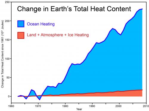
Figure 1: Total global heat content, data from Church et al. (2011)
Secondly, ten years is too short of a timeframe to determine if the warming has stopped anyway, because short-term noise can easily overwhelm the long-term global warming signal over such short timeframes, as happens on a regular basis (Figure 2).
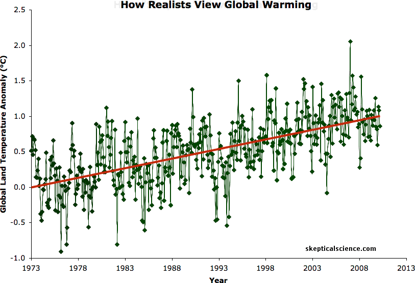
Figure 2: BEST land-only surface temperature data (green) with linear trends applied to the timeframes 1973 to 1980, 1980 to 1988, 1988 to 1995, 1995 to 2001, 1998 to 2005, 2002 to 2010 (blue), and 1973 to 2010 (red). Hat-tip to Skeptical Science contributor Sphaerica for identifying all of these "cooling trends."
To his credit, in his 2007 article Whitehouse acknowledged that short-term effects may have been the cause of the temporarily slowed warming of global surface temperatures. Unfortunately he also posited a second, wholly unsupported possible explanation:
"we are led to the conclusion that either the hypothesis of carbon dioxide induced global warming holds but its effects are being modified in what seems to be an improbable though not impossible way, or, and this really is heresy according to some, the working hypothesis does not stand the test of data."
It's not improbable that short-term noise could dampen the long-term global warming signal. In fact, as Figure 2 shows, it happens quite frequently, but the steady rise of human-caused global warming always wins out in the end.
Whitehouse failed to explain exactly how or why the human-caused global warming theory would fail to "stand the test of data," and the proposition is a strange one, since Whitehouse also admits that rising greenhouse gases will undeniably cause the planet to warm.
A number of climate scientists took issue with the "warming has stopped" myth put forth by Whitehouse and other climate "skeptics," and they were debunked by Gavin Schmidt and Stefan Rahmstorf at RealClimate, and by James Annan on his blog, among others.
The BBC program More or Less set up a wager between Annan and Whitehouse for £100 that, according to HadCRUT, there would be no new record set by 2011. Being a statistics expert, Annan ran the numbers and estimated the odds of a record by 2011 at 87.5%, so he accepted the bet.
Annan's Science vs. Whitehouse's Gut
The basis of Annan's calculations is a simple one - greenhouse gas emissions are rising at a steady rate, and this rise is currently causing approximately 0.02°C warming of the global surface temperatures every year. The challenge is that this human-caused warming can easily be overwhelmed by natural effects over short timeframes. For example, a strong El Niño or La Niña can have a 0.2°C warming or cooling effect, respectively, on global temperatures for a given year.
However, over the long term the temperature effects of the El Niños and La Niñas offset each other, while the steady human-caused warming trend continues to rise. Annan's logic was that between 2008 and 2011 there would be a year in which the short-term natural effects aligned to amplify the human-caused warming trend, leading to a record hot year.
The basis for Whitehouse's end of the wager was on much shakier scientific footing:
"Looking at HadCrut3 it is clear that there isn’t much of an increase in the 1980s, more of an increase in the 1990s, then there is the big 1998 El Nino, followed by no increase in the past decade or so. It therefore seemed far more likely that the temperature would continue what it had been doing in the recent past than revert to an upward trend, in the next few years at least."
In short, Whitehouse bet that whatever had caused the temporary slowdown in surface warming would continue, despite the fact that he apparently did not comprehend its causes. However, Whitehouse was fortunate in that the short-term cooling effects did indeed continue to impact global temperatures.
Mother Nature Intervenes
The main influences on global temperatures are
- human greenhouse gas emissions
- human aerosol emissions (another byproduct of fossil fuel combustion which blocks sunlight, causing cooling)
- the El Niño Southern Oscillation (ENSO; El Niños and La Niñas)
- solar activity
- volcanic activity
Human nature did not help Annan's case either, as human aerosol emissions appear to have increased since 2000, offsetting some of the greenhouse gas-caused warming. But Mother Nature certainly did not work in Annan's favor over the 2008-2011 timeframe.
Solar activity is relatively stable, and thus tends to have a relatively small impact on global temperature changes. However, 2008-2010 was in the midst of the longest solar cycle minimum in a century, which had a cooling effect on global temperatures over that period, working in Whitehouse's favor.
Additionally, 2008 and 2011 were both influenced by strong La Niñas. In fact in 2011, La Niña had the fifth-strongest cooling effect on any year since 1950, and nevertheless was the hottest La Niña year on record, according to the World Meteorological Association. 2009 and 2010 both saw relatively moderate ENSO conditions, and thus were Annan's only real chances of winning the wager. Neither quite broke the 1998 record in HadCRUT3. However, HadCRUT was a rather poor choice of data sets on which to base this wager.
HadCRUT3 Cool Bias
At the end of 2009 (too late to influence the Whitehouse-Annan wager), an analysis by the European Centre for Medium-Range Weather Forecasts (ECMWF) determined that the HadCRUT3 data is biased on the cool side:
"The new analysis estimates the warming to be higher than that shown from HadCRUT's more limited direct observations. This is because HadCRUT is sampling regions that have exhibited less change, on average, than the entire globe over this particular period."
As ECMWF notes, the main problem is that HadCRUT3 lacks temperature station coverage in areas like the Arctic and north and central Africa (Figure 3), where the other data sets (which use different methods to extrapolate for the areas which lack coverage) show these are some of the most rapidly-warming areas on Earth.
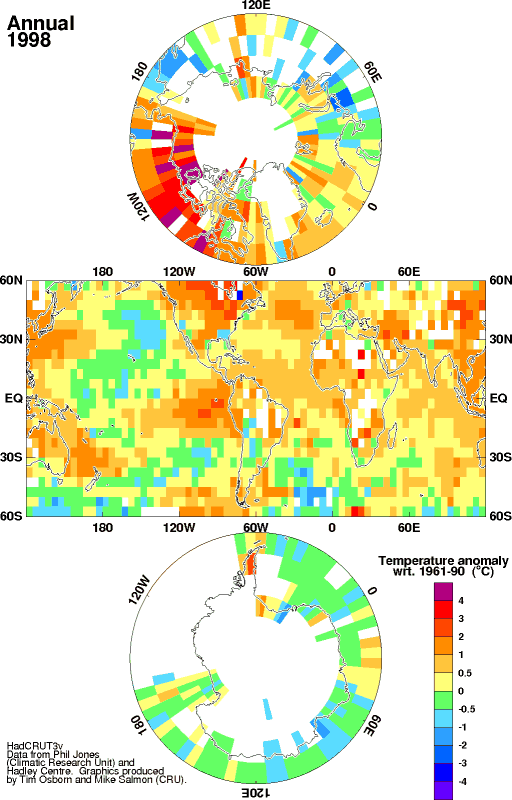
Figure 3: HadCRUT station coverage and temperature anomalies. Note the lack of coverage at the poles and portions of Africa.
The conclusion that HadCRUT3 data has a cool bias was subsequently supported by the Berkeley Earth Temperature Station (BEST) project, which conducted an independent analysis of global surface temperature data. The BEST results were in good agreement with estimates by the NASA Goddard Institute for Space Studies (GISS) and National Oceanic and Atmospheric Administration (NOAA), but showed more warming than HadCRUT3 data, particularly since 2000 (Figure 4).

Figure 4: The decadal land-surface average temperature from BEST using a 10-year moving average of surface temperatures over land. Anomalies are relative to the Jan 1950 - December 1979 mean. The grey band indicates 95% statistical and spatial uncertainty interval.
In fact, the wager would not have worked if Whitehouse and Annan had used GISS or NOAA data, because in both of those data sets, 2005 had already exceeded the 1998 temperature record. Additionally, in both data sets, 2010 was statistically tied with 2005 as the hottest year on record (Figure 5). Thus, as Annan noted in a follow-up story on the wager with More or Less, he arguably would have won the wager using either NOAA or GISS data.
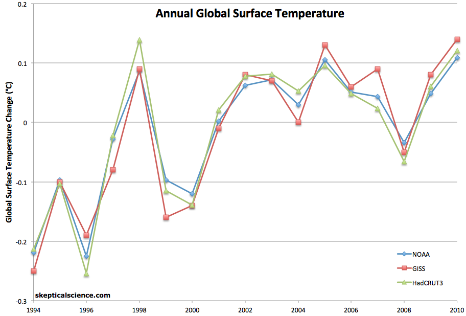
Figure 5: NOAA (blue), GISS (red), and HadCRUT3 (green) annual average global surface temperature anomalies, with 1995-2010 baseline. 2010 and 2005 are the two hottest years on record in NOAA and GISS data.
A HadCRUT Update is Forthcoming
Hadley and U. of East Anglia are currently in the process of updating their data set to include additional Russian and Arctic temperature data, amongst other revisions. It appers that consistent with NOAA and GISS, 2005 and 2010 temperatures will exceed 1998 in the resulting HadCRUT4 data set.
Thus it appears that in 2008, the peak of 1998 had already been exceeded in every major surface temperature data set, including HadCRUT, once the HadCRUT4 results are finalized. Subsequent to 2005, it appears that as with the NOAA and GISS data, 2010 will be statistically tied with 2005 as the hottest year on record in HadCRUT4.
However, the long-term trend is more important than individual record years, and despite the short-term dampening of global surface warming, the underlying, steady march greenhouse gas warming continues, as demonstrated by Foster and Rahmstorf.
Foster and Rahmstorf Confirm Annan's Premise
Foster and Rahmstorf (2011) sought to identify the underlying global warming trend by filtering out the effects of solar and volcanic activity and ENSO using a statistical multiple linear regression technique. They found that in every single data set, once these short-term natural effects are removed, 2009 and 2010 were the two hottest years on record (Figure 6), and that the global warming trend has remained remarkably steady underneath that short-term natural noise.
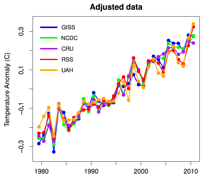
Figure 6: Annual averages of the surface temperature data with the effects of solar and volcanic activity and ENSO removed by Foster and Rahmstorf (2011)
Global Warming Continues
Most importantly, we shouldn't allow this bet to distract us from the scientific evidence. As shown above, regardless of our wagers and wishes, the planet continues to warm. While statistically speaking, a new record will inevitably occur over the next few years, short-term temperature changes are nevertheless inherently difficult to predict. Nevertheless, underneath all of that short-term natural noise, the steady march of greenhouse gas warming continues ever upward, and will always win out in the end until we do something to change that.

Arguments


The number of stations is not a direct indicator of coverage: GISTEMP achieves much better coverage by allowing every station to cover an equal circle of 1200km radius, where in HADCRUT the coverage of a station is a 5x5degree box, which gets smaller as you move to higher latitudes.
Can we find out what the impact of the lack of coverage of HADCRUT is? Tom Curtis suggested a simple approach which I've now implemented. Gridded anomaly maps are produced by all 3 sources. I downloaded all of these, and put them on a common 1x1 degree grid. As a check I made sure I could reproduce the published temperature series from my gridded maps. Then I tried blanking out any cell in the GISTEMP map which was also missing in the corresponding HADCRUT map from the same month. I calculated a temperature series for the resulting map. The results are shown in the following graphs:
(a) 60 month moving average
(b) 12 month moving average from 1970
What this tells us is that if the GISTEMP temperature reconstruction is correct, then we would expect HADCRUT to underestimate temperatures since 2001 simply on the basis of its poor sampling of the temperature field. That is exactly what we do observe. That doesn't prove that GISTEMP is right, but it is strong evidence that HADCRUT shouldn't be relied upon. We'll know more once BEST release a gridded dataset.
Why does the divergence only occur after 2001? I did an additional set of comparisons masking all the maps with single years of data, either 1985 or 2007. The 2007-masked data shows about twice the divergence as the 1985-masked data. That suggests that roughly half the divergence is due to changes in coverage since 2000, while the other half is due to changes in the geographical distribution of anomalies changing the effect of the missing data.
GISTEMP does not achieve any better coverage - it extrapolates. Large portions of Africa, Antarctica, and Greenland remain un-measured.
As to whether the extrapolation is accurate, that remains speculative - one cannot verify extrapolations with non-measurments.
Actually, it's anything but speculative. Station contributions are geographically center-weighted in a 1200km radius, based upon excellent data as to how these anomalies relate. See Hansen and Lebedeff 1987, Fig. 3, for temperature anomaly correlations between stations having >50 years of data in common. They clearly show the very strong correlation versus distance relationship, including results for various latitudes.
Measured correlation, ClimateWatcher. That's not speculative at all.
Well it is speculative to some degree to use correlation to explain extrapolations in very dynamically different locations such as by Gistemp. However, HadCRU does an extrapolation itself... it assumes that the unextrapolated areas are changing at the rate of the rest of the planet... to say that the arctic is warming only as quick as the entire planet is much more dubious.
My disagreement with CW is that, while having some uncertainties (until we cover every square meter of the planet in thermometers), the correlations of temperature anomaly are not speculative, but rather based on quite a lot of data.
lol that sounds really stupid. Actually I hope I lose that bet but bet that I won't.
Don't need every square meter, but if there are no measurements within a 5x5 degree box...
The GISS process amplifies the readings around the un-measured areas. When the anomalies are positive around an unmeasured area, the GISS will be higher than CRU. When the anomalies are negative around an unmeasured area, the GISS anomalies will be lower than the CRU.
This is why the variability ( from month to month ) of GISS is greater than CRU.
That's also why the GISS was 0.4 K/century LOWER than the CRU from 1910 through 1945.
And it's why the GISS was 0.3 K/century HIGHER than the CRU from 1979 through 2011.
In the longer term, for the period 1900 through 2011, CRU = GISS at 0.7 K/century.
When one uses the GISS online tool and uses the 250km smoothing, the results are quite similar to CRU ( they're using the same stations after all ).
There are at least five reasons why GISTEMP could show a greater month to month variability than HadCRUv3:
1) HadCRUTv3 uses less than as many 51.9% as does GISTEMP,with reduced stations resulting in greater variability;
2) HadCRUTv3 has less than 82.7% of the surface area coverage of GISTEMP (and less than 88% of the surface area coverage of NCDC), with less coverage resulting in more variability;
3) The HadCRUTv3 5 degree grid weights tropical stations more strongly than temperature zone stations, and temperate zone stations more strongly than sub-arctic stations. As climate variability increases strongly as you move away from the equator this would artificially result in less variability in HadCRUTv3 than in a strict distance based weighting method as used by GISTEMP (I suspect this is a major, if not the only cause);
4) As I understand it, HadCRUTv3 handles the land ocean interface differently than does GISTEMP, with CRUTEM3 (the land only product) including sea surface temperatures from withing the the 5 degree cell in determining Land temperatures, with a consequent reduction in variability. (This is a technical point on which I am not fully clear. Perhaps Kevin C could elaborate on how much of a factor it would be.); and
5) The areas which HadCRUTv3 does not cover tend to be concentrated in polar regions and areas of high aridity (Sahara desert, Middle East) both of which are regions of higher than average variability in temperature, thereby under sampling total variability.
Isn't it amazing how you (Climate Watcher) have managed to pick out as the only relevant factor from these five the only factor which would suggest HadCRUTv3 is more reliable than GISTEMP, and unerringly picked it out without any need for actual numerical analysis?
As monthly variability is highly correlated with expected temperature trend due to global warming; the most likely reason for the reduced trend in HadCRUTv3 compared to GISTEMP is the reduced number of stations, the tropically weighted index (due to grid area), and the reduced spatial coverage. That this is the case in confirmed by the fact that by adding additional Russian and Arctic stations, HadCRUTv4 has a higher trend than does v3, and much closer to that of GISTEMP.
You do understand basic geography, I hope - and that at the poles a 5x5 degree box becomes a very small area? Basic distance is a much better criteria than degrees, as it's invariant over the globe. Thou doth protest too much, methinks (Hamlet, Act III, scene II)...
Talking to Nick is also a good idea - his method gives a complete global reconstruction using a very different approach to GISTEMP.
The GISS station count is based on the new GHCNv3 version (introduced 11/2011). All the station counts are the number of record present in the raw data - a few records may be dropped before use. The coverage figures and map for GISS are however from the v2 version - I need to update this, but I doubt you'll be able to tell the difference.
This kind of error was made by Roger Pielke Jr in his blog article "How Many Findings of the IPCC AR4 WG I are Incorrect? Answer: 28%", where he calculated that assuming that the IPCC assessments of their probabilistic projections were correct, 28% of those projections would turn out to be incorrect. This is (approximately) true, and only something to make a fuss about if you don't understand why probabilistic predictions/projections were made probabilistically! The IPCC expect 28% to be incorrect and were quite explicit about it.
i.e. a 72% chance of serious, human caused global warming?
However the probability of serious human caused global warming is rather higher than this as not all of those projections directly relate to events with a serious outcome.
The basic point is that if you observe a die to have sixes on five sides and a one on the other, then you would be perfectly rational to accept an even bet on throwing a six, and if you lost it would not mean that your assessment of the situation was wrong!
http://www.4shared.com/photo/d_rL-9Tp/Climate4U_Compoosite.html
from Climate4you:
http://www.climate4you.com/
it would appear that Whitehouse won hands down.
That graphic you link us to is of such poor quality one cannot differentiate the traces, so I'm not sure that graphic (from an unvetted source mind you) supports your opinion.
You also clearly missed the caveats noted in the OP. The question is not really whether or not he won-- using the problematic HadCRUT3 he did win, using the improved HadCRUT4 or any of the other global surface temperature products he lost. The purpose of the post above is, as the titles states, "Lessons from the Whitehouse-Annan Wager".
What lesson do you think "skeptics" are taking from this? I bet some are erroneously taking this as meaning a) AGW is a hoax, b) the warming has stopped, c) It has not warmed as much as expected so there is no reason for concern for doubling or quadrupling CO2. All those interpretations would be wrong (b and c are refuted here (and here) and here, respectively) and would miss the big picture.
And in the meantime, the climate continues to accumulate energy as shown in Fig. 1 in the OP.
IMHO making predictions is a mug's game -- too many variables (or black swans). Just stick to probabilities.
There are several problems with this type of betting, especially in the way that they are understood by the lay populace. Another way of perceiving such wagers is to put the intent in the context of saying that the bet-placers are in fact betting on a particular rate of warming - say, of around 0.2 C per decade - with random noise overlaid.
The first problem is that a pattern of warming even slightly less than the approximate rate that is currently being exhibited suddenly becomes, under the usual framings of the wager as is understood by the non-scientific audience and by dissemblers of the science, proxy evidence that there is no warming at all - especially when the starting point is predicated on the most extreme cherry-pick possible. Such is the trumpetted (if not the real) outcome of the Whitehouse-Annan wager.
The second problem is that such wagers are vulnerable to short-term random variations, where the wagers are concluded in the short term. Of course, this issue impinges on the previous point too...
Having said this, I've recently challenged a number of denialists with significant stakes dependent on the breaking of records. However, my wagers were structured using time spans that permit the signal to emerge over the noise - essentially my wagers were allowing the longer-term rate signal to irrefutably emerge.
Curiously, not a single climate change denier has had the courage to accept my wagers.
I guess that the lesson is not to not bet against extreme outlying cherry-picks, but to do so carefully. In more ways that one it's all about separating signal from noise.
You might try downloading the figure, and then enlarge it. Or go to climate4you.com under the Global Temperature tab.
As far climate4you.com goes, they have the primary data sources listed with the graph, which I use in my analysis, so I have no problem with them.
And no, I did not miss the point. There is nothing like putting a little “skin” in the game, and clearly defined rules.
Doc Snow @ 22
Looking at the data on my posted figure, I would think that Whitehouse would have a good chance to collect some more money. First however, I have to remember how to correctly post links & images,
[DB] Climate4you is a well-known disinformationist site, as has has been illustrated by various SkS blog posts here and here.
This fact was well known to James Annan. It is highly probable, therefore, that he would not have made his bet based on a satellite temperature index, or insisted on a longer period before being confident of a higher record.
As it happens, in two out of three existing Global Surface Temperature records, Annan would have won on. In particular, by the NCDC index, both 2005 and 2010 where hotter than 1998, with 2010 being the hottest. GISTEMP has 2005, 2007 and 2010 being hotter than 1998. (See figure 5 in the main article.)
Further, the bet was made with regard to annual temperatures, not monthly. That makes a large difference. According to GISTEMP, for example, the hottest month on record occurred in March 2002, but the hottest years on record are 2005 and 2010. The difference is that while March 2002 was exceptionally hot, the other months of the year where not, while in 2010 most months where unusually hot, lifting the annual average higher.
Indeed, with regard to monthly temperatures, Annan would have won his bet, for HadCRUTv3 shows a higher monthly temperature in February 2002 (1.0 degree C anomaly) and January 2007 (1.104 degree C anomaly) than the highest monthly temperature recorded temperature in 1998 (0.968 degree C anomaly in April)
So, for both these reasons, use of your graph for comparison in this issue is disingenuous at best.
And the website it comes from has a loud pro-pollutionist bias. It turns the overwhelming evidence of physics, chemistry, and biology; that gets synthesized into modelled projections; as ... 'groupthink'.
The bigger picture was that bet he made with the Russians (is it still on?) betting warmer/cooler 1998-2003 versus 2012-2017. The bet had $10,000 of bite to it, and it really does measure whether AGW shows up with 15 years of more pollution.
Enjoyed the article in general. I guess it's like betting on a usually winning racehorse that has occasional off days!
while I may look at climate4you, and they do have some good graphs, which I have checked out, I make it a point of using primary sources.
owl905 & 29
here is a ref. to a graph using yearly HadCRUT3gl data up to 2009, which I did last year. In addition I used some different filters to evaluate to reduce the "noise". These included the MOV, MATLAB "filtfilt" (Chev 2-pole), & Fourier Convolution. Filter cutoff for the upper was 10 years, while the lower had 30 yrs.
http://www.4shared.com/photo/3P7Sufpf/Filter_Comp_10_30yr.html
I still think Whitehouse made a good bet, and when I update this with 2011 data, I bet he could win again, since the above curves indicate a plateau or maybe a dip.
DB,
question, when you do a preview, are posted images, or referenced images, checked for the correct format?
[DB] "when you do a preview, are posted images, or referenced images"
If they are in a standard graphic format such as ,jpg, .gif or .png, then yes. Other formats may work, but the Preview function will show what will post. If the Preview shows only an image outline or no image, then no.
Images and grphics contained in .pdf's normally cannot be linked directly (except if they contain embedded hyperlinks). Use a screen capture utility such as MWSnap to extract them, then upload to a hosting service or to a blog of your own to then reference them.
Wiki pages often have images on a root page, so ensure the URL string ends in a graphics format (such as .jpg) before linking.