Climate Science Glossary

Term Lookup

Enter a term in the search box to find its definition.

Settings

Use the controls in the far right panel to increase or decrease the number of terms automatically displayed (or to completely turn that feature off).

Term Lookup

Settings


All IPCC definitions taken from Climate Change 2007: The Physical Science Basis. Working Group I Contribution to the Fourth Assessment Report of the Intergovernmental Panel on Climate Change, Annex I, Glossary, pp. 941-954. Cambridge University Press.

Home Arguments Software Resources Comments The Consensus Project Translations About Support

Bluesky Facebook LinkedIn Mastodon MeWe

Twitter YouTube RSS Posts RSS Comments Email Subscribe


Climate's changed before
It's the sun
It's not bad
There is no consensus
It's cooling
Models are unreliable
Temp record is unreliable
Animals and plants can adapt
It hasn't warmed since 1998
Antarctica is gaining ice
View All Arguments...


Username
Password
New? Register here
Forgot your password?

Latest Posts

Archives

On the reliability of the U.S. Surface Temperature Record

Posted on 22 January 2010 by John Cook

The website surfacestations.org enlisted an army of volunteers, travelling across the U.S. photographing weather stations. The point of this effort was to document cases of microsite influence - weather stations located near car parks, air conditioners and airport tarmacs and anything else that might impose a warming bias. While photos can be compelling, the only way to quantify any microsite influence is through analysis of the data. This has been done in On the reliability of the U.S. Surface Temperature Record (Menne 2010), published in the Journal of Geophysical Research. The trends from poorly sited weather stations are compared to well-sited stations. The results indicate that yes, there is a bias associated with poor exposure sites. However, the bias is not what you expect.

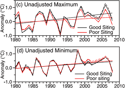
Weather stations are split into two categories: good (rating 1 or 2) and bad (ratings 3, 4 or 5). Each day, the minimum and maximum temperature are recorded. All temperature data goes through a process of homogenisation, removing non-climatic influences such as relocation of the weather station or change in the Time of Observation. In this analysis, both the raw, unadjusted data and homogenised, adjusted data are compared. Figure 1 shows the comparison of unadjusted temperature from the good and bad sites. The top figure (c) is the maximum temperature, the bottom figure (d) is the minimum temperature. The black line represents well sited weather stations with the red line representing poorly sited stations.
Maximum and Minimum Temperature Anomaly for good and bad sites
Figure 1. Annual average maximum and minimum unadjusted temperature change calculated using (c) maximum and (d) minimum temperatures from good and poor exposure sites (Menne 2010).

Poor sites show a cooler maximum temperature compared to good sites. For minimum temperature, the poor sites are slightly warmer. The net effect is a cool bias in poorly sited stations. Considering all the air-conditioners, BBQs, car parks and tarmacs, this result is somewhat a surprise. Why are poor sites showing a cooler trend than good sites?

The cool bias occurs primarily during the mid and late 1980s. Over this period, about 60% of USHCN sites converted from Cotton Region Shelters (CRS otherwise known as Stevenson Screens) to electronic Maximum/Minimum Temperature Systems (MMTS). MMTS sensors are attached by cable to an indoor readout device. Consequently, limited by cable length, they're often located closer to heated buildings, paved surfaces and other artificial sources of heat.

Investigations into the impact of the MMTS on temperature data have found that on average, MMTS sensors record lower daily maximums than their CRS counterparts, and, conversely, slightly higher daily minimums (Menne 2009). Only about 30% of the good sites currently have the newer MMTS-type sensors compared to about 75% of the poor exposure locations. Thus it's MMTS sensors that are responsible for the cool bias imposed on poor sites.

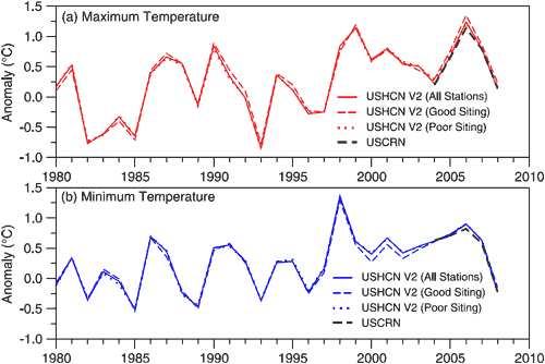
When the change from CRS to MMTS are taken into account, as well as other biases such as station relocation and Time of Observation, the trend from good sites show close agreement with poor sites.
Maximum and Minimum Temperature Anomaly for good and bad sites
Figure 2: Comparison of U.S. average annual (a) maximum and (b) minimum temperatures calculated using USHCN version 2 adjusted temperatures. Good and poor site ratings are based on surfacestations.org.

Does this latest analysis mean all the work at surfacestations.org has been a waste of time? On the contrary, the laborious task of rating each individual weather station enabled Menne 2010 to identify a cool bias in poor sites and isolate the cause. The role of surfacestations.org is recognised in the paper's acknowledgements in which they "wish to thank Anthony Watts and the many volunteers at surfacestations.org for their considerable efforts in documenting the current site characteristics of USHCN stations." A net cooling bias was perhaps not the result the surfacestations.org volunteers were hoping for but improving the quality of the surface temperature record is surely a result we should all appreciate.

UPDATE 24/1/2010: There seems to be some confusion in the comments mistaking Urban Heat Island and microsite influences which are two separate phenomenon. Urban Heat Island is the phenomenon where a metropolitan area in general is warmer than surrounding rural areas. This is a real phenomenon (see here for a discussion of how UHI affects warming trends). Microsite influences refer to the configuration of a specific weather station - whether there are any surrounding features that might impose a non-climatic bias.

UPDATE 24/1/2010: There has been no direct response from Anthony Watts re Menne 2010. However, there was one post yesterday featuring a photo of a weather station positioned near an air-conditioner along with the data series from that particular station showing a jump in temperature. The conclusion: "Who says pictures don’t matter?"

So the sequence of events is this. Surfacestations.org publishes photos and anecdotal evidence that microsite influences inflate the warming trend but no data analysis to determine whether there's any actual effect on the overall temperature record. Menne 2010 performs data analysis to determine whether there is a warming bias in poorly position weather stations and finds overall, there is actually a cooling bias. Watts responds with another photo and single piece of anecdotal evidence.

UPDATE 28/1/2010: Anthony Watts has posted a more direct response to Menne 2010 although he admits it's not complete, presumably keeping his powder dry for a more comprehensive peer reviewed response which we all eagerly anticipate. What does this response contain?

More photos, for starters. You can never have enough photos of dodgy weather stations. He then rehashes an old critique of a previous NOAA analysis criticising the use of homogenisation of data. This is curious considering Menne 2010 makes a point of using unadjusted, raw data and in fact, it is this data that reveals the cooling bias. I'm guessing he was so enamoured with the water pollution graphics, he couldn't resist reusing them (the man does recognise the persuasive power of a strong graphic).

0 0

Printable Version  |  Link to this page

Comments

Prev  1  2  3  

Comments 101 to 141 out of 141:

  1. Humanity Rules, you say in reference to the 'atest Watts/D'Aleo publication: Obviously prepared before the Mennes 2010 paper and based on the surfacestation.org project so I guess we now have both sides of the argument. The point of the top post is that Watts has always relied on anecdotes and photos to forward his argument that the official US temp records are unreliable, owing to UHI and microsite issues (mainly UHI). But never done the necessary number-crunching to make an actual quantitative comparison. We know from his own words that photos and anecdotes are insufficient. "...Actually what we want to find are the BEST stations. Those are the CRN1 and 2 rated stations. Having a large and well distributed sample size of the best stations will help definitively answer the question about how much bias may exist as a result of the contribution of badly sited stations." I learn from the latest publication you linked that:
    As of October 25, 2009, 1067 of the 1221 stations (87.4%) had been evaluated by the surfacestations.org volunteers and evaluated using the Climate Reference Network (CRN) criteria.
    And no analysis has been done. Again. Watts promised to run a time series of the good stations when 75% of the total had been surveyed. He had an opportunity to do this in the Heartland Institute booklet he published last year. He had the opportunity to do that in this latest publication but has not. He has the opportunity to do it at his blogsite any day of the week for a year. He could release his data and let others do it, as was being done a couple of years ago, when analysis of the then 17 good stations surveyed found a close fit to the official temp records. Ironic, isn't it, that he won't release his (meta) data. So, no, we are not now hearing the 'other side' of the argument on the US temp record. We are hearing the same old talking points, seeing the same photos and single-site graphs, and the same old lack of number-crunching that would "definitively answer the question about how much bias may exist as a result of the contribution of badly sited stations" [A Watts - 11/08]. Surfacestations.org, while highly agenda-driven, is nevertheless a useful contribution to station rating. It is news to no one that there are siting and other issues with the USHCN. GISS and NOAA attempt to adjust for these problems when compiling the temp records. Watts claims that they fail do that well, and denigrates and smears the scientists involved. In order to corroborate his claim he must run the analysis as he outlined in 2008, and promised on many occasions. It is now generally felt, by those paying attention, that he has done this analysis and discovered much the same as Menne et al and other publications on the same subject. And therefore he won't publicise that result. He has allowed my posts querying him on this (all but one, and I am unfailingly polite on this issue), but he never answers them. And none of his supporters ever takes up the call, or even replies to my requests. John V likewise made an appeal last year, and Watts immediately made it personal. It's like there is collective cognitive dissonance on this. No one wants to go there, but it is the fundamental analysis that must be done because it goes to the heart of Watts inquiry. It is the raison d'etre for surfacestations.org, and the inspiration for all that has followed in the land of Watts. When will he show us the money?
    0 0
  2. "Response: Note that the choice of the baseline period (eg - 1960 to 1990) has no bearing whatsoever on the temperature trend. As you say, the trend or "how much warmer" it's getting is what we're interested in when we look at temperature anomaly." I disagree. A trend in this case will be that the temp is going up, going down, or staying the same. That trend will have a slope. And I agree the temp. anomaly chart will show that trend, regardless of the base period, and the slope of the trend line will always be the same. But the magnitude of the temp change on an anomaly chart for any given year, or how much warmer that year was than average, is very much influenced by the baseline period. The 2000s where the warmest decade 'on record.' By including them in the baseline, you would increase the average temp over the entire baseline period, thus reducing the magnitude of the increase in temp in the 2000s "over the average." In doing so, the 1960s temp anomaly will apppear colder, because the baseline will be warmer than it was before the 2000s were included. If your intention is to find the trend line, then I agree the base period won't matter. But if you use the anomaly chart to argue "the 2000s showed an +0.513 C increase over the average, the baseline very much does matter.
    0 0
  3. "Response: Note that the choice of the baseline period (eg - 1960 to 1990) has no bearing whatsoever on the temperature trend. As you say, the trend or "how much warmer" it's getting is what we're interested in when we look at temperature anomaly." Trend lines on an anomaly chart don't show how much warmer its getting, only whether its getting warmer, getting colder, or staying the same. It also shows how fast that is happening by the slope of the trend line. And I agree the slope of the trend line won't chage based on the selection of the baseline period. But the "degrees in C" magnitude of the change for a given period, or how much warmer its getting in degrees, is very much affected by the baseline. Marcus' statement that the 2000s were +0.515 degreee C warmer is only true when the baseline was set in 1961-1990. If you change that baseline, you change the average, which means you'll change how much warmer teh 2000s were by comparison. If you included the warm 1990s, or the even warmer 2000s, in your baseline, the actually increase in degrees C 2000s won't be nearly so high. The selection of the baseline can very mcuh shape the "results," and should give everyone pause when provided with information like that. Lies, damn lies, and statistics...
    0 0
  4. If you change the baseline each successive decade, then decadal comparisons then become a more complicated exercise to say the same thing. Someone once told me that NSIDC chose their baseline to make later anomalies look bigger! In fact, they've considered switching to a 30-year base period, but it means that all their previous reports will be out of step (not on trend, obviously). Do they then go back and do the laborious task of making values on old web pages etc conform? No, better to keep the base period and save the trouble. sbarron, do you know there are statistical reasons for choosing those baselines for the temp records? They're not arbitrarily selected, and not to derive preferred magnitudes of anomalies (or they might easily have selected a much lower baseline - say 1880 - 1910, or the global temp at the year 1901...).
    0 0
  5. Sbarron, what total rubbish-the anomaly trend doesn't alter at *all*. For example, GISS & HadCru both use the baseline of 1961-1990, & get a warming trend of around +0.163 degrees per decade for the period of 1979-2009. RSS & UAH satellite data, which uses a baseline of 1979-2000, shows a warming trend of around +0.156 degrees per decade over the 1979-2009 period-very little difference in trend irrespective of the absolute values of the anomalies. Also, both sets of data show a general acceleration in the warming trend, with each decade warming by more than the preceding decade-a disturbing trend regardless of your baseline. Be that as it may, when compared to the 1961-1990 baseline, we see the average temperature anomaly for 2000-2009 being +0.515 degrees, when compared to the 1979-2000 average (which, as you yourself admit, includes the warm 1990's period-& which is mostly *after* accelerated global warming is believed to have begun) the average temperature anomaly for 2000-2009 is still +0.26 degrees. So I'm really curious, what *exactly* is the nature of your objection?
    0 0
  6. Barry also makes a good point. If I wanted to overstate the extent of the anomaly, I'd pick a 30-year baseline period like 1901-1930, when the average global temperature was 0.23 degrees colder than the 1961-1990 period. As far as I can tell, the baseline period was chosen because it occupies a period in history that was mostly stable for other, potential contributing climate change factors (solar, NAO, PDO, volcanoes etc etc). I can't vouch for it, but it seems to make sense.
    0 0
  7. Oh well, we now learn the obvious. If we change the baseline the number changes! I could say I live on the 10th floor of on the first, it's just a change of the baseline. Or I could say that mount Everest is 8000+ m high if I want to impress you, but i could say it's just 1000+ m; it's just a change of baseline again. In the first example the obvious choice of the baseline is ground level, in the second (average) sea level. Guess the obvious choice of the baseline when talking about warming from the pre-industrial era ... they're hiding the rise!!!
    0 0
  8. Riccardo, If it’s so obvious, Riccardo, why just yesterday did you say..."mathematically (and i'd say logically) the choice of the baseline is totally irrelevant?" And just to clarify, I never said if the baseline changes, the baseline changes. I said if the baseline changes, then a given year's or decade's anomaly from the baseline will likely also change. And as I already said, if we were talking trend lines, I'd agree that the baseline doesn't matter. But we're not talking trend lines, as Marcus was citing a specific temperature anomaly over the "baseline." That baseline was set at 1961-1990. Which also, unfortunately Riccardo, is not pre-industrial, if that is what your last post is intending to imply. Marcus, You must see the significance between whether temperatures in 2000-2009 increased by +0.515 degrees C or only +0.26 degrees C, right? barry, I bet there are statistical reasons for choosing certain baselines. And in the hands of scientists, for the purposes for which they're intended, those baselines work great. But don't you see how Marcus used the enormity of his "facts" to attempt to put down jparks skepticism? As Marcus later admitted in #105, depending on where you set the baseline, the 2000s temp might have only increased by +0.26 degrees C, and not +0.515 degrees C as he argued. So while the scientists haven't done anything wrong in selecting their baseline, and Marcus correctly cited their data, Marcus didn't really provide the whole story in making his argument. I don't mean to pick on Marcus. His post just happens to be a perfect example of why I'm skeptical. Specific information can be highlighted to make a point, but later we learn that the details tell a different story. Heck, that seems to be the exact same trouble the IPCC is having these days. You can make a persuasive argument using only the best facts that support it, but that doesn't make your position true. And while your intentions may have been sincere when you made your argument, when the rest of the facts come out it makes you look disingenuous.
    0 0
  9. As far as I can tell, the baseline period was chosen because it occupies a period in history that was mostly stable for other, potential contributing climate change factors (solar, NAO, PDO, volcanoes etc etc). I can't vouch for it, but it seems to make sense. IIRC, I have read that it is statistically preferable to choose a stable (no trend/little trend) period as a baseline.
    0 0
  10. I have been travelling so had limited time to read and digest but have found the exchange on this page to be especially enlightening - and gosh it appears I am a skeptic, oh dear. sbarron's last point is one I would echo. There is a lot for me to learn but if climate science looks like it is using 'tricks' to make me 'believe' something I will remain skeptical - I need to know that the data/baseline is good so that I can trust the trend it shows. You say a weather station sitting next to an a/c unit makes no difference - I just find that too hard to swallow. And today this: http://sppiblog.org/news/“horrifying-examples-of-deliberate-tampering-with-the-temperature-data” http://scienceandpublicpolicy.org/images/stories/papers/originals/surface_temp.pdf Tho' it is another Watts paper so maybe not welcome.
    0 0
  11. jpark and others, The "trend" that is temperature change is change across time. That trend is the "slope" of a graph of temperature on one axis and time on the other axis. By definitions of "trend" and "slope." The trend and therefore the slope will be unaffected by moving the entire plot up or down on the y axis (when the y axis is temperature). Moving the entire plot up or down on the y axis is exactly equivalent, by definition, of adding or subtracting a constant to all the temperatures. In other words, adding or subtracting a constant to all the temperatures does not change the trend of temperature across time. All the above is grade-school math. Not smoke and mirrors.
    0 0
  12. Tom, thanks. I do understand the idea of trends - I do get it, the penny is dropping. But is that it? If that is the totality of the AGW argument (eg. who cares how poorly sited the temp station is) then it looks like the idea is in big trouble. There is too much out there saying the data has been fixed and too little documentation and rebuttal of the charges. Sorry - am repeating myself.
    0 0
  13. jpark wrote "You say a weather station sitting next to an a/c unit makes no difference - I just find that too hard to swallow." It makes no difference to the anomaly--to the change across time. The instrument on black asphalt might be five degrees hotter than an instrument 50 feet away, but that difference is constant across days. Monday, the asphalt instrument reads 55 degrees F, and the distant instrument reads 50 degrees F. Tuesday the overall air temperature in that local area is two degrees higher than it was Monday. So the asphalt instrument reads 57 degrees and the remote instrument reads 52 degrees. The change across days is 2 degrees regardless of which instrument you use. Both instruments accurately reveal the change in temperature of the ambient air. That consistency of change across time when measured by "nearby" instruments is not an assumption, nor a theoretical prediction. It is an observed fact. Observed over and over again. You personally can observe it by downloading and analyzing the temperature data.
    0 0
  14. this was good tho' http://www.theage.com.au/opinion/politics/be-alert-but-wary-on-climate-claims-20100126-mw7z.html
    0 0
  15. Sorry, my first sentence in my previous comment was supposed to be "It makes no difference to the change across time." (I was writing my two comments in parallel and copy-pasted wrong.)
    0 0
  16. Tom, true. But you lost the voter right there. 2 degrees 5 degrees, what the heck, who cares. Oh, ok then, I wont bother! (Only playing devils advocate there - not trying to be rude!)
    0 0
  17. jpark writes: "There is too much out there saying the data has been fixed and too little documentation and rebuttal of the charges." You have that exactly backwards. Watts only offers anecdotal evidence (look at this photograph!) and forceful assertions (the data are garbage!) But he refuses to actually do any quantitative evaluation of the trends. The paper discussed in this thread provides a study that was specifically designed to test Watts's claims. As it turns out, those claims are wrong. The impact of individual station siting on the temperature trend is minimal, what impact there is is mostly compensated for by the analytical process ... and insofar as poorly sited stations have a bias, they tend to be too warm in the early years and too cool in more recent years, which means they are underestimating the warming trend. I hope this helps.
    0 0
  18. Not really, Ned but thanks. I agree about the andecdotal evidence, I see the argument in Menne et al and appreciate it but - and I apologise for the repetition because it must be boring to read - if that is the best argument for countering Watts paper then Watts 'wins'. It may be ancedotal but it looks more real than all the trends of Menne et al. Might be an illusion, I dont know, that's why I was hoping I would find more here - that's it really.
    0 0
  19. Tom, Aren't we actually saying "the asphalt instrument reads 55 degrees F (+/- 2.5 degrees C for a type 5 station), and the distant instrument reads 50 degrees F (+/-0.5 degrees C, for a type 2 station)? And "Tuesday the overall air temperature in that local area is two degrees higher than it was Monday. So the asphalt instrument reads 57 degrees (+/- 2.5 degrees C for a type 5 station) degrees and the remote instrument reads 52 degrees (+/-0.5 degrees C, for a type 2 station)? Given that degree of error, can we be certain we can draw meaningful conclusions from the "consistent" 2 degree temperature difference found over those 2 days at these two sites? I'm not sure that repeating this process several hundred times, then averaging the results with similar stations creates any more meaningful info than can be had on day-to-day basis. I have not read all of Menne 2010, so maybe they address this. But so far, no one else has.
    0 0
  20. sbarron2000, any error is variation around the mean. The mean is unaffected. Averaging lets those variations cancel each other out--averaging across stations at the same time, and averaging across times (e.g., averaging all the daily measurements to produce a monthly mean, averaging the monthly means to produce a yearly mean). That's what statistics is about. Basic statistics. High school level. Not the least bit debatable.
    0 0
  21. jpark - so what you're saying is that the actual science doesn't matter, data doesn't matter, mathematical analysis doesn't matter, only anecdotes do. What you're saying is that the observation that jets leave contrails means that the chemtrail conspiracy is real. What you're saying is that anecdotes about vaccines leading to an increased incidence of autism is more important than all the scientific studies that have actual data showing no link. I can find anecdotes for anything, but data is what matters. Watts' surface station white paper was thoroughly demolished by Menne et al, and nothing you or Watts can say will change that. The only way that Watts has a prayer of recovering is if he does the actual data analysis he's refused to do for years and finds a fatal flaw in the Menne paper.
    0 0
  22. I dont find the Menne et al paper to be about anything real - clever maybe but if this is all about how clever you can be with data from thermometers next to air con units then it is really not at all convincing. I totally agree with your point about anecdotes - I just cant see the point of not answering the basic Watts point which is how can you possibly trust the data. Did you read http://sppiblog.org/news/“horrifying-examples-of-deliberate-tampering-with-the-temperature-data” ?
    0 0
  23. Thanks for the statistics info, Tom. After doing some research, it seems that if the errors found in the weather station measurements are random, they will be washed out by the averaging, and if they are systematic, they are washed out by using the anomaly chart. I like to see a follow-up study that used more than 40% of the available stations, though. Maybe Watts will do that one himself.
    0 0
  24. jpark writes: "I agree about the andecdotal evidence, I see the argument in Menne et al and appreciate it but - and I apologise for the repetition because it must be boring to read - if that is the best argument for countering Watts paper then Watts 'wins'. It may be ancedotal but it looks more real than all the trends of Menne et al. Might be an illusion, I dont know, that's why I was hoping I would find more here - that's it really." No offense, but it sounds like what you're looking for is entertainment, rather than actual science. That makes sense, since Watts's blog is basically about entertainment. (Or, to be more precise, entertainment with an ideological agenda....) I do hope you'll take some time to browse through the archives here. I think you'll come to agree that the clown show over at WUWT eventually gets old, but that reading and discussing science on a site like this has a lot more to offer.
    0 0
  25. sbarron2000 writes: "I like to see a follow-up study that used more than 40% of the available stations, though." Just curious -- do you expect that the results of such a follow-up study would be different? Because my understanding is that the anomalies are generally well-correlated over long distances (hundreds of km). So you should be able to get a good representation of the US from a relatively small number of stations (see, e.g., John V's analysis). Since the 40% are reasonably well-distributed spatially, my guess is that adding more stations won't have a major impact on these findings. I suspect that's the reason why Watts didn't actually follow through on his plans to provide a comprehensive analysis of the trend data when they reached 75%. If he did such an analysis, my guess is it yielded results similar to those shown here.
    0 0
  26. Nope, Ned, def for the science. I am not super familiar with Watts blog or this one here (I like Pielke Jr site tho) and am still learning the basics. There is a lot in the news that makes people like me who are not familiar with the science wonder what it is all about. But I must stop now because I dont think I am adding to the discussion any more - thanks for your patience and the links - will keep reading.
    0 0
  27. "But you lost the voter right there. 2 degrees 5 degrees, what the heck, who cares." Here jpark has a point. Indeed in our ascientific America or Europe or world or whatever, we see how it's diffucult to explain even the basic arithmetics of trend and anomaly. We have some examples in this discussion where we are dealing with supposedly interested and informed people. And Watts knows this very well, he knows that a picture is much more valuable than a graph and that the only thing that matter is to repeat the same claim obsessively.
    0 0
  28. sbarron2000 #108 "If it's so obvious, Riccardo, why just yesterday did you say..."mathematically (and i'd say logically) the choice of the baseline is totally irrelevant?" It was a joke ... a few weird analogies just to say that the baseline does not matters ...
    0 0
  29. sbarron2000 at 21:16 PM on 27 January, 2010 "If you're open minded, should you be so quick to dismiss skeptical discussions of this paper? I don't see how." This situation unlike many others (such as teasing out glacial mass balance, etc.) is extraordinarily simple. Mennes' paper nicely describes the gross effects that are going to entirely dominate the record. Further scrutiny may refine his result, but it's not going to change the main message.
    0 0
  30. Right, doug_bostrom. But you have to admit, even Menne says the results are counter-intuitive. If those are the numbers, then there you go. But I'll be interested to see if anyone challenges these findings.
    0 0
  31. jpark, you clearly don't get it for some reason. So let me try again, this time with a couple of quotes from my post on the Menne paper at scholarsandrogues.com "Watts says that the new station “may” report higher temperatures. But do we know for certain that it will? Determining what effect the AC unit and shade tree have on the temperature measurement requires an actual analysis of the temperature data from the new thermometer and location. Watts’ white paper has no such analysis." and "[Watts’ based that conclusion entirely on qualitative information known as “metadata” (information that may or may not affect the accuracy of a measurement) rather than on quantitative (mathematical) data analysis. With respect to thermometer measurements, the proximity of the thermometer to a heat source like an AC unit or an electrical transformer is metadata.... The problem is that metadata is a tool to determine if there might be a problem in the real data, but it takes actual data analysis to establish if there’s a problem." If you care to read the rest of it, here's the link: http://www.scholarsandrogues.com/2010/01/25/us-temp-record-reliable/ If you don't understand the importance of the Menne argument after all the explanations other commenters have offered here, after reading what John has written, after reading what I've written, then something else is is preventing you from reaching that understanding. It remains to be seen what that something else is.
    0 0
  32. Ned at 05:21 AM on 28 January, 2010 Ned writes: "Just curious -- do you expect that the results of such a follow-up study would be different?" If all of Menne's assurances about everything being well-correlated, and his sample sizes being significant, and his calculated temps are correctly independently verified, then no, I don't expect a different result. 40% of 1200 should be a big enough sample size to see how things work. But once the program is set-up, it should be easy enough to run those additional stations through and see what happens. And just at a glance, I wonder about how well represented some "grids" actually are. Texas has 13 sites, Illinois has maybe 30? CA has 40ish, but NM has 3? I couldn't hurt to get some more temp. data to fill in those big blank areas on the map in Figure 1, could it?
    0 0
  33. Keep in mind the difference between genuine curiosity and argumentativeness, and remember to keep the peace. The patience here is quite commendable.
    0 0
  34. sbarron2000 at 05:51 AM on 28 January, 2010 "But I'll be interested to see if anyone challenges these findings. " Reputations partially depend on it. I'm sure somebody's scorching a spreadsheet even now, trying to salvage the original hypothesis. It'll be a challenge, though. The basic mechanism at play is a lead pipe cinch. Want to see an actual skeptic? Look no farther than Mennes.
    0 0
  35. sbarron2000 asked "I think this is a lot of geospatial averaging of the monthly anomalies and the mean anomaly which goes on prior to actually making our comparisons of temperature anomalies, right? Why was this done? What is the effect of doing it? Would the results be different if you didn't? "Gridding," as geospatial averaging is called, is not just useful. It is essential because we are trying to measure the temperature of the Earth, not of the thermometers. The thermometer manufacturer might be interested in the thermometers themselves in order to assess, oh, say manufacturing quality, so the manufacturer might not care where the thermometers are located. But we use thermometers only as a means to measure the temperature of the Earth's surface. Measuring the temperature of the Earth's surface requires taking a representative sample of the Earth's surface. We do that by dividing the surface into equal sized grid squares and finding a single temperature for each grid square. Then we average all those. The result is an average temperature that equally weights every grid square. In contrast, if we simply averaged all the thermometers regardless of their location, we would have an unrepresentative sample of the Earth's surface. Imagine that on the entire Earth we had only 1,001 thermometers--1,000 in Death Valley but only one at the North Pole. If we simply averaged all 1,001 thermometers' temperatures, the resulting single temperature would be a gross overestimate of the Earth's temperature. It would be nice if our thermometers happened to be distributed completely evenly, because then we could take the shortcut of simply averaging all the thermometers. But in reality, thermometers are very nonuniformly distributed. So we must gather a representative sample of the Earth's surface by computing only a single temperature for each grid square. If one particular grid square happens to have 10 thermometers and another grid square happens to have only 1, then that first grid square's temperature (the average of those 10) probably will be a better estimate of that square's "true" temperature. But its estimate will not be biased in any direction, compared to the square having only a single thermometer.
    0 0
  36. Helpful? http://wattsupwiththat.com/2010/01/27/rumours-of-my-death-have-been-greatly-exaggerated/
    0 0
    Response: Already updated the article above responding to Watt's latest post, which is a little disappointing but understandable if he's saving his best material for peer review.
  37. Maybe not yet... quote: I realize all of this isn’t a complete rebuttal to Menne et al 2010, but I want to save that option for more detail for the possibility of placing a comment in The Journal of Geophysical Research. When our paper with the most current data is completed (and hopefully accepted in a journal), we’ll let peer reviewed science do the comparison on data and methods, and we’ll see how it works out. Could I be wrong? I’m prepared for that possibility. But everything I’ve seen so far tells me I’m on the right track.
    0 0
  38. ... I am behind the curve as ever ;-)
    0 0
  39. doug_bostrom at 17:07 PM on 27 January, 2010 doug, while being a scientist, it's not really the science of climate change I'm interested in, it's the politics. So no I haven't been clinging to any ideas for years. I keep coming back to John's website because I find it challenging and I try to critically appraise it for that reason. The reason I asked those question. Maybe summed up as is instrument change the only real factor in microsite issues of stations because come the adjustment process there appears to be multiple points at which data is adjusted. The following image is a site that got alot of coverage on skeptic sites, it's Darwin Airport, Australia. http://www.estatevaults.com/bol/_graph_cru-darwin7.jpg While there is a big jump in 1940 (maybe location change) there are also many small, positive changes from 1940-1980 giving an apparent trend. What is the justification for these if the Menne 2010 paper has ruled out almost all influence from microsite changes?
    0 0
  40. Update 28/1/10 John could you explain homogenization and interpolation and their relation to raw and adjusted data. because it seems what Watts is complaining about is the interpolation process which he call homogenization. I think!
    0 0
    Response: Interpolation and homogenization are two different things. The strict definition of interpolation is filling in the gaps between data (as opposed to extrapolation which is extending beyond your data). In the case of surface temperature, it's been observed that there is strong correlation of temperature anomaly between adjacent regions so interpolation into regions where no measurements have been taken can be done with some degree of confidence.

    This is also somewhat related to geospatial averaging - Tom Dayton posted a good explanation of that here... 

    Homogenization is the process of adjusting the data to remove spurious biases. For example, moving a weather station to a different location, changing the instrument that measures temperature or changing the time of day that the measurements are taken can all impose warming or cooling biases on temperature readings.
  41. HumanityRules, the use of the raw readings of a station to construct a long time serie is a myth, too many things change with time. Indeed, making a reliable time serie is the most difficult part and a lot of effort has been put to make the raw reading reliable over time. There is no way to extract usefull climatic information from raw data. You can get some general idea of the process from the NCDC itself; no mistery, no hiding.
    0 0
  42. A good rebuttal to D'Aleo and Watts is provided by John Nielsen-Gammon (Prof. of Meteorology at Texas A&M U., and Texas State Climatologist). But that portion of that blog post doesn't start until about one third of the way down; look for the paragraph that starts "Meanwhile," or Find "Watts." Includes a numerical example.
    0 0
  43. Jpark, talking of being "behind the curve", have you found the values of the long term trends in global temperatures from the RSS, RATPAC, GISStemp, CRU and NCDC data yet? Do you know why I keep insisting that you look at the long term trends in those global temperature data sets?
    0 0
  44. JPark, I have a question for you. Why are you having such a hard time understanding the findings of Mennes et al, despite the science being explained to you over and over? I do not sensing a sincere desire to learn on your part, but rather any opportunity to taunt and to obfuscate. Additionally, when posters here have provided very good arguments or explanations (which has been often), your retort has sometimes been to post yet another post from a political blog (WUWT). You seem to accept Anthony's pontification without question or critique. Why is that? I have a hypothesis, every time you close your eyes, you see Anthony's images of a station near a parking lot. If so, then you really do need to move beyond that. Someone called you a skeptic the other day, actually you are displaying traits of someone in denial about AGW, or those of a contrarian; rest assured, your actions show you to definitely not be a true skeptic. I'm hoping if you had a heart problem you would take the advice of the cardiologist and not that of say, your uncle Ben, who seems to be omniscient and very convincing at the dinner table with his anecdotes, but when his claims are checked out, most times they tend to be wrong. Watts by the way, is "uncle Ben".
    0 0
  45. trrll @ 79 - Watts and Pielke Snr. are working on a paper. Should be interesting to see what they come up with with double the stations to work with
    0 0
  46. In all of the explanations of the trend correlations described between the CRN 1 and 2 vs the CRN 3/4/5 sites, is there an implicit finding that there is a constant bias for a given site and that there is not a stochastic error term which is higher for the CRN 5 vs CRN 1 sites?
    0 0
  47. Doug @ 30 - "the lightbulb in the room" mind exercise. (Doug, may I change this a bit, and just for argument sake, I want the light to have a thick metal reflector on it to absorb some of the lights heat energy (yes I'm using an incandescent bulb!), so as to compare to an air field tarmac situation OK?) If the light bulb gets the sensor to read say 17C when the ambient room temp is 16C, then no anomaly will appear until the ambient room temp gets above 17C correct? Take another room also at 16C but no light bulb. With central heating, and both rooms were raised to 18C, then light bulb room would only show a 1C anomaly, whilst no light bulb room would show a 2C anomaly, correct? So though we know in fact that there is a true 2C anomaly, by averaging the two rooms anomalies we only get 1.5C so are thus under reporting by a full 1/2C. So is this what Menne is saying about a cooling bias? But wait, what if at night time, before going to bed, I turned the heat down in my house (again the rooms are at 16C, and sensor one reads 17C, sensor two 16C). Just for argument sake the rooms both loose 1/2C per hour and just for argument, the heat is lowered for 8 hours. Now the room with the sensor that has no light at the time the heat comes back on is reading 12C, but the sensor in the room with the light and heavy metal reflector is at about 13C (yes I grabbed this one out of thin air, but you get my point I hope). Now the combination of both rooms will show a bias towards warmth at about 1/2C. Of course this is a very simple thought experiment, but I hope you get my drift. Sightings really can make a difference. I don’t even want to try to think about a station getting the heat from an air conditioner during the day, then having a large temp drop during that clear starry night! I do not know if the bad sightings create a neg or pos on the anomaly, but it would be good to know in my opinion. Thanx for your time Doug.
    0 0
  48. Leo G, your third paragraph is incorrect because it has the thermometer acting as the thermostat for the central heater. Instead, put a separate thermostat somewhere else in the room and (somewhat unrealistically) so far away from the light bulb that the thermostat is completely unaffected by the light bulb. That results in the light bulb adding 1 degree to the thermometer, in addition to the ambient air's temperature. So when the ambient air temperature goes from 16 to 18, the thermometer also goes from 16 to 18, but then goes up an additional 1 due to the light bulb. The total is the thermometer reading 19, which is a rise of 2 from the starting value of 17. That is the same rise recorded by the thermometer in the room lacking the light bulb.
    0 0
  49. Leo G at 08:08 AM on 29 January, 2010 The artificially heated thermometer is going to be more or less at equilibrium with the cooler environment it sits in. If it were not able to attain that equilibrium it would not only be in violation of physics but it would continue warming forever, or at least until it burst into flames, melted or whatever. If the environment of the biased thermometer is warmed the equilibrium of the biased thermometer is disturbed, the upshot being that the biased thermometer will reflect changes in the ambient temperature of the greater space it occupies, even when the ambient temperature is still lower than the biased reading of the thermometer.
    0 0
  50. It would appear that 'skeptics' believe every station shift or microsite issue leads to a warm bias. this must be why they never, ever report on individual stations that have a cooling bias due to various non-climatic changes. What they do is collect examples of (possible and actual) warm biased stations and generalise from there. What needs to be done, and what has not been done by the skeptics, is the quantitative analysis that would show whether this assumption has merit. That does not prevent conclusions being drawn from anecdotes, unfortunately. In the Watts post on Menne et al we learn that the quantitative analysis is finally going to be done in an upcoming paper, but Even Jones advises further down in the comments that it 'won't do' to simply use the raw data from good stations - that something must be dug out because "more is going on". It will be ironic if they end up 'adjusting' the data, considering the overriding memes at WUWT. I look forward to the quantification of the project undertaken by surfacestations. Though much of the carry on at WUWT is woeful, I maintain that the rating of USHCN by Watts and collaborators is a boon to climatology.
    0 0

Prev  1  2  3  

You need to be logged in to post a comment. Login via the left margin or if you're new, register here.


The Consensus Project Website

THE ESCALATOR

(free to republish)


© Copyright 2024 John Cook
Home | Translations | About Us | Privacy | Contact Us