Climate Science Glossary

Term Lookup

Enter a term in the search box to find its definition.

Settings

Use the controls in the far right panel to increase or decrease the number of terms automatically displayed (or to completely turn that feature off).

Term Lookup

Settings


All IPCC definitions taken from Climate Change 2007: The Physical Science Basis. Working Group I Contribution to the Fourth Assessment Report of the Intergovernmental Panel on Climate Change, Annex I, Glossary, pp. 941-954. Cambridge University Press.

Home Arguments Software Resources Comments The Consensus Project Translations About Support

Twitter Facebook YouTube Mastodon MeWe

RSS Posts RSS Comments Email Subscribe


Climate's changed before
It's the sun
It's not bad
There is no consensus
It's cooling
Models are unreliable
Temp record is unreliable
Animals and plants can adapt
It hasn't warmed since 1998
Antarctica is gaining ice
View All Arguments...


Username
Password
New? Register here
Forgot your password?

Latest Posts

Archives

Does Urban Heat Island effect exaggerate global warming trends?

What the science says...

Select a level... Basic Intermediate

Urban and rural regions show the same warming trend.

Climate Myth...

It's Urban Heat Island effect

A paper by Ross McKitrick, an economics professor at the University of Guelph, and Patrick Michaels, an environmental studies professor at the University of Virginia, concludes that half of the global warming trend from 1980 to 2002 is caused by Urban Heat Island. (McKitrick & Michaels)

The Urban Heat Island Effect (UHI) is a phenomenon whereby the concentration of structures and waste heat from human activity (most notably air conditioners and internal combustion engines) results in a slightly warmer envelope of air over urbanised areas when compared to surrounding rural areas. It has been suggested that UHI has significantly influenced temperature records over the 20th century with rapid growth of urban environments.

Scientists have been very careful to ensure that UHI is not influencing the temperature trends. To address this concern, they have compared the data from remote stations (sites that are nowhere near human activity) to more urban sites. Likewise, investigators have also looked at sites across rural and urban China, which has experienced rapid growth in urbanisation over the past 30 years and is therefore very likely to show UHI. The difference between ideal rural sites compared to urban sites in temperature trends has been very small:


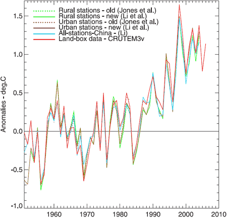
Figure 1. Annual average temperature anomalies. Jones et al (dotted green and brown) is a dataset of 42 rural and 42 urban sites. Li et al (solid green and brown) is an adjusted dataset of 42 rural and 40 urban sites. Li (blue) is a non-adjusted set of 728 stations, urban and rural. CRUTEM3v (red) is a land-only data set (Brohan et al., 2006). This plot uses the 1954–83 base period.

Another way to explore the UHI would be to look at where the majority of warming has occurred across the globe. The UHI should match where most people live. However, if you look at the 2006 global temperature anomaly (figure 2.), you find that the greatest difference in temperatures for the long term averages where across Russia, Alaska, far north Canada and Greenland and not where major urbanisation has occurred.


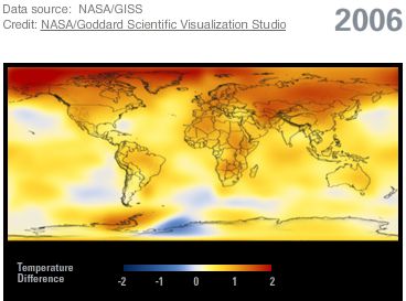
Figure 2. Using source data from NASA/GISS, this illustration shows the amount of change in global surface temperatures in 2006 from 1885.

The Urban Heat Effect has no significant influence on the record of global temperature trends.

Basic rebuttal written by mothincarnate


Update July 2015:

Here is a related lecture-video from Denial101x - Making Sense of Climate Science Denial


Last updated on 5 July 2015 by pattimer. View Archives

Printable Version  |  Offline PDF Version  |  Link to this page

Argument Feedback

Please use this form to let us know about suggested updates to this rebuttal.

Related Arguments

Further reading

  • The Modern Temperature Trend (by Spencer Weart). An in-depth history of surface temperature measurements since the late 1800's. If you find this lengthy article fascinating, you're a complete nerd (raises hand sheepishly).
  • The Power of Large Numbers (July 2007 by Tamino). Explores how we can discern with precision temperature trends with the statistical power of large numbers.

Further viewing

Comments

1  2  3  Next

Comments 1 to 25 out of 74:

  1. John I know this may sound strange but the Urban Heat Island Rffect is so far the only proof we have that there is AGW. The urban enviroment produces additional heat, moreso in some cities like New York because the public buildings are heated by steam piped in from a central location. To maintain boiler pressure it is bled off to the atmosphere daily. In addition the pipes are old, poorly insulated and leak. You dont get ice on the road in NYC. Add to that the fact that the heated surfaces take longer to cool and to have a positive man made input. Industy, especially steel and power plants produce extra year round heat. Every home and vehicle produce heat and in the case of vehicles its direct from the radiator and more since the clean air act because to decrease emissions the engine must run at least 10 degrees F hotter than a normal winter thermostat. We used to use 160 F for warm climates and 180 F for cool climates, now we use 190 F for both. So we do in fact have good evidence for AGW that does not involve GHGs at all. I do not believe the IPCC models account for this and I know they correct for stations in urban environments. What they should be doing is using two uncorrected data sets, One from rural stations only to see what the temperature actually is and another for urban environments to see how much is being added. Well I said it may sound strange.
    Response: There is no doubt temperatures are greater in urban areas than surrounding rural areas. The important question is does this mean the warming trend is greater? Jones 2008 looks at this and finds even though urban areas are warmer, the trend is the same. Another important question is whether developing urban areas have an impact when averaged out over large areas. Again Jones 2008 finds no impact.
  2. uuuuuh...is it me or are the colours all wrong? Canada, Greenland, Siberia all hotter than the Sahara desert?
  3. Oh, silly me....it's the anomaly, not actual temps....but the colour scheme IS dramatic isn't it? All those reds and oranges really catch your eye and make it LOOK hot... There are several sites dealing with Use of Colour to Alter Phsycological Perception and Mind States. Red is associated with danger/alarm/anger/hostility and generates an internal need TO DO SOMETHING. Now, if they had used blue, green, indigo............
  4. Isn't the comparison a bit off? The night-time shot is presumably a single pass compilation whereas the other is a year's data processed and averaged. I would therefore expect the UHI signal to get buried. Can't seem to find a temp anomaly picture at low enough time resolution to make a valid comparison.
  5. Re #3/#4 Mizimi: re #3: In any analysis/description of temperature variations in any field of science and technology, colours are associated with spectral features associated with temperatures. Therefor the red end of the spectrum is hot and the blue end of the spectrum is cold. One would observe the same in thermal colour imaging of body heat sources from infrared imaging: e.g: http://www.digitalinfrared.com.au/images/sample_back.bmp ...and so on. So why on Earth would they use "blue, green, indigo...", unless they were trying to deliberately confuse the observer! Re #4: with respect to your odd statement "isn't the comparison a bit off"? No the comparison isn't "a bit off". Perhaps you need to think about what is being represented in the two images before making an inappropriate interpretation!
  6. Chris: thermal imaging does not produce colours..these are added by the software interpreting the input data as selected by the user. I accept we 'naturally' take white/orange/red to be 'hot' and blue/green to be 'cold' but how cool is a methane flame? Our bodies detect IR quite well but not UV, yet more people get sunburnt than fireburnt. My point about the two images above is that the temp anomaly is a compilation of a years data and thus the UHI's would be obscured. We regularly fly thermal imaging 'sorties' over our airfields to assess which buildings are inadequately insulated ( as well as to give the pilots some practise), but we do it at night to improve the image contrast. UHI effect will also vary according to season. So if these images are supposed to show that UHI effect is so minimal that they do not affect global temp, then, in my opinion, they fail.
  7. O.K. so you agree that the colours denoting changes in temperature are entirely appropriate in the light of the completely general use of the colours asssociated with the visible part of the EM spectrum to denote temperature and temperature change (e.g. in thermal imaging of body temperature as in my link in post 5). That's good. But you're going to carry on maintaining that there's some sort of a disconnect between the satellite photo of the Earth at night (which is a pretty good identifier of urbanization and its density) and the surface temperature anomaly. It should be obvious that if one were to take the satellite picture of the Earth each night and average this for a year, that it would look pretty much the same as the snapshot. Or do you consider that averaged over a whole year there would magically appear lights from massive connurbations in the Arctic and Alaska, the vast Northern territories of Canada and Serbia, the empty regions of Australia, North and Central Africa and so on...? ...I think not.
  8. The satellite photo shows cities at one point in time. The global anomoly picture is an average of a years data. If I stood in Times Square and you took a photo of me, I would clearly stand out. If you left the camera running and took 365 photos on ONE frame I would disappear...other things would get between me and the camera and obscure my image. This is what the GA picture does to UHI effects.
  9. How silly Mizimi. We're not taking a picture of you in Times Square. We're taking a picture at night of the cities and built up areas of the Earth. If we "left the camera running and took 365 photos on ONE frame", the lights of New York and the great connurbation of the Eastern US seaboard are NOT going to disappear are they? ..and nor will the lights of the great cities and connurbations spreading Westwards from the East coast....nor the cities of Western coastal USA...nor the great built up areas down the East coast of South America (Rio; Buenos Aires...)...nor the great cities and connurbations of Western Europe...nor the equivalent cities and connurbations of Japan and the East and S. east coast of China...nor the cities and connurbations scattered around the inhabited coastal regions of Australia...and so on... ...and lights are not magically going to appear in Arctic and Alaska, the vast Northern territories of Canada and Serbia, the empty regions of Australia, North and Central Africa and so on... The Urban Heat Effect is by definition an URBAN heat effect. Urban areas are identifiable by night time satellite photos since they are lit up. The greatest density of light relates to the greatest density of urban infrastructure. The rather obvious conclusion from John Cook's juxtaposition of global surface temperature anomaly and nightime satellite image is that most of the vast areas of the world that have undergone rather large warming in the years to 2005 are those that are very far away indeed from urban centres. In fact one doesn't really need John Cook's night time satellite photo to make that conclusion. One only needs to inspect the global surface temperature anomaly image with a reasonably informed understanding of human population geography to see that the urban heat effects can't have made significant contribution to global surface warming... ...but the satellite photo is an excellent aide to those that might not be too clued up on the geographical distribution of industrialised human populations. ...and it's a beautiful photo, so kudos to John Cook for a very informative juxtaposition...
  10. Have alook at http://www.seedgen.com/thermallondon/space.htm#space "LONDON FROM SPACE Adapted from material kindly submitted by the The British National Space Centre on behalf of the Science and Technology Facilities Council London and many other English cities can be seen as bright thermal `footprints' in this night-time image of England, France and the English Channel. In the false-colour representation used here, temperature increases through blue and yellow to orange over a temperature range of 278-288K (= 5 to 15 degrees Celcius). London Airport reservoirs appear as orange hot spots as they remain hotter than the surrounding land that has cooled quicker since the sun has gone down; the water bodies have a higher thermal inertia than the land due to the higher specific heat capacity. The image was from captured by the European Space Agency's (ESA) ERS-1 satellite at an altitude of around 777 km. (This is a 12 micron night-time image acquired on 7th September 1991; the area covered is 512 x 512 square km.)" Note the temperature range...10C Also , on the same web site you can see THERMAL images of the UK which clearly show the higher temps around cities.
  11. PS: another thermal image site for Paris, France: http://www.geo.uni.lodz.pl/~icuc5/text/O_27A_2.pdf
  12. A passing thought...what data set is the temp anomoly based on? Is it raw data or the data compiled AFTER removing UHI effects? Be nice to know..........
  13. Chris says, One only needs to inspect the global surface temperature anomaly image with a reasonably informed understanding of human population geography to see that the urban heat effects can't have made significant contribution to global surface warming... Well err Chris, oceans cover about 73% of the planet, not many weather stations there, I believe the desserts cover another 10%, not many there either. The majority of the weather stations were and still are situated in the northern hemisphere and this is exactly where most of the cities are located. Google UHI and population growth and see what you get. The other point Chris is that rural sites show little or no warming. Ask yourself why on earth Hanson/giss would want to compare pristine rural data with dodgy urban sites then use iffy and secret algorithms to try to extract the UHI effect out of the urban data when they have the rural pristine data in the first place, odd that. Also ask yourself why T min is increasing at double the rate of T max, I don`t believe the sun shines at night. Have an honest debate, visit climate audit and wattsupwiththat you lean something to your advantage.
  14. Just had a look at the updated satellite composite at Data @ NASA GISS Surface Temperature Analysis Maps.htm (October 2008). Quite a difference to the 2005 composite,a lot more 'colder' areas, especially Antartica, Alaska, North Am,erica and Northern Europe/Greenland.
  15. re #13 Not really Rob. The oceans are covered rather extensively with a series of ocean surface temperature measures. Desserts don't cover 10% of the Earth's surface. At any one time a tiny proportion of the Earth's surface is covered by desserts. Even if every 280 million US citizens was holding a chocolate fudge sundae or a baked Alaska, this would cover a tiny, tiny proportion of the surface of the USA. The proportion of Africa covered by desserts is tiny, since Africans rarely eat dessert...etc...etc... The fact that Tmin is increasing faster than Tmax is what one expects from greenhouse-induced warming. Remember that the atmospheric warming due to enhanced greenhouse gases results from trapping of longwave infrared radiation emitted from the Earth's surface. While the absorption of solar radiation occurs during the day, the emission of longwave IR occurs during the day and the night. It doesn't stop when the sun stops shining. So it's not unexpected that Tmin should increase faster than Tmax...
  16. According to WikiP the land surface area of the earth is 148,939,100 sqkm and the total area of deserts (not chocolate flavoured desserts) bigger than 50,000 sqkm amounts to 31,678,000 sqkm...about 21%. This however includes Antartica which if you remove from the list reduces the total to 17,849,000 sqkm.....more than 10% of the earth's land area and that only includes those over 50,000 sqkm. Googling 'African deserts' gives 25% of Africa is listed as desert....hardly tiny.
  17. You must to see, what said in Royal Netherlands Meteorological Institute (KNMI) about UHI http://www.agu.org/journals/eo/eo0851/2008EO510005.pdf. “… waste heat production…” not anthropogenic GHG making AGW…
  18. Karl, Diaz and Kukla (1988), one of Peterson's (2003) references, carried out an extensive analysis of the effect of urban growth on temperature measures and found that "urbanization has influenced the climate records of even small towns in the US", especially for diurnal minima, means and range. Although from an econometric/modeling point of view I am not convinced that their analysis is top notch, I am equally unimpressed with the rather superficial analysis of the article at the top of this page. I think it is unlikely that there is NO Urban Heat Island effect with a detectable influence on temperature records. Luckily, I am currently supervising a pertinent doctoral dissertation at the University of Piraeus in Greece. With my very best regards to all, John Paravantis Assistant Professor University of Piraeus Greece
  19. As an addendum to my previous post, Parker mediocre effort (2006) conveniently omits Karl, Diaz and Kukla (1988) from its list of references.
  20. ...I meant to write "Parker's" mediocre effort!
  21. Paravantis: So, from your econometric training, are you saying that UHI is NOT affected by wind?
  22. Former Skeptic, I cannot say anything of value about WIND although it seems REASONABLE to expect that wind would affect the intensity of UHI. I certainly will have much more to say in about 2 years from now, when the PhD I supervise will be near completion. Did you have something in mind that I failed to read?
  23. http://home.rr.com/pedex252 two graphs on that site, one is 177 urban stations using adjusted data from the GHCN data set with stations w/o data before 1930 and after 200 excluded the other is 778 rural stations with same exclusions sorry guys but the data disagrees with the explanation made here on this site and it matters not whether adjusted or unadjusted data is used all that matters is whether or not you pick urban or rural stations if you wish to make your own graphs then go here: http://www.appinsys.com/GlobalWarming/climate.aspx some of you should plot some for yourselves and see what you get instead of taking my word for it or anybody else's for that matter
  24. ^^typo, the exclusion should be after 2000 not 200
  25. pedex, what is that 9 °C drop in temperature in one of your graphs? Looks weird.

1  2  3  Next

Post a Comment

Political, off-topic or ad hominem comments will be deleted. Comments Policy...

You need to be logged in to post a comment. Login via the left margin or if you're new, register here.

Link to this page


The Consensus Project Website

THE ESCALATOR

(free to republish)


© Copyright 2024 John Cook
Home | Translations | About Us | Privacy | Contact Us