Climate Science Glossary

Term Lookup

Enter a term in the search box to find its definition.

Settings

Use the controls in the far right panel to increase or decrease the number of terms automatically displayed (or to completely turn that feature off).

Term Lookup

Settings


All IPCC definitions taken from Climate Change 2007: The Physical Science Basis. Working Group I Contribution to the Fourth Assessment Report of the Intergovernmental Panel on Climate Change, Annex I, Glossary, pp. 941-954. Cambridge University Press.

Home Arguments Software Resources Comments The Consensus Project Translations About Support

Bluesky Facebook LinkedIn Mastodon MeWe

Twitter YouTube RSS Posts RSS Comments Email Subscribe


Climate's changed before
It's the sun
It's not bad
There is no consensus
It's cooling
Models are unreliable
Temp record is unreliable
Animals and plants can adapt
It hasn't warmed since 1998
Antarctica is gaining ice
View All Arguments...


Username
Password
New? Register here
Forgot your password?

Latest Posts

Archives

On Statistical Significance and Confidence

Posted on 11 August 2010 by Alden Griffith

Guest post by Alden Griffith from Fool Me Once

My previous post, “Has Global Warming Stopped?”, was followed by several (well-meaning) comments on the meaning of statistical significance and confidence. Specifically, there was concern about the way that I stated that we have 92% confidence that the HadCRU temperature trend from 1995 to 2009 is positive. The technical statistical interpretation of the 92% confidence interval is this: "if we could resample temperatures independently over and over, we would expect the confidence intervals to contain the true slope 92% of the time."  Obviously, this is awkward to understand without a background in statistics, so I used a simpler phrasing. Please note that this does not change the conclusions of my previous post at all. However, in hindsight I see that this attempt at simplification led to some confusion about statistical significance, which I will try to clear up now.

So let’s think about the temperature data from 1995 to 2009 and what the statistical test associated with the linear regression really does (it's best to have already read my previous post). The procedure first fits a line through the data (the “linear model”) such that the deviations of the points from this line are minimized, i.e. the good old line of best fit. This line has two parameters that can be estimated, an intercept and a slope. The slope of the line is really what matters for our purposes here: does temperature vary with time in some manner (in this case the best fit is positive), or is there actually no relationship (i.e. the slope is zero)?  
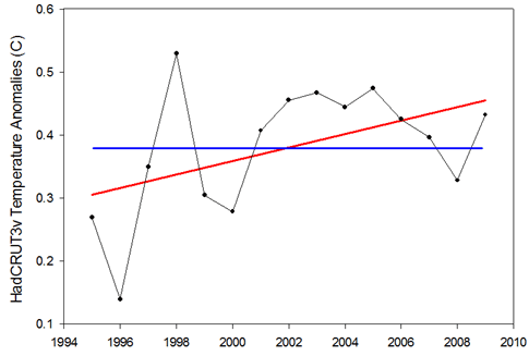
Figure 1: Example of the null hypothesis (blue) and the alternative hypothesis (red) for the 1995-2009 temperature trend. 

Looking at Figure 1, we have two hypotheses regarding the relationship between temperature and time:  1) there is no relationship and the slope is zero (blue line), or 2) there is a relationship and the slope is not zero (red line). The first is known as the “null hypothesis” and the second is known as the “alternative hypothesis”. Classical statistics starts with the null hypothesis as being true and works from there. Based on the data, should we accept that the null hypothesis is indeed true or should we reject it in favor of the alternative hypothesis? 

Thus the statistical test asks: what is the probability of observing the temperature data that we did, given that the null hypothesis is true?

In the case of the HadCRU temperatures from 1995 to 2009, the statistical test reveals a probability of 7.6%. Thus there’s a 7.6% probability that we should have observed the temperatures that we did if temperatures are not actually rising. Confusing, I know…  This is why I had inverted 7.6% to 92.4% to make it fit more in line with Phil Jones’ use of “95% significance level”.

Essentially, the lower the probability, the more we are compelled to reject the null hypothesis (no temperature trend) in favor of the alternative hypothesis (yes temperature trend). By convention, “statistical significance” is usually set at 5% (I had inverted this to 95% in my post). Anything below is considered significant while anything above is considered nonsignificant. The problem that I was trying to point out is that this is not a magic number, and that it would be foolish to strongly conclude anything when the test yields a relatively low, but “nonsignificant” probability of 7.6%. And more importantly, that looking at the statistical significance of 15 years of temperature data is not the appropriate way to examine whether global warming has stopped (cyclical factors like El Niño are likely to dominate over this short time period).

Ok, so where do we go from here, and how do we take the “7.6% probability of  observing the temperatures that we did if temperatures are not actually rising” and convert it into something that can be more readily understood?  You might first think that perhaps we have the whole thing backwards and that really we should be asking: “what is the probability that the hypothesis is true given the data that we observed?” and not the other way around. Enter the Bayesians!

Bayesian statistics is a fundamentally different approach that certainly has one thing going for it: it’s not completely backwards from the way most people think!  (There are many other touted benefits that Bayesians will gladly put forth as well.)  When using Bayesian statistics to examine the slope of the 1995-2009 temperature trend line, we can actually get a more-or-less straightforward probability that the slope is positive. That probability?  92%1. So after all this, I believe that one can conclude (based on this analysis) that there is a 92% probability that the temperature trend for the last 15 years is positive.

While this whole discussion comes from one specific issue involving one specific dataset, I believe that it really stems from the larger issue of how to effectively communicate science to the public. Can we get around our jargon?  Should we embrace it?  Should we avoid it when it doesn’t matter?  All thoughts are welcome…

1To be specific, 92% is the largest credible interval that does not contain zero. For those of you with a statistical background, we’re conservatively assuming a non-informative prior.

0 0

Printable Version  |  Link to this page

Comments

Prev  1  2  

Comments 51 to 53 out of 53:

  1. Berenyi Peter #40, The odd shape of the distribution could probably be approximated by a mixture of Gaussians e.g. a density function f s.t. f(x)= p1f1(x)+p2f2(x)..... +pnfn(x), where all the fi's are univariate normal, and p1+p2...+pn=1 In #50, I would not despair of finding a suitable distribution or combination thereof to fit to the data.
    0 0
  2. #51 tobyjoyce at 00:47 AM on 14 August, 2010 The odd shape of the distribution could probably be approximated by a mixture of Gaussians You would need a whole lot of them. The tail seems to decrease slower than exponentially.
    0 0
  3. BP #52, I said "approximated", and there is software that will fit as many as you like (a finite number, obviously). There may even be an R package that does it. In many cases, tails (which contain the low probabilities) may not be important.
    0 0
  4. #53 tobyjoyce at 03:12 AM on 14 August, 2010 there is software that will fit as many as you like I happen to know the algorithm itself, which is pretty straightforward. But what's the point of this exercise? There is no unique solution to this problem anyway. And tails do matter. Those are the parts of weather that can get costly (both in terms of money and human lives).
    0 0
  5. @barry at 13:56 PM on 13 August, 2010 Why are all the lines crossing at the same(?) point at about 1935?
    0 0
  6. Berenyi Peter #54, I know at least one statistician who would love to get his hands around a problem like that and who would not walk away with "There's no unique solution, anyway"!!! :))
    0 0
  7. tobyjoyce@51 - maybe a student-t distribution and vary the degrees of freedom to match the kurtosis. IIRC the student-t distrubution can be represented as an infinite sum of Gaussians.
    0 0
  8. BP #50 "Yes, but you have to get rid of the assumption of normality. Temperature anomaly distribution does get more regular with increasing sample size, but it never converges to a Gaussian." From a theoretical perspective this is an important consideration, but from a practical perspective it often makes little difference. It is of course quite reasonable to use non-parametric methods whenever you think it's sensible, but NP methods will always have less power for a normal-enough dataset. So it's important to consider whether there's any practical benefit from eschewing the normal distribution. In the case of the two graphs you posted in this discussion, they're what we would consider close enough to normal as makes no odds. (I've spent some time working on this as part of my day job, to satisfy myself empirically of when NP and P approaches are best)
    0 0
  9. Dikran #57 is correct - there are procedures to correct the number of degrees of freedom (and thus cause a corresponding loss of power) when you think there's something up with the normality of a distribution. This can cause less power loss than the use of a non-parametric statistic, so can be desirable. There are also statistical tests available which can tell you if a non-normality correction is justifiable. In the case of the two charts that BP has posted in this thread, I can pretty much guarantee by eye (from a decade or so of experience) that you'd just be losing power for the sake of it if you insisted on correcting their linear model statistics for non-normality. Generally the linear model stats are pretty robust to moderate deviations from normality, so no need to throw the baby out with the bathwater, unless the p value based diagnostics tell you otherwise.
    0 0
  10. Barry @46 Don't stop asking questions, even if you think they are naive, that's how we learn. Looking at your question, if you are saying the graph suggests the rate of warming in each decade is increasing I think you are over-interpreting the results. But I do think the results suggest that the climate has continued to warm each decade for the last 30 years. There were several decades last century when (due to aerosol buildup) the climate didn't warm. Therefore, adding recent decades where warming occurred will increase the proportion of decades showing warming and increase the century trend. I think this result would occur even if the most recent decade had warmed at the same or a slower rate as past decades. At the same time, the fact that the trend keeps increasing when you add in the most recent decade does show that warming continues.
    0 0
  11. This is a very nice article - and all very true. I spent some time myself studying the use of significance tests in climate science. The result? There is a real problem! Significance tests are misused by many, perhaps most, climate scientists. There will be a paper appearing in the Journal of Climate which analyses the precise problem, using Bayesian statistics. In a nutshell: significance tests are generally used to quantify the validity of some hypothesis while it is is nothing like it. In fact, the significance statistic is largely irrelevant. Unfortunately, misuse of significance tests is widespread. Not only climate science suffers, also economics, medical science, social science, psychology, biology. I am afraid that significance tests have muddied the waters of several climate papers and there is a real communication problem here. We need to accept that statistics alone cannot usefully quantify the truth of some hypothesis. And significance tests are possibly the worst in this respect. For more details read Significance Tests in Climate Science.
    0 0

Prev  1  2  

You need to be logged in to post a comment. Login via the left margin or if you're new, register here.


The Consensus Project Website

THE ESCALATOR

(free to republish)


© Copyright 2024 John Cook
Home | Translations | About Us | Privacy | Contact Us