16 years - Update and Frequently Asked Questions
Posted on 10 February 2013 by Kevin C
Update 21/02/2013: Troy Masters is doing some interesting analysis on the methods employed here and by Foster and Rahmstorf. On the basis of his results and my latest analysis I now think that the uncertainties presented here are significantly underestimated, and that the attribution of short term temperature trends is far from settled. There remains a lot of interesting work to be done on this subject.
The ‘16 years’ video has lead to a number of good questions from viewers which simply could not be addressed in a basic 2-minute explanation. We will first look at the results from the latest data, and then try and address some of the questions which have arisen. The main issues which will be addressed are:
- How are the natural influences determined?
- What happens if you use data over a longer timescale?
- What about other versions of the temperature record (e.g. HadCRUT4)?
Each question will be addressed at a basic level where possible, however some of the issues are more technical.
Update to December 2012
The GISTEMP temperature data for December 2012 was not available at the time the video was being made, and thus could not be included. The release of this extra month of data brought a couple of surprises: Firstly the additional month was cooler than expected, and secondly GISTEMP switched from using HadISST to ERSST for the sea surface temperature data. These both affected the results. In addition I have switched to using the constrained trend method described here for the trends reported in the text and included the latest volcano and solar data.
The result of the extra data is that there is now a visually observable change in trend pre- and post-1997, however the post-1997 trend is still significant at the 99.99% level and the change in trend does not reach statistical significance. However the visual impact is affected; the final scene would look like this with the new data:
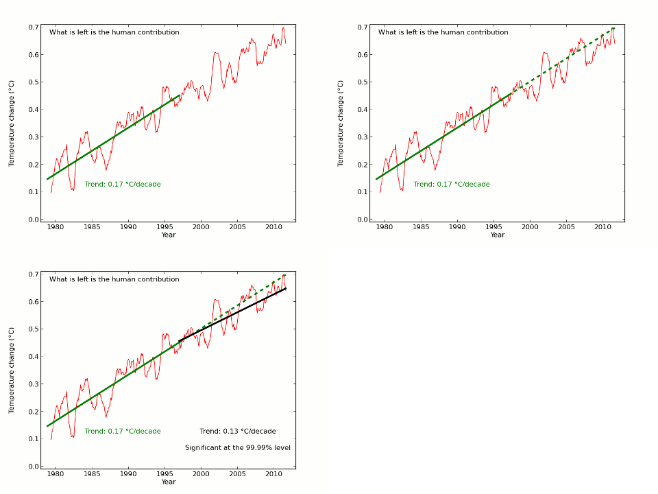
This change in the results highlights the difficulty in drawing conclusions from such short periods - which is why most serious climate scientists avoid doing so. However given the public interest in this issue I will continue to monitor the underlying trends and report if there is a significant change, especially if the change in trend since 1997 becomes statistically significant.
In the short term I hope to annotate the video to direct viewers to this update. I will try to provide a new version of the video using the latest data and methods later in the year, however the task is time consuming and only practical during vacations.
How are the natural influences determined?
The aim of the calculation is to subtract out natural influences from the actual temperatures to obtain an estimate of the human contribution to recent warming. Obviously if we are given a completely free choice of what to subtract out then we can get any answer we want and the exercise is meaningless. So a more rigorous approach is required.
There is a very widely used approach to this problem called ‘multivariate linear regression’, which is used across many fields of science and economics. Linear regression determines how much of each cause (i.e. natural and human influences) is required to best explain the observed effect (i.e. temperature).
Like most statistical methods linear regression can be misused to give misleading results. As more causal factors are added, it becomes easier to get a good fit by chance. Therefore only causal factors which significantly improve the fit to the observations should be used. So if linear regression is used properly we have very limited control over the answer. We can only use causal factors which are strongly supported by the observations, and we don’t get to choose how big the contributions of the various factors are: the linear regression does that for us.
In this case, the causal factors were determined by Foster and Rahmstorf, and included solar irradience (the PMOD satellite data), volcanic eruptions (from Nasa/GISS), the El Niño/La Niña oscillation (Multivariate ENSO Index or MEI), and a linear trend to approximate the current impact of human emissions (and a small correction for annual cycles). The different causal factors are shown in Figure 2: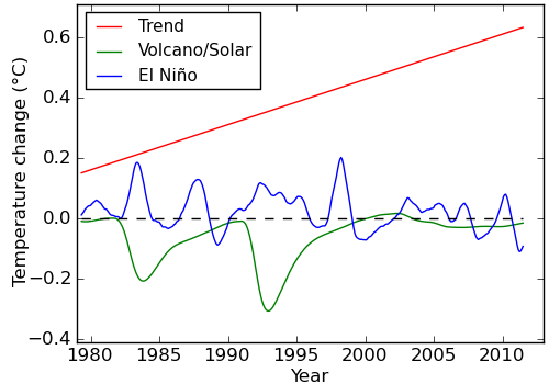
Figure 2: Estimated natural and human contributions to the temperature record, 12 month moving average.
In addition Foster and Rahmstorf allowed each natural influence to have a delay of a few months in its effect on temperature - these delays were also optimised to best explain the observed temperatures. It would be possible to add additional factors, or change the causal factors used, however any such change would need to be justified both physically and statistically.
Figure 3 shows the sum of the contributions, compared to the observed temperatures.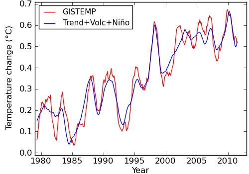
Figure 3: Sum of contributions and temperature record, 12 month moving average.
By definition, any change in the size of any of the contributions makes the fit to the temperatures worse.
In this work, two small changes were made to the Foster and Rahmstorf method. Firstly, there is a natural scale for combining the effects of the solar and volcanic influences, given by the effect they have on the amount of solar energy entering the climate system. This relationship was used to combine the solar and volcanic influences into one, reducing the amount of freedom in the calculation even further - i.e. this calculation is more conservative. This is reflected in the slightly lower final trend compared to Foster and Rahmstorf.
Secondly, instead of delaying the combined volcanic/solar term by a few months, an exponential response was used - just as an oven takes a while to get up to temperature after it is turned on, the effect of the volcanic/solar term was also made gradual. The time for this response was again optimised against the observations rather than chosen. These two changes were made to address an issue raised by Rypdal (2012) that the coincidental occurrence of volcanoes on the declining phase of the solar cycle could cause these two factors to be mis-estimated.
Are the results dependent on the choice of natural factors?
The effect of different and additional natural factors has also been examined. Instead of satellite measurements of solar irradience we can use a proxy, in this case sunspot number. Instead of MEI for El Niño we can use Nino34. In addition the effect of long term oscillations such as the Atlantic Multidecadal Oscillation and Pacific Decadal Oscillation can be tested. However care is required - adding additional terms, even noise, tends to improve the fit to the data. The AIC penalizes the addition of extra parameters to ensure that any new terms make a genuine improvement to the model fit.
| AIC |
Trend pre 1997 | Trend post 1997 | Trend difference | |
| Base calculation | -642.1 | 0.170±0.016 | 0.134±0.019 | 0.037±0.025 (<2σ) |
| MEI->Nino34 | -624.6 | 0.163±0.017 | 0.119±0.020 | 0.044±0.026 (<2σ) |
| TSI->Sunspots | -642.0 | 0.173±0.016 | 0.131±0.019 | 0.042±0.025 (<2σ) |
| Add AMO | -640.3 | 0.173±0.016 | 0.136±0.019 | 0.037±0.025 (<2σ) |
| Add PDO | -640.8 | 0.169±0.016 | 0.131±0.019 | 0.039±0.025 (<2σ) |
In every case the trend post 1997 is significant at the 99.99% level, and the trend difference is not statistically significant. None of the variants on the calculation are statistically better than the original, and in every case the conclusions are unchanged.
What happens if you use data over a longer timescale?
A similar calculation can be performed over the last 130 years rather than the past 35 years as used in the video. In this case it is no longer possible to fit the human contribution as a linear trend - instead the full range of climate influences must be used and their effect on temperature determined. The simplest way to do this is using a very simple ‘2-box model’ (Rypdal 2012) to relate influences to effects - a calculation requiring 20-30 lines of code. In this kind of calculation the speed with which temperature responds to changes in forcing is determined by finding the response times which best fit the observations. Again the result is optimised to best explain the data. This calculation includes one additional term to model the significant impact of El Niño on temperatures, which was omitted from the Rypdal calculation.
The modeled temperatures are compared to the observations using annual data from 1880-2010 in Figure 4.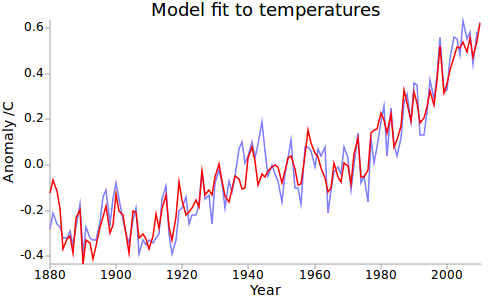
Figure 4: 2-box+El Niño model fit to temperatures over 130 years.
The fit is very good, and the model also shows a slowdown in warming since the late 90’s. The El Nino term, which is the principal factor affecting the rate of warming over the past 16 years, is actually larger than that obtained by the simpler approach.
| El Nino (MEI) coefficient | |
| Foster & Rahmstorf | 0.079 |
| 35 year calculation | 0.071 |
| 130 year calculation | 0.083 |
Using 130 years of data leads to the same conclusion.
Uncertainties in the observations
The use of a regression calculation depends on an assumption that the variance of the observations does not vary significantly - i.e. they are homoscedastic. The principal source of uncertainty in the long run temperature record is due to coverage, with substantially poorer coverage in earlier decades. GISTEMP has near-complete coverage since the establishment of Antarctic stations in the 1950s. The 2-box model calculation above was therefore repeated using just the post-1950 data. The results and therefore the conclusions are unchanged.
In fact the principal limitation of this kind of calculation lies elsewhere: The uncertainties in the forcings are far more important than temperature uncertainties in determining the results of the 2-box model. Fortunately the solar and volcanic effects behave differently from the anthropogenic forcings in that they show significant short term variations. This information might be better exploited by fitting an unknown smooth function instead of the uncertain anthropogenic forcings, and will be explored further in future.
What about other versions of the temperature record (e.g. HadCRUT4)?
The principle difference between the NASA GISTEMP and Hadley HadCRUT4 datasets is coverage - the GISTEMP data covers 98% of the Earth’s surface, whereas HadCRUT4 covers only 84%. The coverage of 6 temperature datasets along with an indication of the temperature change over 15 years is shown in Figure 5.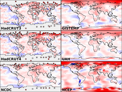
HadCRUT4 is missing the regions of the planet which, according to GISTEMP, the UAH satellite data and NCEP/NCAR reanalysis data (which combines diverse measurements in a weather model) are warming fastest. The implication is that HadCRUT4 underestimates recent temperatures. An estimate of the effect may be obtained by calculating how the UAH, GISTEMP or NCEP/NCAR temperatures would be biased if their coverage were reduced to that of HadCRUT4. The results are shown in Figure 6.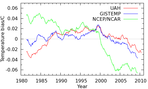
Figure 6: Coverage bias in the HadCRUT4 record estimates from various sources, 60 month smooth.
All the data sources agree that the non-global coverage of HadCRUT4 introduces a warm bias around 1998 declining to a cool bias in recent years, and thus significantly impacts the short term trend. On this basis, we expect the human contribution to the HadCRUT trend after 1997 to be biased lower than the trend prior to 1997. The trends are as follows:
| Trend ± uncertainty (1σ) | |
| Pre-1997 | 0.183 ± 0.015 C/decade |
| Post-1997 | 0.120 ± 0.018 C/decade |
| Difference | 0.063 ± 0.023 C/decade |
The trend post 1997 is lower, exactly as expected. The trend is still significant at the 99.99% level, however there is now a significant difference between the pre and post 1997 trends.
What if HadCRUT4 had global coverage? This question may be addressed by filling in the empty regions of the map from nearby temperatures. There is a good conservative method of doing this, called kriging, which learns how far it can fill temperatures by learning from the data that is already present. A preliminary application of kriging to the gridded HadCRUT4 has been made although the results are provisional at this stage. If the human contribution to the temperature trend is calculated using the global temperatures, the trends are as follows:
| Trend ± uncertainty (1σ) | |
| Pre-1997 | 0.178 ± 0.024 C/decade |
| Post-1997 | 0.152 ± 0.022 C/decade |
| Difference | 0.025 ± 0.033 C/decade |
Once again the change in trend is statistically indistinguishable from noise. When using global data there is no compelling evidence in the temperature record for a change in trend in the human contribution to global warming. Using the krigged data does introduce an interesting feature in the model - the characteristic time of the exponential lag drops from 14 months to 5 months - this will be the subject of further study. At this point it seems likely that an optimal treatment will require a combination of the two methods outlined here to exploit all of the data.
Note: Due to the time consuming nature of this calculation and the slow updating of the HadCRUT4 data this calculation still uses the Nov 2012 data, however the impact of the extra month is not expected to be so significant in this case as for GISTEMP.
Conclusions
Whether we use 35 years of data with the assumption of a linearly increasing human contribution to global warming, or 130 years of data using a simple forced model, the conclusion is the same - the recent slowdown in warming arises from the human contribution being partially masked by natural influences, primary El Niño. All the methods tested agree on the size of the El Niño contribution.
When applying the same method to the HadCRUT4 data, the trend in the human contribution to global warming over the last 16 years remains highly statistically significant. The incomplete geographical coverage of the HadCRUT4 data is expected to lead to a lower trend past 1997, and this is exactly what is observed. The slower warming of the HadCRUT4 data compared to GISTEMP is sufficiently explained by coverage bias.


 Arguments


Thanks. Sorry I know people always want more. Since the Ramsdorf method was publshed I've been curious what the longer term data looked like. Fig 4 is interesting but is there any chance you can show the breakdown of the different forcings that go into making that, similar to Fig2 for the shorter time period. I'm curious what the long run of La Nina in the mid-20th century are doing and what the anthro contribution over the whole century looks like.
Cheers
Thanks! A very nice explanation. Its easy to see that multivariate linear regression is very much susceptible to abuse, and so the number of variables must be limited to those most likely to effect the result.
I'm looking forward to the extension of the Foster Ramsdorf graph as the future unfolds.
Thanks for the comments!
John: Real Climate have an update to the F&R results here. By chance I did the same calculation using Foster's released code a couple of weeks back, with the same results.
HR: I'm slowly working towards producing what I hope to be the best possible estimate of short term trends and their attibution - what you've seen here is just a part of that work. As the uncertainties are narrowed down the underlying trend will probably become more significant, but at the same time any genuine change in trend (which is scientifically interesting) will also become more significant.
The uncertainty in the volcanic+solar lag term is currently the biggest issue, which is why the 35 year calc is unsatisfactorary. I think I am addressing a real issue with the F&R calc, but I am pretty sure my solution is suboptimal. I can't currently claim with any certainty that my results are closer than theirs.
However the 2-box model is also unsatisfactorary, because the uncertain human forcings have a far bigger role in determining the response function than the volcanic term. The fact that it gives similar conclusions is reassuring, but inconclusive.
That's why I think a hybrid method is needed, rather than the 2-box model in it's current form. I'd be very happy if someone else was inspired to look at this.
In the mean time, I posted 2-box model graphs with just enso subtracted, and with enso+volcano+solar subtracted here which give you some idea of what the plots would look like.
I'm lookin forward to Kevin's followup video in 2029 refuting the 'no warming since 2014' claim.
Two questions for Kevin
1) What do you make of the disparities between the RSS, UAH and STAR interpretations of the satellite records? Is some sort of reconciliation in the future or will this be an issue for the foreseeable future?
2) Do you think we will get satisfactory 100% coverage from GISS any time soon, via more data or better algorithms?
Tristan: On the satellite record, I'm afraid that's beyond my expertise. Glenn and Rob have done articles here and here which you may already have seen.
On coverage, GISS is close enough to global (>98%). The recent BEST memo from Robert Rhode suggests their informal method of extrapolation gives results which are pretty close to optimal. Look for my JMA post later in the week which adds a couple more details, and hopefully a fuller treatment later in the year.
Thanks for the enlightenment! Much appreciated :) Looking forward to your future posts.
For those of us who were alive and paying attention back in the seventies, the Met office claimed a -0.5C drop in temperatures from ~1940 to 1970. I see they've conviently ironed that out.
Besides, it was the progenitor of this very data, James Hansen, who claimed "no statistically signifigant warming" for the last 16 years. But presto magico, now we have warming again.
My apologies, Dr. Hansen claimed no warming for 10 years, not 16.
Habilus... You're going to have to provide a reference to the statement that Met office claimed -0.5C from 1940-1970, otherwise your statement has no credibility.
And it was not Hansen that made the statement about statistically significant warming, it was Phil Jones of the CRU. And he stated that there was warming of 0.12C/decade but the time frame that was in question fell just short of statistically significant. The transcript from the interview can be viewed here.
Habilus... Please note that James Hansen works for NASA's Goddard Institute of Space Studies (GISS) not the Met Office.
It seems you're confused on quite a number of points.
... but presto magico, he still gets to have an opinion - and to think it is worth something.
What was Phil Jones up to "back in the seventies"? Not sure. The first major paper of his looking at the temperature record that I'm aware is the 1982 paper that looked at northern hemisphere record:
Variations in Surface Air Temperatures: Part 1. Northern Hemisphere, 1881–1980
I've linked the abstract, and the pdf link for the full paper on that page is not paywalled.
Note that to maximize the "drop" in that record, you have to pick 1940 as the start year, just as fake skeptics keep picking 1998 these days. Spikes in the record - the gift that keeps on giving...
Methinks that Habilus is mixing up a whole bunch of fake skeptic memes:
- They predicted an ice age in the 1970s
- Hansen was wrong
- Jones said no warming
- UK Met Office is bad (aka Climategate and the CRU hack)
Just what were you paying attention to in the '70s, Habilus?
Even ignoring the basic confusion and accidental mixing of fake skeptic memes, there's something even more fundamentally wrong with Habilus' comment.
Apparently science is not allowed to progress.
Even if, for the sake of argument, he was actually correct about what the Met office was saying back in the 70s, what he's basically objecting to is the Met office doing additional work that allows a more accurate figure to be determined.
Let's just take one issue, for example — the sea surface temperature measurements. After WWII, there was a sudden increase in the number of temperature measurements being recorded by British ships, using buckets dropped over the sides of ships, which leads to a cooler temperature reading than what would be measured by engine intakes, the dominant method before then. This leads to a sudden and artificial drop in SSTs, causing a pronounced dip in global temperature reconstructions of that period.
HadCRUT4 now tries to correct for that effect, and the result is that the dip is a lot less pronounced than it was before.
According to Habilus, advancing the science to make the historical temperatures more accurate is simply to "conveniently" iron out a dip that for unnamed reasons was "inconvenient" in the first place. Apparently.
I suppose disco was the pinnacle of music as well.
The bucket data shows a spurious warming trend due to the ships heating the water arund them. The only data I accept is from bathyspheres.
You know, I just remembered something another climate change denier pointed out a few months ago. I don't think I could find it again, but it was a newspaper story from the 1970's that showed "Met Office data" from mid-century. The diagram, indeed showed a ~0.5C drop in temps during that time period. But the graph was obviously not directly plotted from Met data but was a graphical representation done by someone at the newspaper (as far as I could tell).
What I believe was going on with that graph was, the artist misinterpreted -0.05C (which is what the data now shows) for -0.5C.
I have one focussed interest in the sociology of science denial (DK alert - no formal sociology education), which is whether it is possible to identify scientific skepticism from science denial by the form of the arguments alone without even examining the content. I think it often is. In ortherwords, is there a 'fingerprint' we can use to identify science denial? Habilus' comment is a good case study.
First, we have to understand the difference between scientific skepticism and science denial:
Now, the point of the video is that 'warming' and the 'human contribution to warming' are two different things, and that a change in one is not necessarily evidence for a change in the other.
Habilus' response is to reassert a change in the rate of warming, which the video doesn't dispute. (S/he also relies on appeals to authority rather than data, thus showing a predisposition to social rather than evidence based reasoning, and falls for the null hypothesis fallacy). I think this demonstrates my point.
This raises an interesting possibility: Whenever someone makes an argument which has the fingerprints of science denial, don't engage with the argument - by doing so you are validating their position. Point out the structure of their argument.
I have been trying to follow up on Habilus' (@8) claim that the Met Office asserted that the globe had coolled by 0.5 C degrees between 1940 and 1970. I have been unable to track down any such claim. What I have found is the global land temperature record, as determined Mitchell, 1961:
(Source)
That shows just less than a 0.3 C degree fall between the 1940s and the 1960s; but is a land only record and so covers only 30 percent of the globe.
The earliest attempt at a true global, land-ocean temperature record I can find is Farmer 1989, which shows a decline of just over 0.1 C:
Indeed, the only early record showing a 0.5 C decline over that interval is from figure 7.6 (a) of the IPCC FAR, WG1, Chapter 7 (1990). That, however, shows only Northern Hemisphere, land only temperatures.
Giving the Habilus the benefit of the doubt, and assume his distant memories, unbacked by physical evidence, are correct; and that for a brief period the met office showed a greater decline in temperature from 1940 to 1970 than the scientific evidence supported before, or after. But even with this improbable assumption, Habilus can give us no reason why this brief revision showed the naked truth, which later revisions have corrupted.
Habilus you do know, don't you, that "no statistically significant warming for 16 years" does not mean that there has been no warming for 16 years?
It just means (loosely speaking) that we can't rule out the possibility that it hasn't warmed during the last 16 years. If you read the BBC interview, you will find that Prof. Jones clearly understands this, and is perfectly happy to say that the (cherry picked) trend wasn't significant, because he understands why that isn't actually all that surprising (the time span is short, so the power of the test is fairly low).
Tristan @15, it is difficult to imagine how you could think that a ship, entering new water at 4 knots or higher could warm that water significantly before it was measured after being collected from in a bucket thrown from the bow. Regardless, buckets show a cool bias, particularly canvass buckets, with evaporation cooling the water in the bucket prior to measurement. It is true that direct instrumental measurements in engine intakes show a warm bias of about 0.1 C, but great effort has gone into measuring that (and bucket) bias, and correcting for it.
That, apparently means noting for you. In fact, your comment looks like nothing more, to me, than a mere assertion that you don't like the facts, with a tissue of excuse as to why you choose to ignore them.
I enjoyed the bathysphere comment!
(Spending too much time on the front lines of this debate is hard on the nerves and the sense of humour. I can't handle it at all, which is why I try to do research to fill the gaps. Tom's an ace, but I'm guessing he missed your earlier comments and so didn't have the context I did.)
I did the skeptic blogs for about a year. It's rough on the spirit. I imagine it'd be much worse if climate science was your vocation, not merely an interest, as it is in my case.
Something I pointed out on JoNova, where this silly 16 year claim rose once again (sigh)...
Examining any time-span starting in the instrumental record and ending in the present:
KR: That's a good rigorous statement of the situation. Also well done for avoiding the null hypothesis fallacy, an easy mistake commonly made by people on both sides of the discussion.
This is a copy of a comment/question I made of Tamino at openmind. I thought it may interest people here and they may have answers.
----------
Following your comments in a previous post on wildfires where you used non parametric (Theil) regression I wondered if it were possible to use this for temperature trends. A quick search in google-scholar indicates Theil-Sen estimators (TS) are used in climate science but I could not spot an obvious paper analysing global temperature. Are you aware of any?
One of the points made in wikipedia about the 'Theil-Sen estimator' is that you can obtain a similar sample variance in slope from fewer data points and the slope should also be less affected by outliers.
Using the annual giss data I think you can use about 2/3rds of the points and get similar results to Least squares regression; so a 15 year period (97-2012 incl.) gives a similar slope as LMS over 26 years (86-2012 incl.). I get a slope of 0.17 C/decade. The error is about 0.05 but I suspect my methodology is inappropriate. On a graph I plotted a 16yr rolling median and it is evident that the 16yr TS line is very similar to the 27yr LMS line. Surprisingly I find 9 of the highest rates of warming occurred in the last 10 years.
Could you comment on how appropriate the method is for estimating the rate of surface warming? Could it be a better estimator for rebutting claims of no warming obtained from short time periods?
------------
(Why surprising? - Because that is not the finding made here for a post 1997 trend)
Interesting that no-one (that I can see) has commented on the apparent between James Hansen's insistence that CO2 is the prime driver of global warming and the stasis in global warming despite the continual iincrease in atmospheric CO2 concentrations. An argument that other factors impinge negates Hansen's conviction and indeed the conviction of many modellers that CO2 is the prime driver. If so, why a slowdown in global warmig
Ray @27, nobody has commented on the apparent discrepancy because there is no discrepancy. Hansen, like all other climate scientists, believes that short term fluctuations, most notably from ENSO dominate short term temperature trends. That is unsurprising given that the expected temperature increase from change in CO2 level (alone) over the last 16 years is approximately 0.23 C, while ENSO alone can cause temperature fluctuations in GMST of 0.3 C or more in a single year. Given the discrepancy in the scale of the effects over the short term (one to two decades), no climate scientists expects a simple monotonic increase in temperature. That is why the UN makes its predictions with regard to twenty year average temperatures. As I have just shown on another thread, those predictions are on track to be fulfilled.
Re my comment #26. Tamino replied and as a result of what he wrote I realized I had made an error. In fact both methods give very similar results. I think I misled myself whe my results backed up what I though I had read about the T Smethods. My apolgies.
...and mdenison shows us what a true skeptic does. Performs his own analysis, fInds an interesting, potential conflict between his results and someone elses, asks questions, gets answers, checks his work, and then comes back and openly admits that he was on the wrong track.
Kudos for having he courage to ask, and the courage to admit a mistake.
For others, the ongoing discussion at Tamino's is here.
Hey guys - the "16 years" video is now locked as "private". What gives?