


 Arguments


Global cooling - Is global warming still happening?
What the science says...
| Select a level... |
 Basic
Basic
|
 Intermediate
| |||
|
All the indicators show that global warming is still happening. |
|||||
It's cooling
"In fact global warming has stopped and a cooling is beginning. No climate model has predicted a cooling of the Earth – quite the contrary. And this means that the projections of future climate are unreliable." (source: Henrik Svensmark)
At a glance
Earth's surface, oceans and atmosphere are all warming due to our greenhouse gas emissions, but at different rates. Some places are also warming much faster than others: parts of the Arctic for example. That variability is partly because other phenomena act to offset or enhance warming at times. A good example are the effects of La Nina and El Nino, an irregular variation in winds and sea surface temperatures over the tropical eastern Pacific Ocean that can influence temperatures and rainfall patterns right around the world.
El Nino causes even warmer years whereas La Nina tends to peg temperatures back to an extent. Thus 2023 – an El Nino year - was the warmest year on record, according to the USA-based National Oceanic and Atmospheric Administration, but other recent years have not been far behind – 2016 and 2019 are in second and third place respectively. The worrying thing is that 2019 only saw a mild El Nino. And even with a La Nina featuring, 2021 and 2022 were, respectively, still the seventh and sixth hottest years on record.
The year 1998 featured a massive El Nino and consequent temperature spike that was a strong outlier, well above the steady upward trend. That spike and the subsequent return to a more “normal” warming pattern led to claims in the popular media that global warming had “paused” or had even stopped. This was a typical misinformation tactic that, as usual, time has proved wrong. As things currently stand, the top ten warmest years have all been since 2010 and 1998 is nowhere to be seen any more. By modern standards, it simply wasn't warm enough.
Please use this form to provide feedback about this new "At a glance" section. Read a more technical version below or dig deeper via the tabs above!
Further details
In the years following 1998, at the time the hottest year on record, there was a concerted misinformation campaign to convince the public that global warming had variously slowed down, stopped or even that we were entering a period of cooling. Of course, we now know that such claims were nowhere near correct. In today's top ten ranking of warmest years, the year 1998 is nowhere to be seen. It simply wasn't warm enough. So let's take a look at how the claims came about, because they reveal insights into the methodology of those who design and spread misinformation.
The entire planet continues to accumulate heat due to the energy imbalance created through our greenhouse gas emissions. Earth's atmosphere is warming. Oceans are accumulating energy. Land absorbs energy and ice absorbs heat to melt. Year to year ups and downs in these things are simply noise, reflecting variations in how that heat is moved around the planet and what other influences are at work, such as the irregular El Nino Southern Oscillation (ENSO) that can nudge the global temperature one way or another by up to 0.3C. That's why 1998 was such a warm outlier: it coincided with a very strong El Nino. El Nino conditions always warm things up whereas La Nina conditions cool things down (figure 1).
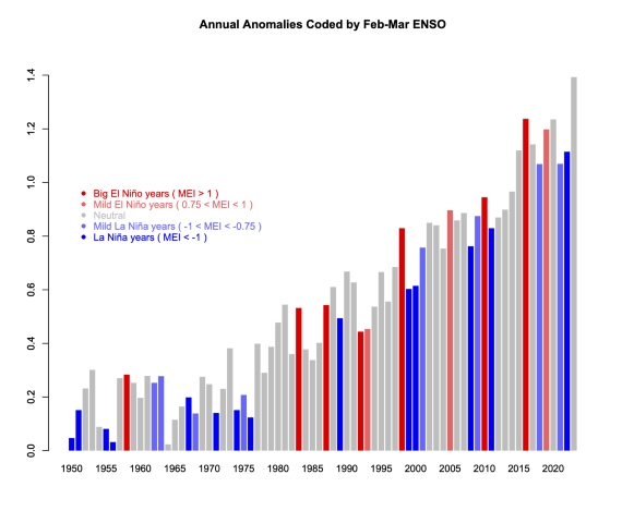
Figure 1: GISTEMP anomalies to end-2023 (with respect to late 19th Century), coded for ENSO state in the early spring - red is El Nino, blue La Nina. 2023 is in grey because that El Nino did not develop until later in the year. Graphic courtesy of Realclimate.
Climatologists routinely use multi-decadal blocks of time when presenting temperature trends for a very good reason. Such blocks allow you to stand back and look at the bigger picture. Due to the noise, taking a much shorter time-span – say just five or ten years – allows you to say anything you like about trends, depending on the particular block you pick.
For example, if you picked a short run of 5-10 years ending in 1998, you could have – if you were so inclined – said, “look how fast it's warming!” Likewise, taking a number of years starting with 1998, you could have made the equally invalid claim that global warming had stopped. And of course, that claim was made, vociferously, in the early-mid 2000s. It was a classic example of cherry-picking: the manifestly unscientific practice of choosing the data that supports the argument one is paid to make on behalf of those who sponsor misinformation campaigns. Once you know about such tricks, you can challenge them yourself. You can ask someone why they showed such a short temperature record when showing a much longer one is the normal practice.
It is difficult but technically possible to filter out the noise described above from temperature datasets. In the paper Foster and Rahmstorf (2011) the authors used the statistical technique of multiple linear regression to filter out the effects of ENSO, solar and volcanic activity (Figure 2). They found that the underlying global surface and lower atmosphere warming trends have in fact remained steady in recent years. There's still noise in there but nowhere near as much. We were still warming all along.
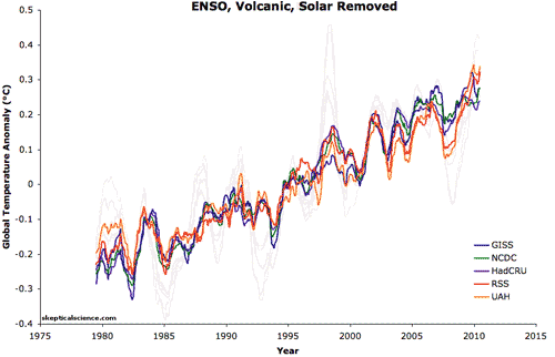
Figure 2: Five datasets of global surface temperature and lower troposphere temperature are shown before and after removing the short-term effects of the El Niño Southern Oscillation (ENSO), solar variability, and volcanic aerosols. A 12-month running average was applied to each dataset.
Last updated on 4 June 2024 by John Mason. View Archives
 And the zonal means plot showing the polar amplification:
Zonal Means Plot for November 2010
Don't know about you, hoss, but this cowpoke says the heat is on...
...but I still feel significantly lucky!
Iris effect, anyone? Bueller?
The Yooper
And the zonal means plot showing the polar amplification:
Zonal Means Plot for November 2010
Don't know about you, hoss, but this cowpoke says the heat is on...
...but I still feel significantly lucky!
Iris effect, anyone? Bueller?
The Yooper

 (Anyone know if JMA corrects for ENSO?)
This other relevant bit caught my eye: See JMA press release here.
It's like Deja Vu all over again...
The Yooper
(Anyone know if JMA corrects for ENSO?)
This other relevant bit caught my eye: See JMA press release here.
It's like Deja Vu all over again...
The Yooper
 An OHC history reconstruction showing impossible features is not the best candidate for estimating trends.
Also, please make up your mind. Earlier on this thread you correctly stated that the planet is warming and that TCR is about 2 C
I said UAH satellite lower troposphere data showed a (moderate) warming trend. That's not the same as "the planet is warming", is it? And I was not talking about TCR (Transient Climate Response), but equilibrium climate sensitivity and said it was at most 2°C, probably considerably less. Other than that, well done, you've quoted me correctly.
An OHC history reconstruction showing impossible features is not the best candidate for estimating trends.
Also, please make up your mind. Earlier on this thread you correctly stated that the planet is warming and that TCR is about 2 C
I said UAH satellite lower troposphere data showed a (moderate) warming trend. That's not the same as "the planet is warming", is it? And I was not talking about TCR (Transient Climate Response), but equilibrium climate sensitivity and said it was at most 2°C, probably considerably less. Other than that, well done, you've quoted me correctly.


Climate Myth...