


 Arguments


Christy Crock #4: Do the observations match the models?
Posted on 19 April 2011 by James Wight
") At the recent US House of Representatives Committee on Science Space and Technology climate hearing, the Republicans called Dr. John Christy as an expert witness testifying against the global warming consensus. Unfortunately, Christy spent his time repeating a long list of climate myths, including the common contrarian refrain that “climate model output does not match up to the real world”. Let’s examine this claim.
At the recent US House of Representatives Committee on Science Space and Technology climate hearing, the Republicans called Dr. John Christy as an expert witness testifying against the global warming consensus. Unfortunately, Christy spent his time repeating a long list of climate myths, including the common contrarian refrain that “climate model output does not match up to the real world”. Let’s examine this claim.
A tale of three climate indicators
Surface temperature observations are well within the range of model projections:
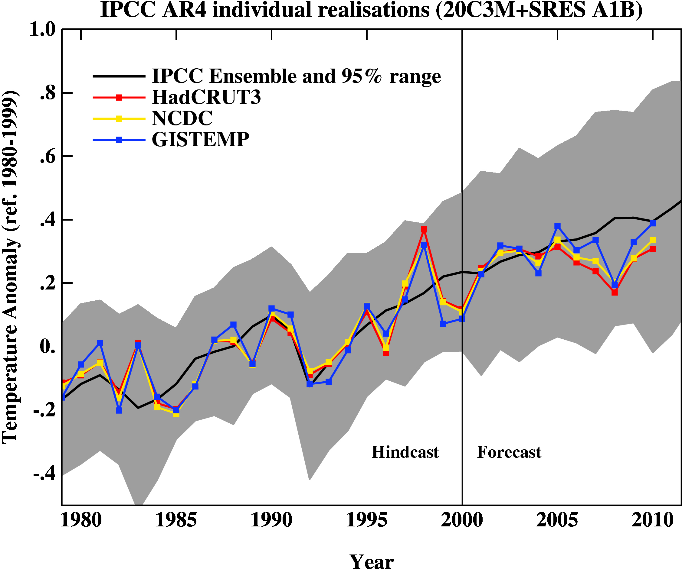
Figure 1: Observed global temperatures since 1980 compared to IPCC AR4 model projections for the business-as-usual A1B scenario. (Source: RealClimate.)
The observed rate of sea level rise is at the upper limit of the IPCC's projected range: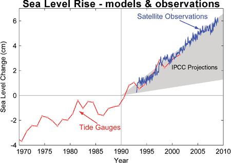
Figure 2: Observed sea level rise since 1970 (tide gauges in red, satellites in blue) compared to IPCC TAR projections for 1990-2010 (grey band). (Allison et al 2009)
The end-of-summer extent of Arctic sea ice is plummeting far more rapidly than those “alarmist” IPCC models predicted:
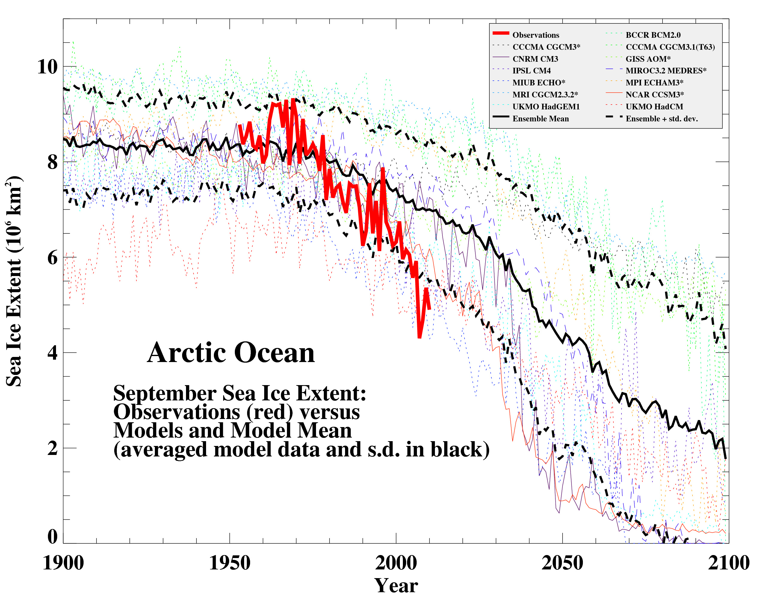
Figure 3: Observed Arctic sea ice extent since 1953 compared to IPCC AR4 models for 1900-2100. (Source: RealClimate.)
These are three of the most important and discussed climate indicators. In all three cases, the reality so far has proven to be as bad or worse than the IPCC predicted.
Yes, the satellites agree
Christy might object that Figure 1 does not include his University of Alabama in Huntsville (UAH) satellite-based dataset of global troposphere temperatures. Yet the satellites are in broad agreement with the surface records. UAH differs from GISS by merely 0.05°C over three decades:
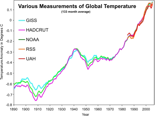
Figure 4: Comparison of surface temperature records (GISS, HADCRUT, NOAA) and satellite records (UAH and RSS). (Skeptical Science Climate Graphics)
A 2006 report by the U.S. Climate Change Science Program, of which Christy was a lead author, concluded:
Previously reported discrepancies between the amount of warming near the surface and higher in the atmosphere have been used to challenge the reliability of climate models and the reality of human-induced global warming. Specifically, surface data showed substantial global-average warming, while early versions of satellite and radiosonde data showed little or no warming above the surface. This significant discrepancy no longer exists because errors in the satellite and radiosonde data have been identified and corrected. New data sets have also been developed that do not show such discrepancies.
The irrelevant tropical troposphere
There is one remaining discrepancy, which Christy has mentioned at a previous hearing. The models predict the tropical troposphere should warm faster than the surface, but the observations on decadal timescales are ambiguous. However, this phenomenon is not specifically a signature of anthropogenic global warming; it should occur no matter what is causing the warming. Briefly, it is caused by rising humidity which reduces the rate of cooling from the surface upwards. Basic physics tell us that more water is evaporated when the atmosphere is warmer, regardless of the cause of the warming. And we have observed humidity rising in tandem with temperatures. Thus noisy data are the probable source of the discrepancy.
The sky is rising
The graphs below show the modeled pattern of temperature change for a 2% increase in solar radiation (top) versus a doubling of atmospheric CO2 (bottom):
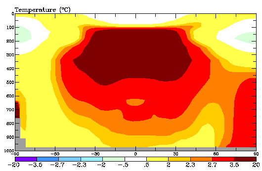
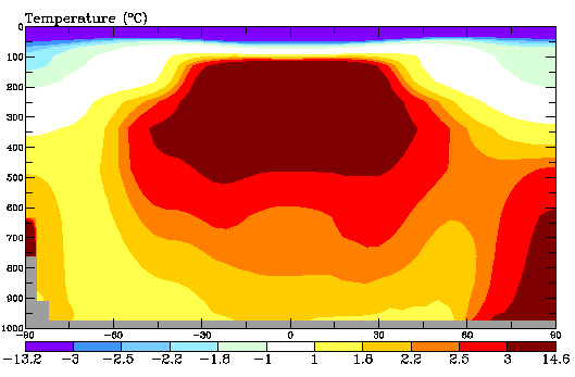
Figures 5 and 6 (Source: RealClimate).
Notice the tropical troposphere warms in both scenarios. The big difference is what happens in the next layer up: the stratosphere. Solar brightening warms up all layers of the atmosphere. If instead CO2 warms the surface, the stratosphere cools markedly – because more heat is being trapped lower down. This is the true fingerprint of anthropogenic global warming.
Satellite measurements find the stratosphere has indeed been cooling:
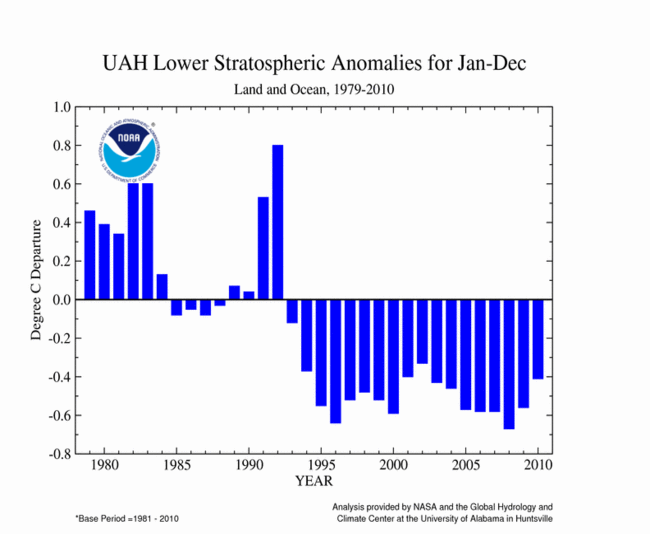
Figure 7: Observed stratospheric temperature since 1979. (NOAA NCDC)
This has caused the tropopause, the boundary between the warming troposphere and cooling stratosphere, to rise by several hundred metres. You could say that humanity has changed the structure of the Earth’s atmosphere.
We have found many more human fingerprints on climate change.
Observations versus models
The reality is that observations are completely consistent with anthropogenic global warming. Furthermore, the observed cooling of the stratosphere is not consistent with the warming being caused by various natural causes such as the Sun or volcanoes. And where they do diverge from climate models, the observations are usually even more alarming.


 0
0  0
0 Sorry, Christy is still wrong.
" If I simply look at the trend over the past 15 years, it certainly looks flat, rather then increasing"
That subjective opinion would be incorrect, and is also cherry-picking, b/c 15 year sis typically not sufficiently long a period to determine a statistically significant trend from a noisy series such as the global SAT. But let us test your subjective assertion witht hat caveat in mind. Last 15 years would be 1996-2010 (inclusive). Trends from Woodfortrees.org:
HadCRUT: +0.10 per decade
GISTEMP: +0.16 per decade
RSS: +0.07 per decade.
UAH: +0.09 per decade
"I don't see a convincing upward trend."
Eyeballing a graph is not the way to do it.
"Therefore, I have to say that, at this stage, the actual data doesn't support the IPCC model trend in recent years."
That would be your opinion based on eyeballing. Please see my post @2 for some objective numbers which run counter to your opinion.
Also from Hansen et al's recent 2010 paper:
"On the contrary, we conclude that there has been no reduction in the global warming trend of 0.15°C– 0.20°C per decade that began in the late 1970s."
Really, this is getting really tired debunking these tired old unsubstantiated memes put forward by so-called 'skeptics'. And you know what, buy cherry picking short windows of time, we can do this ad infinitum, all the while convincing ourselves that it is not warming or that the warming has slowed when the reality is in fact very different. Lindzen and Motl may have gotten away with that trick once with Jones......but they are rapidly exhausting their bag of tricks to hide the incline.
Sorry, Christy is still wrong.
" If I simply look at the trend over the past 15 years, it certainly looks flat, rather then increasing"
That subjective opinion would be incorrect, and is also cherry-picking, b/c 15 year sis typically not sufficiently long a period to determine a statistically significant trend from a noisy series such as the global SAT. But let us test your subjective assertion witht hat caveat in mind. Last 15 years would be 1996-2010 (inclusive). Trends from Woodfortrees.org:
HadCRUT: +0.10 per decade
GISTEMP: +0.16 per decade
RSS: +0.07 per decade.
UAH: +0.09 per decade
"I don't see a convincing upward trend."
Eyeballing a graph is not the way to do it.
"Therefore, I have to say that, at this stage, the actual data doesn't support the IPCC model trend in recent years."
That would be your opinion based on eyeballing. Please see my post @2 for some objective numbers which run counter to your opinion.
Also from Hansen et al's recent 2010 paper:
"On the contrary, we conclude that there has been no reduction in the global warming trend of 0.15°C– 0.20°C per decade that began in the late 1970s."
Really, this is getting really tired debunking these tired old unsubstantiated memes put forward by so-called 'skeptics'. And you know what, buy cherry picking short windows of time, we can do this ad infinitum, all the while convincing ourselves that it is not warming or that the warming has slowed when the reality is in fact very different. Lindzen and Motl may have gotten away with that trick once with Jones......but they are rapidly exhausting their bag of tricks to hide the incline.

 where the objections are not applicable. And then they showed their figure which BP used as the basis of his/er prêt-à-porter objections about models. In that figure values are de-seasonalized. Here the same figure with some retouches for later use:
 The first time I read de-seasonalized in that paper my first instinct was thinking why is it de-seasonalized and later I saw the period (Feb 1985 - May 1989), but even then I thought why is it so much difference. The question is why is it de-seasonalized (not because "de-seasonalized is gooooood") and how is it de-seasonailized. I'll get back to this in a later post (of course BP's comments don't deserve such attention, but I have half a dozen of papers analyzed this way so I can provide fresh exercises to our students)
On the other hand, in spite of BP's forgettable answer, I think that you could be talking about that group include a few models developed during the '90s, and probably used in the Third Assessment though included again in the Fourth one to show a connexion.
I use to teach that what is absent is as important as what is in front of your eyes. Bender's uses hindcasts to that period -not including an exact number of years- but, what about the same analysis for a period closer to the time of the paper, as a hindcast or as a forecast? No mention of that in the paper.
The first time I read de-seasonalized in that paper my first instinct was thinking why is it de-seasonalized and later I saw the period (Feb 1985 - May 1989), but even then I thought why is it so much difference. The question is why is it de-seasonalized (not because "de-seasonalized is gooooood") and how is it de-seasonailized. I'll get back to this in a later post (of course BP's comments don't deserve such attention, but I have half a dozen of papers analyzed this way so I can provide fresh exercises to our students)
On the other hand, in spite of BP's forgettable answer, I think that you could be talking about that group include a few models developed during the '90s, and probably used in the Third Assessment though included again in the Fourth one to show a connexion.
I use to teach that what is absent is as important as what is in front of your eyes. Bender's uses hindcasts to that period -not including an exact number of years- but, what about the same analysis for a period closer to the time of the paper, as a hindcast or as a forecast? No mention of that in the paper.


Comments