


 Arguments


Recent Comments
Prev 1913 1914 1915 1916 1917 1918 1919 1920 1921 1922 1923 1924 1925 1926 1927 1928 Next
Comments 96001 to 96050:
-
Alexandre at 00:56 AM on 23 February 2011Radiative forcing by aerosol used as a wild card: NIPCC vs Lindzen
Here's something interesting. The paper below refuted Lindzen's iris hypothesis. But the really interesting detail was that it was data refuting Lindzen's models. It's actually no problem to use models to assist in the mathematical understanding of a complex problem, but Lindzen repeatedly claimed that everyone did wrong model sensitivity calculations, implying (wrongly) that he was the only one that used observations. Bing et al. 2002 The Iris Hypothesis: A Negative or Positive Cloud Feedback? Excerpt: The modeled radiative fluxes of Lindzen et al. are replaced by the Clouds and the Earth's Radiant Energy System (CERES) directly observed broadband radiation fields. The observations show that the clouds have much higher albedos and moderately larger longwave fluxes than those assumed by Lindzen et al. -
HumanityRules at 00:11 AM on 23 February 2011Deep ocean warming solves the sea level puzzle
Ari, Sorry but this is about what you like. Here's what you wrote about P&J at AGW Observer "This study seems to suggest that in the warming of the deep world ocean the Southern Ocean plays a remarkably large role. The warming found in this study has been poorly known before, so this study seems to make the ocean heat budget, and even the whole Earth heat budget, more accurate." And here's what you wrote about P&J in response to my criticism. "On the mismatch between Purkey & Johnson and this new study, you need to remember that Purkey & Johnson's data is sparse and one point of this new study is to emphasize that there are regional differences in deep ocean warming trends which might be important." So you choose to argue the positive features of the data in your first article and negative when you try to tell a different story. You're trying to elevate the S&C model estimate over the P&J observational estimate by changing your position on P&J. I don't see the rational for that. There's a general issue about to what extent climate science conclusions are interpretive rather than based on hard facts. Often what one chooses to like or dislike about a data set is key to that interpretation. I know that OHC and closing the sea level and energy budget seem to be tricky problems at the moment, especially with regard to the ARGO data. But I don't think you solve that by simply imagining a heap of certainty from the lastest model result. Your headline is misleading, the puzzle is certainly not yet solved. -
fydijkstra at 00:02 AM on 23 February 2011Radiative forcing by aerosol used as a wild card: NIPCC vs Lindzen
"Of course they can't both be right, and probably they neither are". They can't be both right. Indeed. Most skeptics have quite different views (Spencer, Scafetta, Abusamatow, Akasofu, Soon, Lindzen, many others and - most humble - myself). The funny thing is, that only one of them needs to be right to reject the mainstream view about climate sentitivity for greenhouse gasses and predictions about future warming. -
Ari Jokimäki at 23:34 PM on 22 February 2011Deep ocean warming solves the sea level puzzle
Ken Lambert #23: Why are you bringing up already answered arguments as if they haven't been answered? "Does it really?? - certainly does not solve the energy imbalance puzzle." If you claim certainty here, then go ahead and prove your claim. But it will take lot more than simply pretending that the Purkey & Johnson number is the ultimate truth - that is not certain. So, show us where the certainty arises from. -
John Brookes at 23:33 PM on 22 February 2011Skeptic arguments about cigarette smoke - sound familiar?
If you want to take the analogy further, look at the dilemma of a smoker trying to ignore the implications of their habit. Compare this to governments facing their CO2 addiction. -
Kevin C at 21:50 PM on 22 February 2011Antarctica is gaining ice
OK, there is one point in this article which is puzzling me. Take these two paragraphs: "In contrast, the Southern Ocean has been warming at 0.17°C per decade. Not only is the Southern Ocean warming, it is warming faster than the global trend." "Another contributor is changes in ocean circulation. The Southern Ocean consists of a layer of cold water near the surface and a layer of warmer water below. Water from the warmer layer rises up to the surface, melting sea ice. However, as air temperatures warm, the amount of rain and snowfall also increases. This freshens the surface waters, leading to a surface layer less dense than the saltier, warmer water below. The layers become more stratified and mix less. Less heat is transported upwards from the deeper, warmer layer. Hence less sea ice is melted." So the first paragraph suggests that the sea temperature is increasing, the second that the sea (surface) temperature is decreasing, and that this along with the winds is causing the extra sea ice. Does the difference come from the fact that the first measure is sea temp and the second is sea *surface* temp? I don't think so - the 0.17 number looks like a sea surface temp result. The second para says the sea surface layer is cooling. Or does it? No, it says less heat enters it from below. Does that make a difference? But surely only cooling would explain more ice? Unless ice formation involves temporary inhomogeneities perhaps? Are there any measurements which show surface cooling? No-one has mentioned the change in freezing temperature with salinity, so I presume that is too small to be significant. Thanks for any help, Kevin -
Ken Lambert at 21:09 PM on 22 February 2011Deep ocean warming solves the sea level puzzle
"Deep ocean warming solves the sea level puzzle" Does it really?? - certainly does not solve the energy imbalance puzzle. HumanityRules #17 illustrates that the Sea level balance does not close too well either. viz: "If the model fails to match the data shouldn't we question the model? I like the confidence of the title for this article but it seems completely misplaced." Quite right HR - it seems we have another SS Headline which on closer examination; is a fizzer. -
ChristianP at 20:09 PM on 22 February 2011It warmed just as fast in 1860-1880 and 1910-1940
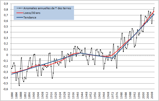
Sorry for my bad English, I am french. Thank you for your very good blog. In your case, without the confidence intervals for the trends, it is difficult to say if all the trends are really statistically significant different. For example, in this graph of Tamino, http://tamino.files.wordpress.com/2010/08/rates.jpg, for those trends, http://tamino.files.wordpress.com/2010/08/annual.jpg, there is not statistically significant difference between the trend 2 and 4 (so, no difference significant between the trend 1 and 3) Other example in my graphs with the GISS data for the lands only, all the differences between the trends are statistically significant : http://meteo.besse83.free.fr/imfix/signifianoterrestrendgiss.png http://meteo.besse83.free.fr/imfix/anoterrestrendgiss.png Could you give us the confidence intervals ? Thank you. -
jyyh at 17:55 PM on 22 February 2011The Global Carbon Cycle by David Archer—a review
"We’ll have to wait and see.", like "youll see what happens when youre dead." -
Ari Jokimäki at 17:29 PM on 22 February 2011Radiative forcing by aerosol used as a wild card: NIPCC vs Lindzen
The iris hypothesis has been studied long ago and the observations were found to be against it. It's amazing that in this situation somebody would claim that this hypothesis is well established. -
owl905 at 17:06 PM on 22 February 2011Radiative forcing by aerosol used as a wild card: NIPCC vs Lindzen
Aerosols get a big vote for variable concentrations and contributions to global weather-system effects. Mid-century suppressed warming has a decent correlation. But this distraction on cloud cover has a big dead end sign on it - it shows little significant change, over decades and half-century measurements, that would indicate it will be a player in reshaping trends. As a forcing or feedback, it's insensitive. From AGWObserver's Collection: http://agwobserver.wordpress.com/2009/09/10/papers-on-global-cloud-cover-trends/ “The global average trend of total cloud cover over land is small, -0.7% decade-1, offsetting the small positive trend that had been found for the ocean, and resulting in no significant trend for the land–ocean average.” "Global mean total cloud cover over the ocean is observed to increase by 1.9% (sky cover) between 1952 and 1995. Global mean low cloud cover over the ocean is observed to increase by 3.6% between 1952 and 1995. … On the other hand, the fact that ships with a common observing practice travel over most of the global ocean suggests a possible observational artifact may be largely responsible for the upward trends observed at all latitudes." -
RW1 at 16:57 PM on 22 February 2011Climate sensitivity is low
KR, "To put it more clearly: If it's not an anisotropic emission, it won't show up. Isotropic emissions, absorptions, and re-emissions are part of the model, not part of the output spectra. Total power emitted from the atmosphere given the model conditions is the output - not a sub-portion of internal isotropic emissions that will then get bounced around." OK, where is this documented? Point me to the paragraphs or pages that state this is what the output spectra represent. -
RW1 at 16:51 PM on 22 February 2011Climate sensitivity is low
I'm willing to be shown incorrect on this issue (and I believe George is too), but you're talking around the crux of the issue. Words like "should" and "everyone else" isn't evidence to the contrary, and more importantly doesn't answer the fundamental question. In another thread, you said the total additional absorbed infrared from models/simulations from 2xCO2 was 7.4 W/m^2. And why haven't you said all this to George on his article and post on the issue at joannenova that you linked? -
Bern at 16:44 PM on 22 February 2011Models are unreliable
As I posted in the other thread: I think the selection of sites in that paper is suspect. In Australia (the only one I commented on), 3/4 of the sites selected for comparison with GCMs are in the rather arid central part of Australia, an area that naturally gets rather extreme weather (either very hot & very dry, or merely quite hot & very wet). To compare data from such stations with a regionally-averaged GCM seems disingenuous, to say the least. You don't have to go all that far from those sites to get others with completely different weather conditions. (It'd be like picking three weather stations in the Namib & Kalahari Deserts, and saying "hey, these measurements don't agree with climate model predictions for southern Africa!" - or, for north american folks, like picking a few stations in Nevada, Arizona, and New Mexico and comparing the results to predictions for all of North America.) -
Climate sensitivity is low
RW1 - To put it more clearly: If it's not an anisotropic emission, it won't show up. Isotropic emissions, absorptions, and re-emissions are part of the model, not part of the output spectra. Total power emitted from the atmosphere given the model conditions is the output - not a sub-portion of internal isotropic emissions that will then get bounced around. -
Climate sensitivity is low
RW1 - Assuming that GW is using the HITRAN spectral database and something like JavaHAWKS for full atmospheric simulations, the spectral database includes absorption/emission spectra for a large number of IR interactive molecules. Full atmospheric emission modeling means looking at absorption, emission, and transmission across the full black body spectra of the Earth emission, over the depth of the atmosphere. Some IR gets radiated back to the surface, some gets radiated around and re-absorbed in the atmosphere, a certain percentage in the 'IR window' goes straight to space, etc. The output from JavaHAWKS is the amount of radiation that actually leaves the atmosphere. Now, I cannot speak for GW, but "imbalance" should be a difference between the outgoing radiation from JavaHAWKS and incoming from the sun (a reasonably known value). Not the amount isotropically radiated from some level of the atmosphere, but the amount finally leaving the atmosphere (one directional) at the end of the modeling. And that's because the model includes the isotropic (omnidirectional, spherical) radiation as part of the calculation, summing up the anisotropic portion as output. That's certainly what everyone else running these models gets; 3.6-3.7 W/m^2 anisotropic radiation going to space for a doubling of CO2. An imbalance (difference!) between incoming and outgoing, an amount going in one direction not balanced by an amount going the other. I hate to say it, but GW does not understand the model he's running... -
RW1 at 15:59 PM on 22 February 2011Climate sensitivity is low
KR, "The line-by-line calculations include photons going up and down by absorption and re-emission, for every level of the atmosphere covered by the model. The imbalance is the end difference between incoming and outgoing, the leftover quantity. Not emitted in all directions from some level of the atmosphere, but just the value emitted to space." OK, show me where this is documented. -
Bern at 15:55 PM on 22 February 2011Prudent Path Week
Moderator: it seems the wrong link was posted in the moderator comment at #36. While off-topic, it seems an "edit post" feature for commenters would be extremely handy...Moderator Response: [Daniel Bailey] Fixed link, thanks! -
Climate sensitivity is low
RW1 - When the HITRAN model (and others) indicate a 3.6/3.7 W/m^2 imbalance, they are indicating photons going outward. The line-by-line calculations include photons going up and down by absorption and re-emission, for every level of the atmosphere covered by the model. The imbalance is the end difference between incoming and outgoing, the leftover quantity. Not emitted in all directions from some level of the atmosphere, but just the value emitted to space. That's what you get when you model the absorption/re-emission over the entire atmosphere. What's going back down to lower levels of the atmosphere or to the surface is part and parcel of the model - the imbalance is only the portion going in one direction, whether that's positive or negative depending on conditions. I'm afraid that George White's misunderstanding of this (and subsequent "halving" of the imbalance) indicates his overall poor understanding of the models he's been running. -
RW1 at 15:34 PM on 22 February 2011Climate sensitivity is low
It was and remains a simple question unanswered. If it's so obviously wrong as being claimed here, it should be easy to point to the documentation that the "halving" is already applied to the 3.7 W/m^2 forcing. I have search around too. I couldn't find anything. -
SoundOff at 15:26 PM on 22 February 2011Radiative forcing by aerosol used as a wild card: NIPCC vs Lindzen
rhjames, It’s not quite right to judge clouds’ cooling effects by how you feel as a cloud passes over your head. Clouds aren’t outside the climate system. The SW energy that did not reach your skin was partially absorbed by the cloud top and partially reflected to somewhere else, some of it outside the climate system. The warmer cloud warms the surrounding atmosphere. At the same time, some of the LW energy emitted by the Earth around you is intercepted by the water vapor held by that same cloud and again used to warm the surrounding atmosphere. A warmer atmosphere won’t let the Earth’s surface radiate as effectively so the surface will warm, though not as much as it cooled in the shady spot where you are standing. Some complicated measurements and accounting are needed to assess the overall effect and we aren’t there yet. -
Marcus at 13:48 PM on 22 February 2011Radiative forcing by aerosol used as a wild card: NIPCC vs Lindzen
@ KR. Yep, as I recall the CERES satellites showed that, even if warming were to result in fewer tropical clouds, that the amount of energy getting *in* through those clouds would be greater than the amount of energy getting out. At least, that's how I understood it. -
Rob Honeycutt at 13:36 PM on 22 February 2011Radiative forcing by aerosol used as a wild card: NIPCC vs Lindzen
I seem to remember reading somewhere that Lindzen even gets annoyed if people ask him about the iris effect. -
Radiative forcing by aerosol used as a wild card: NIPCC vs Lindzen
Chemist1 - The "iris effect" turned out not to fit the facts, and Lindzen dropped that years ago. I believe others are adequately answering your points - most of your comments belong on either the Hansen was wrong or Models are unreliable threads, where they have been more than debunked. -
scaddenp at 11:19 AM on 22 February 2011Radiative forcing by aerosol used as a wild card: NIPCC vs Lindzen
"but the Iris effect is well established". Sorry? My reading is that extensive search failed to find it so the hypothesis has vanished. Got some papers which "establish" this hypothesis? -
scaddenp at 11:07 AM on 22 February 2011Climate sensitivity is low
Yes, precisely what I mean. -
dana1981 at 11:07 AM on 22 February 2011Radiative forcing by aerosol used as a wild card: NIPCC vs Lindzen
Chemist -"Having 3 scenarios of 3 different magnitudes and picking the closest value to published reports does not equate accuracy."
And that's not what was done, either. I suggest you actually read the link I provided."I get it, there is a statistical clustering at around.3 degrees. In reality there is no empirical or physical reason to believe so."
No, again, I suggest you actually read the link I provided. You keep making these factually incorrect statements and then ignoring the references provided which refute your errors. Please, take the time to understand what research has been done rather than simply making erroneous misinformed statements about it. -
scaddenp at 10:54 AM on 22 February 2011A broader view of sea level rise
"Could cutting down forests for agriculture have anything to do with it? " Depends what you mean. Land use change is another (on balance negative) forcing considered in climate theory but as to the CO2 in atmosphere, the isotopic composition shows the increase in CO2 is from fossil sources not biosphere.Moderator Response: [DB] As it turns out, pekka's last post here at SkS was also on 15 October 2009. Kudo's for being thorough, Phil. Hopefully pekka's still around to read your response. :) -
Rob Honeycutt at 10:47 AM on 22 February 2011Radiative forcing by aerosol used as a wild card: NIPCC vs Lindzen
Chemist1... "Having 3 scenarios of 3 different magnitudes and picking the closest value to published reports does not equate accuracy." That would be interesting if it were the case. Problem is, what you're saying is wrong. The accuracy of Hansen's early work is said to be off due only to his estimate of climate sensitivity at 4.2C It's when you adjust the sensitivity figures in his work to 3C you get an almost uncanny match to reality. And, to back that up even further, that happens to be the number that's coming out of many other studies into climate sensitivity. About 3C. In this we have multiple lines of evidence and research zeroing in on exactly the same figure. I don't understand why you would throw your eggs into the Lindzen basket when his work is clearly an outlier. You would be as justified in suggesting that the extreme high sensitivity figures of 10C-12C are correct, which several studies do show. If I were here claiming 10C for climate sensitivity what would you think of my argument? You'd think I was fruitcake! But here you guys repeatedly do exactly the same thing on the low side of climate sensitivity.Moderator Response: Also, scenario B was not picked as the most representative of the temperatures, but as the most representative of CO2 emissions, volcanoes, and so on--the conditions that were used to make the predictions. -
Alexandre at 10:41 AM on 22 February 2011Radiative forcing by aerosol used as a wild card: NIPCC vs Lindzen
I bet the "skeptic" crowd agrees with both Lindzen and the NIPCC. -
muoncounter at 10:21 AM on 22 February 2011Radiative forcing by aerosol used as a wild card: NIPCC vs Lindzen
Chemist1, "Hansen has made numerous projection errors ... Even Real Climate states so" Or not. Since you mentioned RC, here's their latest update of models vs. world: There are other threads which validate Hansen's various 'projections.' See the one dana points to for starters.
Once again, these declarative statements hold little weight here.
There are other threads which validate Hansen's various 'projections.' See the one dana points to for starters.
Once again, these declarative statements hold little weight here.
-
Chemist1 at 10:20 AM on 22 February 2011Radiative forcing by aerosol used as a wild card: NIPCC vs Lindzen
Having 3 scenarios of 3 different magnitudes and picking the closest value to published reports does not equate accuracy. It barely indicates precision. Lindzen is not infallible, but the Iris effect is well established. The projected high probability of a 3 degree at doubling is too high I get it, there is a statistical clustering at around.3 degrees. In reality there is no empirical or physical reason to believe so. -
dana1981 at 10:10 AM on 22 February 2011Radiative forcing by aerosol used as a wild card: NIPCC vs Lindzen
rhjames, please see the 'climate sensitivity is low' rebuttal. Chemist, please see the Lindzen Case Study post and Hansen 1988 was wrong rebuttal. -
Chemist1 at 10:03 AM on 22 February 2011Radiative forcing by aerosol used as a wild card: NIPCC vs Lindzen
Michael, Hansen has made numerous projection errors. He relies on partial data and GCM, high end estimates Even Real Climate states so when praising his scenarios Cloud formation is still highly uncertain. Knowing that,my calculated estimate will most likely need worlk -
ahaynes at 09:59 AM on 22 February 2011Link to skeptic rebuttals with short URLs
- "It's not a bug, it's a feature" (at least that's the gist of the initial response), but "Meanwhile you can select text [e.g., that short URL] in the card list off the edit menu." -
Chemist1 at 09:58 AM on 22 February 2011Radiative forcing by aerosol used as a wild card: NIPCC vs Lindzen
Well if aerosols partially warm but in fact provide a net cooling it will be reduced by black carbon IFR absorption and indirect warming of the Artic by aerosols in the absence of plentiful aerosols. The net warming effect is reduced by IFR scattered to space, partially through horizontal transfer to cloud formation, latent heat processes, forming thunderstorms from cirrus clouds and variable ice sizes. Roughly, estimated, taking UHI, thermometer siting issues, and calculating a median sensitivity with more parameters than Charny, I get a current 0.435 degree C warming, now maximum from all green house gases and only 0.375 maximum with all sulfates input. For a doubling of CO2 the Iris effect effect seems to increase in relative terms in accordance with the known physics, and the total warming is between .85 and 1.06 degrees C which is not significant. This assumes the GCM's are somewhat correct as well as available data -
Phil at 09:55 AM on 22 February 2011Radiative forcing by aerosol used as a wild card: NIPCC vs Lindzen
I think rhjames should actually read the post he was ostensibly responding to. -
michael sweet at 09:51 AM on 22 February 2011Radiative forcing by aerosol used as a wild card: NIPCC vs Lindzen
Rhjames, You need to read some of James Hansens' papers. He also does not like to rely on models and theory so he used data from the past to estimate how the climate will change in the future. There is a lot of data on paleoclimate that shows future climate will be hard to handle. If you were more informed on the facts of Climate Science you might feel less uncertainty. -
rhjames at 09:38 AM on 22 February 2011Radiative forcing by aerosol used as a wild card: NIPCC vs Lindzen
The IPCC has admitted that cloud formation and influence is poorly understood. The CERN CLOUD experiment will hopefully contribute some useful data. Just standing outside on a sunny day, and feeling the difference when a cloud blocks the sun, indicates that cloud area and density must have a significance influence on climate. It seems that the effects of aerosols is also very much still based on theory and models. While it's fair to claim that a lot is understood about climate science, it seems to me that there are still far to many variables which aren't understood. Will positive or negative feedback dominate? Other than models, and can't find any data to conclusively show a direction. I consider that any predictions for future climate must be treated with a high degree of uncertainty. -
Tom Curtis at 09:03 AM on 22 February 2011Climate sensitivity is low
saddenp @91, you mean that if the models where wrong, you would not get results like this: Note: the spectral lines have been deliberately offset so they can be seen clearly. Without the offset, it looks like this:

-
John Hartz at 08:44 AM on 22 February 2011We're heading into cooling
The origin of the myth rebutted by this article may be: Dutch Professor Cees de Jager, a prominent astronomer and solar expert, forcefully asserts that we the world is indeed entering for a long period of very low solar activity. The professor and his colleagues are certain Earth is heading for a "long Grand Minimum" - defined as either a Solar Wolf-Gleissberg or a Maunder Minimum - "not shorter than a century." His 2010 paper, "The forthcoming Grand Minimum of solar activity," outlined the extended period of time that the diminished solar radiation would affect the Earth. The above paragraph is from the article, "Scientists: Sun's approaching 'Grand Cooling" assures new Ice Age" which is spreading like wildfire throughout Climate Denial land. It was posted Feb 18, 2011 on: http://www.sott.net/articles/show/224557-Scientists-Sun-s-Approaching-Grand-Cooling-Assures-New-Ice-AgeModerator Response: See also "What would happen if the sun fell to Maunder Minimum levels?" -
scaddenp at 07:31 AM on 22 February 2011Meet The Denominator
I know I shouldn't but I came across this very funny analysis (thanks Tamino)of an E&E paper which gives some insight into the quality of E&E's editorial work, as well as the "peer-review". I know PT is completely indifferent to such considerations but just so anyone else doesnt confuse E&E with a science journal. -
Chemist1 at 07:22 AM on 22 February 2011Prudent Path Week
Regarding aerosols, that is -
Chemist1 at 07:21 AM on 22 February 2011Prudent Path Week
Moderator, it is well established in physical geography and climate/meteological textbooks and is easily searchable on google books and scholar. I was responding to a post in this thread . -
Chemist1 at 06:25 AM on 22 February 2011Prudent Path Week
I will continue my discussion on models in the appropriate thread. I will say this though: the journal in question is not so small and there is support of the work in science and climate science. More on that in the models are unreliable thread. -
Chemist1 at 06:21 AM on 22 February 2011Prudent Path Week
Aerosols warm and cool.Moderator Response: [muoncounter] See It's aerosols It's helpful if you avoid declaratory statements like this one; please provide some substantiation or citation when commenting on the correct thread. -
scaddenp at 06:19 AM on 22 February 2011Climate sensitivity is low
And also, in scientific arguments, nature is the arbiter. The codes can used to calculate what experiments should observe. If George was right, then the experiments should be giving results half what they in fact do so. -
Ron Crouch at 04:51 AM on 22 February 2011The Dai After Tomorrow
#35 Daniel It's definitely going to be interesting. I think we'll really start to see things going haywire in the next 10-15 years. Should make '29 look like sanity. Yes go to bed and if your like most of us you'll dream that you wake to find it was all just a bad dream in the first place. I sit back and laugh at the irony though. I mean -- what else can one do in this situation. I've got enough grey as it is and I'll be darned if I'm going to ruin my health over the world's problems. Like they say talk is cheap and all I ever hear is talk. How much longer must I or anyone wait for affirmative action? People need to wake up and realize that they are in the biggest war of their lives, a war for their future survival and that of their children. -
RickG at 04:33 AM on 22 February 2011Models are unreliable
293 muoncounter, I noticed also out of the 26 references cited in the paper that the authors cited themselves 10 times and NASA was only mentioned once in the entire paper. I also find it rather less than scholarly to have a blog cited as one of the references, albeit Gavin Schmidt at realclimate.org., of which you have already described. -
ahaynes at 04:16 AM on 22 February 2011Link to skeptic rebuttals with short URLs
...but there's a bug there, you can't copy-paste the URLs. I'll point this out to the proprietors.
Prev 1913 1914 1915 1916 1917 1918 1919 1920 1921 1922 1923 1924 1925 1926 1927 1928 Next


