


 Arguments


Recent Comments
Prev 1934 1935 1936 1937 1938 1939 1940 1941 1942 1943 1944 1945 1946 1947 1948 1949 Next
Comments 97051 to 97100:
-
David Horton at 07:46 AM on 30 January 2011Follow-Up Case Study in Skepticism
Ron at #6, that's my impression too. The whole thing strikes me again as being similar to the Himalayan glaciers, Amazon rainforests, flood prone land in Holland, "controversies". That is, what becomes discussed is the "error" in the exact timing or the exact extent, rather than the actual processes involved. With or without the errors, glaciers are still melting with future disastrous consequences for farming in Asia, the Amazon forests are still under obvious threat from climate change, Holland does face flooding as seas keep rising (as do other countries). Arguing about the detail of an error diverts attention from consequences, in this FEU case the effects on food production as the globe keeps warming. My impression Dana, Ron, was that the FEU error wasn't the result of some manipulation of data, or cherrypicking, but was at least in part the result of disagreement/confusion about the meaning of "pre-industrial" (as well as misunderstanding the thermal inertia question). Is that correct? -
Dikran Marsupial at 06:52 AM on 30 January 2011It's not us
Julian Flood@20 Are you questioning the attribution of the observed rise in atmospheric CO2 to anthropogenic emissions? If so, you don't need isotopic arguments to establish that the attribution is correct. The principle of conservation of mass requires that if both man and the natural environment are carbon sources (i.e. emissions exceed uptake) then the annual increase in atmospheric CO2 must be greater than anthropogenic emissions (our uptake is negligible), as it is the sum of the net anthropogenic and natural contributions. This is observed not to be the case, atmospheric CO2 is rising at a rate about 45% of anthropogenic emissions, so the natural environment must be a net sink, and hence is not causing the observed rise. That particular piece of attribution is rock solid. The fact that the long term rise in atmospheric CO2 has been steady at 45% of anthropogenic emissions would be abit of a coincidence if the observed rise were natural and nothing to do with us! -
dana1981 at 06:49 AM on 30 January 2011Follow-Up Case Study in Skepticism
dorlomin - funny acronym. Actually I recently read Ramanathan et al. (2008) in researching Lindzen's arguments in more detail. He uses the ABC acronym for "atmospheric brown clouds". "Anything but CO2" and "pseudo skeptics" seem to be appropriate descriptions based on the Guardian comments. A third 'case study' examining Lindzen's argument in more detail is in the works. -
dorlomin at 06:38 AM on 30 January 2011Follow-Up Case Study in Skepticism
"anything but CO2” ABCers -
dorlomin at 06:36 AM on 30 January 2011Follow-Up Case Study in Skepticism
Basically your standard climate thread on the Guardian. -
Ron Crouch at 06:15 AM on 30 January 2011Latest GRACE data: record ice loss in 2010
I started a post on this thread that I never finished and I'm glad that I waited thanks to Michael. Aside from the clarification that Michael has attached to the data the fydijkstra supplied, I can see something totally different in the second graph that fydijkstra posted in #7. You see I perceive things differently, so I have different perspective, and obviously fydijkstra drew the downward slope because that is how he perceives things and thus it gives him a different perspective. I can filter out the slope that fydijkstra drew in the graph, and from my perspective I can imagine an upward sloping line that is on the order of 25-30 degrees starting from 1995 to the end of graph, because that's how I perceive things. So for me the issue becomes whether it's a simple case of difference of perspective, or whether fydijkstra is trying to deliberately deceive by manipulating the data to serve a biased perception. -
Eric (skeptic) at 06:11 AM on 30 January 20112010: A Year of Record Warmth and Weird Weather
Tom Curtis #26, you said "In other words, the total amount of water involved was around twice as much as that which caused the 1974 floods". The report here http://www.bom.gov.au/climate/current/statements/scs24b.pdf says "Over the Brisbane River catchment as a whole, average three-day rainfall in the 1974 event was 348.5 mm, compared with 286.4 mm in 2011, and all four major sub-catchments were also wetter in 1974 than in 2011, although by small margins in the cases of the Bremer (1974 442.1 mm; 2011 417.1 mm) and Lockyer (1974 331.3 mm; 2011 292.0 mm) sub-catchments" But the sentence before says "The weeks prior to the 1974 event, whilst wetter than normal, were also less wet than the equivalent weeks prior to the 2011 event." Sounds to me like the water flowing down the rivers (twice as much as 1974) came from a less extreme event, but was preceded by a more protracted wet pattern starting before December. -
Mike G at 06:10 AM on 30 January 2011Monckton Myth #8: Rising sea levels
Cynicus @40 He said "Scleractinia"- the order of modern hard corals. Regardless, scleractinians probably DID evolve from actinians, which are the sea anemones, not sponges. But yes, the Permian was the only time when all known corals went extinct. However, there are other periods where corals nearly went extinct. The most notable of these events was from the Cretaceous to the Paleogene. During that period there are about 20 million years where there are no coral reefs and about 8 million or so where there are basically no coral fossils. Their diversity plummeted during that period and it now appears that the only species that survived were those that could do so without calcifying. It was those species that later re-radiated into the diversity of modern reef building corals. Corals very narrowly escaped extinction, but the other group of reef-builders at the time, rudist bivalves, did go completely extinct. -
arch stanton at 06:09 AM on 30 January 2011Follow-Up Case Study in Skepticism
Thank you for highlighting this difference between the camps. Hopefully it will help those who are inspired (unconsciously) by their desires to believe “anything but CO2” to recognize the difference between “skepticism” and “denialism”. -
Phila at 06:08 AM on 30 January 2011Follow-Up Case Study in Skepticism
Chemist1: Oh and a little information you may not know: you can ignore the thermal inertia of oceans in either calculation because a large amount of heat dissipates due to weather,thus not raising temps. Source, please? Unsubstantiated claims aren't valued very highly here. -
Michael.M at 05:55 AM on 30 January 2011Follow-Up Case Study in Skepticism
That's why I'm calling most of the "sceptics" Pseudo-Sceptics, as pseudo shows their attitude (pseudo-sceptic meaning: false, not genuine, fake sceptic) to scepticism as well as some of their tactics (Etymology, combining form of Ancient Greek "pseudēs": false, lying). It is a pity that many "positive" sounding terms describing the attitude towards AGW are conquered by the pseudo-sceptics: - (true) sceptic - climate-realists - true climate and so on. But words paint a picture in the minds of the listeners, so let's get rid of positive names for unlogic and unscientific behaviour. -
Ron Crouch at 05:55 AM on 30 January 2011Follow-Up Case Study in Skepticism
I think myself that in general the majority of people are too comfortable with accepting things at face value so long as it is in line with their thinking. There's not a whole lot of individuals who actually question the validity of a statement, even about subjects that they are familiar with. When I first saw an article on the FEU-US paper I thought it worthy of mention in another forum, but at the same time I knew there was something odd about it. I just had to sort it out. The first thing I did was to actually read the paper. After that I went to the AR4 to see what the scenarios predict. It didn't match. Then I went searching for contact information so I could query the author as to how they reached the conclusion that temperatures would rise by 2.4oC over the next 9 years. Well by the time I had it sorted out for myself, those who have a better line on contacts than me had already started to blog on the error. But because I had already read the paper I was focusing more on the FEU-US paper's other conclusions. And despite the fact that the world won't be 2.4oC warmer by 2020, that does not preclude that the rest of the conclusions may start to be witnessed in that 2020 time frame. I really don't think we need that much more of an increase in global average temperature before some of the effects discussed in the paper become visible markers. Of course I'm sure that the skeptics will read my comments here and I'll get branded a heretic as well. That's fine I have thick skin. But I guess what I am really trying to say to people in my post is to start using your critical thinking more often, even about issues you think you are familiar with, and do some research before you stick your foot in your mouth or shoot yourself in the foot. And as can be demonstrated in this forum and many others, get the proper perspective. I guarantee it will change your perception of the world around you. -
JMurphy at 05:37 AM on 30 January 2011Follow-Up Case Study in Skepticism
You mean most of the so-called skeptics are not really sceptics at all ? I am so surprised...not. -
michael sweet at 05:28 AM on 30 January 2011Latest GRACE data: record ice loss in 2010
Fydijkstra: The reference you linked only measures surface melting. The 310 GT number you mention is the surface mass balance. Since they only estimated surface melt you would expect the total loss to be much greater. Ice melt from warm ocean water melting the glaciers is expected to melt more ice than surface melt in the long run. The GRACE data measures melt from all sources. Your reference supports the GRACE data claims of record melt. Your claim that these are dueling estimates is incorrect. Why does your second graph not have the data from 1993 and 1994 on it like the graph above it? It appears that the graph is incomplete. -
Chemist1 at 05:27 AM on 30 January 2011Follow-Up Case Study in Skepticism
I think both thea FEU-US and Lindzen paper illustrate what can often happen in science, especially when dealing with unknowns and large uncertainty. The same issues occur in AGW publications in peer review too. Oh and a little information you may not know: you can ignore the thermal inertia of oceans in either calculation because a large amount of heat dissipates due to weather,thus not raising temps. -
Julian Flood at 05:06 AM on 30 January 2011It's not us
I find your knock-down attributions of warming to anthropogenic causes less than convincing. Perhaps you could clarify a couple of things? 1. More fossil fuel carbon in the air. Presumably you mean 'more light isotope carbon in the air'. How is this light carbon attributed to human emissions? It is trivially easy to think of other causes of a 12C signal -- disruptions of the biosphere will alter the flux of isotopes and change the absolute values, a minute warming will enable methanophages to devour clathrates which have been building up for millennia. Etc -- if I remember correctly I found five possible changes which could give this signal - six if you count the burning of fossil fuels. So, without post hoc ergo propter hoc reasoning, how do we know that the signal is anthropogenic? 2. Fossil fuel carbon in coral. I have the same objection to this one: there is a light carbon signal. How do you assign it to fossil fuel burning? 3. Less oxygen in the air. Well, the methanophages would cause that, as would a major disruption of C-fixing, oxygen-producing plankton. There has been a fall in plankton population of 40% in the last seventy years. Does it not seem more reasonable that oxygen use by civilisation is dwarfed by the huge fluxes found in nature? Having seen a flow diagram of CO2 with an uncertainty of +- 70 Gt in the value of export to deep ocean reservoirs, my take on the whole affair is that we are like a little boy peeing into a reservoir during a cloudburst and worrying about whether we will cause the dam to burst. It's warming. CO2 levels are rising. Attribution please. Your assertions above do not reach the standard of proof. Julian FloodModerator Response: [Daniel Bailey] Here's a recent study with data you can download & play with, so you can see for yourself. -
Byron Smith at 04:58 AM on 30 January 2011Follow-Up Case Study in Skepticism
Ron - that is not particularly surprising, since it was not the focus of Dana's excellent article, though you are right that its message is actually what has been lost in the controversy over a mistake in it. Funny how a single mistake can lead deniers to throw out a whole report (admittedly in this case a pretty bad mistake - as all sides agree), while a single grain of truth hidden amongst a pack of lies, half-truths and misleading implications makes any denier a courageous maverick standing against the crowd. -
Alexandre at 04:54 AM on 30 January 2011Follow-Up Case Study in Skepticism
Ron #1 Yes. That shows that the denier tactic is actually successful, shifting the "debate" to responding to crocks instead of mitigation policy or science. -
Ron Crouch at 04:30 AM on 30 January 2011Follow-Up Case Study in Skepticism
Amazing. Out of 310 responses there was not one that address's the underlying message of the FEU-US paper. -
John Hartz at 04:08 AM on 30 January 2011Animated powerpoint of the Indicators of Warming
@John Cook Here's another way to graphically portray "Indicators of a Warming World" in a PowerPoint presentation. First slide: Narrative definition of the basic components of the "climate system," i.e. atmosphere, cryosphere, lithosphere, etc. [Slide header: "What do you scientists mean when they say, "Climate System"?] Subsequent slides: Graphic representations (a la your slide posted above) of the GW Indicators for each component of the slide system. One of my ongoing concerns about how climate change is discussed on public forums, including SkS, is that many people simply do not understand that the "climate system" is more than just the atmosphere and that annual mean global surface temperature is just one of a myriad of ways to measure and track climate change. That is one reason why I have suggested the above slide show. Another is that your graphic simply contains way too much information on a single slide. It works great in the print media where people can stare at it for as long as they need to. -
pdt at 04:06 AM on 30 January 2011Sea level rise is exaggerated
Originally posted in the front-page article about Greenland ice loss. The moderator determined it was off-topic and that this would be the better place for the discussion. How is the short-term (last decade) accelerating land-ice loss (in Greenland and elsewhere) reconciled with sea level rise not accelerating? Does thermal expansion/contraction dominate over this time scale, is there too much error in the measurements, or is this truly something not clearly understood because of insufficient data like the energy budget? I guess the question is more broad in the sense that I wonder if the temperature, land-ice, and sea-level rates of change are fully reconcilable with available data.Moderator Response: [Daniel Bailey] Thank you for setting a positive example! -
John Hartz at 03:49 AM on 30 January 2011Animated powerpoint of the Indicators of Warming
@John Cook I hate to spoil the party, but... 1. The location of "Permafrost retreating poleward" leaves a lot to be desired. 2. Where is "Surface Water Heat Content"? 3. Where is "Land Heat Content"? 4. Where are "Climate Refugees migrating"? -
Daniel Bailey at 03:10 AM on 30 January 2011Tree-rings diverge from temperature after 1960
@ Philip Shehan (13) Welcome to Skeptical Science! There is an immense amount of reference material discussed here and it can be a bit difficult at first to find an answer to your questions. That's why we recommend that Newcomers, Start Here and then learn The Big Picture. I also recommend watching this video on why CO2 is the biggest climate control knob in Earth's history. Further general questions can usually be be answered by first using the Search function in the upper left of every Skeptical Science page to see if there is already a post on it (odds are, there is). Or you can search by Taxonomy. Forcings, except for CO2, have been flat for nearly 40 years. Temperatures continue to climb, and that rate of climb is still increasing (as are CO2 levels). Hope that helps, The Yooper -
Zeroth at 02:55 AM on 30 January 2011Latest GRACE data: record ice loss in 2010
Thanks Daniel. Whats the known reference point for the GRACE graph? Or does it change over time? How is it determined?Moderator Response: [Daniel Bailey] GRACE data begin in 2002, when the satellite was orbited and completed calibration. Nitty-gritty details are at the GRACE site linked earlier. The Original Post (OP) above talks about other sources of data on Greenland ice mass loss. The anomalies in the first graph show the change in mass loss over time (the rate of loss is increasing; eyeball Mk2 suggests a quadratic fit). -
Daniel Bailey at 02:49 AM on 30 January 2011Latest GRACE data: record ice loss in 2010
Re: Zeroth (8) Info on GRACE is here. Ideally, the range of ice mass measurements is shown to increase the accuracy of the next measurement: the anomaly. Climate scientists use anomalies instead of absolutes because they are interested in the change from a known reference point. This allows any signal in the data to emerge (time series of absolute measurements such as temperatures, or in this case: ice mass loss, tend to be very noisy with much variation). I also would be interested in seeing the deviation anomaly from just 2002 as a reference point. Not that it would change the graph any. The Yooper -
Daniel Bailey at 02:26 AM on 30 January 2011Ten temperature records in a single graphic
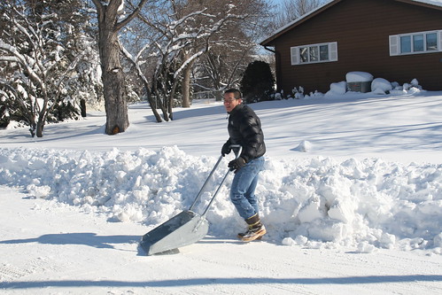
@ Ron @ 107 For the uninitiate, this is a Yooper scooper (average: person, boots, house, winter snow depth). We even have the smaller kid's size. But I use this 10.5 HP, 28" cut snowblower. @ muoncounter Exactly! The Yooper -
muoncounter at 02:19 AM on 30 January 2011Ten temperature records in a single graphic
#108: "Who on earth thought that last question was well-designed?" The survey as a whole reeks of bias; even the ordering of the questions is leading. In a survey that asks about current climate change, how can there be no presentation of current data? Are the students just supposed to guess or have they already been shown the answer? As a fellow science teacher, I'm embarrassed to see this. Here is a link to the US high school AP Environmental Science curriculum outline. Note in particular section VII. "Global change", which is supposed to represent 10-15% of the course. Among the content: Greenhouse gases and the greenhouse effect; impacts and consequences of global warming; reducing climate change; relevant laws and treaties. One has to wonder how that class went. Although it would be interesting to see how a class survey taken before an objective presentation of the data compared to one taken afterwards. -
mlyle at 02:19 AM on 30 January 2011Latest GRACE data: record ice loss in 2010
Sea level change is related not only to loss of land ice, but also thermal warming in the ocean and large scale ocean current structure. There is also a term associated with rebound of continents. Trying to compare Greenland ice loss directly to sea level is a mistake. Here's a site where you can look at the sea level data: http://sealevel.colorado.edu/Moderator Response: [Daniel Bailey] Thanks for the link. All further comments on sea level are off-topic here and should go on a more relevant thread (such as this one by reader PDT). Thanks! -
Zeroth at 02:15 AM on 30 January 2011Latest GRACE data: record ice loss in 2010
@#7, your second graph seems off. Thanks for linking to the data, can someone else run a line of best fit? That line doesn't seem right, and has more under than above(which violates the basic heuristic of line of best fit). The graph looks damning, but should be examined before being accepted. -
pdt at 02:10 AM on 30 January 2011Latest GRACE data: record ice loss in 2010
How is the short-term (last decade) accelerating land-ice loss (in Greenland and elsewhere) reconciled with sea level rise not accelerating? Does thermal expansion/contraction dominate over this time scale, is there too much error in the measurements, or is this truly something not clearly understood because of insufficient data like the energy budget? -
RickG at 01:53 AM on 30 January 2011Latest GRACE data: record ice loss in 2010
7 fydijkstra Why do I get the feeling that you have been in the cherry orchard? -
muoncounter at 01:48 AM on 30 January 2011Latest GRACE data: record ice loss in 2010
#7: "However, it's not alarming, because..." Astute analysis, fydijkstra! Except for the observation in the post that "the rate of ice loss continues to increase, more than doubling since 2002." As if that wasn't clear enough, the graph in Fig 2. has a distinctly negative slope, visually describing the increasing rate of loss. Doubling in 8 years represents a 9% annual rate of change. So your calculation that we can go on for 14000 years misses by several thousand years. But the damage is done long before Greenland is completely ice-free. Amsterdam's airport is how far above sea level? Or is the 'elevation' given here a negative number? -
soo doh nim at 01:32 AM on 30 January 2011Rebuttal to 'Scientist's Can't Even Predict The Weather Right'
For non-technical types, I find that this explanation seems to work: I can predict that Alex Rodriquez will bat close to .325 next season. Now, say it's July 22nd, and the A's are coming to town. Try predicting the first pitch (type & location) A-Rod will face in today's game. Your prediction becomes more accurate as the actual situation (number of outs, men on base, etc) approaches. That's weather. The prediction for the season average is climate. Nine times out of ten I get the Aha! reaction. -
Zeroth at 01:32 AM on 30 January 2011Latest GRACE data: record ice loss in 2010
Okay, I'm sure theres a reason for showing the Ice Mass Anomaly, but it does look deceptive. Can you explain how this is calculated, and why its shown, instead of the actual ice mass numbers? Disclaimer: I'm not a doubter. However, I want to have something strong to show people, and this doesn't fit yet, simply because showing the ice mass anomaly rather than actual ice mass data looks deceptive. -
Ken Lambert at 01:10 AM on 30 January 2011A Flanner in the Works for Snow and Ice calculations
MarkR #25 So Delta F should equate to my F.CO2GHG + F.otherGHG + F.solar (which are all the supposed independent of temperature) Y x DeltaT should equate to the climate and temperature responses: F.WVIA feedback - F.radiative feedbackSB - F.cloud albedo - F.direct albedo. ?? With your Delta Q equal to the difference between the two above terms. Is that right? -
fydijkstra at 00:46 AM on 30 January 2011Latest GRACE data: record ice loss in 2010
Two hundred gigatons mass loss from Greenland every year. It is quite a lot! We could cover the whole city of city of Amsterdam with 1000 meters of water with that amount of ice. Last week there was another paper, claiming that Greenland lost 310 Gigatons between October 2009 and September 2010. It seems to be a race to offer the highest estimates. However, it's not alarming, because: (1) 200 Gigaton is only 0.007% of the total Greenland mass, so we can go on for 14,000 years before the whole sheet disappears; (2) the sea level rise is not accelerating. This is what can be deduced from satellite measurements.

-
David Horton at 22:30 PM on 29 January 2011Latest GRACE data: record ice loss in 2010
Yes, when I see this graph I wonder why do it as an anomaly from average 2002-10. Why not simply present it as an anomaly from 2002? The graph as it is seems misleading, as you point out, suggesting ice gain pre 2007. I can't remember ever seeing a graph present data in quite this way before. Something a bit odd about the other data too. The current ice loss, from the graph, is not "over 200" but seems to be over 300. And the zero figure seems to be in 1975 - 35 years ago, not "2 decades". But prior to that, "some time before" "two decades", the figures are not also zero but again are over 100 in 1965-70. Do we know the reason for that? I would have expected the figures in those years to be zero. Are the measurements less accurate for those early years? Was there a difference in accumulation rates for some reason, or loss rates for some other reason? -
John Chapman at 22:15 PM on 29 January 2011Latest GRACE data: record ice loss in 2010
Thank you SS for this. John -
les at 21:50 PM on 29 January 2011Latest GRACE data: record ice loss in 2010
regarding comments on figure 1... reminds me of Garrison Keillor's intro... "Lake Wobegon where ... all the children are above average" -
Chemware at 21:34 PM on 29 January 2011Animated powerpoint of the Indicators of Warming
jyh @ 2: No, precipitation is rising globally, regardless of ENSO. See the interview with Trenbarth at Climate Progress: Exclusive interview: NCAR’s Trenberth on the link between global warming and extreme deluges This is part of an intensification of the hydrological cycle - so locally both droughts and floods will become more intense. Albatross @ 13: Ever done imagemaps ? Lots of fun :) -
BillyJoe at 21:13 PM on 29 January 2011Latest GRACE data: record ice loss in 2010
Perhaps we should invite Monckton to comment. Maybe he will question how changes in gravity as measured by satellites could possibly give an accurate estimation of changes in the Greenland ice mass. Actually I find it amazing myself but, then, I never ceased to be amazed by what can be achieved by scientists. -
jsam at 20:37 PM on 29 January 2011Naomi Oreskes' study on consensus was flawed
Poor Benny Peiser, having to eat so much crow, as this article highlights his analysis of data was 97% wrong http://www.logicalscience.com/skeptics/BPeiser.html. Naomi Oreskes is an outstanding scholar. -
Alexandre at 20:29 PM on 29 January 2011Latest GRACE data: record ice loss in 2010
Thanks John. Unfortunately, no surprises again... Any news on Antarctic GRACE data? -
adelady at 19:02 PM on 29 January 2011Ten temperature records in a single graphic
I did the survey too. Who on earth thought that last question was well-designed? -
michael sweet at 18:51 PM on 29 January 2011Latest GRACE data: record ice loss in 2010
John, Thank you for updating the data. Is it possible to compare the formula for the quadratic fit and see if the slope increased, decreased or stayed the same over the past year? Perhaps if the fit equation were shown that could be determined. It has been unusually hot over most of Greenland this winter. How will that affect the ice melt this year? -
Stephen Leahy at 16:55 PM on 29 January 20112010: A Year of Record Warmth and Weird Weather
opps here's the link -
Stephen Leahy at 16:54 PM on 29 January 20112010: A Year of Record Warmth and Weird Weather
#29 I asked Trenberth that question you posed. His response: “Without global warming these extremes are unlikely to have occurred." He went on to confirm that: "Changes in extreme weather events are the main way climate change is manifested.” -
Philip Shehan at 16:49 PM on 29 January 2011Tree-rings diverge from temperature after 1960
With regard to tree ring growth diverging from warming. I understand from other sections here that solar activity and cosmic radiation have also declined while temperatures have increased over the past few decades. Is there a possible causal effect due to this correlation? -
Ron Crouch at 15:48 PM on 29 January 20112010: A Year of Record Warmth and Weird Weather
It's more like the new abnormal normal. Abnormal in the sense that events are not only shifting in frequency of occurrence as the distribution shifts, they are also more intense. -
muoncounter at 15:30 PM on 29 January 20112010: A Year of Record Warmth and Weird Weather
#23: "seems to be making rather exaggerated claims" Hardly. The same cogent assessment of the changing probabilities of weird weather events was made here . It's worth quoting over and over until the message sinks in: Was global warming the cause of the 2010 heat wave in Moscow, the 2003 heat wave in Europe, the all-time record high temperatures reached in many Asian nations in 2010, the incredible Pakistan flood in 2010? The standard scientist answer is "you cannot blame a specific weather/climate event on global warming." That answer, to the public, translates as "no". However, if the question were posed as "would these events have occurred if atmospheric carbon dioxide had remained at its pre-industrial level of 280 ppm?", an appropriate answer in that case is "almost certainly not." That answer, to the public, translates as "yes", i.e., humans probably bear a responsibility for the extreme event. ... Although either answer can be defended as "correct", we suggest that leading with the standard caveat "you cannot blame..." is misleading and allows a misinterpretation about the danger of increasing extreme events. Extreme events, by definition, are on the tail of the probability distribution. Events in the tail of the distribution are the ones that change most in frequency of occurrence as the distribution shifts due to global warming. Weird ... its the new normal.
Prev 1934 1935 1936 1937 1938 1939 1940 1941 1942 1943 1944 1945 1946 1947 1948 1949 Next


