



 Arguments







Fixing one of climate’s worst plots
Posted on 7 September 2026 by Guest Author
This is a re-post from The Climate Brink by Andrew Dessler
This is the third and last in our series discussing the use of unadjusted data and how it overstates the warmth of the 1930s over the U.S. See part one and part two for more.
A hall of fame for bad climate plots would definitely include this one:
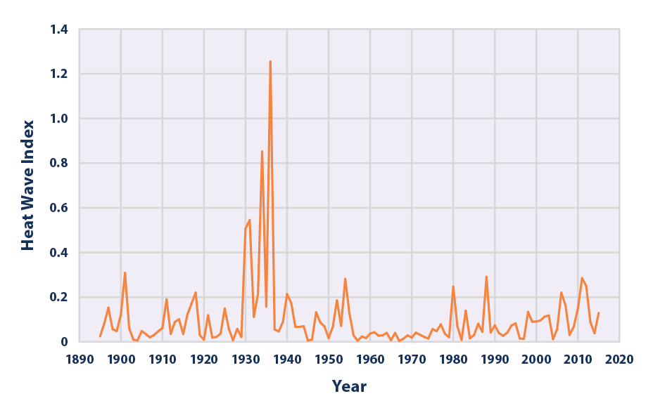
The plot covers the continental U.S., and it dramatically shows that temperatures in the 1930s were more extreme than those of the present period. The metric plotted, the heat wave index, is constructed as a station?average count of qualifying 4?day warm spells (mean temperature exceeds a local one?in?ten?year threshold) in each year, so higher values mean that heat waves were more frequent in that year.
It was originally published in 1999 and has gone through several iterations, with the one above from an EPA website in 2021.
Don’t take this as criticism of the original paper — it was published in 1999, after all. However, the plot has hung around long past its expiration date and has since become a staple of climate denial. I think it’s time to reconsider what the plot actually tells us.
But is it right?
After reading our previous posts on the heat of the 1930s, you probably already know the answer: this plot is wrong in important ways.
The plot above is constructed from raw, unadjusted station data, which contain significant biases both in the individual station records and in the geographic distribution of the stations.
As we discussed in our previous posts, we can adjust for those biases. Here are the plots with biases removed:
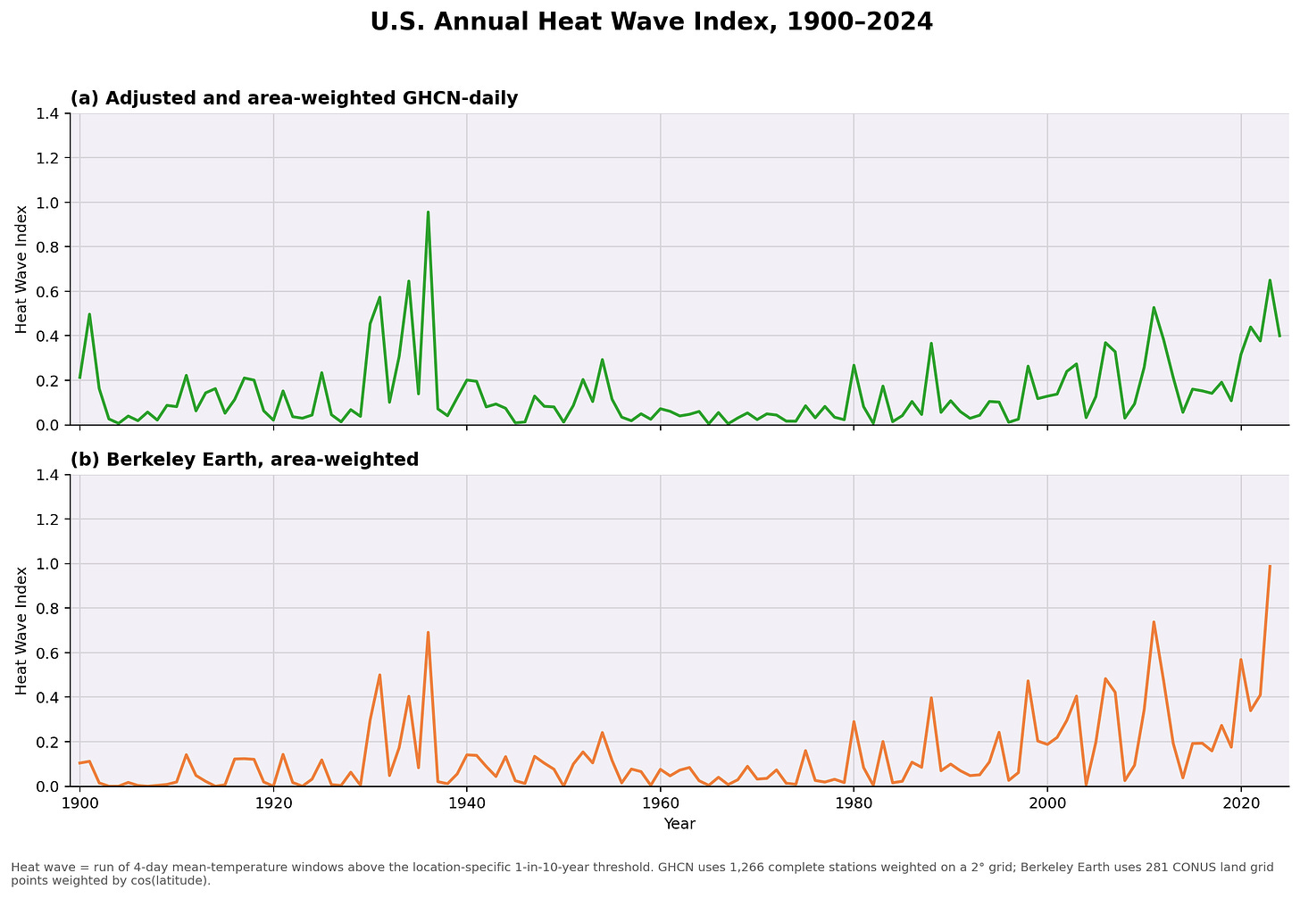
In these plots, I’m using the adjusted and area-weighted GHCN-daily data (described in this post) and the daily Berkeley Earth land data (used in this post).
Both plots show something different than the raw, unadjusted data. The GHCN-daily data show that the most extreme years were 1936, 2023, 1934, 1931, and 2011. In the Berkeley Earth dataset, the most extreme years were 2023, 2011, 1936, 2020, and 1931.
Thus, once you account for biases in the data, you cannot conclude that temperatures during the 1930s over the continental U.S. were more extreme than those of recent years.
Rather, the only fair conclusion is that the last few years have been about as extreme as the hottest years of the 1930s over the continental U.S.
The 1930s were hot, but not because of global warming
Despite this ambiguous answer, we can still learn something from the plot.
First, as we’ve pointed out many times, the heat of the 1930s was regional — it was concentrated in the middle of the U.S. That’s different from today, when extreme temperatures are a global phenomenon.
We understand why this small part of the U.S. was so hot in the 1930s. It was normal climate variability combined with human activities. The relevant human activity was not fossil-fuel combustion but bad farming practices that contributed to the Dust Bowl.
During the early 20th century, aggressive plowing and the replacement of native grasses left Great Plains soils exposed. When drought conditions developed, those degraded soils dried out quickly, reducing evaporation and soil moisture and reinforcing the heat.
This feedback between drought and land degradation amplified temperatures over the U.S. Midwest and helped create the extraordinary heat of the Dust Bowl era seen in the plots above.
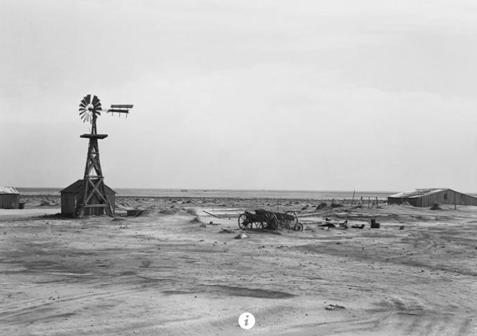
A picture is worth 1,000 words, so here’s what Dalhart, Texas looked like in 1938:
Here’s what Dalhart, Texas looks like today from space:
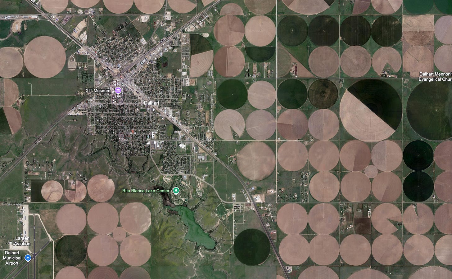
Those circles are the signature of center-pivot irrigation. Irrigation cools the surface, and the expansion of agriculture and irrigation in the central U.S. in the middle of the 20th century played a key role in why heatwaves were low in the middle of the 20th century:
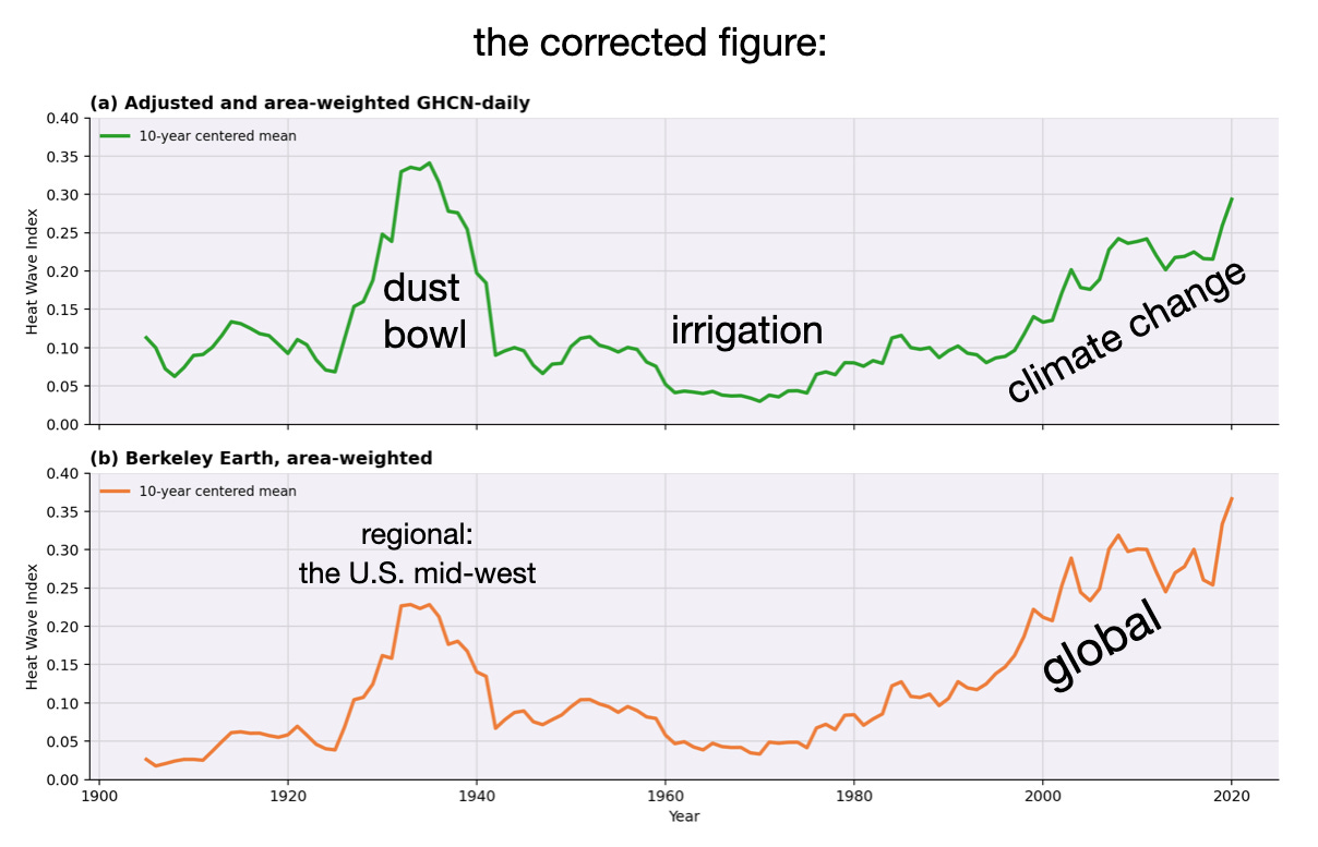
Starting in the 1970s, we see heatwaves trending upward. Unlike the heat of the Dust Bowl in the 1930s, this post-1970 increase is global. This is climate change making heatwaves more extreme.
Conclusions
-
The extreme heat of the 1930s covered a very small part of the planet, the U.S. Midwest. Focusing on just that region is a classic case of cherry-picking.
-
The heat of the 1930s was due to human activity in the form of bad agricultural practices combined with natural variability.
-
Since the 1970s, heatwaves have become more frequent. This differs from the Dust Bowl because it is a global signal, occurring essentially everywhere. This is almost certainly due to greenhouse gas emissions from human activities.
Thus, if you see someone trying to downplay today’s extreme heat by claiming that ‘the 1930s were hotter,’ it’s a scam. Tag it with #1930sScam, hit the share button below, and share the link and the corrected figure.Code to reproduce the figures is here.
Other stuff
My colleague, Prof. Adam Sobel, has a nice post on his substack Deep Convection about km-scale modeling and the state of U.S. climate modeling. You should read it.









Comments