


 Arguments


UAH atmospheric temperatures prove climate models and/or surface temperature data sets are wrong
What the science says...
| Select a level... |
 Basic
Basic
|
 Intermediate
| |||
|
The most likely explanation for why the UAH data set shows less warming of the lower atmosphere than expected is that UAH is biased low. |
|||||
Climate Myth...
UAH atmospheric temperatures prove climate models and/or surface temperature data sets are wrong
the satellite sensors show less warming in the lower troposphere (approximately 10,000 feet above the earth’s surface) than is reported by surface temperature readings. Global warming theory holds that one of the fingerprints of human-induced global warming is more rapid warming in the lower troposphere than at the surface (James Taylor)
Climate models predict, that as a consequence of global warming, the temperature of the lower troposphere (TLT) will warm about 20% faster than the Earth's surface temperature. On the contrary, TLT as computed by Roy Spencer and John Christy at the University of Alabama at Huntsville (UAH)is warming about 20% more slowly than the surface, as measured by groups like NASA Goddard Institute for Space Studies (GISS) and the National Oceanic and Atmospheric Administration (NOAA). There are three possible explanations for this model-data discrepancy:
- The models are wrong and the lower atmosphere should not warm faster than the surface.
- The surface temperature estimates are biased high, showing more warming than is actually occurring.
- The TLT estimates are biased low, showing less warming than is actually occurring.
The answer may also involve a combination of these three possibilities. But which is most likely?
The climate model expectation of greater warming in the lower atmosphere is based on fundamental atmospheric physics, so this may be the least likely explanation for the discrepancy. There are also several surface temperature data sets which are all in very close agreement, and whose accuracy was recently independently confirmed by the Berkeley Earth Surface Temperature (BEST) project, so the second possible explanation also appears rather unlikely.
However, as we've discussed elsewhere, UAH is not the only group analyzing the satellite temperature data. Other groups estimate that the lower atmosphere warming is larger than in UAH (Table 1).
Table 1: Lower (TLT) and mid-troposphere temperature (TMT) estimates from various groups
| Group |
TMT Trend |
TLT Trend (°C/decade) |
| UAH | 0.05 | 0.14 |
| RSS | 0.09 | 0.14 |
| Fu et al. |
0.13 | — |
| V & G |
— |
0.20 |
| Zou et al. |
0.13 | — |
| RATPAC |
— |
0.18 |
Note that the RATPAC radiosonde (weather balloon) data are in close agreement with the higher tropospheric temperature estimates, as are the HadAT2 radiosonde data (Figure 1).
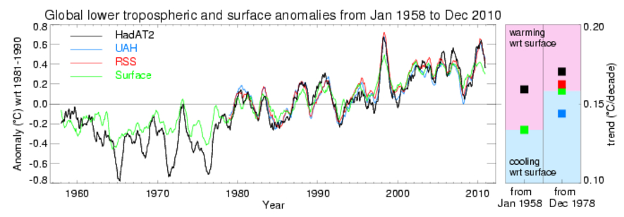
Figure 1: HadAT2 radiosonde data (black) vs. UAH (blue) and RSS (red) lower troposphere temperatures, and HadCRUT3 surface temperatures (green)
This provides yet another reason why it is unwise to assume that UAH is correct and the models/physics or surface temperature data are wrong. It is the UAH data that is the outlier.
Estimating atmospheric temperatures from satellite data is a tricky business. The microwave sounding units (MSU) aboard the satellites don't actually measure air temperature, but rather the intensity of microwave radiation given off by oxygen molecules in the atmosphere, from which the scientists estimate the temperature. Given that the radiation reaches the satellite sensors having travelled through a warming lower atmosphere and cooling upper atmosphere, that bias exists between the various instrument sensors, that the orbital decay of the satellite creates another bias in the data, and a host of other obstacles, there's a lot of careful and painstaking analysis required, and much that can go wrong.
Considering these challenges, it's not a surprise that there have been a number of major corrections to the satellite temperature data over the years. Groups outside of UAH identified two major errors in the UAH analysis, both of which had caused Spencer and Christy to significantly underestimate TLT warming (Figure 2).
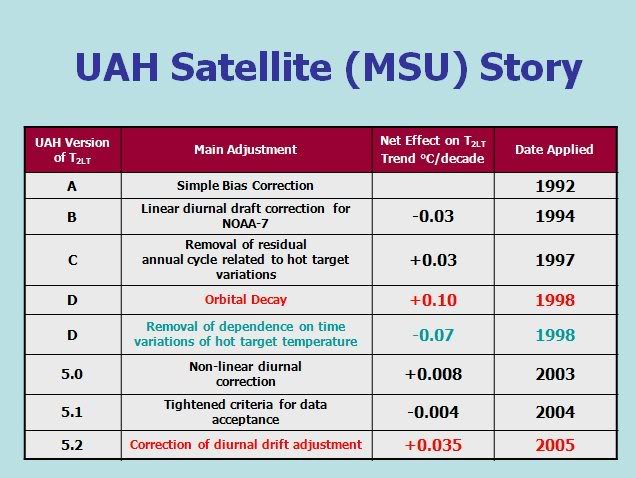
Figure 2: Major corrections to the UAH temperature trend over the years.
Despite the difficulties in the available data, and the numerous adjustments made to their analysis, Spencer and Christy have all along insisted that their data set is correct, and they continue with this overconfidence today. The most likely explanation for why the UAH data set shows less TLT than expected is that UAH is biased low.
Last updated on 1 January 2012 by dana1981. View Archives


Hi. Sorry for the heavy necromancing, but I find the "Major corrections to the UAH temperature trend over the years" tables shown at the bottom of both levels of explaination to be not very helpful, unless one already knows what they see. In the article linked right above them, it is properly explained what the highlighting is supposed to mean (red: suggested by outsiders, but not applied by UAH; blue: applied by UAH and makes up half the trend) and how the numbers are to be understood in context. I believe it could be helpful to either add a small explaining paragraph or remove the figure here altogether, but emphasize that more information on the messed up corrections can be found follwing the link.
Thank you for this amazing resource on Climate Change!
It would be interesting to see the corrections applied to subsequent versions. I know UAH 5.6 showed reasonably close agreement with the surface datasets (and with RSS TLT v. 4). Then it was replaced by UAH 6.0 and it immediately diverged to lower warming relative to all the other sets I follow.
knaugle @2,
I would not myself say that UAH TLTv5.6 "showed reasonably close agreement" with anything other than HadCRUT4 which itself showed less warming than other SAT records like GISTEMP.
And while RSS TLTv3.3 showed lower warming than all others back in the day, RSS TLTv4.0 is now showing more warming than UAHv5.6 did.
A comparison between HadCRUT4, UAH TLTv5.6 & v6.0 and RSS TLTv4.0 is plotted in this WoodForTrees presentation. Note how UAH v6.0 diverges over a short period 2000-12 which is symptomatic of a satellite calibration issue, something the UAH folk themselves accuse other satellite records of ignoring.
MA Rodger @3
What I have to go on was David Cowtan's Univ. York Temperature plotter. For 2000 to 2018, UAH 5.6 reported warming of +0.193°C/decade.
Global set HadCRUT4krigv2 had +0.191°C/decade. That seems reasonably close to me. I have not seen what HadCRUT5 says.
Meanwhile UAH 6.0 gives +0.141°C/decade since 2000. That seems a big downward drop. I imagine different time frames could vary the comparison, but when I used WoodForTrees to plot them all in 20,30, & 40 year increments, UAH 6.0 always stands out. 5.6 not so much.
Cowtan's Univ. of York Temperature Plotter
Sorry, a bit more. I agree GISS and Berkeley show higher warming, but the delta is about half large as what UAH 6.0 shows. I guess it depends what one would call "reasonable".
Regardless, this page is very dated, ending at ver. 5.2.
Knaugle , this very issue is addressed by the science journalist "Potholer54" in his latest Youtube climate video. Video dated 19 March 2022, and titled "A close look at Roy Spencer's claims on global warming". (Duration 20 minutes ~ and is number 59 in his climate series.)
The video lacks the usual humorous touch by Potholer54 . . . possibly because it leans more towards discussing Spencer's intransigence - the failure to acknowledge the validity of the mainstream climate science (owing to Spencer's religious fundamentalist belief that the Earth's climate is ultimately under divine control).
knaugle @4&5,
As we are commenting on SkS, perhaps it would be appropriate to note that Cowtan's "Temperature plotter" is one of the resources provided here at SkS.
And do note that UAH TLTv5.6 data only runs to July 2017 so any trend comparison using more recent dates (so an end date beyond 2017.6) will be comparing apples and oranges. For Jan 2000 to Jul 2017 HadCRUT5 (not on the trend engine) yields a trend of +0.226ºC/decade, pretty-much as per GISS & BEST.
You note the OP above hasn't been updated for a while. The 20 min video mentioned by Eclectic @6 doesn't really explain why UAH TLT 5.2 evolved into UAH TLT 5.6 and then into UAH TLTv6.0. And at one point the video actually uses the table shown in Fig 1 of the OP above.
Post-v5.2 (& I am no expert but if you are interested there is a UAH log of work done which shows one side of it), the evolution of UAH TLT to become 5.6 apparently does still include being driven by folk outside UAH observing problems and the UAH folk taking a long time to notice and to admit it was a problem and then to correct the problem.
Thus v5.3 arrived in 2010 addressing a spurious annual cycle which had been known about in 2008 but apparently first spotted back in 2003.
But much of the difficulty and thus the incrementing versions is down to the performance of individual satellites.
UAH TLTv6.0 appeared in 2015 and strangely UAH are more interested in proclaiming a new lower rate of warming than explaining what the new version is adressing. But perhaps not so strange if you watch that video.
Any thoughts / comments on the below article by Roy Spencer ?
https://www.heritage.org/environment/report/global-warming-observations-vs-climate-models
[PS] Edited link. Please learn to create links yourself with the link tool in the comment editor.
retiredguy - see here. Always kind of bugs me to see someone pushing overtly Christian worldview being happy to play loose with truth.
scaddenp,
I am not personally religious. But I have been open to participating in the activities of a United Church of Canada congregation because my pursuit of learning to be less harmful and more helpful to others is well aligned with their collective understanding and pursuit of reasons to change their mind (and they are open to having people in their congregation who do not share the belief that Jesus was part of the Holy Spirit).
So I know religious people who are also bugged by people who 'claim to be religious' but 'try to benefit by being manipulative and playing loose with the truth'.
The root of the problem in this case is people who claim to be scientific but 'play loose with the truth'. They try to resist learning that they, and people like them, need to 'change their mind'. Many of them, especially more educated ones like Spencer, probably 'know better' than the stories they make up ... which is even worse behaviour.
I will add that many religious people are open to learning about aspects of their developed beliefs that need to be revised. They want their understanding to be consistent with increased available evidence and related improved understanding about what is harmful and how they can be more helpful to others. There may even be a higher percentage of religious-inclined people who are open-minded than there are business-inclined people who are 'open-minded' on climate science matters.
So, I agree that it is shameful for someone like Spencer to 'play loose with the truth' while claiming to be Christian (or any other religious belief group) by presenting a misleading story on a website that claims to be religion-based. Much of the current day understanding of religions pursues limiting harm done and increasing 'helpfulness to others'. The exceptions are people who cherry-pick points and make-up misinterpretations who, in cases like this, are likely business-inclined people hoping to appeal for support. They claim to be <insert religion here> but are clearly just 'playing games in ways they hope they and their tribe will benefit from' - which is shamefully shameless behaviour - but can be very popular'.
retiredguy @8,
The essay by Spencer is his usual mess of nonsense dressed up to look like an informed and reasonable account.
Note for instance his second "takeaway":-
This is not a "takeaway" as such but a simply a bold statement supported only by reference to Irving et al (2021) 'A Mass and Energy Conservation Analysis of Drift in the CMIP6 Ensemble', a paper which does not in any way conclude that 'model drift' invalidates the findings of CMIP models as Spencer states it does. Here Spencer is very badly wrong but likely, as with his other egregious mistakes that happen to support his denialist views, he doesn't care and will not correct it.
In the RealClimate post that scaddenp links to in comment 9, Gavin Schmidt makes specific reference to that Spencer claim that climate models do not conserve energy. Schmidt states:
Note that this statement from Schmidt is in a postscript added three days after the original post. At the top of the postscript, Schmidt states:
This is not the first trip to the rodeo on Spencer's work of this sort. There is a pattern.
Regarding an individual's religious viewpoints and conflicts with their behaviour, it helps to understand the psychological concept of compartmentalization. It's a psychological defence mechanism that allows people to believe two (or more) conflicting things.
...and there is always the George Costanza defence:
Bob Loblaw,
Thanks for the Wikipedia link explaining 'compartmentalization'. It is another of the many considerations regarding the 'religious resisters of learning to be less harmful and more helpful to Others (many of whom are business-interested but claim to be religious - like the wealth pursuing Evangelicals)', along with cognitive dissonance (mentioned in the explanation) and motivated reasoning (Like the motivation to personally benefit. Especially attempts to unjustifiably improve status relative to others through actions that include attacking Others - the classic sport cheater who tries to intimidate or hurt the Other competitors.)