


 Arguments


Recent Comments
Prev 1168 1169 1170 1171 1172 1173 1174 1175 1176 1177 1178 1179 1180 1181 1182 1183 Next
Comments 58751 to 58800:
-
Helena at 05:21 AM on 14 May 2012IPCC graph showing accelerating trends is misleading
"It's not a proof of your original claim. " It proves that, chosen at random (i.e no cherry picking), it is more likely that the slope of long trends will be smaller that the slope of short trends. Do you agree with that ? "The asnwer is yes" Wrong. You cannot infer accelerated warming from greater slopes for shorter recent periods Muoncounter 66 : Your example for rain is not exactly correct. First, I don't understand how those two sentences "It rained really hard the other night, 2" an hour for a bit. Then the rainfall rate decreased. " fit with the rest. The exercise is correct if you "only know" the various trends, and nothing else. So let me start here : I do not know if it rains after or not. I do not know if it was raining before or not. Here is how i write your exercise "Over the course of 4 hours, there is 3" of rain. The rate over the entire period is thus 3/4" per hour. The rate in the last half hour is 1/4" per hour." You take these changing trends as an indicator that the rainfall rate is decreasing. I'm sorry but i don't see how you can infer a deceleration. Maybe you do that because you already assume that it stopped raining after that, or that it must rain at a constant rate, or because you've lived it, but here you're adding crucial extra information that are not contained in the trend itself ! What if i tell you that it rained (3-1/8)" during the first hour, then it was sunny during 1h and half and then it rained again 1/8 (rate of 1/4" for half an hour). Maybe it's a new cloud coming and it's gonna rain for the next 5 hours. Who knows ? You've been adding the information that it's zero after that, but when you do that you do more than comparing the trends to infer the deceleration. -
muoncounter at 04:56 AM on 14 May 2012IPCC graph showing accelerating trends is misleading
Helena#53: "we are on planet SKEPTSCIENCE. ... an indicator that we have an accelerated warming on this planet?" I prefer to work on this planet (for the time being). It rained really hard the other night, 2" an hour for a bit. Then the rainfall rate decreased. Over the course of 4 hours, there was 3" of rain. The rate over the entire period was thus 3/4" per hour. The rate in the last half hour was 1/4" per hour. I took these changing trends as an indicator that the rainfall rate was decreasing. In your hypothetical, I assume you refer to trends calculated from time intervals starting progressively closer to the present, as illustrated in the OP's figure 1 and in DB's response here. Let's also stipulate that each of these calculated trends is statistically significant - neither an artifact of any carefully selected time periods nor some artfully constructed noise. Functions that produce statistically meaningful trends that increase over time are far more likely to be increasing and concave up (which we agree is one form of 'accelerating'). Examples: x^2, x^3, etc (for x>0). On the other hand, functions that are increasing and concave down (decelerating) show the opposite behavior: 'older' trends are greater than more recent trends. Examples can be found among trig functions (5-5 Cos[x]), x between 0 and Pi. Add random noise if you like. Let's not devolve this discussion into wrangling over what the word 'indicate' means. -
Riccardo at 04:48 AM on 14 May 2012IPCC graph showing accelerating trends is misleading
Helena you consistently avoid to address the weaknesses other commenters and I point out. In your last reply to me you end with the trivial fact that long term trends are more constrained than shorter ones. I agree, but it does not mean that they are larger (or smaller for that matter) in any way. It's not a proof of your original claim. On the other hand you still do not see the difference between starting at an old date and going forward from strating today and going backward. I don't want to pile up with other commenters and anyway untill you properly address this point, which is the source of disagreement with us all, the discussion can not move forward. P.S. Let me answer to your question to Tom: can one infer accelerated warming from greater slopes for shorter recent periods (150-10-50-25yr periods like in the IPCC)? The asnwer is yes, the trend has lately accelerated with respect to the secular trend. This is what that graph tells us. Now a hint, applying the same logic to your analysis, what does it tell us? -
Helena at 04:19 AM on 14 May 2012IPCC graph showing accelerating trends is misleading
Well then let's have Tom answer on the important question (for the n'th time) : can one infer accelerated warming from greater slopes for shorter recent periods (150-10-50-25yr periods like in the IPCC). Tom, yes or no ? -
Bob Lacatena at 04:15 AM on 14 May 2012IPCC graph showing accelerating trends is misleading
62, Helena, Yes, you did. I don't see how it can be read any other way. -
Helena at 04:10 AM on 14 May 2012IPCC graph showing accelerating trends is misleading
Tom61, i don't misrepresent any of your claim, but i guess it's easy on a forum to make people think that. Anyway, can you tell me what you think of KR claim that "If those trend changes are statistically significant, and increasing (and they are both), you can infer acceleration." Thanks (that is the same as my yes/no question #53 -
Tom Curtis at 04:07 AM on 14 May 2012IPCC graph showing accelerating trends is misleading
Helena @57 misrepresents my claim, and I believe deliberately so. My stating what her argument is is not the same as my agreeing with her argument, and no reasonable person could expect it to be so. -
Helena at 04:07 AM on 14 May 2012IPCC graph showing accelerating trends is misleading
KR : "If those trend changes are statistically significant, and increasing (and they are both), you can infer acceleration." Sorry but this is wrong. -
KR at 04:02 AM on 14 May 2012IPCC graph showing accelerating trends is misleading
Helena - "...one cannot infer accelerated warming from greater slopes for shorter recent periods." As I stated earlier, "Shorter terms will certainly have higher variances, but absent an underlying change in rate, randomly selected time periods and lengths would statistically average out to the same trend." If those trend changes are statistically significant, and increasing (and they are both), you can infer acceleration. That's the entire point of looking at statistical significance, to judge whether or not apparent indicators are indeed evidence. -
Helena at 03:54 AM on 14 May 2012IPCC graph showing accelerating trends is misleading
... from greater slopes for shorter recent periods -
Helena at 03:53 AM on 14 May 2012IPCC graph showing accelerating trends is misleading
Tom56, i've already agreed on the 25yr trend quite some time ago and i had noted that ironically it would be wrong if stated in AR5 as 1987-2011 is quite smaller. "Your argument against the inference that the warming is accelerating is a claim that the inference is not justified statistically. " Great to see that, based on common sense statistics, you agree that point 1 is incorrect i.e. the word "indicate" is wrong as one cannot infer accelerated warming. -
Tom Curtis at 03:41 AM on 14 May 2012IPCC graph showing accelerating trends is misleading
Helena @51, if you want to claim that claim (2) from the OP is false, you need to show a 25 year trend earlier than the record that has a statistically significant greater trend. As it happens, you cannot even find one with a greater trend, let alone a statistically significant trend. If instead you want to simply claim that it was unjustified, ie, if you change your claim, then statistical significance becomes important. As it stands, given the available data the IPCC is justified in asserting that "it is more likely than not" that the 25 year trend terminating in 2005 was larger than any other 25 year trend on the instrumental record, both because. They are justified in doing so because the measured trend is in fact larger than any prior trend in the HadCRUT3v data, and because on the GISTEMP and NCDC data, which are more extensive, it is also larger than any prior 25 year trend, and by a larger margin. Your argument against the inference that the warming is accelerating is a claim that the inference is not justified statistically. Therefore you cannot ignore statistical significance. The problem here is not that I am asserting a double standard, but that you will not accept any standard which falsifies your claims, however, well justified those standards are. -
Helena at 03:38 AM on 14 May 2012IPCC graph showing accelerating trends is misleading
"my linear trends and the IPCC linear trends" = "my evolution of linear trends and the IPCC evolution linear trends" -
Helena at 03:36 AM on 14 May 2012IPCC graph showing accelerating trends is misleading
Tom52 : Qualitatively, my linear trends and the IPCC linear trends contain the same qualitative information about the underlying temperature function : NONE. That's the only point i'm making. You can answer my yes/no question on message 53 if you wish. -
Helena at 03:34 AM on 14 May 2012IPCC graph showing accelerating trends is misleading
Muoncounter, i have a yes/no question (with explanations if you want of course) for you : Forget about Earth, we are on planet SKEPTSCIENCE. A scientist comes to you and tells you that, when he calculates the past 150, 100, 50, and 25yr temperature trends for the planet, he finds that for the shorter recent periods, the slope is greater. Do you understand what he just told you as an indicator that we have an accelerated warming on this planet ? Thanks for your answer -
Tom Curtis at 03:26 AM on 14 May 2012IPCC graph showing accelerating trends is misleading
To reinforce my points @45 and 49, I note that the difference between the 25 year and 100 year trend in the IPCC example is 0.0103 C per annum. That is nearly double the 95% confidence interval of the 25 year trend, ie, 0.0052 C per annum, and greater than the confidence interval for the trend calculated using the trend calculator of 0.0078 C per annum. In contrast, in Helena's cherry picked example, the difference is 0.0063 C per annum, just barely larger than 95% confidence interval for the 25 years from 1981 to 2005, and less than the interval calculated using the trend calculator. In other words, Helena cannot show a statistically well based inference that the 25 year trend is different from the 100 year trend in her example. Given that, insisting that it should be treated as qualitatively the same as the IPCC example is just bizarre. -
Helena at 03:25 AM on 14 May 2012IPCC graph showing accelerating trends is misleading
Tom49: This is getting tiring, in message 12 you were saying that error bars didn't matter, now they do. A "consistent picture" is one where there is no "exception, especially when the "consistent picture" is based on N=5 trends. And you can get a very large "relative magnitude in the changes in the slopes", with increasing slopes, with an underlying cooling temperature. Back to the quantitative/qualitative discussion, it's tiring. Muoncounter50 : Let me start by the end : "Do you agree that the rate of warming is accelerating? " On the graph ? Yes. "If so, do you agree that an appropriate description of a graph representing that behavior is 'increasing and concave up'? " Yes, already answered that. Now to the relevant point : "You've agreed that the qunderlying function is increasing and accelerating: that's what is relevant." I've agreed to it because you asked me the question directly. And that's the good way to do it, no need to do that linear trend torturing just find the coefficient in front of the x^2 (if it positive, then you have an acceleration). But the IPCC does not start with that. They start with the linear trends. And those increasing linear trends supposedly indicate an accelerated warming. I say that's wrong, and i've proven it. -
muoncounter at 03:09 AM on 14 May 2012IPCC graph showing accelerating trends is misleading
Helena#42: "you can have "trend-lines starting closer to the present have a steeper slope than those starting farther back" and an underlying function that is not "an increasing and accelerating function"" Good: we are now talking about the underlying function (temperature anomaly vs. time), which gets us away from the artifice of choosing time intervals for 'trend' calculation. You've agreed that the underlying function is increasing and accelerating: that's what is relevant. Describing that function by selecting 10 year, 20 year or 100 year intervals does not change the function. #47: "We are not discussing whether temperature is accelerating or not." This isn't a forum for semantics and tautology. The statement in the OP is "the incorrect conclusion is drawn that ... the rate of warming is accelerating". Questions: Do you agree that the rate of warming is accelerating? If so, do you agree that an appropriate description of a graph representing that behavior is 'increasing and concave up'? -
Tom Curtis at 03:06 AM on 14 May 2012IPCC graph showing accelerating trends is misleading
Helena @47, No! The differences in trend in your example are very small relative to the error margin of the trends, and are significantly inconsistent in showing deceleration. Therefore your conclusion does not follow. In contrast, in the IPCC example, the differences in trend are large relative to the error margin of the trends, and with one exception, they all show the consistent pattern. The size of the effect relative to the error margin is a critical factor in determining whether or not a statistical inference is warranted. You choose to ignore that factor simply because it suites your argument. However, I will not. The difference in visual impact between your cherry picked example and the IPCC example comes primarily from the relative magnitude in the changes in the slopes, which is the critical factor on whether the inference is valid or not. Your argument, in the end comes down to just three points: 1) Ignore the magnitude of effects, thereby assuming that the magnitude of the effect has no consequences for statistical inferences; 2) Assume that any noise in the data automatically invalidates any statistical inferences (as when you argue the 75 year trend to 2005 invalidates the overall pattern, while scrupulously ignoring the fact that the 125 year trend reinforces the pattern); and 3) Assume that the possibility that a statistical inference can reach a false conclusion proves that the statistical inference is invalid ,ie, that the fact that inductive arguments are not deductive arguments proves that they are not valid inductive arguments (as when you argue that the 1910 example invalidates the IPCC inference, and even then you must assume that the size of effects is irrelevant to begin with). -
Helena at 02:57 AM on 14 May 2012IPCC graph showing accelerating trends is misleading
Tom45 : i hadn't seen you had depicted the 75yrs trend. Please read my yes/no question as if it wasn't there (like the IPCC, otherwise there is no discussion as their statement "for shorter recent periods, the slope is greater" is an untrue statement and therefore this website article is wrong too). -
Helena at 02:49 AM on 14 May 2012IPCC graph showing accelerating trends is misleading
Tom45 : The first graph shows that, over the 1910-2010 the trend was steep at the beginning of the century, and as we were advancing in the century, it has been decreasing. Do we agree that all of these statements in this sentence are true ? (Please answer yes/no + comments if you wish) But maybe you do realize that it's not such a good idea to compare a short trend to a long trend ? :) KR46 : No, it is not on the point, and no it's not incorrect. You can have a global cooling and still have increasing slopes as depicted by IPCC. But i think you don't understand what we are discussing. We are not discussing whether temperature is accelerating or not. We are discussing whether the IPCC trend torturing supports the accelerating temperature statement. -
KR at 02:36 AM on 14 May 2012IPCC graph showing accelerating trends is misleading
Helena - Regarding my first point, that the forcings are accelerating, and hence an accelerating temperature trend is only to be expected, is entirely to the point. "...the fact that the IPCC method finds smaller slopes for longer trends has nothing specific to an accelerated warming..." Shorter terms will certainly have higher variances, but absent an underlying change in rate, randomly selected time periods and lengths would statistically average out to the same trend. Your assertion is quite incorrect. -
Tom Curtis at 02:35 AM on 14 May 2012IPCC graph showing accelerating trends is misleading
Let us be quite clear, Helena's supposed counter example is not qualitatively equivalent to what the IPCC did: Helena's cherry picked example: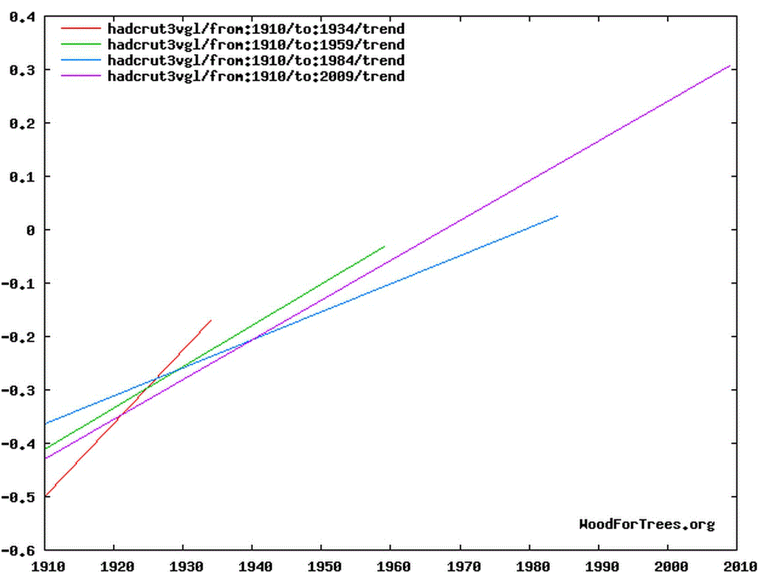 IPCC example:
 Her insistence that the two are equivalent merely shows, IMO, that her reasoning is driven by the conclusions she wishes to draw rather than by the facts on the ground.
-
Helena at 02:26 AM on 14 May 2012IPCC graph showing accelerating trends is misleading
Sphaerica43 : Sorry maybe it was obvious for you, but not for Tom, as he is the one who said that contrary to my apparent claim (and now also yours), it is not possible to pick arbitrary end points mimicking the IPCC graph, and to show a deceleration over the temperature record as a result. Glad to see you agree that it's possible. "while the IPCC method simply and logically says "from X years ago to now"." Again, the fact that the IPCC method finds smaller slopes for longer trends has nothing specific to an accelerated warming, therefore it cannot "indicate" an accelerated warming.Moderator Response: TC: Edited to comply with comments policy. The comments policy is not optional. It contains instructions for html coding of emphasis, so failure to use that resource is not a sufficient excuse for failure to comply with the comments policy. As this is the second time you have been warned on this issue, future all caps will result in the deletion of the offending post. -
Bob Lacatena at 02:19 AM on 14 May 2012IPCC graph showing accelerating trends is misleading
Helena, Your entire argument hinges on cherry-picking a well-known, very short period (25 years) with a very rapid temperature increase, the 1910 to 1934 period, and then supplementing that with a similar period ending in 1959. No one is arguing that you can't cherry pick ranges to give the appearance of a decelerating trend. What we can point out is that your method requires cherry picking, while the IPCC method simply and logically says "from X years ago to now". -
Helena at 02:16 AM on 14 May 2012IPCC graph showing accelerating trends is misleading
Yes Yes Yes (in general, you can find punctual counterexamples but that's not what we're talking about) but what's important is that the converse is not true i.e you can have "trend-lines starting closer to the present have a steeper slope than those starting farther back" and an underlying function that is not "an increasing and accelerating function" And it is the converse that the IPCC is saying. They say : "Note that for shorter recent periods, the slope is greater" ==indicating=>> "accelerated warming" That is NOT true. And that's because steeper slopes for short period trends and smaller slopes for long period trends is a general statistical fact. "Note that for shorter recent periods, the slope is greater" can also indicate a cooling trend if you want. You cannot deduce anything from the fact that "for shorter recent periods, the slope is greater", it's just a general statistical fact. -
muoncounter at 02:05 AM on 14 May 2012IPCC graph showing accelerating trends is misleading
Helena #28: "concave up would be correct." This is in reference to a graph presented without any selective trend calculation. I note that you did not challenge the accuracy or applicability of the BEST temperature anomaly vs time graph, so we must take that to mean you accept it's use in this context. So let's go to yes/no questions. You have already agreed that the graph in question is concave up: -Do you agree that concave up is defined by a positive second derivative? -If yes, do you agree that when both first derivative (slope) and 2nd derivative (rate of change of slope) are both positive, the graph describes a function that is accelerating? -If yes, do you agree that an increasing and accelerating function is correctly described by "trend-lines starting closer to the present have a steeper slope than those starting farther back"? -
Helena at 02:04 AM on 14 May 2012IPCC graph showing accelerating trends is misleading
KR : on your first point, it's out of topic here and i don't wanna have troubles with moderators. On the second point, don't you agree with me with the fact that, on average, slopes for longer trends are smaller that slopes for shorter trends, no matter whether you are in a warming or a cooling world, but because it's a simple statistical result ? The only data i have been torturing is when i answered Tom's challenge (proving you can have decreasing 25-50-100 year trends). My torturing of the data was the same that the one the IPCC used for their graph. Therefore i guess we'll agree that what i did for Tom is at the same level as what the IPCC did : poor scientific rigor ! -
KR at 01:53 AM on 14 May 2012IPCC graph showing accelerating trends is misleading
Helena - "... read KR response ... What he says is not entirely correct, the exponential of the CO2 is taken care of by the log of forcings, it doesnt really play there (the exponential, not the CO2 !)." Actually, Helena, Tamino has demonstrated that CO2 forcing is increasing at a rate greater than exponential, meaning that CO2 forcing is increasing at a rate greater than linear. Meaning that the CO2 forcing component is accelerating. However, the core of your posts here have been nit-picking, and incorrect, complaints that the IPCC graphic shown in the opening post is somehow proven wrong by cherry-picked short term trends, or by wordplay with longer terms. Your arguments have the appearance of someone torturing the data to support a favored point, rather than considering the data for it's worth - I sincerely hope that's not the case. -
Helena at 01:52 AM on 14 May 2012IPCC graph showing accelerating trends is misleading
Ricardo "you did not show that "on a very general basis, longer trends tend to have smaller slopes." " I did not *show* that because the fact that trends over long time periods generally imply smaller slopes is a simple statistics, especially for a physical phenomenon like temperature. Of course you can find punctual counterexamples, but they are punctual. Just think about it : let's say, i'm sure you'll agree, over the past millenium, global temperature was constrained between 0 and 30°C (so we make it very very general). That means that the largest linear trend you can find if you look for the trend over the last 1000 years is 0.3°C/decade. Now let's look on year to year basis, and let's assume that the maximum year to year variation for global temperature is 0.3°C/yr. That's 3°C/decade, already ten times more than the millenium one (which was calculated supposing a 30°C variation !!!). Anyway, i guess you get it : long time trends are much more constrained that short time trends, and therefore you get on average more big trends on shorter times than on longer times. Are you convinced ? -
Riccardo at 01:23 AM on 14 May 2012IPCC graph showing accelerating trends is misleading
No Helena, you di not show that "on a very general basis, longer trends tend to have smaller slopes." You can easily find short term trends with smaller slopes if you change your start point. Again, you are misinterpreting the meaning of what you calculated. -
Riccardo at 01:20 AM on 14 May 2012Turbines in Texas mix up nighttime heat
Nick I think I see what you're saying but the derivation of the Betz's law you quoted assumes a purely laminar flow along the turbine axis, no turbulence whatsoever. If that is the ideal case, heat dissipation due to turbulence damping has to be part of the about 10% overall losses. Then, muoncounter's number is largely overestimted. -
Helena at 01:19 AM on 14 May 2012IPCC graph showing accelerating trends is misleading
small trend = trend over a small time period long trend = trend over a long time period -
Helena at 01:17 AM on 14 May 2012IPCC graph showing accelerating trends is misleading
Moreover, the evolution of the slope does not indicate anything about what the record is actually doing : the record can be going down while the slope of the various trends can be increasing simply because the trends get calculated on smaller time periods. -
Helena at 01:14 AM on 14 May 2012IPCC graph showing accelerating trends is misleading
Ricardo, what i am showing is that, on a very general basis, longer trends tend to have smaller slopes. And therefore what the IPCC shows as an indicator of accelerated warming is merely a statistical artifact. They start with a long trends small slope and end up with a small trend large slope (accelerated warming). I start with a small trend large slope and end with a large trend small slope (decelerated warming). -
Riccardo at 01:01 AM on 14 May 2012IPCC graph showing accelerating trends is misleading
Helena I didn't follow the discussion but at a cursory reading of your claim I find it like a world upside down. You start at an early time and go forward while the IPCC goes the other way around. Are you surprised that you get different or even opposite results? The problem is the meaning and that's what (it seems to me) your're missing. -
Helena at 00:56 AM on 14 May 2012IPCC graph showing accelerating trends is misleading
(therefore your trends don't indicate anything for the behavior of temperature, as i said) -
Helena at 00:54 AM on 14 May 2012IPCC graph showing accelerating trends is misleading
Well, first the trends you calculated are NOT the ones shown on the IPCC. Second, you can easily imagine a temperature record with, as shown by IPCC, a greater slope for shorter periods indicating accelerated warming but where the temperature is in fact cooling. -
Helena at 23:32 PM on 13 May 2012IPCC graph showing accelerating trends is misleading
Eric most of what you say is out of topic we're not discussing natural or man-made acceleration here. We're just discussing the IPCC graph and their use of trends as an indicator of accelerated warming or to support their specific statement.Moderator Response:[DB] Actually, most of what Eric has stated is on-topic and germane to this discussion. You are tortuously arguing against a very simple point:
Using Woodfortrees, this is easily seen, thusly:"Note that for shorter recent periods, the slope is greater, indicating accelerated warming."
[Source]
Or just the trends themselves:
[Source]
Where is the disagreement from the statement to the graphics? It really is that simple.
-
Eric (skeptic) at 22:46 PM on 13 May 2012IPCC graph showing accelerating trends is misleading
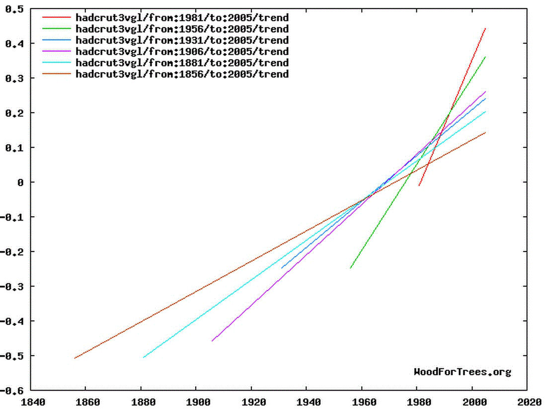
"concave up would be correct. Nobody is saying it didn't warm here." Helena, your phrasing is regrettably imprecise. Muoncounter pointed out that the warming is accelerating by a concave graph. "You can easily imagine records where linear trend fits to the last 25, 50, 100 and 150 years (and even 75 :) ) increase but where the is no warming." Again the issue is acceleration of warming, not simply "warming". The IPCC caption is"...Linear trend fits to the last 25 (yellow), 50 (orange), 100 (purple) and 150 years (red) are shown, and correspond to 1981 to 2005, 1956 to 2005, 1906 to 2005, and 1856 to 2005, respectively. Note that for shorter recent periods, the slope is greater, indicating accelerated warming".
The IPCC graphic is overly simplistic (IMO) since it does not discuss the extent of natural acceleration and deceleration that could lead to a superimposed natural and manmade acceleration. That would require a paper. But the IPCC claim is that there is acceleration of warming (unattributed) and that the acceleration is current (as of 2005). -
BC at 22:22 PM on 13 May 2012Arctic Winter Analysis
Thanks for the interesting article.It'll take a few reads to absorb. A question in the meantime - how do scientists get the sea level pressure and the surface air temperature measurements for a place like the Artic? -
Nick Stokes at 21:24 PM on 13 May 2012Turbines in Texas mix up nighttime heat
Michael, one could say, why not add in the rotational velocity of the Earth as well? Or is air in a plane hotter after take-off? KE for this purpose would be calculated with mean square velocity - ie square of deviations about the fluid mean velocity. Otherwise it depends on frame of reference. Definition of temperature requires local thermodynamic equilibrium in a volume. That volume would have to be moving with the fluid. If there is flow through the volume, then there is advection - no equilibrium. I don't believe the generator exports 59% of the wind energy - that's a very theoretical max. Riccardo, I agree that the 40% refers to emerging KE. My point is that it's no longer avial flow - it's azimuthal or turbulent eddies, and it can't go anywhere much. When it decays, as it must, it will be converted to heat. But MS's calc says it won't raise the temperature much. -
Glenn Tamblyn at 20:25 PM on 13 May 2012Two Centuries of Climate Science: part three - Manabe to the present day, 1966-2012
LT @3. I love the image that in 'skepticland' they get confused easily. "It would be more accurate to say that greater CO2 concentrations cause the outgoing energy to meet greater resistance as it passes from the surface to outer space." My understanding of ther GH Effect is that most 'outgoing radiation' from the surface gets absorbed - perhaps 99%. What matters far more is how much of this initially absorbed radiation 'eventually' manages to escape. The GH effect is defined, less by how much is initially absorbed, rather than by how much is subsequently re-radiated. It is increased restriction of the re-radiated component that is the main game. -
michael sweet at 19:25 PM on 13 May 2012Two Centuries of Climate Science: part three - Manabe to the present day, 1966-2012
Lazyteenager, You are incorrect. The energy into the Earth system currently does not equal the energy out. The Earth has an energy imbalance caused by human greenhouse gasses. See this post for evidence of ocean heat uptake. Energy in equals energy out at equilibrium. The equilibrium has been upset and the globe must warm to re-establish the equilibrium. -
Helena at 19:08 PM on 13 May 2012IPCC graph showing accelerating trends is misleading
Sphaerica27 : It's really a pain to understand what you're looking for. Everything is done on woodfortrees with HadCRUT3 variance adjusted global mean. First my homework : what i showed, responding to Tom's challenge : "it is not possible to pick arbitrary end points mimicking the IPCC graph, and to show a deceleration over the temperature record as a result. You have no counter example to the IPCC's procedure. " is that there exist a common start point for which it works : 1910-1934 > 1910-1959 > 1910-2009 gives a decreasing trend as you get closer to present : 25yr trend #Selected data from 1910 #Selected data up to 1934 #Least squares trend line; slope = 0.013717 per year 50yr trend #Selected data from 1910 #Selected data up to 1959 #Least squares trend line; slope = 0.00773312 per year 100yr trend #Selected data from 1910 #Selected data up to 2009 #Least squares trend line; slope = 0.00742333 per year The closer you get to present, the smaller the trend. Uhhhhhhhhhh Back to IPCC graph. The second thing i showed it that the not depicted 75yr period 1931-2005 is > the 100yr period 1906-2005, which goes against the increasing trend assertion by the IPCC. 100yr #Selected data from 1906 #Selected data up to 2005 #Least squares trend line; slope = 0.00724928 per year 75yr #Selected data from 1931 #Selected data up to 2005 #Least squares trend line; slope = 0.00659195 per year 50yr #Selected data from 1956 #Selected data up to 2005 #Least squares trend line; slope = 0.0124017 per year muoncounter26 : concave up would be correct. Nobody is saying it didn't warm here. Had it been the statement written in the IPCC, i wouldn't be here discussing it with you. The problem is the IPCC saying that linear trend fits to the last 25, 50, 100 and 150 years indicate warming. You can easily imagine records where linear trend fits to the last 25, 50, 100 and 150 years (and even 75 :) ) increase but where the is no warming. I really don't understand how you guys can defend the idea that the IPCC trend graph & statement support or indicate anything. "Do we really need trends to see what's been happening?" I agree with that. But you should tell that to IPCC. I'm the one criticizing their (mis)use of trends to support a statement. -
John Mason at 18:30 PM on 13 May 2012Two Centuries of Climate Science: part three - Manabe to the present day, 1966-2012
re - #3, a certain amount of IR emitted by the planet's surface does not get back out into space because it is absorbed by the GHGs and re-radiated in all directions, including back towards the surface. To me, that's 'prevented' although some might prefer 'inhibited' I guess. Surely if energy in = energy out the lack of net gain would keep us as a snowball, given our distance from the sun - exactly the problem that got Fourier's interest going back in the early 1800s. -
LazyTeenager at 16:38 PM on 13 May 2012Two Centuries of Climate Science: part three - Manabe to the present day, 1966-2012
The fact that carbon dioxide is a 'greenhouse gas' - a gas that prevents a certain amount of heat radiation escaping back to space --------- This is wrong. I know what you intended to mean, but in climate skeptic land they get confused easily. They do crazy things like picking at some analogy or metaphor in the belief that exposing the limitations of a metaphor somehow disproves the greenhouse effect. In case it's not clear the energy in must equal the energy out. This energy is in the form of radiation. It's not prevented from escaping back to space. It would be more accurate to say that greater CO2 concentrations cause the outgoing energy to meet greater resistance as it passes from the surface to outer space. -
Bob Lacatena at 14:48 PM on 13 May 2012IPCC graph showing accelerating trends is misleading
Helena, I did look at your links and graphs, and what I'm saying is that they don't show what you claim they show. Let's try it this way... list the ranges of years, and the slope. Just do that. Let's see you cherry pick the years to make this work. -
muoncounter at 13:22 PM on 13 May 2012IPCC graph showing accelerating trends is misleading
Helena#21: "Increasing trends don't (-snip-) an accelerated warming, and decreasing trends ... a decelerated warming. They don't (-snip-) anything." That has to be a new highpoint in doublespeak. Changing trends don't indicate anything? That requires that 'there's been no warming since xxxx' doesn't indicate anything; nor is there anything indicated by 'there is no scientific basis for saying that warming hasn't stopped'. I suppose 'concave up' doesn't mean anything either. Do we really need trends to see what's been happening?
-
Eric (skeptic) at 11:20 AM on 13 May 2012IPCC graph showing accelerating trends is misleading
Obviously your post is staying since it got fixed. I disagree with your assessment of the log of the exponential and it is addressed here
Prev 1168 1169 1170 1171 1172 1173 1174 1175 1176 1177 1178 1179 1180 1181 1182 1183 Next


