


 Arguments


Recent Comments
Prev 1348 1349 1350 1351 1352 1353 1354 1355 1356 1357 1358 1359 1360 1361 1362 1363 Next
Comments 67751 to 67800:
-
hig314 at 21:16 PM on 20 December 2011It's not bad
Under "Sea Level Rise" it would be good to specifically mention coastal erosion. Rising sea level threatens not just those who will find themselves beneath the waves, it also threatens those atop the tall cliffs. Basically rising sea level changes the mass balance of sediment on beaches. By creating new room ("accommodation space") for sediment storage, sea level rise can quickly drain a beach of sediment, exposing the surface protected by the beach. Also it obviously provides more ready access for storm waves to the base of erosional bluffs. To better understand the messy nature of marine transgression during sea level rise, one could look to areas where subsidence has simulated this effect such as on the Mississippi delta (size warning - 2 mb pdf): I don't know of a nice paper that looks at cases like this and uses it as an analogy for climate-change related sea level rise. -
John Mason at 21:00 PM on 20 December 2011The End of the Hothouse
I'll also quote from the end of Anderson et al 2011 (link in text of post above): "Whereas changing atmospheric CO2 concentrations undoubt- edly contributed to the abrupt cooling that occurred across the Eocene/Oligocene transition, continued cooling and gla- cial expansion in the AP region is best explained by gradual de- velopment of ocean passages, extended isolation of the continent, and development and expansion of the Circum Antarctic Cur- rent. The formation of a complete circum-Antarctic passage has been a continuous process spanning the past 50 million years. That's as up-to-date as I can find.... Cheers - John -
John Mason at 20:53 PM on 20 December 2011The End of the Hothouse
Here's a fairly recent summary of research into the development of the ACC following the opening and then deepening of the Drake Passage: http://geoweb.princeton.edu/people/swanson-hysell/Papers/Barbeau2009a.pdf I'll just quote the final paragraph of the discussion therein: "While an open marine gateway between South America and Antarctica is required for the development of the ACC, evidence of a zenith of Eocene tectonic activity in the Scotia arc alone is insufficient to constrain the ACC onset that may have caused or contributed to Oi-1 glaciation because of the significant sill depths required to allow such circulation (Livermore et al., 2007). However, the ~5 Myr lag between the timing of the provenance shift recorded herein (ca. 39 Ma) and the Oi-1 glaciation (ca. 34 Ma) may have allowed time for the development of sufficient sill depths. The sediment provenance data and kinematic interpretations presented herein are temporally consistent with independent evidence of a middle Eocene onset of Drake Passage opening (Scher and Martin, 2006). Whether sufficient opening and associated subsidence occurred to allow ACC development in time for the Oi-1 glaciation remains to be seen. Considering the ACC's dominant influence upon modern global ocean circulation and temperature distribution (Barker, 2001), constraining the timing and nature of its onset remains vitally important. It appears that at least one part of the gateway's development involved the Eocene kinematics of the Fuegian Andes." Note the caution expressed in this. As ever, more research is needed! Yes, it is also possible that increased oceanic CO2 drawdown was a factor - but until we have a more definitive timing for the onset of the full ACC then it remains a "possible". However, what we DO know is that at full-on Eocene CO2 levels, i.e. 1000-1500ppm, the planet is ice-free, so we ought not to be heading anywhere in that direction! Cheers - John -
Dikran Marsupial at 20:28 PM on 20 December 2011Sea level fell in 2010
mace@14 Scientific discussion is best served by having a high signal to noise ratio, so sanity checking theories before putting them forward (or better still performing some background research) is vital in making sure that ones contributions are signal rather than noise (which is why I only contribute to discussions where I have some background and merely lurk on discussions where I don't). It takes a long time to understand even the basics, so reading the articles on SkS before posting is a good idea. If in doubt, posing the theory as a question is probably a better approach, e.g. "what effect has the recent floods in Australia had on global mean sea level?". There is nothing wrong with not knowing the answers to such questions (I would deinitely defer to Tom on this one!). It is true that other countries have had floods this year, however I suspect that is true of most years (the places in question may vary from year to year), and that the volume of the oceans means this variability has relatively little effect on sea levels. In guaging the effect of these floods on mean sea level, we ought to extend the discussion back in time to get an idea of what effect we should expect to see (I don't know the answer to that). -
John Mason at 20:23 PM on 20 December 2011The End of the Hothouse
TIS, The opening of the Drake Passage was a progressive process: it is by no means certain that it was sufficiently deep (i.e. oceanic) at the time this piece is discussing: however as I note in the piece, it is believed to have been of importance later in the Oligocene and Miocene, which is when the ice-sheets themselves developed. By that point you have three things at work, namely thermal isolation due to ocean currents, steadily-increased albedo and decreasing CO2 - but not at the same rate as in the massive drawdown in the latest Eocene. Interestingly, orogenesis has been linked to other sudden coolings - e.g. the Hirnantian glaciation and the Taconic Orogeny that came a little before. The isotopic signature for weathering then is one of the biggest in the entire Phanerozoic. Similar studies would be useful in this case and I have suggested this to the paper's authors. Cheers - John -
The Inconvenient Skeptic at 19:32 PM on 20 December 2011The End of the Hothouse
Tom #20, The Strait of Magellan is inland of Argentina. It is the Drake Passage that is the land between South America and Antarctica. That is what opened up at the same time that Antarctica froze over and the CO2 dropped. Hypothesis #1: The geography of the Earth changes the ocean currents and this causes: Southern Ocean to Cool and Antarctica to start freezing. This in turn lowers the level of CO2 in the atmosphere because cold water absorbs more CO2 than warm water. The snippet that was politely cut showed the science of solubility of CO2 in water, it was just inconvenient science. Hypothesis #2: The level of CO2 drops for no particular reason, but this causes everything BUT the geographical change and the ocean current change..... The science on this subject is very clear. There is every scientific reason to dismiss claims that CO2 drop triggered the temperature drop of the Southern Ocean and Antarctica.Response:[DB] "The snippet that was politely cut showed the science of solubility of CO2 in water, it was just inconvenient science."
Actually it was just giving publicity to a non-science website, as was politely delineated before.
"The level of CO2 drops for no particular reason"
Now you posit magic.
-
barry1487 at 16:08 PM on 20 December 2011Arctic settles into new phase – warmer, greener, and less ice
Re the first few comments on seasonal behaviour of ice cover: it has seemed to me that the closer track of anomalies to the changing seasons in recent times is mostly a result of thinner ice responding more quickly. If so, this should be more evident in the melt season than during recovery, and I think that can be seen in the CT graphic. -
John Hartz at 15:21 PM on 20 December 2011Foster and Rahmstorf Measure the Global Warming Signal
@Tom Curtis: I stand by my assertion that Tomino's analysis is more understandable to the average person than is Dana's because of the way Tamoino weaves in very straightforward descriptions of terms and acronyms.Response: [dana1981] Your opinion is noted. Can we talk about some science now? -
Bob Lacatena at 14:20 PM on 20 December 2011The End of the Hothouse
12, Ger, I think you have cause and effect reversed. The methane is being released because temperatures are rising and things are thawing, not vice versa. -
scaddenp at 13:13 PM on 20 December 2011The End of the Hothouse
Ger - the height of South pole and the circumpolar current would be the major factors in the difference. -
Tom Curtis at 13:09 PM on 20 December 2011Foster and Rahmstorf Measure the Global Warming Signal
John Hartz @21, the section in which Foster and Rahmstorf defines terms reads as follows:"Our analysis includes the five best-known global and hemispheric temperature time series. All data sets are combined land/ocean temperature estimates. For surface temperature, we use GISS: the land + ocean temperature data from NASA’s Goddard Institute for Space Studies (Hansen et al 2010 and references therein), NCDC: the Smith and Reynolds data set from NOAA’s National Climate Data Center (Smith and Reynolds 2005, Smith et al 2008), and CRU: the variance-adjusted HadCRUT3v data sets from the Hadley Centre/Climate Research Unit in the UK (Brohan et al 2006, Jones et al 2006). For LT temperature, we use RSS: data from Remote Sensing Systems (Mears and Wentz 2008), lower-troposphere data version 3.3, and UAH: that from the University of Alabama at Huntsville (Christy et al 2000), lower-troposphere data version 5.3. We characterize the ENSO by the multivariate el Nino˜ index, or MEI (Wolter and Timlin 1993, 1998). For volcanic influence we use the aerosol optical thickness data from Sato et al (1993), or AOD. To characterize the solar influence on temperature we use the total solar irradiance (TSI) data from Fröhlich (2006). To test whether the results might be sensitive to these choices, we also did experiments characterizing el Nino by the southern oscillation index (SOI) rather than MEI, characterizing volcanic aerosols by the volcanic forcing estimate of Ammann et al (2003) rather than the AOD data from Sato et al, and using monthly sunspot numbers as a proxy for solar activity rather than TSI. None of these substitutions affected the results in a significant way, establishing that this analysis is robust to the choice of data to represent exogenous factors."
(Links to convenient access points for the data substituted for footnotes. Not all links are identical to those in the footnotes from F&R 2011.) They do not mention or define the PMOD TSI index, although Frölich 2006 does indeed detail the PMOD TSI index. PMOD stands for the Physikalisch-Meteorologisches Observatorium Davos, and my writing that represents the first time I have seen it referred to as anything other than PMOD except on its own website. That raises the point that the only acronym's Dana left undefined where acronyms for institutitions (used as short hand for their related indices). In all cases the use of the acronym is far more common than the use of the full name, so confusion is unlikely to arise. Therefore, I think your criticism of Dana on this point is excessive. -
Eric (skeptic) at 13:06 PM on 20 December 2011Models are unreliable
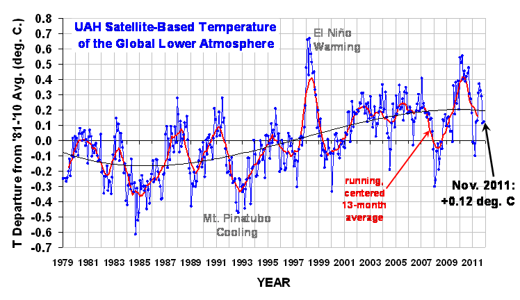
scaddenp, you are right, I was confused. Fig 2a shows both the raw observation which is -0.5 peak cooling and the ENSO-adjusted which is -0.7 UAH shows a bit over -0.4: http://www.drroyspencer.com/wp-content/uploads/UAH_LT_1979_thru_November_2011.png -
Tom Curtis at 12:36 PM on 20 December 2011The End of the Hothouse
TIS @18, a more likely cause of the drop in CO2 was the collision between the Indian Sub-continent and Asia which was occurring at that time. The consequent raising of the Himalayas resulted in massive erosion, a process which absorbs CO2. The cooling of the Ocean due to the opening of the Magellan straight (the gap between Antarctica and Australia) would also have resulted in increased absorption of CO2 into the ocean, but based on the correlation between temperature and CO2 levels observed in the Vostock Ice Core, that would have reduced atmospheric CO2 levels by around 150 to 250 ppmv, and could not account for all, or even most of the 700 - 1200 ppmv reduction observed. -
Ger at 12:02 PM on 20 December 2011The End of the Hothouse
There is a more likely candidate for the faster melting than GHG alone and that would be the dumping of the heat which will be transported to the poles. Not only dumping but also the release of methane and its reduction in the air to carbondioxide + water will release quite an amount of heat. If permafrost is escaping lots of ch4 that might be quite a good reason why the north cap is melting faster than the south pole. -
John Hartz at 11:50 AM on 20 December 2011Foster and Rahmstorf Measure the Global Warming Signal
@chriskoz: Tamino did an excellent job of defining the scientific terms and acronyms in his analysis of the same paper. I believe his approach was superior's to Dana's in this particular regard. -
The Inconvenient Skeptic at 11:23 AM on 20 December 2011The End of the Hothouse
So what caused the CO2 to drop? Could it be the formation of the Southern Ocean that was taking place as the Antarctic Circumpolar Circulation started at the same time. Interesting that a 10 C drop in the 100m of the Southern Ocean would be enough to absorb large amounts of CO2 and cause the levels to drop.Response:[DB] Link to non-science blog snipped.
-
Tom Curtis at 11:07 AM on 20 December 2011Foster and Rahmstorf Measure the Global Warming Signal
Chriskoz @19: AOD is aerosol optical depth, and is a measure of the reflectivity of the atmosphere due to sulfate aerosols including those emitted by volcanoes. TSI is the Total Solar Irradiance, and is a measure of the total power received from the sun across the full range of the electromagnetic spectrum falling on a one meter squared area in orbit and held at right angles to the incoming sunlight. ENSO is the El Nino Southern Oscillation and is the actual physical phenomenon observed in the equatorial Pacific ocean. MEI is the Multivariate ENSO Index, and is one of many measures of the strength of the El Nino Southern Oscillation. -
chriskoz at 10:43 AM on 20 December 2011Foster and Rahmstorf Measure the Global Warming Signal
John Hartz @1 Frankly, of all of acronyms on the figures above, the only one I clearly understand is ENSO (I didn't enven know ENSO could still be double-abreviated to MEI when talking about its measure!) rest of them are pure magic. But I can deduce their meaning from the context, i.e.: TSI must be the sun output variability (? Sun Index) and AOD must be the volcano eruptions. Even without those guesses, the term 'exogenous factors' makes the things understandable. Overall, Dana's article and the statistical analysis in the paper are well understandable, even by untrained people like me. I have a suggestion about those acronyms: make a list of them, for example in Newbie's section, in alpha order. Could be explained, if required, in one sentence each. Or even if not explained, it's nice to have them here at SkS, rather than looking up at wikipedia, discriminate them from incidental idents, etc. Has anyone got such list? If not, I can start sth up: AGW - Anthropogenic (man-made) Global Warming OA - Ocean Acidity ENSO- El Niño Southern Oscillation GHG - Greanhouse Gases SST - Sea Surface TemperatureModerator Response: [DB] A list of acronyms is in the works already. But thanks anyway for the suggestion! -
skywatcher at 10:36 AM on 20 December 2011Foster and Rahmstorf Measure the Global Warming Signal
#13 skept.fr, I'm not sure I agree with you on your point #1. ENSO is the variability, not the rising trend, and so removing the ENSO signal will not remove any of the increasing trend in global temperatures. It would only do so if ENSO showed a trend over the same period. GHG forcing might affect the pattern and strength of ENSO, but that would show up in the ENSO signal oscillations, which are then removed. For your #2, AFAIK, AMO and PDO are not large enough to have a significant effect on global temperatures. For example, when PDO is in a 'cool' phase, a significant part of the North Pacific is in a 'warm' phase as part of the oscillation - the net effect on global temperatures is thus very muted. The PDO is also likely the integrated product of ENSO variations, and so is not a forcing in its own right. The AMO's definition has a linear global warming signal removed from it too. But this discussion (if there is one) is probably best on another thread. -
John Hartz at 10:29 AM on 20 December 2011Arctic settles into new phase – warmer, greener, and less ice
ManOfFireAndLight: The Independent(UK)article that you have provided a URL for is based on the paper "Recent changes in shelf hydrography in the Siberian Arctic: Potential for subsea permafrost instability" which I cited in my post #14. -
scaddenp at 10:19 AM on 20 December 2011Foster and Rahmstorf Measure the Global Warming Signal
I am not aware of any solid evidence that ENSO, PDO or AMO are forced at all. One of the conundrums awaiting better models is what effect GW will have (if any) on ENSO (and thus on regional weather patterns). -
skept.fr at 10:17 AM on 20 December 2011Foster and Rahmstorf Measure the Global Warming Signal
#14 Bert : yes, most (80-90%) of the warming trend is stored in ocean as heat content, so the LT or surface 1979-2011 trends are just a "small picture" of the real effect of forcings on Earth energy balance. For the "signal-noise", I've used the terms of FR : "the global warming signal becomes even more evident as noise is reduced" (noise being here ENSO, volcanoes and sun). #15 Stephen Baines : "There is no apparent long term trend in this index with time. So the index acts as if it were an exogenous factor, with respect to GHG warming signal at least" I agree, to be precise there is a small and negative (but poorly significant) trend for MEI, see table 3 : -0.014-0.023 K/dec. Whatever this trend, it is the "physical logic" that I try to understand, if I can say : the difference we can do theoretically between a noise and a signal in a forced climate. For AMO and PDO, I have not understood your point. As FR have not treated at all these oscillations (or others), we don't know from their paper what is their signature on 1979-2011. -
Stephen Baines at 09:34 AM on 20 December 2011Foster and Rahmstorf Measure the Global Warming Signal
Skept.fr The MEI uses 6 variables, only two of which are temperature variables and one of which is SST. There is no apparent long term trend in this index with time. So the index acts as if it were an exogenous factor, with respect to GHG warming signal at least. As for AMO and PDO, the efefct of such long period cycles should have become more apparent in the residuals after removing the effects of short period cycles and sporadic eruptions. That didn't happen, which suggests there is no cyclical variability on decadal time scales to be explained. -
skept.fr at 09:33 AM on 20 December 2011Renewables can't provide baseload power
Not much time right now, but I continue with some general views from the SRREN 2011. First, orders of magnitude. Readers must recall that we currently produce 492 EJ/y, but with 197 EJ/y losses in production, transportation and conversion of energy, so we actually consume 294 EJ/y. On this table, IPCC authors give the technical potential of RE, minimum and maximum, as estimated by literature. Technical potential is what we could produce from renewable sources (wind, sun, ocean, geothermia, biomass) with current technology. So, the good new is that even the minimum estimates of RE potential total as high as approx 1900 EJ/y, that is nearly five times what we produce now (at 80% from fossil). As this estimate results from actual knowledges and devices: it is not an optimistic projection of what we could do in an hypothetical future with an hypothetical progress, but an assessment of what we could do now.
This figure helps to see where the biggest potentials are and are not. For example, hydropower estimate are convergent but low, 50 EJ /y for minimum and 52 EJ/y for maximum. So, we should not rely to hydro as a baseload power, because it too low for our needs, except in some very well endowed countries like Norway (99% of electricity production from hydro).
Wind and mostly solar have the highest potential for producing electricity and heat. I’ll try to adress later these two energy sources. Production of primary energy or electricity is one thing, but the real challenge is of course to satisfy our final uses in society, so to transport, store, convert this energy.
So, the good new is that even the minimum estimates of RE potential total as high as approx 1900 EJ/y, that is nearly five times what we produce now (at 80% from fossil). As this estimate results from actual knowledges and devices: it is not an optimistic projection of what we could do in an hypothetical future with an hypothetical progress, but an assessment of what we could do now.
This figure helps to see where the biggest potentials are and are not. For example, hydropower estimate are convergent but low, 50 EJ /y for minimum and 52 EJ/y for maximum. So, we should not rely to hydro as a baseload power, because it too low for our needs, except in some very well endowed countries like Norway (99% of electricity production from hydro).
Wind and mostly solar have the highest potential for producing electricity and heat. I’ll try to adress later these two energy sources. Production of primary energy or electricity is one thing, but the real challenge is of course to satisfy our final uses in society, so to transport, store, convert this energy.
-
Bert from Eltham at 09:33 AM on 20 December 2011Foster and Rahmstorf Measure the Global Warming Signal
skept.fr my understanding is that the Global Temperature Anomaly looks 'noisy' because it has other real variabilities superimposed on it. This is NOT noise but real signals that can be evaluated and accounted for. This paper by Foster and Rahmstorf has done just this and they have even adjusted for time dependant effects albeit approximately. All this was done using real physics not number fudging! The remaining real noise is within measurement errors. Your third point about equilibrium is quite valid as the majority of the heat is going into the oceans and thus the situation is far more dire than the GTA suggests. We are all falling off a very high cliff and we are arguing whether we have reached terminal velocity yet. Bert -
skept.fr at 08:59 AM on 20 December 2011Foster and Rahmstorf Measure the Global Warming Signal
The 3 points I don't clearly understand in FR 2011 paper is : • ENSO signal (from MEI) notably consist in SST change. But SST are forced by GHGs as we know (and of course by all other forcings). So, part of the ENSO noise they removed also contains part of the signal they want to identify. I don't see ENSO as an "exogeneous factor" (legend 3, figure above), because GHGs and feedbacks do influence temperature and circulation of oceans. • On a 32 years period, they remove the sole ENSO noise but there are other "natural" modes of variability on such a period. (But the problem is the same : as ENSO, PDO, AMO and others "O" are also forced, no more just "natural", so it is unclear for me how we can distinguish signal and noise when dealing with these "natural-and-forced" oscillations.) • Climate is never on equilibrium, and response time is long for ocean. So we don't know what part of the 1979-2011 trend results from response to previous forcing, and this point doesn't seem adressed in the paper. By the way, it is a physical rathe than statistical point, so maybe FR just leaved it. I think FR get the broad picture with their choices, but I don't know if the decadal trends they obtain from their removals are very precise. Maybe lower, maybe higher. -
ManOfFireAndLight at 08:55 AM on 20 December 2011Arctic settles into new phase – warmer, greener, and less ice
@John Hartz Hopefully you can find out a bit more (including some actual data) about this: http://www.independent.co.uk/news/science/methane-discovery-stokes-new-global-warming-fears-shock-as-retreat-of-arctic-releases-greenhouse-gas-6276278.html -
Bert from Eltham at 08:51 AM on 20 December 2011Foster and Rahmstorf Measure the Global Warming Signal
The take home message from this paper is that cherry picking even a ten year interval to show 'cooling' has completely gone. The other often mentioned 'it is impossible to describe a chaotic system' now rings very hollow as well. The image of the situation has now come into very clear focus. Any further denial would only be due to blindness or ignorance maybe both. Bert -
John Hartz at 08:43 AM on 20 December 2011Arctic settles into new phase – warmer, greener, and less ice
The findings of "Recent changes in shelf hydrography in the Siberian Arctic: Potential for subsea permafrost instability" cited in my previous post are incorporated into a new SkS article, "Abrupt Climate Change - Causes" by Agnostic that will be posted in the near future. -
John Hartz at 08:31 AM on 20 December 2011Arctic settles into new phase – warmer, greener, and less ice
funglestrumpet; The paper you are referring to is: "Recent changes in shelf hydrography in the Siberian Arctic: Potential for subsea permafrost instability" JOURNAL OF GEOPHYSICAL RESEARCH, VOL. 116, C10027, 10 PP., 2011 doi:10.1029/2011JC007218 The "Key Points" of the paper: •Our data provide evidence of drastic bottom layer heating over the coastal zone •We attribute this warming to changes in the Arctic atmosphere •Recent climate change cannot produce an immediate response in subsea permafrost The Abstract and additional information about this paper is available here. -
John Hartz at 08:05 AM on 20 December 2011Arctic settles into new phase – warmer, greener, and less ice
cRR Kampen: If you have not already done so, you may wish to peruse “As Permafrost Thaws, Scientists Study the Risks” published in the New York Times on This in-depth article portrays in words and in photos what's happening to the permafrost in the Arctic. It is part of the NY Times' Temperature Rising series. To access “As Permafrost Thaws, Scientists Study the Risks”, click here. -
cRR Kampen at 07:49 AM on 20 December 2011Arctic settles into new phase – warmer, greener, and less ice
#11, the methane thing in the Arctic becomes the single and by far most alarming change in existence re AGW - if we see methane concentrations rise sharply on a global scale in the next couple of years. Personally, I fear for the absolute worst. -
dana1981 at 07:43 AM on 20 December 2011Foster and Rahmstorf Measure the Global Warming Signal
KR @7 - in general I don't find Bob Tisdale's analyses very good either, but I do give him credit for criticizing poor posts on WUWT like this one quite frequently. He's one of the few 'skeptics' willing to point out the errors made by his fellow 'skeptics'. -
John Hartz at 07:41 AM on 20 December 2011Foster and Rahmstorf Measure the Global Warming Signal
Joe Romm over at Climate Progress also posted an article about the Foster and Rahmstorf paper. Romm's Dec 13 post includes a reprint of the Tomino article cited by Dana. The title of Romm's post is: Sorry, Deniers, Study of “True Global Warming Signal” Finds “Remarkably Steady” Rate of Manmade Warming Since 1979. To access it, click here. -
Stephen Baines at 07:33 AM on 20 December 2011Foster and Rahmstorf Measure the Global Warming Signal
Sphaerica, This is a statistical approach to removing the effects of exgenous variables. As such it is rather "stiff" in how it implements lags. In reality, dynamical considerations could shift the effective lag in any one instance of ENSO forward or backward from the mean lag. As a consequence, I think one can only hope to remove some of the natural variation using these methods. Only a proper dynamical model would truly be able to account for ENSO effects and the such. However, what Foster and Rahmstorf sacrifice in statistical efficiency is more than made up for by the clarity such an approach affords. Clearly warming has proceeded pretty much apace once much of those effects have been removed from the data. The average lags make sense based on modeling as well, I believe. That's a nice consistent picture. -
Foster and Rahmstorf Measure the Global Warming Signal
John Hartz - Takeaways? My personal opinion here, but I see the takeaways as: * Major portions of mid-term climate variability can be attributed to (with statistical significance) various exogenous (outside) factors. * Accounting for those exogenous factors shows a very clear linear warming trend over the last 32+ years, with all temperature records in agreement. * Not incidentally, accounting for the exogenous factors shows a warming trend demonstrating statistical significance of warming over periods as short as 11 years, since 2000! * Related skeptic memes that this is evidence against: It hasn't warmed since 1998, Climate is chaotic, "It's internal variability", It's a natural cycle, etc.Moderator Response: [DB] Fixed text per request. -
Foster and Rahmstorf Measure the Global Warming Signal
dana1981 - I would have to agree. I've read through that WUWT thread, and the singleton removals are numerically invalid for a multiple contribution case like this. You really need to perform a multiple simultaneous regression, or you overemphasize the contributions of the factor(s) you identify first. Interestingly enough, Bob Tisdale (a person whose work is sometimes criticized on Tamino's blog) has been posting on that WUWT thread objecting to Lansner's analysis on much the same grounds. It's good to see that at least a few of the people considered 'AGW skeptics' are willing to critique the opinions of others with that worldview. -
John Hartz at 07:20 AM on 20 December 2011Foster and Rahmstorf Measure the Global Warming Signal
dana1981: In plain Englsih, what are the take-away points of your post?Response:[dana1981] The main point is the last sentence of the post - the warming trend has remained very steady when these short-term factors are filtered out. I've added a concluding statement from F&R to clarify this point.
-
dana1981 at 07:13 AM on 20 December 2011Foster and Rahmstorf Measure the Global Warming Signal
Somebody left a comment which was deleted due to a violation of the Comments Policy - it was just a link to a post on this paper by Frank Lasner on WUWT, suggesting that people should read his post for the sake of 'balance.' I don't agree - Lasner's analysis was extremely poor. For example, he tried to remove the factors one at a time rather than simultaneously (as Foster and Rahmstorf did) with multiple linear regression. This is a statistically poor approach. And in the end his results were effectively the same as F&R. Most of his criticisms of the paper were not valid. Another was the F&R use of TSI rather than sunspot number, but F&R clearly stated that they also did the analysis with sunspot number (and SOI rather than MEI, and a different measure of volcanic activity) and it didn't change their results significantly. As I said, it's a very poor analysis, and shouldn't be read just for the sake of "balance." -
sidd at 06:52 AM on 20 December 2011The End of the Hothouse
C B Dunkerson writes at 23:44 PM on the 16th of December, 2011: "But, in my hypothetical, there are these people who deny it is happening and oppose any action to address it." Not so hypothetical: http://www.washingtonpost.com/national/health-science/virginia-residents-oppose-preparations-for-climate-related-sea-level-rise/2011/12/05/gIQAVRw40O_story.html To paraphrase Haldane: People are not only more stupid than we imagine, they are more stupid than we can imagine. sidd -
funglestrumpet at 06:51 AM on 20 December 2011Arctic settles into new phase – warmer, greener, and less ice
This all fits with the report of giant (one kilometer dia) methane plumes rising to the surface in the Artic that have been discovered by Russian scientists. That's the trouble with tipping points, they slip by so silently - a bit like crossing the event horizon of a large black hole, you don't realise until it's too late. (I have never put a hyperlink in before and after reading in the tips section that if I get it wrong, it will screw up the page, I won't try this time either. The address off my computer is: http://news.yahoo.com/blogs/sideshow/giant-plumes-methane-bubbling-surface-arctic-ocean-163804179.html. I imagine that there is a more academic report somewhere.) -
Bob Lacatena at 06:36 AM on 20 December 2011Foster and Rahmstorf Measure the Global Warming Signal
A few observations of interest, looking at the animated graph: 1) Tropospheric temps (RSS and UAH) seem much more susceptible to ENSO events. The smoothing brings them much more closely in line with the surface observations in terms of variability. 2) Even after adjustment, the tropospheric temps still seem to be more susceptible to "dips" (particularly UAH). 3) MEI is clearly not a perfect indicator of ENSO events, as the timing of those peaks and valleys is still somewhat visible in the final graph. I wonder whether another measure of another ENSO-related variable would smooth things further. I'm not asking you to do the work (Dana), but now that I look at it and try to appraise it... it would have been nice to see the graphs from figure 2 and figure 3 separated and stacked (much like figure 2), but with the x-axis lined up, to let one visually see the factor, before and after graphically. -
cRR Kampen at 06:32 AM on 20 December 2011Arctic settles into new phase – warmer, greener, and less ice
Given the Arctic ice volume trend, it appears the ice cannot exist other than purely seasonal at present climate conditions already. I disagree with the title "Arctic settles into new phase" entirely. There is no 'settlement' - yet.Moderator Response: [John Hartz] The headline was written by NOAA's press office. -
scaddenp at 06:23 AM on 20 December 2011Models are unreliable
Eric - I am not sure where you see 0.3 on Soden. It says ~0.5K (text above Fig1) and that seems to match Fig 2a as well. The GCM predictions are helpfully on the same graphs and seem to match my assessment of "very accurate". -
Daniel Bailey at 06:18 AM on 20 December 2011Sea level fell in 2010
In addition to Tom's comment above, mace, please note that it can take several months to years for rainwater deposited into catchments and watersheds to return to the sea. A compounding factor is the replenishment of depleted aquifers. A nice, open-access, recent review is by Church & White 2011: Sea-Level Rise from the Late 19th to the Early 21st Century John A. Church • Neil J. White Surv Geophys (2011) 32:585–602 DOI 10.1007/s10712-011-9119-1 [Source]
-
arch stanton at 06:01 AM on 20 December 2011Infrared Iris Never Bloomed
EOttawa @18 – That Seed article is very relevant. Gavin’s comment hit the nail – Lindzen sounds like a contrarian but he actually agrees with most of the mainstream science. Like many others that seek to sew doubt, he likes to throw stuff in the fan in the hopes… -
Yvan Dutil at 04:56 AM on 20 December 2011Foster and Rahmstorf Measure the Global Warming Signal
I have two questions: do you have the data in excel file (I don't want to run de R script even it is on the web) and do you know if there is a database of spatial temperature anomaly. I think there is some residual signal that could be removed from the data and I would like to check what it might be.Response:[dana1981] I have the data provided by tamino, which includes the raw and adjusted data. Some of it was in the Excel file he provided, and some was in a .dat file. I didn't run his R programs.
-
John Hartz at 04:51 AM on 20 December 2011Foster and Rahmstorf Measure the Global Warming Signal
Dana: Is the version of Figure 2 with "Enso, Volcanic, Solar Removed" identical to Figure 1?Moderator Response:[dana1981] Almost but not quite. The points in Figure 1 are annual averages. For Figure 2, I just took a 12-month running average. So rather than having 1 point per year, Figure 2 has 1 point per month, each point being the average of the surrounding 12 months.
-
John Hartz at 04:48 AM on 20 December 2011Foster and Rahmstorf Measure the Global Warming Signal
Dana: SkS readers who are not well-versed in climate science acronyms and terminology will have a hard time understanding the information presented in this article. -
Bob Lacatena at 03:57 AM on 20 December 20112011: World’s 10th warmest year, warmest year with La Niña event, lowest Arctic sea ice volume
44, mace, The NOAA has a simpler approach. Here is their ENSO Education page. Here is their general ENSO page.
Prev 1348 1349 1350 1351 1352 1353 1354 1355 1356 1357 1358 1359 1360 1361 1362 1363 Next


