


 Arguments


Recent Comments
Prev 2249 2250 2251 2252 2253 2254 2255 2256 2257 2258 2259 2260 2261 2262 2263 2264 Next
Comments 112801 to 112850:
-
Berényi Péter at 01:20 AM on 27 August 2010Greenhouse effect has been falsified
#64 Ned at 23:33 PM on 26 August, 2010 You assumed it would stay constant, which is (a) not realistic, and (b) a misleading comparison to Venus, which has a much higher albedo It is just as arbitrary and misleading as constructing an "Earth" with neither atmosphere nor hydrosphere but with the same albedo as it actually has, considered as a baseline to the "greenhouse effect". -
Argus at 01:11 AM on 27 August 2010Climate Models: Learning From History Rather Than Repeating It
CBDunkerson, If I understand your first paragraph correctly, you are saying that a steep decrease in sea level during the years 1800-1850 is immediately replaced by a steep increase, from the moment they started burning measurable amounts of coal. The tiny amount burned around 1850 is impossible to read out from the graph, but it certainly seems to be less than one percent of the present figure. If I understand your second paragraph correctly, for the sea level to continue rising, we have to keep increasing CO2 emissions even further. So, if we just stay at the present level of production, sea level will also stay at the present level. That is kind of reassuring. -
DarkSkywise at 00:48 AM on 27 August 2010Humans are too insignificant to affect global climate
They don't. ;-) Fossil fuels are made from plants so they have the same C13/C12 ratio. The difference is not between fuel and plants, but between fuel/plants and "natural" CO2 content of the atmosphere. The atmosphere is a bit richer in 13C because plants have a slight preference for 12C. So if you burn fossil fuels (made from plants), the 13C/12C ratio drops, and you can calculate which part of the CO2 in the atmosphere comes from fuel. -
Warming causes CO2 rise
johnd - You asked if "...do the natural processes that drive the sources and sinks for CO2 follow a similar pattern as what occurs in business where the expenses, sinks, always seem to rise, or fall, just enough to consume all the income, sources, that becomes available?" Well, if you look at the record over the last 10,000 years: Looking back even further, here's a graph from Wiki commons for the last 425KY:
 The answer is "Just enough". It's only in the last 150 that this balance has changed, taking CO2 levels sharply out of the 180-300ppm range to the current ~390ppm.
-
Ian Forrester at 00:36 AM on 27 August 2010Warming causes CO2 rise
johnd said:with one site, Heidelberg Germany typically 370ppm to perhaps 420ppm,
This shows how shoddy johnd's reasoning is. Heidelberg is a large industrial city which produces copious quantities of anthropogenic CO2. This is just a denier grabbing at the slimmest piece of evidence to try and bolster their well debunked arguments. Also, johnd, carbon isotope analysis shows conclusively that the increase in atmospheric CO2 is due to carbon derived from fossil fuels. -
muoncounter at 00:28 AM on 27 August 2010Warming causes CO2 rise
#9: "you confuse me with your "Well, no"" Your statement in #6 "magnitude of the nett increase of CO2 ... is very small against both the emissions and the sinks that occur naturally,"" gave me the impression that you meant the atmospheric CO2 increase is much less than emissions less natural sinks. It is not 'much less'. But I second Ned's suggestion: Where do all those Gtons of CO2 go each year? If they are absorbed by natural sinks, why is atmospheric CO2 increasing by 2ppm per year? Recall that a part per million by volume doesn't sound like much, but we're talking about the atmosphere -- a very large volume. -
Tom Dayton at 23:45 PM on 26 August 2010Greenhouse effect has been falsified
Okay, BP, the child's experiment was not airtight. (For folks whose first language is not English, that was a pun.) So for the next child let's bring in professional help from scientists and the MythBusters! -
Ned at 23:43 PM on 26 August 2010Warming causes CO2 rise
KR writes: Between Occams razor and basic substance conservation (what goes in comes out), it's pretty clear that our CO2 emissions are directly increasing the atmospheric CO2 levels. Yes, exactly. If johnd still disagrees with this, it would probably be helpful if he could provide a clear, concise statement of his argument. A simple version of the mainstream position would be something like this: Burning fossil fuels adds CO2 to the atmosphere. Part of this CO2 goes into the oceans and the biosphere, while the rest remains in the atmosphere. This explains the observed simultaneous increase in both atmospheric and oceanic CO2. johnd, can you offer a similarly straightforward and mechanistic example of your argument? Tell us what you think happens to the CO2 we produce and why CO2 is increasing in both the atmosphere and the ocean (or if you don't believe the data showing that increase, say so). -
Ned at 23:33 PM on 26 August 2010Greenhouse effect has been falsified
BP writes: Albedo is not a free parameter that you can simply give. Of course not. But your initial comment that claimed only a "5 C" increase in temperature was based on a particular assumption about the Earth's albedo. You assumed it would stay constant, which is (a) not realistic, and (b) a misleading comparison to Venus, which has a much higher albedo. I would repeat everything I say in my comment above, but for simplicity's sake I'll just link to it -
Berényi Péter at 23:23 PM on 26 August 2010Greenhouse effect has been falsified
#59 Ned at 21:05 PM on 26 August, 2010 All else being equal, if you put Earth and Venus at the same distance from the sun and gave them the same albedo Albedo is not a free parameter that you can simply give. Especially for atmospheres with a stuff that can condense to droplets provided it gets cool enough (both Earth and Venus have one). Also, with a practically infinite supply of GHG (the store is called ocean) the response of terrestrial climate to an increased opacity in a narrow IR band may be pretty counter-intuitive. The system as a whole does not have to get warmer to maintain power flux balance, it is enough to redistribute water vapor slightly. Not even average upper troposphere humidity has to decrease in order to decrease effective photosphere height (that is, bringing down the place radiation can escape to space from to a lower, therefore warmer level). It is quite enough to let humidity distribution getting a bit more uneven. -
Warming causes CO2 rise
johnd - I'd like to point out that your comment about atmospheric increases and "what is out there is an amount equivalent to the other half", but not caused by our emissions, requires a lot of belief statements. It requires us first to not believe that our CO2 emissions are affecting the atmosphere, while postulating some other, unknown cause that is simultaneously increasing at 2ppm/year. Your claims of uncertainties (what, +/-6% uncertainty from economic estimates as to CO2 going into the atmosphere) are really quite small, considering the multiple decade record showing a consistent increase. Between Occams razor and basic substance conservation (what goes in comes out), it's pretty clear that our CO2 emissions are directly increasing the atmospheric CO2 levels. -
wgray at 22:50 PM on 26 August 2010Humans are too insignificant to affect global climate
"Further confirmation that rising CO2 levels are due to human activity come by analysing the types of CO2 found in the air. The carbon atom has several different isotopes (different number of neutrons). Carbon 12 has 6 neutrons, carbon 13 has 7 neutrons. Plants have a lower C13/C12 ratio than in the atmosphere. If rising atmospheric CO2 comes fossil fuels, the C13/C12 should be falling. Indeed this is what is occuring (Ghosh 2003) and the trend correlates with the trend in global emissions." I'm having trouble understanding this statement, but the basic version is a bit too basic and doesn't answer the question, "How can scientists tell the difference between the CO2 from plants and that from fossil fuel consumption?" -
Ned at 22:43 PM on 26 August 2010Warming causes CO2 rise
johnd writes: Ned at 21:19 PM, re "But without those emissions the X/2 increase would not exist." What do you have to support that claim? I've given a simple and obvious explanation. If you want to claim that there's no connection between our addition of CO2 to the atmosphere and the observed increasing CO2 in the atmosphere, you need to explain that claim. It would be an extremely unintuitive situation, so you really need to provide an extremely convincing explanation. johnd continues: Are you claiming that without current emissions CO2 levels would instead be declining by X/2? No. CO2 levels would probably be basically stable, with the ocean, atmosphere, and biosphere close to an equilibrium. They would certainly not suddenly have risen 112 ppmv in the past century!
Figure 1: CO2 levels (parts per million) over the past 10,000 years. Blue line from Taylor Dome ice cores (NOAA). Green line from Law Dome ice core (CDIAC). Red line from direct measurements at Mauna Loa, Hawaii (NOAA).
-
Ned at 22:29 PM on 26 August 2010Warming causes CO2 rise
johnd writes: The quantities of CO2 flowing through the sources and sinks are substantially larger, so the estimates made there either have to be done to a substantially higher degree of accuracy than that of estimating emissions or the margin of errors will be of such magnitude that the 2ppm becomes meaningless. Why? The 2ppm increase is an observed fact, it's not a guesstimate or a modeled output based on shaky ideas about individual sinks and sources. We know how much is accumulating in the atmosphere, with a very high degree of confidence. The uncertainty in emissions is also small in proportion to the atmospheric increase. Again, the long-term increases in both emissions and atmospheric concentration are remarkably consistent. There are small fluctuations in the rate of increase associated with, e.g., changes from El Nino to La Nina. But those are small fluctuations around a consistent exponential rise. johnd continues: it is not enough to claim that because two measurements move in concert they must be connected when there are bigger and equally relevant processes involved that are not adequately understood or quantified. I just don't want to assume it is not coincidental, the mechanisms have to be identified. Oh, come on! The mechanism is obvious! We burn fossil fuels, producing CO2. The CO2 goes into the atmosphere. We measure an increase in CO2 in the atmosphere. What could possibly be plainer than that? I'll take Occam's Razor, thanks. It seems exceptionally irrational to reject a simple and straightforward explanation in favor of a complicated, improbable, and poorly understood one. The anthropogenic origin of the observed rise in CO2 is one of the clearest, most obvious physical facts in earth system science. If you're determined to object to AGW, wouldn't it at least make more sense to ground that objection somewhere else? -
johnd at 22:25 PM on 26 August 2010Warming causes CO2 rise
Ned at 21:19 PM, re "But without those emissions the X/2 increase would not exist." What do you have to support that claim? Are you claiming that without current emissions CO2 levels would instead be declining by X/2? -
Alexandre at 22:25 PM on 26 August 2010Can humans affect global climate?
Same remark as Anne-Marie #1. Of course, the most abundant GHG is H2O. -
Berényi Péter at 22:22 PM on 26 August 2010Greenhouse effect has been falsified
#58 Will at 20:58 PM on 26 August, 2010 So 79% of the atmosphere is cooled by what process? Does the majority of the atmospheric mass have to transfer its energy through a bottle neck of 0.0385% CO2 in order to radiate to space? Not only CO2, there are others, the one major player being H2O. There is also an "atmospheric window" between 8 and 14 μm and another one called "Arctic window" above 16 μm, which is only "open" if there is very little moisture in the atmosphere. Through these windows radiation from the surface can escape to space directly. At ambient temperatures the only way for nitrogen to cool down is by frequent collisions with other stuff. If the atmosphere of a planet were made of pure N2 with no trace amount of anything else (it also has to be made of a single isotope of N, lets say 14N), it would not get cooler with increasing elevation. But you also have to make sure the surface was absolutely dry and dust free to make it work like that. -
johnd at 22:17 PM on 26 August 2010Warming causes CO2 rise
Ned at 21:19 PM , it is not enough to claim that because two measurements move in concert they must be connected when there are bigger and equally relevant processes involved that are not adequately understood or quantified. I just don't want to assume it is not coincidental, the mechanisms have to be identified. -
Lassesson at 22:13 PM on 26 August 2010Can humans affect global climate?
More detail picking: I noticed that the text say "... in just the last TWO hundred years the concentration of CO2 in the atmosphere has suddenly shot up from 280, to more than 380 parts per million", while the graph say that the 280 ppm level was at 1950, which is less than ONE hundred years ago. Correct me if I'm wrong but I think the graph should be changed to "1850" instead of "1950". Thanx for a good post otherwise! -
CBDunkerson at 22:11 PM on 26 August 2010Climate Models: Learning From History Rather Than Repeating It
Argus #8: The first thing which jumps out at me about your graph is the odd labeling. If you look at the 'hydrocarbons' data you will see that it ACTUALLY starts increasing circa 1850... exactly when the sea level rise begins. They just LABEL the start at around 1940. Switching into 'incorrect skeptic logic' mode for a moment I'd guess that the claim is that fossil fuel use accelerated ~1940 and thus if it were causing the sea level rise that should ALSO have increased at the same point. However, this is faulty logic because temperature forcings from CO2 and other greenhouse gases are NOT linear... they are logarithmic. Meaning that the first X units of increase causes more warming (and thus sea level rise) than the second X units which cause more than the third X units and so on. Basically, in order to maintain a linear increase in temperatures the rate of CO2 emissions HAS to be increasing. -
johnd at 22:09 PM on 26 August 2010Warming causes CO2 rise
Ned at 19:58 PM, uncertainty of the global fossil fuel CO2 emissions estimate is about plus/minus 6% though those of individual countries could be several times that. If an equivalent of about half of the emissions are added to the atmosphere, that uncertain amount equates to plus/minus 12% of the amount being added. So even there is a small example of how the margin of uncertainty can quickly become significant. The quantities of CO2 flowing through the sources and sinks are substantially larger, so the estimates made there either have to be done to a substantially higher degree of accuracy than that of estimating emissions or the margin of errors will be of such magnitude that the 2ppm becomes meaningless. Your analogy of the bank account is a good one for me to make my point. You appear willing to accept that as long the month end balance changes an amount that you have noted bears some relationship to the payments you make on that car you can't afford, then you assume that everything else must be okay, nothing is changing the status quo. That may be OK for a wage earner whose only interest, and asset, is the car. However, if running a business with a large turnover, with many financial sources and sinks, competent management will want to know whether a consistent month end balance comes about because turnover is consistent month in, month out, or is it because expenses are varying in concert with an income that varies for any number of reasons. In other words, do the natural processes that drive the sources and sinks for CO2 follow a similar pattern as what occurs in business where the expenses, sinks, always seem to rise, or fall, just enough to consume all the income, sources, that becomes available? Thinking of all the promises just made in the Australian election, the government budget would perhaps have been a better analogy to use. Doesn't matter what scenario eventuates they claim there will be a surplus of a nominated magnitude. -
Berényi Péter at 21:56 PM on 26 August 2010Greenhouse effect has been falsified
(sorry, #57 was a mistake, I hit the wrong button and hit it early) #51 Tom Dayton at 13:04 PM on 26 August, 2010 there are many more successful such experiments The one you have shown us is not one of them. The child in the video says: "This graph shows my results. The red line shows the temperature of the jar with the CO2 and the blue line shows the control jar. In the morning I put the heat lamp on for a few minutes and as you can see the jar with the CO2 heated up faster. Then, while I was at school they both cooled down, but the CO2 jar stayed warmer. When I got home I turned the heat lamp on again and the same thing happened. From this I concluded the jar with the CO2 in it heated up faster, cooled down slower and maintained the difference." And here is the graph: The two graphs are identical except for the initial divergence and a constant offset later (I have copied a portion of the red curve made yellow onto the blue one to show it). There is no way a difference in emissivity/absorptivity between two objects can produce such a result. What is more, the carbon dioxide in jar B has much lower absorptivity than the thermometers themselves, so one would expect no difference between the two jars whatsoever. And even if there were a difference, jar B would have had cooled faster, not slower, as higher absorptivity goes along with higher emissivity.
But as I've said, there were no such difference in absorptivities, at least none within the bounds of measurement errors. So what has happened?
As you can see jar B has started from a somewhat higher temperature right in the morning, then this difference increased fast, then stayed the same for the rest of the day irrespective of the radiation source was on or off.
Probably there was heating in the room that was turned off for the night and switched back in the morning just before the experiment started. It developed then maintained a temperature gradient between the positions of jar A and B on the table. We would never know for sure, because the kid missed the most basic control experiment. He has failed to switch places of the jars.
The child may be cute, but it does not make his propositions valid. His final conclusion "We expect the Earth to act the same" has nothing to do with the "experiment", in his case it is based on pure belief and indoctrination.
It is a huge disservice to kids to let them embarrass themselves in public like that instead of teaching them proper scientific methodology by pointing out all the obvious errors.
The two graphs are identical except for the initial divergence and a constant offset later (I have copied a portion of the red curve made yellow onto the blue one to show it). There is no way a difference in emissivity/absorptivity between two objects can produce such a result. What is more, the carbon dioxide in jar B has much lower absorptivity than the thermometers themselves, so one would expect no difference between the two jars whatsoever. And even if there were a difference, jar B would have had cooled faster, not slower, as higher absorptivity goes along with higher emissivity.
But as I've said, there were no such difference in absorptivities, at least none within the bounds of measurement errors. So what has happened?
As you can see jar B has started from a somewhat higher temperature right in the morning, then this difference increased fast, then stayed the same for the rest of the day irrespective of the radiation source was on or off.
Probably there was heating in the room that was turned off for the night and switched back in the morning just before the experiment started. It developed then maintained a temperature gradient between the positions of jar A and B on the table. We would never know for sure, because the kid missed the most basic control experiment. He has failed to switch places of the jars.
The child may be cute, but it does not make his propositions valid. His final conclusion "We expect the Earth to act the same" has nothing to do with the "experiment", in his case it is based on pure belief and indoctrination.
It is a huge disservice to kids to let them embarrass themselves in public like that instead of teaching them proper scientific methodology by pointing out all the obvious errors.
-
Byron Smith at 21:47 PM on 26 August 2010Can humans affect global climate?
Another quick change: of course we can’t influence a single weather event. We can and do. Cloud-seeding is one obvious example. Depending how strongly you take "influence", then part of the point of ACC is that we are indeed influencing the weather. Perhaps simply substituting "We can't control what the weather will be like tomorrow, but we can and do have a long term influence on the climate that causes it." Is speaking of the climate "causing" weather is a little too loose as well? Perhaps, "We can and do have a long term influence on the climate patterns which it forms". Kudos again to Graham for his work! -
Anne-Marie Blackburn at 21:35 PM on 26 August 2010Can humans affect global climate?
Just a quick point - 'as CO2 is the most common of greenhouse gasses' needs to changed or clarified. Good post otherwise. -
Will at 21:34 PM on 26 August 2010Greenhouse effect has been falsified
Peter Hogarth @55 The problem lies in the lack of understand of the fact that the atmosphere both radiates and insulates at the same time. This is the cause of the temperature gradient inversion profile of which of course your graph represent averaged figures day/night winter/summer. The temperature gradient inversions are caused by the fact that as the atmosphere thins it looses more energy via radiation, yet at the same time it still has an insulating effect. You have to consider this effect of insulation and radiation as three dimensional while at the same time incoming EMR is heating top-down unidirectional. Air is a top insulator and also a top radiator. The gradient inversions are caused by the imbalance between insulation, radiation and top-down heating. Claiming that the atmosphere is very thin at such high "Thermosphere" altitudes and therefore temperature is not relevant, is simply viewing this situation backwards. The bulge would not exist in the first place were it not for incoming EMR causing massive violent top-down atmospheric heating. -
Ned at 21:29 PM on 26 August 2010Greenhouse effect has been falsified
Will writes: Of course nitrogen emits radiation, at light speed. Therefore it must also absorb at the same rate or become frozen. OK. At what wavelengths does nitrogen absorb and emit radiation? Berényi Péter provided a nice illustration of the absorption bands for other gases. Can you please give us a link to something that shows the equivalent spectrum for nitrogen? Thanks.
-
Ned at 21:19 PM on 26 August 2010Warming causes CO2 rise
johnd writes: The only thing perhaps is that instead of the other half being out there, what is out there is an amount equivalent to the other half. I fail to see any meaningful distinction here. We add X molecules of CO2 to the atmosphere. After a lot of interactions with various sinks and sources, the atmosphere has X/2 additional molecules of CO2. Because of all the interactions along the way, the actual molecules making up the X/2 increase might not be the exact same individual molecules emitted from our coal-fired power plants. But without those emissions the X/2 increase would not exist. This seems very obvious to me, so I hope that you have some deeper meaning that I'm simply not getting .... -
Stu at 21:17 PM on 26 August 2010Humans are too insignificant to affect global climate
"Of course, as CO2 is the most common of greenhouse gasses, the additional concentration is what causes most of the rise in temperature." - careful! You mean most common of anthropogenic greenhouse gases. Accuracy is key in the fight against misinformation. -
johnd at 21:09 PM on 26 August 2010Warming causes CO2 rise
muoncounter at 11:25 AM, you confuse me with your "Well, no" because you immediately agree exactly. The only thing perhaps is that instead of the other half being out there, what is out there is an amount equivalent to the other half. -
CBDunkerson at 21:07 PM on 26 August 2010Arctic sea ice... take 2
HR, there is obviously a vast difference between PIOMAS predictions of minimum ice extent made months in advance and PIOMAS estimates of ice volume made after the fact. There is no evidence of significant discrepancy in those volume calculations. Indeed, they were very close to the measurements yielded by IceSat until it went offline... if anything they slightly UNDER-stated the decline in ice volume. Cryosat II data should be coming out some time in the next couple of months. From the available evidence it seems likely to me that data will be in close agreement with the PIOMAS results. Your citation of the Haas paper is interesting... as you cut it off right before; "However, the volume of older ice may have been less overall due to a lower areal coverage, and because our surveys were still spatially limited." -
Ned at 21:05 PM on 26 August 2010Greenhouse effect has been falsified
Berényi Péter, it was your choice to move the Earth to Venus's orbit and make a quantitative prediction ("5 C") of the magnitude of the increase in temperature associated with the greenhouse effect. That prediction ignored the fact that Venus's albedo is much higher than Earth's. All else being equal, if you put Earth and Venus at the same distance from the sun and gave them the same albedo, Earth would be much colder due to the lower concentration of greenhouse gases in its atmosphere. If you now want to say "Well, there are all these other complications" that's fine -- I agree completely -- but let's note for the record that your initial remarks were just plain wrong. There doesn't seem to be an article on this site specifically about the greenhouse effect on Venus; perhaps that would be a good subject for a post some day. In the mean time, I'd refer anyone who's interested in that subject to: * Goddard’s World by Chris Colose * Venusian Mysteries and Venusian Mysteries – Part Two over at Science of Doom. -
Will at 20:58 PM on 26 August 2010Greenhouse effect has been falsified
Berényi Péter @46 "That is, if a gas does not absorb thermal radiation (like nitrogen) it can't get rid of heat by radiation either." Really? So 79% of the atmosphere is cooled by what process? Does the majority of the atmospheric mass have to transfer its energy through a bottle neck of 0.0385% CO2 in order to radiate to space? Or is their a secret mechanism that only clever people know about? Of course nitrogen emits radiation, at light speed. Therefore it must also absorb at the same rate or become frozen. -
Argus at 20:51 PM on 26 August 2010Climate Models: Learning From History Rather Than Repeating It
Thank you for the updated graph! To me the two graphs look sufficiently similar, and they both convey the same message to me: sea levels have risen at a rather steady rate since 1870 -- so why are we (like in this post) concentrating only on the curve from 1970 up to 2010? One answer might be that the purpose is to connect the last part to the recent rise in CO2. That is why the trend of the preceding century does not fit in. Another answer might be that it is because we can see a steeper rise during the last 20 years, and that this looks alarming enough. However (looking at the graph), a similar steep period seems to have occurred in the period 1935 to 1955, so ...? (The graph I found was from here.) -
Berényi Péter at 20:02 PM on 26 August 2010Greenhouse effect has been falsified
#52 Ned at 19:00 PM on 26 August, 2010 you may be neglecting Venus's albedo I do. As I'm also neglecting the probable huge increase in Earth's albedo due to more clouds if it were put on a Cytherean orbit and also the increase in thermal IR opacity due to the same warm high clouds. The usual practice to ignore changes to albedo when discussing the greenhouse effect is admittedly a silly one. Like Earth with neither an atmosphere nor a hydrosphere but still retaining its present day albedo of 0.3 somehow, making its equilibrium temperature -18°C and comparing it to the actual average surface temperature of +15°C, calling the difference (33°C) the "greenhouse effect". As an exercise, calculate average surface temperature of a perfect blackbody "Earth" with no atmosphere at all for two cases.- it's made of a perfect heat conductor material (uniform heat distribution along the surface is attained instantaneously)
- or it is made of a perfect heat insulator (each point on its surface is in radiative equilibrium, independent of its surroundings)
-
Peter Hogarth at 19:58 PM on 26 August 2010Greenhouse effect has been falsified
Will at 03:30 AM on 26 August, 2010 I think we all need to understand what we mean by “atmosphere” and “heating” at these altitudes and appreciate what is meant by “bulge” and temperature profiles. We are talking about Solar UV radiation “heating” the rarified atmosphere between around 100 and 200km up (and also geomagnetic interactions). The temporarily increased kinetic energy allows (on average) more molecules to move “upwards” away from the effect of gravity, thus leading to a redistribution of density, and an increased density above a few hundred km up. This variation in density of atmospheric gases at low earth satellite orbit heights (around 300km), or so called “diurnal bulge” caused periodic variations in drag which were investigated in the early satellite era. For some historical context see Moe 1977. In terms of temperature, we are referring to the kinetic energy of atoms or molecules, rather than temperature in the sense that most people understand. Figure 1 in Johnson 1967 shows typical “temperature” variations (night time minimum sunspot cycle of around 430 degrees C to daytime maximum sunspot cycle of around 1530 degrees C) associated with the “bulge”. A more detailed graphic, from here, shows your “top down heating” suggestion has a rather obvious problem at around the (arbitrary) Thermosphere/Mesosphere boundary around 90km up (approx -90 degrees C), and again towards the lower Stratososphere.
More independent measurement based evidence against your suggestion is that daytime temperatures do not measurably rise in periods of intense radio and magnetic solar activity when the “bulge” and “heating” can increase dramatically. Average UV activity has also tracked overall solar activity over recent decades of direct measurement (ie small average decline).
shows your “top down heating” suggestion has a rather obvious problem at around the (arbitrary) Thermosphere/Mesosphere boundary around 90km up (approx -90 degrees C), and again towards the lower Stratososphere.
More independent measurement based evidence against your suggestion is that daytime temperatures do not measurably rise in periods of intense radio and magnetic solar activity when the “bulge” and “heating” can increase dramatically. Average UV activity has also tracked overall solar activity over recent decades of direct measurement (ie small average decline).
-
Ned at 19:58 PM on 26 August 2010Warming causes CO2 rise
johnd writes: The magnitude of the nett increase of CO2 being about half of the estimated total emissions from fossil fuels, is very small against both the emissions and the sinks that occur naturally, so a very small error in the estimations and modeling of those natural processes could lead to the wrong conclusions being drawn. Think about this logically for a second. We know with a great deal of confidence how much carbon we're emitting. We also know with a great deal of confidence the magnitude of the increase in atmospheric CO2 over time. By subtracting the former from the latter, we can determine the net effect of all natural sinks and sources with a similarly high level of confidence. Let's say you look at your bank account. You've got various sources of income and expenses. You don't necessarily keep detailed track of them all. However, you do know two things: (1) You've recently added a new and highly quantifiable monthly expense (perhaps payments on a car you couldn't really afford). You know that every month X dollars are being taken out of your account to pay for this new expense. (2) Your monthly statement shows you that, over time, the bottom line on your account is dropping by X/2. At this point, you don't need to sit down and look at every ATM receipt. It's straightforward to conclude that, first, the decline in your account balance is due to the new car payments, and second, if this goes on long enough you'll be in trouble. Of course, it's always helpful to understand your budget in more detail, and the same applies to the Earth system! But uncertainty about some of the details doesn't prevent us from drawing conclusions about the things we do know. -
Rob Painting at 19:44 PM on 26 August 2010Climate Models: Learning From History Rather Than Repeating It
Your graph doesn't look right Argus. Where's it from?. This graph however, is an update to Church & White 2006 A 20th century acceleration in global sea-level rise
-
Ned at 19:37 PM on 26 August 2010Greenhouse effect has been falsified
I'm glad to see people talking about simple experiments that attempt to illustrate the infrared absorptance of CO2. But there are two larger points in danger of being neglected here: (1) There is a very extensive literature on laboratory measurements of the spectral properties of CO2. (2) It's not really possible to completely replicate the real-world greenhouse effect in the lab. Part of the physical process involves an increase in the effective radiating height of the earth's atmosphere, something most labs aren't really set up to simulate. But there are many scientific processes that are similarly unsuited for laboratory replication -- plate tectonics is a great example. The fact that we're logistically incapable of recreating plate tectonics in a laboratory doesn't in any way invalidate it as a scientific theory. Like plate tectonics, we're able to make predictions based on the theories involved in anthropogenic global warming, and verify those predictions using observations. Some of those observations can be made under controlled conditions in the lab, but others can only be done in the real world environment. That's perfectly OK. -
Rob Painting at 19:25 PM on 26 August 2010Arctic sea ice... take 2
HR, Polyakov has an interesting take on the Arctic, including this from his 2002 paper: " Extending our SAT time series by 25 years back to 1875 (years associated with an extended and cold negative LFO (phase) leads to a two-fold increase of the arctic trend compared with the Northern Hemispheric trend (Table 1,Figure 3). While this appears consistent with polar amplification, we believe it is more appropriately described as a statistical artefact resulting from biased sampling of the LFO." "In an analysis of long-term air temperature changes Vinnikov et al. [1980] used gridded northern-hemispheric SAT for 1891–1978, the first half of which was dominated by the negative, cold LFO phase prior to the 1920s, and the second by the positive, warm LFO phase of the 1930–40s. Averaging these data within zonal bands they also found a two-fold polar amplification of SAT trends (Table 1)." Of course much has happened in the Arctic since 2002. -
Argus at 19:22 PM on 26 August 2010Climate Models: Learning From History Rather Than Repeating It
I wonder why graphs showing sea level rise, on this site, always start in the latter half of the 20th century. If you start with a year about 100 years earlier, apparently you get a different picture: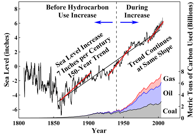 If this graph is right, the sea level started to rise at a steady pace almost 100 years "too early". That is, long before the use of hydrocarbons started to explode around the middle of the 1900's.
So, maybe the proposed reason for the sea level increase (i. e. CO2) is debatable?
If this graph is right, the sea level started to rise at a steady pace almost 100 years "too early". That is, long before the use of hydrocarbons started to explode around the middle of the 1900's.
So, maybe the proposed reason for the sea level increase (i. e. CO2) is debatable?
-
Ned at 19:19 PM on 26 August 2010Greenhouse effect has been falsified
Will writes: Thermal radiation is heat. Vibrating matter. Gas molecules are vibrating matter. They cannot pass through solid glass. You are confusing matter with energy. It is the energy which passes through the glass not the vibrating molecules which cause heat. In the vacuum of space full spectrum EMR produces no thermal radiation, heat. This is just absolute rubbish. Sorry, but there's no better way to put it. Thermal infrared radiation is merely a subset of the electromagnetic spectrum at wavelengths from around 3 to 1000 micrometers. The label "thermal" comes from the fact that this is the range in which the peak emittance occurs from objects at normal earth-surface temperatures. This is important because thermal infrared radiation is the only significant mechanism by which the Earth loses heat to space. If your claims were correct and longwave infrared radiation were unable to propagate through a vacuum, the Earth would rapidly heat up to the point where the oceans boiled away. Your willingness to write articles dismissing the greenhouse effect and accusing scientists of "fraud" when you don't understand even the most basic relevant physics is frankly shocking. It's far and away the best demonstration of the Dunning-Kruger Effect that I've seen in a long time. -
Ned at 19:00 PM on 26 August 2010Greenhouse effect has been falsified
Berényi Péter, in your comments about Venus, I think you may be neglecting Venus's albedo. -
HumanityRules at 15:59 PM on 26 August 2010Arctic sea ice... take 2
http://www.gi.alaska.edu/~bhatt/publications/polyakovetal_2010.pdf A more upto date paper about trends versus natural ossilations in the north atlantic. The indroduction is worth reading just to get the sense of how the author seems to think there is still much to argue for on the subject. -
John Chapman at 15:21 PM on 26 August 2010Climate Models: Learning From History Rather Than Repeating It
Now I've done some internetting and found the answer I was after. The tide gauges are a pipe which has a small hole at the bottom which acts as a capacitor and smooths out the short term fluctuations from waves. Readings are taken every 6 mins. Where were we ... oh yes predictions. -
Tom Dayton at 15:08 PM on 26 August 2010Station drop-off: How many thermometers do you need to take a temperature?
daisym, I'm glad we were helpful. ARGO measures ocean, not air, temperature. There is an excellent site put up by the Argo project. To answer your question specifically, look at the section How Argo Floats Work. There is an excellent video animation at the Argo home page; click on the little picture at the bottom of the section "Why do we need Argo?" A ton of further info at varying levels of technicality are linked at the left side of that Argo home page. -
HumanityRules at 15:07 PM on 26 August 2010Arctic sea ice... take 2
13.Gordon "obsessed" is the wrong word to use but the intention was to show that the recent trend seems to have overtaken the long term variability of the arctic in many peoples minds. And certainly in the discussion of arctic and AGW. I was looking further into this idea and came across the website of Igor Polyakov , an arctic researcher. He seems to have published plenty on the subject and his website has some interesting short, but detailed write-ups. There are some extraordinary lines on the website and in some of his publications such as this. "If long-term trends are accepted as a valid measure of climate change, then the SAT and ice data do not support the proposed polar amplification of global warming. Intrinsic arctic variability obscures long-term changes, limiting our ability to identify complex feedbacks in the arctic climate system." From GRL, VOL. 29, NO. 18, 1878, doi:10.1029/2001GL011111, 2002 I know nothing about this guy except that he doesn't seem to be a perpherial figure in the science. -
Bern at 14:48 PM on 26 August 2010Climate Models: Learning From History Rather Than Repeating It
Further to scaddenp's response re tide measurements - you have similar issues measuring noise levels with a meter. The old-fashioned way was to watch the needle madly wave back and forth, and guesstimate the lower, middle, or upper points. These days, the meters no longer have needles, and *do* take measurements on millisecond timeframes, calculating the averages mathematically. This has led to a few changes in approach over the years, as the old "maximum" level is closer to the 10th percentile of the actual fluctuating values (known as the L10). Similarly, the "minimum" is now measured as the L90, or 90th percentile. But for climate studies, and sea levels in particular, the moment-to-moment variation isn't important, you only care about the average - what we in the noise business call the Leq, or "equivalent continuous level". In the noise case, it's the level with the same acoustic energy (due to logarithmic decibel scales, this isn't the same as the average level). For tides or temperatures, measured on a linear scale, it's just the average over a reasonable timeframe. For tides, you might pick a period of, say, 30 days, to average out a lunar cycle. Temperatures might look at an annual average, to smooth out the seasons - depending on what you're looking for. (sorry for wandering a bit off-topic there... :-P ) -
sailrick at 14:41 PM on 26 August 2010Hansen etal hit a Climate Home Run -- in 1981
factfinder I think perhaps you, like many skeptics, believe that the greenhouse effect is some new fangled idea dreamed up by liberals, like Al Gore. Here is a brief history of the early years. "These are the fundamentals of climate change science, and they are old hat: Fourier calculates colder earth without an atmosphere (1824) Tyndall discovers relationship between CO2 and long-wave radiation (1859) Arrhenius calculates global warming from anthropogenic CO2 (1896) Chamberlin models global carbon exchange including feedbacks (1897) Callendar predicts global warming increase catalysed by CO2 emissions (1938) Revelle predicts inability of oceans to sequester anthropogenic CO2 (1958) (From Spencer Weart's history of ACC - " http://www.aip.org/history/climate/index.htm) -
scaddenp at 13:54 PM on 26 August 2010Climate Models: Learning From History Rather Than Repeating It
Timing of the readings doesnt matter for tide guage. Its the average of the all the readings that counts, because that levels out the waves and lunar cycle. I sure you can find a tide guage near you for example of data. My local can be found at port otago. Of course, going from a change at individual stations to global sea level changes isnt trivial. Satellite altimetry doesnt have a wave or tectonic problem so more reliable when calibrated. Big literature - Stick JA Church into google scholar for starting point, then PL Woodworth for more tide guage orientated stuff. -
daisym at 13:39 PM on 26 August 2010Station drop-off: How many thermometers do you need to take a temperature?
#13, 14 and 15: Thanks for your input. Your points are well taken. Tom, I read the information at the links you provided and must concede that it was compelling. It is unfortunate that construction of the temperature record is such a messy business, and has been so poorly explained to the public. Thanks go to all of you for taking the time to share your knowledge with me. Not being a scientist, I have to get information wherever I can. In this regard, all of you perform a great public service through your discussions among each other on this and similar blogs. I have one final question for anyone with the answer: Do the ARGOS buoys measure temperature of the atmosphere at the surface, and (if so) are these measurements included in calculations of the average global atmospheric temperature? I know that satellite and radiosonde measurements are used, but I've not read where buoy measurements are also used. Once again, thanks.
Prev 2249 2250 2251 2252 2253 2254 2255 2256 2257 2258 2259 2260 2261 2262 2263 2264 Next


