


 Arguments


Recent Comments
Prev 2542 2543 2544 2545 2546 2547 2548 2549 2550 2551 2552 2553 2554 2555 2556 2557 Next
Comments 127451 to 127500:
-
RSVP at 05:06 AM on 29 November 2009The physical realities of global warming
Riccardo Population is not the key point. Population is the ONLY point when no realistic energy alternatives are on the table. I suspect no one is proposing these as each has it own forms of thermal pollution. pdt I wish I could believe you, but have to disagree. There is a very long chain of requirements for sustaining human life other than food production, such as building dikes. -
Ian Forrester at 04:32 AM on 29 November 2009Was there a Medieval Warm Period?
Nofreewind, you don't really understand much about tree rings, do you? In fact the divergence problem is only associated with a very small number of trees from one particular place. These are the rings reported by Briffa. Since his original papers there has been a recent paper published which explains why these particular trees were abnormal in their temperature response. As originally thought, there were other factors involved at that particular location. "Recent unprecedented tree-ring growth in bristlecone pine at the highest elevations and possible causes". Matthew W. Salzer, Malcolm K. Hughes, Andrew G. Bunn, and Kurt F. Kipfmueller http://www.pnas.org/content/early/2009/11/13/0903029106.full.pdf+html -
nofreewind at 03:45 AM on 29 November 2009Was there a Medieval Warm Period?
Before you consider the MWP read The Great Warming by Brian Fagan, renowned archeologist. <$10 on Amazon. What is fascinating about Fagan is that he has fell for the same elixir as so many others drink. In his introduction he talks about how the tree ring data shows the warming, but at the time of his writing he didn't know about the "tricks" used. If the data don't fit, just splice something in that does! No matter what, don't give any cannon fodder to the those who might have inquiring minds. How can we trust the tree ring data, when it doesn't fit since 1960??? So the tree ring data fits the MWP when we didn't even have thermometers, but it doesn't fit the era when we had literally thousands of surface based temperature stations throughout the world. Corals, sediments, ice cores, proxies...I think in the last week we have only scratched the surface.Response: "How can we trust the tree ring data, when it doesn't fit since 1960?"
You're talking about the divergence problem. The short answer is that the tree ring proxy record shows good agreement with other proxies in past periods. It is only in recent decades that tree ring proxies diverge from other proxies and the instrumental record. For more details, see the page on the tree-ring divergence problem. -
pdt at 01:25 AM on 29 November 2009The physical realities of global warming
RSVP, "PS I still havent seen a proposal of how the world is to feed itself while reducing CO2 emissions as world population increases." Part of the answer lies in the answer to this question, "How much of the world's CO2 emissions are related to food production?" -
Riccardo at 22:17 PM on 28 November 2009The physical realities of global warming
RSVP, if we kill half of the world population we will surely need less energy and emit less CO2, even more so if we actually chose people from the developed world. Does this mean that that population is the key point? Should be this our goal? In the last decades global per capita emissions has been almost flat globally. Developed world has reduced and developing world increase, but stil the former is 4-5 times higher (much more if you compare to the poorest countries). This and the historical responsability are the very reson why most of the burden of the reductions is on the shoulder of the developed world. The devolping world should take the responsability of not following our disastrous path. -
Riccardo at 22:01 PM on 28 November 2009Satellites show no warming in the troposphere
hank, point those guy to this post. It stars exactly with the issue of flawed UAH data analisys; the webpage they link is old, well before the flaw was corrected. -
RSVP at 21:55 PM on 28 November 2009The physical realities of global warming
Comparing CO2 Emissions values of (5.3 & 8.0 GtC/y) above for the years 1980 and 2005 gives a relative increase ratio of 1.51. Then going to: http://www.google.com/publicdata?ds=wb-wdi&met=sp_pop_totl&tdim=true&q=population+of+the+world ...and consider world population for the same years, we get 4.4 & 6.4 billion, which gives a ratio of 1.45, which is "coincidentally" very close to 1.51. Apparently, the per capita consumption of oil has remained relatively constant in this period, while the most significant growth in population has occurred in China and India (as per Google site). Somehow I have a hard time not seeing a direct correlation between population growth and CO2 emissions. PS I still havent seen a proposal of how the world is to feed itself while reducing CO2 emissions as world population increases. -
Riccardo at 21:35 PM on 28 November 2009East Antarctica is now losing ice
HumanityRules, i wrote in my previous comment i downloded the data and found the same trend as before. No possible confusion on the stations, there just three in Antarctica. How comes you repeted the same thing and found diferent trends this time? Are you using monthly data or annual averages as in the graphe? Or are you mixing the two as both are in the same table? I'm using the annual averages, as is the case when you look at yearly trends. It's impossible to get different trends using the same data, definitely we used a different set. -
Barry Brook at 15:40 PM on 28 November 2009It's cooling
Great work, just a slight niggle: "Considering a typical nuclear power plant has an output of 1 GigaWatt, imagine 190,000 nuclear power plants pouring their energy output directly into our oceans." A decent sized nuclear power plant is 1 GWe, which at a 33% thermal efficiency, is close to 3 GWt. 190 TWt of energy going into the ocean each year is closer to the heat output of 65,000 1 GWe nuclear power plants. -
hank at 15:31 PM on 28 November 2009Satellites show no warming in the troposphere
This just got used by someone in a Deltoid thread, claiming it's the state of contemporary science: http://spacescience.spaceref.com/newhome/headlines/essd06oct97_1.htm The page begins: Accurate "Thermometers" in Space The State of Climate Measurement Science October 2, 1997 Just how accurate are space-based measurements of the temperature of the Earth's atmosphere? In a recent edition of Nature, scientists Dr. John Christy of the University of Alabama in Huntsville, and Dr. Roy Spencer of NASA/Marshall describe in detail just how reliable these measurements are.... -
HumanityRules at 11:38 AM on 28 November 2009East Antarctica is now losing ice
Sorry I truely don't know how to digitise graphs. Raw data Go to http://www.bom.gov.au/climate/data/weather-data.shtml You should be on historical data (right side menu) You can choose temperature from the drop down menu. Then Mean max temp Finally put the station numbers (see below) in the box then get data. This gives monthly and annual data. These tables can be imported into excel. 300000 300001 300017 The figures in the Turner paper (#14) suggests for a shorter time period. Mawson -0.11/decade Casey +0.01/decade Davis +0.03/decade Out of more general interest there are about 20-30 data sets in Australia that stretch back to 1800's and many more that go back to 1930s-1950s. They are worth a look if youhave an hour or two to search for them. I thought I recognised interesting trends but they are not relevant in this thread. -
SNRatio at 05:48 AM on 28 November 2009What do the hacked CRU emails tell us?
Disclaimed, I think you have misunderstood a bit about the precisions of predictions. You may easily get the impression that the models already are very 'truthful', but when you look closer at the actual uncertainties, you will see they are rather large as estimated now. And that may well prove to be under-estimations in some cases, without disproving the basic usefulness of the models: They are continously adjusted. Just to say that the models are not at all that good is, however, not true at all. And short-term, they are really good in lot and lots of situations now. You can get an impression of the present situation if you look at Tim Palmer's presentation in the session on "Advancinc climate prediction science" on the recent climate congress, http://www.wcc3.org/sessions.php?session_list=PS-3#doc I will also suggest Mojib Latif's presentation in the same session. He has been misrepresented as predicting 30 years without warming - that's not what he said. But when you look at his NH 21-yr moving average curve (this will filter out most solar cyclicity), there is a 60-year cycle with an amplitude of 0.1-0.2 deg that could gives us something like that. -
SNRatio at 05:26 AM on 28 November 2009The physical realities of global warming
@TruthSeeker If you look at the first graph I linked to, you will see that the two 'extremes' in temperature, GISS & UAH, follow each other quite closely - and they don't measure exactly the same (if I have understood it right) after all. And if you you use reasonably long periods for looking at the trends, the differences in most cases become very small. Short term, the differences may be bigger, but talking about 'trends' in such cases is mostly nonsense to me, whoever talks about it. You are in your full right as a layman to make up an opinion built on the impressions you get from media, but I would advice against drawing any sort of strong conclusions without looking closely into the matters. As dhogaza points out, the majority of HadCRU temp data are alreasy in the public domain. What I think could be a good idea, based on your opinion, is to organize 2-3 independent data sets, with somewhat different methodologies and philosophies behind etc. But we must be prepared for the argument that it would cost more than it would benefit. Using independent methodologies on the same (or overlapping) data is already carried out in many cases, but to counter all the (unfounded in most cases, as far as I can see) accusations of bias, it could be done systematically. -
dhogaza at 04:54 AM on 28 November 2009The physical realities of global warming
That is the whole point. According to the IPCC TAR 12.2.3 etl. the arrived at reason for AGW and CO2 is because they can't find another explanation for the warming through 1998.
Roughly 98% of the raw data used for HadCRU temp reconstructions is in the public domain, and that data forms the basis of the GISSTemp reconstruction. The algorithms are different, the results almost identical. The extra 2% of data that's proprietary apparently make little difference in the end product. -
Riccardo at 04:13 AM on 28 November 2009East Antarctica is now losing ice
HumanityRules, i thought that "digitize a graph" was self explaining and i'm sure you understand it. Less clear to me, instead, is which data you used. I didn't notice the link to the raw data in the same page; i downloaded them and the result is the same. Which data did you use? Anyway, even with your results, Casey is warming roughly at the same rate as the global mean, the other two are warming too, even though less. No obvious trends there? -
HumanityRules at 01:48 AM on 28 November 2009East Antarctica is now losing ice
#13 Pedantic is fine. I'm about to get pedantic on you! Not sure what you meant by "digitised the 3 graphs". The BOM website provides the actual numbers for each data point. Go http://www.bom.gov.au/climate/data/weather-data.shtml then fill in the appropriate fields you can get the station numbers from my linked graphs. I put those numbers in excel and added a trend line and got Mawson 0.0077/yr Davis 0.007/yr Casey 0.015/yr I agree with your last sentance. The Mawson Davis and casey data is all in the PDF below. #12 I showed 3 points because that is all the raw data the Australian website carries, I didn't choose them thats all there is. There are plenty of records for Oz as well, I thought given the site owners nationality there might be some interest for this site. I love the fact that you ask me for linear regressions and null hypothesis and then show me for comparison a map with different shades of pink!! Check the references for your article they make interesting reading. Here's one PDF http://www.scar.org/researchgroups/physicalscience/reader_turneretal.pdf . This shows a mixed picture over the continent. It appears something significant is occuring on the penninsula. But then what does that mean for the rest of the continent. They report 11 data sets rising and 7 falling. There are 3 data sets on the penninsula which means that for the rest of the continent there are 8 rising and 7 falling. -
neilperth at 00:12 AM on 28 November 2009What do the hacked CRU emails tell us?
In a strange way the hacked HadCrut emails have finally convinced me that global warming is man-made :) -
Riccardo at 11:00 AM on 27 November 2009What do the hacked CRU emails tell us?
TruthSeeker, you should be frustrated for not having looked at the science behind dendroclimatology and at the simple fact that one set of tree rings alone tells us just a little, many different cross-checked reconstructions are solid evidence. It would be really poor science if they throw away thousands of data sets just because a few got weird. Indeed, they are studying the divergence problem, which is related more to tree physiology than to climate. -
TruthSeeker at 09:57 AM on 27 November 2009The physical realities of global warming
Also, what is wrong with asking for another source to support the data that the HADCRU provides. The whole accusation is that they are biased and fix the data to fit their hypothesis, they fight the freedom of information act and deny access to their data, and that independents don't support their conclusions. I could be convinced that their evidence is accurate if an independent part could replicate the data. Now, I would still like someone to explain to me that, if it is currently increasing, this trend isn't driven by the sun, as the thread on that subject is woefully lacking.Response: There are various independent studies that confirm the HADCRU data - coincidentally I'm working on a post on that very subject (hopefully later today).
How do we know the sun isn't driving the warming trend? Because over the past 30 years, the sun has shown a slight cooling trend. Because of this, there is a long list of peer reviewed studies concluding the sun has played a very minor role in global warming. -
TruthSeeker at 09:52 AM on 27 November 2009The physical realities of global warming
Here is the quote I was referring to but since has been deleted. " the people responsible for the graph may be accused of cherry-picking. I don't, but in the present situation, i would never have shown something like that. Other selections give entirely different results. " See, SNRatio suggested that they could be accused of cherry picking and that other selections give entirely different results. -
TruthSeeker at 09:40 AM on 27 November 2009It's the sun
Did anyone answer the question as to why correlation has to be between increase and sun activity and temperature. As I heard it stated, I can put a pot of cold water on my stove, heat up my stove from fold to a constant temperature quickly, and then have the water take much longer to heat and continue to heat up even after my stove is at a constant temp. Why is it any difference from the sun? Especially now as the sun activity seams to be declining and the temperatures of the last decade are stagnate.Response: This issue is examined in Climate time lag. -
TruthSeeker at 09:33 AM on 27 November 2009What do the hacked CRU emails tell us?
Riccardo at 20:23 PM on 25 November, 2009 TruthSeeker, "So why don't we exclude all the tree ring data, since its be proven to be faulty?" Never this proof appeared," Really, the proof appeared when they "diverged" from the temperature record, and as a result those individual entries are no longer considered good. If they arn't what evidence does anyone have that these were ever any good? Until someone can explain to me why, when their is no temperature record, they are good, but when a temperature record exist they are "to low" they will just be proof positive that these scientist are cherry picking. I am getting frustrated with the number of people telling me they were once good(supplying no supporting evidence) and then saying but now that we have temperature records they are to low. -
Riccardo at 08:31 AM on 27 November 2009East Antarctica is now losing ice
HumanityRules, I know you're not in bad faith and i hope you'll not find me too pedantic for what i'm going to say. You should not take graphs for what they just appear; look at the tempeature scale, it's huge for the kind of difference you're looking for. I digitized the three graphs to check for trend. Casey and Davis are both increasing (0.014 and 0.019 °C/yr respectively) but the former is not statistically significant due to the few data available. Mawson is almost flat, 0.002 °C/yr not statistically significant. Doing science is a hard task and no one should draw conclusions without thinking twice and checking thrice. Or more. -
PeterPan at 07:13 AM on 27 November 2009An overview of Antarctic ice trends
A skeptic recently showed me that the IPCC 2007 blamed the West Antarctic ice loss on ongoing grounding line retreat since the Last Glacial Maximum: "They found [...] a trend in antarctic shrinkage of about 90 Gt yr–1, primarily because of retreat of the West Antarctic grounding line in response to the end of the last ice age" http://www.ipcc.ch/pdf/assessment-report/ar4/wg1/ar4-wg1-chapter4.pdf (p 366) The references are Huybrechts 2002 (abstract) and Huybrechts et al 2004 (full pdf): "quite large thinning rates up to 30 cm/year over the West Antarctic ice sheet, related to ongoing grounding line retreat since the Last Glacial Maximum". I don't know if they are speaking about the same thing... He, of course, also pointed that the glaciar rebound was overestimated (Bevis et al 2009 - press) and it may substract around 33 Gt/yr from GRACE estimates. From the linear trend (143 ± 73 Gt /año), that would leave 110 Gt/yr, from which 90 Gt/yr would be natural (according to IPCC-Huybrechts) and just around 20 Gt/yr that might be human-related. :P Quite elaborated, I must admit it... -
chris at 06:44 AM on 27 November 2009What do the hacked CRU emails tell us?
"unable to adequately simulate".... oh dear...split infinitives now. We just can't take seriously anything you say. -
Riccardo at 05:52 AM on 27 November 2009The physical realities of global warming
HumanityRules, "3) Yet in the measurement of the atmospheric CO2 in ppm for the last 50 years they show a linear rise." you quoted fifty years so i though you were referring to Mauna Loa, the only marine instrumental record i know of going back so far. Anyways, the difference between Mauna Loa and global average are minor. In the report, instead, the graph starts in 1980 and I understand it may appear linear, the shorter the trend the more whatever curve can be approximated by a straight line. But this is not even the case. Instead of eyeballing, plot the data and fit a straight line, you'll notice that the data will be higher than the straight line on the two sides and lower in the middle (you might want to do better and calculate the residual); this means that the trend is not linear. -
Mizimi at 05:40 AM on 27 November 2009What do the hacked CRU emails tell us?
Apologies for my english...perhaps I should have said " unable to adequately simulate" Also of the items I listed 4 are the subject of recent research so it is not unexpoected that they are not included in current models. They do have an impact however; for example, terpene release and subsequent decomposition forms aerosols which increase low level cloud density ( apparently by up to 5%). -
Albatross at 04:55 AM on 27 November 2009East Antarctica is now losing ice
Humanity, "No obvious trends there". I disagree. Now I would have believed your claim had you plotted a linear regression and determined whether not one can reject the null hypothesis that the slope is zero? You have also chosen three locations in a continent the size of the USA. The following shows the big picture: http://earthobservatory.nasa.gov/IOTD/view.php?id=8239 Convinced now? And this is not even from the much debated Steig et al. paper. -
chris at 04:33 AM on 27 November 2009The physical realities of global warming
re #14 Just to add to your post SNRatio: I guess there's a simple physics answer to the point about the rather significant warming consequences (sea level rise, Arctic sea ice and polar ice loss and glacier retreat, precipitation patterns) and the absence of large warming during the last decade: i.e. there actually has been quite a bit of warming during the last decade! Many of the warming consequences are likely the response to persistent high temperatures. That's particularly the case with ice (melt) and sea (rise)-related consequences to warming which have rather long response times. So the single short anomalous spike in the temperature trend in 1998, didn't have strong consequences in terms of ice melt and sea level rise, and it is the fact that the global temperatures are persistently around 0.2 oC warmer globally in the "noughties" compared to the 1990's that's likely responsible for the significant consequences. That ~0.2 oC global average rise is "amplified" over land and additionally "focussed" in the high Northern latitudes, and so it's pretty significant. I guess it's pretty obvious, but it's always worth repeating that the fact that global temperatures haven't signficantly surpassed the 1998 level doesn't mean that the world hasn't warmed significantly.... -
TruthSeeker at 03:03 AM on 27 November 2009The physical realities of global warming
SNRatio, "To me, the _lack_ of a huge temperature rise during the last 10 years, together with the "business even better than usual" changes in the real important parameters, like rainfall, deglaciation and sea level, is what really bothers me: I think this gives strong indications that the 2 oC target may not be acceptable at all." What 2 oC target are you referring to? -
Alexandre at 01:47 AM on 27 November 2009The physical realities of global warming
I´ve never seen here that Science paper with the specific comparision between IPCC projections and observations (maybe I missed it somewhere). Anyway, I´ve been looking for an excuse to post it, so here it is: Rahmstorf et al. 2007 "Recent Climate Observations Compared to Projections"Response: Actually, that paper was covered in Comparing IPCC projections to observations. -
SNRatio at 22:55 PM on 26 November 2009The physical realities of global warming
About the temp record, the people responsible for the graph may be accused of cherry-picking. I don't, but in the present situation, i would never have shown something like that. Other selections give entirely different results. Remember that except for GHG, forcings would have implied cooling the last decade. Here you can look at updated 12month running means (I think that was what I got) of GISTEMP and UAH over a realistic observational period (glossing over any inherent data problems in these time series) And to explore updated trend, look at HADCRUT3, variance-adjusted, with trendline of last 10 years To me, the _lack_ of a huge temperature rise during the last 10 years, together with the "business even better than usual" changes in the real important parameters, like rainfall, deglaciation and sea level, is what really bothers me: I think this gives strong indications that the 2 oC target may not be acceptable at all. -
HumanityRules at 18:46 PM on 26 November 2009East Antarctica is now losing ice
Not sure if anybody is interested in raw data but Australia's BOM has a website were you can get historical raw climate data and plot graphs. It includes three stations in Antarctica. The website is here http://www.bom.gov.au/climate/data/weather-data.shtml I've plotted the annual mean max temps for all three stations Mawson Casey Davis No obvious trends there. -
HumanityRules at 16:41 PM on 26 November 2009The physical realities of global warming
#8 that is the record for Mauna Loa which I see does have an upward curve but the document shows a global average for CO2 in ppm which really does look linear. So when they say in the bullet points that they see an almost threefold acceleration in emissions in the last 18years we shouldn't expect a three fold acceleration in the rate of increase of CO2 in the atmosphere (a little more given the carbon sink issue)? -
dhogaza at 16:39 PM on 26 November 2009The physical realities of global warming
This may not be the right interpretation, but perhaps the IPCC report was most certain regarding temperature response and, when uncertainties were greater the authors tended to forecast toward the lower range of projections.
I think that interpretation is totally reasonable, since the IPCC stuff has to be vetted by every country involved, and there's tremendous pressure to stick to the "what we know almost absolutely" stuff since, despite what denialists claim, government (especially in the US), isn't receptive to the scientific claims. So the less solid the data and the science investigating it, the more likely the IPCC report downplays it. So you see the recent copenhagen climate report put forward by 26 leading climate scientists pointing out how conservative AR4 was ... -
WAG at 13:49 PM on 26 November 2009The physical realities of global warming
Also, I'd add that skeptics have two neat cognitive tricks for dismissing claims that "global warming is happening faster than expected." First, they say, "well this means the models were wrong, so we shouldn't believe them." Second, they say, "well this just proves scientists are altering data to make it sound scarier." It's cognitive dissonance times 1000 -
WAG at 13:46 PM on 26 November 2009The physical realities of global warming
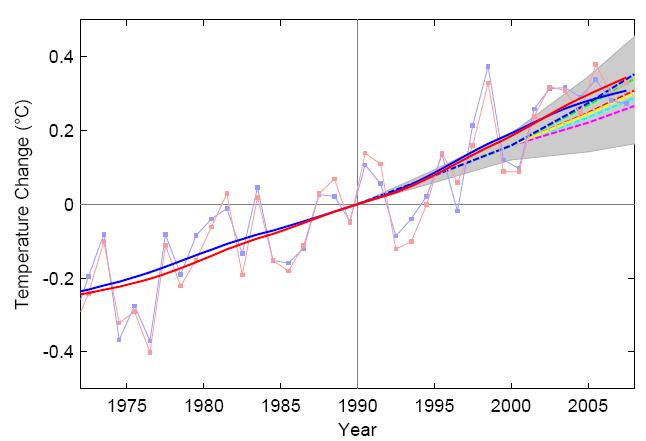
John - You ought to add the temperature graphs from this previous post here. They do a good job of answering the skeptic assertion that "observations don't match models' predictions."Response: Thanks for reminding me of that post. Here's the observed versus modelled temperature (I'll keep it here in the comment as the post above is focused on the Copenhagen Diagnosis report):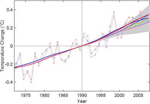
Courtesy of Tamino: Solid blue and red lines are trends from GISS and HadCRU data, dashed lines are IPCC projections included in the TAR. -
HumanityRules at 11:55 AM on 26 November 2009East Antarctica is now losing ice
Not sure what you mean about 30%. My understanding for East Antarctic is that there is a positive anomaly in the GRACE data. From Chen and many others this is put down to GIA i.e. the land is rising and depending on how much you believe is occuring this leads to stasis or falling ice mass. The Tregoning paper suggests using GPS data that the positive anomaly can't be put down to GIA therefore it must be due to ice/snow accumulation. It should be noted that the work was done on coastal regions. So one method says stasis followed by ice loss while another says ice gain followed by stasis. I think this does change the picture. I also think it does change a fundamental pillar of the antarctic picture. -
Steve L at 11:38 AM on 26 November 2009Record high temperatures versus record lows
Thanks for that Albatross. I've got a tinyurl for the Kilinc & Beringer paper: http://tinyurl.com/yeqsp5p Unfortunately I won't be able to look at it or the diagnosis any time soon (too many deadlines!). -
Albatross at 10:52 AM on 26 November 2009The physical realities of global warming
SteveL, maybe they "hid" the red trace under the blue line. Seriously though, good point. Perhaps an oversight? This document was not subjected to as intense a review as AR4 ways, for example. PS: I provided a reference for you on the other thread concerning temperature records that you might be interested in. -
Riccardo at 10:49 AM on 26 November 2009The physical realities of global warming
HumanityRules, you are missing that the CO2 concentration trend is not linear. It would be linear only if the emissions were constant. In math words, concentration is the integral of emissions, scaled by the roughly constant factor of the ocean sink. -
Riccardo at 10:31 AM on 26 November 2009East Antarctica is now losing ice
HumanityRules, The old model is wrong? Assume it is, include the new model and recalculate mass balance. What's the effect? Around 30%, fair enough. It does not change the picture, science goes a step further and we're all happy :) What i want to say is that when a single piece of a complex picture turns out to be wrong, unless it is a foundamental pillar we can not conclude that the whole picture is wrong, we need to look at the consequences before coming to conclusions. We've already seen this kind of adjustments many time before, it continuosly happen indeed. -
HumanityRules at 10:06 AM on 26 November 2009The physical realities of global warming
I have a small question about the CO2 section. 1)They show the rate of CO2 emissions have increased since 2003. 2) They also say that the ability of the natural carbon sinks to absorb CO2 has dropped (by 5%) 3) Yet in the measurement of the atmospheric CO2 in ppm for the last 50 years they show a linear rise. If human CO2 is the main source of the increases in atmosphreic CO2 and if the first two points are correct then surely we should see an increasing rate of CO2 accumulation in the atmosphere. What am I missing? -
HumanityRules at 09:56 AM on 26 November 2009East Antarctica is now losing ice
Riccardo It's not just a case of more accurate data. It's that models were developed based on the same best guess assumptions about GIA, a perfectly reasonable thing to do at the time. These models have gone on to inform almost every measurement of antarctic ice loss. Direct GPS measurements have suggested that these assumptions are wrong. Which calls into doubt the accuracy of almost all previous measurements. That is important. I'm still unsure what weight to put on the conclusions from the GPS data. -
Steve L at 09:36 AM on 26 November 2009The physical realities of global warming
I find it interesting that most signs of trouble are advancing faster than expected, but the one metric showing the expected rate of change is global temperature. This may not be the right interpretation, but perhaps the IPCC report was most certain regarding temperature response and, when uncertainties were greater the authors tended to forecast toward the lower range of projections. Another observation: the tide gauge estimate of sea level rise in Fig 3 above stops years ago. The same is true here in the figure from Church 2008: http://www.skepticalscience.com/sea-level-rise.htm Why? Have the tide gauge data not been processed yet? -
wingding at 08:55 AM on 26 November 2009What do the hacked CRU emails tell us?
I have put together two posts analyzing two of the accusations made http://allegationaudit.blogspot.com -
Riccardo at 08:53 AM on 26 November 2009What do the hacked CRU emails tell us?
Mizimi actually switched from "unable to include many known factors that influence climate" to "model inadequacies". Quite a big difference. The only thing partly true is that small scale phenomena are not simulated, but some sort of parametrization is used; which is a trick (intentionally used this word ;) ) to include phenomena at a scale smaller than the grid. -
Nunataq at 08:48 AM on 26 November 2009The physical realities of global warming
dhogaza, Many thanks for that clarification. It is well noted and I will be sure to mention that when linking to the report. -
dhogaza at 08:30 AM on 26 November 2009The physical realities of global warming
Appreciate this summary. Most folks would find the latest IPCC release a bit of a challenge.
Again, for the sake of accuracy, this report is not an official IPCC document, though many of the authors are significant authors of AR4. -
Nunataq at 07:55 AM on 26 November 2009The physical realities of global warming
John Appreciate this summary. Most folks would find the latest IPCC release a bit of a challenge. Great to have a link to help with that. All the best.
Prev 2542 2543 2544 2545 2546 2547 2548 2549 2550 2551 2552 2553 2554 2555 2556 2557 Next


