


 Arguments


Recent Comments
Prev 647 648 649 650 651 652 653 654 655 656 657 658 659 660 661 662 Next
Comments 32701 to 32750:
-
IPCC overestimate temperature rise
A not-so-trivial note here: the 1990 FAR models used a direct forcing of CO2 simplified equation of 6.3*ln(C/C0) (see pg. 52 of the FAR Radiative Focing document), while later literature in particular Myhre et al 1998 using improved spectra computed a direct CO2 forcing of 5.35*ln(C/C0), changing that direct CO2 forcing estimate from 4.37 W/m2 to 3.7 W/m2. N2O and CFC simplified values were also updated at that time, those for CH4 were unchanged.
As with the Hansen 1988 predictions, this inaccuracy in early line-by-line radiative codes led to some overestimation of climate sensitivity and warming in those earlier GCMs - which, mind you, was not specifically due to errors in the GCMs, as they were using the best values available at the time.
-
Stephen Baines at 05:22 AM on 14 November 2014IPCC overestimate temperature rise
"The only thing I guess I really have left to say is that I don't count that as trivial, dishonest or entirely without value."
IF you conclude from the comparison that the underlying physical model is useless, you are in fact wrong. That is all anyone is saying. The physical model works OK IF the forcings are correct and you use a proper baseline. More recent models do better, and capture a lot more of the natural variability, so the focus on FAR escapes me.
In that light, the comparison in the figure is only really useful to show that it is hard to predict volcanoes, economic and political crises, management decisions, and technological changes that might influence the forcings. But that point is really quite trivial, and is the whole point behind using different scenarios, as you point out.
You must realize that people use the mismatches that stem from the second problem to imply that the first problem is serious, when an appropriate comparison would indicate that the physical model works prety well. They don't always make that argument sincerely, but sometimes they just don't know better. If you go into a discussion not realizing that, you will be unpleasantly surprised by the result.
-
MA Rodger at 05:04 AM on 14 November 2014IPCC overestimate temperature rise
bcglrofindel @45.
"The atmospheric CO2 and CO2 equivalent concentrations they used in scenarios BAU, B, C, D still span the current day values. If I'm not mistaken, falling inbetween BAU and B?"
You are mistaken. For instance, compare the total of equivilant values in AR5 Table AII.2 for AD2000 with those in FAR Table 2.7. AR5 forcings lie below all values used by FAR.
-
Russ R. at 04:52 AM on 14 November 2014More research confirming large methane leakage from shale boom
CBDunkerson,
Very well... which of the three SRES scenarios shown above (A1B, A2, or B1) aligns most closely with the demographic, socio-economic and techological development path the world has followed since 1990?
Here's your reference: https://www.ipcc.ch/pdf/special-reports/spm/sres-en.pdf
Moderator Response:[PS] Fixed link
-
bcglrofindel at 04:14 AM on 14 November 2014IPCC overestimate temperature rise
@Dikran and Tom
If I'd been able to find or see the original source reference to this graph of temp vs. FAR I'd not even have posted as my query was answered:

What I read and could see instead was no mention of how actual temperature compared to the FAR because that was declared misleading, unscientific, etc. JSmith attempted his own graph of same, and it was pointed out that his actual was grossly inaccurate and nothing like what an honest plot of actual vs FAR would look like. However, there was still lack of any plotting of what that different honest FAR vs actual would look like. As it turns out, a separate page on this very site had exactly that graph as linked above. Better still before KR kindly pointed to that graph, I had broken down and endeavoured to digitize the FAR graphs myself and reference temperature trends over the period prior to 1985 from the FAR graphs. Averaging across that time frame, I get the encouraging reward of a near matching to the result of above pre-existing graph.
The only thing I guess I really have left to say is that I don't count that as trivial, dishonest or entirely without value. I still staunchly disagree that looking for that result is inherently dishonest, or even misguided.
The Joe Blow public wants simple tests that lack lengthy qualifications and caveats. The IPCC team that worked on FAR understood that, and half their reason to exist was to endeavor to bridge that gap. To that end, the projections they did included considerations for a broad range of possible unknowns. A key reason for doing this is to span the spectrum of possible future outcomes. Discount their efforts to that at your peril. The CO2 sensitivity ranges they used spanned from 1.5 to 4.5, which if I'm not mistaken is still within the currently expected range? The atmospheric CO2 and CO2 equivalent concentrations they used in scenarios BAU, B, C, D still span the current day values. If I'm not mistaken, falling inbetween BAU and B?
If you start denying those basic coverages, you're discrediting the FAR report and work for any skeptics. They'll just throw your claims right bakc in your face and say see, told ya so. As you've admitted, the IPCC so misjudged climate conditions 25 years later that not even it's defenders expect it to be correct.
Meanwhile there exists the graph I've included showing a tracking of actual temp to IPCC predictions from 25 years ago with the actual temp between the IPCC worst and best scenario estimates. Yes, there are plenty of caveats to be included, but simple is better. Certainly better than throwing the entire IPCC FAR team under the bus for no good reason.
-
MA Rodger at 04:09 AM on 14 November 2014IPCC overestimate temperature rise
bcgirofindel @38.
Your original comment here talked of JSmith making "mistakes or inaccuracies in matching" data. But JSmith did no matching. Rather, he simply cut and pasted a graphic sourced from the internet, a graphic which originated as part of a piece of denialistic reporting by Der Spiegel.
And I'm still at a loss as to why the "simple apples to apples comparison" called for would require to be with the IPCC FAR graphics rather than the IPCC FAR calculations. Surely we wish to judge the IPCC on the veracity of its calculations not on its abilities in accurately predicting the future w.r.t. such things as the speed with which CFCs would be phased out, the drop in methane emissions from waste tips and petrochemicals, the collapse of Communism, etc.
-
Tom Curtis at 03:31 AM on 14 November 2014IPCC overestimate temperature rise
Given bcglrofindel's comments @38, I am tempted to let him totter of with his stick to the gun fight. However ...
While the two graphs shown by KR @34 are excellent for their purpose, that purpose is not the comparison of post 1990s trends. As the comparison of temperature changes post 1990 is the "purpose" of the pseudo-skeptical interest in the FAR projections, the graphs are not suitable for the underlying purpose. Used as such, a competent* pseudo-skeptic will point out that:
1) The graph shows a multi year average of the GISS temperature record, thereby eliminating (by regression to the mean) some of the lower temperature values in the twenty first century;
2) The graph has no clearly defined baselining procedure (and natural candidates are excluded by relative values); and (most importantly)
3) By taking the change in temperautre from 1880, the graph allows the accumulated relative difference over 110 years to distract from the very different rates of change between observations and IPCC FAR projections post 1990 (and particularly post 2000).
Please note that these are only problems when the graphs are used, contrary to their original purpose, to compare changes in temperature post 1990. Further, note that, with regard to point (2), although the baselining method is not specified, a perfectly valid baselining technique may have been used (and probably was given that Dana constructed the graph). However, if you do not know what it is, you cannot defend its reasonableness, or correct for it if you think it unreasonable.
Because the graphs are not suitable for comparison of post 1990 changes in temperature, the original article included a graph for just that purpose:
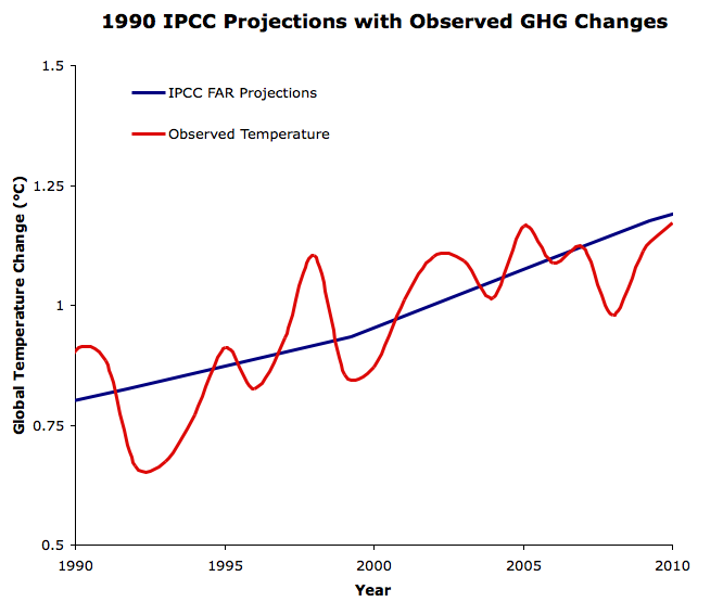
Note, however, that for that graph, the IPCC "projection" was adjusted to reflect actual (rather than projected) changes in GHG forcings.
So, once again we return to the same points. A proper comparison requires understanding the difference between projections and predictions, and not expecting the IPCC to "predict" the fall of the former Soviet Union (among other things).
(* The incompetent pseudo-skeptics tend to simply reject such graphs out of hand on the sole basis that they come from Skeptical Science.)
-
Dikran Marsupial at 03:24 AM on 14 November 2014IPCC overestimate temperature rise
bcglorfindel wrote "IMO, the big problem here is trust and confidence in modelling."
The graph you propose will not be able to address this question in a scientific manner because projections tend to have stated uncertainties, as do the observations, so you would need to add credible intervals to both before you could really determine whether the models had peformed as well as could be reasonably expected over such a short timescale.
Another important point to bear in mind (and this is really important) which is the mean of an ensemble of model runs is not a projection of the trajectory of the Earth's actual climate, just of theofirced component (i.e. the climate change that results from a change in the forcings, rather than sources of internal climate variability). A fairer comparsion would involve also adjusting the observations to account for the effects of internal variablity (e.g. by regression analysis to remove the effects of ENSO and volcanic forcings which the models do not include).
Performing an apples-v-apples comparsion is not as straightforward as you might think, and performing the comparison properly includes either performing the adjustments to the best of your ability or including the caveats that explain (if not quantify) likely sources of discrepancy. -
Dikran Marsupial at 03:15 AM on 14 November 2014IPCC overestimate temperature rise
incidentally, it is pretty well known that electronic forms of communication have a tendency to be percieved as being rather more agressive than actually intended, which I think applies to all sides in this discussion. Note my previous comment was intended as helpful guidance for bcglrofindel on adjusting his posting style to be a little less confrontational, and hence improve his/her interaction here.
-
Dikran Marsupial at 02:59 AM on 14 November 2014IPCC overestimate temperature rise
bcglrofindel I think perhaps it would be a good thing if you were to review the wording of your initial posts here in understanding the reception you have received. jsmith wanted asked a question about why the adjustments made such a large difference compared to the diagram that he introduced into the discussion. It was explained why that diagram was itself highly nuanced (the nuance explaining a lot of the difference). Your first comment began
"If JSmith's methods were wrong can you not at least address his core concern? "
Note that you implicitly question the issues that I had raised (or at least do not accept them), but if his core concern was indeed the discrepancy, then the issue that I had raised explains most of it. You began on this thread by effectively glossing over a substantive issue that had been raised. That is not conducive to scientific discussion.
KR then made the very important point that GCM projections are not intended to be accurate over such short timescales, and gave an appropriate plot of various projections to demonstrate this, but your reply was frankly rather rude "You still aren't giving a simple apples to apples comparison." and went on to ask " Isn't it trivial to plot actual temperature against the 3 projections the IPCC gave in Fig 6.11? "
the answer to this is that "yes it would be trivial, but it would be misleading for the reasons that had already been explained to you, for a start it is important to take into account that the observed forcings did not match those used in the scenarios, so you should adjust for that in order to make a like-for-like comparison"
however you write "That would easily do away with all the hedging and confusion and end the matter, no? "
now "hedging" suggests that someone is being deliberately disingenuous in their presentation of the data. Getting the science right, and adjusting for known problems is not "hedging".
Can you see that your own comments here have not been altogether conducive to good natured discussion.
you carry on
"Why can't I find such a simple plot anywhere? All the places I find such a plot, like JSmith's in thread, it's called out as inaccurate. Can't 3 simple plots done on excel in about a half hour clear this up and silence skeptics?"
I explained why JSmiths plot is problematic (I wouldn't say innacurate, just that there are nuances in its interpretation that you need to be aware of). Now accepting my criticism would be fine, or challenging it, that would be fine to. However you chose a third option, which was to imply that it was some sort of partisan rejection. I find that kind of treatment of my well-intentioned comments to be pretty offensive. However, that is pretty much water of a ducks back these days, so I let it go; others may not have been that charitable.
I suspect that part of the problem here is that the issue is not as straightforward as you think it ought to be, and you are having difficulty accepting that others know more than you do about this. Hopefully this will help you see why you have had the reception you have recieved, it is at least partly your own fault.
In short, it is better to ask questions with some humility, and if you don't understand why something is not done the way you think it should be done, consider that there may be good reasons and ask why, rather than demand plots being drawn to your specifications.
-
IPCC overestimate temperature rise
bcglrofindel - I had forgotten about that earlier FAR specific post; SkS really contains a lot of information. If you're interested in other predictions that have been examined here, the Lessons from Predictions button in the left margin is quite useful.
I'm afraid that much of the strength of the reaction to your questions was based on past experiences - I cannot count how many times someone has commented here and on other climate blogs claiming despite the evidence that mismatches between specific projections and observed temperatures somehow invalidate all climate modeling, despite the projected emissions not matching actuals. The pattern for those 'skeptics' is one of starting out with what sems like a reasonable question, then not accepting the explanations, degenerating into denial, libertarian fantasies, and conspiracy theories while asserting counterfactuals, before their politeness finally expires and moderation kicks in. But it's difficult to distinguish between such people and the genuinely curious early in the exchange.
Note to everyone - As bcglrofindel points out, such a strong reaction can be quite offputting. Save the sarcasm for people who have demonstrated the need for heavy implements in clue delivery.
-
bcglrofindel at 01:12 AM on 14 November 2014IPCC overestimate temperature rise
@KR thanks, the graph there is pretty much exactly what I was wanting to track down. When it was in the gif with a dozen other graphs I failed to pick it out specifically.
@Tom Curtis, I understand being enthusiastic when you are passionate about something, but your posts are all coming across way overly aggressive. So much so you don't really even seem to have bothered with reading my actual requests as I never insisted on the BAU scenario comparison, but just any comparison to the entirety of the scenarios used in the FAR including bau, b, c, and d.
@All
IMHO I don't quite agree with the vehement insistance on rejecting the initial query itself. KR's second last post and in particular his source are pretty much exactly what I was looking for from the start. I hadn't thought I'd asked the question that badly? The extensive insistence that we should discourage people from making the query at all, and even further should be shaming them for asking it is, well, wrong. That approach is going to just drive away most people and as likely as not they'll take the extreme defensiveness as proof the claim is true. Meanwhile, the reality is that plotting temp against the FAR scenarios places reality having fallen HOTTER hotter than FAR BAU at 1.5 sensitivity.
Additionally, insisting that under NO CIRCUMSTANCES no circumstances was reality anywhere near even the most optimistic of the FAR's assumptions and scenarios is basically telling a skeptic they were right all along, and exactly the OPPOSITE opposite tactic I'd think should be taken.
Sorry, I don't want to be hyper critical, and doubly so with a good answer to my query in hand. I do however find the extraordinary grilling and condmening of the query as counter productive and frankly damaging and really want to put that out there as something to be cautioned against.
Moderator Response:[JH] The use of "all caps" is akin to shouting and is prohibited by SkS Comments Policy.
-
CBDunkerson at 22:48 PM on 13 November 2014More research confirming large methane leakage from shale boom
Russ wrote: "No... I'm saying the IPCC has overestimated either CH4 emissions, or residence time, or both."
You appear not to understand the difference between projections and predictions. A prediction is a description or depiction of expected future results. A projection is a depiction of future results based on a specific set of assumptions.
The chart you posted in #5 shows projections not, as you incorrectly stated, predictions. If we assume emissions at the A1B level then we get one projection of future atmospheric concentrations, but if we assume emissions at the A2 level then we get a different projection. If X then Y. Not, 'the result will be Z'. Indeed, the description of that chart in the report begins;
"Figure 1.6 | Observed globally and annually averaged CH4 concentrations in parts per billion (ppb) since 1950 compared with projections from the previous IPCC assessments."
Further, the text of the chapter you linked notes that actual emission levels from 1999 to 2006 were lower than the range of past trends used as the basis for projections in previous reports and that emissions are now rising again;
"As discussed in Dlugokencky et al. (2009), trends in CH4 showed a
stabilization from 1999 to 2006, but CH4 concentrations have been
increasing again starting in 2007 (see Sections 2.2 and 6.3 for more
discussion on the budget and changing concentration trends for CH4).
Because at the time the scenarios were developed (e.g., the SRES
scenarios were developed in 2000), it was thought that past trends
would continue, the scenarios used and the resulting model projections
assumed in FAR through AR4 all show larger increases than those
observed (Figure 1.6)."Thus, everything you claim to be confused about is quite clearly explained in the source you claim to be working from.
-
wili at 21:50 PM on 13 November 20142014 SkS Weekly News Roundup #46A
I though this title sums up the recent situation nicely (even if I'm not sure China is trying to save anything other than its reputation):
-
Bob Loblaw at 11:40 AM on 13 November 2014IPCC overestimate temperature rise
As a followup to KR's last sentence, you can get a look at what a pseudo-skeptic does with this comparison by looking at this Skeptical Science post about Pat Michaels.
-
IPCC overestimate temperature rise
It's very important to remember that the scenario projections _are not predictions_! The only 'prediction'(more correctly a conclusion) from the climate model is that of the _relationship_ between emissions and climate change. The only appropriate test is to examine whether the relationship embodied in the physics of the models holds between actual emissions and observed temperatures, not between observations from actual emissions and 'what if' scenarios with wholly different GHG histories.
Complaining about a mismatch between observations and model projections from scenarios that didn't occur, as is so common from 'skeptics', is nothing more than a strawman argument, a logical fallacy.
-
Tom Curtis at 09:35 AM on 13 November 2014IPCC overestimate temperature rise
bcglrofindel @ 30, no! Responses like mine may drive away deniers, ie, pseudo-skeptics who want to generate a talking point without understanding it. Genuine skeptics, however, are only interested in apples to apples comparisons. If the IPCC plotted only the expected temperature increase due to green house gases (and did not include the temperature decrease due to aersols), they will want to know that, and want to plot "the temperature increase due to GHG" against the IPCC projections (and will note, unfortunately that no thermometers are only able to distinguish temperature changes due to greenhouse gases). Alternatively, they will want to plot the actual temperature increase against either the IPCC FAR projections adjusted to match the actual change in forcing, or against that scenario which most closely matches the actual change in forcings (scenario B for overall forcings). Further, they will want the reasons for those particular comparisons discussed rather than being presented with an unexplained graph that will only mislead the unwary.
Despite this, you persist in wanting a temperature comparison with the BAU projections despite the known fact that emmissions did not follow the BAU scenario, and the change in forcing between 1990 and 2011 matches the much lower value of scenario B.
-
scaddenp at 09:23 AM on 13 November 2014Remote-control robots reveal why the Antarctic ice sheet is melting
Don, I think you are confusing the seaice with permanent ice shelves like the Ross and Ronne which are certainly not seasonal.
DAK, I think you can regard the ice shelves as the edges of ice sheets in terms of the article. Losses translate into faster rates of movments in the icesheets.
-
DAK4Blizzard at 09:22 AM on 13 November 2014Remote-control robots reveal why the Antarctic ice sheet is melting
Don @4
It's true that much of the sea ice around Anarctica isn't permanent (a point often overlooked by climate contrarians). And granted, much of Antarctica's coastline is (or almost is) ice-free in summer. But a significant portion of the Antarctic Peninsula's coast seems to have ice shelves.
I do take your point on the ice shelve's role being minor in how warm water may reach the surface. I'd appreciate if someone could further explain or refer to what role (if any) sea ice plays in warm water reaching the surface and affecting the coastline. -
Don9000 at 08:59 AM on 13 November 2014Remote-control robots reveal why the Antarctic ice sheet is melting
DAK @3
The Antarctic ice shelves are and for all the time we've known them have been largely seasonal, the minimum area being about about 3 million km2 and the maximum area some 18 million km2.
I don't believe it matters whether the sea ice is present or not where the warm water eddies are concerned. If anything, I'd guess the sea ice might cause more heat to reach the ice sheet. To me, the system looks like a roiling lava lamp.
-
DAK4Blizzard at 07:06 AM on 13 November 2014Remote-control robots reveal why the Antarctic ice sheet is melting
"This loss of ice isn't caused by melting on the surface of the ice sheet, as even summer temperatures in Antarctica tend to be below zero degrees."
True, though I do think surface temps get close to 0°C on the Antarctic Peninsula during summer. (And sunshine can override such temperatures to induce melting, though I don't know how cloudy that region is in the summer.) So what could also be important is the potential for those temps to rise above freezing in the summer with future warming, and whether that would be enough to drive a lot more ice melt. What does the research have to say on this?
"Instead, loss of Antarctic ice is largely caused by warm water at the coast melting the edges of the ice sheet."
I would think the most vulnerable ice would be the ice shelves, not the ice sheet itself. Much of Antarctica’s coastline, including the Antarctic Peninsula, is buffered by ice shelves. Should we be concerned with melting ice sheets on those coastlines, or primarily just coastlines where there is no ice shelf? (It appears the robots covered the northern tip of the Antarctic Peninsula — around 63°N. So in that case, there isn’t an ice shelf present.)
But even if ice shelves can protect the ice sheet from the warmer water, I do see how this could have big implications down the road for coastlines that are buffered by an ice shelf. If the ice shelf melts, the coastline could become vulnerable to the water.
-
Rob Honeycutt at 06:59 AM on 13 November 2014Remote-control robots reveal why the Antarctic ice sheet is melting
wili... Is this research showing increased loss? Or is it merely showing the mechanisms at play in measured and projected ice loss?
-
wili at 05:23 AM on 13 November 2014Remote-control robots reveal why the Antarctic ice sheet is melting
Greeeeat! (not)
So another reason why melting may happen even faster than we thought. It seems as though there have been a number of these lately. Is anyone putting them all together to determine how much more slr we should expect in the coming decades once these newly discovered mechanisms are figured in?
-
IPCC overestimate temperature rise
bcglrofindel - If you recall, I gave you a graph of temperatures vs. projections earlier in the thread, including the 1990 FAR. More specifically in the collection of SkS threads examining past projections is a direct FAR comparison here:
Far more relevant are FAR models using actual greenhouse emissions to present (which didn't exactly match any of the scenarios), as the various scenarios were just that, scenarios, not looking-glass prophetic visions of future economies:

The FAR models were quite simple - but all in all did a reasonable job.
In short: The FAR projections were not exact matches to observed history, but the models they used appear to be in the right range for predicting trends vs. GHG emissions.
I believe that is a sufficient response for the naysayers.
-
scaddenp at 04:53 AM on 13 November 2014IPCC overestimate temperature rise
"We are talking about the 1990 IPCC report, so the current record is about 25 years out and closing on the 30 years you suggest quickly."
Yes, but it seems you are trying to compare a point - the temperature today - with a position on the curve which is not valid. You can compare the 30 year average with the projected 30 year average. To do otherwise means you are forever wrong - "+ve esno cycle - the models are underpredicting", oops, "-ve cycle. the models are too hot". What the models to do not pretend to do, is predict enso variability and any comparison that do not allow for that is invalid.
-
bcglrofindel at 03:47 AM on 13 November 2014IPCC overestimate temperature rise
tom_clarke, thanks.
A websearch for that kind of data is what ended up bringing me to this article :). I again appreciate the very great degree of variability there is in projections. The FAR folks did up three separate graphs for CO2 doubling sensitivity of 4.5, 2.5 and 1.5. Then, within each graph they also included 4 different emissions scenarios. I appreciate that leaves lots of room to fall outside the modelled scenarios. At the same time, I don't especially like going overboard in declaring that the entirety of all the scenarios projected by the FAR folks were all to pessimistic. That just about leads to a "told ya so" from the ones claiming the FAR projections are all too hot compared to instrumental records.
IMO, the big problem here is trust and confidence in modelling. Hindcasting accuracy doesn't exactly resonate with a skeptical audience as proof positive. Projections like the FAR that are 25 years old though are pretty powerfull. It's hard to 'fake' getting good results 25 years later. It's also necessary to explaing bad results 25 years later.
That said though, I'm still at the stage of answering the question of whether the projections have yielded good, bad or in between results 25 years later. The graph would seem a simple endeavour. I've tried digitizing data points from Fig6.11 below for sensitivity of 1.5, the coldest, but with emission scenario Business as Usual(the most pessimistic). By digitizing though I mean zooming tight on the image and drawing my own graph lines across to attempt to get close numbers:
1962 - 0.375
1963 - 0.375
1975 - 0.49
1987 - 0.625
1988 - 0.625
2000 - 0.75
2012 - 0.875
2013 - 0.875

-
gws at 03:13 AM on 13 November 2014More research confirming large methane leakage from shale boom
Russ, you are using a red herring tactic.
While it is true that our knowledge on methane atmospheric sources and sinks is limited in such way that we cannot yet explain in detail why global atmospheric methane is doing what it does, that does not diminish the facts that
- methane sources again exceed sinks,
- methane emissions from fossil fuel mining and use (ca. 100 Tg CH4) are a major contributor to the global source, and are on the rise again, and
- the US is contributing more strongly to that source and rise than in the past
Since such tactic is not tolerated here, I suggest you drop it and discuss the main contents of the article instead if interested. Thanks.
-
tom_clarke at 03:10 AM on 13 November 2014IPCC overestimate temperature rise
bcglrofindel,
I don't have precise data for the answer you want, but would make some points:
(1) el Nino / la Nina phase correlates highly with internal (ie not externally or CO2 driven) temperature variability, and we are currently in a highly el Nino negative period, which therefore would be expected to be unusually cooler than the projections. However there are forcings over the last 10 years (TSI, aerosols) which affect the temperature so I am not sure how dominant this effect is.
(2) I can't give an immediate answer because the correct projection needs to be chosen for CO2 emissions. This does not require much work.
(3) A straight comparison should be doable, as long as careful attention is paid to baselining, and result in a deviation explainable to some extent by variability in aerosols (volcanic and anthropogenic), TSI. The rest will be internal variation (of which the el Nino/la Nina phase is an important component) and errors in the 1990 model assumptions or input data.
I'd like to see the answer but am not in a position myself to provide it. I wonder if a web search would find something?
One point to remember is that all of the un-modelled variability noted above is highly significant - so that we expect the actual temperature to depart a lot from the model average (which is what you see in the graphs). And that the actual temperature represents one run of a model, so that it is much more variable than the variation in model averages.
Another related point is that in doing these comparisons you need to be really careful about (for example) baselining. There is so much decadal randomness that small changes in even quite a long baseline can make a big difference.
You will see that the above is explaining my inability to give a simple answer such as you ask without lots of ifs an buts. Sometimes life is like that! Perhaps somone else can link to a reasonably complete study?
-
Composer99 at 01:59 AM on 13 November 2014More research confirming large methane leakage from shale boom
I have a longer follow-up prepared, however global methane concentration is off-topic for this particular thread.
Any suggestions as to an appropriate thread? One of the 'IPCC models vs observations' threads, perhaps?
-
bcglrofindel at 01:52 AM on 13 November 2014IPCC overestimate temperature rise
Tom Curtis,
I believe responses like yours just drives away skeptics. A question as simple as how do the IPCC projections from 1990 compare to the instrumental record today nearly 25 years later seems a fairly honest starting point. To summarize the correct response to such a query as declaring the very question as "inappropriate" is terrible.
IMHO, the correct responses are one of:
The actual is hotter, and here is why.
The actual is cooler, and here is why.
The actual is very close, and here is why.
-
bcglrofindel at 01:44 AM on 13 November 2014IPCC overestimate temperature rise
scaddenp,
We are talking about the 1990 IPCC report, so the current record is about 25 years out and closing on the 30 years you suggest quickly. I also don't think it's the best argument to just tell people well the answer doesn't matter, or is just a strawman. The IPCC temperature projections ARE described in th executive summary as BEST guess changes. The IPCC executive summary IS being used to inform policy changes. When I see someone claiming that the IPCC temperature projections, in ALL scenarios, estimated higher actual temperatures than we see today on actual record I don't feel like telling them it's irrelevant is a strong argument.
More over, my underlying and overarching question was if there is anywhere one can simply go to point out the truth or falsity of such a claim? We have the instrumental temperature record available all over the place online, but referencing it correctly to the IPCC FAR fig6.11 is tricky without the actual data underlying the FAR projections.
My question more simply is if someone claims that the IPCC F(irst)AR overestimated temeprature compared to actual measurements are they making a false statement? If I say that isn't true, am I lying?
-
Russ R. at 01:30 AM on 13 November 2014More research confirming large methane leakage from shale boom
Composer99,
No... I'm saying the IPCC has overestimated either CH4 emissions, or residence time, or both. The observed methane concentrations (with uncertainty of ±4 ppb as of 2011) are sufficient evidence of this.
Here's the link to the figure:
- http://www.ipcc.ch/report/graphics/images/Assessment%20Reports/AR5%20-%20WG1/Chapter%2001/Fig1-06.jpg
And the chapter:
- http://www.ipcc.ch/pdf/assessment-report/ar5/wg1/WG1AR5_Chapter01_FINAL.pdf
And the data table:
- http://www.ipcc.ch/pdf/assessment-report/ar5/wg1/WG1AR5_AnnexII_FINAL.pdf
Enjoy.
Moderator Response:[JH]
Please note that posting comments here at SkS is a privilege, not a right. This privilege can be rescinded if the posting individual treats adherence to the Comments Policy as optional, rather than the mandatory condition of participating in this online forum.
Please take the time to review the policy and ensure future comments are in full compliance with it. Thanks for your understanding and compliance in this matter.
-
Composer99 at 01:04 AM on 13 November 2014More research confirming large methane leakage from shale boom
Russ R:
You're the one asserting that (1) the IPCC has underestimated CH4 emissions and that (2) the degree of underestimation is significant or meaningful in some vague, ambiguous, can't-quite-spell-it-out-can-you kind of way.
So it's incumbent upon you to provide sufficient evidence to support your assertion.
So instead of playing rhetorical silly buggers, how about providing the figure number or section of the report that the graph appears in.
-
Russ R. at 00:37 AM on 13 November 2014More research confirming large methane leakage from shale boom
Composer99,
You should address your question abut uncertainty bars to the IPCC, since it's their chart. Amusing how all of a sudden you grasp at any prospect of uncertainty to avoid accepting a completely obvious conclusion.
What's the word for that sort of thing?
Moderator Response:[JH] Keep it civil or loose your privilege of posting on SkS.
-
Russ R. at 00:36 AM on 13 November 2014More research confirming large methane leakage from shale boom
gws,
"Some work to do."
It appears we agree on this point.
-
bcglrofindel at 00:34 AM on 13 November 2014IPCC overestimate temperature rise
@Bob Loblaw,
Thanks for that. I'm Canadian and so yesterday was remembrance day and thus I was out visiting family and not back in till now.
My background is comp sci, so I very much understand that the original FAR models assumptions matter to the results they plotted and if scenario baseline assumptions aren't met that results will differ. I agree with all of that as self evident. It's also IMHO a very big and broad subject to try and get into.
My question that I still only have a fuzzy yes/maybe/no answer to is about how actual measured temperature compares to the published FAR temperature projections in Fig6.11. I totally understand that those projections had massive spreads within themselves because of the broad number of scenarios and unkowables they were working from. That doesn't stop people I've seen from posting the claim that ALL the FAR Fig6.11 projections are higher than current actual temperatures. I don't have a problem articulating the reasons that would be 'ok' or not a disprove of underlying theory. I can argue for and against that well enough. What I don't know is if that base claim is even remotely true. The best I can do is try and see from the graphs in Fig6.11 what temp increase from 1990 through 2014 the graphs show, which is extremely rough and not in anyway pursuasive. Additionally, if anyone has access somewhere to the actual raw data used for Fig6.11, then it should be trivial to show how actual temperature has tracked to the Fig6.11 scenarios, no? Yes, I know the scenarios Fig6.11 used with radically high assumptions will be too high, and we all know to expect that. I just want to know if people that claim all scenarios in Fig6.11 exceed modern temp can be called liars? More over, if I call them liars, am I actually the one lying?
-
MA Rodger at 20:30 PM on 12 November 2014More research confirming large methane leakage from shale boom
gws @4.
Absolutely. Rough-and-ready to the power N. I had a go at the numbers with no idea what the result would be. If anything, I expected it to be far higher than 6%. However, that result does perhaps allow some sort of consideration of an upper limit to fugative leaks from fracking. True, the atmospheric CH4 balancing act does contain some big players and they will be noisy. But the numbers do suggest that some of the larger percentages for leaks being talked about (The leakage rates found for Bakken and Eagle Ford in the study discussed here is 9% &10%.) would make fracking itself one of those big players.
-
Stephen Baines at 16:45 PM on 12 November 20142014 SkS Weekly News Roundup #45C
Here's an article in the NYT by Piers Sellers describing how Rep. Stockman from Texas completely abused Sellers' honest description of the science regarding ice ages and climate change to confuse congressional testimony on the issue. Sellers sets the record straight.
-
Tom Curtis at 15:25 PM on 12 November 2014We must manage global warming risks by cutting carbon pollution, top scientists conclude
Regardless of where austrartsua should have posted, his elimination of a vast literature which is reduced to (apparently) just one study by the parroting of a phrase (which it is questionable as to whether austrartsua understands). Just one sample from that literature:
"Bush-era tax cuts are scheduled to expire at the end of 2012, leading to interest in raising revenue through a carbon tax. This revenue could be used to either cut other taxes or to avoid cuts in Federal programs. There is a body of economic research suggesting that such an arrangement could be a win-win-win situation. The first win—Congress could reduce personal or corporate income tax rates, extend the payroll tax cut, maintain spending on social programs, or some combination of these options. The second win—these cuts in income taxes would spur the economy, encouraging more private spending and hence more employment and investment. The third win—carbon dioxide (CO2) pollution and oil imports would be reduced. This analysis uses the MIT U.S. Regional Energy Policy (USREP) model to evaluate the effect of a carbon tax as part of a Federal budget deal. A baseline scenario where temporary payroll cuts and the Bush tax cuts are allowed to expire is compared to several scenarios that include a carbon tax starting at $20 per ton in 2013 and rising at 4%. We find that, whether revenue is used to cut taxes or to maintain spending for social programs, the economy is better off with the carbon tax than if taxes remain high to maintain Federal revenue. We also find that, in addition to economic benefits, a carbon tax reduces carbon dioxide emissions to 14% below 2006 levels by 2020, and 20% below by 2050. Oil imports remain at about today’s level, and compared to the case with no carbon tax, are 10 million barrels per day less in 2050. The carbon tax would shift the market toward renewables and other low carbon options, and make the purchase of more fuel-efficient vehicles more economically desirable."
(Rausch & Reilly, 2012, emphasis added)
As the bolded sentence makes plain, there is a body of economic research on the topic (not a single study). In fact, my search on google scholar found 22,800 results (excluding citations and patents).
-
dana1981 at 15:19 PM on 12 November 2014We must manage global warming risks by cutting carbon pollution, top scientists conclude
There is a link in the above post to a discussion of the economic benefits of a revenue neutral carbon tax. It is one study - feel free to reference any evidence to the contary. I don't think any exists.
Also, a revenue neutral carbon tax does make carbon fuels more expensive. In most households those costs are offset by the resulting rebate, but who wants to turn around and give that money right back to the oil companies? Higher prices are still a motivator even if the funds are returned to the taxpayers.
-
One Planet Only Forever at 14:49 PM on 12 November 2014We must manage global warming risks by cutting carbon pollution, top scientists conclude
Trevor_S,
I would suggest that a start towards increased acceptance of the science and the policy requirements it irrefutably leads to would be for 'people who understand and accept the science and acknowledge that CO2 emissions need to be dramatically reduced' to stop repeating made-up claims that the people who try to deliver messages to encourage better understanding are excessively travelling in damaging ways to spread their message.
The real problem is the people profiting from damaging unsustainable activity who abuse their wealth to fund the creation and dissemination of such made-up claims.
-
We must manage global warming risks by cutting carbon pollution, top scientists conclude
austrartsua - Did you post on the thread you intended to? There's no mention of taxes in either the opening post or any of the comments until yours.
-
austrartsua at 14:14 PM on 12 November 2014We must manage global warming risks by cutting carbon pollution, top scientists conclude
Dana is falling for a bad case of "single-study syndrome" when he makes the claim that a revenue-neurtral carbon tax could be beneficial for the economy. This one study seems pretty dubious to me. It also seems odd, basic economics tells you if you want people to stop using fossil fuels, you have to make them more costly. If a carbon tax is truly revenue-neutral, no one would change their behavior. They'd put up with higher energy costs because they are getting a subsidy from the gov.
The study seems hard to believe.
-
Composer99 at 13:44 PM on 12 November 2014More research confirming large methane leakage from shale boom
Russ R:
Where are the uncertainty bars on the observed methane concentration time series?
Absent those, you can't really say that observed concentrations are below projected ones, since you can't exclude the possibility that the observed and projected spreads overlap.
-
Riduna at 12:44 PM on 12 November 2014More research confirming large methane leakage from shale boom
Fugitive emissions from fossil fuel mining are undoubtedly increasing and contribute to some as yet unquantified extent to rising atmospheric CH4. Another bit in the jigsaw which represents the quasi methane budget espoused by the IPCC’s 5AR?
There is no reason to believe that scarcity of tropospheric –OH radicals has anything to do with growth in the level of CH4. Perhaps ongoing increase in the level of atmospheric CH4 has something to do with emissions associated with ocean warming and degradation of permafrost, particularly in Siberia?
-
Miguelito at 12:39 PM on 12 November 2014More research confirming large methane leakage from shale boom
All I have to say is, Jesus Farking Christ, is industry sloppy.
The only bright light in that study is that the area over the Haynesville Shale shows no emissions bullseye despite that it grew into one of the largest gas fields in the U.S. over the period of the study. Too bad the study authors didn't calculate leakage rates for it too. It would have made an interesting contrast with the Bakken and Eagle Ford, where operators aren't after the gas, but oil and condensate instead.
All in all, it only makes it more urgent for the EPA's methane regs to be implemented sooner rather than later and for those regs to be expanded from gas wells to all wells. Of course, industry will sue, because that's what industry does.
-
gws at 10:33 AM on 12 November 2014More research confirming large methane leakage from shale boom
Russ, your question was addressed by me here. If you read the papers I just linked above, you will also find that the methane budget bottom-up estimates, which underlie the IPCC's projections (not predictions), tend to be higher than the top-down estimates (derived from atmospheric measurements), and that difference has not been reconciled yet.
Some work to do.
-
Trevor_S at 10:28 AM on 12 November 2014We must manage global warming risks by cutting carbon pollution, top scientists conclude
No edit,
I forgot to include the link to Professor Kevin Andersons comments and the typos above.. forgive me.
-
Trevor_S at 10:24 AM on 12 November 2014We must manage global warming risks by cutting carbon pollution, top scientists conclude
So is CO2 fertilization really that strong of an effect in the short run?
I read this in the Australia "Land" today (online edition, agricultrual Newspaper owned by Fairfax)
CO2 a nutrient, not pollutant: Moore
of particular interest where the comments... sigh
eg
Finally this paper writes something that is truthful about CO2 and the climate change fiasco
There is "little" hope (99% wide agreement) of structural change at a national level and virtually "none" at an international level (99.9% confidence, wide agreement) to ensure efficacy of emissions reductions with any chance of keeping under the 2 C target... over to you Professor Anderson
- At current (2014) emission levels, the 1000Gt will be consumed in less than 23 years.
- But with CO2 certain to rise over the coming few years, then, at the likely 2020 emission level, there will be ~13.5 years until the full 2°C carbon budget will have been consumed; i.e. full decarbonisation of energy before 2034.
I know you guys keep going on with the evidence but as this study in to anti vax indicates, you may actually be doing more harm than good ?
researchers found that while they were able to teach parents that the vaccine and autism were not linked, parents who were surveyed who had initial reservations about vaccines said they were actually less likely to vaccinate their children after hearing the researchers messages.
Which brings me to my question :) Where the sites advocating actions that are effective, something akin to here ? I know we have people like Naomi Klien etal flying all over the Planet, flogging product, telling us not to fly all over the Planet and flog product but there must be some sites with a little more "integrity" ? or is the reason we don't hear from these people because they just live a low emissions lifestyle themselves ? eg Joan Pick's / Ted Trainer's etal of this world
Perosnally I think encforced penury is the only true solution, emisisons dipped with the global economic crisis and I know when I quit my job (no welfare) and moved remotely off grid to lower my emissions, having no money enforced a low emissions lfestyle but am interested in debate on this issue .
-
Russ R. at 10:10 AM on 12 November 2014More research confirming large methane leakage from shale boom
For all this extra methane being released into the atmosphere, why has its concentration so stubbornly lagged model predictions?

Prev 647 648 649 650 651 652 653 654 655 656 657 658 659 660 661 662 Next


