


 Arguments


Recent Comments
Prev 939 940 941 942 943 944 945 946 947 948 949 950 951 952 953 954 Next
Comments 47301 to 47350:
-
Bob Lacatena at 14:08 PM on 18 March 2013Watts Interview – Denial and Reality Mix like Oil and Water
A. Scott,
You're kidding, right? With all of the complete and total bullsh*t that Watts has spewed, and with what is spelled out here, your response is to attack Dana for failing to address a detail the way that you wish he had?
(snipped)
Moderator Response: (Rob P) - inflammatory snipped -
Albatross at 14:07 PM on 18 March 2013Watts Interview – Denial and Reality Mix like Oil and Water
Well, if Marcott et al gave Tony Watts and Steve McIntyre (aka Nigel Persaud) a hissy fit, goodness' knows what the graphic below by Jos Hagelaars is going to do to them (H/T Eli Rabett); it may very well give them brain aneurysms.
Forget nuances about how to splice these data together and qualms about the paleo reconstructions potentially missing high frequency noise, it is quite apparent that we humans are in the process in engaging in what has to be one of the stupidist experiments we could have possibly conceived. That stark reality has driven some who are driven by ideology (hello Tony and Nigel) into deep denial-- don't be duped by their fear, uncertainty and doubt (FUD) tactics.
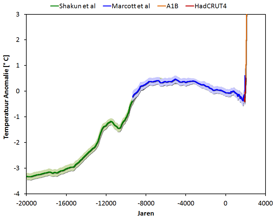
[Source]
Moderator Response: [TD] Linked the Eli reference. -
Bob Lacatena at 14:04 PM on 18 March 2013Watts Interview – Denial and Reality Mix like Oil and Water
Ray,
So you think that discussing a comparison between a peer-reviewed paper and a previous chapter of a doctoral thesis "would significantly enhance the discussion of climate change"?
I don't know how many ways I can say this. Let's be perfectly clear:
If someone has a specific reason why the Science paper is invalid, then it can be stated and argued. That's science.
Pointing to a chapter in the publishing scientist's doctoral thesis from several years ago, trying to draw false analogies, and trying to chip away at his integrity by doing so is not "discussing the science," it's playing games.
And that is the whole point of this post, the fact that Watts and his crew do not actually discuss the science. They play games. That is all that they do, although they do it under the pretense of discussing the science.
For anyone foolish enough to fall for that ploy... shame on you. Watts has been caught making enough hypocritical, false and misleading statements for people to be more wary about trusting him. The guy is pathetic.
You don't get a free pass. If you want to repeat his nonsense, then you're no better than he is.
There's discussing the science, and there's playing games.
I wonder what the difference is.
-
bill4344 at 13:53 PM on 18 March 2013Watts Interview – Denial and Reality Mix like Oil and Water
How entertaining:
Stop playing silly games please. Your comment is nothing but an attempt to distract from the facts.
Which it clearly is, and equally clearly he didn't bother to properly read the post!
But admissions are for wimps; instead this is brazenly followed by an abrupt switch to new set of unsubtantiated chumming assertions!
-
A. Scott at 13:37 PM on 18 March 2013Watts Interview – Denial and Reality Mix like Oil and Water
And since you brought it up and made some claims about what it says:
by has effectively extended the so-called and found that current temperatures are higher than they've been for 75% of the past 11,500 years, and the current rate of warming is faster than at any point during that timeframe.
In particular I'm interested in your claims that Marcott has "extended" the "hockey stick" and, further, shows "the current rate of warming is faster" than any point in the last [its 11,300 not 11,500] years.
I'm curious if you still stand behind theise claims, in light of the work that's been done by Steve McIntyre and a number of others showing the hockey stick portion of the Marcott paper is based on a very small number of proxy's and has other issues. And particularly in light of the fact the author seems to agree - stating they "clearly" indicated the recent portion of their work - the part containing the hockey stick - was "not robust." -
dana1981 at 13:34 PM on 18 March 2013Watts Interview – Denial and Reality Mix like Oil and Water
A. Scott - you should really read more carefully before launching rude attacks on others. If you had read the post I linked for the source of the GISP2 data, you would have seen that it says
"In order to make absolutely sure of my dates, I emailed Richard Alley, and he confirmed that the GISP2 “present” is 1950, and that the most recent temperature in the GISP2 series is therefore 1855."
As for your complaints about attributing Easterbrook's graphs to Watts, sorry, but cry me a river. I didn't build my shoes, or my bed, or my house, but they're still mine. Watts used the graph in one of his blog posts (and I don't think he even attributed it to Easterbrook).
Stop playing silly games please. Your comment is nothing but an attempt to distract from the facts.
-
A. Scott at 13:24 PM on 18 March 2013Watts Interview – Denial and Reality Mix like Oil and Water
Denial Strategy #3: Damage Control by Misrepresenting Data
When one chooses to attack others perhaps it might make sense to bother to get your own facts correct Dana.First - you attack what you claim as "Watts Graph" ... which you know full well was not Watt's at all. You had to copy and paste the URL here and in doing so would have clearly seen it was not Watt's at all:
http://hot-topic.co.nz/wp-content/uploads/2011/01/easterbrook_fig5.png
It is clearly one of Easterbrooks graphics, which would make perfect sense, as it was an article by Don Easterbrook. And the next graphic you show is clearly identified as Easterbrooks - not Watt's - in the inline comment in the graph and the URL.
Then you attack the accuracy, not of the data, but of a legend on the graphic. There are multiple versions of this graphic available on the internet. Many have the same (2000 AD) legend. It is not unique to Easterbrook. And there is a good reason for it.
You claim that 2000 AD is not the correct "present" date - that the data only goes to 1950. Yet you offer only another page at SKS as proof. When we go to that page here we see two more graphs from Easterbrook - adding more evidence yet you knew the source was not Watts.
On that SKS page we also find a NOAA graphic showing the R.B. Alley 2000 GISP 2.
Nope, no legend for what the "present" date is there either - even on the NOAA graphic you use to allegedly support your claims. You post a link below it to the NOAA FTP data for Alley 2000. My ftp is down, but a review of my archived copy shows - nope, zero mention of the "present" date there either. The only reference is "PERIOD OF RECORD: 49 KYrBP - present."We must accept your statement you are correct. Despite your failure to provide evidence that supports your claim. Doesn't mean you're wrong - but does mean you have failed to prove you are right.
(-snip-), lets go direct to the source - to NOAA's GISP 2 Paleo page for Alley 2000 and see what they say.Alley, R.B. 2000. The Younger Dryas cold interval as viewed from central Greenland. Start Year: -107175 AD End Year: 2000 AD
(-snip-).
I'm well informed about this issue as I had the same question long ago when I first started looking at Alley. I went to verify what "current" was and had to dig very deep.
Now I just happen to know you are correct. (-snip-)."
Moderator Response:[DB] As an FYI, this site uses a Comments Policy very similar to that at Shaping Tomorrow's World. A policy you found onerus and difficult to live up to. As a suggestion: adherence to the Comments Policy is a mandatory condition of participation in this venue. Said participation is thus an earned right, not an entitlement. A right that can and will be rescinded should individuals here place themselves above that mandatory condition of participation.
Multiple inflammatory tone snipped.
-
JohnB6223 at 13:18 PM on 18 March 2013Debunking Climate Myths from Politicians
An informative list of the known attitude of Australian federal politicians to climate change is here
-
Matt Fitzpatrick at 13:00 PM on 18 March 2013February 2013 Arctic Sea Ice Death Spiral Update
So from a purist's perspective, the polar plot should be one turn around the circle = one annual cycle, with twelve spokes for the months? Yeah, I could see that. It'd produce a different shaped spiral, but I bet it'd be just as striking and informative.
-
quokka at 12:50 PM on 18 March 2013Does Norway lack political commitment to renewables?
As AndyS points out nearly all of Norway's electricity production is from hydro. I'm not sure what the point of the article is - it's all very vague. It's hard to imagine why Norway would have any motivation to build for example off shore wind.
As Norway already has a low emission electricity supply, what would be more interesting is learning about how that might be put to good use by electrification in for example transport, heating and industry. In particular a look at space heating by the numbers and what prospects there are for large scale deployment of heat pumps would seem very relevant. Heating must surely be a big energy consumer.
What the paragraphs on PV have to do with this escapes me entirely. It's hard to see the relevance.
-
bill4344 at 12:22 PM on 18 March 2013Science vs. the Feelies
ubrew@#2 ...as are many of our fellow planetary inhabitants, with more being added to the list with every year of inaction that passes! In the real world this means the expression - and everyone knows that's what it is - is a perfectly acceptable shorthand drawing attention to the scale of the threat to life as we've known it.
-
ubrew12 at 11:23 AM on 18 March 2013Science vs. the Feelies
Bill @1: I thought the same. An attempt at balance, but Hadley felt a need to finger wag at those who use the term 'save the planet' as if that was what was at risk (the planet is not at risk, we, specifically our civilization, are at risk).
-
William Haas at 11:03 AM on 18 March 2013Water vapor is the most powerful greenhouse gas
The theory is that adding CO2 to the atmosphere will further retard the passage of IR radiation through the atmosphere that will cause warming. The warming in turn will raise the capacity of the atmosphere tho hold H2O which in turn will cause H2O to be added to the atmosphere which further retards the passage of IR radiation which will cause more warming. So the H2O additional warming effect is modeled as a positive feedback to adding CO2 to the atmosphere. This is what appears to happen in the lower atmosphere. But in the upper atmosphere the opposite occurs. The retarding of CO2 that warms the lower atmosphere acts to cool the upper atmosphere. It is in the upper atmosphere where IR radiation is radiated to space. Assuming a constant solar radiance and constant value of earth albedo, for the earth to gain energy the black body appearance of the earth has to drop which means temperatures in the upper atmosphere decrease. Decrease in temperature in the upper atmosphere causes H20 capacity in the upper atmosphere to decrease which causes H2O levels to decrease. H2O is a green house gas. H2O decreasing will have the opposite effect of increasing CO2 in the atmosphere. Decreasing H2O will allow more IR radiation to leak through cooling the lower atmosphere and warming the upper atmosphere. As the upper atmosphere warms back up again the net flow of energy into the earth is decreased. So in the upper atmosphere H2O acts as a negative feedback to added CO2. Negative feedback systems are inherently stable.
-
Ray at 10:51 AM on 18 March 2013Watts Interview – Denial and Reality Mix like Oil and Water
Thanks for a considered responase DSL.. I mention Gergis as there are similarities between McIntyre's analysis of her paper and Marcott's paper. You say the difference between the two figures is inconsequential but the uptick at the end of the Science paper is what has generated the interest. Consequently it is receiving attention form those who have the expertise to assess the published results. (-snip-). If those posting here and on "denier" sites, could leave their comfort zones to discuss points of science without rancour, as indeed you have done, this would significantly enhance the discuaaion of climate change.
Moderator Response: [DB] Off-topic/inflammatory tone snipped. -
AndyS at 10:32 AM on 18 March 2013Does Norway lack political commitment to renewables?
Furthermore, Norway is not in the EU, and has no commitment to be in any kind of EU supergrid.
-
AndyS at 10:24 AM on 18 March 2013Does Norway lack political commitment to renewables?
99% of Norway's electricity comes from Hydro
How does this translate into "lack of commitment to renewables"?
-
bill4344 at 09:41 AM on 18 March 2013Science vs. the Feelies
As usual it's a good little video, but, frankly
I'd like to speak to you about global warming, and about what we all can do to make an impact, to help protect our planet and to save our planet
from Kucinich is utterly unremarkable, unless one is indulging in an absurd level of pedantry - I mean hell, remember all those people who claimed they were going to 'feed the world' back in the 80's; that wasn't true, now was it?
Certainly Kucinich's comment does not much resemble the characterization of it that follows.
Sure, fears of Di-hyrdogen Monoxide and boiling oceans are fair-enough as targets, but if we're going to lump everyone who wants to 'save the planet' from global warming in with the 'God won't let this happen' and 'it's arrogant to believe we could change anything' brigade our chances of solving the problem begin to approach zero to an even greater extent than they currently do!
I suspect this is a good example of the perils of 'balance'.
-
Tom Curtis at 07:52 AM on 18 March 2013Lessons from Past Climate Predictions: Syun-Ichi Akasofu
Matthew L @42 (Cont)
The real problem with articles like that in the Mail on Sunday is not that the IPCC makes predictions, but that the Mail on Sunday's reporting is atrocious.
For a start, the IPCC's actual predictions are stated in terms of the expected difference in average temperatures over twenty year periods. Thus, the AR4 predicts that the average Mean Global Surface Temperature over the period 2011 to 2030 will be 0.64 C (A2 scenario) greater than the average over the period 1980 to 1999, assuming no major volcanic events and changes in solar activity. As there where two major volcanic events between 1980-1999, that represents a prediction of just less than 0.2 C per decade in periods not significantly influenced by volcanic activity (as now) and only over multi-decade time scales. This nuance is important, but completely lost in normal reporting (let alone the Mail).
Further, the supposed 95% confidence interval shown by the Mail is nothing of the sort. Rather, it is the envelope in which 95% of model runs are found. The two things are related but not the same.
Pressing on, the HadCRUT4 temperature series has only 2/3 rds of the reporting stations of the NOAA or GISS products; and what is worst, they have a biased distribution which understates warming. Use of HadCRUT4 rather than the GISS L/O index is unjustified, and makes large difference in short term comparisons.
As noted above, it is absurd to consider a prediction falsified because it has not yet crashed out of the 95% confidence interval, Indeed, by definition, we expect accurate predictions to spend 5% of the time outside the 95% confidence interval.
Further, Roses' panel of experts are a very biased selection, and not particularly expert in the particular topic. (Curry's area of specialization, for example, is Hurricanes - not GMST.)
In fact, it is safe to say the only thing true or not massively distorted in the article is the name of the author.
In the face of overwhelming incompetence, or in Rose's case, probable deliberate malfeasance, by reporters; it is absurd to blame climate scientists for the poor state of climate science communication; or in this case the total misrepresentation of the nature and state of play of the IPCC predictions.
-
Tom Curtis at 07:04 AM on 18 March 2013Lessons from Past Climate Predictions: Syun-Ichi Akasofu
Matthew L @42, the current temperature trend from 1997 is 0.074 +/- 0.175 C. That strikes me as being pretty much midway between the IPCC prediction of "about 0.2 C per decade" and Akasofu's prediction of "a halting of warming after 2000". Indeed, that overstates the accuracy of Akasofu's prediction, which should show a trend of (at most) -0.075 C per decade since 2000. Last time I looked, the difference between the Akasofu "prediction" and the trend ( 0.149 C/decade) was greater than the difference between the IPCC prediction and trend ( 0.126 C/decade).
(Out of time, more later.)
-
uknowispeaksense at 06:36 AM on 18 March 2013February 2013 Arctic Sea Ice Death Spiral Update
@Kevin C, communicating scientific information/data/concepts to laypeople is always difficult and the use of simple graphs accompanied with simple explanations is the only way to go with this sort of informtaion. I always shudder though at encouraging people to get out their trusty eyecrometer to examine a graph as that is the common practice at all the denier dens. I think the big difference though is where all the experts in those places eyeball complicated published graphs (or fake graphs generated by the usual suspects, sometimes with yellow highlighted trendlines) people like Andy Robinson are producing good quality accurate graphics that are designed for general consumption as they are simple, and eyeballing them won't produce erroneous conclusions. So, "purists" could maybe take a leaf out Andy's book and consider the necessity to communicate science to non-scientific people. After all, they are in the vast majority and need to be informed about what's going on, not just in climate science either, but across all disciplines.
-
william5331 at 05:44 AM on 18 March 2013Death in Jurassic Park: global warming and ocean anoxia
The release of methane from the sea bottom in the Arctic is interesting in this context. Methane has two effects. Bubbles which are reaching the surface, are scrubbing oxygen out of the water as the oxygen in the water diffuses into the bubbles. Methane which remains in the water combines with oxygen, depleating it and contributing toward acidification. Add to this, incredible increases in phytoplankton productivity as this formerly issolated water is exposed to sunlight and an anaerobic Arctic ocean is not out of the question. This will add methane from anaerobic processes to the methane being released from sea bottom clathrates. The oft quoted figure of 20 for the relative effectiveness of Methane vs Carbon dioxide as a green house gas is only true on a 100 year basis. Is only true if methane is being released at a constant rate over many years. For the short term effect on warming, as methane release accelerates, a figure over 100 is closer to the truth.
http://mtkass.blogspot.co.nz/2013/03/the-real-strength-of-methane.html
-
MA Rodger at 04:23 AM on 18 March 2013Lessons from Past Climate Predictions: Syun-Ichi Akasofu
Matthew L
The Rail On Sunday article you mention. A strange article. Myself, I would have thought for a "95% certain estimate" to be "spectacularly wrong" it would have at least to stray outwith the zone of 95% certainty. The Daily Rail being such an informative newspaper doesn't bother to wait for the actual event but informs us it is "about to crash out."
The data appears to be HadCRUT4 annual data, so now we have the "foolhardy" Rail predicting the HadCRUT4 2013 average will be below the IPCC 95% confidence limit, which is what? About 4.7 deg C?
BTW - If there is a 60 year cycle, why is it so scrunched up within the BEST record in years before 1900? -
Bob Lacatena at 03:26 AM on 18 March 2013Watts Interview – Denial and Reality Mix like Oil and Water
DSL,
The success of the tactic is so sadly predictable, even when only promoted with innocent questions like "I wonder why the difference" (Watts) or "Are there any explanations for these discrepancies of which you are aware?" (Ray).
-
DSL at 02:47 AM on 18 March 2013Watts Interview – Denial and Reality Mix like Oil and Water
Classic! Ray, go to Climate Reality's FB page and look at the most recent comment from "Jack Schit" under the "Climate Myth #10" post. It was posted 15 minutes prior to this comment. I'll copy it here anyway:
"So yet another Hockey Schtick has been shown to be a Fraud. Is it not time to admit that current Global Temperatures are not "unprecedented" once and for all? Then perhaps a mature discussion could take place on real climate drivers. http://climateaudit.org/2013/03/16/the-marcott-shakun-dating-service/"
As I said, McIntyre knows his audience.
-
vrooomie at 02:12 AM on 18 March 2013February 2013 Arctic Sea Ice Death Spiral Update
Golly, Kevin, what a GOOD point! I see *no* cyclical nature, at all, of a graph showing *seasonal* ice averages from 1979 to 2013. How could I have NOT seen that wasn't cyclical?...;)
-
Matthew L at 02:09 AM on 18 March 2013Lessons from Past Climate Predictions: Syun-Ichi Akasofu
I think making any kind of prediction of future global warming from such a simplistic statistical analysis is a rather foolhardy exercise. Akafosu would have been better to have pointed out the approximate 60 year cycle and left precise temperature predictions to the gambling fraternity! I know you will stick to your point about his prediction being wrong, but I will stick to mine that it is proving closer to the actual figures than the IPCC predictions. But that is all beside the point.
Personally I think prediction of any kind of the overall GMST is a dangerous thing to do as, over short (non-climatic) time periods of less than 30 years, it can very easily go wrong for the sorts of reasons you highlight (ENSO, volcano activity, quiet sun etc).
Making predictions such as those in the IPCC reports can lead to hysterically misinformed articles in the press such as the one in today's Mail on Sunday in the UK.
Ultimately the only way we will know if such a 60 year cycle does exist is if it continues to show up in the temperature record. What is clear from the figures though is that the climate is warming, and that the underlying rate of that warming is accellerating.
-
DSL at 00:29 AM on 18 March 2013Watts Interview – Denial and Reality Mix like Oil and Water
Incidentally, that's "Marcott" -- not "Narcott."
Ray, you're not serious with this whole McIntyre defense thing, surely. McIntyre's reason for attacking the change in graphs is as clear as the methodologies of Marcott's thesis and Marcott et al. (2013). It might be interesting to know the reason for the difference, but the difference is not worth freaking out over, and McIntyre's response qualifies as "freaking out" (the equivalent of stopping a group hike to point out a normal anthill). As you say, though: he's not an idiot. Why the reaction, then? And why post his thinly-veiled accusation of dishonesty before receiving and sharing the Marcott response? Hardly good auditor behavior. Let's ask the question of purpose a year from now, when I get people in the mainstream telling me that Marcott et al. (2013) is a fraud (link to CA). McIntyre is no idiot. He knows his audience.
And why do you keep mentioning Gergis? If Watts had to pull every post that had its methodology revealed to be "fatally flawed," the blog would be empty.
-
Bob Lacatena at 23:56 PM on 17 March 2013Watts Interview – Denial and Reality Mix like Oil and Water
Ray,
1. You're not fooling anyone. Look up "concern troll."
2. Tom's points are irrelevant. Comparing Chapter 4 with the current paper is simply a foolish distraction, which works for people who want to see controversy where there is none, and who would rather focus on such trivial "controversy" that the facts of the science.
3. Steve McIntyre has spent a decade picking on a single graph and proxy study from 1999 that make up a mere fraction of climate science, and have been reinforced ten fold and multiple ways since then. In so doing he has accomplished zero, except to entertain deniers who want to see value in his "labors." You can worship your denial heroes all you want, but Steve McIntyre is going to be a sad, comical footnote when the history of climate change is finally written.
4. It's "Steve McIntyre", not "Steve McIntytre" (see, I can nit-pick nonsense, too).
-
Kevin C at 23:38 PM on 17 March 2013February 2013 Arctic Sea Ice Death Spiral Update
I have a "purist's" objection to the spiral graphic, in that polar plots are for representing cyclic data.
However what the spiral does really well is brings the beginning and end of the series together to show how much they differ. So while it's not the way a mathematician would use such a plot, it is an excellent way to communicate the changes to a wider audience.
I guess this highlights the fact that communicating data to specialists and non-specialists are different problems and so require different approaches.
-
Ray at 22:31 PM on 17 March 2013Watts Interview – Denial and Reality Mix like Oil and Water
Sphaerica @57 As the whole article about which these posts are being written is all about Anthony Watts it seems strange to read you think "I'm promulgating "Watts' idiocy" as my comments on Anthony Watts were only a couple of sentences. I merely mentioned he had posted figures from Narcott's PhD Figures as well as those from the Science paper. I really can't see what is idiotic about Watts doing that. And why is Tom Curtis insisting "on giving fodder...."? He appears to be making valid points about the two figures in question. That you may not like those comments is hardly reason to attack him for doing so. With regard to Steve McIntytre, he does not peddle idiocy. Incidentally it's Sistine Chapel
Moderator Response: [JH] The purpose of discussion threads is to allow notification and correction of errors in the article, and to permit clarification of related points. Though we believe the only genuine debate on the science of global warming is that which occurs in the scientific literature, we welcome genuine discussion as both an aid to understanding and a means of correcting our inadvertent errors. To facilitate genuine discussion, we have a zero tolerance approach to trolling and sloganeering. -
barry1487 at 22:25 PM on 17 March 2013Watts Interview – Denial and Reality Mix like Oil and Water
"And has McIntyre or Watts actually asked Marcott about the differences (instead of quite publicly insinuating that Marcott is guilty of some sort of fraud)?"
McIntyre has communicated with Marcott:
climateaudit.org/2013/03/13/marcott-mystery-1/#comment-404356
-
barry1487 at 22:23 PM on 17 March 2013Watts Interview – Denial and Reality Mix like Oil and Water
Tom,Of course one can ask the questions. I think Sphaerica may have been a little too tied to Watts' bad faith when saying it was not legitimate to ask questions about differences.
Marcott's email address is in the 2013 paper. Put the question to him. You seem interested enough.
No doubt you've already checked out the supplementary material.
www.sciencemag.org/cgi/content/full/339/6124/1198/DC1
Commenters at WUWT are saying that discrepancies should have been explained in the subsequent paper. It's this kind of attitude, which is prevalent, that annoys and can make anyone frustrated.
If you get some answers, post them here.
-
Bob Lacatena at 22:02 PM on 17 March 2013Watts Interview – Denial and Reality Mix like Oil and Water
54, Ray,
I don't know what you're talking about because I didn't really give much reason as to why the two would differ. My only comment was that they were produced for different purposes with different degrees of attention, even if one is based on the other. To compare the two is like claiming that the Cistine Chappel is a failure as art because Michelangelo's original sketches weren't as good. [And no, I'm not comparing Marcott's work to Michelangelo's, it's just a useful analogy.]
-
Bob Lacatena at 21:59 PM on 17 March 2013Watts Interview – Denial and Reality Mix like Oil and Water
Tom, you keep completely missing the rather simple point, and in so doing you are giving fuel to Ray's confusion.
Chapter 4 was written as supporting material for a thesis, which has a stated goal (already covered) and an implicit, unstated goal ("earn my Ph.D.").
The Science paper was written, based on previous work begun for the Ph.D., as an end in and of itself.
There is no suprise at all that there are differences. If you or Watts or McIntyre have issues with the methods used in the Science paper, then address them. But if your only focus is to point out that Chapter 4 was different from or less thorough than the Science paper, then you are simply wasting everybody's time and confusing everyone, because it is no surprise.
If you have issues with the Science paper then state them. Any similarities to or differences from Chapter 4 are irrelevant.
Let's imagine that you were discussing sea level rise on an SkS comment thread, and in one comment you made a particularly good argument concerning CO2 levels. Let's say you liked that comment so much that you expanded on it, corrected some mistakes you made, and published it as a blog post.
Would it then be fair for deniers to dig up your original comment, and to complain that the original comment and the resulting post had differences?
Why is this so difficult?
And why do you insist on giving fodder for Ray to promulgate Watts' and McIntyre's idiocy?
-
Tom Curtis at 21:45 PM on 17 March 2013Lessons from Past Climate Predictions: Syun-Ichi Akasofu
Matthew L @40, there is no question that the GMST is initially flat at the start of the twentieth century, rises sharply, before being flat again, then rising sharply again. This means it can be approximately modelled by a linear trend plus a regular wave (saw tooth or sine). It is a far different thing to be able to show that it is better modelled by such a pattern than, for example, the global forcings resulting from solar, volcanic, GHG and aerosols. Even if you could accomplish a superior fit with the linear trend plus regular wave (dubious, but possible if you add in extra parameters), that does not show a physical basis for your theory, which of course the explanation in terms of forcing has in spades. Your graph showing an "underlying regular wave function" does no more than show the first point, ie, that the temperature trend in the twentieth century is not a simple straight line or parabola. It tells us less than we knew just looking at the temperature graph.
As to how Akasofu's predictions are fairing, if we consider this graph of the linear trend plus regular sine wave, not very well:

For comparison, this is the fit between temperatures and known forcings:
You should pay attention to the end of the graph. There is sufficient discrepancy between the Akasofu prediction and actual temperatures that he must relly on the effect of short term events to explain the discrepancy. But then he is left struggling to explain why La Nina years such as 2008 and 2011 are above his prediction rather than below it. Indeed, we can test his prediction by removing ENSO as a factor by comparing temperatures El Nino years, La Nina years and La Nada years. Once this confounding factor is removed, if there is anything to be said for Akasofu's theory, the pattern he predicts should be evident:
Doesn't seem to work for him.
-
Tom Curtis at 21:11 PM on 17 March 2013Watts Interview – Denial and Reality Mix like Oil and Water
Ray @54, the graphs extend to approximately 2000 AD in both cases, but the Marcott reconstructions only extend to 1950, ie, 0 BP (by standard convention). This can clearly be seen in Fig 1A from the science article, where the Mann 2008 EIV reconstruction is extended well past the Marcott reconstruction.
-
Matthew L at 21:02 PM on 17 March 2013Lessons from Past Climate Predictions: Syun-Ichi Akasofu
Tom, thanks for the comments. My extension of the WfT graph was simply to run the WfT graph again, take a screen cap and overlay it on the SkS graph. It was just to give an idea of how things had gone since this article rather than to be figure accurate. I think some of the problem is that when the article was written the WfT series would have been using HadCRUT 3 whereas it is probably now using HadCRUT 4.
I note your comment "It should be noted that Matthew L's apparently sine like rate of change graphs are purely a function of using trend lengths approximately equal to, or greater than a half cycle. Doing so guarantees a sine like graph for any underlying regular wave function".
Surely that is the whole point? The graph is trying to reveal the "underlying regular wave function". I am not sure it is the case with scientists, but certainly the climate blogging community go out of their way to deny any kind of "regular wave function" exists in the climate and that it is purely an illusion caused by noise and that there is no physical cause known - as is clearly stated by Dana in this article. And my retort was that just because a cause is not known does not mean that there is no cause or that the apparent pattern does not exist - using the example of early solar astronomers seeing the sun spot cycle.
I am not really trying to defend Akasofu in his prediction of the future trend which, as Dana stated in his reply to my post, is running cold relative to the actual figures. However it is running cold rather less than the IPCC predictions are running warm. I think he is "on to something" in that there does appear to be an "underlying regular wave pattern". However, what I think he has missed, is that there is an upward trend in that wave pattern which is causing an increase in the underlying rate of change.
What I see in this graph is that the short-term rate of warming may be lower than the IPCC was predicting, leading to a lower temperature in 2100, but that the rate of warming is gradually increasing which means a delayed but possibly larger warming subsequently. Obviously that is reading an awful lot into one chart, and it would be interesting to build a hypothesis for what might be going on.
-
Tom Curtis at 20:57 PM on 17 March 2013Watts Interview – Denial and Reality Mix like Oil and Water
Sphaerica @53, looking closely at the two figures, there is only two methods common between the two, ie, the "Standard" method (Arithmetic mean of the 73 proxies) and the RegEM method. In both graphs, the "Standard" reconstruction is extended through to 1950, but not further. However, in the Thesis, the value of the "Standard" reconstruction at its termination (1950) is -0.4 C; whereas in the Science article it is nearly +0.3 C. In the thesis, the terminal value for the RegEM method is 0.0 C, whereas in the Science paper it is about 0.05 C.
Focussing on the difference in the Standard (Arithmetic mean) method,
1) The difference betwen the two is not due to a different terminal point, as both terminate in 1950.
2) It is not due to employment of a different method, as an arithmetic mean is well defined.
3) No difference of purpose can make a difference in the result of the algorithm.
A difference of 0.7 C degrees in the same terminal position using the same method is something that requires explanation. That explanation is likely to be in the form of an enhanced proxy in the Science paper due to updated proxy data, more rigorous interpolation of data, or infilling by some other method.
If the two graphs had different terminal dates, your point would have merit. It may even have merit in explaining why greater effort was taken to ensure as many proxies as possible extended to 1950 - but it does not explain how the later was accomplished and hence does not explain the difference.
-
Ray at 20:47 PM on 17 March 2013Watts Interview – Denial and Reality Mix like Oil and Water
Dana @38 I didn't criticise the post, unless saying "I was rather surprised" is criticism which I don't think it is but you apparently do. Fair enough, we differ on the semantics. As for others who have taken me to task re the Figures in the PhD and Science papers, at Clmate Audit a comparison has been made of the later sections of the figures in question which suggest Sphaerica @37 may (note I say may not is) be somewhat mistaken in his comments as to why the Figures differ. The comparisons made by Steve McIntyre (who is a competent statistician) show both Figures do cover the periods 1961-1990. Perhaps he is mistaken however and Sphaerica is not althogh Tom Curtis @ 47 suggests he, Sphaerica, may be. I would not, of course, presume to comment on what the outcome of this attention to the Marcott Science paper will be but the saga of the Joelle Gergis paper perhaps could be borne in mind when commenting, particularly when commenting on Steve McIntyre
-
philipm at 18:03 PM on 17 March 20132nd law of thermodynamics contradicts greenhouse theory
I want to post here my admiration of the persistence of those who have kept up with almost 1000 posts rebutting a rather obviously flawed argument, that starts from failing to observe that you can’t apply the 2nd law of thermodynamics unless you have a closed system. There is a continuous influx of energy from the sun, so the ground and atmosphere aren’t a closed system. Case closed.
If Gerlich really is physics professor at an apparently good university who has real students, they should demand a refund if this is the quality of his understanding.
BTW there are a few dead links in the Notes:
- http://groups.google.com/group/rabett-run-labs?hl=en
- http://scienceblogs.com/deltoid/2009/03/gerlich_and_tscheuschner_oh_my.php
- http://tamino.wordpress.com/2009/03/07/open-thread-11/
-
Rob Painting at 17:19 PM on 17 March 2013Matt Ridley Risk Management Failure Deja Vu
Roger Dewhurst - your comments are on the wrong thread. See: Ridley, Murdoch and Lomborg Attempt to Greenwash Global Warming.
Given the prior analyses of satellite greening show opposing trends what is so special about the latest as-yet-unpublished study? See you over at the other thread.
-
Rob Painting at 17:12 PM on 17 March 2013Water vapor is the most powerful greenhouse gas
Absolutely Doug. But it gives insight into how some contrarians operate.
-
Tom Curtis at 14:20 PM on 17 March 2013Lessons from Past Climate Predictions: Syun-Ichi Akasofu
Before responding to Matthew L @35, I checked a few details, which themselves raise additional issues. The least important of these is that the graph of the running five year average of the Wood for Trees (WfT) temperature index is offset by about - 4 months. Because of the steep slopes in the area, that offsets the start point of the prediction by about 0.005 C. Having noted that, that seems inconsequential to me. I note it, howeve, in case anyone else finds the same discrepancy.
Also of little consequence, Matthew L's extension of the WfT observed index is too low. On WfT, the low point around 2010 is no lower than that around 2007. Matthew, however, places it around 0.005 C lower.
The most important issue, however, is that Akasofu's prediction is incorrectly stated by Akasofu. In all his figures, Akasofu shows a sine like wave in representing his 60 year cycle. That is consistent with the various indices (AMO, PDO) that he presents as evidence of that oscilation. Therefore, his prediction is of a sine like oscilation superimposed on a linear 0.5 C per century trend.
In a sine like oscilation, however, as the wave approaches the peak or trough, the slope of the sine like component of the wave approaches zero. That means, at the peaks and troughs, the underlying 0.5 C per century trend should be evident. Given that Akasofu states that the most recent peak was in 2000, and the most recent trough in 1970, he should predict a 0.05 C per decade trend for the ten years (or indeed, any symetrical interval) bracketing those years. So, his predicted trend from 1995-2005 is 0.05 C per decade. It is actually 0.213 C per decade (GISTEMP; NOAA: 0.212; HadCRUT3: 0.234; HadCRUT4: 0.222). 1970 fairs a little better, with trends ranging from 0.087 to -0.016 C per decade (GISTEMP and HadCRUT4).
Of course, with a sine wave fluctuation, the maximum negative trend is predicted to be reached in 2015, so the trend from 2000-current is predicted to be significantly negative (0.075 C/decade). In fact, it is positive (GISTEMP: 0.072 C/decade; NOAA: 0.044 C/decade; HadCRUT3: 0.008 C/decade; HadCRUT4: 0.043 C/decade).
However, Akasofu can only avoid refutation of his hypothesis by the recent data by acknowledging that over the short term, the impact of ENSO and volcanism dominate over long term trends.
That does not save him, however, for his prediction, with a sine like oscilation, shoud be for a maximum positive trend at around 1985, with the trend gradually developing to that point, before gradually falling back to 0.05 C per decade 15 years later. In fact, the trend from 1970 to 2000 is indistinguishable from a linear trend plus noise (as shown by the plateau in the trend, see graph below). The same can also be said of the trends from 1940 to 1970, and from 1910 to 1940. Indeed, the model of a sine wave superimposed on a linear trend performs very poorly in predicting trends:

(Successive 217 month trends for GISSTEMP and linear plus sine wave models. Click on graph for larger image.)
It should be noted that Matthew L's apparently sine like rate of change graphs are purely a function of using trend lengths approximately equal to, or greater than a half cycle. Doing so guaranttees a sine like graph for any underlying regular wave function (although the amplitude of the wave function approaches zero as the trend length gets large relative to the full underlying wave length.)
As previously noted, Akasofu can accomadate this discrepancy by allowing for large short term fluctuations related to ENSO. If he does so, however, he must explain why he makes no attempt to remove the ENSO signal, and why the underlying trend with the ENSO signal removed is so strongly positive.
Finally, it could be reasonably argued that I am being too kind to Akasofu. In modeling his prediction, I have used a regular sine wave with an amplitude of 0.2 C and a wave lenght of 60 years. In fact, in his only direct presentation of the wave I am aware of, he shows two full cycles, with no cycle having the same duration, amplitude or shape of any other:

(From Akasofu, "On the recovery from the LIA", Natural Science, 2010, Fig 4d)
Allowing this, essentially freehand modification means Akasofu could have fit any sine like pattern in the tempeature data, regardless of its cause. It also means the pattern he fitted is not predictive, for no information is contained about the lengths or amplitudes of future "cycles", given that these parameters are allowed to vary freely.
-
Matt Fitzpatrick at 13:59 PM on 17 March 2013February 2013 Arctic Sea Ice Death Spiral Update
In fairness, the perspective in the second figure exaggerates values below 30 thousand km3 in more recent years.
But the circle (spiral) graph is stunning. It even provides a tidy disappearing point for when months start hitting zero. If not for that, I imagine some people might take the flat segment on a non-circular graph between September 20X0's zero and September 20X1's zero as "evidence" of no warming.
-
Leto at 13:55 PM on 17 March 2013Matt Ridley Risk Management Failure Deja Vu
Hi Roger,
When I asked for details, I was wondering whether Ridley had mounted any sort of sophisticated botanical argument of relevance to the science of climatology. If you can't answer without mentioning fears of a mini-ice age and mass starvation on the back of "lacl of warming for over a decade", or without dismissing concerns about AGW as "inane", it does give me some idea of the audience he is pitching to, at least.
Comment policy on this site prevents me from saying much more of what I think, so I'll leave it at that. Some of the more patient folk here at SkS might be ready to discuss your ideas with you.
I'm not sure you've done Ridley any favours here.
Leto.
-
Bob Lacatena at 13:44 PM on 17 March 2013Watts Interview – Denial and Reality Mix like Oil and Water
52,
Tom, the paper does have a different focus from Chapter 4 of the thesis, because Chapter 4 of the thesis was preliminary material in support of 3 distinct and separate goals of the thesis, but with no other intent of its own, while the paper which grew from and builds upon Chapter 4 has a purpose in and of itself. The distinction is critical to the discussion. The distinction is, in fact, the crux of the argument.
When Chapter 4 consisted of a reconstruction in support of questions concerning paleo issues several thousands of years ago, the only relevant aspect of modern temperatures within Chapter 4 was some overlap with more recent proxies so as to calibrate and validate the temperature record extending further back.
When Chapter 4 grew into a paper intended explicitly to comment on the variability of climate for the past ten thousand years, as compared with recent climate change, then the issue of more recent temperature change became relevant and was included.
-
Doug Hutcheson at 13:30 PM on 17 March 2013Matt Ridley Risk Management Failure Deja Vu
Roger Dewhurst @ 33, your claims seem to be extraordinary and require extraordinary proofs. For a quick review, I recommend having a look at the following articles here:
- http://www.skepticalscience.com/co2-plant-food.htm
- http://www.skepticalscience.com/heading-into-new-little-ice-age.htm
- http://www.skepticalscience.com/global-warming-stopped-in-1998.htm
Moderator Response: [DB] Thank you. You pre-empted the need for further Moderator intervention. Interested parties may engage Roger Dewhurst on the appropriate thread. -
Doug Hutcheson at 13:17 PM on 17 March 2013Water vapor is the most powerful greenhouse gas
Rob Painting @ 166, the extraordinary claim that the net response to a doubling of CO2 would be a temperature increase of 0.2OC requires more than "a tiny kernel of truth", I would have thought. I have emailed Radio National to see if they have a transcript of the interview and will post here again, if I get a response.
-
Tom Curtis at 13:05 PM on 17 March 2013Watts Interview – Denial and Reality Mix like Oil and Water
barry @51, the paper does not have a different focus from Chapter 4 of the thesis; and nor does it, except for minor modifications, have different methods. Further, pointing out that it has different methods (minor as the changes are) does not answer the question as to which difference in the methods resulted in the changes in the data presented in otherwise equivalent graphs. Nor is it clear from the description of the methods in the paper and thesis in what the difference lies.
While I agree completely with your final sentence, the issued raised in bad faith by McIntyre and Watts could also be raised in good faith. Merely pointing out that McIntyre and Watts do not ask the questions in good faith does not show the questions do not need an answer.
-
barry1487 at 11:53 AM on 17 March 2013Watts Interview – Denial and Reality Mix like Oil and Water
"And yet, as might be expected, Dr. Marcott chose to build upon his previous work and to take it in a new direction, one relevant to a major issue of the day, anthropogenic climate change."
Anthony Watts did the same for the US temperature record, building upon the work of Fall et al (he was a co-author) when drawing up his unpublished effort on station exposure. Both papers give a pie chart on percentage of stations with different classification. They are different from each other.Should we now imply that A Watts has done something questionnable by 'altering' the latter graph?
No - the papers have a different focus (and methods). Same with Marcott. Honest participants would take the trouble to find out why there are differences, and not just make implication with 'questions' they are not interested in answering for themselves.
Prev 939 940 941 942 943 944 945 946 947 948 949 950 951 952 953 954 Next


