


 Arguments


Recent Comments
Prev 942 943 944 945 946 947 948 949 950 951 952 953 954 955 956 957 Next
Comments 47451 to 47500:
-
BillEverett at 19:31 PM on 14 April 20132013 SkS Weekly News Roundup #15B
chriskoz@1, I agree absolutely, in a sense. Not to be a nitpicker, but not all scientists need to become activists. In my view, we are engaged in a war, and a global mobilization at least on the scale of 1939-1945 is needed. The "enemy" is Us and our relation to Nature. If we wait for the Pearl Harbor moment to wake up and get involved, we may wait forever. Nature's predominant strategy in this "war game" may well be a version of the Chinese(?) "Death by a 1000 little cuts." It is not a two-, three-, or four-front war but a multi-multifront war. One person can only fight well on one front. But we all need to engage where we can fight best. We still need more science to learn what we do not yet know, to make what may be crucial new discoveries. The general picture, however, is rather clear.
When we say "all of us," it is of course a generalization. "All of us" did not participate in the agricultural revolution thousands of years ago, which was accomplished over many centuries. There are still some Stone-Age hunter-gather humans on the planet. "All of us" did not participate in the industrial revolution a few centuries ago, which was acoomplished over many decades. There are still many pre-industrial agricultural humans on the planet. In the same way, I think not "all of us" need now participate in the--what shall we call it?--the sustainable-responsible revolution, which must be accomplished over a few years. We need just a sufficiently large percentage of "all of us."
I believe the total problem is too large and complex for me or you (or anybody) to understand. It then follows that the total problem, if we will solve it, can be fully understood only by the collective intelligence of mankind. Just how this collective intelligence can form and function, I don't know. But I have been thinking about it for more than forty years and have started to work on it more actively very recently. I you want to know more about this aspect, contact me personally.
NOTE TO MODERATOR: Please delete this comment if you consider it too much off-topic. I won't be offended.
-
chris at 19:27 PM on 14 April 2013Real Skepticism About the New Marcott 'Hockey Stick'
Tom, my point is very simple. You can’t use as a test for whether a contemporary style 100 year warming (converted into a spike with an additional 100 year cooling) might have existed in the Holocene but missed in the Marcott reconstruction…. an event for which the evidence indicates was faster and probably much smaller in amplitude when globally averaged.
There are some other points:
1. In my opinion Marcott et al (2013) has been over-interpreted. It’s value lies in the fact that it provides a continuous record of global surface temperature throughout virtually the entire Holocene. It captures the broad temperature excursion forced largely by orbital insolation effects and supports expectations based on the latitudinal response to those. That’s an excellent advance.
2. However the nature of the reconstruction means that moderately high resolution temperature variability is sacrificed. It’s simply not a suitable reconstruction for assessing this.
3. How do we deal with this if we want to address questions about amplitudes and time scales of potential temperature excursions in the Holocene? I would say that we approach this in exactly the way it has been approached. We look at high resolution records (ice cores mostly and maybe tree rings for isotopic signatures of solar variability) in which evidence of virtually any climatic perturbation (and its likely origins) is very likely to be recorded. We then make a focussed effort to address the amplitude and timescale by examining pre-existing proxy series and finding new ones that cover the period of the climatic excursion.
4. That's been done with the 8.2 kYr event. The evidence is pretty strong (it seems to me) that the event (the last great delayed gasp of the glacial to Holocene climatic transition) is the stand-out event in the Holocene ice core record, and that there isn’t evidence for other marked and rapid climatic excursions records (although there is plenty of evidence of smaller scale temperature variability). Focussed attention on proxies encompassing the 8.2 kYr event supports the interpretations about its origins and its local and globally averaged temperature impacts that we discussed above.
5. But pretty much none of that comes out of inspection of Marcott et al which was addressing a different set of questions.
-
chriskoz at 18:18 PM on 14 April 2013Real Skepticism About the New Marcott 'Hockey Stick'
Rob@67,
Depending what you want to do with it.
As slide aid for science presentation, it's indeed bad: too much text. The text should be converted to graphics. Presenter would not be able to fit that information in one slide anyway.
As a poster about implications of Marcott 2013, it is good. Viewers like yours, who "be able to grasp the key points in 1 or 2 seconds, almost without thinking" does so by looking at the graphic only, inquisitive viewers may want to read the text which enhances the graphic quite well.
The only simplification that I'd do (without loss of information) is to remove the first bullet point in the first frame (±1ºC band of temperatures) because the same can be read from the graphic. The frame title can also be removed, so maybe somehow combining two frames would be good idea (they are talking about emissions rather than T). The small print (credits) can be made even smaller and tenser, esp. long link to the blog. Marcott 2012 is a typo (unless you mean Shaun's dissertation from a y ago - you probably do not).
Enhancement of the graphic caption is possible to match the graphic:
Shakun et al - make it green
Marcott et al - blue
A1B - red
HadCRUT 4 - brown
I like the horizontal arrows tied to dates when emissions must fall. Year 2012 should be stressed with a comment "(we missed it)". Maybe a shortened version (graphics + horizontal lines & dates + just one line of credits) would suit SkS. It would suit my slide show, if you asked me.
-
Paul Magnus at 16:43 PM on 14 April 20132013 SkS Weekly News Roundup #15A
Climate Change will also lead to bigger brigher and more impressive rainbows....
-
Ray at 13:31 PM on 14 April 2013Further Comments on The Economist's Take on Climate Sensitivity
scaddenp
Hopefully the Moderator will permit this post but as your post asking the questions was permitted I would imagine that my responses to those questions will also be permitted. However I don't wish to be too sanguine as that would be presumptuous.
1/ The next El Nino of greater than 1.8 wont break surface temperature records.
No idea. Here's a couple of comments that suggest the answer to your question might be less straightforward than it appears. El Niño is not the only effect on weather as it is just one fluctuation among many, and the weather is the sum of all of these overlaid and interacting. Most of these interactions are poorly understood, particularly the longer-term ones, and as we get longer and longer records we become aware of more and more complexity. This from Scientific American "The results show that the variability and strength of the ENSO cycle was greater during the 20th century than at most points in the 7,000-year fossil record -- but the episode is not unprecedented, the scientists said, pointing to a similar period during the early 17th century." This variability probably precludes a definitive answer to your question
2/Models should be able predict the ENSO patterns
Your question really isn't phrased correctly. The answer to the question you ask is "Yes they should be able to. A more pertinent question is perhaps is "are they able to predict the ENSO patterns". The answer to that question is that so far the predictive results are variable as the observational results showed the 1997 El Nino was occurring before the models predicted it. The US Global Change Research Information Office has suggested a possible reason for this predictive failure is the Madden -Julian effect which was not considered by models.They go on to say "At present, no forecast system captures intraseasonal signals such as the Madden-Julian oscillation with any skill. Once again, a target exists for improved models". This seems to answer the revised question.
3/ Eli Nino's will be rare in the future and La Nina/Neutral conditions will surface temperatures as they are.
This question doesn't make sense
-
chriskoz at 13:22 PM on 14 April 20132013 SkS Weekly News Roundup #15B
Jim Hansen retiring - that's the big news. He's one of the most accomplished luminaries of climate science.
On the other hand, Jim's decision to quit science and concentrate on activism may be a powerful symbol of what should now be a priority for all of us, including the scientists.
-
Rob Honeycutt at 12:12 PM on 14 April 2013Real Skepticism About the New Marcott 'Hockey Stick'
My suggestion would be to try to let the image speak and use less words. Way less words. Try to get rid of the right side altogether. Enhance the left to where it says, visually, everything written on the right.
Also, sit down to list the 3 or 4 most important points (better if only 2 or 3) for the graphic and make sure you're delivering that effectively in your visuals.
I think there's a ton of potential in the graphic. Right now it's too much and you lose more people than you inform. The viewer really has to be able to grasp the key points in 1 or 2 seconds, almost without thinking. This can do that. It just needs to be edited down.
-
Tom Curtis at 10:20 AM on 14 April 2013Real Skepticism About the New Marcott 'Hockey Stick'
Rob, sometimes the information overload is worth it, IMO. That is particularly the case when you have the simple version of the same graphic, ie, the original "wheel chair", already available when simplicity is desirable.
Having said that, Paul has already asked for suggestions, so if you can think of an appropriate way to simplify the graphic, suggest away.
-
Rob Honeycutt at 10:13 AM on 14 April 2013Real Skepticism About the New Marcott 'Hockey Stick'
Tom @63... That's a very busy graphic. It's information overload, IMHO. It would be great to find a way to simplify it because there's a lot of really good information.
-
Tom Curtis at 10:09 AM on 14 April 2013Real Skepticism About the New Marcott 'Hockey Stick'
Chriskoz @55, I would not be so confident of what Chris has shown.
Consider Tamino's comparison of Marcott's Regem reconstruction (with temporal and temperature perturbation; black) with his unperturbed reconstruction by the difference method (red):
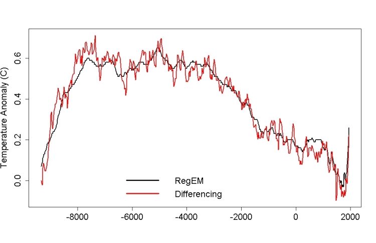
You will notice, very prominently in Tamino's reconstruction, a down spike of about 0.15 C at 8.2 Kya. You will also notice its entire absence from Marcott et al's RegEm reconstruction (as also, of course, from their Standard5x5 reconstruction). So, clearly the full Marcott method will smooth away an 8.2 K event, even if the record of it exists inthe proxies.
Based on the 73 Marcott proxies (or at least those which extend to 8,2 Kya), the 8.2 K event was an event that significantly altered the global mean surface temperature if not an event experienced as a negative temperature excursion everywhere globaly. In fact, again based on those proxies, it probably altered NH extra-tropical temperatures:

It also probably altered NH tropical temperatures, although by how much it is hard to say given the two large, flanking warming spikes:
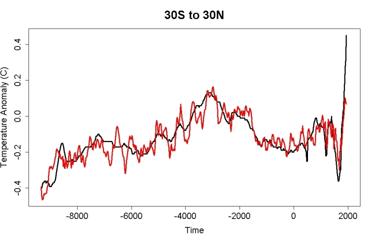
You will note that Marcott et al do not even show the 8.2 Kya spike in regional reconstructions, and oddly, shows a slight positive spike in the tropical reconstruction at the location of the downward spike in the unperturbed difference reconstruction. Also of interest, the tropical 8.2 K event shows as about 50% larger at maximum than the NH extra-tropical event, as near as I can estimate it.
Finally, the 8.2 K event is not identifiable in the SH extra-tropics:

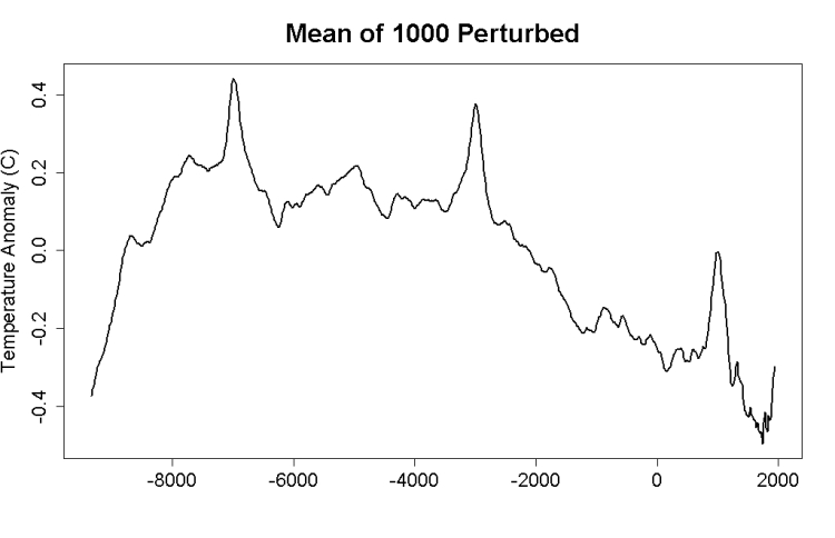
I will respond to Chris's specific criticism in a later post. For now it is sufficient to point out that the 8.2 K event was sufficiently large and wide spread to appear clearly in a global network of proxies, and that Marcot et al's reconstruction does not show it, even though based on that reconstruction. More importantly to this specific discussion, even though Marcott et al's reconstruction does not show it, Tamino's reconstruction does even taken as the mean of 1000 temporally perturbed reconstructions:
And this comes to the point. I am not arguing that the 8.2 K event was as large as a Tamino spike, or that it was a globally extensive negative temperature excursion. I am arguing that if the Marcott et al reconstruction were sensitive enough to show a Tamino spike, then it is surprising that it does not show the 8.2 K event. Citing Tamino's analysis does not undercut this point, as his reconstruction clearly shows the 8.2 K event. Ergo Marcott et al did something different that resulted in a lower temporal resolution than Tamino shows, and until his emulation shows sufficiently low a resolution as to not show the 8.2 K event, but still shows Tamino spikes, he has not established his point.
As a secondary point, I am also arguing that the 8.2 K event could, with low but significant probability have been the equivalent of a negative Tamino spike. Arguments to the contrary persist in ignoring temporal error in proxies.
-
Tom Curtis at 08:05 AM on 14 April 2013Real Skepticism About the New Marcott 'Hockey Stick'
Paul R Price @60, excellent!
Dana, would it be possible to include Paul's graphic as an update to this post, to the Axis of Evil post, and to include it in the climate graphics.
-
Tom Curtis at 08:01 AM on 14 April 2013Real Skepticism About the New Marcott 'Hockey Stick'
Brandon Shollenberger @53:
1) Jonathon Koomey's graph should have included the instrumental record to link the robust section of Marcott's reconstruction to the temperature projections with a robust record of temperatures over the last 130 years; but
2) Had he done so, as Jos Hagelaars did above, it would have made no difference in visual impact, as can be easilly seen above. This is true even if the "blade" is omitted and the instrumental record is shown. It follows that you are quibbling.
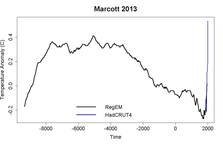
3) Tamino has shown that using the difference rather than simple averages, the uptick is still there (and is robust), but that it is not as large. Further, he has shown the uptick using the method of difference to be well represented by Marcott et al's RegEm reconstruction. So, here is Tamino's replication of the RegEm reconstruction from Marcott plus the HadCRUT4 temperature record:
When you can point out a visually significant difference from including that graph instead of Marcott et al's 5x5 reconstrution in Koomey's graph, then you will show you have a point.
-
scaddenp at 07:23 AM on 14 April 2013Real Skepticism About the New Marcott 'Hockey Stick'
Well I think the Paul's graph is excellent. The impact comes from
a/ temperature range in the holocene. (question on uptick irrelevent to that).
b/ the instrumental temperature range.
c/ and, more importantly, the size of projected range.
The only way I can see bleating about the robustness of the uptick in the proxies is relevant given the instrumental record, would be if you believed the proxies were biased low. This in turn means finding some problem with the calibration that somehow as escaped notice.
-
Paul R Price at 07:06 AM on 14 April 2013Real Skepticism About the New Marcott 'Hockey Stick'
@chriskoz Thanks again for the format tips, much better quality and more downloadable now.
@Tom Curtis Graphic adapted as per your corrections (I think).
This is the poster version revise since @20 (base graphic as above, derived from Marcott via Hagelaars, and then annotated). Does need to be downloaded to see it well. Any suggestions/corrections from SkS readers welcome.
-
william5331 at 06:39 AM on 14 April 20132013 SkS Weekly News Roundup #15A
US congressman
And these guys have control of enough atomic weapons to blow the top metre of the earth off into space. You would think that the religious right would take seriously god's gift of dominion over all his great works. After all, Dad was passing on the family business to his kids. He didn't specifically tell us not to squander them but I think it would be fair to assume that he hoped we would look after them. I don't get the conservatives. They have a preponderance of fundamentalists but totally ignore the good book. Why aren't conservatives conservationists.
Just in the middle of Farley Mowat's book, Sea of Slaughter. A must read.
-
Albatross at 03:19 AM on 14 April 2013Further Comments on The Economist's Take on Climate Sensitivity
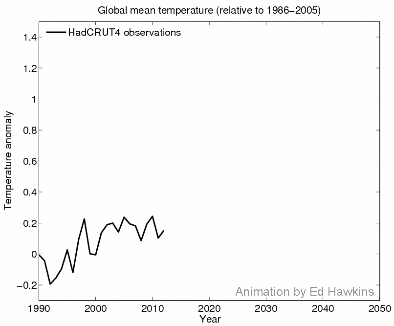
It is unfortunate that people (some who should even know better), continue to misrepresent and misinterpret Ed Hawkins' graphic. Ed Hawkins recently posted a figure that specifically deals with the misinterpretations.
[Source]
Referring to the above figure, Hawkins concludes that [my edit for clarity]:
"This demonstrates that a slowdown in [surface] warming is not inconsistent with future projections."
As another example of Ed' warning. Look at The Economist figure carefully. Circa 1975 the observed global temperature dropped (temporarily) below the confidence interval of the model simulations. Now applying the current logic of responses to the slowdown in global surface temperatures, back then fake skeptics at the time would have no doubt been loudly claiming that the models were "useless", or perhaps claiming that it was evidence that climate sensitivity was low/er, or evidence that global warming was a non issue. They would have been wrong, global temperatures have increased about 0.6 C since then.
So similar arguments being made today are almost certainly going to be wrong.
-
dana1981 at 02:58 AM on 14 April 2013Real Skepticism About the New Marcott 'Hockey Stick'
I would also strongly suggest that Brandon read the blog post that he's commenting on.
-
Bob Loblaw at 02:39 AM on 14 April 2013The anthropogenic global warming rate: Is it steady for the last 100 years?
Dr. Tung:
Please consider all the comments about the inclusion of temperature in the calculation of AMO - this is an issue that is important. ENSO has been mentioned in this context, as a phenomenon that can be defined without using temperature as part of the calculation (e.g. here).
Note that ENSO, meaning El Nino - Southern Oscillation is made up of two phenomena that were identified independently before they were recognized as being related. The Southern Oscillation Inex (SOI) was originally identified solely from the pressure difference between Tahiti and Darwin, and it was recognized that it varied over time and could be related to weather changes. El Nino was a phenomenon related to ocean temperatures (and its effect on weather and fishing off the coast of S. America) Only later was the physical link between the two recognized and explained (and research continues). The fact that SOI can be calculated without measurements of T is important - even if the pressure is related to T through atmospheric dynamics, there is an independence of SOI as a numerical value from any T results you want to look at.
In a T=f(x, other terms) situation, you need to be sure that your arrangement of terms doesn't have you looking at a T=f(x)*f(T) situation. What people are suggesting is that you have phrased things as T=f(x)*f(AMO) + other terms, but because f(AMO) includes an f(T) component, you are not properly isolating T on the left side of the equation. Writing the equation as f(AMO) only hides the fact that you are writing T=f(T) - a substitution of the AMO=f(T) relationship shows clearly that you have a T=f(T) equation.
It might help if you can provide part II of your response soon - that may help focus the discussion.
-
Real Skepticism About the New Marcott 'Hockey Stick'
Brandon Shollenberger - If Marcott et al had aligned their reconstruction with modern instrumental temperatures on just the last 150 years of their reconstruction, which they state "...is probably not robust", you might have a point.
They did not, this is a strawman argument. As clearly stated in the paper:
To compare our Standard5×5 reconstruction with modern climatology, we aligned the stack’s mean for the interval 510 to 1450 yr B.P. (where yr B.P. is years before 1950 CE) with the same interval’s mean of the global Climate Research Unit error-in-variables (CRU-EIV) composite temperature record, which is, in turn, referenced to the 1961–1990 CE instrumental mean.
They used 1000 years of overlapping data to align and reference to a paleotemperature reconstruction, which itself is aligned and referenced to overlapping data in the instrumental record. The last 150 years of the Marcott et al reconstruction during the instrumental period (the 'uptick') are interesting to consider, but have no impact on alignment. Your objection therefore has no grounds - I would strongly suggest reading the paper.
-
dana1981 at 02:12 AM on 14 April 2013Further Comments on The Economist's Take on Climate Sensitivity
Climate4All @13 - equilibrium climate sensitivity (which the Norwegian study is attempting to estimate) should be an essentially constant value. It shouldn't fall or increase by any significant amount just by adding in another decade's worth of data. If it does, as with the Norwegian study, then you know something is wrong with the model (i.e. it's too sensitive to short-term natural variability, and not accounting for some important factor[s]).
-
Rob Honeycutt at 02:12 AM on 14 April 2013Real Skepticism About the New Marcott 'Hockey Stick'
Brandon... "Robust" in reference to the Marcott paper is not the same thing as "reliable." You're conflating the two terms. In fact, the modern warming data is extremely robust and reliable. So, the modern uptick, irrespective of Marcott, is something that should shock you out of your shorts!
As has been continually pointed, you're making arguments that support high climate sensitivity. So, you can't do that, then turn around again and claim that CS is low in another conversation.
-
dana1981 at 02:10 AM on 14 April 2013Further Comments on The Economist's Take on Climate Sensitivity
archie @8 - this is not right:
"If the actual global mean temperature is exiting the 5-95% confidence level of the climate models - clearly there is something wrong with the models. "
First of all, I don't know what "exiting" means here. That assumes we know what will happen in the near future, which nobody does. Second, as pointed out by Tsumetai @9, we expect the data to fall outside the 5-95% confidence interval 10% of the time (below it 5% of the time).
In short, what's happening is that the model runs that simulate the lagest cooling effect on surface temps from natural variability are right. Then you have to compare the current observational data to the model runs and see if that makes sense. So what's happening in the real world? We're seeing a preponderance of La Niña events, an accelerated warming of the oceans, especially the deep oceans, low solar activity, etc. Basically what we would expect for a period of relatively flat surface temps - the heat is going elsewhere.
If there's anything 'wrong' with the models, it would be that they don't accurately reflect the magnitude of natural variability associated with the transfer of heat to the oceans, but since the observations are still within the range of model simulations, that's not an accurate statement.
-
Brandon Shollenberger at 01:57 AM on 14 April 2013Real Skepticism About the New Marcott 'Hockey Stick'
chriskoz, I'm afraid the link you provided doesn't answer my question at all. The graph I'm referring to showed "Reconstructed Temperature" from Marcott et al cleanly flowing into "Projected Temperature." The part where the two join is at the end of the uptick you say is "not reliable."
I'm not asking about Marcott et al's work. I'm saying, given the uptick isn't reliable, why is John Cook praising a graph that relies upon the uptick? Erase the uptick from that graph, and there would be a large gap between the two lines. It wouldn't be a "powerful" graph anymore.
-
Bob Lacatena at 01:30 AM on 14 April 2013The anthropogenic global warming rate: Is it steady for the last 100 years?
I haven't read everything through (boy, you guys are long-winded), but I think to me the crux of the problem is "how much of AMO is inherent in AMO, and how much of AMO is a response to rising temperatures?"
To put it another way, ENSO events can be measured by using observations other than temperatures... sea surface height, barometric pressure differences, and even sea surface temperature distribution (i.e. is the east markedly different from the west). One can measure ENSO events (if one wishes) based on criteria which have nothing to do with absolute temperature changes, and so one is able to separate those two components.
By measuring AMO purely using temperatures, no matter what you do, you are unable to separate cause and effect. No argument is of any meaning unless and until you come up with a measure for AMO that is independent of temperature.
For example, KK Tung says in his post:
“The phenomenon likely involves thermohaline circulation variability in the Atlantic Ocean. As described in Dima and Lohmann [2007 ]; Semenov et al. [2010] , the negative feedbacks between the strength of the thermohaline circulation which brings warm sea-surface temperature (SST) to the North Atlantic, and the Arctic ice melt in response to the warm SST, which, because of reduced deep-water formation, then slows the strength of the thermohaline circulation after a delay of 20 years, together create the restoring force responsible for the oscillation."
Is it possible to describe an AMO index which is based entirely on some (non-temperature based) strength of the thermohaline circulation, and so to correlate the AMO itself with temperature changes rather than correlate temperature changes to temperature changes?
-
KK Tung at 01:09 AM on 14 April 2013The anthropogenic global warming rate: Is it steady for the last 100 years?
In answer to MA Roger at post 21: Now we are getting to the point! Please read our paper, Tung and Zhou. MLR is a mathematical procedure, not a physical one. In our paper it came towards the end after evidence---and there were many pieces----was presented that supports physically the need to remove the AMO to reveal the anthropogenic response. Then we said, "Now we are in a position" to do this quantitative analysis, which is the MLR. You would be right if all we did were to see an AMO-like bent in the data and we removed that. Someone else may disagree with the evidence that we presented and have a better argument for removing the Pacific Decadal Oscillation, for example. Then he/she would then do a MLR using the PDO as a regressor. This is the scientific process. Neither is circular. I would accept his/her MLR result over mine if I find his physical argument and observational evidence presented more compelling.
On your last point. Consider the case of a time series--let's use it as the observation----that contains a nonlinear "anthropogenic " signal and a white noise. And nothing else. Suppose the noise is large and I can't see the anthropogenic signal without doing the MLR analysis, but I do not know what to use for the anthropogenic regressor. So I have to guess. Now suppose I am lucky and chose a regressor that happens to be varying in time like that nonlinear signal. After doing the MLR the residual is found and I examine that carefully. I see that it is white noise. The conclusion I would then make is that the MLR is successful and the anthropogenic signal is nonlinear. If on the other hand I am unlucky and picked a linear function as my regressor, then the residual will not be just noise, but have some trends as well. Then I would conclude that my MLR is not successful and the anthropogenic signal should be nonlinear. Then for my second try I would pick a more nonlinear regressor, until the residual becomes just noise.
-
Dumb Scientist at 00:46 AM on 14 April 2013The anthropogenic global warming rate: Is it steady for the last 100 years?
You may call me a pedant if you wish but my reticence to just answering Yes-Yes was more due to philisophy than facts. ... In this case it was not clear to me if the question was about some hypothetical N.A.SST or the N.A.SST(1856-2013). [MA Rodger]
I wasn't planning to call you anything. In fact, I think your responses have been quite helpful. For the record, I was referring to the same N.A.SST(1856-2011) used in Tung and Zhou 2013, which do contain an AGW signal.
The residual compensates for the non linearity of the assumed nonlinear function. We pointed out in Zhou and Tung that it is the removal of the AMO that makes the most difference in getting the final result, a point that Dumb Scientist now correctly understood. It is not the form of the anthropogenic regressor or the amount of smoothing involved. I will talk about the issues related to the choice of the AMO indice in the second post next week. It is not a circular argument. [KK Tung]
I've repeatedly pointed out that the form of the anthropogenic regressor or adding the residual back is not the problem that concerns me. It's the fact that warming the globe also warms the N. Atlantic, and that net anthropogenic warming was faster after 1950.
I still think it's circular to subtract a linearly detrended AMO to determine AGW, and then find that the remaining AGW is linear. I've been consistent about this point for months, so it's not clear what I "now correctly understood" because that seems to imply a shift in my understanding that I'm not aware of.
I'm grateful to MA Rodger for answering my two yes/no questions. Dr. Tung, would you please answer them? It would only take a few seconds, and I'm very interested to see what your answers will be. Thank you for your time.
-
archie lever at 00:45 AM on 14 April 2013Further Comments on The Economist's Take on Climate Sensitivity
(-moderation complaints snipped-).
Moderator Response:[DB] Models are off-topic on this thread, as previously noted. This applies to all parties, equally.
[TD] Archie, nearly everything on this topic is related to everything else, so it would be easy for every post and comment thread to end up being about everything. One of the strengths of this site is the collection of related ideas together. That makes them easy to find. It also reduces redundancy across threads. And often people discover that they change what they want to write after reading the original post and some of the other comments in the most immediately relevant thread.
-
MA Rodger at 21:55 PM on 13 April 2013The anthropogenic global warming rate: Is it steady for the last 100 years?
KK Tung @19.
I fear you are incorrect. Your answer @12 to the 'first point' did get through. However I disagree with that answer, as I do with what I understand of your renewed answer @19.
May I attempt to explain.Your two points from the post are
(1) The "finding" of a smooth or even linear net anthoropogenic forcing/warming profile (NAF/WP) is not wrong. I agree, as long as it is a "finding" supported by the data.
(2) The smooth NAF/WP is not the product of circular reasoning. This I pretty-much disagree with as I dispute that the smooth NAF/WP is a "finding." Rather I see it as a product of the analytical method not a product of the data, even using MRL. Because...
We start with a wibbly-wobbly temperature record. We agree that we can see the signature of ENSO and volcanic forcing and if we look the signature of solar forcing too. We are happy that these signatures can be extracted using MLR. This smooths out the wibbly-wobbly temperature record 1980-2011 and we are still happy. If those wibbly-wobbles had been truely part of the NAF/WP then NAF/WP would look more the product of a hyper-active child armed with graph paper and crayon than the product of climatological analysis.
In Tung&Zhou13 this MLR is carried out 1850-2011 which yields a profile not dissimilar to the temperature record for 1850-1980, a bendy profile, perhaps an oscillating profile. This we are agreed should contain all the NAF/WP.
Now the 1850-2011 profile (before and after extracting ENSO etc) is remarkably similar to the AMO profile. If you remove that AMO profile, because of that strong similarity, you will always get a smoothed result. If this smoothed result contains the full NAF/WP, the NAF/WP will arguably be likewise smoothed. This is not a "finding" of the analysis. It is the natural outcome of the process. It can be no other way given the choise of using AMO.
The "finding" is not a smooth NAF/WP but if it is legitmate to extract the AMO profile and leave the full NAF/WP behind, the corollary (no stronger) is that NAF/WP will be smooth.There are parts @19 which I struggle with, although this may be pre-empting the next post.
You say "The residual compensates for the non linearity of the assumed nonlinear function." Yet you describe in the post how you treat that Residual. You proclaim your analysis "successful" because "Except for s a minor negative trend in the last decade in the Residual, it is almost just noise." Surely reducing the Residuals to almost just noise and calling it "successful" leaves no room for any non-linear function, NAF/WP or otherwise. -
MA Rodger at 21:20 PM on 13 April 2013The anthropogenic global warming rate: Is it steady for the last 100 years?
Dumb Scientist @18
You may call me a pedant if you wish but my reticence to just answering Yes-Yes was more due to philisophy than facts. A question about N.A.SST will involve, as well as our respective understandings of the nature of N.A.SST (which will not be identical, possibly radically so), but also our respective understandings of the nature of the question which also will not be identical, possibly radically so. In this case it was not clear to me if the question was about some hypothetical N.A.SST or the N.A.SST(1856-2013). -
archie lever at 21:08 PM on 13 April 2013Further Comments on The Economist's Take on Climate Sensitivity
Doug Hutcheson and others
The Economist leader writer said that - not me.
He/she also said that:
"OVER the past 15 years air temperatures at the Earth’s surface have been flat while greenhouse-gas emissions have continued to soar. The world added roughly 100 billion tonnes of carbon to the atmosphere between 2000 and 2010. That is about a quarter of all the CO₂ put there by humanity since 1750. And yet, as James Hansen, the head of NASA’s Goddard Institute for Space Studies, observes, “the five-year mean global temperature has been flat for a decade.”
I assume that by global temperature the authors mean the composite sea and land temperature, but you would probebly have to confirm than with Jim hansen and Ed Hawkins.
(-off topic snipped-).
Moderator Response:[DB] Please take further discussion of models to the "models are unreliable" thread. Models are off-topic on this thread.
-
chriskoz at 20:47 PM on 13 April 2013Real Skepticism About the New Marcott 'Hockey Stick'
Tom Curtis,
You turned a lot of attention to 8.2ky event as the proof that Marcott 2013 reconstruction could not catch signifficant departures from Holocene optimum, contradicting Tamino's conclusions.
But have you considered the oposite: can 8.2ky be taken as a proof that Marcott 2013 is "incensitive" to the dT signals such as AGW? I tend to agree with chris who says that it cannot. He's shown @51 that there is no evidence 8.2ky was a global event, and the NH cooling due to AMOC overturning, was globaly diluted.
So, we may turn the topic around and ask: since Marcott 2013 did not detect 8.2ky event, can we conclude the event wasn't global? I.e. it resulted in circulation overturning only, therefore influenced some proxies only but overall, it did not create any forcing that would influence the global energy budget, like CO2 does? I'm postulating that it was only local cooling, because I don't know any mechanism by which the global energy imbalance could have been created to last over a century. To my liking it was more like a gigantic ENSO disturbance. To claim otherwise (that 8.2ky created signifficant negative global forcing comparable in scale with AGW, as you seem yto imply) you have to provide the physical mechanism for that.
-
chriskoz at 20:12 PM on 13 April 2013Real Skepticism About the New Marcott 'Hockey Stick'
Brandon@53
Tamino answers your question comprehensively here.
Essentialy, the "uptick" in Mercott 2013 reconstruction is not reliable because fewer of their data covers the last centuary.
What is reliable, is the almost perfect alignment of last 2000y with other proven reconstructions of that period, e.g. Mann 2008, and consequently, with temperature record such as HadCRUT4. That's why the "blade" on figure 1 is marked with red (reliable HadCRUT4 data). So, Marcott 2013 uptick is not robust, but the rest of it is robust and the alignment with the other reconstructions is also robust and that's all we need to know to have confidence in this graph.
-
Jim Hunt at 20:02 PM on 13 April 2013Further Comments on The Economist's Take on Climate Sensitivity
Fresh from accusations of being a "SkepticalScience affiliate" by denialistas amongst The Economist commenters, I finally arrive here courtesy of a comment on my own blog. Would anyone here like to play "Spot the difference!" and then "What if?"?
Re #12 and #18, here's the latest news from the sharp end over here in soggy South West England, just down the road from the Hadley Centre:
http://econnexus.org/met-office-admit-our-climate-is-being-disrupted-by-the-warming-of-the-arctic/
To summarise, it seems Julia Slingo disagrees with The Economist leader writer. However it's still not clear what she intends to do about it. -
John Russell at 19:32 PM on 13 April 2013Further Comments on The Economist's Take on Climate Sensitivity
Ray at #12 Re; apparently conflicting comments about weather from the UK Met Office.
One of the problems is that although we can know with high levels of certainty that the world is warming, and by how much per decade, it's very difficult to predict the effects of that warming on the resultant weather in a particular country -- particularly one as prone to variable weather as the UK. That's because we've never seen rapid rises in global temperature before during any periods when humanity has been in a position to record the results.
The truth is that a few years back the Met Office were more confident as to how global warming would manifest itself on UK weather than they are today. That's why, for instance, they dropped the long-range weather forecast. We've entered unchartered territory now and the changing pattern of the jet stream that has become apparent over the last few years is one example of the sort of change we're seeing.
As climate scientists have started to realise how much they don't know about the way global warming will manifest itself on weather, you've seen the Met Office change from statements like "expect warmer winters with less snow" (the simplistic guess) to the uncertainty revealed by the statement by Julia Slingo who said about the current cold weather the other day, "if this is how how climate change could manifest itself, then we need to understand that as a matter of urgency".
I think that instead of looking at this a weakness you need to put it in the context of the huge scientific research effort to understand what global warming will mean to weather.
If you'll permit me to use an analogy. It's like the uncertainty of a hot air balloon flight. If we know the direction of the wind, the amount of weight on board and how much gas it carries, we can predict with a reasonable level of certainty in roughly what area it will land. The more information we have and the more experienced the pilot, the surer we can be of predicting the landing site. But there are always variables and at the moment things are happening that create uncertainties we have not experienced before. This is making predictions more difficult; but everyone is working very hard to understand those uncertainties. Don't lose sight of the fact that however much uncertainty there is there is, one thing is not in question: the ballon will come down somewhere.
-
Brandon Shollenberger at 18:49 PM on 13 April 2013Real Skepticism About the New Marcott 'Hockey Stick'
John Cook recently "tweeted" this:
If we don’t change our direction, we’ll end up where we’re headed - powerful graphs by Jonathan Koomey
Sharing a link to this piece which shows a graph of projected temperatures grafted to Marcott et al's reconstruction. The visual impact of this graph depends largely upon the uptick of Marcott et al's reconstruction flowing into the projected temperatures. However, this post says:
Much of the manufactured controversy about the Marcott paper is in regards to the 'blade' or 'uptick' – the rapid warming at the end of the graph over the past century. While their reconstruction does identify an approximately 0.6°C warming between 1890 and 1950, the authors note in the paper that this result is probably not "robust."
Without the uptick in Marcott et al., there would be little (if anything) to create a visual connection between the "reconstructed Temperature" and "Projected Temperature" of the graph John Cook says is "powerful." You guys say that uptick is "probably not 'robust.'"
How can a "powerful" graph rely upon a result that is "probably not 'robust'"?
-
scaddenp at 18:04 PM on 13 April 2013Further Comments on The Economist's Take on Climate Sensitivity
Climate4All - climate models have no skill at decadal prediction. They have never pretended to. That is pretty much the point made - and the problem with the methods that dont take account of high surface temperature variability.
First I have heard that model predict weakening of it. Got a source for that?
-
Climate4All at 15:35 PM on 13 April 2013Further Comments on The Economist's Take on Climate Sensitivity
@14 scaddenp
The contention that I address only are those that Dana and Micheal suggest.
Not the OHC values. Not El Nino and its relationship to to surface temperatures. Not models being able to predict ENSO patterns, though I do believe that some models adjust for a general weakening of it.
Dana is willing to say they got it wrong, but by how much and at what certainty should global temperatures reside. he didnt say they got it completely wrong.
Has Mann done a similar study for the last decade yet?
I just wanted clarification.
-
Alun at 15:29 PM on 13 April 2013Further Comments on The Economist's Take on Climate Sensitivity
I think we are encountering a problem I find frequently in my work with financial modelling. These models are less complex than the climate models, but their use generates similar arguments about interpretation of actual results versus those expected from the models. The simple problem is that the vast bulk of consumers of model outputs (climate and financial) have a very limited appreciation of stochastic type outcomes.
One can talk all one likes about 90% CIs and that 5% of actual outcomes will fall above and 5% below, but the users still get twitchy when the actuals are not tracking near the median line. The reaction in my experience is ALWAYS that there must be something wrong with the model and if the 90% CI line is broken the general view will be that the model is definitely and clearly wrong and must be fixed.
This inherent difficulty of understanding is coupled with the fact that the majority of the presentation of climate warming to date has demonstrated the effects using surface temperatures. Surface termperatures, after all, are what people, plants and animals actually experience.
I started studying climate impacts and models back in the 1970's and have no doubts about the veracity of the current science or its predictions (naturally within the normal scientific error bars). The current results are falling close to the 90%CI boundary because of the correlations of effects that hold surface temperatures lower over recent years versus the correlation of effects that held them higher 15 years ago. The actuals have not broken the boundary in the timeframe on the chart above which covers nearly 100 years and we would have expected a few by now so the models are clearly doing a very good job and I, for one, am quite comfortable with the estimated sensitivity. It looks absolutely spot on (within error bars).
But expect serious confusion and complaint against the models if the actuals actually do breach the 90%CI. The problem of course is much much wider than surface temperatures so we better start educating as even some of the comments on this forum demonstrate.
-
scaddenp at 15:19 PM on 13 April 2013Further Comments on The Economist's Take on Climate Sensitivity
Climate4All - please tell me how you can get OHC values at current levels with a sensitivity of 1.5.
For those of you here that think current surface temperature trends suggest climate models are wrong, can I ask which of these you believe?
1/ The next El Nino of greater than 1.8 wont break surface temperature records.
2/Models should be able predict the ENSO patterns
3/ Eli Nino's will be rare in the future and La Nina/Neutral conditions will surface temperatures as they are.
Ray, Climate4All, Archie?
-
KK Tung at 15:12 PM on 13 April 2013The anthropogenic global warming rate: Is it steady for the last 100 years?
In answer to MA Roger at post 14: I am glad I answered your second point. Somehow I still failed to yet my answer through on you're first point. While one of the two methods in Tung and Zhou used smoothing, the second method, the MLR method, does not, and it is this second method that I discussed in the present post. Let me try another way to presenting this point: Give me any nonlinear function that you prefer (within reason of course, and it should have an increasing long term trend), I go through the MLR. I would still get a fairly linear response as long as I add back the residual. The residual compensates for the non linearity of the assumed nonlinear function. We pointed out in Zhou and Tung that it is the removal of the AMO that makes the most difference in getting the final result, a point that Dumb Scientist now correctly understood. It is not the form of the anthropogenic regressor or the amount of smoothing involved. I will talk about the issues related to the choice of the AMO indice in the second post next week. It is not a circular argument.
-
Climate4All at 14:38 PM on 13 April 2013Further Comments on The Economist's Take on Climate Sensitivity
If climate sensitivity hasn't fallen by a factor of 2, what would some of you suggest as a respectable amount of 'fallen off', and what percentage of certainty would that lay at?
-
Ray at 13:55 PM on 13 April 2013Further Comments on The Economist's Take on Climate Sensitivity
Interestingly the UK Met office has just released a statement on cold winters that is completely at odds with its previous comments on the effects of global wrming on the UK climate. Sometimes, like Archie Lever I find it difficult to determine what the real situation is.
-
DSL at 13:22 PM on 13 April 2013Further Comments on The Economist's Take on Climate Sensitivity
And Archie, global ice mass loss has accelerated during the Had4 surface temp "hiatus." Remember: the climate-scale global (plus poles) surface trend is .169C per decade, just a hair short of the expected rate of warming. Use the eyecrometer and end up standing in the foolish line.
-
Doug Hutcheson at 12:13 PM on 13 April 2013Further Comments on The Economist's Take on Climate Sensitivity
Archie said
"The mismatch between rising greenhouse-gas emissions and not-rising temperatures is among the biggest puzzles in climate science just now."
Er ... not rising temperatures? Are you referring to global temperatures, or land surface temperatures? Globally, the oceans have been warming at the expected rate. Land surface temperatures have been constrained by such influences as ENSO and have behaved as expected, given the forcings. Which part of this is a big puzzle?
-
Tsumetai at 11:57 AM on 13 April 2013Further Comments on The Economist's Take on Climate Sensitivity
Archie, we generally expect about 10% of the data to fall outside the 5-95% CI. That's kind of what a 90% CI means.
-
archie lever at 11:24 AM on 13 April 2013Further Comments on The Economist's Take on Climate Sensitivity
dana 1981
This quote is the central issue posed by the Economist article.
"Temperatures fluctuate over short periods, but this lack of new warming is a surprise. Ed Hawkins, of the University of Reading, in Britain, points out that surface temperatures since 2005 are already at the low end of the range of projections derived from 20 climate models (see chart 1). If they remain flat, they will fall outside the models’ range within a few years.
The mismatch between rising greenhouse-gas emissions and not-rising temperatures is among the biggest puzzles in climate science just now. It does not mean global warming is a delusion. Flat though they are, temperatures in the first decade of the 21st century remain almost 1°C above their level in the first decade of the 20th. But the puzzle does need explaining.
The mismatch might mean that—for some unexplained reason—there has been a temporary lag between more carbon dioxide and higher temperatures in 2000-10. Or it might be that the 1990s, when temperatures were rising fast, was the anomalous period. Or, as an increasing body of research is suggesting, it may be that the climate is responding to higher concentrations of carbon dioxide in ways that had not been properly understood before. This possibility, if true, could have profound significance both for climate science and for environmental and social policy."

If the actual global mean temperature is exiting the 5-95% confidence level of the climate models - clearly there is something wrong with the models. This has not been effectively addressed in any of the comments seen here of the Discovery News article or links.
-
Dumb Scientist at 10:01 AM on 13 April 2013The anthropogenic global warming rate: Is it steady for the last 100 years?
But if you add that N.Atlantic SST does contain an AW signal, then the answer to Q1 will have to be yes. [MA Rodger]
How could N. Atlantic SST not contain an AGW signal?
But where do such answers lead? They say 'Yes, they will remove some of the AW signal' and then beg the question 'How much is "some"?'
Exactly. Such answers would lead to the discussion I wanted to see in Tung and Zhou 2013: namely 'How much is "some"?' I'm astonished that they didn't even address the possibility that they're subtracting signal (unless I missed something?).
That surely leads off towards the nature of AMO which is the subject of the next part of these posts.
As I mentioned to Lee and ptbrown13 in the comments on my article, I have no problem with the idea that AMO variability has parts that are strictly internal and parts which alter the radiative imbalance of the climate. While a discussion of the nature of AMO could be informative, I'm skeptical that the nature of AMO can be elucidated by subtracting AGW after 1950.
-
MA Rodger at 09:49 AM on 13 April 2013The anthropogenic global warming rate: Is it steady for the last 100 years?
Dumb Scientist @16.
The two questions you pose could be answered in a number of contexts with differing assumptions to yield different answers.
But if you add that N.Atlantic SST does contain an AW signal, then the answer to Q1 will have to be yes.
And if you add that the AW signal is not linear, then AMO derived from N.A. SST through linear detrending will still contain an AW signal and the answer to Q2 will have to be yes.
But where do such answers lead? They say 'Yes, they will remove some of the AW signal' and then beg the question 'How much is "some"?' That surely leads off towards the nature of AMO which is the subject of the next part of these posts.
My apologies if the logic I present @ 14 has proved unclear. I shall attempt to re-state it.
If the AW forcing profile is smooth, so too will the AW signal within the temperature record. And visa versa. Thus if an analysis has by its nature the effect of smoothing the AW signal, by its nature it will produce a smooth AW forcing profile. Therefore such analysis cannot in itself be used to show how smooth is AW forcing.
This is perhaps why I spy in the post discontent with bendy forcing profiles - bendy profiles are inconsistent with a significant AMO signal being superimposed on the AW signal.
-
Dumb Scientist at 07:10 AM on 13 April 2013The anthropogenic global warming rate: Is it steady for the last 100 years?
... such a profile here is the implicit result of your analysis because you began by smoothing the temperature series. It is thus "assumed" and not "found". ... [MA Rodger]
I don't understand this point. I thought the issue was simpler, but I might be failing to comprehend in addition to my obvious failure to communicate. Perhaps it would help if we all answered these yes/no questions:
Question 1
Would regressing global surface temperatures against N. Atlantic SST without detrending the SST remove some anthropogenic warming from global surface temperatures?
Yes or no?
Question 2
Now suppose we regress global surface temperatures against N. Atlantic SST after linearly detrending the SST. In other words, we regress against the standard AMO index as Tung and Zhou 2013 did.
Just imagine that anthropogenic forcings increased faster after 1950. In that case, would regressing global surface temperatures against the AMO remove some anthropogenic warming from global surface temperatures after 1950?
Yes or no?
I'll start: my answers are yes and yes. In fact, I think answering yes to question 1 also implies a yes to question 2, but I'm willing to be educated.
-
william5331 at 05:54 AM on 13 April 2013The anthropogenic global warming rate: Is it steady for the last 100 years?
It should be interesting when the Chinese people demand that the Chinese government stops sending aerosols into the atmosphere. A similar scenario unfolded when America started electrostatically precipitating particulate matter from her smoke stacks and began to scrub out SO2.
Prev 942 943 944 945 946 947 948 949 950 951 952 953 954 955 956 957 Next


