


 Arguments


A Swift Kick in the Ice
Posted on 19 February 2011 by Rob Honeycutt
Commenting in the trenches of the climate change blogosphere I find a large number of people who lack very basic understanding about Arctic Ice. While I'm not an expert in the field I have managed to learn a few things with regards to why Arctic ice is an important issue. There are a few misconceptions that require a "swift kick in the ice."
When learning about these issues myself I came upon a question that I could not immediately answer. We know that water vapor is a strong greenhouse gas. We know that warmer air holds more moisture than cold air, in fact, to the point where the Antarctic is one of the driest deserts on the planet. So, how does this jibe with the idea of polar amplification, the idea that the poles will warm faster than the rest of the planet on average? The climate models tell us that the poles will warm faster, and the model results are proving true now. Why would the poles warm faster if there is so little water vapor in the air?
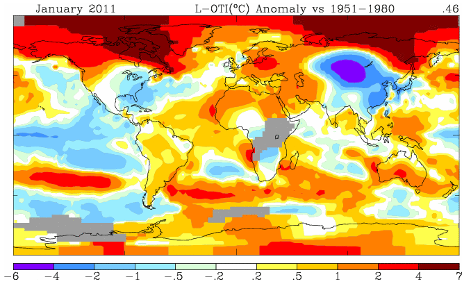
Fig 1 - Surface Temperature Map for Jan 2011 (Source: GISS)
The first answer comes by way of looking at a surface temperature map (Fig 1). What we find is that the north and south poles are not warming equally. In fact, the term "polar amplification" is better described by saying "Arctic amplification." If we look out to the end of the century there is anticipated to be amplification in the south as well but most of the warming will take place in the north.
But that still leaves us with, why? The Arctic gets cold too, therefore is drier than the equator. Why would the equator not warm faster?
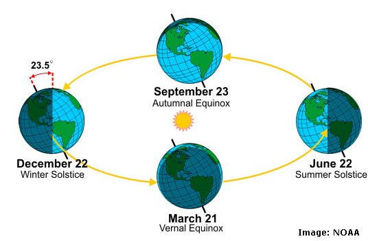
Fig 2 - Orbital tilt through the year
Pretty much everyone knows that these basic very important facts about the north pole:
- The ice at the pole is covering the Arctic ocean. It's sea ice.
- Both poles are mostly dark half the year and mostly light half the year.
These two very basic aspects of the Arctic make it special in terms of climate change form the reason why Arctic Amplification is happens and is so important.
Each year the ice of the Arctic thaws back to a minimum extent during the late summer, usually some time in September. Then it freezes back each winter. This is obviously because summer months are warmer and winter months are colder.
The Battle of Albedo
Now I'll beat you up with the concept of "albedo." Albedo is the effect where light colored surfaces reflect light and dark colored surfaces absorb light. Think of it as white pavement or black pavement. Black pavement is always going to scorch your bare feet more than white pavement in the noontime sun. Dark surfaces absorb more heat from the sun. Light surfaces reflect more light away and absorb less heat.
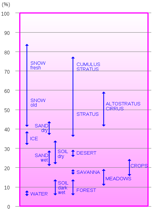
Fig 3 - Albedo effects (source: wikipedia)
As you can see from Figure 3, the albedo of fresh snow is dramatically different from water - it's much more reflective.
In the winter the Arctic sea is almost completely frozen over but this doesn't matter a lot because there is little sun shine for half the winter and even no sun shine at all for several months of the year. There is no albedo effect at all during this part of the year.
In the summer months, though, the story is the opposite. If the Arctic Sea is covered with ice in the summer - as it has been dating back perhaps thousands, to millions of years - the incoming sunlight is mostly reflected back to space without adding any heat to the Earth. But, as ice melts back, as is happening today, the summer sun is absorbed by the darker open sea exposed by the disappearing ice.
The open water absorbs more and more heat during the extended daylight of the summer months until winter comes again, when the Arctic Sea freezes. But because of warming the ice is also losing its capacity to freeze back to previous levels. This is what is meant by a feedback. Less ice makes warmer water, which makes thinner ice, which melts easier, which makes warmer water… and so on.
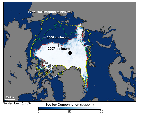
Fig 4 - 2007 Summer sea ice minimum (source: NSIDC)
This also points out why the sea ice in the Antarctic is less important and generates less warming. The Antarctic is a land mass 1.5 times the size of the United States. Each winter sea ice develops around the Antarctic continent but thaws back mostly to the coast each summer. There it can go no further. The continent is almost completely covered in snow year round so the south pole maintains its high reflectivity during the summer months.
Something to be wary of is people who point to very select years or short time periods to say the ice is not melting. You have to look at all the data to see the full picture. The full picture of the Arctic clearly shows a rapid decline of ice both in extent (area) and volume (total ice). Some people will also tell you that ice is growing in Antarctica. That's true and false. Winter sea ice extent is increasing slightly, but the land based ice, on the whole, is melting. And as we understand above, winter sea ice extent is not going to have any effect because there is little or no sun in the winter.
When you take a moment to step back from the dusty battle taking place on climate issues sometimes you gain a little perspective. I've actually learned quite a lot doing battle in the blogosphere trenches. On occasion I get a boot on the derriere that forces me to try to better understand the arguments on both sides of the issue and learn more about what scientists are trying to tell us.
It's not a pretty battle, and you have to bust ice to really get down to the truth.
- - - - - -
For the most up to date and accurate information about snow and ice issues you can visit the NSIDC, the National Snow and Ice Data Center.


 0
0  0
0 Consider the comparison of 1st Oct, 2007 with 1st Oct, 2010. The first thing to notice is that the total extent of sea ice that is 3 meters thick or thicker is greater in 2007 than in 2010. What is more, nearly half that ice is over 4 meters thick, and a quarter over 4.5 meters thick in 2007, while in 2010 only a third of the equivalent ice (and one ninth of the total) is over 4 meters thick, and virtually none is over 4.5 meters thick. Consequently, even though 2011 has a greater extent of 2 to 2.5 meter ice, we would expect on the PIP2 data for 2010 to have less ice.
The author creates an opposite impression by concentrating initially on the Dec 31st data, while ignoring the strong rebound in the PIOMAS data to that date.
The author thinks he can make a more telling analysis than this with his graph of volumes. However, that graph is based first on pixel counts on a plane projection of the pole, which underestimates the area of the thickest ice relative to the thinest, and the more so the greater the ice extent.
He also, of necessity assumes that the contours mark sharp steps in ice thickness. He assumes that, for example, a change from a blue to a green shading is a change from (at minimum) 2 to 2.5 meters of ice thickness, where as it may have been a change from 2.45 to 2.52 meters thickness. The necessary approximation in this process means his method is to crude for any but the coarsest comparison. You should read his graphs as having error bars of plus or minus 50%, and allowing for that possible error, PIOMAS falls well within the range of his calculations.
Of course, there is a directly measured product for ice volume available, that produced by Icesat:
Consider the comparison of 1st Oct, 2007 with 1st Oct, 2010. The first thing to notice is that the total extent of sea ice that is 3 meters thick or thicker is greater in 2007 than in 2010. What is more, nearly half that ice is over 4 meters thick, and a quarter over 4.5 meters thick in 2007, while in 2010 only a third of the equivalent ice (and one ninth of the total) is over 4 meters thick, and virtually none is over 4.5 meters thick. Consequently, even though 2011 has a greater extent of 2 to 2.5 meter ice, we would expect on the PIP2 data for 2010 to have less ice.
The author creates an opposite impression by concentrating initially on the Dec 31st data, while ignoring the strong rebound in the PIOMAS data to that date.
The author thinks he can make a more telling analysis than this with his graph of volumes. However, that graph is based first on pixel counts on a plane projection of the pole, which underestimates the area of the thickest ice relative to the thinest, and the more so the greater the ice extent.
He also, of necessity assumes that the contours mark sharp steps in ice thickness. He assumes that, for example, a change from a blue to a green shading is a change from (at minimum) 2 to 2.5 meters of ice thickness, where as it may have been a change from 2.45 to 2.52 meters thickness. The necessary approximation in this process means his method is to crude for any but the coarsest comparison. You should read his graphs as having error bars of plus or minus 50%, and allowing for that possible error, PIOMAS falls well within the range of his calculations.
Of course, there is a directly measured product for ice volume available, that produced by Icesat:
 PIOMAS has been compared to it, and performs well:
 As you can see, when compared to measured data, PIOMAS, if anything, over estimates ice volume.
So I guess it all depends on how you want to verify your data - actual observations, or pixel counts and pub coaster arithmetic.
As you can see, when compared to measured data, PIOMAS, if anything, over estimates ice volume.
So I guess it all depends on how you want to verify your data - actual observations, or pixel counts and pub coaster arithmetic.

 With a long-term decline in evidence:
 Further reading here.
 0.3 degrees per decade is a Northern Hemisphere norm these days. See the Northern hemisphere warming thread.


Comments