Climate Science Glossary

Term Lookup

Enter a term in the search box to find its definition.

Settings

Use the controls in the far right panel to increase or decrease the number of terms automatically displayed (or to completely turn that feature off).

Term Lookup

Settings


All IPCC definitions taken from Climate Change 2007: The Physical Science Basis. Working Group I Contribution to the Fourth Assessment Report of the Intergovernmental Panel on Climate Change, Annex I, Glossary, pp. 941-954. Cambridge University Press.

Home Arguments Software Resources Comments The Consensus Project Translations About Support

Twitter Facebook YouTube Mastodon MeWe

RSS Posts RSS Comments Email Subscribe


Climate's changed before
It's the sun
It's not bad
There is no consensus
It's cooling
Models are unreliable
Temp record is unreliable
Animals and plants can adapt
It hasn't warmed since 1998
Antarctica is gaining ice
View All Arguments...


Username
Password
New? Register here
Forgot your password?

Latest Posts

Archives

Carter Confusion #3: Surface Temperature Record Cherries

Posted on 17 July 2011 by Tamino

This is a re-post from Tamino's Open Mind blog

A certain blogger decided to inform us all that Bob Carter does the Business, referring to the this presentation to the Sydney Mining Club. Others have praised Carter’s presentation at the Heartland conference. There’s a lot of similarity between two presentations. And what, you wonder, does Bob Carter have to say about global warming?

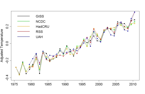
For one thing, Carter goes to some length to claim that the surface temperature record (according to institutions like NASA GISS) is unreliable. In fact he implies that it’s downright useless. Yet he also states that the satellite record is reliable (and he uses the version from UAH). Which makes me wonder — if the satellite record is so reliable but the surface record is so useless, why do they agree so closely?

One also wonders — why is it that when the influence of exogenous factors (like el Nino, volcanic eruptions, the solar cycle) is accounted for, the match is even better, not just between NASA GISS and UAH satellite data, but among all five best-known global temperature data sets?

It looks like Carter’s characterization of the surface temperature record is just fake criticism from a fake skeptic.

Carter also repeats his common claim that we’ve seen cooling over the last decade. Which makes me wonder — has he actually looked at the data? Because both the surface temperature record from NASA GISS and the satellite data from UAH show positive trend rates up to the present for all start years from 1990 through 2004 — no matter how you define “the last decade,” it hasn’t shown global cooling; Carter’s claim is a fake trend from a fake skeptic.

Carter makes much of the satellite record, taking advantage of the fact that when he gave his presentation to the Sydney Mining Club the most recent data point was March 2011, a low point due to the La Nina:

He doesn’t just focus on that one point. He focuses on three:

Two can play at that game — I can pick three points too:

I’ve got to credit Carter for his ability to plumb the depths of fakery — it’s hard to imagine a more fake portrayal of the data than Carter’s 3 dots. All he has shown is that because the data show noise in addition to trend, it’s easy to find an extra-high point early and an extra-low point late, put big red dots on them, and imply that there’s been no real change. It’s called “cherry picking,” and it’s yet another fake trend from a fake skeptic. We should pity those who lap it up, because being an idiot is not enough to make you to fall for this — you have to be a complete idiot.

Carter does pay lip service to the idea of a trend. But he disdains the trend for the entire data set — in fact he seems to disdain trends altogether — instead showing these two straight lines, one ending at 1997, the other beginning at 1999:

He then tells a fable about the 1998 el Nino causing some kind of “shift” in the fundamental state of the climate system, after which it “settled in” to a different basic temperature level. There’s a name for his kind of theory.

More to the point, the two lines he draws aren’t trend lines. He just drew two flat lines to give the impression of no change. There’s a name for that too.

Here are actual trend lines up to 1997, and after 1999:

Incidentally that post-1999 trend line is even steeper than the trend line through the entire data set:

In case you suspect that the reason for the uptrend since 1999 is that I’ve included data after March 2011, I’ll add the trend line using just data from 1999 through March 2011 (in blue):

Carter’s flat lines are nothing but fake lines from a fake skeptic.

Having insulted the surface temperature record and tormented the satellite data, Carter moves on to the radiosonde record from HadAT2. But he didn’t bother to go get the data. Instead he shows this graph, which leaves out the last 9 years:

It’s a reproduction of this graph from Thorne et al. (2005, JGR, 110, D18105):

This data set is for the 500 hPa level of the atmosphere (about 5.5 km altitude). Carter again plays with dots to imply there’s been no warming, starting with two dots in his Sydney Mining Club presentation:

In his Heartland presentation he used three dots, and claimed that there’s been no global warming for 52 years, since 1958.

I can play with dots too. I can also go get the actual data:

I can even play with smoothing functions and show how fake Carter’s claim of “no global warming for 52 years” is:

The most surprising thing about Bob Carter’s presentations, both at the Sydney Mining Club and at the Heartland conference, is that his chicanery is so amateurish. He’s so transparent that you really have to bury your head in the sand (or perhaps somewhere else) not to see right through it.

0 0

Printable Version  |  Link to this page

Comments

Comments 1 to 35:

  1. I have a question: The first graph supposedly shows UAH and GISS temp data. Then the UAH LT 5.3 shows something different. Which graph is the correct one? They can't both be as the data is different. Or am I reading this wrong?
    0 0
  2. I looked at Woodfortrees to see if I could find a similiar UAH temperature record. This is what I found: UAH temperature record
    0 0
  3. Camburn@2, it is odd, for when I follow your link I find this: But when I stop blatantly cherry picking, and use 1979 as the start date instead of 1998, I find this, which is obviously the same data as is being used by Tamino and Carter: So you have some explaining to do. Why did you post a link to such a blatantly cherry picked range of years when it is clear from Tamino's graphs that he is using the data from 1979 to present?
    0 0
  4. Tom: He used a short baseline as well......remember? 1997 or such. I am talking about the difference in the graphs. The first graph says it is UAH Mid Trop temps. Ok, the following graphs should be the same then...right? That is my first question....and you didn't answer it. The wood for trees analysis shows that you can do different things by cherry picking. My main question still is.....why the difference in the graphs? Aren't they suppose to be the same thing? And instead of being accusatory....this is a ligitimate question.
    0 0
  5. Tom: Look at your longer version. Another reason I used the shorter version is that the graph shows UAH and GISS extremely close. Yet when looking at the graphs further in the piece....they don't match the UAH graph in the first illustration. Tamino is no dummy....so there must be a logical explanation, which I don't see.
    0 0
  6. Same thing in the 2nd graph......hence my question.
    0 0
  7. The next question is: What are the base years for the anomolies in the first temp graph? The base years would have to match or the illustration is not credible. Too many questions here to make a good analysis so far.
    0 0
    Response:

    [DB] The obvious question at this point is:

    1. What statistical methodology is needed for a good "Camburn analysis"?
  8. So Camburn, are you here to defend Carter's scientific misconduct or what? It sadly certainly seems so.
    0 0
  9. Trivial question. Would filtering out Mt. Pinatubo, which should have been El Nino years, make much of a difference on the trend line?
    0 0
    Response:

    [DB] Tamino's second figure has El Nino and volcanic effects removed.

  10. Albatross: Carter is an (-Snip-). I am trying to do an analysis of Tamino's post but without more information it may be impossible.
    0 0
    Response:

    [DB] Carter is many things, but that adjective applied to him is not correct, nor nice.  Tamino makes it clear that Carter, from a scientific and statistical standpoint, is being deceitful.

  11. DB: But even with those removed.....what is he using? GISS and UAH.....it is obvious.......the graphs don't match and I don't know why, nor can figure out why. I thought someone might know.
    0 0
    Response:

    [DB] Much of this analysis done by Tamino is based on work he had originally done earlier this year:

    http://tamino.wordpress.com/2011/01/06/sharper-focus/

    http://tamino.wordpress.com/2011/01/20/how-fast-is-earth-warming/

  12. Albatross: Maybe calling Carter an (-Snip-) is a bit strong. I can't figure out his conclusions either.
    0 0
    Response:

    [DB] Inflammatory snipped.

  13. Camburn, you give the game away, as if we did not already know it, when you write "Too many questions here to make a good analysis so far". Really? In what way can there be any doubt that simply picking three points at the same temperature instead of analyzing the linear trend is a bad analysis? In what way can there be any doubt that simply drawing in flat lines as a substitute for the actual linear trends is a bad analysis? Your questions of Tamino's analysis are clearly a desperate attempt to find a gnat to strain at so that we do not notice that Carter want's us to swallow camels. It will not work, and try as you might, you will not escape they fact that you have been caught blatantly cherry picking! You say, "He used a short baseline as well......remember? 1997 or such". No he did not! Every graph shown by Tamino above, including those by Carter show at least three decades. You say, "Another reason I used the shorter version is that the graph shows UAH and GISS extremely close. Yet when looking at the graphs further in the piece....they don't match the UAH graph in the first illustration." On the contrary, the match is very similar both before and post 1998. Indeed, the match is almost exact in all years except strong El Nino and La Nina years which are known to have a much larger effect on space born temperature measurements than on surface data (and has the same effect on the RSS index). There is no question about the difference between the first two and later graphs as the only difference between them is the difference between annual averages and monthly averages, and can be determined by counting the number of data points per year. There is no question about the difference between the UAH lower troposphere data as Tamino clearly labels it and the TLT 5.3 except that WoodforTrees (not Tamino) may be using the very slightly different version 5.3 of the UAH data rather than the current version 5.4. There is no question about the baseline of the anomalies, which is clearly identical. And there is no question that you have been around the woods long enough to pick up these things for yourself. So there is no legitimacy to your questions.
    0 0
  14. Tamino has a new post up on trends & noise: http://tamino.wordpress.com/2011/07/16/trend-and-noise/ Very timely and related to the ongoing understanding issues present.
    0 0
  15. First Off: Thank you DB 2nd off: Tom...if you can't see that the first graph shows UAH and GISS as almost identical then you need glasses. Then the 2nd graph is presented, which is about the same as the 1st graph. Then.....the 3rd graph is presented of UAH alone....and it is not even close to the first two graphs that are suppose to be UAH temps. So, yes, I have legitimate questions as to the basis of said graphs. As far as Mr. Carter, my comment of what I think of him has been snipped twice. And appropriately so on consideration. In a more gentle tone..let's just say that in my humble opinion he has no validity. Good enough? Once again thank you DB. I look forward to reading tamino's post you posted.
    0 0
  16. DB: Thank you for the link. I understand entirely what Tamino is trying to portray. One of the shortcomings of his type of trend analysis is failure to detect a turn in trend. This is a common failure in marketing of grains, which I won't go into in detail, but one area that I am very familiar with. However, with the above said, I still can't find the source of his graphs in fig 1 and 2 concerning UAH. A UAH anomoly graph is presented in figure three which just does not match the anomoly of fig 1 nor fig 2. When I see this being done in regards to any type of analysis it raises red flags to me. Maybe no one will ever figure the answer to my question out, but I would like to know an answer. I take it that some of the mods etc may be able to email him and ask him. Thank you in advance.
    0 0
    Moderator Response: You should post a comment on his site, asking him.
  17. Tom@13: Where do you see a description of the baseline for the anomolies? I just re-read this and can find no source for the baselines. In any graph presented, there should be no difference in the UAH anomoly...yet there is. That is my question. I know that version 5.3 is different than version 5.4 as far as UAH as the baseline for the anomoly is now more extended as the time series of the data has increased. You are correct, I have been around for quit some time. Most of the time I can figure out what is being presented in a non-biased way. Concerning my question.....I can't. DB: I am going to post on the blog. Thank you.
    0 0
  18. Camburn @15, below is the first image from Tamino's post, overlaid on the third (ie Carter's). If you look very closely you will see the black line of Tamino's annual average of UAH overlaid on the 13 month running average plotted by Carter. You do have to look very close. The only alteration made was to adjust both to the same scale. They are the same curve, and your questions are not legitimate.
    0 0
  19. Tom: That is the 3RD image. Come on man......look at the 1ST image please, and compare it to the 3rd image. And better yet, compare it to the UAH 5.3 anomoly further down. I give up. You apparantly don't understand my question at all, or don't want to understand it.
    0 0
  20. Tamino understood my question. Thank you for the recomendation DB. The answer is, which I should have been able to figure out, is that the 1st graph is annual temperatures. The 2nd graph is also annual temperatures. The 3rd graph is monthly averages. The baselines for the anomolies has been adjusted accordingly.
    0 0
    Moderator Response: Ah, but it wasn't DB. Many a mystery moderator lurks here....
  21. If Tom and Camburn would forgive an intervention here- In order for figure one and three to be the same, I have to do two things- 1 is conventional rescale...stretching and shrinking the x and y axes to line up. But the second thing I have to do is "re-zero" the y-axis from Tamino's plot in figure 1 to Carter's "After Spencer" plot in figure 3. ( about -0.35 degrees). If I do that, I get what Tom says and shows in his figure in 18. If I don't do that, I see the point Camburn is making.... that the graphs don't seem to be showing the same data. I suspect that there is a good reason for the re-zeroing, or "correcting an offset', but it would help the interests of civil discourse to have it explained.
    0 0
  22. ah... I see you have an answer..and the difference is as I noted the baseline adjustment.
    0 0
  23. Thank you Dave123 for noteing my question, and also the answer that Tamino was kind enough to present.
    0 0
  24. Camburn, from my 13:
    "There is no question about the difference between the first two and later graphs as the only difference between them is the difference between annual averages and monthly averages, and can be determined by counting the number of data points per year."
    With regard 19, the image I displayed was the first image overlaid on the second image. That you thought it was just the third image is telling. For completeness, here is Tamino's fifth image overlaid on his third (ie Carter's). In this case it is monthly plot overlaid on monthly plot so there is no need to re-zero the mean: If you can tell the difference at 500 pixel width, you are doing better than I. I cannot distinguish them at 2000 pixel width. Finally, I find it very hard to credit that somebody who has been in this debate as long as you have cannot pick that data presented as annual and means have the same basic shape, nor see through the very slight differences introduced by differences of scale.
    0 0
  25. Tom: Call it a mental block as I readily admit I should have been able to discern this. But I didn't.....and I got frustrated. I didn't read your total response at 13 because of the inuendo that started right away. I do get a bit tired of that. I posted the question because I did not discern something that should have been obvious to me. I always try to be a gentleman when posting as I do not know all the answers to climate science. I do have an excellent understanding of it, and recognize the error bars, the certainty and also the uncertainty. I glean what I can when I can that adds to that knowledge base.
    0 0
  26. Carter also seems to have missed the most recent UAH data points... That calls for a Homer-style, "DOH!"
    0 0
  27. FYI, that chart comes directly from Spencer himself.
    0 0
  28. Camburn, the "innuendo started right away" as you put it because you lead of with a link to a cherry picked graph from woodfortrees. When called to justify that, you responded with two statements which are easily recognized as false. You do not get to do that and at the same time pretend to be an innocent enquirer after knowledge.
    0 0
  29. Tom: I included the forgotten year in Tamino's analysis. As I said, I also did it to present confirmation of the UAH data with a short term graphic. I know you didn't like the results of the graph, so be it. I added one year to tamino's analysis. The main thing is that Tamino's analysis is mostly correct. There are trend change issues which will be addressed in the future. Mr. Carter's analysis is....appropriate word that won't get snipped.......showing a lack of basic knowledge of most everything. So old chap......keep plugging but learn to be a bit less vitriol. It will serve you well in life.
    0 0
    Response:

    [DB] Overlooking the innuendo and lack of patience issues, you display much hubris in thinking to show Tamino "the error of his ways".

    Trend changes in climate science do not mirror those in grain futures and commodities where the market can be swayed by human perception and emotion.  Climate changes due to changes in forcings.  Increased understanding of those forcings and the physical processes underlying those forcings allows climate scientists to better predict future changes.  Without a physical process to attribute a change to, speculation on a graph "not looking right" is climastrology.

    Tamino has previously studied trend changes here:

    http://tamino.wordpress.com/2010/08/13/changes/


    If you want to play Grasshopper to Tamino's Master Po, feel free to do it on his blog.

  30. Camburn, it is not Tamino's analysis per se. It is Carter who ended his first false "trend line" in with the Dec 1996 datum, and started his second false "trend line" with the January 1999 datum. In order to analyze what Carter had done, Tamino had to do the same thing, only with real trend lines. Consequently your implied suggestion that Tamino was cherry picking is unwarranted. What is more, Tamino has already adressed the issue several times. Most recently he addressed it yesterday in discussing Steve Goddard's cherry pick of almost exactly the graph you cherry picked (he terminated his before the recent rises in global temperature since March). Before that he addressed it in "How fast is the Earth warming". And if you think I have been vitriolic, try posting that Tamino's analysis of Carter is correct, and that Carter is a "" on WUWT.
    0 0
  31. I wonder if Carter is 'talking the graphs' as looking at the area under the 'curves' above and below the zero line and finding them equal and concluding that it all must be noise....conveniently forgetting that when you convert to deviations from a calculated average for the time period, that's exactly the behavior you expect....that's what averaging and subtracting the average will do....and ignoring the obvious...that the area below the baseline is to the left, and that the area above the baseline is to the right.
    0 0
  32. Tom Curtis - excellent analysis as usual. Thanks for battling the misinformation from the usual suspect.
    0 0
  33. I wonder why we need to keep fighting the same battles over and over... Cambern, the only differences I can see from your graph to Taminos first graph: 1. You used monthly anomaly data instead of annual anomalies. 2. You didn't use all the UAH data (the UAH satellite data begins in 1979), but you started in 1998. This is a cherry-pick. 3. Tamino adjusted the UAH data to compare to GISS, for the different baseline periods. UAH uses the most recent (warmest) 30 years ending in 2010, so reports smaller anomalies in comparison to the warmer baseline period, than GISS and HadCRUT which uses older (cooler) baselines. The baselines don't really matter, except that people MUST adjust for the different baselines when comparing the different anomaly data. Many people have made this mistake over and over again so many times over the years, that knowledgeable people are getting a bit frustrated with newbies (or pretenders) who compare the anomalies without taking into account the adjustments for different baselines. Many skeptics who should know better; and who have been told over and over to adjust for the baselines when comparing anomalies; STILL continue to post misleading posts comparing the anomalies BEFORE adjusting them to get accurate comparable results. Anthony Watts has done this over and over and clearly seems to be unable to learn even the basics of using anomalies for measuring temperature trends (see this idiotic Watts post from July 2009, where he ignores baseline differences.)
    0 0
  34. As a student and future geologist, I feel ashamed from those geologists , like Bob Carter, that deny climate science. What should be evident tob any with a minimum knowledge of Geology, in particular Historic Geology (that includes paloclimatology as a branch) is that we are doing in a few decades what nature did in hundred thousands or millions years in the past. This wil cause necessarily a disruption, because life on Earth cannot tollerate such radical changes in so little time. One of the graphs he presented was this: With greenhouse gases at levels not seen in 15 million years, he should be very concerned about abrupt athropogenic climate change, because the glacial-interglacial oscillations evident in the graph above will be gone so we we are on track to an ice-free Greenland and a small ice sheet in Antartica, like in the Miocene 15 million years ago. But he isn't, and the places where he gives his conferences, associated with free market capitalism such as the Heartland Institute suggest that his thoughts are strongly influenced by political/economical ideology. He also make a conference at Sydney Mining Club, suggesting a link with coal industry. So it seems that Bob Carter was either blinded by ideology or by economic convenience. What a shame for the geoological community! Nota Bene: If one thinks about it, the mining industry should be very concerned about climate change and peak oil, because them could make the costs of extraction skyrocket resulting in heavy economic losses. So them should be sustaining climate regulations, not opposing them.... ...unless you extract coal, of course ! The mining professionals in extracting metals (copper, iron, lead, zinc, silver, gold, platinum, etc) and gemstones (diamonds, smeralds, zaffires, rubys, etc) should break away from the fossil fuel industrial monster, so that the mining industry as a whole would not be morally stained for the wrongs of one of his branches (the fossil fuel extraction branch).
    0 0
  35. Twice I have written to the Vice Chancellor of James Cook University stating that Carter has (a) misrepresented the science and (b) used the JCU logo to add credibility to his talks. Not so much as a single word reply. Are they so scared of Carter at JCU that they wont take any action?
    0 0

You need to be logged in to post a comment. Login via the left margin or if you're new, register here.


The Consensus Project Website

THE ESCALATOR

(free to republish)


© Copyright 2024 John Cook
Home | Translations | About Us | Privacy | Contact Us