


 Arguments


We may be closer than we thought to dangerous climate thresholds
Posted on 26 January 2017 by John Abraham
We don’t want the Earth to warm more than 1.5–2°C (2.7-3.6°F) compared to the pre-industrial climate. These targets are not magical; they are expert judgements about what it takes to avoid some of the more serious effects of climate change. We know the seas will rise (they already are). We know droughts and flooding will get more severe (they already are). We know there will be more heat waves, more intense storms, and ocean acidification (all happening now). We cannot stop some of the changes. But if we keep climate change to these limits, we think we can avoid the worst effects.
Where did these targets come from? Well, I mentioned that they are expert judgements but they are based on science. For instance, we can look into the deep past using ice cores, sediment records, and other tools to see how the past climate changed. We can also look into the future with computer models to predict how the future climate will evolve. Through these tools we can get a sense of how large the impact is if temperatures rise.
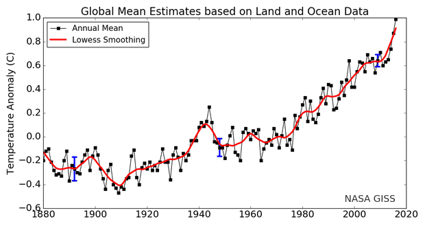
The obvious question is, where are we at? How much have temperatures risen since the pre-industrial time period? It might seem like that is a simple question. In fact, groups like NASA in the USA regularly provide temperature data as below. According to this image, the 2016 temperature increase has just hit 1°C (1.8°F). So, it would appear that we have some ways to go before hitting our target, right?
Not so fast. Whenever you see an image like the one below, you should ask what years are the baseline. These graphs are termed “temperature anomaly plots.” They don’t show the actual temperature; rather they show the temperature difference between two time periods. It turns out the figure below is oriented so that it is relative to the time period 1951-1980. So when we say that 2016 had a temperature anomaly of 1°C, we really mean that it was 1°C warmer than the 1951-1980 time period.
So, some important questions are, what were the temperatures prior to the graph shown here? What was the pre-industrial temperature? If the pre-industrial temperature is cooler than 1951-1980, it would mean that we have warmed even more than 1°C (1.8°F).
Prior to this publication, some choices were made based on expediency. For instance, in the latest IPCC report, the global reference period was 1850-1900 because it was thought that high-quality records could go back as far as 1850. However, some warming had already occurred by 1850. For instance, greenhouse gases were already being emitted then. Perhaps more importantly, humans had already changed the landscape through practices such as farming and animal husbandry. These land changes can affect temperatures as well. By using 1850 as a start date, you miss these changes and underestimate the total change in the global climate.
The authors considered a number of issues when selecting their recommended period. First, they attempted to select a period prior to significant global warming – before many greenhouse gases and land changes occurred. Second, it would be best to have a choice that didn’t have natural forcings (natural climatic changes such as volcanoes, significant solar changes, and so forth). Using three different analysis methods, the authors are able to conclude that from their pre-industrial time to the 1986-2005 period, there was a likely global temperature increase of 0.55–0.80°C (1–1.4°F).


Recommended supplemental reading:
How the World Passed a Carbon Threshold and Why It Matters by Nicola Jones, Yale Environment 360. Jan 26, 2017
For "A Better Graph" with 1880-1920 base period by James Hansen and Makiko Sato, see A Better Graph.
To convert NASA GISS anomaly base 1951-1980 to base 1880-1920, add 0.27 degrees C.
[Within the portion here at SkS, there is a paragraph missing compared to the the Guardian site. It is right before the para "Prior to this publication,..."]
On the substance of the article, I'm uneasy with the logic presented. It seems we have a carefully considered limit to warming determined by experts, and then quite independently, and after the fact, we need to go about determining the pre-industrial baseline to discover how we are doing. That seems to imply that the limits are based on relative changes from an (initially) unknown value, and not based on absolute temperatures nor based relative to known data points in the last few decades.
Is that really the correct logic? Perhaps the nature of the changes requires that we benchmark against an uncertain past, but it also seems to imply the expert-set limits do not include an assessment of impacts connected to known temperatures.
What was the zero point that the experts used in arriving at their judgement that warming should not exceed 1.5 to 2 degrees?
The main thing that concerns me about this articl is that it ignores climate intertia. It seems to be quibbling about a few tenths of a degree, whereas the equilibrium temperature for our current GHG concentrations is much higher than the current temperature. (I have no idea how much higher — that is what I would have hoped the article would tell us :)
Rate of change: during 1950-1980 the average rate of change was around 0. Like if the than emitted fossil CO2 was in equilibrium with the nature. Nature, the sea, was in that period capable to absorp that amount of CO2. Currently It looks like the top layers of the oceans are satured so more CO2 stays in atmosphere, capturing more heat.
I saw (sorry forgot reference) at another site that it takes a 30 years before the mixing of the deeper layers is back in (some sort of) equilibrium.
And lo and behold, around 2010 we see an even faster rate of heating up occur. Even if the heating is a 0.1 C (its more a 0.15~02) a year, after 13 more years we would be at 2.3 C already before (if nothing changes) we pick up another sprint in temperature rise)