


 Arguments


2017 is so far the second-hottest year on record thanks to global warming
Posted on 31 July 2017 by dana1981
With the first six months of 2017 in the books, average global surface temperatures so far this year are 0.94°C above the 1950–1980 average, according to NASA. That makes 2017 the second-hottest first six calendar months on record, behind only 2016.
That’s remarkable because 2017 hasn’t had the warming influence of an El Niño event. El Niños bring warm ocean water to the surface, temporarily causing average global surface temperatures to rise. 2016 – including the first six months of the year – was influenced by one of the strongest El Niño events on record.
Reality has debunked the ‘warming stopped’ myth
For a long time one of the favorite climate denier myths involved claiming that we hadn’t seen any global surface warming since 1998. That myth has fallen by the wayside since 2014, 2015, and 2016 each broke the global surface temperature records previously set in 2010 and 2005 (which were also both hotter than 1998). Yet the myth persisted for years because 1998 was anomalously hot due to the monster El Niño event that year, which meant that global temperatures weren’t much hotter than 1998 until 2014 to today.
Now the first six months of 2017 have been 0.3°C hotter than 1998, despite the former having no El Niño warming influence and the latter being amplified by a monster El Niño. In 1998, there was also more solar energy reaching Earth than there has been in 2017.
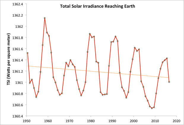
Total solar irradiance data (red) and linear trend (orange) since 1950 from the Laboratory for Atmospheric and Space Physics Solar Irradiance Data Center at the University of Colorado. Illustration: Dana Nuccitelli
In terms of El Niño and solar temperature influences, 2017 thus far has been most similar to 2006, but 2017 has been 0.3°C hotter than 2006 as well.
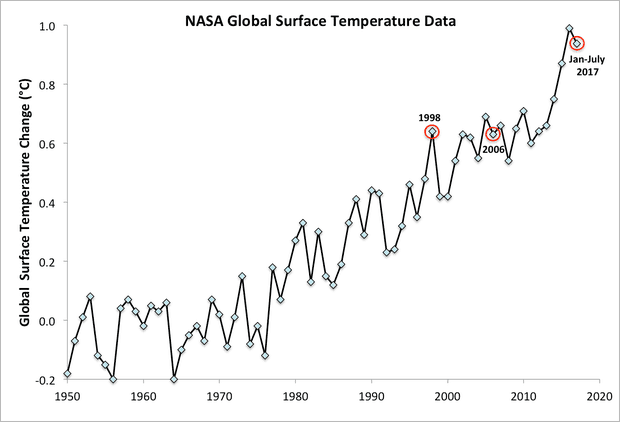
Global average surface temperature data from the NASA Goddard Institute for Space Studies. Illustration: Dana Nuccitelli
No, Rick Perry, the oceans aren’t to blame
In a recent Senate committee hearing, Trump’s Department of Energy Secretary Rick Perry said that he didn’t believe human carbon pollution is the primary control knob for the Earth’s climate (it is; hence the title of this NASA paper published in the journal Science in 2010), but instead placed most of the blame on “naturally occurring events – the warming and the cooling of our ocean waters.”
That’s a simple hypothesis to test. If global surface temperatures were rising due to an exchange of heat from ocean cycles, then as Perry noted, ocean temperatures would be alternatively warming and cooling. When oceans transferred heat to the surface, their temperatures would cool, and vice-versa. That’s simply not happening – measurements show that the oceans have steadily built up heat:
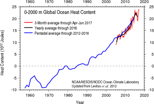
Global ocean heat content data for 0–2000 meters. Illustration: National Oceanic & Atmospheric Administration, National Centers for Environmental Information
Instead, every component of the Earth’s climate is warming. Surface air temperatures, lower atmospheric temperatures, ocean temperatures, and sea levels are rising as ice around the globe melts. That’s a key signature not of an internal Earth cycle, but of an external influence – either an increase in incoming energy from the sun, or a decrease in outgoing energy, for example due to an increase in the heat-trapping greenhouse effect. And as we’ve established, there’s actually been a slight decrease in incoming solar energy.
The culprit is quite clearly human carbon pollution. That’s how the first six months of 2017, despite lacking solar or El Niño ocean warming, can be hotter than 1998, and 2006, and every year before 2016.


There's no doubt about the overall argument Dana presents, but the first graph contradicts his claim that "[i]n 1998, there was also more solar energy reaching Earth than there has been in 2017." At least to my aging eyes, 1997 (when the El Niño first appeared) and 1998 are plotted as the two lowest points in the 1990-2000 period, both well below the 2017 point.
A couple of points regarding the Solar irradiance chart. Comparing the High 1362.2 vs the low of 1360.6 is a drop of only .1174%. Comparing the average at the start of the chart (circa 1950) is 1361.4 vs 1361.2 is only a .01469% drop. Isnt the change well below the measurement error range?
The time span is relatively short, The threecharts below covering the period circa 1800-2010 probably give a better perspective.
LINK
http://appinsys.com/globalwarming/GW_Part6_SolarEvidence_files/image017.gif
https://farm6.staticflickr.com/5784/22170076646_a855617076_o.jpg
[RH] Shortened long link.
[PS] Fixed link
[TD] True solar irradiance graphs, with their sources, are in this post.
JohnthePainter@1
By zooming in on the page then scrolling sideways you can see that average for 1998 is the dot above the orange line.
The hashes on the x-axis are the start of year. And the dots are the annual average shown in the middle of the year. This presention may be confusing to look at, but it is necessary when different averages like monthly, annual, or multi-year are being presented on the same chart.
People will believe what they want to believe, and then find or absorb reasons or (more often) things that sound like reasons to make themselves comfortable. We all do this in one realm or another.
The links at post 2 don't work properly. They go back to this page, but copying and pasting them works ok.
[PS] Fixed
Tom13 @2
I don't think the solar irradiance data would be in the margin of error or it wouldn't even get published would it?
However I recall reading that the data before 2002 is ground measured, and so accuracy is just very average, but since 2002 it is satellite based and very accurate indeed, with a very small margin of error as below. So falling solar irradiance since 2002 does seem to coincide with sharply rising temperatures over the last couple of years at least.
www.nasa.gov/mission_pages/sunearth/news/sorce-10yrs.html
Sigh, this is about difference between precision and accuracy. Precision is 0.01, accuracy 0.2. The question around basis, calibration have been around for a while. Good article here about it and what it does or doesnt matter. When looking for a forcing on climate, then what matters is the change, rather than absolute value.
If you get your information from appinsys and the badly named "friends of science" you will never want for moonshine.
TSI value changes from the solar charts by Tom13, reveal the increase from pre-1700 (Maunder minimum the main reason for LIA) and today is 2W/m2 from 1364 to 1366 (1990s studies), or 1.5W/m2 from 1360 to 1361.5 (AR5 - more reliable source). Attenuating this figure of 1.5W/m2 by 4 (sphere vs. disk surface), and by further 30% for average Earth albedo, you get 1.5/4*70% = about +0.3W/m2 solar forcing on Earth surface between LIA and today.
At the same time, human induced forcing reached 2.29W/m2 according to AR5, and upgraded few months ago to 2.5W/m2.
So if you should have a feeling how AGW signal relates to long term natural signals such as "recovering from the effects of little ice age", you have the answer in the numbers above. AGW signal is at least 8 times (would be more perhaps 10 times - 3W/m2 - if we removed temporary effects of aerosols) stronger than "recovery from LIA" signal.
If LIA was so "dramatically cold" according to legendary tales, and natural cycles are to blame for GW we're experiencing according to the deniers, then the numbers above tell a scary story: the AGW is already 10 times stronger than "LIA recovery", although it did not reach equilibrium T yet. Wait for our childern to experience equilibium conditions, and it grows stronger and stronger as we keep burning FF.
I just finished viewing a doc on You-Tube entitled “Climategate II Explained – NOAA Whistleblower – Data Manipulation – Global Warming Hoax” by Larouche PA published recently. Wikipedia’s account of Larouche PAC seems entirely economic, no climate change involvement indicated. The gist of the 72 minute lecture by an unidentified (?spokeperson for Larouche PAC?) was that ““NOAA breached its own rules on scientific integrity when it published the sensational but flawed report, aimed at making the maximum possible impact on world leaders including Barack Obama and David Cameron at the UN climate conference in Paris in 2015.” This was by Karl et all (2015) that claimed warming rate was twice what prior versions showed ( source Anthony Watts October (2015) and argued that truth was shown by satellite data from both UAH and RSS showing a flat line over this period. I know that Anthony Watts is a notorious climate change denial blogger, but rather than just dismissing the whole argument based on its source, I’d rather understand more of the background on this – basically is it true that, as alleged in this doc, NOAA fiddled the data, suppressed any internal dissention and then mysteriously “lost” the data all as revealed by whistleblower John Bates, a 40 year NOAA veteran and eminent climate scientist. I’m well aware that cherry-picking end-points over such a short period is no good way to consider the warming trend and that RSS put out a correction to its earlier data. What I want to know is any specific background on this specific accusation of wrong-doing by Karl et al exposed by Bates..
Later the talk characterizes such antics as typical for climate change advocates, citing the “broken hockey stick” supposedly exposed by McIntyre & MacKitrick in Energy and Environment. I heard Michael Mann’s response that their method was flawed but, again, I’d like to understand this on a deeper level than just “he said, she said”.
It also goes on about NASA supposedly lowering data before 1950 and raising it after 1950 thereby supposedly creating a warming trend. I heard about the correction of “bucket variances” for ocean data but I also thought I’d heard that these NASA adjustments created a lower warming trend not higher – so is the Larouche Pac presentation just a bald-faced lie or is there some more subtle fallacy involved in it?. The same accusation of NASA adjusting data upwards after 1950 was made in another doc on You-Tube, so, on the basis that where there’s smoke, there may be fire, I’m wondering where this story is coming from. I appreciate that adjustments to the temperature record have to be made to produce the best estimate of trend and so this can change retroactively and this fact alone allows the deniers to come in with clod-hopping boots, but as I said above, my understanding was that the net result of these adjustments was a lower warming trend not higher as alleged, so is that just a lie or what?
They also had a more fundamental question which I admit has confused me quite a bit also and that is how it is at all possible to calculate a global average from such a variety of circumstances affecting each temperature measuring device? I saw an explanation on NASA’s web-site of why changes were more reliable to average than absolute values but even so (and even after watching Cowtons’ excellent presentation on Denial 101x) it’s still a baffling subject. Maybe there is a good reference you can give me to read up on this.
[PS] I think you can probably assess the quality of your source when you read the links provided by responders. Bates himself denies any fraud. For more details on how raw temperature data is homogenized, see the myth "Temp record is unreliable". Any further discussion of temperature station homogenization in that thread please.
John S @9,
The criticism of Karl et a; (2015) you describe is six-months old and dealt with here. The paper has stood the test of time and it is not just NOAA and NASA SAT records that show the first half of 2017 to be the second warmest on record and the warmest non-El-Nino Jan-to-June by some way.
NOAA - 2016 +1.07ºC, 2017 +0.91ºC, 2015 +0.86ºC.2010 +0.78ºC.
NASA - 2016 +1.10ºC, 2017 +0.94ºC, 2015 +0.82ºC, 2010 +0.78ºC.
BEST - 2016 +1.06ºC, 2017 +0.96ºC, 2010 +0.79ºC.
BEST - 2016 +1.06ºC, 2017 +0.96ºC, 2010 +0.79ºC.
Ooops.
Continuing from premature submission above.
BEST & HADCRUT do not use the Karl SST data yet the warmth of recent years is still there.
BEST - 2016 +1.06ºC, 2017 +0.96ºC, 2010 +0.79ºC, 2015 +0.76ºC.
HadCRUT - 2016 +0.90ºC, 2017 +0.75ºC, 2015 +0.70ºC, 2010 +0.61ºC.
Even the satellite data of UAH & RSS show 2017 as the 4th hottest start-to-the-year on record (after 2016, 1998 & 2010), this with TLT measurements far more influenced by the El Nino wobbles which boost 1998 and 2010 above 2017. They certainly do not show "a flat line over the period." The video simply has no merit.
John S @9
Regarding the John Bates and Karl controvery. The accusations were data fiddling and incorrect process and reported in the daily mail tabloid newspaper.
Karl did nothing wrong. To quote Sheakespeare, much ado about nothing, or in modern terms an empty beat up. Things were all twisted out of context. The temperature adjustments were verified by several independent climate bodies, but the daily mail rant carefully omitted this key fact. The adjustments were also very small, again this was carefully not stated in the daily mail beat up. Bates was also demoted by Karl 2012, so take what you wish from that.
You can get a good picture of it in the following articles
www.carbonbrief.org/factcheck-mail-sundays-astonishing-evidence-global-temperature-rise
www.businessinsider.com.au/noaa-climate-data-not-faked-2017-2?r=US&IR=T
Regarding the NASA adjustments, refer to the recent article on this website listed in the left hand margin "Explainer. How data adjustments affect the global temperature record"
There are all sorts of adjustments, but the important thing is the big global land ocean trend raw data from 1900 - 2016 has actually been adjusted down. There is a graph in the article.
Regarding average global temperatures, these are based on weather stations all over the planet. NASA use a couple of thousand. Coverage is good overall, but with gaps in central africa, parts of the oceans, and only a few stations in very northern and antarctic regions. Nasa give technical analysis of why this is sufficient for a meaningful average, and this is on their website somewhere.
Just google "images for global weather stations". Here is one I looked at. Im not a climate scientist, just interested in the issues, but its pretty intuitively obvious there are plenty of weather stations over enough of the planet.
www.worldclim.org/methods1
[PS] please put further responses on temperature record on this thread. You can provide a link to your response here.