


 Arguments


Is Arctic Sea Ice 'Just Fine'?
Posted on 18 August 2010 by Alden Griffith
Guest post by Alden Griffith from Fool Me Once
The decline in arctic sea ice over the last three decades is one of many important indicators of global warming. It also represents an important feedback in the climatic system: as ice melts, the earth’s surface becomes less reflective and absorbs more energy, resulting in more warming (and more ice melting and more warming, etc…). However, some would like you to believe that all is well up north. In his March 12, 2009 testimony to the U.S. Congress, Lord Christopher Monckton described arctic sea ice as “just fine” (see text here and slides here).
Below are two figures from his reports for the Science and Public Policy Institute that he uses to support this claim (the first of which was part of his testimony):
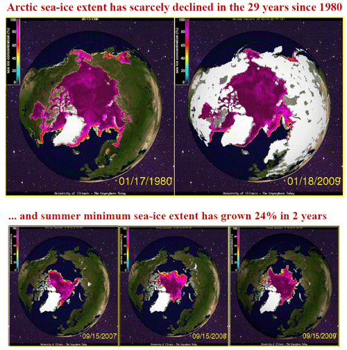 Figure 1: Images of arctic sea ice extent used by Lord Christopher Monckton to support the notion that “arctic sea ice is just fine.” (SPPI 2009, 2010)
The top figure – “Arctic sea-ice extent has scarcely declined in the 29 years since 1980” – rests on two datapoints of arctic sea ice extent in January 1980 and January 2009. The bottom figure – “summer minimum sea-ice extent has grown 24% in 2 years” – uses three datapoints, showing sea ice extent in September from 2007 to 2009. So with all of the research that has been carried out on arctic sea ice, we only need 5 data points to conclude that sea ice is fine? Let’s see how these data look when plotted on a graph:
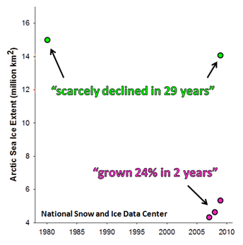
Figure 2: Monckton’s 5 datapoints plotted using arctic sea ice extent data from the National Snow and Ice Data Center (NSIDC).
The graph above looks a little sparse, so let’s fill it in with all of the available sea ice extent data from the NSIDC:
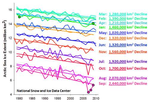 Figure 3: Arctic sea ice extent data for every month from November 1978 to June 2010 (NSIDC). Reported declines in sea are calculated from the start to the end of each month’s trendline.
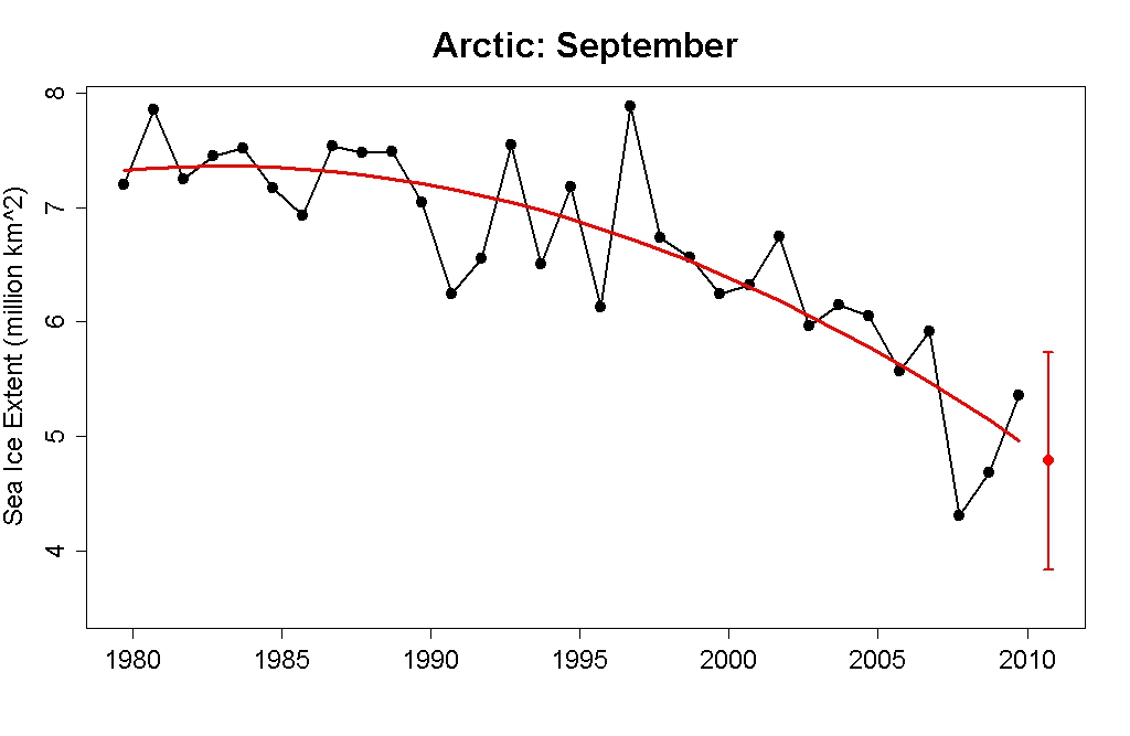
Wow. More than just cherry picking, this is like trying to hide an elephant behind a teacup! The entire 30-year dataset on sea ice extent is about as unambiguous as it gets: sea ice is declining. In particular, the start of the September trendline in 1979 is nearly 2.5 million square kilometers above the end of the trendline in 2009. How big is that?: Picture the U.S. east of the Mississippi River (minus Wisconsin). Or the Mediterranean Sea. Or one and a half Alaskas. This is a big deal. Unless you live in a cherry-picked world of only five datapoints, arctic sea ice is not "just fine".
Be sure to check out Fool Me Once for a more thorough presentation of the claim that "arctic sea ice is just fine / rebounding".


 0
0  0
0 Are my eyes deceiving me, or is the Actic Ice minimum extent for the last few years much closer to the 2040-2060 scenario than the one projected earlier?
Here is an image from a few days ago (white is 100% concentration, declining to blue <~30%):
Are my eyes deceiving me, or is the Actic Ice minimum extent for the last few years much closer to the 2040-2060 scenario than the one projected earlier?
Here is an image from a few days ago (white is 100% concentration, declining to blue <~30%):

 Everybody looks at the 2007 curve and concludes that the melt amount is less because all other curves are well above that minimum. However, look where the yellow and red curves start the melt season: at a value well above the black curve. Its the difference between annual max and annual min that counts. If the prior year's max extent is greater and the mins are close, the melt amount is in fact increasing.
#6: "in the context of climate change, thirty years is really too short a time span."
A sea ice reconstruction going back to 1870 is available here. The min extent (column 4) is fairly flat thru 1950, then begins falling at an increasing rate. Is it just coincidence that the CO2 (ice core+atmospheric composite) curve begins taking off at about the same time?
But why should that matter? If 30 years of decreasing extent isn't enough to establish the problem, how will presenting more make any difference?
Everybody looks at the 2007 curve and concludes that the melt amount is less because all other curves are well above that minimum. However, look where the yellow and red curves start the melt season: at a value well above the black curve. Its the difference between annual max and annual min that counts. If the prior year's max extent is greater and the mins are close, the melt amount is in fact increasing.
#6: "in the context of climate change, thirty years is really too short a time span."
A sea ice reconstruction going back to 1870 is available here. The min extent (column 4) is fairly flat thru 1950, then begins falling at an increasing rate. Is it just coincidence that the CO2 (ice core+atmospheric composite) curve begins taking off at about the same time?
But why should that matter? If 30 years of decreasing extent isn't enough to establish the problem, how will presenting more make any difference?


Comments