


 Arguments


Was 1934 the hottest year on record?
What the science says...
| Select a level... |
 Basic
Basic
|
 Intermediate
| |||
|
1934 used to be the hottest year on record in the USA. However, the USA only comprises 2% of the globe. What about the other 98%? According to NOAA temperature records, as of 2024, the hottest years on record globally were 2016 and then 2023, the latter year's temperature smashing the record by a wide margin. |
|||||
Climate Myth...
1934 - hottest year on record
Steve McIntyre noticed a strange discontinuity in US temperature data, occurring around January 2000. McIntyre notified NASA which acknowledged the problem as an 'oversight' that would be fixed in the next data refresh. As a result, "The warmest year on US record is now 1934. 1998 (long trumpeted by the media as record-breaking) moves to second place." (Daily Tech).
At a glance
Let's not shy away from the fact that in the contiguous United States, the year 1934 was particularly warm. It was among a cluster of years marked by the notorious droughts known as the 'Dust Bowl' years, during which huge dust-storms were frequent and did great damage to the soils of the Prairies.
But how significant is 1934 in the bigger, global picture? Let's take a look.
The background to this tale involves the NASA GISS temperature dataset. In August 2007, blogger Steven MacIntryre noticed a series of sudden temperature leaps in that dataset. They had occurred early in the year 2000, leading some to speculate that the Y2K computer bug must have been behind them.
NASA investigated. The data used for the NASA GISS record are from the National Oceanic and Atmospheric Administration (NOAA). NOAA had adjusted the data to filter out spurious excess warming. Sources of such biases are well-known. They include time of observation, non-ideal siting of weather-stations, relocation of them and urban heat island effects.
The specific error was nothing to do with Y2K. It was simply that, from January 2000, NASA were mistakenly using unadjusted data, so all those spurious anomalies were still in there and it looked warmer than it should.
Nobody's perfect and that includes scientists, but science is a self-correcting process. Errors that do occur are corrected when found. Correcting this specific error meant that some six years of temperature data had to be adjusted downwards. That meant that the order of the warmest years was also affected and after adjustment, 1934 and its Dust Bowl heat once again stood out prominently.
That's what happened back then, in a nutshell. Now to look at 1934 in context, with the added benefit of another 17 years of hindsight, of course.
Firstly, the corrected temperature record covered only the Lower 48 - the states of the USA excluding Alaska and Hawaii - where 1934 was indeed a very hot year. Zooming out of the USA - making up around 2% of the world's surface - to the whole globe, however, shows that 1934 was in fact a rather chilly year. In order to understand what's happening to global temperatures, the whole globe - the other 98% - also needs to be considered, year in year out.
Secondly, it may have been possible to attempt crudely dressing-up 1934 as another 'final nail' in the 'global warming coffin' in 2007, but no longer. If you now look at the global league-table of warmest years, the ten hottest of them have occurred since 2010, with 2023 being just the latest record-breaker.
The year 1934 was a very warm one in the United States. No-one disputes that. In fact, it's meteorologically quite interesting. The Dust Bowl years are thought to have been at least partly human-caused - by poor agricultural land-management. But the way temperatures have gone now, 1934 is merely of local, historic importance: a curio to look back at from time to time - and a warning to look after your topsoil!
Please use this form to provide feedback about this new "At a glance" section. Read a more technical version below or dig deeper via the tabs above!
Further details
In the NASA GISS temperature dataset, for the period 2000-2006, unadjusted NOAA records were erroneously included, thereby incorporating sources of bias making the record warmer than it should have been. This error was spotted by blogger Steve McIntyre in August 2007 and after investigation it was corrected by NASA. But the error immediately got people talking in certain quarters, with a particular focus on one year: 1934.
The year 1934 was a very hot year in the United States: in 2017, it still ranked sixth behind 2012, 2016, 2015, 2006, and 1998. It was in fact part of a series of hot dry years that are referred to as the time of the Dust Bowl. This severe crisis of historic proportions was caused by a combination of natural factors, especially severe drought, and human-made ones. In particular, it was the widespread failure to apply farming methods appropriate to dry elevated plains, such as ways to prevent wind erosion, that made a bad situation worse. Nature did the rest.
Natural topsoil is a precious resource indeed and they managed to lose much of it in a series of huge dust-storms. Strong winds are not uncommon over the Great and High Plains and land use has to be designed with resilience to them born in mind. The drought occurred in three main waves that took place in 1934, 1936, and 1939–1940. Some regions of the High Plains experienced drought conditions for as long as eight years.
As bad as the Dust Bowl years were, global warming takes into account temperatures over the entire planet, including the oceans. In any case, the land area of the U.S. Lower 48 accounts for only 2% of Earth's total surface area. Despite the U.S. sweltering in 1934, that year was not especially hot over the rest of the planet, as you can see on the 1934 map in fig. 1 (below). Globally, 1934 temperatures were actually cooler than average for the 20th century.
1934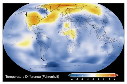
2022
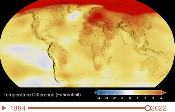
Figure 1. Global temperature maps for 1934 (top) and 2022 (bottom). Source NASA.
Science deniers pointing at 1934 as 'proof' that recent hot years are not that unusual are wrong, for several reasons. Apart from anything else, science does not set out to prove things: it presents evidence and develops hypotheses to explain things. That aside, the key sin here was the choosing of a single warm year (1934) in a single country (USA Lower 48) to make a talking-point about a phenomenon that is global in its nature and reach. That is an obvious example of the fallacy of 'cherry-picking' - waving around a single fact that supports a dubious claim and thereby ignoring the rest of the data (i.e. the rest of the world - fig. 2). It's essential to step back and look at the bigger picture at all times. Anyone failing to do that by cherry-picking out single years in single places is not behaving in a scientific manner.
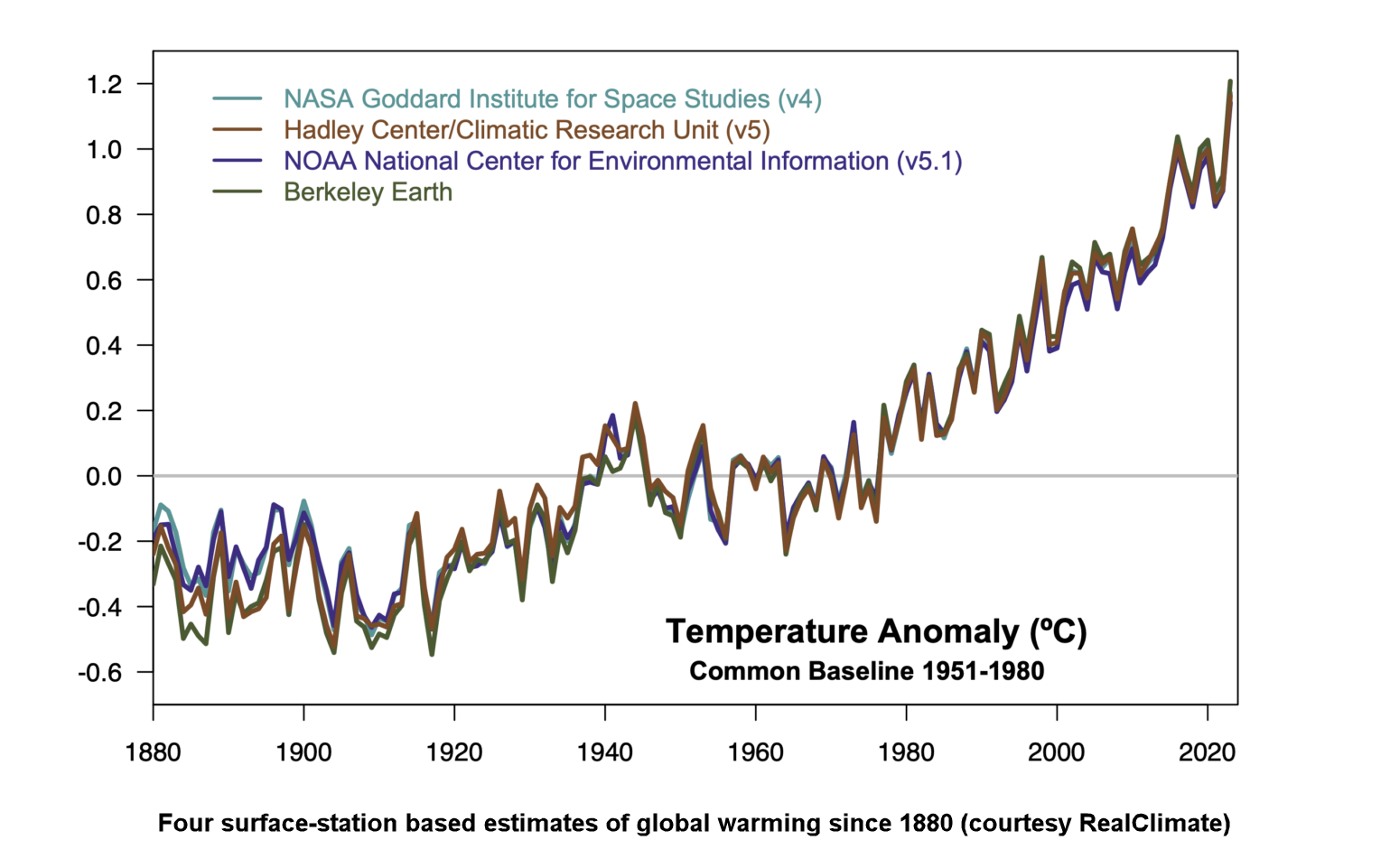
Figure 2: Multiple independent global surface temperature products show a very coherent pattern of temperature change over the 1880-2023 period. While there is overlap in the weather station inputs and ocean data, the methods for correcting for missing data, inhomogeneities, spatial sampling etc. are independent. Graphic: Realclimate.
Regional and year-to-year temperature variations will always occur. Our climate is noisy like that. The reason we are so worried about climate change is not because of a single extreme in one place on one date. It's the long-term average trend, over the entire world. That trend shows an undeniable increase in global surface temperatures and global ocean temperatures. As of the time of writing (May 2024), the years 2023, 2016, 2020 and 2019 are the hottest on record. So far.
This rapid global heating is dramatically altering the planet we live on and we don't have a spare. If there's one thing 1934 should always remind us about, though, it is the consequences of not looking after our home. That's what the history books will recall about the 1930s on the prairie-lands.
Last updated on 9 June 2024 by John Mason. View Archives


Darkmath,
Did you really post an average temerature of the USA that simply averages all temperatures without adjusting for differrences in number of sites, location of sites or time of day of measurements? If you really think that is acceptable data you are welcome to think whatever you want. Real scientists don't agree and you will convince no-one here that you make sense.
Your suggestion that the world wide "climate model" has warming built into it is completely false (in addition to being sloganeering). The adjustments to the early ocean temperatures substaintially raise those temperatures so that the slope of the line is lowered. see this SkS article.
The denier websites you have frequented have mislead you. If scientists models currently raise temperatures why would they lower the slope with their early adjustments? Your argument is contradicted by the data.
DarkMath @48, if you don't like NOAA, you can always use the AGW denier funded Berkeley Earth Surface Temperature project results:
Technically, the BEST data series make no adjustments. Instead, when there is a known, or reasonably inferred change of equipment, location, or time of observations they treat the data as coming from two distinct stations - a proceedure which Anthony Watts endorsed as having his full confidence (until he saw the results). It is certainly a proceedure that has the full confidence of Judith Curry (denier enabler), Richard Muller (temperature series skeptic), Zeke Hausfather (luke warmer) and Steven Mosher (Luke Warmer), not to mention three independent scientists selected by at the time, climate skeptic Richard Muller.
For the record, the highest ranked running 12 month mean temperature in the 1930s according to BEST ranks 23rd. In contrast, eight of the 12 highest ranked 12 month running mean temperatures are in 2012, with another three in the last three months of 2011.
But you want to cherry pick just July temperatures. However, the highest ranked July temperature in the 1930s is 1936 (ranked 3rd) followed by 1934 (ranked 6th). In contrast, in the 21st century the highest ranked are 2012 (1st), 2006 (2nd), 2011 (4th), and 2002 (5th). The average July temperature across the 1930s was 0.66 C. Across the 21st century (to 2012) it was 0.85 C.
And if you are wondering, BEST uses approximately 8 times as many stations as does the USHCN, with an increasing number in time over the 20th and 21st century.
In short, your cherry pick of the cherry pick still does not give you the conclusion you desire.
Your only refuge is to insist that when a station changes its instrument entirely, or its time of day for observations, or is moved to a new location, it should be treated as the same station with no adjustments for differences in recorded temperature between the new and the old; and to take meaningless arithmetic means that do not care that the station density in New York is far higher than that in Nevada, thereby giving more importance to North Eastern state temperatures than to those in the mid-west or west:
Your bias in favour of rich, Democratic eastern states is noted.
Tom Curtis, you have valid points about why the temperature needs to be adjusted and/or estimated. But the problem is those adjustments and estimates change over time:
The more the temperature record changes the less confidence I have in it.
Then there is the discrepency between NASA's land and satellite temperature data. They don't always match up. For example here:
I don't have any skin in the game here. I have a strong science background but only deal with medical data all day long. I'm an objective observer of climate science. But I got to tell you though is the more I read the more I think the science definitely doesn't appear "settled". And given I've become an expert in observing human scientific endeavor over the past 30 years, :-), I always expect the worst.
[TD] All the adjustments, both procedures and individual raw and adjusted data, are publicly available--along with the rationales for the repeatedly improved adjustment methods. You are welcome to state on SkS your specific objections to any of those procedures, rationales, or data. But you are not welcome to simply state, without referring to any of that evidence, that you just don't trust the adjustments, because that implies that you don't trust the scientists no matter how publicly and thoroughly they document their work, which implies that you are unwilling to discuss evidence. The SkS comments are for evidence-based discussions. All that I've just told you to address, must appear in the thread that moderator PS pointed you to, not this thread.
Regarding satellite measurements of temperature, read the post "Which is a more reliable measure of global temperature: thermometers or satellites?" Comment further on that topic on that thread, not this one. I strongly suggest that before commenting there you also read the post "Satellite measurements of warming in the troposphere"--all three tabbed panes, but especially the Advanced one. You should hesitate to assume the satellite temperature indices are superior to surface and balloon indices especially because those satellite indices started to diverge from both surface and balloon indices around the year 2000 when the satellite instruments were switched.
[RH] Please limit images to 500px.
michael sweet: "without adjusting for differrences in number of sites, location of sites or time of day of measurements"
There are many different ways to clean up data. For example adjusting for changes in the time of day. Say a weather stations data from 1900 - 1950 was taken at 12:00pm and from 1950 - 2000 it was taken at 1:00pm.
NASA/NOAA's approach to clean the data is by far the most complicated. It didn't have to be. You could start out in this case without making any adjustments at all. You simply treat them as two separate data sets. Voila. All that matters is that weather stations change in recorded temperature at a specific time. You reduce it to a rate of change, one set for the 12:00pm and another for 1:00pm. It no longer matters what time the temperature was taken because using 2 datasets instead of one removes time of measurement as a variable. The same would hold true for an elevation change or change in location.
NASA/NOAA didn't even attempt this simple option. Instead they went with some hefty calculations to make that one stations 100 years of data appear if it was all taken at the same time, the same location and same elevation. That's great, it's worth doing but shucks that is a lot of work. If anything the much simpler "treat a change in time/elevation/location" as if it were another weather station technique could be used to validate the more complicated approach. If I've learned one thing in my engineering career it's always go with the simplest option first.
[PS] This is getting offtopic here. Please post any responses to Darkmath about how the temperature record is adjusted to "Temp record is unreliable".
Darkmath - put any further responses you wish to make over adjustment there too please.
[TD] Darkmath, read the Advanced tabbed pane on that thread before commenting there. You also must actually read Tom Curtis's response to you, in which he already explained the BEST team's approach of not making any adjustments. Then you must respond to his comment explicitly (on the thread that moderator PS has pointed you to). I write "must," because SkS comments are for discussion, not sloganeering. "Sloganeering" includes failing to engage with respondents substantively.
[JH] I flagged DarkMarth for sloganeering upstream on post #48. I also advised him to read the SkS Comments Policy and to adhere to it.
DarkMath:
In comment #53, you state:
In comment #54, you state:
Does your "engineering career" include dealing with medical data all day long?
DarkMath @53, first, when comparing temperature anomalies (as shown in the two graphs above), you need to provide them with a common baseline - ie, the interval with a mean temperature of 0. Failure to do so can create a strong apparent visual discrepancy even between temperature series which are isomorphic. It is very evident in your first graph that no such common baseline is calculated, with not even a single data point having common values, let alone a 30 year period with a common mean. If you employ a common mean, the comparison looks like this:
Second, there are several differences between the 1981 and the 2016 product. Of these, the most important are:
1) An increase in the number of reporting stations from around 1000 (1981) to around 2200 (1987), to around 7,200 (1999-to 2015), to 26,000 (2016 but possibly not yet implimented). The differences in station numbers reporting at a given time between 1987 and now are shown below. In 1981, the number of reporting stations is half that of 1987, though no doubt following a similar pattern over time;
2) The introduction of adjustments for station moves, instrument changes, etc from the 1990s (detailed in a 1999 publication;
3) The introduction of adjustments for the urban heat island effect (1999), and the switch of classification of urban areas from a classification based on population to one based on the intensity of night lights as observed from satellite (2010);
In addition for the full global Land Ocean Temperature Index, the use of Sea Surface Temperature data started in 1995, and the way temperatures over sea ice was changed in 2006 to better reflect the fact that sea ice insulates the overlying air layer from the SST. These changes do not effect the above graph, which are based on the Meteorological Station only data.
IMO, it is thoroughly unrealistic to expect such changes to have no impact on the estimate of global temperature. Nor is it realistic to expect that because in 1981, no adjustments for station moves etc (because Hansen did not have access to the station metadata to make such adjustments possible, nor under undertaken the research that would provide the theoretical justification for how those adjustments are made), nor to incorporate more data as it becomes available. And now that you are on record as endorsing the methodology of the BEST temperature series (@54), here is a comparison of the BEST temperature series with that from the NCDC, which uses the same data as does GISTEMP:
Clearly, if we are to trust the BEST temperature series, we should conclude that the adjustments by NOAA, and ipso facto by GISS, have improved the data. Further, if we adopt the logic that we should automatically distrust measurements which purportedly improve over time, we should not accept modern determinations of the speed of light, which have inflated by 50% over the original measure in 1675.
With regard to the satellite data:
1) The satellite, TLT data measures a weighted average of atmospheric temperatures from 0 to 12,000 meters, whereas the surface temperture data measures a hybrid of the 2 meter air temperature over land, and the SST over sea. These are not the same thing, nor are they expected to change in lock step:
2) The satelite TLT data is far more greatly effected by ENSO and volcanic temperature fluctuations, making it much noisier. As a result of this, the strong El Nino in 1997/98 along with the strong La Ninas in 2008 and 2011/2012 have a much larger effect on the short term trend post 1998.
3) The satelite TLT data has four or five major versions from different teams, all using precisely the same data but with much larger differences in trend etc than the different land surface series (most using different data, and all using different methodologies). Prima facie, that indicates the TLT temperature series is less well known than is the surface temperature series.
4) The particular satellite temperature series you use (RSS) has just had a major revision increasing the post 1998 trend in its TMT dataset. That revision will have a similar impact on the as yet unrevised TLT dataset once the revision is made, so we know the data show in not currently accurate.
The use of satellite data to construct a temperature series requires far more adjustments than is required for the surface temperature series; and there is no consensus among those working in that field as to the correct way to make those adjustments. Further, as noted above, the different way of making those adjustments has a significant impact on the final product (unlike the case with the surface products, where different methods come up with essentially the same result). Given that, in a case where surface and satellite data disagree, there is no question that the surface data should be considered a more reliable indication of the surface trend.
[TD] Thank you, Tom, for carefully reading DarkMath's comment, for responding specifically to his/her points, for responding in detail and thoroughly, and for responding with referenced evidence rather than handwaving, personal incredulity, and implications or even accusations of conspiracies. DarkMath, please follow Tom's example in your commenting style.
(Tom, we are trying to move this discussion to the appropriate threads, so in future please respond to DarkMath on those other threads.)
DarkMath,
I responded to you here.
Most experienced readers follow the comments page here where all your posts, and the responses, will show up.
The science of carbon is not up for debate. it is well known. And it is well known what carbon does in the atmosphere, it warms it. And we know where the carbon is coming from, human activity. A small child of three could look at the photos of the antarctic and tell you whays happening, the ice is melting. When it all melts, 200 feet of sea level rise, billions displaced a world we can hardly recognize today. All for burning petroleum, what is a unique and precious chemical goldmine, that cannot be duplicated in the laboratory. And we burn it, to enrich a few people. There are more jobs, more money and a cleaner future in renewables but greed and ignorance have prevented it. We now talk about protecting cola miners, the most dangerous job in the world, instead of retraining coal miners to work on renewable energy programs like wind and solar. Why do we want to keep them and their children down in the mines, greed and ignorance. When you hear "drill baby drill" or "energy voter" you can count on a deep and brutal ignorance of the facts.
The chart of global temperature on this page in 1934 appears to be exceptionally misleading. As I understand it we have nothing like so clear a picture of global temperatures in 1934, with significantly less than 50% global coverage and many areas having only a handful of readings. Such charts do not appear to be justifiable.
[DB] Not counting 2018 (which is almost ready for inclusion), 1934 is the 7th-warmest year in the US. You can look this up yourself.
Globally 1934 is nowhere near the warmest year, coming in at the 86th-warmest.
LTO:
Please provide a reference to support your wild claim that Global temperature in 1934 was inadaquate. BEST (financed by deniers) starts global coverage in 1850 and GISS (more conservative) starts at 1880. Both are way before 1934.
Michael: See here: https://researchonline.jcu.edu.au/52041/
I find your response disingenuous. What % of the globe do think was being sampled at least once a day in 1934, or indeed 1880? Common sense would tell you it's relatively low, with the southern hemisphere exceptionslly low. What were the 'deniers' in 1850 denying, pray tell?
The 1934 chart pretends to have accuracy to a few degrees Fahrenheit. Independent of whether you believe in AGW, this is fanciful thinking.
Sigh, if you want to rely on John McLean, then you will never want for moonshine. See here. A pretty simple check is construct a temperature series from the GHCN stations that have been around since 1934 and see if you can spot the difference. See here for time series with just 60 stations for comparison and also a proper discussion of coverage bias.
The chart does not pretend any such accuracy - go to the appropriate papers for each of the temperature records to see what the error bars are.
LTO @61 ,
your link is to the work of Dr John McLean.
To add to Scaddenp's comment: The short story is : McLean has made a fool of himself. And not for the first time.
Please, LTO, try to be logical and scientific in assessing important issues, such as AGW. Everywhere you look on science-denier websites, you find deluded crackpots who continue to tie themselves in knots . . . cherrypicking and/or doctoring data . . . doing all sorts of crazy stuff in trying to deny the "bleeding obvious". LTO, you owe it to yourself to dig deeper and really look into the rubbishy propaganda (which you seem so attracted to).
Check out Andthentheresphysics on Dr McLean's ideas. Plenty of other respectable sources critiquing his nonsense. ( In particular, the McLean paper is an exercise in triviality. )
LTO:
Your citation is to an obscure PhD thesis. Here is a discussion of the thesis from And then There's Physics. The thesis states "The audit covers a broad range of issues but leaves the quantifying of the impact of such errors to others". That means the writer has not checked to determine if the supposed "errors" affect the result. All this data was reviewed and argued about in the 1970's. Scientists agreed that the data was properly collected and analyzed. You are 50 years too late. An unreviewed PhD thesis cannot be compared to papers published in Nature and AScience.
Please provide a peer reviewed citation to support your wild claims.
NASA GISS averages their data over 1200 km. They have good coverage over the globe since 1880. You can check their errror bars at their web site here. Scientist have determined that the data since 1880 are sufficient. It is well known in the scientific community that the HADCRU4 record does not have very good coverage of the globe. That is why their estimate of warming is too low. Other records like GISS and BEST have better coverage.
Common sense tells me that the data is sufficient since the IPCC report, accepted by every nation on the globe, accepts the data.
In 1850 there were no deniers. Everyone agreed that CO2 would casue an increase in global temperatures. By 1896 Arhennius had estimated the increase from doubling CO2 and got a number that is still in the range of sensitivities. Here is his peer reviewed paper.
For someone who is just starting to learn about AGW you are very well informed about obscure denier papers. You are aware that most of the deniers have given up arguing because the evidence of warming is so obvious that it is not necessary to even measure the temperature any more. Rising seas, disappearing ice, fire storms and unprecedented hurricanes all tell a story.
Hi everyone
Sounds like there's some history with this McLean fellow, but let's set it aside for now, as whether or not he's said silly things about other topics is neither here nor there. A phd thesis is absolutely peer reviewed, and thoroughly challenged. Mine certainly was, admittedly at a far more renowned university, but snobbery on such matters is uncalled for. Your comments on peer review and Science/Nature are a bit naive generally, but particularly so in the wake of this debacle https://phys.org/news/2018-11-climate-contrarian-uncovers-scientific-error.html
Appeal to (lack of) authority is not science. Nor are we bound by what some now-dead scientists thought 50 years ago (notably when they thought a new ice age was upon us). I've learnt a lot from this site, but the 'ignore that person because he's an idiot' line of argument is not persuasive. Play the ball, not the man.
Michael: Arhennius was hardly the last word, as you presumably know. I'm not really aware of much of the past GW politics (or interested in it), having previously taken it at face value. I recently became interested when someone I respect - Scott Adams - started looking at it. Do follow Scott's discussion on twitter / periscope, I'm sure he'd find your contributions useful.
Back to the topic at hand. Nobody has yet answered my questions, so I'll formalise it. So NASA GISS averages out temperatures over 1200 km? That's almost the length of the UK, which in itself raises an eyebrow from someone who lives in London and is familiar with the weather in scotland. You probably mean 1200 sq km(?), but this still covers many degrees C of gradation in the UK and probably most places in the world. Nevertheless, let's go with that for now, which equates to ablut 42,000 grids globally, 21k in each hemisphere. Please correct if wrong.
1. What % of all the ~42k (or however many therr are) grids had daily temperature readings from at least 10 different locations, split out by north/southern hemispheres percentage, in 1880, 1920, 1934, 1960 and 2000 respectively?
If the answer for 1936 is >80% I'll withdraw my criticism of the chart.
2. As above, but the % that had at least one daily max/min temperature reading within each grid for those years.
Thanks!
Calm down please, LTO. We were discussing Dr McLean's work.
And I am sorry you are not cynical enough to realize that there are PhD's . . . . and there are PhD's. To put it politely ;-)
Dr McLean is criticized because he puts forward idiotic ideas ~ and more than one idiotic idea and on more than one occasion. He is a repeat offender (and therefore deserves no presumption of innocence). The likely explanation is that his emotional bias provides Motivated Reasoning for his intellect to deny the "bleeding obvious". This is very typical of denialists (of all levels of intelligence).
Even you yourself, LTO, should try some introspection to identify the underlying causes of your apparent determination to oppose the scientific evidence by means of rhetoric & sophistry. Look at the overall picture please. Melting ice, rising seas, alteration of weather patterns, migration of plant & animal species in response to global warming [global warming at a time in this interglacial when the world had been on a natural multi-millennial cooling trend]. All "bleeding obvious" ~ and irrelevant as to whether you classify Year 1936 as a this or a that.
LTO, if you are a true skeptic, then you will present some reasonable evidence to support your "viewpoint". But so far, you have only made handwave rhetorical comments. There is a reason why (over recent decades) the number of climate scientists disagreeing with the mainstream consensus . . . has steadily dwindled to a minuscule minority. Quite simply: they have no valid evidence to support their (often mutually contradictory) assertions.
LTO, please get your act together, and present something substantive. And good luck with that! Indeed, I suspect you will need Divine intervention more than good luck ;-)
LTO,
You demonstrate again a deep knowledge of denier literature, contrary to your claimed recent introduction to AGW. You have chosen a particularly obscure issue to hang your hat on. I cannot find a reference with 30 minutes of GOOGLE time. This demonstrates that the issue is not important even to deniers. Please link the denier site (and the post about global coverage) you are getting your information from.
Hansen 2006 discusses the problems with the HADCRU data set. That is the one referred to in your PhD thesis. As you can see, Hansen beat McLean in finding this issue. Hansen discusses how GISS resolved the issue so that they are not affected. BEST is also not affected. I note that the HADCRU issue results in HADCRU underestimating global warming because they do not include the Arctic and Antarctic.
Cowtan and Way web site discuss the issue in more detail and show how they correct the HADCRU issue.
Your attitude has changed from someone who claimed actual questions to someone demanding answers to obscure denier garbage. I am not your GOOGLE boy. Unless you make particularly wild claims I will no longer respond.
LTO,
According to this video (https://youtu.be/ts0OVXLY5yE), the BEST record covers 80% of the Earth's land area from about 1900 to 1950. Only the Antarctic continent is not covered. From about 1950 over 95% of Earth is covered.
Hmmm. Intriguing change in tone. I don't yet have a viewpoint; what I'm trying to do is evaluate the evidence being presented.
First, thank you for putting in the time to try and find an answer - I really appreciate it, even if it's made you grumpy in the process. Having done some fuether research myself, I have some answers.
First, I see that the 1200 km figure is actually a 'smoothing radius', which assumes that a climate measuring station within 1200 km 'influences regional temperature'. Again, that is the length of Britain, and only a radius, so the diameter is twice this. A bit odd on its face, but depends how the smoothing is done I suppose. Note: it appears to come from a 1987 paper discussed below. Dodgy, but not necessary to go into now.
I also had success on the gridding, and it looks like GISS breaks the globe down into 16,200 grids, (each presumably ~31,500 sq km - ie size of belgium) which are used to build the charts above. I base this on the data you can export from their site. So my question can be reformulated as:
1. What % of all the 16,200 grids used to create the charts above had daily temperature readings from at least 10 different locations, split out by north/southern hemispheres percentage, in 1880, 1920, 1934, 1960 and 2000 respectively?
Michael, an aside: That you can't find the information could be a sign that the question isn't important. However, given that the question is in essence one of how good the coverage of actual measurement data is and therefore what inferences can be drawn from it, the question seems to me to be of primary importance. You may well take the view that if this Hansen fellow says something then it must be true, but as I said earlier appeals to authority are not science. It's not very reassuring if you can't answer basic questions about the quality of the data set you're relying on and using to draw trend lines,
The discussion in the Hansen paper you cite is trivial and adds nothing. It does however link to a 1987 paper that was perhaps the foundational work for this data set. Link is here: https://pdfs.semanticscholar.org/3106/d76f96f30c55f2fa1d7c4e09b2f0f11c3140.pdf
To my pleasant surprise Fig 1 goes some way to answering the question, which you can see here: https://imgur.com/a/HKxf6G3
Each circle has a diameter of 2,400 km (two Britains!) and within it a single meteorological station. Figure 2 shows the globe divided into just 80 grids(6 million sq ft each!), and you can see that for many grids continuous coverage didnt even start until well after 1934, and further the number of stations in many is tiny (far fewer than 10) despite covering enormous areas that will have variances in temperature of many degrees C.
The paper is an absolute must read, if you can do so skeptically. Hansen's done a good job with a very limited data set. The problem is thst that data now appears to be being massively overinterpreted.
For fun, I overlaid the 1930 station coverage from Hansen's 1987 paper against the 1936 chart on this page here: https://imgur.com/a/E8mtlqf You can see the chart is just making up data showing a dramatic 4F decrease in temperature across much of the globe despite there not being a meteorological station within many thousands of kilometers. Remember each circle is two Britains wide, and contains just one meteorological station.
So can I answer my own question? Unfortunately not, but I can answer a similar questions using Hansen's 1987 paper:
Q: if the globe was divided into just 80 grids of roughly 6 million sq km each, how many contained at least 10 meteorological stations in 1987? For reference Australia is just 7.6 million sq km.
A: Roughly 65%
Given the explosion of stations in 1960 comapred to 1930, the answer for 1934, even at such a low resolution, would have been much smaller.
My conclusion from all of this is unchanged: that to try and pretend that you can show a chart of global temperatures in 1934 with certainty of within a few degrees F is totally misleading. It doesn't pass the sniff test.
Michael: That video isn't what it purports to be. The percentages appear to be of mathematically sampled land area, not land area that actually had a weather station on it. Further, the analysis of past data has a pretty major assumption:
"Our calculation assumes that the regional fluctuations in the Earth’s climate system during the entire study interval have been similar in scale to those observed in the reference period 1960 to 2010'
Ummm... How can that be justified, if ihe period from 1960-2010 is apparently one of unprecedented climate change?
LTO, it seems to me that you are focused on absolute temps, whereas the global avg. temp. reconstructions are given in anomalies. The distinction is important, and this series of posts explains it all very well: Of Averages and Anomalies, especially Parts 1B and 2A, for your other hang-up on "coverage".
scaddenp, up thread, pointed you to this post at AndThenTheresPhysics which is the most recent look at the amazing fact that you don't need thermometers covering every sq. meter of the globe to get a good sense of how the temps are increasing. One of the first to do this analysis is Nick Stokes here: Just 60 stations.
You can do so yourself using Kevin Cowtan's "temp tool".
LTO:
Regarding your question about how BEST justifies averaging anomalies over large areas I will point out that the BEST study was financed by the Koch brothers (fossil fuel deniers) for the specific purpose of finding errors in the surface temperature record. No errors were found. I presume that their data analysis would withstand rigorous examination since it was designed by deniers.
I am interested to find out that you are so expert at temperature records that you can dismiss the work of multiple scientific groups for the past 50 years without even reading their papers. Arguing that you do not believe scientists can average anomalies over 1200 km is simply an argument from ignorance. Arguments from ignorance do not carry any weight on this web site, you must provide evidence to support your wild claims.
Your tone changed so I changed my tone.
David Kirtley @71 ,
thank you for that reference to Nick Stokes's "Just 60 stations".
I recalled him saying that he could get a good approximation of global temperature change from a fairly small number of observation stations [ less than 100 ] . . . but I did not recall the exact number he had used in his test case. ( Also, slightly amusing to see the paucity of USA continental stations used in the analysis! )
All of which, is leaving LTO's argumentation looking even more hollow.
The 1200km correlation in temperature anomalies comes from the data, and while initial work done in 1987, it has been reproduced by numerous workers. And the reason is no great surprise either - 1200 km is about the size of a weather system.
Please note the anomaly definition, it is critical. It is saying that if have a station that is measuring say 2 degrees above the local average for that thermometer, then you expect thermometers with 1200 km to also be measuring 2 degree above their local average, especially if you consider monthly average which takes the time factor of the weather system out of it.
Absolute temoperatures vary wildly over very short distances - that is why anomaly methods are used.
Hi all
Thanks for your responses, but either you've misunderstood my criticism or you aren't being serious. Let me restate it.
The 1934 chart in this topic purports to show the 'global temperature' for 1934 was cooler than "average for the 20th century", with massive swathes of the globe and southern hemisphere oceans and Antarctica in particular apparently being multiple degrees cooler. It is an absolute nonsense to suggest we know anything about the temperature across the globe to this level of resolution. There is a huge fraction of the southern hemisphere that was much more than 1,200 km from the nearest measuring station in 1934. ( See https://imgur.com/a/E8mtlqf ) There wasn't even a single weather station on Antarctica then (1.5x size of continental US), but you'd like me to believe it was 1-4 degrees colder than 'average' in 1934.
Further, I don't believe that the 1,200 km radius is valid for temperature anomalies over the ocean to any certainty, where currents must play a far greater role than on land. In other words, the error across the chart is far greater in most places than the purported effect. It is totally misleading and asserts something we don't know.
As to the people talking about needing only a handful of measuring stations. Unfortunately you appear to have not read the fine print. This is only if they are very strategically placed around the globe. They were not strategically placed in 1934, with massive gaps. One of the big elephants in the room with historical temp records are ocean temperatures.
As always, thoughts on what I may have got wrong very welcome. Please do acknowledge and quantify uncertanties. Thanks!
[PS] This is verging on sloganeering and strongly suggests you have either not read or understood the resources offered to you on the anomaly method. Arguments from Personal Incredulity have no place here. Either present data supporting your claims or show us the faults in the published analyses of SST data. Scientists do the hard sweat over data.
If you are determined not accept the science, then this site is not for you. I would encourage you however to engage in some critical thinking and decide what data would change your mind. Then we might be able to help.