


 Arguments


Recent Comments
Prev 999 1000 1001 1002 1003 1004 1005 1006 1007 1008 1009 1010 1011 1012 1013 1014 Next
Comments 50301 to 50350:
-
Rob Honeycutt at 13:04 PM on 29 December 2012The Y-Axis of Evil
Reading through my post again I was just realizing something. We're already committed to temperatures outside the past 5 million years, regardless of what we do. The question is, how far outside of the Holocene are we going to push it. Just how bad are we going to make this. That is the predicament we face and the choices we are making today. -
curiousd at 12:02 PM on 29 December 2012CO2 effect is saturated
Hi, Thanks to the help here, and hours of struggling, I can now demonstrate some cool things with Modtran, which if used with care, is a great teaching tool. Potentially that NCAR program on the same website would also be useful. Maybe there is some kind of workshop people hold for users? In my own research field they hold such workshops at synchrotrons to help people hone their software analysis skills. If there were at least a handbook on NCAR with worked examples? Sigh! Just one example of where I go awry here, follows: 1. I find the temperature corresponding to no GHG for the default incoming solar flux. That should be T earth, which averaged over the globe would be about 255 K. 2. I go back to default and put in CO2 375 ppm. 3. The output gives you temperatures associated with various altitudes. 4. If the T earth for the setting you use were 255 K for no GHG - then go back to 3 above and write down the altitude for 255 K 5. Now try 750 ppm. The surface temperature goes up but the altitude for 255 K should go up too. It does this, but.... 6. Check against equation: change in this altitude times lapse rate = change in temperature. 6. I get a much bigger change in temperature using the altitude change method than the actual computed change in temperature. I have a feeling I am careening around in a complex vehicle randomly trying to make sense out of tweaking the controls. I probably need to go someplace to learn this one on one? -
littlerobbergirl at 11:06 AM on 29 December 2012Food Security: the first big hit from Climate Change will be to our pockets
Mark, we who read apocalyptic fiction, from 'death of grass' to 'the year of the flood' know the drill: hole up in the hills until the bad men finish killing each other, try not to look like you are worth robbing, have an emergency exit - a few of us cooperators always survive, but i just dont want us to have to do it again! Ive been preparing for it all my life but like the man said let this cup pass ... Anne - Hey polytunnels! If we put up enough, could we cancel out the albedo change from the arctic ice loss? You can already see the ones in spain from space :) -
Bernard J. at 10:48 AM on 29 December 2012The Y-Axis of Evil
Cornelius and villabolo. Spencer's fit was actually a third order polynomial, and many of us disparaged him over the years for the statistical uselessness of prediction that it provided. I suspect that Spencer omits it now because the most recent values for time have reached the point where the record and the polynomial are starting to permanently part ways as the polynomial decends toward y = minus infinity. Of course, Spencer can always go up an order or two - but then he'd be an even greater laughing stock (if such is possible) amongst people with any operant understanding of appropriate curve fitting... Jimspy, 1/1000th of a degree Celsius would simply be a millidegree, just as 1/1000th of a metre is a millimetre! -
dana1981 at 09:06 AM on 29 December 2012IPCC Draft Report Leaked, Shows Global Warming is NOT Due to the Sun
Aside from containing a few dozen ad hominem attacks and personal insults, Rawls' latest post is just an exercise in ignorance. By definition a change in temperature is caused by a change in forcing (dT = lambda*dF). Yes, there is a 'lag' and thermal inertia, but the solar forcing is too small for the temperature response to take more than 5-10 years. Rawls even admits as much, saying "The strongest temperature response to a change in solar forcing is seen with a lag of about ten years (Usoskin et al. 2005)". So how does Rawls figure we're still warming in response to the solar activity increase 60+ years ago? To be blunt, Rawls doesn't have a clue what he's talking about. -
michael sweet at 08:30 AM on 29 December 2012IPCC Draft Report Leaked, Shows Global Warming is NOT Due to the Sun
Rawls has published a response to this post at WUWT (not linked). I noticed that his Cosmic Ray data only goes up to 2001. The graph appears similar to the one in the OP here because Dana used an 11 year average. A close examination of both graphs indicates in the last ten years the GCR count has gone down, the opposite of the effect Rawls claims. Several posters at WUWT have asked for a complete record of the GCR count, it will be interesting to see if Rawls posts one. WUWT does not allow posters to post graphs so I cannot post an up to date graph of GCR. -
sauerj at 08:29 AM on 29 December 2012The Y-Axis of Evil
Very convincing rebuttal; slam dunk! I would like to see two more charts inserted into the article. Take the last two charts and then "blow" the Y-axis back up. 1) Add a Fig.4b. It would be same as Fig.4 except change the upper & lower Y-axis limits to the Holocene limits. 2) Add a Fig.5b. It would be the same as Fig.5 except change the upper Y-axis limit to equal the BAU red-line (or slightly greater) and change the lower Y-axis limit to equal the Holocene lower limit. Doing so, would allow us to better see the true extent of the temperature changes relative to these properly set boundary limits. ... Excellent article! -
jimspy at 07:49 AM on 29 December 2012The Y-Axis of Evil
I have to say, I'd thought of this "perception" problem before, or this "opportunity for distortion", and I'd like to propose a solution: declare a new unit of temperature, the "millitherm" - 1/1000th of a degree Celsius. So what we are all trying to avoid is an increase in GAST of 2000 millitherms. Currently we've experienced an increase of 800 millitherms. I know, it's the same thing...but this is a PR game whether we like it or not, and perceptions count. Just my 2000 mils worth. -
bromwich at 06:26 AM on 29 December 2012West Antarctica warming more than expected
I admit (and regret) that the correlation figure as it is described in the media has been a source of confusion, and the caption associated with it is sometimes downright incorrect. This was the case, in particular, for the initial version of the figure caption in the NCAR press release. Note that this caption has since been amended by NCAR to emphasize that "the color scale represents correlations, not temperatures". To clarify, in the paper we refer to the correlation map as the "footprint" of the Byrd temperature record: the orange-red areas denote where the temperature tends to vary in phase with Byrd temperature on an interannual basis (being warmer-than-normal when it's warmer-than-normal at Byrd, colder-than-normal when it's colder-than-normal at Byrd). The figure should not be interpreted - as it has often been -- as a map of the long-term temperature trends for Antarctica. Such a map is not part of our results. If it were, it would show warming in central West Antarctica, as well as in the Antarctic Peninsula. The fact that, in the correlation map, Byrd temperature doesn't show much of a relationship with temperature in the Antarctic Peninsula (AP) might surprise some. But it can be easily explained. For example, sea-ice conditions have a greater effect on temperatures in the AP than in the West Antarctic interior. Some seasons also show signs of anticorrelation between Byrd and the AP: some anomalies in the wind pattern over the Amundsen Sea cause more warm air advection from the north to the Byrd region, while the AP receives more cold air from the south (or vice versa). If we had temperature records that were long enough to correlate the mean decadal temperatures across Antarctica, then we expect the orange-red area in the correlation map to encompass the AP. David BromwichModerator Response: [JH] Prof Bromwich: Thanks for stopping by and posting this clarification. -
william5331 at 06:06 AM on 29 December 2012The Y-Axis of Evil
This is a truly classic article. Very well expressed. Incidentally you mention that "we are very reliant upon this narrow stable climate to sustain the global agriculture that can support such a vast population of humans." Yup!! and we are virtually certain to be outside this envelope rather soon. What's the corollary to this. You guessed it. The Lovelock number. 1b (0r less??) people on earth. I get all smug (probably without justification) when I realize that I live in the southern hemisphere surrounded by a huge climate moderating ocean. http://mtkass.blogspot.co.nz/2012/11/greenland-melting.html -
villabolo at 04:33 AM on 29 December 2012The Y-Axis of Evil
Cornelius @ #18 I noticed that too. I'm sure he'll put that sine wave back when we get the next La Nina. A volcano or two would also help. -
Rob Honeycutt at 04:25 AM on 29 December 2012The Y-Axis of Evil
Cornelius B... Might be interesting to add it back for him to see what it implies about his motivations for removing it. -
Cornelius Breadbasket at 04:20 AM on 29 December 2012The Y-Axis of Evil
villabolo @ 17. It was only a few month ago that Dr Spencer overlaid an oscillating sine wave over this graph to make it appear as if the recent warm weather was part of a cycle. He himself included a disclaimer to the effect that it was for comparison purposes only, but his graph was reproduced on many denialist sites that did not include this disclaimer. It is interesting that Dr Spencer has now removed the sine wave. -
villabolo at 03:57 AM on 29 December 2012The Y-Axis of Evil
Somebody better tell the skeptical Dr. Roy Spencer that his charts are wrong. ;-)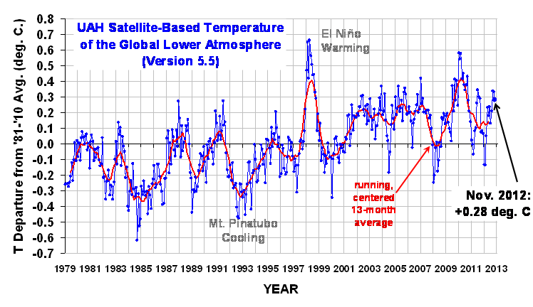 Here is a simple analogy for non-experts:
Imagine a mountain range that starts with small hills and works its way to taller mountains.
Now imagine looking at that mountain range from 50 miles away and being told that there are no tall mountains.
Moderator Response: [RH] Fixed image width.
Here is a simple analogy for non-experts:
Imagine a mountain range that starts with small hills and works its way to taller mountains.
Now imagine looking at that mountain range from 50 miles away and being told that there are no tall mountains.
Moderator Response: [RH] Fixed image width. -
ubrew12 at 03:45 AM on 29 December 2012The Y-Axis of Evil
One response to D Boehm is that yes, you can live from 0 to 30 C; you just can't feed yourself for long outside 14 to 16 C. -
keithpickering at 03:40 AM on 29 December 2012The Y-Axis of Evil
In addition to the Denial Depot post pointed to by Bob Loblaw, this post from Dr. Inferno takes on this kind of absurdity with almost exactly the same graph cooked up by Böehm. -
Albatross at 02:54 AM on 29 December 2012The Y-Axis of Evil
There are an astonishingly large number of examples demonstrating how fake skeptics and those in denial use graphics to mislead their audience. Here is another one Dick Lindzen used recently. Here is an example of Roger Pielke Jnr. misleading people by claiming the damage from Superstorm Sandy was about only half of the current estimate. His misleading graphic has not yet been updated. Other tricks employed by fake skeptics include failing to remove the annual cycle in temperature and sea ice data (for example), failing to apply the inverse barometer correction in sea level data so as to reduce sea-level rise, using uncorrected ENVIROSAT data in order to lower the rate of sea-level rise. The list goes on and on and on. At one point back in 2009 Roger Pielke Snr. was adamant that sea-level rise between 2006 and 2009 had "flattened" and that, by his misguided reckoning, this meant that sea levels was not rising at the upper bound of projections summarized in the IPCC reports. Now look where we are today, global sea level continue to rise at the upper end of the projections discussed in the IPCC assessment reports.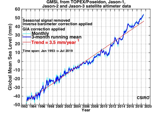 [Source]
All attempts by fake skeptics, contrarians and those in denial to do whatever it takes to hide the signal in a noisy data time series. They have no credibility and simply cannot and must not be trusted to report the science accurately and correctly, despite what they may try and claim to the contrary.
[Source]
All attempts by fake skeptics, contrarians and those in denial to do whatever it takes to hide the signal in a noisy data time series. They have no credibility and simply cannot and must not be trusted to report the science accurately and correctly, despite what they may try and claim to the contrary.
-
dana1981 at 02:33 AM on 29 December 2012Contrary to Contrarian Claims, IPCC Temperature Projections Have Been Exceptionally Accurate
Ron King, I think most of your questions are answered in the above post. For the influences of solar, ENSO, and volcanoes, see my post on Foster and Rahmstorf (2011). Akasofu is roughly as close to the measured trend since 2000 as the AR4, but as noted in the post, virtually every natural temperature influence has been in the cooling direction over that timeframe, and when those are filtered out with the Foster and Rahmstorf methodology, he's way off and AR4 is spot on. Climate models include natural variability simulations, but when multiple model runs are averaged together, that natural variability gets averaged out, which is why the multi-model temperature projections are quite smooth. -
Bernard J. at 02:22 AM on 29 December 2012The Y-Axis of Evil
Jennifer Marohasy once posted using the same gambit as D Böehm. It shows ignorance - either wilful or otherwise - of the high school-level* concept of magnitude-of-variation versus consequence. If such folk do not understand the significance appropriate display of the magnitude of variations relative to sequelæ, they should consider the tolerance of humans to changes in core body temperature. Doesn't matter if one describes it in terms of kelvin or celsius - a few degrees way from optimum spells death, and even fractions of a degree have profound effects. Attempting to illustrate the tolerable physiological range on a kelvin scale starting at absolute zero would be nothing short of ridiculous. [*I see after refreshing the thread that bath_ed made the same observation] -
Tristan at 00:14 AM on 29 December 2012It's El Niño
Ron King. There is no period for which any oscillation has absolutely zero impact on a trend. As periods get longer, the impact gets smaller and smaller. In practice, over 130 years the impact of an ENSO magnitude oscillation is negligible. I haven't done the math required to figure out how long an interval you need to be confident that an ENSO magnitude oscillation would only impact the surface temp trend (for instance) +/- 0.01 c/decade. It'd be a fair bit more than 20 years. -
bath_ed at 23:46 PM on 28 December 2012The Y-Axis of Evil
What an excellent explanation of the difference between global average temperature changes and changes in weather temperature! It's something that can be hard to grasp because it can be counter-intuitive that the difference in global temperature between glaciation and alligators in the Arctic can be less than the day-to-day changes in temperature at a single place. I don't know who D Böehm is or what his or her background is, but for Dr Lindzen, who is an actual scientist, to use such a distortion is unforgivable. Choosing appropriate> values for the X and Y axes was one of the things that was drummed into us in secondary school science and I'm sure it must be a basic of any high school science education. We were always taught that one should choose values that start at or near the smallest data value and end at or near the largest one; for example if you were producing a graph showing people's height it would be absurd to start the Y axis at 0 cm as no person is 0 cm tall. -
BWTrainer at 23:27 PM on 28 December 2012The Y-Axis of Evil
KR: Clearly your sock puppet learned from the best - PT Barnum. He's notorious in PR circles for writing letters to the editors of several newspapers using multiple pseudonyms in order to increase awareness of his circus and sway public opinion. He even "criticized" himself under some names so that he could then defend himself under different ones. -
Ann Owen at 23:19 PM on 28 December 2012Food Security: the first big hit from Climate Change will be to our pockets
We grow veg for market on a tiny plot (1/4 acre)and have many years of experience of growing plants, but last spring and summer were as difficult as I've ever experienced. It wasn't just the low temperatures and the endless rain, but also the constant low light levels creating ideal conditions for pests and diseases. We're trying to adapt to unpredictable and chaotic weather and seasons by using poly tunnels and hugel culture, which is working to some extend, but are adding their own complications. All in all, growing food is becoming more difficult, more time consuming and the general public still think that anybody can do it after watching "Ground Force" a few times. This cannot end well... -
Mark-US at 23:01 PM on 28 December 2012Food Security: the first big hit from Climate Change will be to our pockets
PS Ooops sorry about not snipping my conclusion but what a riot.... I sound like a denialist..... "My guessing goes like this (I think)" -
Mark-US at 22:58 PM on 28 December 2012Food Security: the first big hit from Climate Change will be to our pockets
Hollow point ammunition..... Bushmaster assualt weapons..... Global warming, meet the massacre at Sandy Hook Elementary in Newton CT. The current shortages of weapons and ammunition at US gun stores is not due to government restrictions, but on a surge in demand. When the US population really is hungry, the resulting anarchy will be well-armed, and NRA nuts will feast on liberal tree hugger flesh, at least if you take various rightwing blogs seriously. Community gardens will be plundered, wildlife populations will be poached to decimation, and all will struggle. It makes me very morose, until I start thinking about the Toba catastrophe, and a personal hypothesis, formed after some interesting neuro research a year or two ago into people who tend to respond with fear, vs those who can keep conflicting info in their head at once. http://www.sciencedaily.com/releases/2011/11/111101173636.htm Think of humans as an "heirloom variety" with different populations having different traits, to better weather changing circumstances. Sure, aggression may benefit the gun nuts initially. But as things get worse, perhaps the genes for cooperation will pass thru a bottleneck of human evolution, like some say occurred after the Toba eruption reduced human pop to a few thousand souls. Add in religion... essentially a culturally accepted mythology.... and there is a chance we can rewrite the script. From a Christian perspective, more of a "stewardship" version of God's post-flood commands to Noah, than the resource exploitation version favored by contemporary industrialists (and consumers). In sum, I am hoping we really do miss those three meals. But only once in awhile, enough to perk people up so that they value good government intervention, instead of simply embracing mob rule. Anyway, in the US, when hunger comes, even the liberal treehugger peace and loveniks will realize just how many guns live on their street. Buckle up, Bones. . My guessing goes like this: I think -
Ron King at 22:58 PM on 28 December 2012Contrary to Contrarian Claims, IPCC Temperature Projections Have Been Exceptionally Accurate
Tristan ENSO is supposed to be neutral. It is described as a cyclical redistribution of heat around the system according to Trenberth and others. If ENSO is not neutral over time then it becomes an external forcing which has not so far been accounted for in AR4 for example. There are several ENSO cycles over 20 years, so please nominate what time period is required for ENSO to become neutral.Moderator Response: [DB] Please take further discussion, including responses, about El Nino / La Nina / ENSO to the "It's El Nino" thread. -
Mark-US at 22:35 PM on 28 December 2012Arctic continues to break records in 2012: Becoming warmer, greener region with record losses of summer sea ice and late spring snow
@Terranova #12 Beats me why anyone expects to be taken seriously, when they claim a couple highly reductionist cherry-picked shimmies of the overall spider web of which we are part constitutes "ecological" speech. -
Tristan at 20:21 PM on 28 December 2012Contrary to Contrarian Claims, IPCC Temperature Projections Have Been Exceptionally Accurate
ENSO isn't supposed to be neutral. It's an oscillation, hence over any given interval it will have a maximum possible influence on a trend line. 20 years certainly isn't long enough to be able to read an accurate air temperature gradient without controlling for ENSO. -
shoyemore at 19:03 PM on 28 December 2012The Y-Axis of Evil
Harold Wainers's Visual Revelations Chapter 1 - Rules of Bad Graphics Rule 1: Show as little data as possible Rule 2: Hide what data you do show .... hiding the data in the grid,.. hiding the data in the scale . . People like Wainer and Edward Tufte (The Visual Display of Quantitative Information) are already aware of the tricks of people like Böehm and Lindzen. -
Ron King at 17:53 PM on 28 December 2012Contrary to Contrarian Claims, IPCC Temperature Projections Have Been Exceptionally Accurate
dana 1981 It seems that the best qualified skeptic Akasofu got closest to the actual 'averaged' temperatures. Presumably these averages are annual without any smoothing?? All the IPCC predictions are trending strongly up (0.19 deg/decade) - while the actual temperatures are slightly up (0.06 deg/decade). Akasofu at 0.02deg/decade cooling is closer than the IPCC. Why is he then the 'least wrong'? Fig 11 corrects the actual temperature observations to what they would have been without solar, volcanoes and ENSO and gets a better match with IPCC projections. Did the original IPCC projections exclude all these factors? I seem to recall AR4 mentioned volcanoes as an intermittent and unpredictable cooling effect, ENSO is supposed to be neutral over several cycles (20 years?) and solar is dismissed in AR4 as a minor forcing something like 0.12W/m-2 compared with a total radiative forcing of 1.6W/m-2. 20 years (1990-2010) is roughly 2 solar cycles - so the effect should be neutral over this period in any case unless more is made of longer term solar effects that does the IPCC in AR4. From what we know of ENSO, Solar and volcanic effects - why would they aggregate in the 1990-2010 period to a number significantly different to any random 20 year period? -
Albatross at 16:18 PM on 28 December 2012The Y-Axis of Evil
Nice post Rob. Dick Lindzen is guilty of using the same form of trickery with the y axis scale to mislead his audience. -
Bob Loblaw at 14:21 PM on 28 December 2012The Y-Axis of Evil
Similar issues on selection of graph scales have been covered over at Denial Depot, by good ol' Dr. Inferno... -
jyyh at 13:38 PM on 28 December 2012The Y-Axis of Evil
Please do not link to WTFIUWTW. I am also curious about the upper and lower bounds on that graph. I would have been nice if the producer of the graph would have found out the upper and lower limits of complex multicellular life, but no. These would have been c.+40 (°C) and -2 (°C), but maybe he's using some other scale. I mean, the '30' in that graph might well represent the Planck Temperature and the '0' might be 0 Kelvin. Of course it looks like the range between 10 and 20 is about the same as in Celsius scale, but I can't say for sure. No way this kind of graph would have passed in the secretary school, I hear. The X-scale is another matter, but given the incompetence in choosing the Y-axis endpoints, I'm afraid the producer of the graph may have misunderstood the 1850-2006 column in the ref. It is NOT the time of the day, but the year (which again is not shown in the graph.) Of course the above is just pure speculation about what's been going on in the mind of the producer of that graph. What I'm pretty sure of though, he doesn't want to draw attention to changes in global temperatures, and wants to have a bit of fun reading these responses. -
Doug Hutcheson at 13:23 PM on 28 December 2012The Y-Axis of Evil
Rob, thanks for the post. That last graph says everything worth saying: BAU will take us outside conditions that have existed for the past 5 million years. There's a sobering thought, as we approach another year of policy makers fiddling round the edges at best and deliberately making things worse at worst. Evolution has not fitted us to occupy our niche for very long, in geological terms. What a stupid species. -
Doug Hutcheson at 13:07 PM on 28 December 2012Contrary to Contrarian Claims, IPCC Temperature Projections Have Been Exceptionally Accurate
dana1982 @ 13 thanks for persevering. I think it has sunk in now. John Russell @ 11, there are codes that provide all the common symbols. Some that we have discussed in this thread are:° renders as the degree symbol °. © renders as the copyright sign ©. – renders as an n dash –. — renders as an m dash —.
It would be best to review the pages linked to in earlier comments here, as HTML is off topic for the thread. Thank you, mods, for letting it run. -
Rob Honeycutt at 12:57 PM on 28 December 2012The Y-Axis of Evil
KR... That's interesting that our D Böehm has an actual history. Perhaps he'll be inclined to come and explain himself. (I'm not holding my breath on that one.) -
The Y-Axis of Evil
D Böehm aka Smokey aka dbs (a moderator on WUWT who likes to post under sock-puppets) has posted any number of monstrously distorted graphs - he appears to make a hobby of them. Over and over and over.. Now, I will note that I feel anonymity on the Web is a good thing. Sock-puppeting, however, is another story entirely - if a moderator on a site misrepresents himself/herself as a rather virulent poster or two (who seem oddly immune to moderation), that is not honest. I don't care what a posters real name is, or where they work, their posts should make sense on their own. But if they are mixing roles as moderator of a site and an unrestrained sock-puppet poster of distorted information and insults, that's just downright deceptive. And calls into question the site itself - if there's deception in an aspect as important as moderation, what else is going on? From the WUWT policy page:* Internet phantoms who have cryptic handles, no name, and no real email address get no respect here. If you think your opinion or idea is important, elevate your status by being open and honest. People that use their real name get more respect than phantoms with handles. I encourage open discussion. * Anonymity is not guaranteed on this blog. Posters that use a government or publicly funded ip address that assume false identities for the purpose of hiding their source of opinion while on the taxpayers dime get preferential treatment for full disclosure. * A real working email address that you own (as a commenter) is required, so that I may contact you if needed. False or misleading email addresses may earn banishment. Changing handles and/or changing email addresses to get around this will also earn the same fate.
Hmm... I sense an inconsistency. For a previous critique on this kind of graphic distortion, with no discernible purpose other than to deceive, see a comment on D Böehm/Smokey's work here.Summary: If you see a graph with unneeded compression or expansion, and in particular if you see one where [ ] the important data has been altered to change values, you can conclude one thing with certainty. The presenter of that graph is attempting to mislead. - KR
--- Disclosure: I have been banned from that particular site since a post of mine that mentioned "D Böehm/Smokey", i.e. calling attention to the sock-puppet. Annoying, but rather unsurprising. -
Tom Curtis at 12:16 PM on 28 December 2012The Y-Axis of Evil
VictorVenema @1, the natural upper bound is the Planck Temperature, or 1.416834*10^32 degrees K. Clearly, on a graph properly displayed, not only is recent global warming completely inconsequential, but current global temperatures are, to a first approximation, zero (being 22 orders of magnitude smaller than the accuracy to which the Planck temperature is known, and hence massive warming by millions of degrees Kelvin is an absolute necessity for the future survival of life on Earth ... At least, I think that's how Böehm's reasoning goes. -
littlerobbergirl at 12:15 PM on 28 December 2012The Y-Axis of Evil
Nice build up. Fig 3, getting worried, but that bau line is the killer - welcome to the oligocene! -
littlerobbergirl at 11:41 AM on 28 December 2012Food Security: the first big hit from Climate Change will be to our pockets
Villabolo, more hopeful types here: global ecovillage network http://gen.ecovillage.org/ worldwide network of permaculture and similar groups and communities In uk and spreading fast transition towns http://www.transitionnetwork.org/ Spaerica i have that nightmare its replaced the nuclear one ill be an old lady with my bees and chickens easy meat for the roving gangs of brutalised starving townies. We have to make a better vision, enough nuclei of rational self sufficiency to spread to all. The great turning is the vision, it might sound impossible right now but has to be tried. Mutate and survive! John - forgot to say leeks did brilliantly and i did get early potatos and sarpo mains, they definately worth growing. I have been doing nearly everything in plugs and twice what i should need, and lots different stuff and varieties so at least i get something, i sell or swap gluts which gets me to meet the neighbors - more building community. Some things have gone feral and come up every year: chard, lambs lettuce, watercress, parsnips (really! They still dont come up from bought seed but 'my' ones pop up everywhere). But i have 1/2 acre to play with, and most of it is nettles :/ -
VictorVenema at 11:39 AM on 28 December 2012The Y-Axis of Evil
Why start the y-axis at 0°C? The only objective lower temperature limit is zero Kelvin. :-) Any suggestions for an objective upper limit? -
Tom Curtis at 10:31 AM on 28 December 2012Other planets are warming
Saparonia @19, Solanki 2004 shows the following reconstructions of sunspot numbers based on icecore isotopes: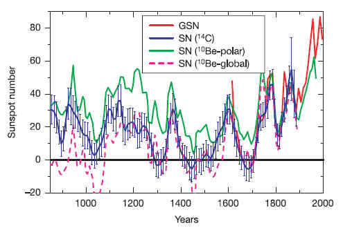 With two out of three reconstructions showing negative sunspot numbers in some periods, and the third significantly under representing solar variability, it is clear that these methods are not sufficient to make so definitive a statement about sunspot numbers.
Even should we accept the reconstructions at face value, however, the fact is that solar forcing between twentieth century maximum and maunder minimum is about 0.3 W/m^2 at Earth's distance from the Sun. for Mars and the outer planets, the forcing is much less because of the inverse square law. Why we should ignore the 1.8 W/m^2 forcing from CO2 in favour of the much smaller solar forcing remains a mystery. Even more mysterious is why we should do so when the solar forcing has been declining over the last 30-50 years.
With two out of three reconstructions showing negative sunspot numbers in some periods, and the third significantly under representing solar variability, it is clear that these methods are not sufficient to make so definitive a statement about sunspot numbers.
Even should we accept the reconstructions at face value, however, the fact is that solar forcing between twentieth century maximum and maunder minimum is about 0.3 W/m^2 at Earth's distance from the Sun. for Mars and the outer planets, the forcing is much less because of the inverse square law. Why we should ignore the 1.8 W/m^2 forcing from CO2 in favour of the much smaller solar forcing remains a mystery. Even more mysterious is why we should do so when the solar forcing has been declining over the last 30-50 years.
-
Saparonia at 09:17 AM on 28 December 2012Other planets are warming
This is a recent study of ice cores that seems to show that the Sun is actually more active on a longer timescale and it's activity has increased. A&A 413, 745-751 (2004) DOI: 10.1051/0004-6361:20031533 "Reconstruction of solar activity for the last millennium using 10Be data" I. G. Usoskin1, K. Mursula2, S. Solanki3, M. Sch?ssler3 and K. Alanko2 The study used ice cores. The authors concluded "In conclusion, we have presented here a new reconstruction of solar activity on the millennium time scale based upon a description of the related physical processes. It implies that the present high level of sunspot activity is unprecedented on the millennium time scale. The results will be the subject of further analysis." -
michael sweet at 06:37 AM on 28 December 2012Contrary to Contrarian Claims, IPCC Temperature Projections Have Been Exceptionally Accurate
Dana, Excellent post as always. You should consider sending a copy of this post to the lead author of the IPCC chapter. There is some room for misunderstanding their original graph. -
dana1981 at 06:27 AM on 28 December 2012West Antarctica warming more than expected
The caption did initially say it was a measure of temperature - I changed it to temperature correlation, since that's what the figure is actually showing. -
John Hartz at 05:29 AM on 28 December 2012West Antarctica warming more than expected
@Philip M Cohen #1: There is no discrepency between the caption under the graphic and the graphic's legend. Both use the term, "temperature correlation." We have invited the paper's co-author, David Bromwich, professor of geography at Ohio State University and senior research scientist at the Byrd Polar Research Center, to particpate in this discussion thread and clear-up any confusion about what the graphic portrays. -
Bob Lacatena at 03:20 AM on 28 December 2012Food Security: the first big hit from Climate Change will be to our pockets
villabolo, I picture a Mad Max style assault on Arcosanti, where the attacking horde wants not gasoline but a sustainable lifestyle, even though their very numbers will preclude it. Still, when people are hungry, logic goes out the window (actually, it seems that when people are wealthy and happy, logic goes out the window, as well). Arcosanti may seem sustainable, but it is not a solution that can be used for 7 billion people. And I imagine that it is taking a huge amount of energy and global resources to construct, unless it is being build with horse-and-man-power alone, and only locally attained resources like precious metals. No... in the long run, Humongous would sit before his punked-out horde in his souped-up cobbled-together roadster, announcing over the loudspeaker that if the Arcosanti will abandon their stronghold, he will let them live. And when they refuse, Arcosanti will be overrun, and what is there will be destroyed. It's a nice thought, but probably not a viable, globally applicable solution. -
dana1981 at 02:30 AM on 28 December 2012Contrary to Contrarian Claims, IPCC Temperature Projections Have Been Exceptionally Accurate
JosHag @12 - if I were to extend Figure 9 back further in time, it would look essentially the same as Gavin's figure, though slightly different has he's using A1B and I'm using A2. Our baselines are probably also different. I just set the model mean value in 2000 equal to the 1998-2002 average temperature anomaly. I'm using the A2 model mean data from here, but you're right that the trend should be 0.18 or 0.19°C per decade to this point. I'm not sure how I got 0.16°C, I'll have to check on that later, but I've revised the post accordingly. -
dana1981 at 02:18 AM on 28 December 2012Contrary to Contrarian Claims, IPCC Temperature Projections Have Been Exceptionally Accurate
Doug @9, as I noted @2, it's not as simple as adjusting for different ECS estimates because we're not in equilibrium. -
OPatrick at 00:31 AM on 28 December 2012Food Security: the first big hit from Climate Change will be to our pockets
John, I'm one of those who gave up this year. If the rain holds off I might head off down there this afternoon and start preparing the ground for next year - hope springs eternal. I think food security is something most people are still blithely unaware of and it's something we should be coming back to time and again. Events like Sandy grab people's attention but it's important that we use those opportunities to point to these issues which will impact on everyone. For people like me it just means a depressing patch of weedy mud and a few more pounds and pence on the weekly shop. For many people around the world a poor harvest means devestation.
Prev 999 1000 1001 1002 1003 1004 1005 1006 1007 1008 1009 1010 1011 1012 1013 1014 Next


