


 Arguments


Global warming and the El Niño Southern Oscillation
What the science says...
| Select a level... |
 Basic
Basic
|
 Intermediate
| |||
|
El Nino has no trend and so is not responsible for the trend of global warming. |
|||||
It's El Niño
"Three Australasian researchers have shown that natural forces are the dominant influence on climate, in a study just published in the highly-regarded Journal of Geophysical Research. According to this study little or none of the late 20th century global warming and cooling can be attributed to human activity. The close relationship between ENSO and global temperature, as described in the paper, leaves little room for any warming driven by human carbon dioxide emissions. The available data indicate that future global temperatures will continue to change primarily in response to ENSO cycling, volcanic activity and solar changes." (Climate Depot)
At a glance
This particular myth is distinguished by the online storm that it stirred up back in 2009. So what happened?
Three people got a paper published in the Journal of Geophysical Research. It was all about ENSO - the El Nino Southern Oscillation in the Pacific Ocean. ENSO has three modes, El Nino, neutral and La Nina. In El Nino, heat is transferred from the ocean to the atmosphere. In La Nina, the opposite happens. So within ENSO's different modes, energy is variously moved around through the planet's climate system, but heat is neither added nor subtracted from the whole. As such, in the long term, ENSO is climate-neutral but in the short term it makes a lot of noise.
The paper (link in further details) looked at aspects of ENSO and concluded that the oscillation is a "major contributor to variability and perhaps recent trends in global temperature". First point, sure. Second point, nope, if you accept climate trends are multidecadal things, which they are.
That might have been the end of it had the authors not gone full-megaphone on the media circuit, promoting the paper widely in a certain way. "No scientific justification exists for emissions regulation", they loudly crowed. "No global warming", the denizens of the echo-chamber automatically responded, all around the internet. This is how climate science denial works.
Conversely, the way that science itself works is that studies are submitted to journals, peer-reviewed, then some of them get published. Peer review is not infallible - some poor material can get through on occasion - but science is self-correcting. So other scientists active in that field will read the paper. They may either agree with its methods, data presentation and conclusions or they may disagree. If they disagree enough - such as finding a major error, they respond. That response goes to peer-review too and in this case that's exactly what happened. An error so fundamental was found that the response was published by the same journal. The error concerned one of the statistical methods that had been used, called linear detrending. If you apply this method to temperature data for six months of the Austral year from winter to summer (July-December), it cannot tell you that during that period there has been a seasonal warming trend. So what happens if you apply it to any other dataset? No warming! Bingo!
A response to the response, from the original authors, followed but was not accepted for publication, having failed peer-review. At this point, the authors of the rejected response-to-the-response started to screech, "CENSORSHIP" - and the usual blogosphere battles duly erupted.
It was not censorship. Dodgy statistical techniques were picked up by the paper's highly knowledgeable readership, some of whom joined forces to prepare a rebuttal that corrected the errors. The response of the original paper's authors to having their errors pointed out was so badly written that it was rejected. That's not censorship. It's about keeping garbage out of the scientific literature.
Quality control is what it's all about.
Please use this form to provide feedback about this new "At a glance" section. Read a more technical version below or dig deeper via the tabs above!
Further details
ENSO, the El Nino Southern Oscillation, is an irregular but well-understood phenomenon that affects the Eastern and Central Pacific Oceans. It is important both on a local and global basis, since it not only causes changes in sea-surface temperatures. It also affects the thermal profile of the ocean and both coastal and upwelling ocean currents.
Such changes can and do affect the diversity and abundance of important edible seafood species. Cold and warm-water forms are forced to migrate to where they find the conditions more to their liking. El Nino events in particular, where warm waters prevail close to the sea surface, can inflict a temporary loss of commercially important species of fish and squid from where they are traditionally fished. Some coastal communities along the Pacific seaboard of South America have a strong dependency on such fisheries. As such, prolonged El Nino conditions can be seriously problematic.
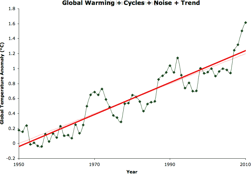
The warm El Nino mode of ENSO also affects global temperatures, as heat energy is transferred from ocean surface to the atmosphere. A strong El Nino is easily capable of raising temperatures above the upward slope that represents the change in radiative forcing caused by our increasingly vast greenhouse gas emissions - global warming, in other words. Conversely, the opposite to El Nino, La Nina, suppresses global temperatures. When several La Nina years occur in a row, climate science deniers are given the opportunity to insist that the world is cooling. This has happened before, most notably in the post-1998 period.
However, as fig. 1 shows, global temperature is rising independently of the short-term ENSO noise. Fig. 1 also shows that 2022 was the warmest La Nina year in the observational record. In fact, El Nino, La Nina and neutral years are all getting warmer.
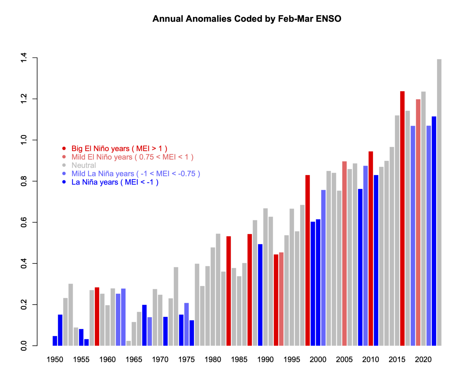
Fig. 1: variations in ENSO in a warming world. This plot therefore shows two independent phenomena that affect climate: the noisy ENSO and the underlying relentless upward climb in temperatures caused by our rapidly-increasing emissions of CO2 and other greenhouse gases. Temperature records typically get broken in El Nino years because the temperature is given an extra boost. 2016, a major El Nino year, held the global temperature record for a few years, but 2023 saw that record fall again. 2023 is in grey because that El Nino did not develop until later in the year. Graphic: Reaclimate.
The reader should by now be in no doubt about the difference between the long term global temperature trend caused by increased greenhouse gas forcing and the noise that shorter-term wobbles like ENSO provide. You would have seen something similar during the descents into and climbs out of ice-ages too. That's because ENSO has likely been with us for a very long time indeed. Ever since the Pacific Ocean came close to its present day geography, millions of years ago, it has likely been there.
The reader should by now be in no doubt about the difference between the long term global temperature trend caused by increased greenhouse gas forcing and the noise that shorter-term wobbles like ENSO provide. You would have seen something similar during the descents into and climbs out of ice-ages too. That's because ENSO has likely been with us for a very long time indeed. Ever since the Pacific Ocean came close to its present day geography, millions of years ago, it has likely been there.
Nevertheless, here we have something that warms the planet, even if that's on a temporary basis. As a consequence, some people with ulterior motives might just become interested. Over a decade ago now, that's what happened. A paper, 'Influence of the Southern Oscillation on tropospheric temperature' (Mclean et al. 2009) was published in the Journal of Geophysical Research. One of its co-authors, a well-known climate contrarian, commented:
"The close relationship between ENSO and global temperature, as described in the paper, leaves little room for any warming driven by human carbon dioxide emissions."
If you enter the above quote, complete with its quotation marks, into a search engine, you will get lots of exact matches. Strange? Not really, if you have studied the techniques of climate science denial.
- a paper is published that barely mentions global warming.
- its authors go on to distribute slogans implying that they have put yet another Final Nail in the global warming coffin.
- right-wing media of all sorts from newspapers to blogs ensure wide distribution of the talking-points.
- individuals serve to fill in the circulation-gaps.
This is how it works, time and again. However, glaring errors were soon noticed in the paper, leading a group of specialists to offer a rebuttal, published in the same journal a year later (Foster et al. 2010).
Statistics is not everyone's cup of tea, but a very straightforward explanation of the key error was provided by Stephen Lewandowsky, writing at ABC (archived):
"This is best explained by an analogy involving daily temperature readings between, say, July and December anywhere in Australia. Suppose temperature is recorded twice daily, at midday and at midnight, for those 6 months. It is obvious what we would find: Most days would be hotter than nights and temperature would rise from winter to summer. Now suppose we change all monthly readings by subtracting them from those of the following month—we subtract July from August, August from September, and so on. This process is called "linear detrending" and it eliminates all equal increments. Days will still be hotter than nights, but the effects of season have been removed. No matter how hot it gets in summer, this detrended analysis would not and could not detect any linear change in monthly temperature."
Anyone can do this in Excel. First input a series of representative temperatures for the transition from Austral winter into summer:
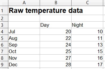
Reasonable? OK, then let's plot them. Still looks like what we'd expect. It gets warmer in Australia from July to December and nights are usually colder than days, right?
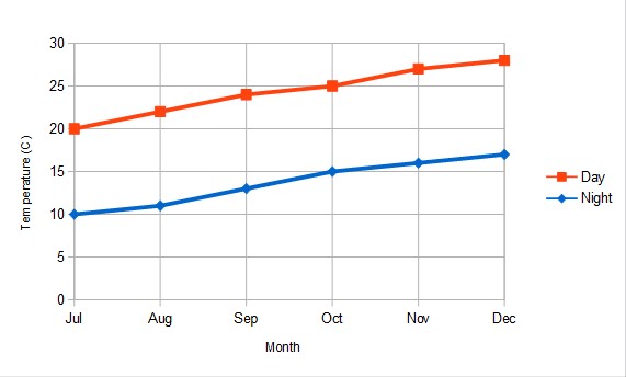
Now, let's do that detrending. This is what you get:
As Lewandowsky pointed out in his ABC article:
"Astonishingly, McLean and colleagues applied precisely this detrending to their temperature data. Their public statements are thus equivalent to denying the existence of summer and winter because days are hotter than nights."
In other words: Fail.
Last updated on 24 March 2024 by John Mason. View Archives
 The differences between that graph and the first in your post are that I have used weekly rather than monthly data, and that I have rescaled by the ration of the Standard Deviations of the Data, ie, by multiplying the Nino 3.4 anomaly by 0.1224305012. Had I scaled the global SST to match Nino 3.4 as done in the first graph, the factor would have been 8.1678992563 rather than 10. In other words, that graph inflates the Global SST anomaly values by 22%. I also detrended the Nino 3.4 anomaly, and it is not clear that Tisdale has done so in the first graph. I hope that helps.
 It is simply the weekly SST anomaly for various regions of interest to this discussion. It is presented without rescaling, rebaselining, or lagging or any other device that might conceal the vast differences of variability between the two regions. So presented it is immediately apparent just how variable the Nino 3.4 region is compared to other regions.
You might think that that is just because it is a small area, and the larger areas contain sub-regions with contrasting trends that reduce the mean variability. However, one of those regions, (Indian Ocean Tropical, in orange) is the region of the Indian Ocean from 50 to 100 degrees East, and from 5 degrees North to 5 degrees South. That is, it occupies the same area, and the same latitude as the Nino 3.4 region, yet it has only 32.3% of the variability of the Nino 3.4 region. Clearly the Nino 3.4 region (and presumably other directly ENSO effected regions) are exceptionally variable relative to other regions of the world's oceans.
Another way of saying that is that the region has a very high noise to signal ratio when it comes to detecting medium term trends. The same is true of the East Pacific, which is dominated by ENSO variations.
We all know that when it comes to detecting long term trends, we want to focus on the signal, not the noise. If you do not, you will find yourself "going down the up escalator, and all sorts of other improbable contortions. That is not reason to avoid studying the Eastern Pacific SST, but it is reason to take care that you are not fooling yourself with noise to avoid looking at the signal.
You can take several steps to avoid fooling yourself in that regard. You can check out statistical significance:
It is simply the weekly SST anomaly for various regions of interest to this discussion. It is presented without rescaling, rebaselining, or lagging or any other device that might conceal the vast differences of variability between the two regions. So presented it is immediately apparent just how variable the Nino 3.4 region is compared to other regions.
You might think that that is just because it is a small area, and the larger areas contain sub-regions with contrasting trends that reduce the mean variability. However, one of those regions, (Indian Ocean Tropical, in orange) is the region of the Indian Ocean from 50 to 100 degrees East, and from 5 degrees North to 5 degrees South. That is, it occupies the same area, and the same latitude as the Nino 3.4 region, yet it has only 32.3% of the variability of the Nino 3.4 region. Clearly the Nino 3.4 region (and presumably other directly ENSO effected regions) are exceptionally variable relative to other regions of the world's oceans.
Another way of saying that is that the region has a very high noise to signal ratio when it comes to detecting medium term trends. The same is true of the East Pacific, which is dominated by ENSO variations.
We all know that when it comes to detecting long term trends, we want to focus on the signal, not the noise. If you do not, you will find yourself "going down the up escalator, and all sorts of other improbable contortions. That is not reason to avoid studying the Eastern Pacific SST, but it is reason to take care that you are not fooling yourself with noise to avoid looking at the signal.
You can take several steps to avoid fooling yourself in that regard. You can check out statistical significance:
 This is a bit crude, but as the table shows, the increase in regional temperatures plus two standard deviations for Nino3.4 (1.52 C)and the East Pacific (0.4 C) comfortably exceeds the increase in Global SST anomaly (0.26 C). A proper analysis of the error of trend calculations taking into account auto-correlation and multi-decadal influences such as the PDO is likely to find (I suspect) that they do not differ significantly from the model predictions for the East Pacific of 0.42 and 0.44 C (as quoted by Tisdale).
Be that as it may, the important point here is that Tisdale's hypothesis does not even pass the most rudimentary test in showing that the limited warming in the East Pacific is unexpected given global warming.
An even more rudimentary test is to check that your analysis is robust with regard to endpoints, and hence is not just a function of short term fluctuations. In this case, we that ENSO dominates the region and is the source of the large fluctuations in temperature. Looking at the ENSO 3.4 index, we see that Tisdale's start point just happens to precede the second strongest El Nino event since 1950, and precedes a period note worthy for its lack of La Ninas; but that the end of the period is noteworthy for weak El Ninos and several strong La Ninas:
This is a bit crude, but as the table shows, the increase in regional temperatures plus two standard deviations for Nino3.4 (1.52 C)and the East Pacific (0.4 C) comfortably exceeds the increase in Global SST anomaly (0.26 C). A proper analysis of the error of trend calculations taking into account auto-correlation and multi-decadal influences such as the PDO is likely to find (I suspect) that they do not differ significantly from the model predictions for the East Pacific of 0.42 and 0.44 C (as quoted by Tisdale).
Be that as it may, the important point here is that Tisdale's hypothesis does not even pass the most rudimentary test in showing that the limited warming in the East Pacific is unexpected given global warming.
An even more rudimentary test is to check that your analysis is robust with regard to endpoints, and hence is not just a function of short term fluctuations. In this case, we that ENSO dominates the region and is the source of the large fluctuations in temperature. Looking at the ENSO 3.4 index, we see that Tisdale's start point just happens to precede the second strongest El Nino event since 1950, and precedes a period note worthy for its lack of La Ninas; but that the end of the period is noteworthy for weak El Ninos and several strong La Ninas:
 This pattern fully accounts for the negative trend in the Nino 3.4 anomaly, and hence the flat trend for the Eastern Pacific. Is it, however, a consequence of the start point of the data?
 As it turns out, yes it is. Just preceding the start point was another period of strong La Ninas. Including that period in the data results in a warming East Pacific:
 It turns out that not only is the lack of warming in the East Pacific not statistically significant, its existence is an artifact of the choice of start and endpoints in the data.
I assume this is not the result of conscious cherry picking. Tisdale's chosen data set just happens to start in 1981. But he should have been aware of the possibility that what he thought he saw was just an artifact of incomplete data, and checked longer time periods using other data. He was negligent at least.
This leaves him in an awkward position. Tisdale has provided no physical basis for his theory. He is, therefore, recommending it to us soley on the basis of the statistically unusual nature of the data. But it turns out that the data is not statistically unusual after all. That leaves his theory with nothing to recommend it until he can provide us with a physical mechanism behind his theory.
It turns out that not only is the lack of warming in the East Pacific not statistically significant, its existence is an artifact of the choice of start and endpoints in the data.
I assume this is not the result of conscious cherry picking. Tisdale's chosen data set just happens to start in 1981. But he should have been aware of the possibility that what he thought he saw was just an artifact of incomplete data, and checked longer time periods using other data. He was negligent at least.
This leaves him in an awkward position. Tisdale has provided no physical basis for his theory. He is, therefore, recommending it to us soley on the basis of the statistically unusual nature of the data. But it turns out that the data is not statistically unusual after all. That leaves his theory with nothing to recommend it until he can provide us with a physical mechanism behind his theory.
 Yet if you fit a trend line it yields a statistically significant result.
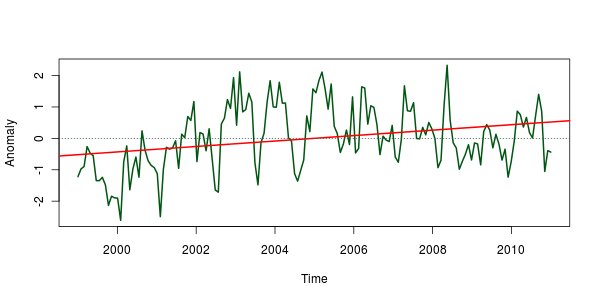
Now my question to you is, if you just eyeball the graph and claim that there is an increase till 2005 and then decrease from there, is it a valid claim?
If you claim that there is a step, you at the bare minimum have to run some statistical testing as a sanity check. If your assertion passes a statistical test, we can then proceed with caution. If does not, there is no reason for it to be taken seriously.
############################
Now that I think about it a bit more, I think there is a much bigger problem.
Your basis for shifting the global SSTA at those two points is based on your arguement that "extra heat piled up globally after an El Niño and during the transition to the first following La Niña", which you supported with the animation, that supposedly shows the "extra heat globally".
The problem is this: since you are plotting a scaled global temperature anomalies and a regional temperature anomalies, you can't even interpret the difference between the two as a temperature difference because one of the quantities is scaled, let alone extra heat.
Yet if you fit a trend line it yields a statistically significant result.
Now my question to you is, if you just eyeball the graph and claim that there is an increase till 2005 and then decrease from there, is it a valid claim?
If you claim that there is a step, you at the bare minimum have to run some statistical testing as a sanity check. If your assertion passes a statistical test, we can then proceed with caution. If does not, there is no reason for it to be taken seriously.
############################
Now that I think about it a bit more, I think there is a much bigger problem.
Your basis for shifting the global SSTA at those two points is based on your arguement that "extra heat piled up globally after an El Niño and during the transition to the first following La Niña", which you supported with the animation, that supposedly shows the "extra heat globally".
The problem is this: since you are plotting a scaled global temperature anomalies and a regional temperature anomalies, you can't even interpret the difference between the two as a temperature difference because one of the quantities is scaled, let alone extra heat.
 For those wanting technical details, I adjusted each interval between Kayell's stated adjustment points to have a common mean. Transitions where spaced over five weeks with an equal change in each week to avoid introducing very large adjustments in a single week. Both the Nino3.4 and Global anomalies have been divided by their Standard Deviation. The rescaling makes the magnitude of variation consistent for comparison without pretending global fluctuations are much larger in degrees C than they actually are.
Contrary to Sphaerica @74, although this method of detrending is arbitrary, it does not give a noticeably inferior fit to simple linear detrending:
For those wanting technical details, I adjusted each interval between Kayell's stated adjustment points to have a common mean. Transitions where spaced over five weeks with an equal change in each week to avoid introducing very large adjustments in a single week. Both the Nino3.4 and Global anomalies have been divided by their Standard Deviation. The rescaling makes the magnitude of variation consistent for comparison without pretending global fluctuations are much larger in degrees C than they actually are.
Contrary to Sphaerica @74, although this method of detrending is arbitrary, it does not give a noticeably inferior fit to simple linear detrending:
 Indeed, if you look at the residuals - the difference between the scaled Nino 3.4 anomaly and the scaled Global anomaly in the two graphs, it is difficult to tell them apart:
 Of particular interest here is the yellow line, which shows the difference in the residuals between the linearly detrended and Kayell adjusted graphs. It shows a clear pattern of rising gradually with the linear detrending, with three abrupt shifts down from the adjustments following Kayell's method. The important thing to note is that the difference never exceeds (approximately) 0.5 Standard Deviations. That means the difference between the two methods is not statistically significant.
That simple fact is devastating to Kayell's argument.
Kayell (and Tisdale) argue that the data show step changes in the SST data, yet it is well known that the combination of a linear trend, noise and natural cycles can give the appearance of step changes where none exist:
Of particular interest here is the yellow line, which shows the difference in the residuals between the linearly detrended and Kayell adjusted graphs. It shows a clear pattern of rising gradually with the linear detrending, with three abrupt shifts down from the adjustments following Kayell's method. The important thing to note is that the difference never exceeds (approximately) 0.5 Standard Deviations. That means the difference between the two methods is not statistically significant.
That simple fact is devastating to Kayell's argument.
Kayell (and Tisdale) argue that the data show step changes in the SST data, yet it is well known that the combination of a linear trend, noise and natural cycles can give the appearance of step changes where none exist:
 Consequently, when we see what may naively be interpreted as a step change, we need evidence that we are not simply fooling ourselves. That evidence, for Kayell (and Tisdale) is the ability to "detrend" the global SST anomaly by introducing three major shifts rather than by simply linear detrending. But as it turns out, there is not statistical difference between the two methods. Therefore, the ability to "detrend" by introducing step changes is not significant evidence.
Indeed, it is worse than that. We can test the "fit" between the Nino3.4 and Global anomalies for the two different methods of "detrending". We can take the correlation, for example, although there are reasons to think it is not a suitable method for the comparison. Alternatively, we can take the Root Mean Squared Deviation:
Consequently, when we see what may naively be interpreted as a step change, we need evidence that we are not simply fooling ourselves. That evidence, for Kayell (and Tisdale) is the ability to "detrend" the global SST anomaly by introducing three major shifts rather than by simply linear detrending. But as it turns out, there is not statistical difference between the two methods. Therefore, the ability to "detrend" by introducing step changes is not significant evidence.
Indeed, it is worse than that. We can test the "fit" between the Nino3.4 and Global anomalies for the two different methods of "detrending". We can take the correlation, for example, although there are reasons to think it is not a suitable method for the comparison. Alternatively, we can take the Root Mean Squared Deviation:
 That's all the difference there is between the two methods of "detrending". The linear detrend scores (just) better in terms of Root Mean Square Deviation, but the Kayell Adjustment shows a whopping 0.0075 better correlation between Nino 3.4 and adjusted Global SST anomalies. And on that massive 0.0075 difference rests the entire claim of a step change in sea surface temperatures following the 97/98 El Nino.
Colour me unimpressed.
Of course, this is not a case where we are comparing the predictions of two physical theories with distinct predictions. Climate science clearly predicts an approximately linear trend in SST over the period of interest, as modulated by ocean cycles and noise. There is a substantial, well worked out physical theory predicting the result. What is more, there are known factors likely to lead to the appearance of a step change in the data. The Pinatubo eruption in the 1990s, and a weakening solar cycle coupled with a switch from El Ninos to La Ninas in the 2000s are, when coupled with global warming, perfectly adequate explanations for that appearance.
In stark contrast, neither Kayell nor Tisdale have provided any physical theory predicting a step change. Consequently their only justification for believing one exists is statistical, ie, the 0.0075 point superior correlation when using the Kayell Adjustment compared to a linear detrending. So once again we find that Kayell and Tisdale have no evidence to support their claims, and no theory to justify making them.
That's all the difference there is between the two methods of "detrending". The linear detrend scores (just) better in terms of Root Mean Square Deviation, but the Kayell Adjustment shows a whopping 0.0075 better correlation between Nino 3.4 and adjusted Global SST anomalies. And on that massive 0.0075 difference rests the entire claim of a step change in sea surface temperatures following the 97/98 El Nino.
Colour me unimpressed.
Of course, this is not a case where we are comparing the predictions of two physical theories with distinct predictions. Climate science clearly predicts an approximately linear trend in SST over the period of interest, as modulated by ocean cycles and noise. There is a substantial, well worked out physical theory predicting the result. What is more, there are known factors likely to lead to the appearance of a step change in the data. The Pinatubo eruption in the 1990s, and a weakening solar cycle coupled with a switch from El Ninos to La Ninas in the 2000s are, when coupled with global warming, perfectly adequate explanations for that appearance.
In stark contrast, neither Kayell nor Tisdale have provided any physical theory predicting a step change. Consequently their only justification for believing one exists is statistical, ie, the 0.0075 point superior correlation when using the Kayell Adjustment compared to a linear detrending. So once again we find that Kayell and Tisdale have no evidence to support their claims, and no theory to justify making them.
 Source: 2012: Record Arctic Sea Ice Melt, Multiple Extremes and High Temperatures, WMO Press Release No 966, Nov 28, 2012


Climate Myth...