


 Arguments


Recent Comments
Prev 1004 1005 1006 1007 1008 1009 1010 1011 1012 1013 1014 1015 1016 1017 1018 1019 Next
Comments 50551 to 50600:
-
Hans Petter Jacobsen at 07:03 AM on 20 December 2012Solar Cycle Model fails to predict the recent warming
Thanks to MA Rodger @6 for his discussion of the Longyearbyen temperature series. The local temperature series vary considerably with respect to how well they fit with the Solar Cycle Model. Longyearbyen is a short series, starting in 1912. The other local series in [2] cover a longer period of time. I therefore think it is wrong to place special emphasis on Longyearbyen, as SSH do in [1]. I think it makes thing even worse to do separate analyses for the four seasons in the Longyearbyen series, as SSH also do. The Longyearbyen temperature series contains monthly absolute temperatures. I convert them to monthly temperature anomalies to be able to use monthly resolution for the start and end of both the solar cycles and the temperature series. The Longyearbyen temperatures at rimfrost.no is now available up to and including November 2012, covering the first four years of SC24. I just repeated the analysis with the updated temperatures. The observed mean temperature in these four years is 4.6°C higher than the model's prediction for SC24. I played a little with that number, and concluded approximately as MA Rodger does at the end of his comment @6. Thanks also to MA Rodger @10 for the link to the HadCRUT4 temperatures. That is what I need to answer Alex's question in his @4. I see that the file format is a little different from the formats that I have programmed so far, so I need some time to update the programs. -
MA Rodger at 06:20 AM on 20 December 2012Solar Cycle Model fails to predict the recent warming
Hans Petter Jacobsen @8 Is this HadCRUT4 page of use? -
Esop at 06:10 AM on 20 December 2012Sun and climate moving in opposite directions, says leaked IPCC report
Excellent summary. I can't believe why the deniers keep bringing up the failed "it's the sun" argument time and time again. I guess they feel that they can reach new groups that don't know that the argument is proven wrong multiple times, and their message has never really been about the truth anyway. -
LarryM at 03:57 AM on 20 December 2012Solar Cycle Model fails to predict the recent warming
It's unfortunate that the real utility of the SSH study was missed in the SSH paper, but fortunately was clearly presented in this article and the longer version. Until cycle 20 there is somewhat of a correlation and a plausible physical mechanism to conclude that the solar cycle is a detectable forcing for the climate system. That forcing presumably continues after cycle 20 but is small compared to some new forcing that is not correlated with the solar cycle and really kicks in in the 1970s (hmmm...what could it be?). This post very nicely explains what the SSH paper could have explained if only they had applied high quality scientific analysis as effectively as Hans Petter Jacobsen. Would you consider submitting your analysis to the journal as either a Comment on SSH or a separate paper that challenges the SSH conclusions? -
Alex C at 03:23 AM on 20 December 2012Add Frame and Stone to the List of Papers Validating IPCC Warming Projections
Mighty Drunken @22: Maybe there was a bit of a misunderstanding? Sorry I was referring to Figure 1.4 in this blog post, not Figure 1.4 from AR5. Bad ambiguity on my part, no I mean that the results from Rahmstorf et al. (2012) show this quite clearly. -
Hans Petter Jacobsen at 02:00 AM on 20 December 2012Solar Cycle Model fails to predict the recent warming
Philip @3, I agree that the failure of the model after cycle 20 is obvious when the dots are numbered with their solar cycle numbers. I don't know why SSH don't show the numbers. Without the numbers it is very difficult for the reader to see the failure. I did not see it myself before I had downloaded the temperatures, written the programs and examined my plots with the numbers. In [2] SSH show many plots with many local temperature series and with the HadCRUT3 NH temperature series, but without the solar cycle numbers. In this post on my google blog I show many of the same plots, with the numbers. I did this to check that the dots are in the same positions. They are, so there is no disagreement betwen SSH and myself on that. Alex @4, on this website we can download the HadCRUT3 (and the CRUTEM4) temperatures in a simple ascii format, but not the HadCRUT4 temperatures. Therefore I have not executed the programs with the HadCRUT4 temperatures. Do you know of a website where I can download the HadCRUT4 temperatures in the same simple format ? -
Esop at 01:33 AM on 20 December 2012Solar Cycle Model fails to predict the recent warming
#6: Agreed. Their prediction for Svalbard is so far off that it beggars belief: http://www.yr.no/place/Norway/Svalbard/Svalbard_radio/statistics.html The remarkable thing is that (as far as I have seen) nobody in the scientific community has taken them to task for this failure regarding Svalbard temperatures. Ie, they can continue this nonsense and get away with it, duping the ignorant masses in the process. Very few in the scientific community take these guys seriously, but that does not mean they don't have an impact. They get quoted in the Norwegian press all the time, geting more coverage and having more impact than those doing real science. -
MA Rodger at 00:50 AM on 20 December 2012Solar Cycle Model fails to predict the recent warming
These two papers by Solheima Stordahlb & Humlum are classics of the genre - nonsense presented to look like scientific argument. The graph-fest presented in The long sunspot cycle 23 predicts a significant temperature decrease in cycle 24 was the first to be written although the last to be published (allowing both papers to reference each other). As yet, the authors haven't quite perfected their style. In this first paper they are quite insistant that just "looking at" their graph of sun cycle lengths "tells us that we can expect several long cycles in the next decades" which their analysis says is indicative of very low NH temperatures. What is remarkable by its absence in these two papers is intelligent comment about the temperature records since Sun Cycle 23 ended. These are the ones that will contribute to the low average temperatures they are predicting for Sun Cycle 24. The nearest they get to such a comment is in their second paper Solar Activity and Svalbard Temperatures where they suggest a small drop in Winter temperatures in 2009 &10 may point the way to their predicted freeze up. Yet this 2009/10 Winter record is hardily even a straw to grab onto. These jokers are predicting Svalbard temperatures will drop "from −4.2°C in SC23 to −7.8°C, with a 95% confidence interval [−5.8 to −9.6]°C in SC24." This is their grand finding, the whole reason for the paper. And why not? Svalbard's annual and winter mean temperatures "are completely described by the PSCL-model" that they created. To achieve this lower annual mean, given the 2009-2011 mean at −3.76°C is even higher than the mean for SC23 (also noting the all-time record high for winter 2011-12) and also given the last 12 months could be taken as a reasonable value for the 2012 mean temperature (−1.87°C which would be the second highest annual mean on record), then the average over the remaining years of Sun Cycle 24 to achieve the temperature drop forecast by our trickster trio would have to be −10.4°C, with a 95% confidence interval [−7.6 to −13.2]°C. If you bear in mind the coldest single year on record for Svalbard (from 1912) is −10.4°C, never mind "even less likely," can we really take these jokers seriously? -
Enginerd at 00:45 AM on 20 December 2012IPCC Draft Report Leaked, Shows Global Warming is NOT Due to the Sun
I have been on vacation the last week and am trying to sum up this latest non-scandal. It seems like a guy with limited (if any) scientific credentials violated his confidentiality agreement with IPCC by releasing draft text prematurely. And, the real punch line here is that he claims to have had a moral obligation to do so. I would think the real news story here is about this unethical individual breaching his contract with IPCC. Have I missed anything? I'll wait until September to read the final IPCC text. -
Hans Petter Jacobsen at 00:10 AM on 20 December 2012Solar Cycle Model fails to predict the recent warming
Thanks for the feedbacks. It is great that Esop asked the newspaper to do a follow up inteview with SSH in 2014. When I downloaded the temperatures from the internet in May/June 2012, the HadCRUT3 NH temperature anomalies were available up to and including March 2012. The model's prediction for solar cycle 24 (SC 24) is -0.381°C. The mean temperature in SC24 up to and including March 2012 is +0.505°C, which is plotted in Figure 1 and 2. Now the HadCRUT3 NH temperatures are available up to and including October 2012, and the mean temperature observed so far in SC24 has risen to +0.525°C. This makes it even less likely that the temperature in SC 24 will be as low as predicted by SSH. -
Alex C at 23:32 PM on 19 December 2012Solar Cycle Model fails to predict the recent warming
Very nice post, thanks for looking into this. I wonder, how would this look using data from HadCRUT4? -
Treesong2 at 23:29 PM on 19 December 2012Solar Cycle Model fails to predict the recent warming
It seems that if you just number the dots by cycle number in their diagrams, the increasing failure of the model after cycle 20 is blatantly obvious. How can they have failed to think of this? -
Mighty Drunken at 23:27 PM on 19 December 2012Add Frame and Stone to the List of Papers Validating IPCC Warming Projections
Alex C @ (18) "As to "the globally-averaged surface temperatures ... generally are in the middle of the scenario ranges," that is quite clearly demonstrated by Figure 4. The statement doesn't mean that it tracks the mean all the time, but the observations fall within the first standard deviation range without seeming to be biased toward one side of it. " It seems to me that Fig 1.4 does show a bias to one side, that the IPCC projections shown in the graph do side on the prediction of more warming than has occurred. Am I reading the graph incorrectly? I understand that due to recent natural variation the global temperatures are "depressed" and therefore this is expected. -
Esop at 22:10 PM on 19 December 20122012 SkS Weekly Digest #50
Whitehouse/Huntsman for the White House in 2016. (I imagine that sensible guy/fellow Utahn Huntsman gives up on the anti-science GOP well before the next election) -
Esop at 22:00 PM on 19 December 2012Solar Cycle Model fails to predict the recent warming
Excellent work, Hans Petter! Great to see some sensible stuff coming out of Norway, pretty rare these days. I remember seeing a presentation of SSH's work in an article in the newspaper Aftenposten last year. I emailed the journalist and told her to do a follow up interview with SSH in 2014. We'll see if that happens. Could be interesting. A record warm 2013 or 2014 (depending on ENSO) could mean big trouble for the deniers. I say could, because the science side has not been nearly good enough at highlighting the failed cooling predictions of the denial movement (going back to at least 2007) A failed prediction is something the average Joe understands, but so far, the deniers have been allowed to fail time after time without the public getting informed. -
dana1981 at 17:14 PM on 19 December 2012IPCC Draft Report Leaked, Shows Global Warming is NOT Due to the Sun
Klapper, you're trying to refute a statement about a long-term trend by cherry picking short-term data. If you read SkS regularly, you should know that's not a valid approach. -
John Brookes at 16:39 PM on 19 December 2012Solar Cycle Model fails to predict the recent warming
Nice, thank you! -
curiousd at 12:29 PM on 19 December 2012CO2 effect is saturated
Tom Curtis you have made my day!! So I shut off all the other GHG and ran Modtran with 375 PPM CO2. Wrote down outgoing flux. Kept everything the same except went to 750 ppm CO2. Adusted the temp offset to give same out going flux as before. Doubling CO2 then gives radiative energy balance for this location, if CO2 the only GHG, with a 1.1 degree C increase offset. Probably lucky but cool (pardon the expression). ( FYI Hansen says in his book that "Any physicist worth his salt can show doubling CO2 with no feedbacks gives 1.2 degree increase".) -
Steve L at 12:12 PM on 19 December 2012New research from last week 50/2012
I too have enjoyed these posts. I probably only read a majority of the abstracts a few times, but there were always a few gems among the ones I did peruse. I wish I had more time to delve into your offerings -- there was always the intention to come back and look more thoroughly, but never the opportunity. -
Klapper at 11:59 AM on 19 December 2012IPCC Draft Report Leaked, Shows Global Warming is NOT Due to the Sun
"...since 1980 they are amplifying a cooling effect..." I don't think that is anywhere close to the truth. I downloaded the count from the Moscow monitor, which has data from 1958 to 2012. Keep in mind the "troughs" in the count should be warming pulses if the GCR/cloud theory is correct, and the "peaks" should be cool/neutral phases for climate. Also keep in mind the warm forcing from GCR is not only the depth of the trough, but really the breadth/depth combination. However, using just peak/trough values, in the Moscow database the deepest trough is around 1990, the lowest peak is the one ending in 1998. Hence the greatest warming effect should have been in the 1990's for GCR if theory is correct, not as stated: a cooling effect since 1980. That brings us to the next point. The count clearly went back up since 2000, since the trough from 2000 to 2003 is clearly not as deep as the troughs in the count at 1982 and 1991. However, it does last longer so net forcing might still be high compared to other troughs. Since 2003 the count really bounced back up, the peak of 2009 being higher than any other in the record. However, keep in mind temperature has not really been increasing since 2000, so that does not invalidate the GCR/cloud hypothesis. -
Chris G at 11:12 AM on 19 December 2012Add Frame and Stone to the List of Papers Validating IPCC Warming Projections
Jeez, I respond to Klapper because I see that it has been a while with no response, and by the time I type it out, there are three. -
Chris G at 11:08 AM on 19 December 2012Add Frame and Stone to the List of Papers Validating IPCC Warming Projections
Klapper (14), I suppose most of these talking points have been gone over before, but... Lower CO2 is not the only factor that was not (could not?) be predicted in 1990 which has reduced the rate of increase in the surface temperature. There has been an increase in Asian aerosols, the sun has been less active than usual, and the ocean has been warming at depth - which may or may not be related to the dominance of La Nina in recent years. Not sure, but it appears you are trying to imply that, because the explanation is complicated, it must be wrong. A model is just a way to approximate reality. Science works by replacing models with better ones, whether that is in chemistry, nuclear physics, what have you. So, if you are going to throw out the IPCC ensemble of models, what are you going to replace it with? If you are going to replace it with nothing, then you might as well be saying we don't know everything; therefore, we know nothing, and that conclusion really doesn't follow that premise. If you can show a model which does a better job over the last 20 years, as well as the over the historical record, that would be very interesting. Pretty lines on a graph with no connection to the laws of physics would not be very interesting. -
Albatross at 11:05 AM on 19 December 2012Add Frame and Stone to the List of Papers Validating IPCC Warming Projections
Klapper @14, Re your claims concerning the FAR predictions, please look carefully at the figure inmy post @1 above and Figure 1 in the [main post]. You are applying a linear trend to a curve that is not linear, with the result that the resultant trend overestimates the amount of warming expected between the end points. Indeed, when done properly, the graphs above show excellent agreement between what was predicted for circa 2011 and what was observed. I sense that you are reluctant to accept that predictions made over 20 years ago, using pretty simplistic models by today's standards, have done remarkably well. Now please compare those predictions with those of "skeptics" and those in denial that are shown above. Your post contains at least one error. 2012 is probably officially going to be designated a La Nina year (yet it will very likely be the 9th warmest on record). As for 2013, it is still a little too soon to say, but the official forecast is for ENSO neutral conditions to persist into 2013. Your claim of a La Nina for 2013 misrepresents the official position of the CPC. But here again we have "skeptics" arguing about the noise (i.e., ENSO) when it has already been pointed out by climate scientists ad nauseum that it is pointless (and misleading) to focus on periods of time that are unable to extract a statistically significant signal from the noisy temperature record. Yet "skeptics" continue to play this disingenuous and scientifically meaningless game. FWIW, my simple box-type model is predicting a global surface air temperature anomaly for GISTEMP of about 0.61-0.65 C, so 2013 may tie or break the current global record (+0.64 C) without the boost of an El Nino. And think about this, barring a large tropical volcano blowing its top, 2013 will likely be warmer than 1998 was (+0.59 C), and that year followed a huge El Nino (a three plus sigma event if I recall correctly). If that happens it will impressive and speaks to just how much the positive radiative imbalance (from humans increasing greenhouse gases) is warming the planet. [Edited to fix typos, see square brackets] -
Alex C at 10:47 AM on 19 December 2012Add Frame and Stone to the List of Papers Validating IPCC Warming Projections
Klapper @14: The actual FAR scenario that best fits the modern realized climate forcing is Scenario 2.5(D). This was discussed in detail in "Wall Street Journal 'Skeptics' Misrepresent the IPCC" by Keith Pickering, 3 March 2012. http://www.skepticalscience.com/wsj-skeptics-misrepresent-ipcc.html As Dana said too, you're ignoring GHG reductions in other forms like CFCs, which were banned by the Montreal Protocol only just before FAR was released. Furthermore, you're forgetting that since FAR was released there was an update to the forcing equations that the IPCC used, the new paper being Myhre et al 1998. The CO2 equation, ∆F = Aln(C/C_0), was A = 6.3 in FAR and A = 5.35 in Myhre et al 1998. In other words the IPCC was using a higher forcing per increase in CO2 than later research suggested to use. It's no wonder their prediction might be higher. ENSO predictions right now are neutral with a slight positive bias. I myself wouldn't bet on another La Nina. And there are ways, remember, to filter the ENSO signal anyway. Foster and Rahmstorf did this. If you really think that an El Nino will cause a spurious spike, then maybe we can just apply their methodology and remove it, and we'll see then. JoeT @17: They weren't just CO2 emission scenarios, they were total emission scenarios. The (1) and (3) points in Section 1.3.1 also tell why the projections aren't in line with the observations, which is because of natural variability that the projections did not model. So, if we include *only* present CO2 levels, of course they won't change much, but if we use the fuller 3D models and include the correct natural variability we have observed, the models will predict the temperature accurately. As to "the globally-averaged surface temperatures ... generally are in the middle of the scenario ranges," that is quite clearly demonstrated by Figure 4. The statement doesn't mean that it tracks the mean all the time, but the observations fall within the first standard deviation range without seeming to be biased toward one side of it. -
catamon at 10:36 AM on 19 December 2012This is Global Warming - A Lesson for Monckton and Co.
Was doing some further contemplation re my post above in terms of where we are in the "cycles" Lord Monkton has referred to. 60 years before 1998 it was 1938, so i'd say that was in the last "cooling phase of the ~60-year cycle of the ocean oscillations". from a chart here: it looks to me like around then we were also, broadly speaking, in a similar stage of low or decreasing solar activity. So, for arguments sake i will assume that the decade following 1938 has similar conditions in regard to solar and ocean "cycles" to what Monkton is claiming for the 1998 to now period. from a chart here: It appears that the temperature records show a quite rapid cooling over a decade or so. That's something i have seen on a lot of the charts depicting temp in the 20th century. Regardless of how different people treat the data, that didn't happen post 1998. Implies to me that there is some other factor at play now compared to then and the warming effect increased of CO2 levels would seem to be one of the candidates. My conclusion from this and reading other people posts here on this issue that really do make sense to me: Lord Monkton is perhaps not quite as smart as he thinks he is, and the most polite thing i can say about it is that he has rather blatantly shot himself in the foot with his published justifications for "16 years with no warming". -
Riduna at 10:12 AM on 19 December 2012Thawing of Permafrost Expected to Cause Significant Additional Global Warming, Not yet Accounted for in Climate Predictions
… as a truly "emerging issue" (the effects of warming permafrost) could not have been included in climate change modelling to date. Really? This issue has been “emerging” and largely ignored by overly conservative scientists for a decade or more. It is not as though the effects of thawing permafrost have only become apparent in the last year or so. We have known for decades that roads, railways, pipelines, bridges and buildings resting on permafrost foundations would be disastrously compromised by thawing which creates poorly drained waterlogged landscapes lacking bearing strength. That permafrost embodies or covers significant methane deposits, preventing their release into the atmosphere is hardly new. Their presence, estimated quantity and their warming effects, if released by thawing permafrost have been reported on in peer-reviewed Papers for at least 20 years. Over the last decade many scientists have reported their findings on cryogenic carbon, the threat posed my thawing permafrost and warned of the potential for this feedback to bring about abrupt climate change. The broader climate science community have largely ignored their findings. Belatedly declaring this a “truly emerging issue” seems a feeble excuse for the way it has been and continues to be ignored by those engaged in climate science modeling. -
JohnB6223 at 09:49 AM on 19 December 2012Debunking Climate Myths from Politicians
Moderator, I accept that the "snipped" posts may have strayed from the topic 'Climate Myths from Politicians', but the accusations of deception leaves me perplexed. Deception was never my intent. The content of the posts were verbatim extracts from Parliamentary Hansard, accompanied by a link to the source documentation. Any perceived deception contained in the texts were not of my making. -
mspelto at 08:45 AM on 19 December 2012More ice loss through snowfall on Antarctica
You are correct, the papers cited indicate that sub shelf is the most important not just one of the relevant processes. Thwaites Glacier is one location where the basal melt is leading to acceleration and rifting and calving losses. -
JoeT at 08:22 AM on 19 December 2012Add Frame and Stone to the List of Papers Validating IPCC Warming Projections
KR: Thanks, that was very helpful. I want to make sure I understand a few things. As you pointed out, #4 says, "the bars on the side represent the range of results for the scenarios at the end of the time period and are not error bars." These are scenarios presumably for CO2 emission. But from Figure 1.6, the prior predictions for CO2 emission seem pretty good. Am I to conclude then, that if someone used the actual CO2 concentrations rather than the scenarios, the picture wouldn't have changed all that much? And if that's true, is that the reason why natural variablility, especially ENSO, is the dominating effect? It was also interesting to see that the report says, "Analyses by Rahmstorf et al.(2012; submitted) show that accounting for ENSO events and solar cycle changes would enhance the comparison with the AR4 and earlier projections." Which Dana shows very nicely in Figure 4 above. One issue especially bugs me. I can see that natural variability accounts for the discrepancy between the data and the scenarios. What i don't see is how "the globally-averaged surface temperatures ... generally are in the middle of the scenario ranges" after 2005 or so. They don't look like they are in the middle. Nor should they necessarily have to be. -
dana1981 at 08:21 AM on 19 December 2012Add Frame and Stone to the List of Papers Validating IPCC Warming Projections
JoeT - the hubub over Figure 1.4 is basically explained by the Ramhstorf paper I posted on earlier, linked at the top of this post. Basically surface temps are running on the low end of the model projection envelope because short-term effects have been in the cooling direction, but if you filter those out using the Foster and Rahmstorf methodology, it's smack dab in the middle. Klapper @14 - CO2 is not the only GHG. CFCs play a big role, as noted in the above post. We've already analyzed the numbers - net forcing vs. temperature. I'm not sure why you're trying to parse it out by only looking at a couple of GHGs instead of looking at the net forcing. Frankly I'm not sure what point you're trying to make. -
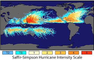
Klaus Flemløse at 07:39 AM on 19 December 2012Hurricanes aren't linked to global warming
Hurricanes Worldwide 1970-2012
Based on data from Maue, RN (2011): Global Frequency . I have studied the development of the number of tropical cyclones during the years January 1970 through September 2012 divided into the Northern and Southern Hemisphere. I would like to thank R.N. Maue for collecting data on tropical cyclones and making data public.
The reason why I have made this analysis is that there have been mistrust in the climate skeptical world to the predictions made by IPCC, and using the data from R.N. Maue it should be possible retrospectively to verify or falsify the prediction made using elementary statistical tools. In addition to this, I was not aware of the differences found below between the Northern and Southern Hemisphere.
The following graph shows the development of the number of tropical cyclones for the years January 1970 through September 2012.

Please use zoom to see details.
The number of Major Hurricanes is significantly growing in the Northern Hemisphere and the Southern Hemisphere, while the Tropical Storms are significantly decreasing in the Southern Hemisphere.
This is in line with IPCC’s prediction of increasing number of Major Hurricanes and a decreasing number of Tropical Storms.
Since hot sea water is the fuel for tropical cyclones, I understand why we will see an increasing number of Major Hurricanes. But I do not understand why the number of Tropical Storm is expected to decrease in the future as they already have done.
There is a positive correlation between then number of Tropical Storm, Hurricane and Major Hurricane within the Northern Hemisphere and the Southern Hemisphere respectively.
If you look at a shorter time span than 43 years, other observations could be made. For the years 2009-2012 the number of tropical cyclones is smaller than expected. However, 4 years are a too few years to put forwards a statement on a general trend. Please be aware that 2012 only includes 9 month so far.
There is an apparent difference in the development of the number of tropical cyclones in the Northern and Southern Hemisphere. There is more tropical cyclone in the Northern Hemisphere, approx. 68% out of the total number of tropical cyclones.
The following picture shows some of the differences between the Northern and Southern Hemisphere in respect of tropical cyclones:
The tropical cyclone prone area is much large in Northern Hemisphere than in the Southern Hemisphere.
When you look at number of Major Hurricanes per month, it appears that there is a remarkable difference in their distribution per month. In the following graph, I have shifted the month to produce frequency distribution by season.

The number of Major Hurricanes for the Northern Hemisphere shows a left skew distribution with a gradually decreasing trend after the peak at the month of September, while the number of Major Hurricanes for the Southern Hemisphere shows a more abrupt decreasing trend after the peak at the month of March.
The tropical cyclone season is 12 months for the Northern Hemisphere and 9 months for the Southern Hemisphere.
There is a 6 and 12 month cyclic variation in the number of tropical cyclones. This follows from the seasonal shift between the Northern and Southern Hemisphere and from a spectral analysis not shown here. The following graph shows the number of Tropical Storms worldwide for the years 2000-2012 by month:

I have used a generalized linear model with a linear trend and two harmonic terms with a cycle and 6 and 12 month to respectively in order to produce the graph above.
Please use zoom to see details.
The variation originates from merging the figures from the Northern and Southern Hemisphere, each with its own cyclic variations. The model explains 65% of the total variation. There is no significant trend and approx. 87 Tropical Storms are expected annually.
In total the number of tropical cyclones in the Southern Hemisphere makes up 32% of the total number of tropical cyclones.
The tropical cyclones prone area in the Southern Hemisphere makes up 42% of the total tropical cyclones prone area. This number is found by counting 5 * 5 degree squares on the map page 505 Marine Safety Information Chapter 35 Tropical Cyclones where tropical cyclones occur. As a first guess, this is probably OK to do so, but a better estimate is wanted.
The number of tropical cyclones in the Southern Hemisphere, calculated in proportion to tropical cyclone prone area, equals 0.42*6690= 2803. The actual number is 2134. This is significantly lower.
This leads to the following questions? 1) Why is the tropical cyclones prone area smaller in the Southern Hemisphere than in the Northern Hemisphere?
2) Why is the number of tropical cyclones in the Southern Hemisphere in proportion to area smaller than the in the Northern Hemisphere?
3) Are these findings in line with IPCC’s predictions?
Atlantic cyclones - biased information As a result of the dominance of US based news media worldwide, the information about the tropical cyclones in the Atlantic region is more dominant than from the other parts of the world. This can lead to an incorrect understanding of trends and causes, since the number of tropical cyclones in the Atlantic region accounts for only 12.6% of the total number of tropical cyclones. The Atlantic Tropical Storms, Hurricanes and Major Hurricanes accounts only for 13.1 %, 12.7 % and 10.8 % of the total number of Tropical Storms, Hurricanes and Major Hurricanes respectively.
More details can be found in the statistical analysis of tropical cyclone data from R.N.Maue Worldwide Hurricane analysis. -
Add Frame and Stone to the List of Papers Validating IPCC Warming Projections
JoeT - "...this site has already commented on the leaked report." Fair enough. Read section 1.3.1 of that leaked report, which discusses the figure in question. First,...the projections from the models were never intended to be predictions over such a short time scale...
Section 1.3.1 goes on to state:There are several additional points to consider about Figure 1.4: (1) the model projections account for different emissions scenarios but do not fully account for natural variability; (2) the AR4 results for 1990–2000 account for the Mt. Pinatubo volcanic eruption, while the earlier ssessments do not; (3) the TAR and AR4 results are based on MAGICC, a simple climate model that attempts to represent the results from more complex models, rather than the actual results from the full three-dimensional climate models; and (4) the bars on the side represent the range of results for the scenarios at the end of the time period and are not error bars.
They also do not, as a rule, include ENSO events except as emergent behavior in some of the models. Finally,In summary, the globally-averaged surface temperatures are well within the uncertainty range of all previous IPCC projections, and generally are in the middle of the scenario ranges. However, natural variability is likely the dominating effect in evaluating these early times in the scenario evaluations...
Emphasis added. --- The GWPF and WUWT arguments about this (still in review) figure ignore natural variability, ignore that the models did not and do not predict ENSO, that earlier models did not include Pinatubo, and that the model ranges shown are not error bars. Climate models are appropriate for predicting 30 year averages, not the next five years in detail, and the skeptics (should have) have been around long enough to know that. In short, the GWPF and WUWT articles are a rather extensive misrepresentation of the figure discussed. "...full of sound and fury, Signifying nothing." -
Klapper at 07:01 AM on 19 December 2012Add Frame and Stone to the List of Papers Validating IPCC Warming Projections
These graphs won't look nearly so convincing by the end of 2012. The original FAR prediction was for 1 degree C from 1990 to 2025 which works out to 0.28C/decade. The actual trend from 1990 to the end of 2010 from GISS is 0.186C/decade. However, the GISS trend to where we are now is only 0.160C/decade (with most of 2012 in). As for reduced GHG growth being the explanation, here are the numbers for CO2: forecast in 1990 from Figure 1.7 of Chapter 1 of FAR (approximately) 398 ppmv; actual for 2010 is 392. Is that drop in GHG emissions enough to drop the trend from 0.28 to 0.19? Hard to say. Methane also was way below forecast. FAR doesn't include a methane future growth graph. However they do note in Table 1.1 of Chapter 1 it was 1720 ppbv and growing at 15 ppbv per year. Actual growth since 1990 is much much lower, growing at less than 4 ppbv between 1990 and 2010 inclusive. Even if I agreed the actual to forecast miss for FAR is explainable by less than forecast GHG growth (I don't, at least not all of the forecast error), it will be harder to argue that going forward if La Nina conditions return in 2013 as currently forecast. (link attached) http://www.cpc.ncep.noaa.gov/products/CDB/Forecast/figf4.shtml The arguments coming back at me will be 2013 won't count because it is a La Nina year (if it does emerge as forecast). However, I have no doubt if you got an El Nino instead (and hence possibly another record) it absolutely would count and be further evidence of man-made climate change. -
Tom Curtis at 06:53 AM on 19 December 2012CO2 effect is saturated
curiousd @189, the modtran model is a Line by Line (LBL) model. That means, for a given specified set of atmospheric conditions it will calculate the IR radiation up or down at any given layer of the atmosphere from 0-70 km altitude; but it will not by itself adjust the atmospheric conditions to adjust for any change in radiative forcing. You, however, can perform the operation manually to determine the effect of a change in well mixed GHG concentration. To do so: 1) Open the model in two separate windows. 2) In the first window, set up your initial conditions. In my example this will be the default conditions of 375 ppmv CO2 and a clear sky tropical atmosphere. Note the Iout for those conditions. 3) In the second window, set "hold water vapor" to "rel hum" if you want to include the water vapour feedback, or to "pressure" if you want no feedbacks. 4) Set the change in CO2 or CH4 levels for the experiment. For my example I will double CO2 to 750 ppmv but hold CH4 constant. 5) Set the temperature offset until Iout matches that in the first window. In my example, with a water vapour feedback, that requires an offset of 1.48 C; or 0.89 C with no feedbacks. Other base settings will require different offsets. For example, for the experiment above except for mid-latitude winters, an offset of 0.77 C is required to maintain radiative equilibrium with no feedbacks; and 1 degree C with a water vapour feedback. It may seem that if you calculated the values for a number of conditions and determined area weighted values based on the area in which those conditions apply across the Earth, you could determine the the net radiative effect with an LBL model. That is not so, firstly because it only incorporates one of many feedbacks; and secondly because in the real atmosphere a change in radiative forcing will also result in changes in lateral energy transfers, so that radiative equilibrium need not be held at each location but only across the whole planet. Of course, it is easy to show with an LBL model that temperatures increases are required under all conditions with an increase in CO2 level to maintain radiative equilibrium so that the planatary Mean Surface Temperature must increase to maintain global radiative equilibrium - but that only tells you that there is an effect, not its precise magnitude. Global Circulation Models fill the gap by automatically changing atmospheric conditions at each location based on change in radiative forcing, changes in temperature, and changes in lateral energy transfer. Unfortunately, I know of no GCM with a convenient web interface like that of ModTran. -
JoeT at 06:25 AM on 19 December 2012Add Frame and Stone to the List of Papers Validating IPCC Warming Projections
KR, As in the link you provided, this site has already commented on the leaked report. This is why I come here -- we're going to see this stuff get played out all over the place. It's important to get the rebuttal out as soon as possible, which was the purpose of Dana's post -- you know, the one that you linked to. AlexC, Yeah I read that section (& only that so far). Frankly I was hoping that Dana could provide more insight than I have, since it is directly related to the post he wrote above. -
scaddenp at 06:22 AM on 19 December 2012Add Frame and Stone to the List of Papers Validating IPCC Warming Projections
Smith - models do volcanic by throwing in eruptions based on global average. This is of course no prediction of exactly what year they will occur in but if this wasnt done, then the lack of volcano aerosols becomes a forcing. Hindcast model can of course use the actual volcano predictions. Similar, solar is put in based on what is expected of the solar cycle though hindcasts can do exactly what happened. ENSO is not really a forcing - it a mode of internal variability. There are models focussed specifically on predicting ENSO because of its meteorological importance but they have very limited success so far. Instead ENSO-like behaviour emerges from the models but this is a chaotic phenomena and so model outputs are not good predictors of actual ENSO. For this (and other issues with internal variability), models have very little skill at decadal or less prediction. They are after all climate models - targeting at predicting what will happen to 30 year averages. What you can expect for climate has be result of averaging many different runs with different initialisation and likely forcing scenarios. -
Doug Bostrom at 06:20 AM on 19 December 2012Add Frame and Stone to the List of Papers Validating IPCC Warming Projections
Further to KR WUWT seems a very efficient anger factory, or at least anger is a major byproduct. In that connection it's worth consideration of research indicating induced emotions may be addictive in some senses of the word. -
Stephen Leahy at 06:15 AM on 19 December 2012Doha Climate Summit Ends With No New CO2 Cuts or Funding
Tks for posting my IPS article. In my personal opinion little will change unless people march on their respective capitals demanding action and refuse to leave until it happens. -
Alex C at 06:07 AM on 19 December 2012Add Frame and Stone to the List of Papers Validating IPCC Warming Projections
Actually never mind, it appears you indeed do have access to the chapter. -
Alex C at 05:57 AM on 19 December 2012Add Frame and Stone to the List of Papers Validating IPCC Warming Projections
JoeT - following KR's good sense to not go into detail on a leaked report, but also to try to help some more with your question, if you have by chance actually been able to obtain a copy of the draft, it would help to read the text accompanying the graphic in the section it appears in. Chapter 1.3.1 is where you'd find that discussion, and where you'll see just how dishonestly WUWT et al are touting Figure 1.4. -
Add Frame and Stone to the List of Papers Validating IPCC Warming Projections
JoeT - And no, it's not a surprise that the folks on WUWT are worked up. That's what they do - take something out of context, or wrong, get worked up, and make a great deal of noise as if it were the "game changer" for climate science. Sigh. "...it is a tale, Told by an idiot, full of sound and fury, Signifying nothing." - Macbeth -
Add Frame and Stone to the List of Papers Validating IPCC Warming Projections
JoeT - As per the IPCC Draft Report Leaked thread, it's entirely inappropriate to be commenting on something that is (a) a draft, and thus likely to change in some aspects before publication due to reviewer comments, and (b) a work that is only publicized due to the violations of confidentiality by one of those reviewers. If you wish to comment or query regarding one (or more) of the published papers the IPCC may refer to in the draft, in regards to the data and conclusions of those published works, that's another matter entirely - please do. -
John Hartz at 04:46 AM on 19 December 2012More ice loss through snowfall on Antarctica
mispelto @#4: Thank you for your prompt response to my initial request. A follow-up question: The first sentence under the header, “Sea-level is rising – that is a fact” of the OP is: A number of processes are relevant for ice-loss in Antarctica, most notably to sub-shelf melting caused by warming of the surrounding ocean water. I presume that the term "sub-shelf melting" is equaivalent to "basil melting." Am I correct? -
curiousd at 04:32 AM on 19 December 2012CO2 effect is saturated
Question: If I run Modtran, the number given as "ground temperature" is, in the tropical atmosphere setting, the same whether I turn off all the greenhouse gases (CO2, water vapor, methane, ozone) or leave defaults. The ground temperature in the tropics is 299.7 K with or without GHG. I don't think this can be right? Help? -
JoeT at 04:13 AM on 19 December 2012Add Frame and Stone to the List of Papers Validating IPCC Warming Projections
Dana, Since it's related to this post, I'm hoping that you would comment on Figure 1.4 in Chapter 1 of the IPPC draft. It seems to have the people at WUWT all worked up (and now my head hurts from reading the comments there). -
dana1981 at 04:11 AM on 19 December 2012Add Frame and Stone to the List of Papers Validating IPCC Warming Projections
Smith, I believe the 1990 IPCC report only used a simple model forced by GHGs, whereas more modern climate models also simulate natural forcings as well as internal variability. -
Smith at 03:30 AM on 19 December 2012Add Frame and Stone to the List of Papers Validating IPCC Warming Projections
Do the GCMs have any component which takes into account variations in solar, volcanic or ENSO? -
Dikran Marsupial at 02:23 AM on 19 December 2012This is Global Warming - A Lesson for Monckton and Co.
BTW, the results will vary according to the dataset you chose, but the 1997-current confidence interval is so large that they will all include a continuation of the long term trend. It is a bit ironic though that the dataset produced by the climate skeptic is the one that shows the most warming! -
Albatross at 02:23 AM on 19 December 2012Add Frame and Stone to the List of Papers Validating IPCC Warming Projections
LarryM @#2, In the interest of full disclosure, those words of mine were inspired by those of Dr. Pierrehumbert, whose AGU talk I had the good fortune to watch in person. PS: Tks for fixing my broken link DB. -
Dikran Marsupial at 02:15 AM on 19 December 2012This is Global Warming - A Lesson for Monckton and Co.
On the topic of "no warming since [insert cherry picked date here]", if you go to the SkS trend calculator and compute the long term trend (1979-present) for the UAH dataset (produced by climate skeptic scientist Roy Spencer), you will get a trend of 0.138 ±0.074 °C/decade (2σ). Next, lets compute the trend from 1997 (the start of the "hiatus"), which turns out to be 0.090 ±0.232 °C/decade (2σ). This is clearly not statistically significant as a zero trend lies within the confidence interval. However, the long term trend of 0.138 °C/decade also lies well within the confidence interval, so the observations are also consistent with there having been no hiatus in warming, but just steady warming at 0.138 °C/decade with some perturbations superimposed on it due to e.g. ENSO. Furthermore, the long term trend of 0.138 °C/decade is closer to the estimated trend than a zero trend is, so the continuation of the long term trend is marginally more consistent with the observed trend than a hiatus. Essentially Monckton is making a statistical error in thinking that the lack of statistically significant warming implies that there is statistically significant evidence for stasis. The statistics are equivocal, they rule out neither a continuation of the underlying warming trend, nor the existence of a hiatus in warming. The difference between the scientific mainstream and the skeptics on this is that mainstream scientific opinion on AGW is not predicated solely on a 16 year trend (there are many other lines of evidence e.g. OHC and a lot of basic physics), whereas the existence of a hiatus is predicated pretty much purely on the lack of a statistically significant warming.
Prev 1004 1005 1006 1007 1008 1009 1010 1011 1012 1013 1014 1015 1016 1017 1018 1019 Next


