


 Arguments


Recent Comments
Prev 1020 1021 1022 1023 1024 1025 1026 1027 1028 1029 1030 1031 1032 1033 1034 1035 Next
Comments 51351 to 51400:
-
Doug Bostrom at 02:17 AM on 27 November 2012It's El Niño
I typically don’t bother investigating global data. Thereby conveniently avoiding the problem of explaining how net ocean heat content is increasing, along with atmospheric temperature. Realistically, that’s the only way anyone can attempt to perform an attribution study on the warming of ocean heat content data--or sea surface temperature data. By ignoring ocean heat content? -
John Hartz at 02:10 AM on 27 November 2012It's El Niño
@Bob Tisdale #58: In your response to Albatross, you conveniently ignore the first question hea had posed, i.e., "Can Mr. Tisdale please direct us to a peer-reviewed paper in a reputable journal in which he has presented his hypothesis and provided supporting evidence of said hypothesis?" If Albatross hadn't beaten me to the punch, I would have asked the same question.I suspect that many other readers would have as well. The ball, as they say, is in your court, Mr, Tisdale. -
Bob Tisdale at 01:33 AM on 27 November 2012It's El Niño
Albatross: “Additinally, would Mr. Tisdale stake his ‘reputation’ (in the 'skeptic' blogosphere) and his hypothesis on the aforementioned paper? He can respond to the last statement and question onthe relevant DK thread.” Curious tactic, Albatross. Nice try, but I have no reason to stake my reputation on the work of someone else. Douglass and Knox (2012) analyzed ocean heat content data on a global basis. I typically don’t bother investigating global data. Why? Looking at global data can be misleading. It’s best to divide the oceans into logical subsets, because coupled ocean-atmospherics processes impact ocean basins in significantly different ways. Realistically, that’s the only way anyone can attempt to perform an attribution study on the warming of ocean heat content data--or sea surface temperature data. Regards -
DSL at 01:30 AM on 27 November 2012WSJ, Sandy, and Global Warming - Asking the Right Questions
KR, the analogy could hold: it's better to pay higher taxes to get better projections than to wait for disaster to strike and have to go to a loan shark. Perhaps it's a stretch. I'm giving this one a 60% chance of being spam. -
Composer99 at 00:48 AM on 27 November 2012We're heading into an ice age
Wait, didn't I see a movie about this once? -
Lionel A at 21:39 PM on 26 November 2012Climate change evident across Europe, confirming urgent need for adaptation
Yes John, things are looking bleak but it seems that our elected remain in cloud cuckoo land juudging by this report from the BBC Energy Bill: Households to fund £7.6bn green investment which policy looks like a cynical attempt to make renewable energy even more unpopular with those who from either NIMBY or ideological precepts are already shouting against wind farms. Roger Harrabin in a side column wrote this:But beyond 2020 Mr Osborne has refused to commit. He doesn't think the UK should be taking a global lead on cutting emissions while competitor economies are not following. And he thinks gas may be a cheap power source in future. So he has rejected the plan for a 2030 target for cleaning up the electricity sector. This 2030 goal is not legally binding, but it is said to be needed if the UK has a reasonable chance of meeting long-term emission targets under the Climate Change Act.
If Mr Osborne is relying on fracking to provide much onshore gas production then he is ignoring many of the dangers that are becoming clear from North American operations. This from contamination of water supplies, potable water will become more expensive than oil by orders of magnitude in the future if these methods continue, increased seismic instability, seepage of 'waste' methane from the ground across workings and the excavation of vast tracts of land to source the special sand used in the process. If the true costs of all those problems are factored in then I doubt very much if gas is a cheap option. There may also be an element pushing for import of Canadian tar-sands oil and even the production of gas from coal. I remember the gas-works with its gas holders storing 'town gas' and also the choking atmosphere of fogs laced with the gaseous effluents from these plants. I saw parts of a programme on TV the other evening which looked at some of the pristine Indian Ocean coastline of Western Australia where plans are afoot to create a vast mineral extraction enterprise and a port facility even larger than the one already on that coast. Madness. I understand that the GWPF has been active in 'advising' the chancellor, and others in our government and is it a coincidence that Peter Lilley was in the audience at Lindzen's Westminster (side room) presentation earlier this year. -
John Russell at 19:37 PM on 26 November 2012Climate change evident across Europe, confirming urgent need for adaptation
I note the article says, "Climate change is projected to increase river flooding [in N Europe]". In fact what's happening in the UK as I write this is pretty conclusive proof that this particular effect is already being observed, so much so that an insurance industry spokesperson on the BBC flagship morning news programme, 'Today', this morning stated that, "flooding is the biggest climate change threat facing UK". "The new normal." 2012 has been wetter than anyone here can remember, some villages seeing record flooding on three occasions over the last six months. The insurance implications are a time bomb for the government. The link to global warming, when finally accepted, is our best hope for finally defeating denial and making joe public and politicians alike face up to the need for real action to cut emissions. -
IanC at 16:33 PM on 26 November 2012It's El Niño
Kayell, Part 1: The main problem here is that you are working with a noisy dataset, and you elected not to apply any statistical test, or even some quantitative measurement. Eyeballing, is not a particular good tool. Your claim that "The ENTIRE global rise above the NINO3.4 occurs at two specific instances. Not at any other time." is demonstrably false. Sphaerica shifted the events at La Nina events and produced a plot similar to yours, so is it La Nina? I played around with the data, and if I allow myself two shifts, the ones that minimizes the overall difference between the two dataset actually occurs in 1984 and 1996. In this case perhaps the best explanation is volcanoes? Simply put, without doing any rigorous analysis, you cannot not rule out other possibilities, so you are not entitled to claim that your interpretation is correct. More on part 2 later. -
Paul W at 15:28 PM on 26 November 2012Climate change evident across Europe, confirming urgent need for adaptation
Doug H @2 I think that you have correctly labeled the current politics in developed nations. We need to move towards crisis management of the situation at each available pretext as at these times what is considered possible is more up for grabs. As I see it the technical situation is a good deal better than the political one. -
Doug Hutcheson at 14:03 PM on 26 November 2012Climate change evident across Europe, confirming urgent need for adaptation
Paul W @ 1If we stopped burning FF today, civilisation (in developed countries at least) would fall apart. If we continue burning FF unabated, projections tell us that global civilisation will fall apart.- Is there a FF trajectory that will save civilisation in advanced nations, while allowing development of Third World nations?
- Is there any chance of developed nations adopting such a FF trajectory>
-
Doug Hutcheson at 13:50 PM on 26 November 2012President Obama's Statement on Climate Change
Q Sounds like you're saying, though, in the current environment, we're probably still short of a consensus on some kind of attack. THE PRESIDENT: That I'm pretty certain of.
Really? You think Republicans are not in a consensus with Democrats about Global Warming? Well, I never! -
michael sweet at 12:51 PM on 26 November 2012We're heading into an ice age
Tom, Thanks for the references. I checked the Rutgers snow lab and only 0.16 million km2 of snow cover remained in week 31 this year, not counting Greenland. At least the anomaly will stop going up, since all the snow is gone. A lot of permafrost is also melting, but I do not have a reference at hand. NSIDC probably has something. Robert, what is your response to this data? -
Tom Curtis at 10:06 AM on 26 November 2012We're heading into an ice age
Further to Michael Sweet's comment @269, Milankovitch cycles are supposed to initiate glacials by cool summers failing to melt snow, thereby increasing albedo with a progressive cooling over time as a result. Merely piling more snow onto a preexisting ice cap will not increase albedo, and so cannot initiate an glacial. As it happens, with a warmer world, NH summer snow extent has decreased significantly, the reverse of that required to initiate a new glacial (July shown): What is more, ice caps are not accumulating ice on Baffin Island, rather they are melting.
Zdanowicz et al (2012) report:
What is more, ice caps are not accumulating ice on Baffin Island, rather they are melting.
Zdanowicz et al (2012) report:
"At latitude 67°N, Penny Ice Cap on Baffin Island is the southernmost large ice cap in the Canadian Arctic, yet its past and recent evolution is poorly documented. Here we present a synthesis of climatological observations, mass balance measurements and proxy climate data from cores drilled on the ice cap over the past six decades (1953 to 2011). We find that starting in the 1980s, Penny Ice Cap entered a phase of enhanced melt rates related to rising summer and winter air temperatures across the eastern Arctic. Presently, 70 to 100% (volume) of the annual accumulation at the ice cap summit is in the form of refrozen meltwater. Recent surface melt rates are found to be comparable to those last experienced more than 3000 years ago. Enhanced surface melt, water percolation and refreezing have led to a downward transfer of latent heat that raised the subsurface firn temperature by 10°C (at 10 m depth) since the mid-1990s. This process may accelerate further mass loss of the ice cap by pre-conditioning the firn for the ensuing melt season. Recent warming in the Baffin region has been larger in winter but more regular in summer, and observations on Penny Ice Cap suggest that it was relatively uniform over the 2000-m altitude range of the ice cap. Our findings are consistent with trends in glacier mass loss in the Canadian High Arctic and regional sea-ice cover reduction, reinforcing the view that the Arctic appears to be reverting back to a thermal state not seen in millennia."
Fisher et al (2012) report:"There has been a rapid acceleration in ice-cap melt rates over the last few decades across the entire Canadian Arctic. Present melt rates exceed the past rates for many millennia. New shallow cores at old sites bring their melt series up-to-date. The melt-percentage series from the Devon Island and Agassiz (Ellesmere Island) ice caps are well correlated with the Devon net mass balance and show a large increase in melt since the middle 1990s. Arctic ice core melt series (latitude range of 67 to 81 N) show the last quarter century has had the highest melt in two millennia and The Holocene-long Agassiz melt record shows that the last 25 years has the highest melt in 4200 years. The Agassiz melt rates since the middle 1990s resemble those of the early Holocene thermal maximum over 9000 years ago."
Sharp et al (2011) report:"Canada's Queen Elizabeth Islands contain ∼14% of Earth's glacier and ice cap area. Snow accumulation on these glaciers is low and varies little from year to year. Changes in their surface mass balance are driven largely by changes in summer air temperatures, surface melting and runoff. Relative to 2000–2004, strong summer warming since 2005 (1.1 to 1.6°C at 700 hPa) has increased summer mean ice surface temperatures and melt season length on the major ice caps in this region by 0.8 to 2.2°C and 4.7 to 11.9 d respectively. 30–48% of the total mass lost from 4 monitored glaciers since 1963 has occurred since 2005. The mean rate of mass loss from these 4 glaciers between 2005 and 2009 (−493 kg m−2 a−1) was nearly 5 times greater than the 1963–2004 average. In 2007 and 2008, it was 7 times greater (−698 kg m−2 a−1). These changes are associated with a summer atmospheric circulation configuration that favors strong heat advection into the Queen Elizabeth Islands from the northwest Atlantic, where sea surface temperatures have been anomalously high."
Finally, Schrama et al, (2011) report:"In this paper we discuss a new method for determining mass time series for 16 hydrological basins representing the Greenland system (GS) whereby we rely on Gravity Recovery and Climate Experiment (GRACE) mission data. In the same analysis we also considered observed mass changes over Ellesmere Island, Baffin Island, Iceland, and Svalbard (EBIS). The summed contribution of the complete system yields a mass loss rate and acceleration of −252 ± 28 Gt/yr and −22 ± 4 Gt/yr2 between March 2003 and February 2010 where the error margins follow from two glacial isostatic adjustment (GIA) models and three processing centers providing GRACE monthly potential coefficient sets. We describe the relation between mass losses in the GS and the EBIS region and found that the uncertainties in all areas are correlated. The summed contribution of Ellesmere Island, Baffin Island, Iceland, and Svalbard yields a mass loss rate of −51 ± 17 Gt/yr and an acceleration of −13 ± 3 Gt/yr2 between March 2003 and February 2010. The new regional basin reconstruction method shows that the mass loss within the southeastern basins in the GS has slowed down since 2007, while mass loss in western basins increased showing a progression to the north of Greenland."
The reported ice mass loss for Baffin Island alone is -10.8 Gt/year. In sum, ice sheets and ice caps in the Canadian archipelago are loosing ice with warmer weather, the opposite to the effect predicted by Robert. His theory is therefore falsified. -
Paul W at 09:08 AM on 26 November 2012Climate change evident across Europe, confirming urgent need for adaptation
While this is a good report and I don't doubt it's findings the forward projections of adapting seem short sighted. Do we stop all building below 25 meters above sea level so we can focus our future resources on what will still be left. In order to be able to adapt I would have thought a move to directly ASAP ending fossil fuel use is needed. A bit more than just cutting back! Followed by moving towards those energy methods that put carbon back in the ground at least to some extent. Since the 2 degree C so called safety margin is being found to have less and less meaning as we are now headed towards well over 3 C. Also 1.5 degrees C increase over the pre industrial level (where we would get to if we stopped fossil fuel use now) looks more like the disaster point. The equilibrium sea level rise is more than the global economy can afford to adapt to. So logically this implies that prevention is now even more important than adaption. The focus towards adaption while pragmatic is still well short of pragmatic enough. The lameness about not (or giving up on) reducing CO2's rise to zero rise is more than a little "interesting". -
michael sweet at 07:52 AM on 26 November 2012We're heading into an ice age
Robert, Why did scientists stop producing papers that you can cite over a decade ago? Can you cite a paper that suggests that warm temperatures over Baffin Island initiated the ice ages? The Milankovitch cycles are generally presumed to initiate the ice ages by cooling the Northern Hemisphere. This slow cooling allows snow to accumulate in Northern Canada. Please provide a recent citation that claims warm water in the Baffin area initiated the ice ages. Your supposition that an ice free arctic, deduced by eyeballing the Cyrosphere Today graph, will cause snow to accumulate is the opposite of the snow records observed at the National Snow lab at Rutgers. Those records show a dramatic decrease in the summer snow levels across the Northern Hemisphere. -
IanC at 07:35 AM on 26 November 2012It's El Niño
Bob, Yes I understand how the PDO index is constructed. The point is that you can get an idea of how the rest of the basin varies by regressing the SST anomaly (SSTA) onto the PDO index to extract the inter-decadal variation that is associated with the PDO. While the PDO index is constructed using N. pacific data, the subsequent regression demonstrate that there is strong evidence that the tropical Pacific ocean vary coherently with the N Pacific. There are ample evidences of a basin-wide inter-decadal oscillation. Here are two: Zhang et al. 1997, did an EOF with SSTA of the entire basin . For the low-pass filtered (c.f. fig 3) computation, the dominant mode has a similar spatial structure as the one depicted on the JISAO website. Furthermore, the principal component varies similar to the PDO index. Shakun and Shaman 2009 showed that if you do a similar analysis with data from the southern Pacific, and the principal component is again highly correlated to PDO index. Furthermore, they again recover similar spatial structure across the entire pacific ocean. Conclusion is that no matter which way you look at it, there appears to be a robust inter-decadal mode of variability in the pacific. The main point is that although looks like the ENSO, there are two distinctive differences: - 20-30 years for PDO vs 6-18 months for ENSO. - ENSO is most prominent in the tropics, while for PDO the responses in N. Pacific and Tropics are similar in amplitdue. PDO index is one of the ways you can characterize this oscillation, the same way SSTA from a limited region (e.g. NINO3.4) can characterize the state of a basin wide oscillation (ENSO). Your assertion that the PDO index has no relation to the SSTA is wrong, because one cannot interpret the PDO index (principal component) without concurrently consider the spatial structure (EOF), simply because a mode of variability in an EOF/PC analysis is actually represented by EOF*PC. Here you'll see that you have to choose a normalisation, because if you take c*PC and EOF/c (c is a constant) you get the same thing when you multiple the two together. Take a look at the EOF and PC for the PDO (from Deser et al. 2010 : Notice that the units for the top panel (the EOF) is in degrees per standard deviation. The PC (PDO index) is given in standard deviation, so to recover the SSTA you indeed have to multiply the two to get the right units.
The average of the EOF in the N. Pacific definitely negative (<0), but probably no smaller than -0.4. Taking the average you get -0.2 degrees C per SD, which is exactly the scaling factor you found.
You are technically correct in saying that "PDI index is not SSTA", but you are completely missing the point: the PDI index, in conjunction with the EOF, does in fact describe SST variations.
In the eastern pacific (as you defined it), if you average the EOF you probably get 0.3 degree per SD. Between 1980-1985 and 2005-2010, the PDO index went from +1 to -0.5, so
ΔSST= -1.5 * 0.3 = -0.45 degrees C
you can probably argue for a couple of tenths either way, but the key is that the change in eastern Pacific due to PDO is large enough to explain the lack of warming in the eastern pacific.
You said "There’s no flaw in my reasoning or understanding of what causes the PDO. Using different methods, Di Lorenzo came to the same conclusion."
In your blog post, the crux of your argument is fig7, where you plotted 85-month smoothed PDO - Nino3.4 as well as N. Pacific air pressure index (NPI). The figure shows a good correlation between the two series, which you then said "Is The Difference Between NINO3.4 SST Anomalies And The PDO A Function Of Sea Level Pressure?, the answer appears to be yes."
(1) Nowhere in your analysis did you present an argument of causality..
(2) In addition, you applied a 85-month filter, which will likely wipe out any signal in ENSO. In fact if you plot a 85-month smoothed PDO index against the NPI I suspect you will get just as good of a result, so likely what you have found is a good correlation between PDO index and NPI.
Can you post the reference to di Lorenzo?
Final point:
In your original post, you said ‘According to numerous peer-reviewed papers, surface temperatures respond proportionally to El Niño and La Niña events'. I think the reasonable interpretation, based on your wording, is that numerous papers concluded that surface temperatures respond proportionally to El Niño and La Niña events; this is very different from papers assuming the same.
Notice that the units for the top panel (the EOF) is in degrees per standard deviation. The PC (PDO index) is given in standard deviation, so to recover the SSTA you indeed have to multiply the two to get the right units.
The average of the EOF in the N. Pacific definitely negative (<0), but probably no smaller than -0.4. Taking the average you get -0.2 degrees C per SD, which is exactly the scaling factor you found.
You are technically correct in saying that "PDI index is not SSTA", but you are completely missing the point: the PDI index, in conjunction with the EOF, does in fact describe SST variations.
In the eastern pacific (as you defined it), if you average the EOF you probably get 0.3 degree per SD. Between 1980-1985 and 2005-2010, the PDO index went from +1 to -0.5, so
ΔSST= -1.5 * 0.3 = -0.45 degrees C
you can probably argue for a couple of tenths either way, but the key is that the change in eastern Pacific due to PDO is large enough to explain the lack of warming in the eastern pacific.
You said "There’s no flaw in my reasoning or understanding of what causes the PDO. Using different methods, Di Lorenzo came to the same conclusion."
In your blog post, the crux of your argument is fig7, where you plotted 85-month smoothed PDO - Nino3.4 as well as N. Pacific air pressure index (NPI). The figure shows a good correlation between the two series, which you then said "Is The Difference Between NINO3.4 SST Anomalies And The PDO A Function Of Sea Level Pressure?, the answer appears to be yes."
(1) Nowhere in your analysis did you present an argument of causality..
(2) In addition, you applied a 85-month filter, which will likely wipe out any signal in ENSO. In fact if you plot a 85-month smoothed PDO index against the NPI I suspect you will get just as good of a result, so likely what you have found is a good correlation between PDO index and NPI.
Can you post the reference to di Lorenzo?
Final point:
In your original post, you said ‘According to numerous peer-reviewed papers, surface temperatures respond proportionally to El Niño and La Niña events'. I think the reasonable interpretation, based on your wording, is that numerous papers concluded that surface temperatures respond proportionally to El Niño and La Niña events; this is very different from papers assuming the same.
-
Robertgj at 07:20 AM on 26 November 2012We're heading into an ice age
Sorry, I omitted the Field et al. reference for the absence of temperate climate trees in northern Germany: Field, M.H., Huntley, B., and Müller, H., 1994, Eemian climate fluctuations observed in a European pollen record: Nature, v. 376, p. 779-783. -
Robertgj at 07:05 AM on 26 November 2012We're heading into an ice age
As a wise man once said: “ It’s not what we don’t know that slows our progress, it’s what we think we know that isn’t true.” Conventional wisdom says that the last ice age began by cooling in the Baffin Island area, but a detailed examination of the evidence shows that it began by a large precipitation increase under warmer oceanic conditions. Please note that the Penney and Barnes ice caps on Baffin Island and the Devon Island ice cap have survived to this day, and would surely grow if they had a large moisture supply. To argue the next ice age climate change about the year 2020, we need to consider the known evidence for the last initiation, explain that evidence, and apply that explanation to the next decade or so. There are two parts to this argument: (1) the evidence, and (2) the explanation. Here are the references for Part 1: For a warmer ice-free Baffin Bay precisely when new glaciation began: Koerner, R.M., Bourgeois, J.C., and Fischer, D.A., 1988, Pollen analysis and discussion of time-scales in Canadian ice cores: Annals of Glaciology, v. 110, p. 85-91. For extreme warmth in the Labrador Sea east of southern Baffin Island: Fillon, R.H., 1985, Northwest Labrador Sea Stratigraphy, sand input and paleoceanography during the last 150,000 years: in Andrews, J.T., ed., Quaternary Environments: Eastern Canadian Arctic, Baffin Bay and Western Greenland, Boston: Allen and Unwin, p. 210-247. For the ~500 year pulse of clay and hematite showing heavy regional precipitation and erosion: Adkins, J.F., Boyle, E.A., Kegwin, L., and Cortijo, E., 1997, Variability of North Atlantic thermohaline circulation during the last interglacial period: Nature, v. 390, p. 154-156. For the glacioeustatic sea level fall in that ~500 year interval, see the Cane Vale B transect in fig. 2 in : Johnson, R.G., 2001, Last interglacial sea stands on Barbados and an early anomalous deglaciation timed by differential uplift: Journal of Geophysical Research, v. 106, no. C6, p. 11543-11551. In Part 2, the key to the explanation was the collection of data in 2011 using the ESA ENVIISAT system that showed that atmospheric pressure differences dominate the flow of polar water into Baffin Bay, and the realization that a lower polar pressure could cause an ice-free Labrador Sea and Baffin Bay. The ice-free Baffin Bay in the absence of polar water stratification has a perfect analog in the ice-free Greenland Sea extending northward to Svalbard to where the ice on the polar ocean can form due to the river discharge stratification there. The timing of year 2020 is obtained from the web site: http://arctic.atmos.uiuc.edu/cryosphere/ where you can draw your own curve through the points of seasonal minimum sea-ice area, a curve that I extrapolate to zero about 2020. The reason why and when the warm Baffin-Labrador Sea conditions ended, together with the other physical, meteorological and oceanic parts of the explanation, are embodied in a paper too long for this forum and which was rejected recently by “Geology,” perhaps because of the wise man effect, above. The next ice age may not last for thousands of years under rising CO2 concentrations, but a short-term validation of this prediction will make Canada and northern Eurasia much more unpleasant and will result in very difficult political and societal problems. It would be better to recognize the coming change sooner than later. -
Doug Bostrom at 06:59 AM on 26 November 2012It's El Niño
Further to Bob's reply at #53, I don't see what relevance Bob's ideas have to global warming. If global surface temperature is increasing along with global ocean heat content more or less simultaneously on a scale greater than a decade or so, what's the relevance of ENSO to the long term problem of global warming? "Increasing global ocean heat content" means the net warmth of the entire ocean is increasing, which in turn means the notion of energy shifting from one portion of the global ocean to another to produce the false impression of warming doesn't pan out. Which I suppose is the point of the rebuttal. Presuming that Bob is asserting that the E. tropical Pacific is responsible for warming the entire remaining planet on scales greater than a decade, something else I don't understand is how the E. tropical Pacific could do so without becoming more than a touch cooler itself. It seems we ought to be seeing a relatively drastic cooling of the region but we don't. If anything, we see the opposite. -
Tom Curtis at 06:24 AM on 26 November 2012Global Surface Temperature: Going Down the Up Escalator, Part 1
setit-bagain @131 objects to the discussion of paleo evidence because "... of the lack of sufficient quantity of evidences about oceans. The oldest probes of ocean bottom are younger than 250 millions of years." This is rather odd because it was he(?) that introduced discussion of paleo evidence to this thread. If he now objects to it, his entire discussion @115 is not only of topic, but hypocritical. Not that he(?) shirks from hypocrisy elsewhere in his discussion. Given the chart he introduced @110, any questioning by him of the quality of data presented by others is hypocritical in the extreme. That is obvious to anybody familiar with the climate science debate and data, but may be less so to casual readers. For the later, therefore, I have overlain the twentieth century record from that chart with the twentieth century record from thermometer measurements (Gistemp): At first glance, it may seem that Cliff Harris and Randy Mann (the authors of that piece of fiction) at least got the mid twentieth century temperatures correct. That is not so. They are as inconsistent in temporal scale as they are incorrect about temperatures, and the dip they show is purportedly the slight cooling in global temperatures that followed the eruption of Mount Pinatubo.
Anybody who seriously presents the Harris/Mann graph as having accurate information thereby brands themselves as having no concern about accuracy of information provided the propaganda puff pieces they cite support their predisposed position. Setit-bagain has repeatedly so branded himself, not only with the Harris/Man graph but also with claims that the Norse in Greenland grew crops and orchards (they in fact imported grains and fruit, purchasing them with furs); with his citation of an obsolete temperature record of the phanerozoic; and with his neglect to mention (if he even knew) about the fainter sun in the early phanerozoic.
Now he brands himself again by insisting that correction for acidification is a "patch against the uncomfortable truth". This despite the fact that the authors of the phanerozoic temperature record he cites accept the validity of the correction.
Having so thoroughly branded himself, is there really need to respond further to his obvious attempts at propaganda in lieu of scientific discussion?
At first glance, it may seem that Cliff Harris and Randy Mann (the authors of that piece of fiction) at least got the mid twentieth century temperatures correct. That is not so. They are as inconsistent in temporal scale as they are incorrect about temperatures, and the dip they show is purportedly the slight cooling in global temperatures that followed the eruption of Mount Pinatubo.
Anybody who seriously presents the Harris/Mann graph as having accurate information thereby brands themselves as having no concern about accuracy of information provided the propaganda puff pieces they cite support their predisposed position. Setit-bagain has repeatedly so branded himself, not only with the Harris/Man graph but also with claims that the Norse in Greenland grew crops and orchards (they in fact imported grains and fruit, purchasing them with furs); with his citation of an obsolete temperature record of the phanerozoic; and with his neglect to mention (if he even knew) about the fainter sun in the early phanerozoic.
Now he brands himself again by insisting that correction for acidification is a "patch against the uncomfortable truth". This despite the fact that the authors of the phanerozoic temperature record he cites accept the validity of the correction.
Having so thoroughly branded himself, is there really need to respond further to his obvious attempts at propaganda in lieu of scientific discussion?
-
Albatross at 03:55 AM on 26 November 2012It's El Niño
Intriguing discussion. Can Mr. Tisdale please direct us to a peer-reviewed paper in a reputable journal in which he has presented his hypothesis and provided supporting evidence of said hypothesis? Talking of journal papers, I think it safe to assume that Mr. Tisdale agrees with and understands exactly how Douglass and Knox (2012) analyzed the OHC data. Additinally, would Mr. Tisdale stake his "reputation" (in the "skeptic" blogosphere) and his hypothesis on the aforementioned paper? He can respond to the last statement and question onthe relevant DK thread. -
vrooomie at 02:45 AM on 26 November 2012Newsflash: A 4°C warmer world can, and must be, avoided - World Bank
Dan, that could certainly be one reason...;) -
Bob Tisdale at 23:44 PM on 25 November 2012It's El Niño
doug_bostrom asked, “…is it the claim of Bob Tisdale that there's no trend in global ocean heat content, or if anything that global ocean heat content has in fact decreased as global surface temperature has increased?” Nope. -
Bob Tisdale at 23:42 PM on 25 November 2012It's El Niño
IanC says: “PDO (regardless the physical cause) is fundamentally a basin-wide mode of variability over inter-decadal timescale.” Incorrect, IanC. The PDO Index is derived from (it's the leading principal component of) the sea surface temperature anomalies of the North Pacific, north of 20N, after the global sea surface temperature anomalies have been removed. By definition it cannot be a “basin-wide mode of variability over inter-decadal timescale” because it does not represent the data of the basin. JISAO includes the basin maps to show the “El Niño like” spatial patterns in the North Pacific (north of 20N). To help with your bearings, look for Hawaii on the maps. It's at about 20N latitude. IanC says: “A change of PDO index from 1 to 0 corresponds to a relative cooling of 0.4 degrees over 1982-2010, which is large enough to account of the lack of warming in eastern pacific.” Also incorrect, IanC. The PDO does not represent the sea surface temperature anomalies of the North Pacific and it definitely does not represent the sea surface temperatures of the East Pacific. Over decadal timescales the PDO is inversely related to the sea surface temperature anomalies of the North Pacific: http://i52.tinypic.com/15oz3eo.jpg Please also detail with data how you determined “A change of PDO index from 1 to 0 corresponds to a relative cooling of 0.4 degrees over 1982-2010…” when the PDO does not represent sea surface temperature anomalies in any way, shape or form. IanC says: “Your point (d): Is this post the basis of your point? If so, your reasoning is fundamentally flawed, as a correlation does not imply causation, it is equally, if not more, likely that SST anomaly causes a change in air pressue.” There’s no flaw in my reasoning or understanding of what causes the PDO. Using different methods, Di Lorenzo came to the same conclusion. IanC says: “Regarding ENSO: Your references all appear to be linear regression analyses, which assume that surface temperature respond proportionally to El Niño and La Niña, which is very different from your assertion in post 40, where you said: ‘According to numerous peer-reviewed papers, surface temperatures respond proportionally to El Niño and La Niña events, but it’s obvious they do not.’” You’ll need to expand on why it’s different, IanC. -
Tom Curtis at 21:42 PM on 25 November 2012It's El Niño
It is interesting to not the varying scales used by Kayell @49. He uses at least three (possibly four) different inconsistent scales for the Global - East Pacific SST. Not until the sixth graph (the one showing timing of El Nino events, and volcanoes) that he shows a close approximation to the correct scale. His inconsistent scaling is unexplained, and is germain. -
Doug Bostrom at 18:06 PM on 25 November 2012It's El Niño
Could I get a point of clarification? Stripping away the forest of verbiage that's sprouted up here and instant treading lightly on brass tacks, is it the claim of Bob Tisdale that there's no trend in global ocean heat content, or if anything that global ocean heat content has in fact decreased as global surface temperature has increased? -
Kayell at 15:48 PM on 25 November 2012It's El Niño
DB (moderator) says: "If you walk away when a flaw is identified in your analysis then you shouldn't be surprised if others find your argument unconvincing. As you are challenging the mainstream scientific position, the onus is on you to show that your argument is solid. That is the way science works." What did you have in mind? Where's the flaw? -
michael sweet at 11:02 AM on 25 November 2012We're heading into an ice age
Robert, Can you provide a citation to peer reviewed data supporting your wild hand waving or is this original thought of yours unsupported by actual data? -
skywatcher at 10:22 AM on 25 November 2012Global Surface Temperature: Going Down the Up Escalator, Part 1
Setit-Bagain, your off-topic misconceptions about early geological history are very entertaining (recommended reading might be Wikipedia on the Faint Young Sun before moving on to more advanced literature such as Royer et al 2004. Re-read Tom's second point in #126. Having opened your musings on this thread with the staggering misconception with the view that Greenland was actually "green" 1000 years ago (as opposed to mostly white with small green patches around the edges in summer, very similar to today), I wonder if you actually have any on-topic opinion about the Escalator? It's such a great graph. Setit-bagain, do you accept that the world is still warming, or do you prefer non-significant trends? [As an absolute aside, Eiríkr Þorvaldsson would probably be laughing if he knew that his marketing trick was still fooling people, a millennium later!] -
Daniel Bailey at 09:55 AM on 25 November 2012We're heading into an ice age
Again, human fossil fuel bolus injections were not around in previous interglacials so you still are comparing apples to guavas. I'll trust what the science has to say about this current interglacial. And the verdict is that ice ages are not recurring anytime soon. Not while human activities are acting to retard their formation. Not on our watch, as they say. See? No waiting necessary. -
Daniel Bailey at 09:47 AM on 25 November 2012Newsflash: A 4°C warmer world can, and must be, avoided - World Bank
I believe John Russell was engaging in hyperbole... -
vrooomie at 08:37 AM on 25 November 2012Newsflash: A 4°C warmer world can, and must be, avoided - World Bank
John Russell@7: other than your obvious ad hominem, got anything actually *meaningful* to add to the discussion? The World Bank is not lily-white, as are all banks to a lesser or greater degree, but they do tend to follow along with establish science more so than most. As for being labelled a "warmist?" Given the *large* amount of reputable, refereed information available (including the Koch Bros-funded BEST study) that *robustly* supports the theory of rapid AGW, I'm happy to called such, for the truth is...we ALL are getting warmer: deniers, tin-hatters, socialists, atheists, World Bankers, and "watermelons" alike. -
IanC at 07:31 AM on 25 November 2012It's El Niño
Bob, "I assume this is a discussion of the East Pacific data. The appearances are not in question. The trends are." The trend is going to be affected by the particular realization of internal variability, particularity since you are looking at a 30 year long trend, any inter-decadal variability will affect the trend. Your observation is "the actual trend differs from the ensemble trend", from which you drew the conclusion that "models are wrong". For your assertion to be valid, you have to show that the discrepancy is larger than what internal variability can account for. You haven't done the necessary step. Regarding PDO: PDO (regardless the physical cause) is fundamentally a basin-wide mode of variability over inter-decadal timescale. In the above the left is the positive phase, while the right is the negative phase.
You are correct that the most significant change occurs in the northwestern pacific, but there is also a significant component in the eastern pacific as well: the amplitude of the mode is 0.4 degrees for the eastern pacific.
Furthermore the PDO index went from positive to negative over 1980-2010
In the above the left is the positive phase, while the right is the negative phase.
You are correct that the most significant change occurs in the northwestern pacific, but there is also a significant component in the eastern pacific as well: the amplitude of the mode is 0.4 degrees for the eastern pacific.
Furthermore the PDO index went from positive to negative over 1980-2010
 A change of PDO index from 1 to 0 corresponds to a relative cooling of 0.4 degrees over 1982-2010, which is large enough to account of the lack of warming in eastern pacific.
Your points (a)-(c) ( which you've written about here ) refer to how PDO index relates to the actual temperature anomaly. I don't see the relevance here.
Your point (d): Is this post the basis of your point? If so, your reasoning is fundamentally flawed, as a correlation does not imply causation, it is equally, if not more, likely that SST anomaly causes a change in air pressue.
Regarding ENSO:
Your references all appear to be linear regression analyses, which assume that surface temperature respond proportionally to El Niño and La Niña, which is very different from your assertion in post 40, where you said: "According to numerous peer-reviewed papers, surface temperatures respond proportionally to El Niño and La Niña events, but it’s obvious they do not."
A change of PDO index from 1 to 0 corresponds to a relative cooling of 0.4 degrees over 1982-2010, which is large enough to account of the lack of warming in eastern pacific.
Your points (a)-(c) ( which you've written about here ) refer to how PDO index relates to the actual temperature anomaly. I don't see the relevance here.
Your point (d): Is this post the basis of your point? If so, your reasoning is fundamentally flawed, as a correlation does not imply causation, it is equally, if not more, likely that SST anomaly causes a change in air pressue.
Regarding ENSO:
Your references all appear to be linear regression analyses, which assume that surface temperature respond proportionally to El Niño and La Niña, which is very different from your assertion in post 40, where you said: "According to numerous peer-reviewed papers, surface temperatures respond proportionally to El Niño and La Niña events, but it’s obvious they do not."
-
Pete Dunkelberg at 06:45 AM on 25 November 2012President Obama's Statement on Climate Change
This article, Some Electoral Math For ‘All You Climate People’, first points out that the GOP gained very strong support in the recent election compared to the 2008 election in "coal counties". It also points out that coal miners are people with families and they need jobs just like anyone else. Following through the comments, it seems that the people in coal country were turned against the president by political adds financed largely by the Koch brothers, and the counties in question are mostly in "red states" anyway. But to come to my point: this comment has a good idea. If we are to make the big, needed changesIf they ever get to the point of having the cojones to simply list the many compelling reasons why the U.S. and ultimately the world, must quickly and, yes, drastically transfer to a low carbon economy then it seems to me that an incredibly obvious part of the Big Pitch would be a ‘First In Line’ component. First In Line would send all sorts of monetary and training incentives and prioritizations EXACTLY towards the companies and workers in the fossil fuel industries. They already possess a huge batch of trained, skilled ‘energy infrastructure’ workers.
Let's start this with coal miners. By the way, if you have the time, note the difference between the above discussion and this one at Neven's. -
Pete Dunkelberg at 06:16 AM on 25 November 2012President Obama's Statement on Climate Change
...and then working through an education process that I think is necessary....
Yes, starting at the Whitehouse!...a discussion, a conversation across the country about what realistically can we do long term to make sure that this is not something we're passing on to future generations...
Discussion good, thinking this is just a potential problem for future generations bad, very bad. Has no one yet told you that drought and crop failure will be very hurtful in the world your own children will live in?I don't know what either Democrats or Republicans are prepared to do at this point,....
Not much if you just talk to electeds in congress. A lot, I think, if you go over their heads and talk seriously to the people as a leader. (First you need that education. Pa'lante!)...the American people right now have been so focused, ... on our economy....
Hello? Who was it that didn't even mention climate during the election campaign?This one is hard....
It is probably impossible unless you figure out that we must "solve" climate and jobs together, and you must show some leadership, and spend to create jobs. -
Robertgj at 05:40 AM on 25 November 2012We're heading into an ice age
Daniel, all facts are not relevant, but this fact is: lower temperatures did not trigger the last ice age, 120,000 years ago. The severe climate with its winter sea ice vanished in northern Baffin Bay in a warming implied by unusual willow pollen and the more negative oxygen isotope ratios at the bedrock base of the Devon ice core (Koerner et al, 1988). East of southern Baffin Island at the site of sediment core HU75-58, 60% of the foraminifera were warm water species, now absent in today’s cold seas (Fillon, 1985). The warmer waters west of Greenland imply a cyclonic circulation and cloudy weather with heavy snowfall over Baffin Island, Quebec and Labrador. The heavy precipitation increased erosion that is confirmed by the large abrupt ~500 year pulse of hematite-containing sediment in a deep-sea record (Adkins et al., 1997). During that 500-year interval glacioeustatic sea level fell about 2.5 m, as measured on presently uplifted Barbados (Johnson, 2001) at the Cane Vale B site. Ice-free seas west of Greenland may again trigger an ice age. Ice-free seas can be established only if there is no sea-surface stratification there, and that only if the less dense polar water inflow through the Nares Strait ceases, and that only if the perennial sea ice on the polar ocean goes away, consequently enabling a warmer polar atmosphere in winter and a lower atmospheric pressure that reduces or eliminates polar water inflow through the Nares Strait. Indeed, the increasing atmospheric CO2 may eventually terminate our next ice age hundreds of years later, but during the first century after year 2020 when the perennial polar sea ice is gone, it is very likely that Canada will see widespread thickening snow fields on now bare summer tundra, and temperate climate trees in northern Europe will vanish, like their pollen vanished from the record 120,000 years ago (Field et al., 1994). You only need to wait another ten years to see if this triggering prediction is right or wrong. -
Philippe Chantreau at 03:31 AM on 25 November 2012Global Surface Temperature: Going Down the Up Escalator, Part 1
I don't know what kind of a vision of a conversation you can possibly have SB. I know that SkS is about the scientific litterature found in peer-reviewed publications. They are usually called articles or papers, not books. As a whole, they constitute the weight of the evidence. Your last posts are so confused as to be virtually impossible to sort out. English is not my first language either, I make efforts in order to establish effective communication. If you can't be bothered making that kind of effort, then indeed you are wasting your time here. If you are not willing to consider the weight of the evidence or to examine scientific references provided, you are also wasting your time. Perhaps you should have looked closer at the comment policy and the various statements that explain what is done here before piping up. There are more scientific references on SkS than any other web-site on the subject of climate change. If that's not where your interest is, there are many other sites with different outlooks. What you do next is up to you, but SkS will remain anchored in the published science litterature and the comment policy will remain the same, as will the English language. -
Kayell at 03:26 AM on 25 November 2012It's El Niño
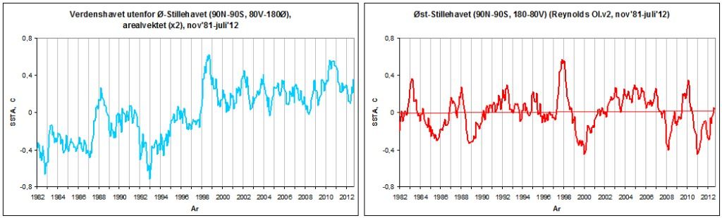
PART 2 We continue to explore the satellite-based SST data from Reynolds OI.v2 (Nov'81-Oct'12) and see what patterns it might reveal. This graph, global SSTA: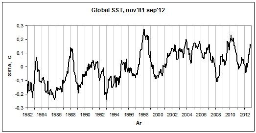 is the area weighted sum of the two following subsets:
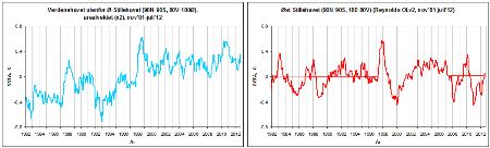 (left: The World Ocean Outside the East Pacific - 90N-90S, 80W-180E; 2/3rds of the global ocean
right: The East Pacific Ocean - 90N-90S, 180-80W; 1/3rd of the global ocean)
It was when looking at these two SSTA graphs, together producing the global graph above, that Tisdale had his eureka moment.
If we superimpose the two global subset graphs above on each other, we see quite clearly specifically where the discrepancy between the East Pacific and the global SSTA curve (recalling Part 1) primarily arises:
(left: The World Ocean Outside the East Pacific - 90N-90S, 80W-180E; 2/3rds of the global ocean
right: The East Pacific Ocean - 90N-90S, 180-80W; 1/3rd of the global ocean)
It was when looking at these two SSTA graphs, together producing the global graph above, that Tisdale had his eureka moment.
If we superimpose the two global subset graphs above on each other, we see quite clearly specifically where the discrepancy between the East Pacific and the global SSTA curve (recalling Part 1) primarily arises:
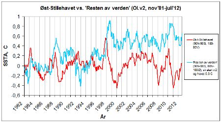 The NINO3.4 region is located in the East Pacific Ocean. Its signal totally dominates the SSTA evolution of that basin. According to the graph above, there is no upward trend in SSTA in the East Pacific Ocean since at least 1981. That's 1/3rd of the global ocean. Look at this map (from GISTEMP):
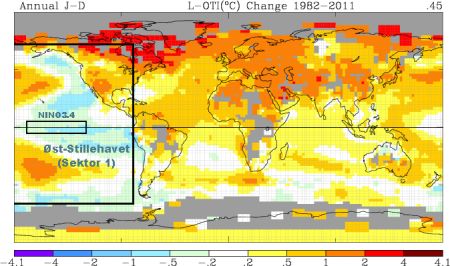 It shows the global distribution of temperature change between 1982 and 2011. Please disregard the continental parts at this point. The oceanic change (its size and distribution) is calculated using Reynolds OI.v2. I've defined the East Pacific Ocean (65N-60S, 180-80W) and the NINO3.4 region (5N-5S, 170-120W), the latter making up ~5,7% (!) of the former.
There's a distinct pattern manifesting itself here. Peculiarly, the West Pacific is one of two sectors of the world ocean (the other being the North Atlantic) displaying a particularly large positive change over the period in question. It has experienced a pronounced warming. And this even while sitting just next to (and being intimately oceanically linked to) the one major region of the world ocean that hasn't warmed at all. In fact, barring those two sub- to extratropical warm tongues coming in from the West Pacific, the East Pacific Ocean (and specifically the equatorial NINO3.4 region) has actually cooled since 1982.
This striking contrast between two neighboring, tightly interconnected sectors of the same ocean basin alone should tell us something.
What is going on?
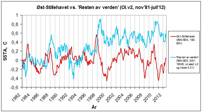
Let's get back to the SSTA graph for the world ocean outside the East Pacific:
It shows the global distribution of temperature change between 1982 and 2011. Please disregard the continental parts at this point. The oceanic change (its size and distribution) is calculated using Reynolds OI.v2. I've defined the East Pacific Ocean (65N-60S, 180-80W) and the NINO3.4 region (5N-5S, 170-120W), the latter making up ~5,7% (!) of the former.
There's a distinct pattern manifesting itself here. Peculiarly, the West Pacific is one of two sectors of the world ocean (the other being the North Atlantic) displaying a particularly large positive change over the period in question. It has experienced a pronounced warming. And this even while sitting just next to (and being intimately oceanically linked to) the one major region of the world ocean that hasn't warmed at all. In fact, barring those two sub- to extratropical warm tongues coming in from the West Pacific, the East Pacific Ocean (and specifically the equatorial NINO3.4 region) has actually cooled since 1982.
This striking contrast between two neighboring, tightly interconnected sectors of the same ocean basin alone should tell us something.
What is going on?
Let's get back to the SSTA graph for the world ocean outside the East Pacific:
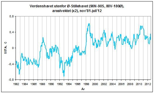 A staircase if ever there was one. This is how the change in SSTs outside the East Pacific in the GISTEMP map above actually progressed through time. If we were to draw a straight trendline from 1981/82 to 2011/12, we would only see the total upward change. We would miss (obscure) all that which happened in between, what led to that total, how (and specifically at what times) the change in temperature took place.
Blessed with a natural scientific curiosity, we're of course interested in the how and when. We want to investigate the total change a bit closer.
There are two definite upward shifts to be found along the curve above - one in 1987-88 and one in 1998-99. Do these years sound familiar in any way? In addition, there's one, albeit much smaller, in 2010. Outside of these two (three) pretty eye-catching sudden thrusts, there is no traceable upward trend in the dataset. If anything, there's a hint of the opposite. The entire rise in SST for this vast region from 1981/82 to 2011/12 is to be found in these two (three) particular instances of abrupt elevation of the mean level of anomalies. Without these instances, no general warming. Note how the specific shift events (particularly the first two) put all other up and down fluctuations along the curve to shame. They shoot up like towering pinnacles at the front of each new step.
I've adapted the graph to visualize the steps:
A staircase if ever there was one. This is how the change in SSTs outside the East Pacific in the GISTEMP map above actually progressed through time. If we were to draw a straight trendline from 1981/82 to 2011/12, we would only see the total upward change. We would miss (obscure) all that which happened in between, what led to that total, how (and specifically at what times) the change in temperature took place.
Blessed with a natural scientific curiosity, we're of course interested in the how and when. We want to investigate the total change a bit closer.
There are two definite upward shifts to be found along the curve above - one in 1987-88 and one in 1998-99. Do these years sound familiar in any way? In addition, there's one, albeit much smaller, in 2010. Outside of these two (three) pretty eye-catching sudden thrusts, there is no traceable upward trend in the dataset. If anything, there's a hint of the opposite. The entire rise in SST for this vast region from 1981/82 to 2011/12 is to be found in these two (three) particular instances of abrupt elevation of the mean level of anomalies. Without these instances, no general warming. Note how the specific shift events (particularly the first two) put all other up and down fluctuations along the curve to shame. They shoot up like towering pinnacles at the front of each new step.
I've adapted the graph to visualize the steps:
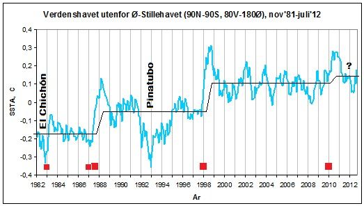 The red squares down by the x axis denote the great El Niños that directly preceded the shifts: The double Niño of 1986/87/88, the Super-El Niño of 1997/98 and the globally influential Niño 2009/10 (I have also included the giant El Niño of 1982/83, almost as powerful as the 1997/98 event, but noticeably suppressed globally by the El Chichón eruption).
Ok. We've now looked at how the SSTA evolved in the world ocean outside the East Pacific through time. It basically all happened in two (three) sudden upward shifts, one in 1987-88 and one through 1998 (+ the minor (and still unresolved) one in 2010).
Now let's look at how it evolved spatially.
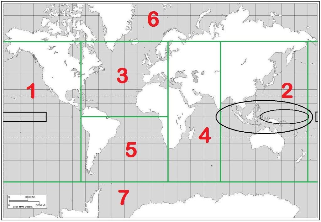
We split the world ocean into 7 sectors:
The red squares down by the x axis denote the great El Niños that directly preceded the shifts: The double Niño of 1986/87/88, the Super-El Niño of 1997/98 and the globally influential Niño 2009/10 (I have also included the giant El Niño of 1982/83, almost as powerful as the 1997/98 event, but noticeably suppressed globally by the El Chichón eruption).
Ok. We've now looked at how the SSTA evolved in the world ocean outside the East Pacific through time. It basically all happened in two (three) sudden upward shifts, one in 1987-88 and one through 1998 (+ the minor (and still unresolved) one in 2010).
Now let's look at how it evolved spatially.
We split the world ocean into 7 sectors:
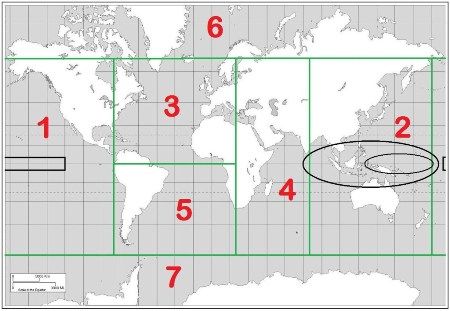 (Sector 1: East Pacific Ocean (65N-60S, 180-80W); Sector 2: West Pacific/East Indian Ocean (65N-60S, 80-180E); Sector 3: North Atlantic Ocean (65N-0, 80W-20E); Sector 4: West Indian Ocean (65N-60S, 20-80E); Sector 5: South Atlantic Ocean (0-60S, 80W-20E); Sector 6: Arctic Ocean (90-65N); Sector 7: Southern Ocean (60-90S). The black rectangle in Sector 1 is the NINO3.4 region. The two black ellipses in Sector 2 mark different definitions of the West Pacific Warm Pool (WPWP). Nevermind those for now.)
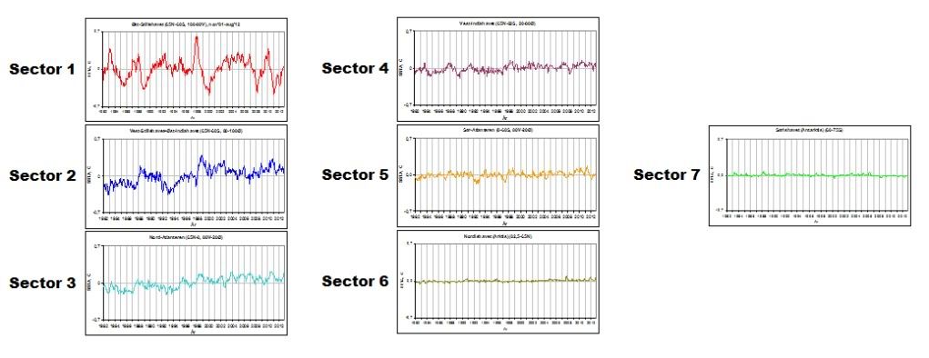
If we area weight the SSTA data for each of these sectors against each other, we come out with something like this:
(Sector 1: East Pacific Ocean (65N-60S, 180-80W); Sector 2: West Pacific/East Indian Ocean (65N-60S, 80-180E); Sector 3: North Atlantic Ocean (65N-0, 80W-20E); Sector 4: West Indian Ocean (65N-60S, 20-80E); Sector 5: South Atlantic Ocean (0-60S, 80W-20E); Sector 6: Arctic Ocean (90-65N); Sector 7: Southern Ocean (60-90S). The black rectangle in Sector 1 is the NINO3.4 region. The two black ellipses in Sector 2 mark different definitions of the West Pacific Warm Pool (WPWP). Nevermind those for now.)
If we area weight the SSTA data for each of these sectors against each other, we come out with something like this:
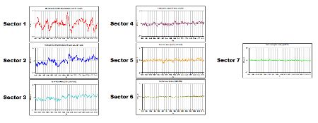 This shows the absolute influence each separate sector has on the final global SSTA graph shown at the top of this post.
It is quite revealing. The Pacific reigns supreme. Not really big news. But still.
There is something in particular one should note about these graphs. The (NINO) amplitudes of the East Pacific completely overwhelms the amplitudes of all other sectors of the world ocean. No wonder the global graph looks so similar to the East Pacific one, the main difference being the trend. The East Pacific (Sector 1) temperature swings also dwarf those of the West Pacific/East Indian Ocean (Sector 2). Only at two points along the Sector 2 curve above there's a rise that is (nearly) comparable to the amplitudes of Sector 1. These two instances occur in 1987-88 and in 1998-99. Those dates are getting familiar.
But why is the SSTA evolution of the East Pacific (Sector 1) and the West Pacific/East Indian (Sector 2) so different from one another?
To understand this, one has to understand how the ENSO process works. More on that in Part 3.
But first (and rounding off Part 2) let me show you something. What happens if we add the area weighted SSTA data from the other basins outside the East Pacific to the SSTA curve of the West Pacific/East Indian? That is, Sector 2 +3+4+5+6 and 7.
This is what happens:
This shows the absolute influence each separate sector has on the final global SSTA graph shown at the top of this post.
It is quite revealing. The Pacific reigns supreme. Not really big news. But still.
There is something in particular one should note about these graphs. The (NINO) amplitudes of the East Pacific completely overwhelms the amplitudes of all other sectors of the world ocean. No wonder the global graph looks so similar to the East Pacific one, the main difference being the trend. The East Pacific (Sector 1) temperature swings also dwarf those of the West Pacific/East Indian Ocean (Sector 2). Only at two points along the Sector 2 curve above there's a rise that is (nearly) comparable to the amplitudes of Sector 1. These two instances occur in 1987-88 and in 1998-99. Those dates are getting familiar.
But why is the SSTA evolution of the East Pacific (Sector 1) and the West Pacific/East Indian (Sector 2) so different from one another?
To understand this, one has to understand how the ENSO process works. More on that in Part 3.
But first (and rounding off Part 2) let me show you something. What happens if we add the area weighted SSTA data from the other basins outside the East Pacific to the SSTA curve of the West Pacific/East Indian? That is, Sector 2 +3+4+5+6 and 7.
This is what happens:
 (The lower graph, the blue one, is Sector 2 (West Pacific/East Indian Ocean). The middle graph, the orange one, is Sector 2+3 (The North Atlantic). The upper graph, the pale blue one, is the world ocean outside the East Pacific (65N-60S).)
Watch how the upward shifts and the steps are simply consolidated going from Sector 2 (West Pacific/East Indian) to global outside Sector 1 (East Pacific).
Moderator Response:
(The lower graph, the blue one, is Sector 2 (West Pacific/East Indian Ocean). The middle graph, the orange one, is Sector 2+3 (The North Atlantic). The upper graph, the pale blue one, is the world ocean outside the East Pacific (65N-60S).)
Watch how the upward shifts and the steps are simply consolidated going from Sector 2 (West Pacific/East Indian) to global outside Sector 1 (East Pacific).
Moderator Response:[DB] If you walk away when a flaw is identified in your analysis then you shouldn't be surprised if others find your argument unconvincing. As you are challenging the mainstream scientific position, the onus is on you to show that your argument is solid. That is the way science works.
Therefore, you shouldn't ignore the moderator's advice here: "I would recommend that you do not proceed onto part 2 until we have had a chance to digest part 1 and for relevant questions to be answered".
-
wili at 03:22 AM on 25 November 2012Newsflash: A 4°C warmer world can, and must be, avoided - World Bank
Here's another shorter video that covers some of the same ground--well worth a listen/watch: http://climatechangepsychology.blogspot.com/2012/11/david-roberts-remix-climate-change-is.html -
DSL at 02:51 AM on 25 November 2012Global Surface Temperature: Going Down the Up Escalator, Part 1
setit-bagain, you said "Hey read this book! O, yes I will, but you read this book!" What book are you talking about? I don't think anyone has linked to a book. They've linked to the published science. Read it. It might be important. You also say that the temperature was in the Harris & Mann chart. Not so. That was a hand-drawn sketch of Holocene temp. Here's something better. -
setit-bagain at 02:27 AM on 25 November 2012Global Surface Temperature: Going Down the Up Escalator, Part 1
Tom Curtis Neat but incorrect. And it is incorrect because of the lack of sufficient quantity of evidences about oceans. The oldest probes of ocean bottom are younger than 250 millions of years. It is virtually impossible to get a picture about oceans beyond this time border. Our only reliable source is investigation of continental plates. To make a picture different from this on a continent is more likely a fantasy than something serious. To adapt this fantasy according some expectations based on present theories do not makes these claims trustworthy even with convinient tools as acidification as patch against the uncomfortable truth. (-snip-).Moderator Response: [DB] Off-topic soliloquy snipped. -
setit-bagain at 02:13 AM on 25 November 2012Global Surface Temperature: Going Down the Up Escalator, Part 1
Composer99 and company (-snip-)? For instance I posted a diagram about temperature in near history but it was decorated with meaningless history names and volcanic activity. All the same the temperature was there… And many (-snip-) grabbed names and not temperature component. My mistake. (-snip-). I am deeply sorry, but that fashion is not included in my vision about a conversation.Moderator Response: [DB] Inflammatory tone and terminology snipped. -
skywatcher at 01:36 AM on 25 November 2012It's El Niño
Not to Distract too much from Tom Curtis' points above, but I would be interested if Bob Tisdale could answer KR's three underlined points in post #29 on this thread. Frankly, I feel that until he works out and demonstrates to the world: 1: why ENSO should suddenly be involved with warming the world despite a long-term (multicentury) neutral average) 2: why the demonstrated TOA spectral changes in IR emission/absorption that have CO2's fingerprints all over it are unimportant. 3: (perhaps most importantly) what is the energy source that allows the oceans to drive atmospheric temperature changes while themselves warming on a global scale? Where is the energy coming from, Bob? Until then, selective examination of partial regions of ocean basin data are, to me, the oceanographic equivalent of suggesting that a cold winter's day in Reykjavik disproves global warming. Just a more fancy cherry-pick, but a cherry-pick, nonetheless. -
Dikran Marsupial at 23:09 PM on 24 November 2012Human CO2 is a tiny % of CO2 emissions
While anthropogenic emissions are responsible for 100% of the post-industrial rise in atmospheric CO2, only about 3-4% IIRC of atmospheric CO2 is of directly anthropogenic origin. Thus Jone's statement is technically correct, but deeply misleading. The reason for this is that the vast natural exchange fluxes continually swap atmospheric CO2 (some of which is of directly anthropogenic origin) with CO2 from the oceanic and terrestrial reservoirs. These exchange fluxes have no net effect on atmospheric CO2 levels, but they do mean that relatively little CO2 in the air is of directly anthropogenic origin as it only takes on average 4-5 years for each molecule of CO2 to be exchanged with "natural" CO2. The thing that matters though is not whether the CO2 in the atmosphere is of directly anthropogenic origin, but what is causing total emissions (natural+anthropogenic) to be greater than total uptake, as that is what is causing atmospheric CO2 to rise, and the answer to that is "anthropogenic emissions". -
Tom Curtis at 22:16 PM on 24 November 2012It's El Niño
Thankyou. I notice that the strongest correlation between Nino 3.4 and global SST is when global SST lag Nino 3.4 by nine weeks. In your comparison, you say you used a 6 month (equivalent to a 26 week) lag. Why did you use a lag 17 weeks longer than that indicated by the data? -
Bob Tisdale at 21:19 PM on 24 November 2012It's El Niño
Tom Curtis asked, "To what date do you refer when you mention 'the start of the satellite-based' dataset?" Since we're discussing the monthly Reynolds OI.v2 data, the first month is November 1981. -
chriskoz at 19:04 PM on 24 November 2012Sheffield vs. Dai on Drought Changes
Just thet simple amount of precipitation is not the indicative how well the soil has been saturated with moisture. The form/duration is equally important. A sudden heavy and quick storm over bone dry land does not impregnate it at all just wash the surface and may even be detrimental by eroding it. A steady drizzle over few days may saturate deep soil even if its total amount is smaller than the storm would bring. A consistent record of drought changes would be done better with a standardised measure of soil moisture. Anyone has been doing it on a large scale consitently enought for the last 60y? I doubt it. I guess chenges in river flows can be used as proxies. Again, you need a long, detailed record. There will be increased floods and bigger droughts in between, depending on ENSO. Naysayers will always argue that "on average, nothing has changed". -
Tom Curtis at 16:23 PM on 24 November 2012It's El Niño
Bob Tisdale, you wrote, "The East Pacific Ocean (90S-90N, 180-80W) has not warmed since the start of the satellite-based Reynolds OI.v2 sea surface temperature dataset". The Reynolds OI.v2 data set is normalized to the period 1971-2000. The NOAA website you link to above plots data from Nov 1, 1982. To what date do you refer when you mention "the start of the satellite-based" dataset? -
Bob Tisdale at 15:25 PM on 24 November 2012It's El Niño
IanC: Excuse the delay.
You replied, “You are comparing data with a particular realization of internal variability to data with internal variability filtered out. You are effectively comparing apples to oranges, so of course they look different.”
I assume this is a discussion of the East Pacific data. The appearances are not in question. The trends are.
You replied, “To actually make a sensible analysis, you will at the very least have to look into internal variability of each model run, which entail comparing a large number individual model runs.”
Not me. I’m done with my analysis. It is the responsibility of the party wishing to dispute my results to show the effects of the point that party wants to introduce to the discussion. With that in mind, the models do such a poor job of simulating ENSO you’d be better off trying to remove the effects of ENSO from the East Pacific sea surface temperature data. Then you won’t have to analyze each of the dozens and dozens of model runs. If you don’t want to do that, that’s okay, because the “Rest of the World” data still needs to be explored.
You replied, “To answer your question, a far more plausible explanation is internal variability (e.g. PDO).”
Unfortunately, that explanation doesn’t work for a number of reasons. (a) The PDO represents the standardized leading Principal Component of the sea surface temperature anomalies of the North Pacific north of 20N after the global temperatures have been removed, not the sea surface temperature anomalies. (b) The standardization of the PDO exaggerates its actual variability by a factor of about 5.6, if memory serves. In other words, the standardization exaggerates the importance of the PDO. (c) The PDO is actually inversely related to the sea surface temperature anomalies of that portion of the North Pacific on decadal timescales. (d) The PDO is an aftereffect of ENSO and the sea level pressure of the North Pacific. The sea level pressure of the North Pacific causes the difference between the PDO and ENSO. (e) The dominant component of the PDO is the sea surface temperature of the Kuroshio-Oyashio Extension, in the western North Pacific, not the East Pacific.
You asked, “What scaling and time shifting have you applied to the NINO3.4 data?”
The scaling factor is 0.12 and there’s a 6-month lag.
You asked, “Can you provide references?”
Yup. Every study that attempts to remove the effects of ENSO from the surface temperature record by scaling an ENSO index and by subtracting the scaled and lagged ENSO index from surface temperatures assumes surface temperatures respond proportionally to El Niño and La Niña events. Examples in alphabetical order:
Foster and Rahmstorf (2011) “Global Temperature Evolution 1979–2010”
And:
Lean and Rind (2009) How Will Earth’s Surface Temperature Change in Future Decades?
And:
Lean and Rind (2008) How Natural and Anthropogenic Influences Alter Global and Regional Surface Temperatures: 1889 to 2006
And:
Santer et al (2001), Accounting for the effects of volcanoes and ENSO in comparisons of modeled and observed temperature trends
And:
Thompson et al (2008), Identifying signatures of natural climate variability in time series of global-mean surface temperature: Methodology and Insights
And:
Trenberth et al (2002) Evolution of El Nino–Southern Oscillation and global atmospheric surface temperatures (See note 1)
And:
Wigley, T. M. L. (2000), ENSO, volcanoes, and record-breaking temperatures
Note 1: Trenberth et al (2002) included the following caveat (my boldface):
“The main tool used in this study is correlation and regression analysis that, through least squares fitting, tends to emphasize the larger events. This seems appropriate as it is in those events that the signal is clearly larger than the noise. Moreover, the method properly weights each event (unlike many composite analyses). Although it is possible to use regression to eliminate the linear portion of the global mean temperature signal associated with ENSO, the processes that contribute regionally to the global mean differ considerably, and the linear approach likely leaves an ENSO residual.”
The divergences shown in brown are those ENSO residuals.
Moderator DB asked, “Do you have a link to the specific dataset(s)?”
The Reynolds OI.v2 data is available on a gridded basis through the KNMI Climate Explorer:
http://climexp.knmi.nl/selectfield_obs.cgi?someone@somewhere
And through the NOAA NOMADS website:
The coordinates of the NINO3.4 region are 5S-5N, 170W-120W. The coordinates for the East Pacific is 90S-90N, 180-80W. And the coordinates for the Rest of the World are 90S-90N, 80W-180. I provided a brief introduction to the KNMI Climate Explorer here:
http://bobtisdale.wordpress.com/2010/12/30/very-basic-introduction-to-the-knmi-climate-explorer/
And DB asked, “Is the NINO3.4 data processed in anyway? and if so, how?”
The NINO3.4 sea surface temperature anomalies were scaled by a factor is 0.12, lagged 6 months, and both datasets in the graph of the detrended Rest of the World data were smoothed with 13-month running-mean filters.
Regards
-
Doug Hutcheson at 13:35 PM on 24 November 2012Human CO2 is a tiny % of CO2 emissions
Tom Curtis @ 236, if I expressed what I really think of Alan Jones and his veracity, the comment would be moderated faster than a speedingbullsh*tbullet.Moderator Response: [DB] Likely, yes.


Prev 1020 1021 1022 1023 1024 1025 1026 1027 1028 1029 1030 1031 1032 1033 1034 1035 Next


