


 Arguments


Recent Comments
Prev 1059 1060 1061 1062 1063 1064 1065 1066 1067 1068 1069 1070 1071 1072 1073 1074 Next
Comments 53301 to 53350:
-
CBDunkerson at 23:39 PM on 25 September 2012Solar cycles cause global warming
Falkenherz wrote: "1. The graph in the Washington Times (Source: "University of California-Berkeley Earth-Surface Temperature Project" -> so it IS based on scientific work?)" Yes, that label would mean that the graph was part of a scientific study... if the label itself weren't fiction. The Berkeley Earth Surface Temperature (BEST) project concluded that past temperature studies were accurate (in contradiction of their initial assumptions) and that the observed warming was almost entirely due to humans. Their findings on solar influence can be summed up with the statement, "Solar variation does not seem to impact the temperature trend." So the question becomes, how did Soon and Briggs get a graph (which appears nowhere in the BEST studies) showing a 'strong correlation' between temperatures and solar variation from a study that concluded there was no correlation between temperatures and solar variation? The likely answer is that they took temperature data from BEST, TSI data from some other source, put them together on a graph, and falsely labelled the result as coming from the BEST study. The 'US daytime high temperature' values shown on the WT graph appear to match up with the 10 year moving average of such on this page from BEST. So far as I know the source of their TSI 'data' remains a mystery. -
Lessons from Past Climate Predictions: Arctic Sea Ice Extent 2012 Update
DB, I had always assumed that's how he did it. I recall a study about goats disappearing near the WeatherBell compound . . . -
Tom Dayton at 22:35 PM on 25 September 2012Solar cycles cause global warming
Falkenherz, when TSI started increasing way back when, the Earth heated and therefore started radiating more on its way to thermal equilibrium between the new, higher level of energy coming in, and the energy going out. It could not reach equilibrium, because the incoming radiation (from TSI) kept increasing. When TSI plateaued around 1960, the Earth still was working toward equilibrium by continuing to increase its outgoing radiation. But because the incoming radiation now was constant, the Earth should have crept closer to equilibrium. That closing of the energy imbalance between energy coming in and energy going out should have been reflected in the in-out gap decreasing. Instead, the in-out gap has continued to increase despite the constancy (or slight decline) of the incoming radiation. So there must be some factor reducing the energy going out. What could that be, do you suppose? See John's post on climate lag. -
CBDunkerson at 22:28 PM on 25 September 2012Record Arctic Sea-ice minimum 2012 declared - it's the Silly Season!
Panzerboy #28: There are no "graphing tricks" involved... this post pulls together graphs from multiple different sources covering different time frames and even different units of measurement (square miles vs square kilometers). Thus, implying that the 'failure' of these different sources to all use the same starting point for the Y axis is some kind of deception makes no sense. It is standard practice to produce graphs scaled to the range of values observed or likely to be observed. When the NSIDC graphs were first plotted a few decades ago you could as 'easily' have argued that the Y-axis should go up to 20 million square miles (a value not seen for centuries) as down to 0. Now that the ice is in full out collapse and zero is becoming a possibility it is likely that the NSIDC will have to reframe the graph in the upcoming years... but again that is just following the need to show the full range of observed values without massive amounts of white-space above or below the observed range. Indeed, scaling a graph well outside the range of observed values often constitutes a 'trick' because it reduces the perceived degree of change. On a scale going up to 100 million square miles the melt of the past few decades would look like a nearly flat line. Hence the standard practice of scaling graphs to fit the observed values rather than a large range around them. -
yocta at 21:47 PM on 25 September 2012Lessons from Past Climate Predictions: Arctic Sea Ice Extent 2012 Update
RE #2 No Problem :) RE#3 I think you mean he is referring to his 2011 Prediction not his 2013. The video the Eli rabbet has posted refers to Bastardi's 2011 prediction (and indeed your screenshots show this) As far as I can tell, Bastardi hasn't put out a 2013 prediction although you can find one tweet about it here to which he tried to predict the melt was over this year on Aug 26 -
Robert Murphy at 20:41 PM on 25 September 2012Lessons from Past Climate Predictions: Arctic Sea Ice Extent 2012 Update
Joe Bastardi said: "...I think that's where we're gonna be next year. We're gonna recover dramatically here, with the cold that is coming over the next 9 to 12 months. I think next year you're gonna see the latest start to the sea ice melt that we've seen in a long time...." This is the same guy who can't read a map. -
Ari Jokimäki at 20:29 PM on 25 September 2012New research from last week 38/2012
Sporehopper: "Is there any research that has recorded any effects associated with human activity and development. Specifically: North Central region of Florida. The massive growth of the Orlando, Fl area..." There's lot of research on this subject area. This one is studying Orlando: The Urban Heat Island and Local Temperature Variations in Orlando, Florida - Yow & Carbone (2006) This paper came up in same search: The Disappearance of Dense Fog in Los Angeles: Another Urban Impact? - LaDochy (2005) Another on rainfall: Effect of urbanization on the diurnal rainfall pattern in Houston - Burian & Shepherd (2005) There are lots and lots of papers on the general topic of weather impacts of urbanization, so you might want to try to search more specific papers yourself for example in Google Scholar. -
chriskoz at 20:25 PM on 25 September 2012Record Arctic Sea-ice minimum 2012 declared - it's the Silly Season!
Dave123 @32 The "It's soot" myth has already been debunked here. mikeh1@7 has shown, that Matt Ridley from WSJ had fallen victim of that myth. Together with your Hansen 2003 meme, it sounded funny. Out of suriosity, I've read Matt's article (normally I don't read WSJ because it's waste of time) to check the source of his opinion, and here it is, his entire attribution:Some scientists have noticed that the decline in Arctic sea ice correlates better with the rapid growth of coal consumption in China than it does with global temperature
A little disapointment here that Matt did not cite verifiable source but rather "Some scientists" limbo. But no surprise here: deniers like him often practice such reporting. So we cannot conclude that Matt Ridley lacks basic skills to understand a simple 5-sentence abstract. But said conclusion can be declared probable. In fact "Some scientists" can also mean Hansen 2003. -
Lanfear at 20:06 PM on 25 September 2012Solar cycles cause global warming
Falkenherz@43 "TSI seemed to go upward already a long time, roughly since 1700, by a total of roughly 2,5 W/m2 since then." Hmmm... where did you get that figure? The study you refer to states: "The cycle-averaged increase in TSI since the Maunder minimum is estimated to be ~1 W/m2." This is also supported by fig 14 (using the eye-chronometer). Regarding your point 2: There still remains the question of where that heat from the slightly positive TSI-trend is hidden? I think the only possible answer here would be the deep sea (>2000m). But then again, it seems to be working on a too slow pace for this case, if one is to believe the validity this claim: "Scientists estimate that it takes one section of the belt 1,000 years to complete one full circuit of the globe." In that case it would mean that we would be seeing the heat energy coming up from the MWA and not the latest TSI positive trend. As Dikran said in 44 (and repeated later, your're writing too fast :-), you need to come up with a more physical explanation, otherwise this is only (IMHO) a exercise in hiding the god. -
Dikran Marsupial at 20:04 PM on 25 September 2012Solar cycles cause global warming
@Falkenherz As I said in the second paragraph of my previous post, there needs to be a plausible physical mechanism to explain why there should be a lag. Essentially the laws of physics are the reason why temperature doesn't lag 100 years behind TSI. Correlation is not cuasation, and a good way of avoiding falling into the trap of making an incorrect association is to require a plausible physical mechanism. Given the nature of noisy time series, there will often be an apparent corellation in time series if you adjust enough parameters of the anlysis (e.g. start/end points, lags etc.) purely by random chance. As the old statistical maxim goes "if you torture the data enough, eventually they will always confess". -
Falkenherz at 19:53 PM on 25 September 2012Solar cycles cause global warming
Marsupial, my question Nr. 2 was not linked to the graph in the Washington Times. My question Nr. 2 was rather assuming that that graph was wrong and TSI acutally did not increase since 1960, as this seems to be in line with the theory which this website believes to be correct. So, what I meant with a lag is that the increase of TSI until 1960 probably did not directly relate to temperature, but only shows its effect after 1960. The rise of temperature between 1900 and 1960 would then have a cause in rising TSI from before 1900. Long term graphs always seem to show a long term raise of TSI. So basically, the question is, why can we exclude a TSI induced raise of global temperature which lags behind, say, roughly 50 or even 100 years? -
Falkenherz at 19:41 PM on 25 September 2012Huber and Knutti Quantify Man-Made Global Warming
As the basis, where all their calculations start, Huber and Knutti (2011) take "the Bern2.5D climate model of intermediate complexity". I read this as: We make evidence from a model (and assume that the model matches observations from the past). On figure 1a, the line for solar radiation is taken from "Radiative forcings from historical reconstructions and the SRES A2 scenario for different forcing agents". It is almost near zero. My point is; if you start with such an assumption, it is not very surprising to come to the result that GHG must be the dominant contributor. So, for me, it seems like this article does a kind of a no-conclusion and just elaborates on said assumption. How come that TSI is assumed so low? I just wanted to point this out here, because I am coming from the "solar-cycles" article, and also from "it's the sun", and I was pointed towards this article here. I frankly do not understand how and why TSI is estimated with such a low increase in radiative forcing. -
Esop at 19:26 PM on 25 September 2012Lessons from Past Climate Predictions: Arctic Sea Ice Extent 2012 Update
I seem to remember that this Burt Rutan (of aerospace fame)fellow sometime this spring claimed that the Arctic sea ice was recovering. Appears to me that his claim was inaccurate. -
Dikran Marsupial at 19:16 PM on 25 September 2012Solar cycles cause global warming
Falkenherz With regard to lags, if you look at the chart from the Washington Times article, clearly TSI appears to be lagging behind USA temperatures, not the other way round (until 1960 ish). Temps start rising in about 1860, but TSI falls until about 1890, temps fall from 1940, but TSI falls from about 1950. This would suggest changes in USA temperatures cause changes in TSI prior to 1960. However, the real point regarding lags is that there needs to be a reasonable physical explanation to explain why there should be a lag, rather than a mere statistical phenomenon. It is hard to see a physical mechanism that would explain why TSI changes have a lagged, rather than an instantaneous effect. -
Falkenherz at 19:08 PM on 25 September 2012Solar cycles cause global warming
Lanfear, if this is true, then my question is answered. But how do we know that global temperature and TSI were coupled directly? If I see curves (like in figure 15 here, especially the one from "Lean 2000" http://sun.stanford.edu/LWS_Dynamo_2009/61797.web.pdf), then there might as well be a lag, since TSI seemed to go upward already a long time, roughly since 1700, by a total of roughly 2,5 W/m2 since then. -
Falkenherz at 19:02 PM on 25 September 2012Solar cycles cause global warming
To my question 3, I think I got it; from "it's the sun", nicely explained there, thanks. According to figure 8 over there, for the last 100-150 years, there is very roughly about 22% of solar contribution to global warming. Translating this into the kind of answer I was looking for in question 3, roughly about 0,6 Degrees of the 0,76 Degrees raisal of global temperature in the last centuries cannot be attributed to TSI and must be due to GHG. I hope this is roughly correct. Now I just need to understand what TSI data is correctly used and how they translate TSI into temperature... on to more articles to read! I anybody could still bring some light (or links) into questions 1 and 2, please. -
Lanfear at 18:58 PM on 25 September 2012Solar cycles cause global warming
Falkenherz@40 "Couldn't it be that global temperature is still rising because of the TSI forcings from before 1960?" I have a hard time understanding this point. The problem AFAIK is that up until this timepoint the TSI/temperature has been coupled directly without any delay. Now you propose that there is a delayed mechanism hidden somewhere that continues to heat up the atmosphere (and apparently upper 2000m of the sea). Furthermore the mechanism is at least as strong as the apparent TSI-effect was. So the question is: Why hasn't this mechanism revealed itself earlier and where was the heat hidden? -
Falkenherz at 17:03 PM on 25 September 2012Solar cycles cause global warming
Dear co-commenters, my main question has not been answered, instead I received a lot of corrections on some of my (admittedly wrong) conclusions, and some nitpicking on words. But, on the basic questions, I am still unclear what to think. 1. The graph in the Washington Times (Source: "University of California-Berkeley Earth-Surface Temperature Project" -> so it IS based on scientific work?) shows a continuous upwards trend of TSI, as does also the graph "historical TSI reconstruction" on http://lasp.colorado.edu/sorce/data/tsi_data.htm. I am asking about the long-term observations on TSI, not only since 1960. There are people like Leif Svalgaard on WUWT who deny any TSI increase since 1800 (if I understood his ppt presentation which he linked there correctly). 2. If people say that TSI since 1960 is not raising anymore and that is why GHG have to be the dominant driver: Did people think about possible lags to TSI forcings in our climate system? Couldn't it be that global temperature is still rising because of the TSI forcings from before 1960? 3. If we nevertheless assume (or have evidence?) that the TSI is not high enough to further raise global temperature, how come that I always encounter the claim that there is a rise of +0.76°C since 1850, and "most" of it was caused by AGW? I hold my claim that this is a miscommunication, and I am asking of how much is exactly attributed to GHG after removing the TSI forcing. When I look for answers, I am suddenly confronted with decadal trends, which in fact does not answer my question. I read the one essay from Pasini et al. (2012) which is trying to answer this (link provided by DSL further up). But if I understand that essay correctly, their only evidence is a so called Granger causality. Looking this mathematical contruct up on wikipedia, I think this can hardly be treated as sound evidence, rather as an indication that there could be evidence. -
dana1981 at 15:57 PM on 25 September 2012Lessons from Past Climate Predictions: Arctic Sea Ice Extent 2012 Update
David, click the last link in this post. It covers Kinnard. -
David Lewis at 15:37 PM on 25 September 2012Lessons from Past Climate Predictions: Arctic Sea Ice Extent 2012 Update
I've never seen this data before. Ramez Naam has a "guest blog" posted on Scientific American's site. The post contains a chart Naam cooked up starting with data from the 2011 Kinnard et.al. study Reconstructed changes in Arctic sea ice over the past 1,450 years which combines historical and proxy data to provide an educated guess as to what the record was from around 600 AD to 2006. Naam has added data up to the present, to produce this: Although Naam says he had to ask Kinnard for the chart, and the Kinnard et.al. study is behind a paywall at Nature, the Supplementary Information in pdf form isn't. Page 10 in the supplement has what looks a lot like the data Kinnard gave Naam on a chart containing a lot of other data.
-
Daniel Bailey at 15:06 PM on 25 September 2012Lessons from Past Climate Predictions: Arctic Sea Ice Extent 2012 Update
Bastardi would do better by divining goat entrails. -
dana1981 at 15:02 PM on 25 September 2012Lessons from Past Climate Predictions: Arctic Sea Ice Extent 2012 Update
David - yes if you click the first link in the above post, you'll see a screenshot of that Bastardi prediction, and then how it compared to the observations (the latter is also shown in Figure 6 above). -
David Lewis at 14:48 PM on 25 September 2012Lessons from Past Climate Predictions: Arctic Sea Ice Extent 2012 Update
I missed the fact that this entertainment was issued in 2010. Sorry. I find it hard to take these clowns seriously. It would be funnier if he had done this a few days ago. -
David Lewis at 14:42 PM on 25 September 2012Lessons from Past Climate Predictions: Arctic Sea Ice Extent 2012 Update
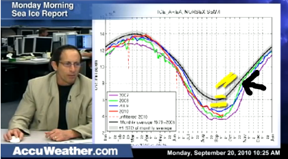
Eli Rabett has a "Your Joe Bastardi Entertainment Moment" video clip up on his blog. Bastardi makes public his prediction for 2013. He draws this yellow line as his prediction while he talks: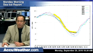 "...I think that's where we're gonna be next year. We're gonna recover dramatically here, with the cold that is coming over the next 9 to 12 months. I think next year you're gonna see the latest start to the sea ice melt that we've seen in a long time...."
One might ask, why, Joe?
"that is simply because of (hesitates)... you know... my studies show. And we'll see if I'm right".
Then, he claims he predicted correctly what happened this year. First, he said ""I was right about this year. It did not get down below here":
"...I think that's where we're gonna be next year. We're gonna recover dramatically here, with the cold that is coming over the next 9 to 12 months. I think next year you're gonna see the latest start to the sea ice melt that we've seen in a long time...."
One might ask, why, Joe?
"that is simply because of (hesitates)... you know... my studies show. And we'll see if I'm right".
Then, he claims he predicted correctly what happened this year. First, he said ""I was right about this year. It did not get down below here":
 "If people want to say, and they keep finding some metric to make you think its lower than it actually is... And I'm the guy who said this is where its going to wind up" (Confidently and proudly draws this yellow line):
 You heard it from Joe. That's where it wound up this year.
Then, he issues his prediction for the next 30 years. "...It's not going to get back to normal. That shouldn't happen for another twenty or thirty years. But we should be back up here next year. The higher you climb away from your low point the harder it is to get back, and I fully expect twenty, thirty, some of those years beyond, to be a little bit above normal...." (Draws the upper yellow squiggle line well above all other lines):
You heard it from Joe. That's where it wound up this year.
Then, he issues his prediction for the next 30 years. "...It's not going to get back to normal. That shouldn't happen for another twenty or thirty years. But we should be back up here next year. The higher you climb away from your low point the harder it is to get back, and I fully expect twenty, thirty, some of those years beyond, to be a little bit above normal...." (Draws the upper yellow squiggle line well above all other lines):
 This is just like war propaganda. (snip)
Moderator Response: [RH] Inflammatory snipped.
This is just like war propaganda. (snip)
Moderator Response: [RH] Inflammatory snipped. -
jmsully at 12:10 PM on 25 September 2012Record Arctic Sea-ice minimum 2012 declared - it's the Silly Season!
And Watts comes through in spades for Prediction 3! Yep, it really doesn't matter, just like the 2007 minimum didn't matter. -
scaddenp at 11:15 AM on 25 September 2012Increasing CO2 has little to no effect
Coming from a geological background, I would also point out that climate theory is pretty successful at predicting the surface temperatures of other planets/moons given atmospheric concentration, TSI and albedo. Regard each planet as a lab experiment. -
dana1981 at 10:34 AM on 25 September 2012Lessons from Past Climate Predictions: Arctic Sea Ice Extent 2012 Update
Thanks yocta. I play a little fast and loose with the posting date/time, which is entered manually. We generally publish one post per day, and this one is intended as the post for the 26th, Aussie time. -
yocta at 10:27 AM on 25 September 2012Lessons from Past Climate Predictions: Arctic Sea Ice Extent 2012 Update
I've been waiting for this article for a while. Well done thanks SkS team :) PS, unless you are a time traveler or more east than I am in Sydney, is the posting date of the article supposed to be the 25th of September 2012? -
dana1981 at 07:56 AM on 25 September 2012Mann Fights Back Against Denialist Abuse
Mann's responses to Silver's climate chapter seemed very reasonable and polite, and entirely valid if Mann's descriptions are correct. I too would like to see Silver's response. It sounds like his climate chapter is all too similar to the Super Freakonomics climate chapter, which was quite poor. -
vrooomie at 07:03 AM on 25 September 20122012 SkS Weekly Digest #38
Dana@3: I say we pool our resources, out of the *piles* of cash we get from our multi-gabillionaire backer, and buy JM an 'atta boy!' Put me in for a quid....:) -
SirNubwub at 06:00 AM on 25 September 2012It's the sun
DB, thank you. -
It's the sun
SirNubwub - While I feel it inappropriate to speculate on others motives, I would like to point out some issues with your previous postings. Your first posting on SkS, as far as I have found, asked "Can I now present to my classes that the hockey stick argument has been discarded by the AGW proponents? ". I recall another one (can't find it at the moment) asking why there was no significant warming in 15 years. You've also recently put forth the proposition that climate science is driven by the money, rather than the data. And in this thread you open up by stating "I am not here to debate a point. I have read the report, but I am not knowledgeable enough in the topic to try to defend it. I just want to learn the alarmist side of the point", then showing a graph of cherry-picked data, from a bad source, arguing directly against the point of the opening post. So, in context, you have presented a series of 'skeptic'/denial talking points, asking about the "alarmist side", usually with an air of "Doesn't this prove all of the science wrong?". The support for these points (IIRC) has been from newspaper articles, blog postings, and sources like the NIPCC. Bad sources, bad phrasing in your questions, all of which unfortunately can lead to a perception that you are more interested in propping up denial memes than investigating the data. It also appears clear to me that you have not read the opening post(s) on the threads you have joined, or looked over the list of 'skeptic' arguments, all of which quite frankly answer the questions you have raised. If you wish to be taken as someone actually interested in answers, I would suggest several things: (1) read the opening post(s), (2) critically evaluate your sources, and (3) ask questions, rather than dropping these "Aren't all of you wrong?" statements. Because, quite frankly, anyone involved enough in climate science and the public discussion to be present on a website like this has already heard enough"Silver Bullet" arguments from 'skeptics' to find them quite antagonizing.Moderator Response: [DB] The thread in question leads up to this comment by SirNubwub here. Fixed link & text per request. -
John Hartz at 05:09 AM on 25 September 2012It's the sun
@ SirNubwub #1032 I'd be very pleased if you were to proove me wrong. If you do, I will apologize.Moderator Response: [DB] SirNubwub should be accorded the benefit of the doubt, as per his/her recent comment above. Comments made in good faith on these threads are what matter. -
Mann Fights Back Against Denialist Abuse
Mann responds to Nate Silver at HuffPost. Silver's book The Signal and the Noise: Why So Many Predictions Fail -- but Some Don't apparently plays up the uncertainty game. Mann dresses him down but may have managed to avoid burning the bridge. I would like to see what Silver says in response. -
SirNubwub at 04:23 AM on 25 September 2012It's the sun
John, You have me wrong and I am a bit ticked by you accusation. All of my discussions have been based on data from referrenced links. I have admitted that I have been wrong on two occassions now in the past few days. If that and my reply in line 1030 is not what you want to see from all skeptics, then please tell me how you hope I would reply.Moderator Response: [DB] Point taken. Dialogue and discussion in good faith should be accorded respect from all parties. The point of this site is to disseminate and foster civil discussion of the primary literature of climate change and to overcome misperceptions and misinformation about it. -
John Hartz at 03:16 AM on 25 September 2012It's the sun
@ Bob Loblaw #1029: SirNubWub's posts on this thread and others suggest to me that his primary purpose is not to learn, but rather, it is to provoke SkS authors into saying something intemperate. Therefore, be careful not to take the bait. -
SirNubwub at 03:13 AM on 25 September 2012It's the sun
Bob, Thanks for the info. I see that the graph I posted is fairly useless. I will have to dive deeper into the subject of radiation. I appreciate the link. -
Bob Loblaw at 02:48 AM on 25 September 2012It's the sun
SirNubWub: You really need to get more specific in just what it is you're looking for. Although not totally useless, "sunshine hours" is awfully simplistic. It used to be commonly measured by devices such as the Campbell-Stokes Sunshine Recorder, and is defined formally as the amount of time where direct solar radiation exceeds 120 W/m^2. It depends on cloud, other atmospheric conditions, sun angles, etc., and is only very loosely related to solar energy received at the earth's surface. Likewise "cloud cover". Cloud is not something that is easily summarized in one number. What type? What altitude? What time of day? all this changes the effect that "one tenth cloud cover" will have on solar radiation. If you are interested in energy received at the surface, it is better to look directly at the measurements, such as those archived at The Baseline Surface Radiation Network. Note that the "fake skeptics" that are trying to mislead people (or are misleading themselves) will often ignore real, direct readings of importance (e.g. radiation) and focus on indirect, approximate readings of loosely-related factors (e.g., sunshine, cloud cover). This is another form of cherry-picking. Regardless of whether it is intentional or the result of confirmation bias or motivated reasoning, it is not good science. -
Bob Loblaw at 02:31 AM on 25 September 2012Increasing CO2 has little to no effect
Following up several points in one place... Although a controlled experiment of "the greenhouse effect" is not possible (we're doing an uncontrolled one, however), many, many parts of atmospheric science are amenable to controlled lab experiments - such as IR characteristics of CO2 and other gases, scattering effects of aerosols, and much other physics-related issues. There isn't any simple "global climate theory" - it's a compendium of many aspects of physics and biology; some with extremely strong evidence, others with less. A specific question can be answered with specific details, but if the question asked is "What's the Answer to Life, the Universe, and Everything", then answering "42" is probably not an answer to the question you really want to know. I know I've seen the table of contents of "The Warming Papers" on-line. Many of the papers contained in it are freely available for download, too. (Try Google Scholar.) -
It's the sun
SirNubwub - I would suggest looking at Ari Jokimäki's list of Papers on global cloud cover trends, in particular Eastman et al 2011. -
SirNubwub at 02:23 AM on 25 September 2012It's the sun
I have been able to find some data on global cloud cover. I also see that it is a bit complicated with low clouds cooling Earth and high clouds warming Earth. Will take some figuring out. Again, thanks for your time. -
chuck101 at 02:18 AM on 25 September 2012SkS: testimony to the potential of social media and the passion of volunteers
SirNubWub repeats one of the favourite denialist memes, (along with the ones about Einstein and Galileo), that billions are spent on government research into AGW, so the fact that Big Oil spends a few million here and there on countering the science is no big deal. The big difference is the word RESEARCH. When you carry out proper research, you do not necessarily know what you are going to find. So you could, for example, set up an experiment to measure ice pack thickness by satellite, year by year. The results may be different from what you expect, but you report them honestly, regardless of any ideological bias you might have. Contrast this with the 'research' carried out by the likes of Watt, or our very own Bob Carter. The result is preordained. We and they know that they will never in a million years admit that AGW is happening, or even express any doubt whatsoever. That is not research. That is propaganda pure and simple. If they ever started accepting the possibility that AGW is happening, they would lose their oil industry funding immediately. THAT, is the difference, and I am constantly amazed that supposedly intelligent people (well, so they claim to be), cannot see this. -
SirNubwub at 02:16 AM on 25 September 2012It's the sun
KR and marsupial Thank you for your input. I understand your points. From the information provided to me, I did not have the information on the Heartland funding. I will look for data on global cloud cover. Does anyone have any links to such data? Thank you both for your time. -
dana1981 at 02:06 AM on 25 September 20122012 SkS Weekly Digest #38
Thanks very much chriskoz. Let's give John Mason credit for the well-deserved reposts of his article too. Good job John! -
It's the sun
SirNubwub - Japanese daylight hours versus Chinese temperatures? And you think this is serious? You don't recognize the cherry-picking involved here? Or the disassociation between the two regions? The use of two different (and not directly related - as a tiny example, Japan is an island affected by oceans, China a fair chunk of a continent) subsets of data to argue against global information? Cherry picking - "...the fallacy of incomplete evidence is the act of pointing to individual cases or data that seem to confirm a particular position, while ignoring a significant portion of related cases or data that may contradict that position. It is a kind of fallacy of selective attention, the most common example of which is the confirmation bias." The NIPCC "report" has been discussed elsewhere - it is a Heartland Institute funded effort that is quite frankly an effort in disinformation. I would strongly suggest you look into better resources than what are essentially industrial and ideological lobbying groups. Your post appears (IMO) to be a clear example of confirmation bias. Which is not a product, I'll note, of an "open mind". -
SirNubwub at 01:44 AM on 25 September 2012It's the sun
Marsupial, The point that I am looking at is that the amount of sunshine has increased from 1970 to 2000, just like global temps. I agree that this is just for Japan, (as I said, just "supporting evidence") but wouldn't this regional data indicate that global data should be investigated with an open mind?Moderator Response: [Dikran Marsupial] (a) the amount of sunshine is measured in hours, thus it is nothing to do with the sun, but cloud cover over Japan. (b) The temperature data is for China. Thus neither is necessarily representative of global conditions. Secondly cloud cover over Japan is unlikely to have a close causal reationship with temperatures over much of China (apart from perhaps the Eastern coastal region). What makes you think that such links are not invstigated with an open mind? The EU for instance has spent about 12 million Euro investigating possible links between cosmic rays (which are modulated by solar activity) and climate. I think you need to reconsider some of your preconceptions about mainstream science. This is the last I am going to comment on this as I don't want to actively participate in a discussion that I am moderating (hence self-moderation of my previous moderation comment). -
SirNubwub at 01:15 AM on 25 September 2012It's the sun
I am not here to debate a point. I have read the report, but I am not knowledgeable enough in the topic to try to defend it. I just want to learn the alarmist side of the point. The following graph is part of a report that is found at http://nipccreport.org/articles/2011/nov/23nov2011a5.html I see the graph as supporting evidence for the idea that the sun has been a major player in the recent warming from 1970-2000. I would like to know why I should not view the graph in this way. I thank you in advance. Moderator Response: [Dikran Marsupial] If you are genuinely interested in the science, then beginning by labelling the mainstream view as "alarmist" is probably not a good way to start the discussion. Please read the comments policy before continuing.
 -
Dikran Marsupial at 23:51 PM on 24 September 2012Increasing CO2 has little to no effect
By the way, David Archer and Raymond Pierrehumber (of RealClimate) published a book a while back called "The Warming Papers", which is essentially a collection of some of the key historical landmark papers on climate change, with commentary from the authors. So if you want to find out the historical undepinnings of climate change research, the Warming Papers is an excellent place to start. ALL skeptics should get a copy of it and read it so they know the true depth of what they are skeptical of. -
Dikran Marsupial at 23:44 PM on 24 September 2012Increasing CO2 has little to no effect
I have an idea for an experiment, and have identified a suitable industrial partner, however I have been unable to attract sufficient funding from the Natural and Environmental Reseach Council. They say I should just use a model instead. More seriously, to perform a physical experiment you would need to have a colum of atmosphere tall enough to exhibit a significant lapse rate, which pretty much rules out any lab based experiment. The basic mechanism was first suggested by Calendar and the first quantative analysis performed by Gilbert Plass in the 1950s. That is probably the closest you will get. -
Kevin C at 23:01 PM on 24 September 2012New research from last week 38/2012
The sea level oscillation paper looks very interesting (at least from the abstract and figures). If the signal is real, the WN Pacific, North Atlantic and Indian ocean are past their upward inflection, so while they are still contribute positively to sea level rise, they contribute negatively to acceleration. However my first guess is that we are seeing the response to the late 19thC volcanoes and the mid-20thC aerosol cooling.
Prev 1059 1060 1061 1062 1063 1064 1065 1066 1067 1068 1069 1070 1071 1072 1073 1074 Next


