


 Arguments


Recent Comments
Prev 1166 1167 1168 1169 1170 1171 1172 1173 1174 1175 1176 1177 1178 1179 1180 1181 Next
Comments 58651 to 58700:
-
fatir.b at 23:05 PM on 5 July 2012Murry Salby's Correlation Conundrum
...net collected from all sources and sinks... that is what ultimately controls atmospheric CO2. -
bill4344 at 23:03 PM on 5 July 2012Murry Salby's Correlation Conundrum
Caerbannog - John Mashey, surely? -
fatir.b at 23:01 PM on 5 July 2012Lindzen and Choi 2011 - Party Like It's 2009
"some stupid mistakes...It was just embarrassing." nice one :) -
Steve Brown at 22:29 PM on 5 July 2012Nil Illegitimi Carborundum
Steve Brown, London -
Tristan at 21:57 PM on 5 July 2012Carbon Pricing Alarmists Disproven by the Reality of RGGI
Thank you very much Adelady :) -
PaulGood at 20:23 PM on 5 July 2012Nil Illegitimi Carborundum
Paul Goodfellow UK -
Michaelf at 19:03 PM on 5 July 2012Review of new iBook: Going to Extremes
Is there an Android version? -
Neven at 18:26 PM on 5 July 2012Ocean heat flux and the Arctic
Thanks a lot, Daniel! It's a bit of a long read, but as ocean heat flux is what the Maslowksi prediction hinges on, I figured it'd be good to thoroughly describe the whole thing once and for all. I'm now looking into the effect of the PDO and AMO on the Arctic Sea Ice, but it's even less clear-cut than ocean heat flux. Oh well, I'll see how far I can get. In the meantime, the ice is melting big time... -
Tom Curtis at 13:53 PM on 5 July 2012Ian Plimer Pens Aussie Geologist Gish Gallop #2 of the Week
dissembly @27, the graph comes from the German Advisory Council on Global Change (WGBU) special report on Solving the Climate Dilemma: The Budget Approach (Fig 2, page 5) Also of interest is Fig 5.3-5 (page 31) which shows per capita budgets for select individual nations, shown below as modified: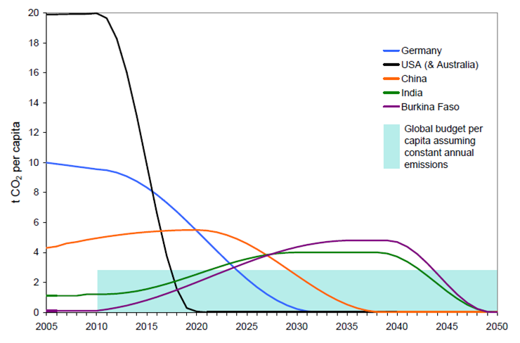 Note that in the WGBU graph, Australia is not included with the US. Australia's actual per capita CO2 equivalent emissions are 28 tonnes per annum.
-
Tom Curtis at 13:25 PM on 5 July 2012Ian Plimer Pens Aussie Geologist Gish Gallop #2 of the Week
dissembly @26 I have not forgotten the Green's betrayal of principle and Australia when they rejected Kevin Rudd's Emissions Trading Scheme. All they achieved by that betrayal was to delay the scheme by two years, to implement it in a less effective form, and to provide a massive boost to the opponents of action on AGW in Australia, most noticeably to Abbot and the right faction of the Liberal Party. -
Tom Curtis at 13:15 PM on 5 July 2012Ian Plimer Pens Aussie Geologist Gish Gallop #2 of the Week
dissembly @25, I have discussed your plan elsewhere where it is on topic. For this discussion the relevant question is can you generate the appropriate political will to accept your plan. The minimum cost of your plan amounts to the equivalent of an increase of the GST to 15% plus a 5% tariff on all exports; or alternatively, a 10 year depression (very low or negative growth for 10 years). (See discussion elsewhere.) If you do not have a realistic plan to persuade a major party, and the majority Australians to vote for these consequences as part of your plan before the end of this electoral cycle, you do not have an alternative plan to the Carbon Tax. You only have an unsubstantiated wish list and no way to implement it. If that is the case, my comment about abandoning an acceptable plan for a possibly good plan implemented when the cows come home stands. -
dreater at 13:10 PM on 5 July 2012Nil Illegitimi Carborundum
Dave Eater, Pennsylvania (USA) -
Tom Curtis at 13:09 PM on 5 July 2012Zero Carbon Australia: We can do it
dissembly claims elsewhere to have a plan to tackle global warming, which in some elements resembles the plan discussed above. Therefore I consider this a more appropriate place to discuss his plan. Of course, when I say discuss his plan, I really mean discuss the elements of the plan above which resemble his plan, for he has yet to detail his plan in discussion, or link to a location where it is detailed. In what follows I shall be discussing the costs of a particular plan for reducing GHG emissions. They are large, and IMO worth it. However, there are much lower cost methods of tackling the problem of global warming. So anybody reading this post should not be dissuaded from tackling climate change. The first thing to discuss about the above plan is the cost, given at 3% of GDP per annum over 10 years. Because, for practical purposes, all government income comes from taxation, any contribution by government to this cost must be obtained by taxation, and while governments can tax governments, the money required to pay those taxes must come from further taxes so that, eventually the entire impost must fall on the private sector of the economy. As it happens, in Australia, private expenditure represents 64.3% of GDP. To fund an project requiring 3% of GDP per annum, therefore, the government would need to apply a 5% tax on private expenditure. The most convenient way to do this would be to increase the GST from 10 to 15%, and to apply a 5% export tariff on all exports. Such a large increase in tax and tariffs would have a significant impact on the Australian economy. Indeed, at its simplest it would decrease economic growth by 3% of GDP per annum. As economic growth is typically between 2 and 3%, the plan commits Australia to very low or negative growth for 10 years. That is, it represents a plan for a 10 year depression. If Australia was doing this while the rest of the world continued to drag its feet on climate change, the cost would be greater as businesses relocated overseas to avoid the impost. Regardless of that, I would still favour this plan. Although the cost is substantial, it is less than the prospective cost of climate change. However, even that cost is not sufficient to tackle climate change by this means. First, this plan only deals with stationary energy. It does not include emissions from transport, agriculture, and land use change. dissembly needs to detail how he will reduce emissions in those areas. This will involve additional, probably comparable costs. More importantly, this plan if implemented immediately following the next election, ie, circa 2014, will reduce to zero emissions to late. It is a ten year plan, so if implemented in 2014, it would achieve zero emissions for stationary energy by 224. However, if Australia is not going to free load on climate change, ie, demand a larger per capita emissions target than other nations receive, it must reach zero emissions by (according to figure 1 above) 2020. (In fact, that chart is inaccurate for Australia, which has per capita CO2 equivalent emissions of 28 tonnes per annum, thereby requiring a cessation of emissions by 2015 if we are not to be freeloaders.) dissembly may think he can implement the plan in 6 years, or less, but the most important fact here is that the quicker you eliminate GHG emissions, the greater the economic cost of doing so. That is partly because construction costs of rapid builds are higher. It is also partly because a rapid transition does not allow the time for prices of technologies to decrease as they mature. It is also partly because transitions over a long period can defray costs by replacing infrastructure as it becomes obsolete. Finally, it is partly because rapid transitions create disruptions in the economy, which become noticeable as unemployment and/or inflation. So, while it may be possible to implement the above plan faster, it can only be done at substantially greater cost. The upshot of all this is that the only way Australia can pull its weight in tackling global warming is by allowing an international system of tradible carbon emission credits. In that way Australia can pay for its excess per capita emissions by buying credits from nations who will not consume their full quota. That or pretend we are pulling our wait by insisting on an international agreement requiring equal percentage reductions in emissions for all nations, regardless of per capita emissions. This later option has the same effect as demanding a free transfer of emissions credits from poor nations to wealthy nations. That is, it demands that poor nations subsidize wealthy nations on the basis that the wealthy nations are wealthy, and the primary causes of the problem. (This is currently the western worlds basic negotiating position, and unsurprisingly the third world can see through the self serving nature of that position.) -
skywatcher at 12:42 PM on 5 July 2012Ian Plimer Pens Aussie Geologist Gish Gallop #2 of the Week
dissembly #24: I have a question for you. Why do you think "the majority of average people" oppose the carbon price? Could it possibly be because of a massive right-wing political/media campaign that has successfully reframed the carbon price as a carbon tax? Fueled by the massive right-wing misinformation campaign, the average Australian and small business actually believes they will be poorer - that they are being taxed with no benefits. I'm sure you know this is not the whole story - it's the fallacy of discussing only the costs without the benefits. The truth is that (provided the measures are impemented correctly) most ordinary people and small businesses will not be poorer under the carbon price, as they also get a raft of other tax breaks which should compensate them for the goods and services they pay for that have a higher price directly due to the carbon price. How many average Australians actually know this?? How many of the Aussies who are opposed to this actually realise their take-home pay might go up this month because of the carbon price? Because you certainly wouldn't know this if you listened to Tony Abbott and read The Australian, and a lot of other media. I don't blame the average Australian for not knowing this, because they have been royally misinformed by carbon price opponents. Do you think that big decisions like this should be reversed on account of half-truths and misinformation, and the fact that many average Aussies have been misinformed? -
llewelly at 12:38 PM on 5 July 2012Nil Illegitimi Carborundum
Llewellyn Reese, USA -
Taylor at 12:37 PM on 5 July 2012Nil Illegitimi Carborundum
Taylor Fleet, Virginia, USA -
dissembly at 12:33 PM on 5 July 2012Ian Plimer Pens Aussie Geologist Gish Gallop #2 of the Week
@21, Tom, I'm looking for the source of the graph, and I can't find it. I'm dubious about it's validity, as all of the pro-carbon tax arguments that I've seen on this site assume targets such as 80% reductions. In fact, most genuine environmentalist proponents of a carbon tax have such targets in mind. But this policy will give us something like 2% real reductions (which you hand-waved away saying that this means a 60% decrease in the rate of emissions growth - a substantial shift from the usual metrics used in climate policy recommendations). I can't find your source here, but would I be correct in suspecting that the graph you provided models much more substantial carbon taxation models than what we have? I would expect those dashed lines to be much closer to the solid lines, if the graph were based on what is actually 'on the table'. -
dissembly at 12:23 PM on 5 July 2012Ian Plimer Pens Aussie Geologist Gish Gallop #2 of the Week
@dana1981 "The reality of the situation was that it was the best we could do at the time from a political standpoint" I feel that this only stems from hidden premises about the way in which the political process actually works. It requires one to resign themselves to the machinations of electoral politics. But elected politicians are forced to deal with the reality of what is happening in broader society. A concerted campaign that actually spoke to ordinary people and got them involved (rather than alienating them) could do much better, no matter which party is in power. The carbon tax undermines this process, and makes it much less likely that we will be able to win further action on global warming. I have watched this actually unfold in Australia. Only a few years ago, some of the biggest rallies called (not counting the anti-war protests) rotated around climate change. And people were calling for real action, they had their sights set far higher than Tom with his "when the cows come home" remark. The death of this movement coincided, in part, with the raising of the carbon tax (in direct contradiction to what many people were actually calling for). When the environmentalist organisations (and the Greens) started to resign themselves to this policy, the rallies shrunk rather than growing, and I can't think of any that have happened in the last year. Even the Occupy movement here included anti-environmentalist elements - partly motivated by the carbon tax, for all the economic reasons I've given above. You write: "Sometimes the perfect is the enemy of the good" - but you miss one of the vital points that I am trying to make: What you call "good" in this case (and I question whether any of us would categorise this policy as 'good' outside of the rhetorical saying) in fact helps to *preclude* the perfect (what I would call the "adequate"). I don't think Tom's replies portrayed a realistic assessment of either the local or the global political situation. Just a side note to his earlier claim that opposition to the carbon tax is all either organised by conservatives, or by socialists being misled by conservatives; the Greens in fact had a very good position on Kevin Rudd's carbon tax, describing it as "worse than useless" only a few short years ago. The current carbon tax is even more watered down than it was back then. Their position has not changed as a result of any sudden change in the science, they just want to maintain a particular position within parliament - one which they will most likely lose next election as a result of this. -
otter17 at 12:04 PM on 5 July 2012Help Send Peter Sinclair to the Mt. Baker Glacier
Over at climatecrocks.com, Peter said that he is climbing stairs with heavy loads in his backpack. Great feature. It's awesome how Skep Sci and Climate Crocks bring us closer to the scientists, peer review literature, and how science is done. I had money in my donation budget this year for both sites! -
dissembly at 11:53 AM on 5 July 2012Ian Plimer Pens Aussie Geologist Gish Gallop #2 of the Week
@Tom Curtis #22 - "for the sake of a supposedly good plan implemented when the cows come home." Again, as I said to you earlier, if the plan I outlined can't be achieved, then global warming cannot be addressed. You only imagine the carbon tax to be achievable because that's what's immediately on the table in front of you. Do you have no memory of five years ago? Or ten? Or thirty? If we all used your analysis, nothing would ever have changed, in any field, ever. Your constant snarky denigration of the idea of actually pushing for genuine action in regards to global warming only makes me wonder why you are here in the first place. If you seriously do not believe that anything can be done about global warming (except for the carbon tax, of course), then why do you even bother attending a site to convince people of the reality of it? It won't make a difference either way, according to your attitude. -
dissembly at 11:47 AM on 5 July 2012Ian Plimer Pens Aussie Geologist Gish Gallop #2 of the Week
@Tom Curtis, I disagree with your assessment of my original claim. In fact, your own posts only reinforce what I was saying. Even while you pay lip service to the shocking idea that people could have different views to you *and not be conservative*, you say things like "many people with a socialist bent have been mislead by those conservatives", showing that my post was making quite a relevant and important point, because, clearly, you are an example of one of those people who imagine that all the opposition to the carbon tax somehow stems from conservatives. More importantly, I wasn't claiming only that "the left wing" opposes the carbon tax, but that *the majority of average people* oppose it. It is important, for your argument, that you skip over this vital point, because further down you need to argue that "fair enough's good enough" in terms of having a carbon tax. As if having a carbon tax has no negative effect on our ability to campaign for real action. You can only achieve this by imagining the massive, non-ideological opposition to the carbon tax out of existence. -
Garry Shilson-Josling at 11:07 AM on 5 July 2012Nil Illegitimi Carborundum
I am deeply grateful for your courage and your work. Garry Shilson-Josling. Sydney, New South Wales, Australia. -
dbturton at 09:41 AM on 5 July 2012Nil Illegitimi Carborundum
D. Bruce Turton, Edberg, AB, Canada. Pity we need to take such cowards so seriously insofar as physically threatening, but never admit any intelligence to them. -
davesouza at 07:55 AM on 5 July 2012Nil Illegitimi Carborundum
dave souza, UK -
Pagw at 07:41 AM on 5 July 2012Nil Illegitimi Carborundum
Peter Watson, UK -
adavid at 07:29 AM on 5 July 2012Nil Illegitimi Carborundum
Anthony David Australia (PhD student RSES, ANU) -
real skeptic at 06:49 AM on 5 July 2012Scientific literacy and polarization on climate change
I think my post is somewhat political, maybe a little bit ad-hominem-ish, but pretty much on topic... It would be interesting if instead of just a proxy for overall scientific literacy, they had done some questioning about how informed they are about this specific subject, aiming to be somehow as neutral as possible -- evaluating mere awareness of the main arguments and counter-arguments of both sides, regardless of which side one think is scientifically correct. I have a gut feeling that even though "skeptics" may score higher on overall scientific literacy, they perhaps have more biased and even superficial sources of information in this subject specifically. I'm also curious on how the things would be regarding the acceptance of evolution -- I'm not trying to imply that climate skepticism is equivalent to creationism in terms of scientific validity/unscientific absurdity, I just think that there may be underlying mechanisms (the one I described above) that could cause similar results. For example, I've seen quite a few MDs who are creationists, I assume they would score high on overall scientific literacy (perhaps higher than average, not creationists MDs specifically, but MDs in general), but I can attest that they can be nevertheless utterly ignorant when it comes to the relevant evidence for evolution, and they would repeat even the most flawed anti-evolutionist arguments ("then why still there are monkeys"), exposing a lack of relevant knowledge even in the most basic foundations, and also some sort of "intellectual laziness" and bias towards confirmation. I think something similar may occur with the issue of climate change, people who can be in fact very scientific literate, but who haven't examined this specific subject very carefully, falling for logically sound arguments (and coming up with their own), but not investing much time checking their validity. It surprised me a little bit that in "the other side" the less scientifically literate who still find global warming potentially dangerous don't exaggerate the threat, along the lines of "the day after tomorrow" (or even "inconvenient truth" to some degree). I guess that's perhaps because even though there may be quite a bit of those, they're "smoothed" on the average by the effect of a majority that just have a superficial grasp of the thing, but good enough to sort science from science fiction catastrophe movies. -
Simon Peatman at 05:29 AM on 5 July 2012Nil Illegitimi Carborundum
Simon Peatman Norwich, UK (PhD student at UEA) -
Larry Lazar at 05:09 AM on 5 July 2012Nil Illegitimi Carborundum
Larry Lazar, St. Louis, Missouri, United States -
Bob Lacatena at 04:45 AM on 5 July 2012Murry Salby's Correlation Conundrum
My vote is Principia Scientific International. -
DrTsk at 03:52 AM on 5 July 2012Murry Salby's Correlation Conundrum
As a Chemical Engineer, I deal every day with mass, energy, and momentum balances. I just want to pull every hair from my head every time I see such cranks!!! I mean, ancient sophists would have declare him their supreme leader. -
dana1981 at 03:19 AM on 5 July 2012Ian Plimer Pens Aussie Geologist Gish Gallop #2 of the Week
Tom's point @21 is a critical one. In the USA, some liberals opposed the last attempt to implement a carbon cap and trade system 2-3 years ago because they felt it was insufficient. The reality of the situation was that it was the best we could do at the time from a political standpoint (and in fact Republicans managed to block it anyway). Sometimes the perfect is the enemy of the good. We are very rapidly running out of time to sufficiently reduce our emissions enough to avoid nasty climate consequences. Right now any implementation of a carbon pricing system - however imperfect - is a major achievement. Get a system in place and if you think you can improve it, then modify it after the fact. But the longer we wait to get those systems in place, the more our chances of avoiding catastrophic consequences dwindle away. -
keithpickering at 03:01 AM on 5 July 2012Murry Salby's Correlation Conundrum
Here's an alternative (simpler, though less mathematical) way to explain it. During El Niño events, atmospheric CO2 grows faster, and during La Niña events, atmospheric CO2 grows slower. That does not mean that the oceans and soils emit more CO2 during El Niño, and emit less during La Niña (as Salby would have us believe). Rather, it means that the oceans and soils absorb less CO2 during El Niño, and absorb more CO2 during La Nina. The correlation is real, but Salby's interpretation of its meaning is exactly reversed from what's really happening. -
caerbannog at 02:55 AM on 5 July 2012Murry Salby's Correlation Conundrum
May I suggest that Dr. Salby submit his paper to the Journal of Scientific Exploration (JSE)? JSE publishes cutting-edge research like this. (I forget who found this gem -- otherwise, I'd give due credit.) -
dana1981 at 02:42 AM on 5 July 2012Carbon Pricing Alarmists Disproven by the Reality of RGGI
Thanks adelady, that's useful information. -
dana1981 at 02:40 AM on 5 July 2012Murry Salby's Correlation Conundrum
HH @8 - yes, the YouTube host has disabled embedding of this video, but you can watch it by clicking on the link provided when you try to play it. -
Hyperactive Hydrologist at 02:33 AM on 5 July 2012Murry Salby's Correlation Conundrum
I just tried to watch the video but the embedding has been disabled. -
Bernard J. at 02:17 AM on 5 July 20122012 SkS Weekly Digest #26
John. I did think twice about it, but given the whole premise of the site, and the lack of skill thus far shown, I thought it worth the mention. If it is embroidered in the future, and the growing internal contradictions then pointed out as that occurs, other denialists may actually be dissuaded from embarrassing themselves. It's easier to call a false start before the runners are at full Gish Gallop... Besides, there's a perverse corner of my mind that imagines a rebuttal or two appearing on SkS's list (should the wiki ever stagger past "alpha"), which would greatly upset the apple cart of that site's front page, as they are forced to either include the rebuttals in their list - which then becomes effectively self-rebutting, or to omit them and be patently seen to be censoring anything counter to their cause. Such would be unavoidable, because the raison d'être of the site is to refer people to each of the items on the Skeptical Science list! Of course, there could very likely arise a recursive loop, as circular links are updated, but one would hope that in the process even the most obdurate denialists would eventually cotton on to the gaping holes in the nonsense that passes for science on their side of the fence. The fundamental premise of the wiki really was very poorly thought out... However, if the SkS moderators don't feel like directing traffic to that train-wreck of a site, I'm happy for them to smack my posts. -
John Hartz at 01:49 AM on 5 July 20122012 SkS Weekly Digest #26
Bernard J and Bill: A general rule of thumb: Do not provide free publicity for your opponent. -
Bernard J. at 01:23 AM on 5 July 2012Murry Salby's Correlation Conundrum
Sorry, Spectacled Wombat! -
Bernard J. at 01:22 AM on 5 July 2012Murry Salby's Correlation Conundrum
Scpetical Wombat at #2:Salby has since indicated that he is having trouble getting it accepted (how does that figure with "in print"). [snip] In due course I expect that we will see either an "Energy and Environment" paper or a WUWT post claiming yet another conspiracy to block the publication of an inconvenient paper or possibly both.
Another option is The Science World Journal, which would publish it without critical assessment... as a recent issue has shown with respect to another mathematically-challenged paper. -
Dikran Marsupial at 00:52 AM on 5 July 2012Murry Salby's Correlation Conundrum
@oneiota and @skepticalwombat I have tried contacting Prof. Salby, pointing out the lines of reasoning that show his conclusion to be false, and asking for clarification on exactly how the analysis was performed, but have recieved no reply (I also sent him an early draft of this blog post for comment). I would hope that the paper has now been withdrawn. -
Yvan Dutil at 22:39 PM on 4 July 2012Murry Salby's Correlation Conundrum
This is the typical denier tricks: remove the trend and then claim there is no trend! -
chriskoz at 22:05 PM on 4 July 2012Murry Salby's Correlation Conundrum
It is beyond my comprehension, why the simple arithmetic equasion: 1) En - Un = C' - Ea 2) the principle of conservation of mass altogether understood by primary school kids; are being denied by contrarians like Salby, who confuses the issue by taking about correlations, instead. The only explanation is: Salby hopes that people are less likely to know about correlations, or specifically about their irrelevance to the subject question. In other words: his hopes are to confuse the simple issue rather than to explain it. The same observation applies to larger teachings on the subject of AGW. E.g.: why am I confused/find hard to understand what I'm reading on WUWT or in contrarian books like Heaven+Earth? As opposed to the clarity and simplicity of information here on SkS or in books by people like James Hansen? Precisely, because contrarians are interested in spreading disinformation and confusion only. The case of prof Salby here is a classic one. -
Sceptical Wombat at 20:52 PM on 4 July 2012Murry Salby's Correlation Conundrum
Oneiota In fact it is now 11 months since Prof Curry claimed that it was "in print" and was expected in 6 months. Salby has since indicated that he is having trouble getting it accepted (how does that figure with "in print"). To quote The technical paper underpinning my presentation to the Sydney Institute has certainly not been withdrawn. The cycle of scientific publication is slow, typically about a year. For a subject as political as this one, it can be very slow. The fiasco surrounding Spencer and Braswell (2011), a thinly-veiled exercise in coercion, didn’t help. But, with patience, we will eventually get there. In due course I expect that we will see either an "Energy and Environment" paper or a WUWT post claiming yet another conspiracy to block the publication of an inconvenient paper or possibly both. -
Macro at 18:59 PM on 4 July 2012Nil Illegitimi Carborundum
Malcolm Croft New Zealand -
adelady at 17:53 PM on 4 July 2012Carbon Pricing Alarmists Disproven by the Reality of RGGI
"How does that compare to the non-RGGI states, whose emissions have also reduced?" Well these two items are showing the RGGI states reducing CO2 emissions 20% faster than the other states. Not only that, they're increasing GDP faster as well. Much happiness all round. -
Tom Curtis at 16:52 PM on 4 July 2012Ian Plimer Pens Aussie Geologist Gish Gallop #2 of the Week
dissembly @20, I am not assuming you vote for Abbot. I am assuming you want to tear a part an adequate plan implemented now for the sake of a supposedly good plan implemented when the cows come home. -
Tom Curtis at 16:50 PM on 4 July 2012Ian Plimer Pens Aussie Geologist Gish Gallop #2 of the Week
dissembly @19, as a matter of etiquette it is preferable to use different comments to respond to different respondents, except where they have made essentially the same argument. Having said that, there are two key points at issue. The first is that you took exception to the Dana's claim that"the Australian government (primarily their Labor Party) passed Clean Energy Bill 2011, which implemented a national carbon pricing system (starting as a tax, then becoming an emissions trading system). This was a major achievement for Australia, but one which political conservatives tended to oppose"
You claim that his claim was untrue because many people with left wing opinions also the Carbon Tax, however: a) That is irrelevant to his claim. He claims that conservatives have tended to oppose it, and that is false only if many conservatives have supported it. As it happens, conservatives have by an large opposed it; so Dana's claim was true. b) Even your claim that left wing people have opposed it is misleading because, without shadow of doubt, the campaign against the Carbon Tax has been organized by people from the conservative side of politics. It is true that many people with a socialist bent have been mislead by those conservatives, and consequently oppose the Carbon Tax, but that is because of misinformation pushed by Conservatives, not because of any fundamental opposition to the Carbon Tax. So, your argument opposes a strawman in that even if your claims where correct they would not falsify Dana's claims; and they also misrepresent the political situation in Australia. On the other hand, they do illustrate how poorly Australians have been served by politicians and main stream media in that, it is true that currently elected parties poorly represent the views of and serve the interests of the people who elected them. The second key issue is the practicality of the Carbon Tax as an early step in the response to climate change. The simple fact which you are ignoring is that the response to climate change has been so long delayed that it must now be a very fast response to avoid the worst consequences of global warming. To give an illustration of that, the following graph shows the rate of reduction in emissions needed to have a 50% chance of avoiding a greater than 2 degree C increase in global temperature, on the assumption that benchmarks are set on a per capita basis by national grouping: Note that dashed line is the reduction required if we exclude emissions trading. The task is obviously substantial, even with emissions trading (solid lines). Butif we do not flatten emissions growth now and we reject emissions trading, we will be placed in a position within one electoral cycle where Australia must end all emissions within a year, or not contribute its fair share to the task of reducing global emissions.
Actually, it is worse than that. Australia's per capita CO2 equivalent (CO2e) emissions are 28 tonnes per capita per annum. If per capita emissions targets are set on a per nation basis, rather than by national grouping, and without emissions trading, Australia must end all emissions by 2013, or else not be contributing its share to tackling global warming.
So, if your plan to tackle global warming cannot end national emissions by 2013 (and it cannot), then you need to commit to the Carbon Tax now as a means to keep the task manageable. We need to do it on the ethical ground that we should not expect more of other nations (ie, a lower per capita emissions target) than we accept for ourselves. We should also accept it because if we do not, we preclude the negotiation of a reasonable global response because we shall have already violated the terms of any such reasonable response before negotiations begin if we do not curb our emissions now. Finally, we should commit to the Carbon Tax because only with a Carbon Tax can Australia keep emissions down long enough to arrive at an effective solution.
This is not a claim that the Carbon Tax is the best means available to tackle climate change. It is just recognizing the practical fact that a Carbon Tax is currently being implemented, and that no alternative policy can be implemented soon enough to stop the rise of emissions over the next three to five years.
And if you can't recognize that practical fact, and get on board; you are part of the problem. If you cannot recognize that fact, you are guaranteeing that Australia's policy will be in practice, to restrict global warming to 3 degrees, or more. If you think your solution is better, then by all means argue for it - but your argument should only be that, while your plan is better, we should support the Carbon Tax until your plan can be implemented. To do otherwise it to pull your driver of the starting grid because you think your new car design currently in testing would be better for winning the race she is about to start.
Note that dashed line is the reduction required if we exclude emissions trading. The task is obviously substantial, even with emissions trading (solid lines). Butif we do not flatten emissions growth now and we reject emissions trading, we will be placed in a position within one electoral cycle where Australia must end all emissions within a year, or not contribute its fair share to the task of reducing global emissions.
Actually, it is worse than that. Australia's per capita CO2 equivalent (CO2e) emissions are 28 tonnes per capita per annum. If per capita emissions targets are set on a per nation basis, rather than by national grouping, and without emissions trading, Australia must end all emissions by 2013, or else not be contributing its share to tackling global warming.
So, if your plan to tackle global warming cannot end national emissions by 2013 (and it cannot), then you need to commit to the Carbon Tax now as a means to keep the task manageable. We need to do it on the ethical ground that we should not expect more of other nations (ie, a lower per capita emissions target) than we accept for ourselves. We should also accept it because if we do not, we preclude the negotiation of a reasonable global response because we shall have already violated the terms of any such reasonable response before negotiations begin if we do not curb our emissions now. Finally, we should commit to the Carbon Tax because only with a Carbon Tax can Australia keep emissions down long enough to arrive at an effective solution.
This is not a claim that the Carbon Tax is the best means available to tackle climate change. It is just recognizing the practical fact that a Carbon Tax is currently being implemented, and that no alternative policy can be implemented soon enough to stop the rise of emissions over the next three to five years.
And if you can't recognize that practical fact, and get on board; you are part of the problem. If you cannot recognize that fact, you are guaranteeing that Australia's policy will be in practice, to restrict global warming to 3 degrees, or more. If you think your solution is better, then by all means argue for it - but your argument should only be that, while your plan is better, we should support the Carbon Tax until your plan can be implemented. To do otherwise it to pull your driver of the starting grid because you think your new car design currently in testing would be better for winning the race she is about to start.
-
dissembly at 16:04 PM on 4 July 2012Ian Plimer Pens Aussie Geologist Gish Gallop #2 of the Week
Can I just say, because I think some people might not have gotten this, that I do not support Abbott or his party? I personally vote left-to-right, and am a member of a party that is far-left. I'm not saying "this is a bad policy, therefore we should vote for the other guys" (although that is what a lot people will be inclined to do); I'm saying "this is a bad policy, we need to push for a good one."
Prev 1166 1167 1168 1169 1170 1171 1172 1173 1174 1175 1176 1177 1178 1179 1180 1181 Next


