


 Arguments


Recent Comments
Prev 2452 2453 2454 2455 2456 2457 2458 2459 2460 2461 2462 2463 2464 2465 2466 2467 Next
Comments 122951 to 123000:
-
JMurphy at 00:02 AM on 27 March 2010What CO2 level would cause the Greenland ice sheet to collapse?
Ned wrote : "I do not understand why you [GALLOPINGCAMEL] persist in accusing the honest, hardworking scientists of NOAA and NASA of "throwing away data" that they were never given in the first place ... particularly when many different, independent analyses of the data show there is no effect on the end result." For the very same reason that he/she keeps repeating things like : 'The idea that humans are a significant factor in raising global temperatures rests on a very shaky foundation as "Climategate" has shown.' I.E. A few emails/files (none of which actually relate to the science of AGW, unless you believe in cherry-picking words and quotes) are enough for some to carry on denying. 'Unless better evidence is presented I will continue to believe that natural factors dominate.' I.E. With reference to the previous excuse : 'I don't want to accept AGW and will use any straws to clutch at.' 'The "Copenhagen Diagnosis" mentioned at the top of this thread encapsulates the IPCC's over reaching and exaggeration of mankind's influence.' I.E. 'I don't understand/want to wilfully misinterpret the IPCC and what they do and don't do..because I don't want to accept AGW.' 'This is what I call the "Catastrophe de Jour" approach which has damaged the IPCC's credibility beyond repair.' I.E. 'I must join in with those who want to destroy the credibility of the IPCC and we will use any small errors to try to do so; or, at least, to make sure that we can justify our denial of AGW.' 'The IPCC's Alarmist predictions for 2100 depend on climate models (GCMs) and Michael Mann's adherents who cling to tree ring temperature proxies.' I.E. The conservative projections based on GCM and AOGCM models from 10 different countries are, supposedly, all based on Michael Mann and his friends. Hmm. And, supposedly, they are the only ones using tree-ring temperature proxies. Hmm 'One of the many scientists who doubt mankind's ability to affect climate is Roy Spencer:' I.E. One of the very few, but a trusted expert to those who wish to clutch at straws and deny. And one who is presently struggling to explain the high UAH anomalies without reference to AGW. All the statements are trying to justify denial, and neither facts, figures nor reality will be allowed to get in the way of that. That means constant repetition, ignoring others, repetition, repetition, etc., etc. -
Ned at 23:29 PM on 26 March 2010CO2 was higher in the past
muoncounter: Thanks for the link to that Villas et al. 2002 paper. That's really neat. They claim that marine carbonate deposition sequestered a mass of carbon equivalent to 350 times the current quantity of atmospheric CO2! I like their explanation of the mechanisms for both the onset and termination of glaciation. -
Ned at 23:14 PM on 26 March 2010Water vapor is the most powerful greenhouse gas
Thanks for the comment, Bob Close. First, on the very narrow point of CO2 vs water vapor: As a thought experiment, imagine that you could somehow remove all the water vapor from the atmosphere, and prevent any more water from evaporating into the atmosphere (but you keep CO2 constant). Now, alternatively, imagine that you removed all the CO2 from the atmosphere, but kept water vapor constant. (Yes, both these alternatives are physically impossible on our world, but use your imagination). The world with no water vapor (but normal CO2) would get much colder than the world with no CO2 (but normal water vapor). So in that sense, you could say that "water vapor is more important than CO2 in warming the planet". However, neither of those is a realistic scenario. In the real world, we are doubling CO2 concentration. This has the effect of warming the planet somewhat. Water vapor then acts as a feedback, increasing the warming started by CO2. So we end up with our natural base temperature (t0) plus some new warming from CO2 (dt1) plus some additional new warming from the water vapor feedback (dt2). But in terms of assigning responsibility for that warming ("whodunit?") ... both dt1 and dt2 are a result of the increase in CO2. If we hadn't burned any coal or oil, we would still be at t0. The same would be true if there were some other event that caused warming (or cooling). For example, 65 million years ago a bolide impact on the Yucatan peninsula injected a lot of dust, aerosols, etc. into the stratosphere, which cooled the planet, which in turn reduced the amount of water vapor, which cooled the planet further. None of that cooling would have happened without the bolide impact, so even though some of the cooling involved water vapor, we still would say that all of the cooling was caused by the impact event. That initial cooling was followed by a rapid and extreme warming, caused first by CO and other shorter-lived greenhouse gases, then by CO2 which lasted for many centuries. Much of this new carbon came from the carbonate rocks that were vaporized at the impact site, injecting lots of carbon into the atmosphere. Once again, this warming was amplified by the water vapor feedback, but none of it would have occurred without the presence of CO, CO2, etc. So on both the downswing and the upswing in temperatures, water vapor acts as a feedback amplifying the change in temperature that is created by some other forcing (greenhouse gases, aerosols, solar variations, etc.) -
Peter Hogarth at 22:59 PM on 26 March 2010Visual depictions of Sea Level Rise
Berényi Péter at 21:33 PM on 25 March, 2010 I can only suggest your skepticism about GPS is groundless and would be quite worrying to the surveying/military/geodetics community world wide. Please think about the implications. You should re-read your original reference from Ekman 2000, chapter 4 about the then emerging science of vertical GPS measurements and then update it by 10 years by reading the references I and others have supplied, and continuing with your online course. Your comments about “same story” indicate that you have some belief system against AGW which you are using here to discredit high precision geodesy and GPS. This is not evidence based. You have also seem to have confused differences between Geoid and real Earths surface, (which I agree can be very large), and the absolute measurement error in these differences, which is small. I have first hand experience of modern precision GPS base stations as used for Real Time Kinematic work, such as vessel positioning and real time tidal or even absolute heave corrections of vessel motion. If I place such a system on the Earths surface, turn it on, and then look at the diagnostics, I can see the RMS vertical error gradually reduce and settle over a few minutes to cm level or better. This is reported as a difference to geoid measurement (WGS84 usually) but is ultimately referenced to the ITRF Geocentric frame and GPS orbital parameters as already discussed at length. The Geoid is merely a useful tool (for charting etc). Local chart vertical datums are another story altogether! I appreciate you are learning about Geodesy, but a learner should be cautious about making sweeping generalizations based on casual reading. The following is a practical short introductory guide to real world height measurement, and it is already slightly dated as the technology advances rapidly: Heighting with GPS: Possibilities and limitations. The section on manufacturers quoted accuracy should be noted. These are real systems in everyday use. I can supply more detailed references if you wish, but please take time to absorb first and comment later? I have designed non-GPS cm level long range precision positioning/tracking systems down to component level, and these sometimes rely on GPS for absolute accuracy and repeatability over long periods so I have some hard won knowledge of many of the issues I am trying to explain. I still do not consider myself an expert, though I hope you realise that I answer your points constructively with science modulated by rational thought. If I am allowed an off topic comment your conclusions on GPS are indeed “something completely different!” -
Ned at 22:41 PM on 26 March 2010What CO2 level would cause the Greenland ice sheet to collapse?
gallopingcamel writes: Yes, I find the prospect of a cooler world much more scary than a warmer one. Perhaps, but the former isn't a realistic danger while the latter is. You might also find the prospect of being chased down Main Street by a hungry T.Rex "much more scary" than the prospect of being killed in an auto accident on Main Street ... but which eventuality is it worth expending effort to prevent? In addition, gallopingcamel writes: On the weather station drop off issue, nobody has addressed my question. How can you justify throwing away most of the data? Yes this has been addressed repeatedly and very specifically. You simply keep ignoring the answers. In very plain terms: No data are being "thrown away." Neither NASA nor NOAA are "eliminating" weather stations -- they use the data that are provided to GHCN by participating national meteorological programs in other countries, and in some cases those stations are dropped by their home countries or there are delays in reporting. For example, with Canada, there are many more stations with data currently through 2008 which presumably will be providing updated data at some point. If you have a problem with this, complain to Canada, not to NASA or NOAA. I do not understand why you persist in accusing the honest, hardworking scientists of NOAA and NASA of "throwing away data" that they were never given in the first place ... particularly when many different, independent analyses of the data show there is no effect on the end result. -
James Wight at 22:35 PM on 26 March 2010The Dunning-Kruger effect and the climate debate
I found the information on this page, regarding global vs Mauna Loa CO2, actually more useful than that on the "CO2 measurements are suspect" page. Perhaps you might consider copying it there? I think there is also material here for a potential response to "Mauna Loa is a volcano".Response: James, I like your thinking - you have a knack for identifying content from one part of my site that is useful elsewhere. Kind of like "renewable content" for "sustainable blogging". I've just added the 104th skeptic argument, "Mauna Loa is a volcano". Will probably flesh it out further with more info on how they account for the volcano CO2. I've also shamelessly copied the Mauna Loa content to the "CO2 measurements are suspect" page. When I get the time, I'll reshape both contents to make them more distinct from each other. -
Ned at 22:23 PM on 26 March 2010Is the science settled?
RSVP writes: Considering that the Moon's temperature goes from 123 C down to -233 yields a median of -55C, telling you that -55 C is where temperatures on the Earth would tend to go in the absence of its atmosphere. So if temperature holds roughly around 14 C (as it does on Earth), this can be attributed to all "greenhouse" effects combined. This is more or less right. The Earth has a higher albedo than the Moon, so with no greenhouse effect the Earth would actually be a bit cooler than the Moon. You're right that this temperature differential is proof of the existence of the greenhouse effect (which should go without saying, but someone keeps disbelieving it over in this other thread) and that it's due to the combination of all greenhouse gases, not just CO2 (mostly water vapor in fact). So that's all well and good. However, RSVP continues: My point being that if anything, for Earth, there is a natural tendency towards cooling... NOT warming. At first I was confused by this, but I think I understand what you mean. We need CO2 to keep the Earth from freezing over, right? Of course, too much CO2 would be unpleasant (cf Venus). For the foreseeable future, though, there is no physical mechanism that could either eliminate the greenhouse effect and freeze us, or create a runaway greenhouse and broil us. Whew! Insofar as there is a long-term natural trend, there are two things to keep in mind: (1) On a timescale of hundreds of millions of years, the sun is getting brighter, which would naturally tend to cause the Earth to heat up (and eventually this will become unstoppable). (2) On the other hand, on the same timescale, CO2 is being removed from the atmosphere and sequestered in carbonate rocks, reducing the greenhouse effect and cooling the planet. So far, over the long term (say, the Phanerozoic Era) the Earth's temperature has generally cooled, meaning that (2) has had a bigger impact than (1). Of course, there's a lower bound below which CO2 can't go, and at some point in the distant future the increasing irradiance will swing the thermostat back towards "broil"....) However, that's all pretty much irrelevant on the timescales we care about (tens, hundreds, thousands, or even millions of years). Right now there's no danger of an abrupt decrease in the greenhouse effect. Instead, the danger is entirely on the "warm" side, especially if we keep burning coal. -
Ned at 21:56 PM on 26 March 2010Is the science settled?
Berényi Péter writes: "It depends on [...]" What is the "it" in that sentence? -
LauraM at 21:55 PM on 26 March 2010How you can support Skeptical Science
I just read Lubos Motl's critique. If that's the best proofreading of the arguments out there, then I say you've done very well indeed. Although, it is obvious he didn't even bother with the expanded links for quite a number of them. "He apparently thinks that the more convoluted chain of arguments he constructs, the more likely it will become." This applies to LM perfectly. -
Philippe Chantreau at 19:10 PM on 26 March 2010What CO2 level would cause the Greenland ice sheet to collapse?
Yet the prospect of a cooler world is both less likely and a lot more remote in time. Milankovitch cycles won't bring glaciation until 10s of thousands of years from now, way more time than civilization has existed. It is not assured that Humans will still be around by then. If they are, I'd like to think that they'll be able to deal with it with science and technologies that were tens of thousands of years in the making. You are entitled to your opinion, but I do not find it to be based on an objective assessment of the existing science and neither is Roy Spencer's opinion. He has demonstrated that through many of his writings and a few blunders too, not the least being related to his own UAH erroneous data, which had to be corrected by others. Unlike his blog posts or opinion pieces, Spencer's record of scientific publications does little (if anything) to undermine the consensus model of Earth' climate. I am unimpressed. -
Bob Close at 18:29 PM on 26 March 2010Water vapor is the most powerful greenhouse gas
Good discussion guys! It appears from the comments in general and reading of various paper quoted innthe Arguements,that the critical longer term measurements behind the IPCC consensus understanding of the CO2 forcing and amplification of the dominant water vapour greenhouse effect and feeed backs are not yet available. So although many suspect or actually believe that CO2 has a strong influence on pushing higher atmospheric temperatures, we dont actually know this to be true as a scientific fact. Arguements were made that increased CO2 has caused a little warming which then causes water vapour increases that sustains and amplifies the warming. But surely as Mizimi has rightly emphasised in many ways, water vapour is the dominant GHG as part of the natural evaporative cycle, so it's always been operating and the anthropogenic CO2 increase has just caused some minor additional warming! How does one differentiate the various contributions to GW? Fundimentally then what is the hard proof that CO2 is the dominant factor in GW?, leaving aside model driven assertions that are by default somewhat suspect because factors chosen or their levels may not be represenative of the real complexities involved. I have read the Carbon isotope proposal showing the increased carbon in CO2 mostly comes from burning fossil fuels-and that seems reasonable, but doesn't in itself prove AGW. Climatologists may be sure that their data tells the story well enough, but so far it does not convince me, though I admit to being worried by the evident belief expressed by many authors. However, asserting that CO2 must be the main cause of AGW because nothing else fits the bill- is not geood enough! The science on this must be more clear cut and definitive than at present, especially when major global policy affecting future world economic growth and energy use is at stake. -
Berényi Péter at 17:43 PM on 26 March 2010Is the science settled?
#66 Ned at 06:29 AM on 26 March, 2010 "water vapor acts as a feedback, amplifying the forcing from CO2" It depends on global upper troposphere average log absolute humidity trend, which is unknown. Radiosonde balloon measurements indicate a decreasing trend in absolute value, but are questioned. Remote sensing (satellites) is not quite up to the task yet either. Both spectral and vertical resolution are poor, humidity reconstructions are based on sophisticated model calculations, their validity depends on hidden assumptions. -
RSVP at 17:41 PM on 26 March 2010Is the science settled?
Thank you Marcel Bokstedt for the reply to the question..."why does Earth's average temperature happen to oscillate about 14 C (or whatever the number happens to be)?" I dont know if it takes so much science or just plain common sense. Considering that the Moon's temperature goes from 123 C down to -233 yields a median of -55C, telling you that -55 C is where temperatures on the Earth would tend to go in the absence of its atmosphere. So if temperature holds roughly around 14 C (as it does on Earth), this can be attributed to all "greenhouse" effects combined. My point being that if anything, for Earth, there is a natural tendency towards cooling... NOT warming. The Earth's temperature is not free floating but "grounded" in a value that is generally driven by its distance from the Sun, and that temperature is much lower than what we are used to. Also, as I tried to say before, graphs such as Figure 2 above, or that which Ned posted, tell you nothing about where temperatures should end up, however they do make an assumption of water being in specific state, (i.e., slightly above its triple point). -
gallopingcamel at 16:27 PM on 26 March 2010What CO2 level would cause the Greenland ice sheet to collapse?
Philippe Chantreau (#60), Guilty as charged! Yes, I find the prospect of a cooler world much more scary than a warmer one. When populations are stressed they are more prone to disease be it the Black Death, Malaria or a 'flu pandemic. -
gallopingcamel at 15:54 PM on 26 March 2010What CO2 level would cause the Greenland ice sheet to collapse?
scaddenp (#59), The idea that humans are a significant factor in raising global temperatures rests on a very shaky foundation as "Climategate" has shown. Unless better evidence is presented I will continue to believe that natural factors dominate. The "Copenhagen Diagnosis" mentioned at the top of this thread encapsulates the IPCC's over reaching and exaggeration of mankind's influence. This is what I call the "Catastrophe de Jour" approach which has damaged the IPCC's credibility beyond repair. The IPCC's Alarmist predictions for 2100 depend on climate models (GCMs) and Michael Mann's adherents who cling to tree ring temperature proxies. One of the many scientists who doubt mankind's ability to affect climate is Roy Spencer: QUOTE There is no question that great progress has been made in climate modeling. I consider computer modeling to be an absolutely essential part of climate research. After all, without running numbers through physical equations in a theoretically-based model, you really can not claim that you understand very much about how climate works. But given all of the remaining uncertainties, I do not believe we can determine — with any objective level of confidence — whether any of the current model projections of future warming can be believed. Any scientist who claims otherwise either has political or other non-scientific motivations, or they are simply being sloppy. UNQUOTE For more information check out: http://www.drroyspencer.com/ On the weather station drop off issue, nobody has addressed my question. How can you justify throwing away most of the data? In my business there are thousands of scintillation detectors counting energetic photons. We could have saved millions of dollars by dispensing with 80% of the detectors but instead we squirelled away money to buy more! -
Philippe Chantreau at 15:39 PM on 26 March 2010What CO2 level would cause the Greenland ice sheet to collapse?
Gallopingcamel, you are sliding toward irrationality and, well, alarmism, with your post #58. Let's not oversimplify things, shall we? Pestilence: Yersinia Pestis multiply in the digestive tracts of fleas, whose blood diet leads to fibrin plug obstructions. The fleas become active above 10 degC. Warmer spring temperatures and wetter summers lead to greater incidence of the disease. http://www.pnas.org/content/103/35/13110.abstract The pestilence of the Black Death is not a companion of cold times. It is interesting to note that wet summers, which tend to be have less very hot days, are especially conducive to greater rates of infections, since the fibrin plugs dissolve above 27.5 degC, temp less likely to be reached consistently for a number of days in a wet summer. As for famine, the potato blight has made a comeback recently, and has been associated with the hairy nightshade, which is well suited to benefit from a longer growing season too: http://www.sciencedaily.com/releases/2007/01/070102132649.htm http://www.jstor.org/pss/4046887 -
Philippe Chantreau at 14:40 PM on 26 March 2010Is the science settled?
Marcus, short answer: better but nowhere near where they could be. Truth is, the US wastes a lot of energy. The electrical grid is also a significant problem. Plethoric intermediates (brokers types) only add to the problem, since their ways of making money do not necessarily go in the direction of best overall efficiency (remember Enron). Misplaced subsidies also work against efficiency: a small business owner would get a better tax rebate from claiming a large SUV than a compact sedan for example. This is somewhat OT, so we should probably drop the issue for now. -
Marcus at 13:57 PM on 26 March 2010Is the science settled?
Yes, I was going to make the same observation Phillipe. How much of the increase in efficiency is actually the result of Americans buying more European & Asian cars I wonder? We all know that US Auto makers fought tooth & nail against mandated efficiency standards-& where are they now? -
scaddenp at 13:57 PM on 26 March 2010What CO2 level would cause the Greenland ice sheet to collapse?
If sealevel rise stayed at 320/c then I would agree. However at end of last glaciation, while there was a lot more glaciers to melt, the rate of temperature rise was much lower. We dont know how fast sealevel will rise with various scenarios but best guess is in 80-150cm by 2100. This puts you up around the 1000/c level. Not a problem for you or I but one for our descendents. You dont think mankind can control sealevel? We are raising temperatures so we just stop doing it. Or do think sealevel rise is due to some other unknown factor other than ice melt and ocean warming? I think we can control but I dont think we can impact GHG gases quickly which is why we start acting now for the sake of the future. And I think Florida problems are pretty trivial compared to Bangladesh and Nile. As to whether warm is good or bad - how many times do people have to tell you its all about rate of change not what you change to. And on weather stations - why dont you read the what people have pointed to you about "selecting" weather stations and the process by which station data is gathered instead of making inane comments? -
muoncounter at 13:53 PM on 26 March 2010CO2 was higher in the past
Ned, "a much smaller increase in CO2 today will produce a climate that would have required much higher CO2 to achieve in the Paleozoic." That's an excellent way of putting it. The Ordovician's big dropoff in CO2 is usually explained by the massive, continent-wide carbonate banks (Trenton, Knox, Arbuckle, Delaware Basin, etc in the US) deposited in warm, restricted shallow seas. "These carbonate rocks constitute part of the “Great American Bank” (Ginsburg, 1982) that extended more than 3,000 km (1,864 mi) along nearly the entire length of what was the southern seaboard of the Laurentian continental mass" -- Pennsyvania Geological Survey The deposition of carbonates (Ca0+CO2->CaCO3, calcite) is linked to climatic change in this paper: "The accumulation of great volumes of carbonates during pre-Hirnantian late Ordovician, in regions where these deposits were previously absent, is suggested as a major sink of atmospheric CO2. This would have caused an important lowering of the average temperature". We don't see such massive carbonates deposited today. -
gallopingcamel at 13:15 PM on 26 March 2010What CO2 level would cause the Greenland ice sheet to collapse?
muoncounter (#55), Sure there are negatives to a warmer climate but longer growing seasons in the higher latitudes is such a huge positive that it completely swamps the negatives. There is plenty of evidence for longer growing seasons in the Medieval Warm Period and the prosperity that resulted. What if temperatures go much higher than recent "Climate Optimums"? Then we have to look back to the Eocene and there is plenty of room for debate about conditions back then. It is very well documented that a cooler climate increases stresses on humanity through glacial advances, famines, pestilence, bad weather and much more. Asking for a cooler climate makes no sense at all given that we know what to expect. -
gallopingcamel at 13:01 PM on 26 March 2010What CO2 level would cause the Greenland ice sheet to collapse?
I seem to be drawing a crowd here so I will try not to disappoint anybody. scaddenp (#53), with regard to the rate of sea level rise the current rate is quite low at ~320 mm/century. Since the end of the last Ice Age, sea levels have risen by ~120 meters, often at rates exceeding 10 mm/year. There were periods when sea levels rose very rapidly indeed as mentioned in earlier posts on this thread. According to the USGS, the melting of all the remaining ice sheets and glaciers would raise sea levels by another 80 meters. A serious matter for folks like me who live in Florida. The catch is how long will it take? You seem to believe the IPCC who predicted that the Himalayan glaciers would disappear by 2035. This nonsense has been dubbed "Glaciergate". You ask me what rate of rise I would like which seems to imply that you think mankind can control sea levels. I seriously doubt this but we can probably do a great deal of harm just by trying! There was an old lady who swallowed a fly....... -
Philippe Chantreau at 12:10 PM on 26 March 2010Is the science settled?
Chris is back! Good to read you again! HR, your graph of auto mileage shows excellent progress for 20 years, then little to no progress until 2005. The average fuel consumed per vehicle is in fact on the increase since the early 90s. Nothing to brag about. Do you have any figures on how it has been in Europe? -
Ned at 12:05 PM on 26 March 2010Oceans are cooling
Lyman et al. 2006 and Gouretski and Koltermann 2007 both illustrate that the oceans have been cooling since 2003. The same authors of Lyman et al. 2006 published a correction in 2007 noting that the apparent cooling had been an artifact of errors in the analytical method used. From their abstract: "Two systematic biases have been discovered in the ocean temperature data used by Lyman et al. [2006]. These biases are both substantially larger than sampling errors estimated in Lyman et al. [2006], and appear to be the cause of the rapid cooling reported in that work." Much has been published since then, including a followup by the same authors (Willis 2009) -
Ned at 11:48 AM on 26 March 2010Is CO2 a pollutant?
suibhne writes: Is there no one with a background in thermodynamics that can give G&T a reasonable debate? Actually, a number of those coauthors have already explained the problems with G&T in various blog posts etc. elsewhere. But it will be nice to have something appear in a journal. If I were you I'd drop G&T and find some more productive ground for climate skepticism. This one is a lost cause. -
Ned at 11:39 AM on 26 March 2010CO2 was higher in the past
Oh, yes, you're quite right .... I'm not at all minimizing the problems resulting from doubling CO2 on short timescales. Just pointing out that when people refer to the very high CO2 in the Paleozoic, 400 million years ago, they need to realize that it was countered by what was a much lower solar irradiance. If CO2 hadn't dropped over time, the world would be more or less uninhabitable today. Or, another way of putting it is that a much smaller increase in CO2 today will produce a climate that would have required much higher CO2 to achieve in the Paleozoic. -
michaelkourlas at 11:25 AM on 26 March 2010Oceans are cooling
Lyman et al. 2006 and Gouretski and Koltermann 2007 both illustrate that the oceans have been cooling since 2003. -
suibhne at 11:16 AM on 26 March 2010Is CO2 a pollutant?
I'm afraid that I have misled the readers of this thread. I thought that a peer reviewed article was about to be released. Instead it is a comment. Chris Ho-Stuart one of the authors addmitted None of my co-authors are prominent as physicists. The reference is: Joshua Halpern, Christopher M. Colose, Chris Ho-Stuart, Joel D. Shore, Arthur P. Smith, Jörg Zimmermann (2010) Comment On “Falsification of the Atmospheric CO2 Greenhouse Effects within the Frame of Physics”, (to appear in) International Journal of Modern Physics (B), Vol 24, Iss 10, March 30 2010. Is there no one with a background in thermodynamics that can give G&T a reasonable debate? -
chris at 10:18 AM on 26 March 2010Is the science settled?
Geo Guy at 08:37 AM on 26 March, 2010 Your post is a little confused about water vapour as a greenhouse gas Geo Guy. Water vapour partitions into the atmosphere according to the atmospheric temperature (and pressure). It's effectively the atmospheric temperature that governs the levels of water vapour on average. With an Earth atmosphere warmed by the sun, and containing greenhouse gases that amplify the atmospheric temperature above the Earth's blackbody temperature, water vapour will partition according to the atmospheric temperature (Clausius-Clapeyron equation), further amplifying the atmospheric temperature (since water vapour is a greenhouse gas). With a constant CO2/methane/nitrous oxide etc. level and a constant solar output, the atmosphere will settle around an equilibrium temperature, a significant contribution to which will be the water vapour that partitions into the warmed atmosphere. Now: raise the CO2 levels. The atmosphere will warm. Since the atmosphere warms so the atmospheric water vapour levels increase. Sinc water vapour is a greenhouse gas the CO2-induced warming is amplified. To what then do we attribute the enhanced warming? Strictly speaking some is from raised CO2 and some is from the resulting raised water vapour which partitions at higher partial pressure due to enhanced CO2-induced warming. However, in essence all of the warming is a consequence of the raised CO2, even 'though part of this is the warming from the CO2-induced enhancement of water vapour concentration (the water vapour feedback). The water vapour feedback applies to anything that enhances (or reduces, of course) the atmospheric temperature. So if the sun became a bit brighter (say) such that the direct atmospheric warming is 1 oC, and the resulting water vapour feedback adds an additional x of additional warming, then the total warming from the solar enhancement + water vapour feedback is something like 1 + x + x^2 + x^3 + x^4 ... which is 1/(1-x). So if the water vapour response to a 1 oC warming is 0.5 oC then the total warming (when everything comes to equilibrium) is 1/(1-0.5) = 2 oC. Again, strictly speaking we could say that 1 oC of warming is due to the sun being brighter and 1 oC is due to the water vapour. But all the warming is essentialy due to the sun being brighter, since the water vapour feedback is a direct result of thesun-induced warming in this case (that's pretty much what is meant by "feedback"). This is all pretty well understood, and the water vapour feedback is (of course!) taken into account. No one "puts water vapor into a subordinate role"! -
scaddenp at 09:45 AM on 26 March 2010Is the science settled?
Geo Guy - what causes water vapour increase - temperature rise. What causes temperature rise CO2. CO2 is the forcing - water is the feedback. Oh and so is albedo etc. It doesn't make sense to refer to feedbacks when looking for causes. Ditto, ice age cycle is driven by solar, not the CO2 feedback that amplifies it. On and on IPCC, PLEAZZE! The IPCC reviews and summaries the the published science. The talk about the "inaccuracies" is crock - so some human mistakes happen but is that the best you can do?? Note a lack of issue of WG1 which I bet has been heavily scrutinized. As for "radiative forcing" being coined by IPCC - where do you get these ideas? Do you understand it? Do you realise why it so useful? Want to google the published science that uses the term? You are at a website devoted to scientific answers to skeptic rubbish. Try looking at the articles. -
chris at 09:42 AM on 26 March 2010Is the science settled?
re Geo Guy 08:37 AM on 26 March, 2010 Asserting falsehoods isn't helpful Geo Guy: Two here:Finally the term radiative forcing was coined by the IPCC - so it's best that we use a different term - after all their mandate was not to identify the cause of global warming but rather instead they set out to prove global warming is attributable to man's activity.
(a) The IPCC was formed in 1988. The term "radiative forcing" has a long history in atmospheric science. Here's a paper from 1975, for example: D. W. Blake (1975) Radiative Forcing Of Annual And Semiannual Oscillations In Stratosphere Transactions-American Geophysical Union 56, 996-996. Therefore the term "radiative forcing" clearly couldn't have been "coined by the IPCC" could it, Geo Guy, since it was alread "coined" many years before the existence of the IPCC. (b) The IPCC wasn't set up "to prove global warming is attributable to man's activity." We can look at the IPCC mandate here: and see that your assertion is false. -
Marcus at 09:29 AM on 26 March 2010Is the science settled?
Geo Guy, you're way off base for the following reasons: 1) Water vapor is about 100 times more concentrated in the atmosphere than carbon dioxide, yet contributes about 70% of the *natural* Greenhouse effect compared to the 20-30% contribution of carbon dioxide-this makes CO2 20 times more potent-on a parts per million basis-than water vapor. 2) Given this fact, even a 1% rise in water vapor is not sufficient enough to give the rise in temperature-especially given the short lived nature of water vapor in the atmosphere, as compared to CO2 & methane. 2a) CO2 levels have risen by 110ppm above pre-industrial levels-almost all of it in the last 40 years-which actually represents an almost 1% rise per year in atmospheric CO2 levels. 3) Water vapor is just as likely to act to increase albedo (clouds) as it is to capture outgoing long-wave radiation. -
Geo Guy at 08:37 AM on 26 March 2010Is the science settled?
In response to Ned (#66). During the period from 1980 to roughly the present, the water vapor content of the atmosphere gre by an average of 1% per year, a rate that is significantly higher than that of CO2. However, contending that the so-called warming observed during that same period is solely attributed to growing CO2 concentrations is quite frankly hard to fathom. Putting water vapor into a subordinate role IMHO is like sticking your head into a pile of sand. It doesn't make sense. I also contend that any data posted from any IPCC report needs to be taken with a grain of salt, given the inaccuracies and the questionable process that was followed in producing and finalizing those reports. Given that water contributes anywhere from 35% to 75% towards the greenhouse effect, (65% to 85% when you include clouds) it certainly suggests it has a primary function in affecting climate on this planet. (On a comparative basis, CO2 is believed to account for 10% to 25%.) Finally the term radiative forcing was coined by the IPCC - so it's best that we use a different term - after all their mandate was not to identify the cause of global warming but rather instead they set out to prove global warming is attributable to man's activity. -
Geo Guy at 08:21 AM on 26 March 2010Is the science settled?
In response to the response given to BlackCanvas above, the author has proved squat - except for supporting the hypothesis that given a model that has been constructed showing CO2 to be the cause of climate change, it is obvious that when you move that driving factor from the model, the obvious result will be cooling. That in no way supports the contention that man-generated CO2 caused a rise in global temperatures. For someone who espouses about the validity of the so-called "science" behind climate change the above statement suggest a complete lacking of what is cerdible and what isn't. Perhaps it is best said: "CLIMATE MODELS PROVE NOTHING!" - They simply project a relationship amongst parameters that has been modeled by the creator of the model. Simply because a model generates a relationship between C)2 and higher temperatures, it does not prove that relationship exists in the way portrayed in the model. -
chris at 08:13 AM on 26 March 2010A peer-reviewed response to McLean's El Nino paper
KR 07:54 AM on 25 March, 2010 ".....those are all parts of reasonable scientific discussions." I don't think that's quite right KR, although I agree with you post overall. The contrived "disagreement" over the derivates isn't a matter of opinion or point of view. McLean et al. are categorically wrong, and I expect that they know it. If you take a function (say temperature in relation to time) that has a trend, then the derivative eliminates the trend. You could reproduce the Mclean et al artefact simply by considering a linear trend with a gradient of (say) 1 unit per year. The derivative has zero slope and an amplitude of 1. If you have two data sets: (i) Southern Oscillation Index (SOI) which has no long term trend (ii) the tropospheric temperature (RATPAC for example) that has a long term trend (around 0.4 oC over the period of interest).. ...the SOI may account for some of the variance in the temperature series (that which corresponds to short term variation), but won't account for any of the variance that corresponds to the long term trend (since the SOI has essentially zero long term trend). So the contribution of the SOI to the RATPAC variance will be smallish. Now take the derivative of each of the data sets (McLean et al did this by subtracting the 12 month running average from the 12 month running average 1 year in advance, as can be seen from their paper). Now each of the SOI index series and the RATPAC troposperic temperature series has zero long term trend (that's what happens when you take the derivative of the data). Lo and behold (!) the apparent contribution of SOI to the tropospheric temperature has magically increased. It's a crude and blatant arithmetical fudge. McLean et al sooo want to pretend that the SOI underlies long term temperature variation (as in the quote from their "reply to comments" that you reproduced in italic in your post above). It's got very little to do with "reasonable scientific discussion" sadly... -
muoncounter at 07:34 AM on 26 March 2010CO2 was higher in the past
Ned, "if CO2 were to go over 2000 ppm today most of that ice would (eventually) be gone." Agreed. And I certainly am not questioning the role of solar irradiance. But the geological proof that ice once existed at our South Pole -- striated bedrock among other unmistakable features -- would still be there. So any future scientific inquiry -- if there is such an enlightened future -- would say "see, they had 'glaciers' in a time of high CO2!" and conclude that CO2 is unimportant. "increase in solar irradiance by 4% over the past 400 million years" ... "Compare that to the anthropogenic CO2 forcing" 400MY is time enough for evolutionary changes on the grand scale. Isn't anthropogenic forcing is on a time scale of 100s of years? Not enough time for many organisms to get ready for a warmer environment. -
Ned at 07:08 AM on 26 March 2010CO2 was higher in the past
muoncounter, we have a continent at the south pole now, but I suspect that if CO2 were to go over 2000 ppm today most of that ice would (eventually) be gone. As a rough calculation, an increase in solar irradiance by 4% over the past 400 million years would yield something like +9 w/m2 forcing. Compare that to the anthropogenic CO2 forcing of something like +1.5 w/m2 ... -
scaddenp at 07:03 AM on 26 March 2010Is the science settled?
HumanityRules - when a paper runs in the face of direct measurement and other analyses of the data, then there are good reasons to be doubting. When it is furthermore based instrumentation which is known to have erroneous trends due to improvements in sensors, then I certainly wouldnt jump to conclusions. Check back in a year and see what cites have been made of this paper. I also wouldnt overestimate the impact of these uncertainties on models. Sensitivity is established from multiple lines of evidence. This looks like a desperate clutching at straws to me. -
scaddenp at 06:48 AM on 26 March 2010We're heading into an ice age
N/A - perhaps you should start with AR4, WG2 on the IPCC website. It is heavily referenced and details the impacts. Check the references, decide for yourself. The critical question is how fast can we adapt? The problem areas as I see it are densely-populated delta regions (Bangladesh, Nile, Niger etc), and regions prone to long-lasting drought. Disruptions to water cycle are unfortunately not that easy to predict. -
muoncounter at 06:29 AM on 26 March 2010CO2 was higher in the past
Wow. This topic just came up in the current Greenland melting discussion (#52) so I spent a few minutes looking at denial sites. Widespread indeed is the notion that very high CO2 in geologic past coincided with glaciation and that somehow negates today's relatively paltry 370 ppm CO2. Graphs like this abound:
 — from the "Frontiers of Freedom" website. There are a couple of very straight-forward holes in these denialist arguments. 1. Ordovician CO2 over 4000 ppm and glaciation proves CO2 doesn't matter! Nope: Look at the distribution of continental landmasses of the Ordovician (~450 MY). Those "glaciers" were the south-polar ice cap. There wasn't much in the way of land in the northern hemisphere. 2. Warming and cooling is purely cyclical! CO2 variation is natural! Sure, there are natural cycles. But something very important and very obvious changed over the geologic time scales involved that makes such simple comparison irrelevant: Plants. Lots of plants. Gymnosperms (conifers etc) originated in the late Devonian-early Carboniferous (380-300 Mya) and angiosperms (flowering plants) in the Cretaceous (100 Mya). All that carbon in the Carboniferous coalbeds? Dead plants that took CO2 out of the atmosphere. The downward trend apparent in the graph above from the Cretaceous forward? More plants. And now we've turned the downward CO2 trend around despite a world rich in plants... maybe we can hope that a whole new class of plant life comes to our rescue... but that would require evolution and the science is still uncertain on that too.
 -
Ned at 06:29 AM on 26 March 2010Is the science settled?
Geo Guy writes: The biggest complaint I have with the current debate is the 100% focus on CO2 when we know there are so many other parameters that work together in setting the climate here on earth. Why the focus on CO2? As John discusses in this thread elsewhere on the site, CO2 is not the only driver of climate change. However, it is the largest single climate forcing today: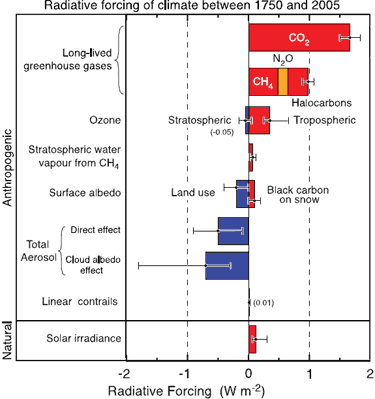 Figure 1: Global mean radiative forcing of climate. Anthropogenic RFs and the natural direct solar RF are shown. (IPCC AR4 Figure 2.20a)
Geo Guy continues: Their failure to recognize the important role that water vapor plays in the greenhouse effect to me is a significant shortfall in their reports. After all we do know that water vapor has a much greater greenhouse gas effect than does CO2.
On the contrary, everyone recognizes the role of water vapor. But water vapor acts as a feedback, amplifying the forcing from CO2, other greenhouse gases, solar, etc.
Figure 1: Global mean radiative forcing of climate. Anthropogenic RFs and the natural direct solar RF are shown. (IPCC AR4 Figure 2.20a)
Geo Guy continues: Their failure to recognize the important role that water vapor plays in the greenhouse effect to me is a significant shortfall in their reports. After all we do know that water vapor has a much greater greenhouse gas effect than does CO2.
On the contrary, everyone recognizes the role of water vapor. But water vapor acts as a feedback, amplifying the forcing from CO2, other greenhouse gases, solar, etc.
-
Geo Guy at 06:02 AM on 26 March 2010Is the science settled?
First of all, Science is never settled. As soon as we believe that issues have been settled, we will stop progressing. No matter how confident people may be about a theory and no matter how accurate that theory may be, we can only continue to move forward if we allow healthy debate and not roll over at the whims of people who try to shove their perspective down our throats as being "true correct, beyond debate yadda yadda yadda". The least scientific method to prove a theory is to use graphs of data. While graphs serve to help one explain a theory, they do not prove anything. The biggest complaint I have with the current debate is the 100% focus on CO2 when we know there are so many other parameters that work together in setting the climate here on earth. Why the focus on CO2? Well that is the only way in which the IPCC can relate climate change to man's activities (which was their mandate when they were established by the UN. Consequently they have failed miserably in their attempt to shove the cause of climate change onto man. Their failure to recognize the important role that water vapor plays in the greenhouse effect to me is a significant shortfall in their reports. After all we do know that water vapor has a much greater greenhouse gas effect than does CO2. -
Ned at 05:58 AM on 26 March 2010What CO2 level would cause the Greenland ice sheet to collapse?
gallopingcamel writes: On another thread I was asking how one could justify discarding 80% of the surface weather stations (the station drop off problem). Most of the folks on this blog thought that was fine because Tamino (a statistician) assured them the answer was not affected. Er, no. Your questions about declining station numbers were addressed repeatedly by many commenters, including me here and here>. There are now at least four separate replications of this (Tamino, Zeke Hausfather, Ron Broberg, and now Joseph at "Residual Analysis"), all of which show no significant difference between stations that stopped reporting and those that kept reporting. Watts and D'Aleo made some ugly accusations that have been shown to be incorrect. I would suggest that unless you're prepared to offer some actual evidence, you should probably stop promoting their claims. Continuing, gallopingcamel writes: My point about the CO2 concentration was that we are living in a low CO2 era. In the past there have been periods with >4,000 ppm concentrations. Right ... several hundred million years ago, when the sun was significantly dimmer, and yet the world was quite a bit warmer thanks to all that CO2. This is dealt with in John's article Does high levels of CO2 in the past contradict the warming effect of CO2?. -
muoncounter at 05:10 AM on 26 March 2010What CO2 level would cause the Greenland ice sheet to collapse?
Camel, #52: "suggesting that the melting of the Greenland or polar ice caps is a "catastrophe" is Alarmist nonsense. The negatives of reduced glaciation are more than offset by the benefits." Melting ice is a symptom, not the disease. Unfortunately there are an enormous number of other symptoms. Excuse the length of this post, but I've compiled a mere handful for reference: Warming and earlier spring increase western US forest wildfire activity "large wildfire activity increased suddenly and markedly in the mid-1980s, with higher large-wildfire frequency, longer wildfire durations, and longer wildfire seasons. The greatest increases occurred in mid-elevation, Northern Rockies forests, where land-use histories have relatively little effect on fire risks and are strongly associated with increased spring and summer temperatures and an earlier spring snowmelt." Drought's growing reach "the fraction of global land experiencing very dry conditions (defined as -3 or less on the Palmer Drought Severity Index) rose from about 10-15% in the early 1970s to about 30% by 2002. Almost half of that change is due to rising temperatures rather than decreases in rainfall or snowfall," Global warming increases flood risk in mountain areas "if global temperatures increase by 2 degrees Celsius (3.6 degrees Fahrenheit), then large floods that occurred about once every 100 years could occur up to 5 times more often." Climate change amplifying animal disease "The World Animal Health Organisation said a survey of 126 of its member-states found 71 percent were "extremely concerned" about the expected impact of climate change on animal disease. Fifty-eight percent said they had already identified at least one disease that was new to their territory or had returned to their territory, and that they associated with climate change." Public health-related impacts of climate change "The population of many pathogens increases at higher temperatures, and this is likely to occur in lakes, streams and coastal zones as water temperature increases. In the coastal zone, toxic algal blooms will likely be more frequent as ambient, and consequently water, temperature rises, increasing the risk of illness originating from aquatic recreation, such as swimming and surfing, and from contamination of seafood (Rose et al., 2001)." Ecological responses to climate change "We have reviewed merely a portion of the enormous body of basic research on ecological and physiological processes that are sensitive to climatic variables such as temperature and precipitation. The evidence indicates that only 30 years of warmer temperatures at the end of the twentieth century have affected the phenology of organisms, the range and distribution of species, and the composition and dynamics of communities." Evidence from a wide range of unrelated disciplines points in the same direction. Many of the symptoms are already here - and the disease remains untreated and often is flat-out denied. Unrelated to topic, but here's a story of warnings ignored, or what would have been called at the time 'Alarmist nonsense'. -
Doug Bostrom at 04:28 AM on 26 March 2010What CO2 level would cause the Greenland ice sheet to collapse?
gallopingcamel at 14:29 PM on 25 March, 2010 The negatives of reduced glaciation are more than offset by the benefits. GC, would you care to quantify that? Are you making a prediction based on analysis, or instead stating your opinion without support? -
Ned at 03:02 AM on 26 March 2010Visual depictions of Sea Level Rise
Berényi Péter, I'm not sure I understand your point in this comment. You suggest there is a qualitative similarity between areas with positive geoid/ellipsoid separations and areas with high sea level rise. Maybe there is, and maybe there isn't -- the southwest Pacific and northeast Pacific seem to show that, but then look at the Indian Ocean, or the east vs. west coast of South America. But even if there were a moderate correlation, so what? You assert "There is no legitimate reason to be a correlation between undulations and local sea level trends" but you don't give any justification for that claim. Keep in mind that both geoid height and SLR exhibit very high levels of spatial autocorrelation. -
Arkadiusz Semczyszak at 01:08 AM on 26 March 2010Is the science settled?
"... how has climate responded to forcings in the past?" And here we return to the reliability of data from ice cores, on which based Hansen and Chylek. And open another Pandora's box (http://www.someareboojums.org/blog/?p=7) - huge doubts ... -
Arkadiusz Semczyszak at 01:07 AM on 26 March 2010Is the science settled?
@ProfMandia and unreal2r Specifically, the discussion on costs: 1. Without CCS will not achieve over the next 20-30 years a sufficient reduction in CO2 emissions. CCS is perhaps 70-80% of the cost of combating AGW. CCS is in no way improves the efficiency of energy - on the contrary - only generates costs. 2. Adoption of a AGW theory version of the IPCC (required haste) the effect of the introduction of large-scale too "young" technology for renewable energy. It harms the technology. For example, solar power - is still underdeveloped energy storage technology is at night - the day melting salt (NaCl, KCl, and others) - is still too inefficient technology. 3. Trenberth - one of the "creators" Climategate - the end justifies the means? 4. @ Scaddenp - bravo! I agree completely. The theory of risk - an acceptable degree of probability - an intolerable absolutizing (IPCC), the principle of the superiority of prevention ... Here I recommend the work of V. Klaus, a professor of economics and the Czech president: "Blue Planet in Green Shackles" (one of the chapters of this book) and http://www.guardian.co.uk/environment/cif-green/2009/may/01/vacla-klaus-emissions -Economy -
Marcel Bökstedt at 22:58 PM on 25 March 2010Is the science settled?
RSVP> It's probably off topic here too, but I find the question interesting. One answer would be "If there had been really huge temperature variations, we would not be here to record them". Another answer is suggested by the idea that in the long perspective the level of CO2 and the temperature is controlled by rock weathering. The removal of CO2 from the atmosphere due to weathering would have to be in equilibrium with the outgassing of CO2 from volcanos etc.. Of course, this raises a different question: Why does outgassing not change over the millions and millions of years? -
tfhabig at 22:52 PM on 25 March 2010Antarctica is gaining ice
One thing that seems to have been missed here is that an increase in sea ice will not change the ocean level since that mass is already in the ocean. A decrease in land ice will add to the sea level.
Prev 2452 2453 2454 2455 2456 2457 2458 2459 2460 2461 2462 2463 2464 2465 2466 2467 Next


