


 Arguments


Recent Comments
Prev 488 489 490 491 492 493 494 495 496 497 498 499 500 501 502 503 Next
Comments 24751 to 24800:
-
DSL at 15:02 PM on 19 August 2016There's no correlation between CO2 and temperature
Hrmmm . . . yes, Victor. I have an idea. How about we get roughly 300 of the leading climate scientists together and have them work over the basic science. They'll end up creating a summary based on the existing research. Then, they can open up their summary to a series of peer reviews. Maybe two of them should be open reviews. I expect several thousand scientists would want to get involved in review. If the basic science made it out of that process still established as the overwhelmingly consensus-of-evidence strongest theory, would you elevate your level of probability for it?
-
victorag@verizon.net at 14:31 PM on 19 August 2016There's no correlation between CO2 and temperature
Speaking very generally:
I've done a fair amount of research in the social sciences, especially in the areas of semiotics, ethnology, and cultural evolution, and have read extensively in the fields of psychology, archaeology, population genetics and cognitive science. And one issue that keeps coming up whenever data is being evaluated, is the issue of bias. As is well recognized in all the sciences, researchers tend to see what they expect to see, or what they want to see, and as a result many studies are tinged by confirmation bias, regardless of the intentions of the researcher, which are usually honorable.
As a result, in many fields the gold standard for any sort of testing is the controlled, double-blind experiment, where no one involved in the process has any knowledge of what's involved or any interest in the result. I realize, of course, that double-blind research is usually not possible in a field such as climate science, but that does not mean that the possibility of bias should be ignored. There is a very good reason why double-blind testing is considered so important.
I've read a great many papers by obviously qualified climate scientists that deal with the issue I've raised here, i.e., the correlation or lack of it between CO2 and warming, and while there is certainly much that I'm incapable of understanding, the impression I get is that the goal of the research in almost every case is to find some way to justify a predordained result. Thus if it's a question, say, of "accounting for" something like the so-called "hiatus," then the entire research effort is directed toward that goal, and if the goal cannot be reached then the research would be deemed pointless and would remain unpublished.
This is the impression I got from the Grant/Rahmstorf paper especially, but I get similar "vibes" from many of the others as well. While this feeling might in fact be unjustified, I do believe it goes a long way toward explaining the skepticism of so many when encountering this research, because in the absense of something like a controlled double-blind experiment it's very difficult to completely remove the suspicion of confirmation bias, even if it isn't there. It would be helpful, I think, if someone were to lobby for a different approach, where the interpretation of the data could be done by people from some other field, with no skin in the game and no preconceptions — or at least double checked by such people on a completely independent basis, so there is no possibility of influence from the primary researcher to what we could call the "control group."
When we see result after result that appears to confirm the same hypothesis, then many climate scientists see that as proof positive that "climate change is real." But a skeptic such as myself can get a very different impression, for the reasons summarized above. Rather than continually harping on the "mounds of evidence" supporting your position, which only arouse suspicions, you might do better to find some way to convince the world that your findings are the result of truly impartial and objective research rather than simply a set of foregone conclusions.
Forgive me if my remarks seem offensive, but imo these are issues you need to consider if you expect the entire world to bend to your demands.
Moderator Response:[JH] Argumentative & hyperbolic sloganeering snipped.
-
nigelj at 14:10 PM on 19 August 2016Climate urgency: we've locked in more global warming than people realize
Interesting discussion. I'm not a vegetarian, but I concede meat eating is pretty inefficient use of resources. We need a lot of plant matter to generate a small quantity of meat. Maybe the answer is to keep meat eating pretty moderate.
But then we look at the oceans where a lot of plankton is presumably needed to support a small number of fish. We can't eat plankton so we might as well eat the fish. We have nothing to lose, provided we don't over fish, and no obvious impacts on climate change.
-
victorag@verizon.net at 13:46 PM on 19 August 2016There's no correlation between CO2 and temperature
Speaking very generally:
I've done a fair amount of research in the social sciences, especially in the areas of semiotics, ethnology, and cultural evolution, and have read extensively in the fields of psychology, archaeology, population genetics and cognitive science. And one issue that keeps coming up whenever data is being evaluated, is the issue of bias. As is well recognized in all the sciences, researchers tend to see what they expect to see, or what they want to see, and as a result many studies are tinged by confirmation bias, regardless of the intentions of the researcher, which are usually honorable.
As a result, in many fields the gold standard for any sort of testing is the controlled, double-blind experiment, where no one involved in the process has any knowledge of what's involved or any interest in the result. I realize, of course, that double-blind research is usually not possible in a field such as climate science, but that does not mean that the possibility of bias should be ignored. There is a very good reason why double-blind testing is considered so important.
I've read a great many papers by obviously qualified climate scientists that deal with the issue I've raised here, i.e., the correlation or lack of it between CO2 and warming, and while there is certainly much that I'm incapable of understanding, the impression I get is that the goal of the research in almost every case is to find some way to justify a predordained result. Thus if it's a question, say, of "accounting for" something like the so-called "hiatus," then the entire research effort is directed toward that goal, and if the goal cannot be reached then the research would be deemed pointless and would remain unpublished.
This is the impression I got from the Grant/Rahmstorf paper especially, but I get similar "vibes" from many of the others as well. While this feeling might in fact be unjustified, I do believe it goes a long way toward explaining the skepticism of so many when encountering this research, because in the absense of something like a controlled double-blind experiment it's very difficult to completely remove the suspicion of confirmation bias, even if it isn't there. It would be helpful, I think, if someone were to lobby for a different approach, where the interpretation of the data could be done by people from some other field, with no skin in the game and no preconceptions — or at least double checked by such people on a completely independent basis, so there is no possibility of influence from the primary researcher to what we could call the "control group."
When we see result after result that appears to confirm the same hypothesis, then many climate scientists see that as proof positive that "climate change is real." But a skeptic such as myself can get a very different impression, for the reasons summarized above. Rather than continually harping on the "mounds of evidence" supporting your position, which only arouse suspicions, you might do better to find some way to convince the world that your findings are the result of truly impartial and objective research rather than simply a set of foregone conclusions.
Forgive me if my remarks seem offensive, but imo these are issues you need to consider if you expect the entire world to bend to your demands.
Moderator Response:[PS] Claims of "bending to demands" is incendary. Repeat similar and post will be deleted. It is not deleted so that other commentators are able to judge your so called serious enquiry.
If you cant fault the science demonstating the correlation when done properly, you cannot dismiss it with hand-wavy comments about how you believe science should be done. If this is wrong, then where are the alternative skeptic theories that provide better explanation?
Instead of the handwaving, once again, please state to commentators where you agree and where you disagree.
-
victorag@verizon.net at 13:08 PM on 19 August 2016There's no correlation between CO2 and temperature
Once again I want to thank everyone who responded for being so patient, so thorough and so civil. I hadn't noticed that I'd shifted the goalposts, but if that's the case I apologize. I find this dialogue extremely interesting and useful but I hope no one will mind if I persist a bit with some further questions. What I hope you will all consider is not simply the issues I've raised per se, but how questions such as these might help you to understand why some of us have remained skeptical for so long. It's not so much that I claim to understand what climate scientists are doing and reject it, as that I do not understand completely and that certain disturbing questions persist, probably because the matter at hand is so complex, but also because certain technical issues go over the heads of laymen struggling to understand. I won't attempt to deal with all the issues that have been raised, but I do have a few more questions/comments:
1. I did click on the Benestad and Schmidt paper and read much of it. I realize that many forcings were considered but what got my attention was the graph illustrating, in part, the affects of solar forcings during the early 20th century, and it looks to me as though the slope is too narrow to account for the steep temperature rise. Tom C. has claimed, above, that the response to volcanic forcings is the major factor, based on Cowtan's graphs. This is a perfect example of the sort of thing skeptics such as myself have problems with, because it's hard to see how the lack of a forcing could produce a significant warming. It seems more logical to posit some unknown forcing that could have produced this effect. And if you want to insist that there is no evidence of such a thing, my answer would be that this very dramatic runup in warming seems to be the evidence.
Secondly, I don't see how a set of graphs can in itself demonstrate anything in the absence of some sort of report explaining what they represent and how they were arrived at. Has Cowtan published on this and if so could you provide a link.
2. "The claim "The cooling from 1940 onward, followed by a long levelling off until 1979 is also difficult to explain as the result of natural forcings, despite Cook's effort to do so." verges on sloganeering if you do not provide evidence to support that, and aerosols are an anthropogenic forcing."
Where is this term "sloganeering" coming from? I don't recall offering a slogan. Have you consulted a dictionary? And yes, I can provide such evidence, in the form of a paper by James Hansen et al., published in the journal Climate Dynamics, in 2007: "Climate simulations for 1880–2003 with GISS modelE." (This was available on the Internet but as I just discovered, it no longer seems to be. Perhaps you already have a copy.) The data in this paper was the basis for the data used by Cook in his aforementioned blog post. Here is an excerpt from the abstract:
We carry out climate simulations for 1880–2003 with GISS modelE driven by ten measured or estimated climate forcings. . . Discrepancies between observations and simulations with all forcings are due to model deficiencies, inaccurate or incomplete forcings, and imperfect observations. Although there are notable discrepancies between model and observations, the fidelity is sufficient to encourage use of the model for simulations of future climate change. . . Principal model deficiencies include unrealistically weak tropical El Nino-like variability and a poor distribution of sea ice, with too much sea ice in the Northern Hemisphere and too little in the Southern Hemisphere. . .
The paper, written with the assistance of 38 associates, is incredibly complex and, as the author himself acknowledges, filled with "notable discrepancies" and "deficiences," and, judging from the content generally, many uncertainties. Yet Cook picks up on data and graphs from this paper and refers to them as though they constituted reliable evidence that CO2 is "the dominant forcing" and that this data is sufficient to establish the correlation in question, i.e. the correlation between CO2 emissions and global warming. Sorry, but after skimming through the complexities of the Hansen paper, I find this pat conclusion difficult to accept.
I have one other point to make but I'll do that in a separate post.
Moderator Response:[PS] Just to be clear: Sloganeering in my interpretation is making an assertion (the slogan) without providing supporting evidence.
When Tom answered your criticism on F&R, you suddenly jumped to another objection which is suspiciously like shifting the goal posts. A published to reference to Cowtan's works has already been given (Crawley et al).
-
RedBaron at 12:33 PM on 19 August 2016Climate urgency: we've locked in more global warming than people realize
@saileshrao,
I have been thinking about your post all day. I have a quandry. In all honesty I do not want to discourage you from Veganism. See if you can follow my train of thought. I honestly think that veganism is really only possible in developed countries. In developed countries like the USA where I am developing one small niche to add to the regenerative models I posted about above, as much as 95% -97% or more of the animal products available to consumers have used the destructive agricultural production models. So a Vegan boycott of those products is actually in my view a big help.
There are fundamental flaws in your grand vision of a world completely transformed to veganism. But I really don't think it is productive to alienate a potential ally with arguments over that 3%. Nor do I think any Vegan movement has any chance at all to convert the entire world to your dietary restrictions anyway. So I believe the point is moot anyway.
What I will say is this. Your grand vision of rewilding vast areas would actually remove them from food production too. The remaining land could feed our population, but without using biomimicry on that remaining land (which by necessity requires carefully managed animal impact) It would be impossible to produce enough food without agrichemicals at our current technology. So the remaining land would eventually degrade in the boom and bust cycle I referenced above. We would need to continually go back to those newly rewilded areas and bring them back into agricultural production, and rewild the degraded land, in sort of a huge rotational fallow plan. Beyond being unrealistic, it is also only delaying the inevitable, because you really haven't converted to a regenerative agricultural model. All you are really doing is destructive agriculture, but on less land temporarily. It can't solve AGW, only slow it. It would be the best we could do, if we didn't have regenerative production models. From a systems science POV it is not much different than what we have now, just without animals. Still a cause of AGW, but cut by 1/2. And that's assuming you could even make it work at all.
So no I don't fear Veganism. I encourage it. It helps pressure a change. But taken to the extreme of the whole world going Vegan, likely not workable, and certainly not a plan to eliminate AGW. Again, less damaging to the soils is not the same as regenerating the soils.
-
Tom Curtis at 08:50 AM on 19 August 2016There's no correlation between CO2 and temperature
victorag @67 & 68:
1)
"one still can't help but wonder whether these same three forcings were all that were needed to correct for other discrepancies in the temperature data over a much longer time period, such as the 1940-1979 "hiatus""
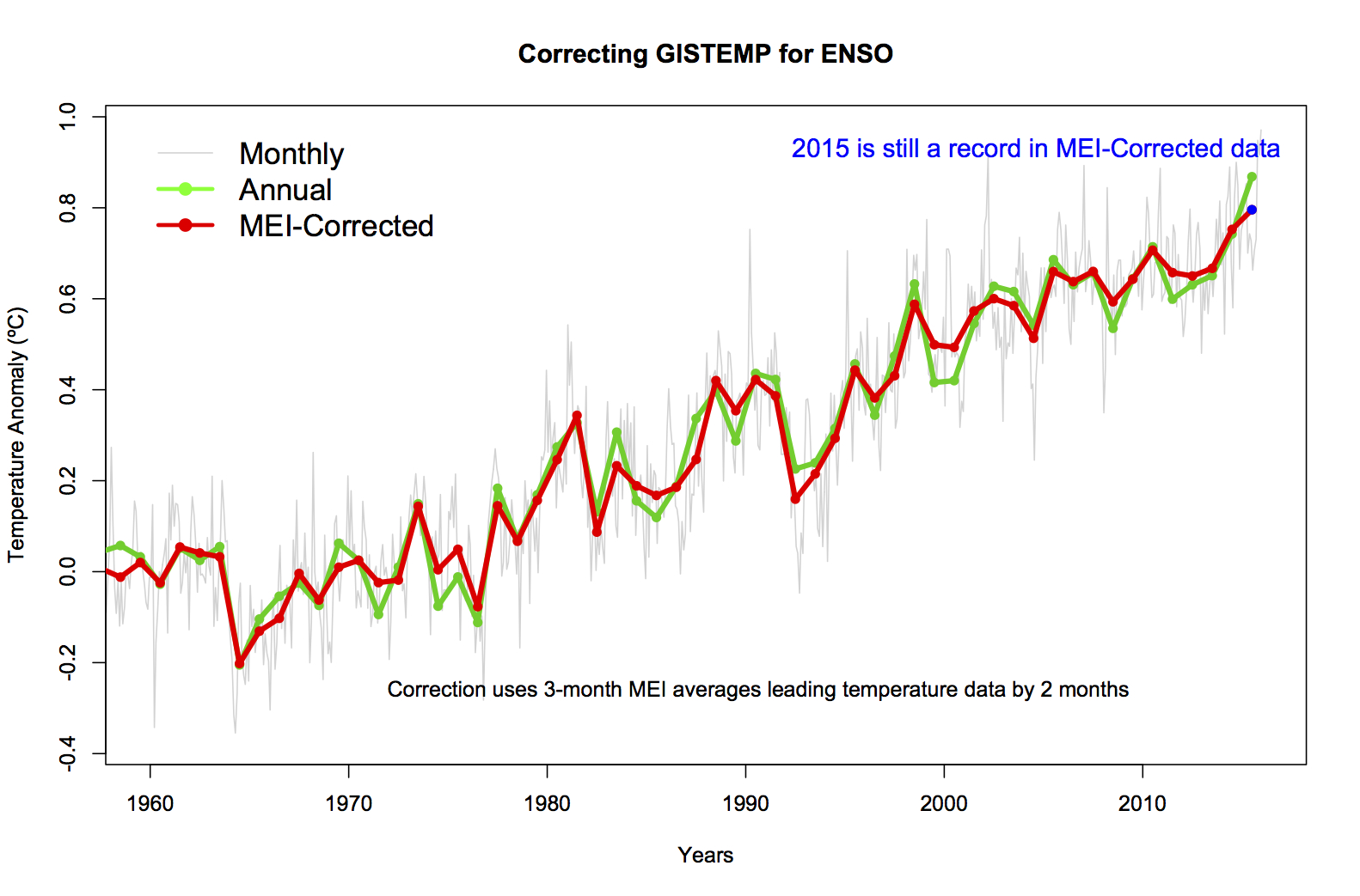
Except that if you look at Kevin Cowtan's model on the default settings, you can see that those same factors account for the 1940-1979 hiatus (Fig 1). You can also see that the response to volcanic forcings is the major natural player in the temperature increase from 1910-1940 (Fig 4), and that ENSO is a major player in flattening the temperature response in the 1940-1979 hiatus (Fig 5).
It should be noted that Cowtan's model uses the same two natural forcings, plus the same mode of natural variability as is used in Foster and Rahmstorf. Further, instead of a default assumption that any temperature response not due to those three factors is due to the sum of anthropogenic forcings, it explicitly includes those anthropogenic forcings. If a Foster and Rahmstorf's methodology would not reproduce the anthropogenic temperature response if applied over the full 1880-2010 interval, then neither should Kevin Cowtan's model produce such a good fit over that interval using the same modes of natural influence plus the explicit anthropogenic forcings.
2)
"I am also wondering whether there has been any followup to the FR paper, and whether the three criteria they chose in 2010 still do the same job as convincingly when we consider the intervening years from then to now?"
Here is are the results of the Foster and Rahmstorf adjustment updated to 2012:

For what it is worth, 2011 and 2012 saw the two strongest La Nina years since 1974/75. Since then we have had two neutral years (2014 and 2015) each of which set temperature records unadjusted, and an El Nino year which has seen unprecedented montly temperatures in the first half of the year, and is very likely to set a third annual, global record temperature in a row. Given that, it is likely that the Foster and Rahmstorf methodolog would indeed do the same job as convincingly, although I can find no update to 2015. I can, however, find an ENSO only adjustment to 2015 which supports that contention:
3)
"I was thinking of the presentation offered on this blog by John Cook back in 2009, titled The CO2/Temperature correlation over the 20th Century ( http://www.skepticalscience.com/The-CO2-Temperature-correlation-over-the-20th-Century.html ), in which he lists 10 such forcings. It seems to me that if you are going to systematically analyze the effects of natural forcings you need to settle on the exact number of all forcings that have been identified and then apply them across the board."
Of the ten forcings identified by John Cook, only two are natural - solar and volcanic. The ten forcings are the same forcings as used in Kevin Cowtan's model, and if you set the model to the GISS 2011 forcings, you can even use the same dataset (extended by two years) as is used in John Cook's article. So, again "The resulting adjusted temperature [in the Foster and Rahmstorf model] therefore reflects not the temperature influence of CO2, but of the sum of all anthropogenic forcings" (see my comment @65); and again Foster and Rahmstorf use the same natural causes of variability as those used in Kevin Cowtan's model (with all 10 explicit forcings) with essentially the same result over the 1979-2010 interval (see Fig 6 of model results).
As to any unknown forcings, first in science a principle of economy is applied where we do not postulate causes without reason do do so. Foster and Rahmstorf (and Kevin Cowtan's) model show that the temperature data do not require us to postulate additional causes for the global temperature variation. Therefore if you want to postulate an additional natural source of variability, you need to show why it is necessary. You also need to provide (or find where somebody has provided) an annual index of that purported cause of variability without which the effect of the purported cause of variability cannot be tested (ie, the claim that it is a cause of variability has not been put in a falsifiable form). It is not incumbent on working scientists to chase every 'fairy at the bottom of the garden theory', but rather of the proponents of those theories to bring them into sufficiently rigorous a form that they can be tested by scientists.
Further, given the efficacy of the explanation of global temperature from 1880 onwards using the two natural, eight anthropogenic forcings plus ENSO, any postulated additional natural cause of variability must be highly correlated with one of the two natural forcing, the anthropogenic forcing, or ENSO. That would be astonishing if coincidental, and if not coincidental then the purported additional natural cause of variability has already been included de facto in the analysis. Further, if its correlation was with an anthropogenic forcing and the correlation was not coincidental, the purported additional cause would also be anthropogenic.
Moderator Response:[PS] Thanks Tom for your considered and civil response. Victor, in the interests of maintaining civil and focused dialogue, it would be could if you could indicate where you agree or disagree with response made to you. It would especially be appreciated if you refraimed from shifting the goalposts.
-
Tom Dayton at 08:43 AM on 19 August 2016There's no correlation between CO2 and temperature
It seems to me that if you are going to systematically analyze the effects of natural forcings you need to settle on the exact number of all forcings that have been identified and then apply them across the board. If certain ones have no appreciable effect during a certain period that's no excuse for excluding them — unless you want to open yourself to the perception of cherry picking.
victorag is sloganeering, because he has failed to respond or even acknowledge my previous response in which I pointed out that "cherrypicking" is logically impossible as a label for removing only a subset of factors, when the goal of those authors was to eliminate the influence of that particular subset of factors in order to better reveal the influences of all the remaining factors. VictorAG continues to baselessly and totally irrationally claim that by eliminating only some factors it is possible to hide the influence of the remaining factors.
-
victorag@verizon.net at 05:59 AM on 19 August 2016There's no correlation between CO2 and temperature
[PS] "Tom does not accuse you of cherry-picking. He disputes your logic by pointing out what the study sought to achieve and as such used the data available for that purpose. To continue, please state which forcings you think are missing."
I was thinking of the presentation offered on this blog by John Cook back in 2009, titled The CO2/Temperature correlation over the 20th Century ( http://www.skepticalscience.com/The-CO2-Temperature-correlation-over-the-20th-Century.html ), in which he lists 10 such forcings. It seems to me that if you are going to systematically analyze the effects of natural forcings you need to settle on the exact number of all forcings that have been identified and then apply them across the board. If certain ones have no appreciable effect during a certain period that's no excuse for excluding them — unless you want to open yourself to the perception of cherry picking. I'll add, by the way, that after all natural forcings have been identified and removed, that does not necessarily leave you with CO2, because the remainder might well be some as yet unidentified forcing, combined with CO2.
The paper by Benestad and Schmidt to which you refer is about solar forcings and, as I recall, the effect they found of solar forcings during the sharp warmup of1910-1940 is only slight. I've seen others claim that this warming period could be explained by solar forcing, but this study would seem to have refuted that theory. If in fact there is still no natural explanation for the early 20 century warmup, and CO2 levels were too low to have much effect, then it looks as though there is some as yet unidentified natural forcing that produced the warming during that period — and the same natural effect could have caused the similar extreme warmup during the period 1979-1998.
The cooling from 1940 onward, followed by a long levelling off until 1979 is also difficult to explain as the result of natural forcings, despite Cook's effort to do so. After reading through the paper by Hansen et al, on which he bases his data, the many complexities and uncertainties in the assessment of these various forcings become all too evident.
Moderator Response:[PS] Was it that hard to just click on the Benestad and Schmidt ref? It uses all the forcings. Also note in the your Cook link that forcing are not equal and most are very minor.
The claim "The cooling from 1940 onward, followed by a long levelling off until 1979 is also difficult to explain as the result of natural forcings, despite Cook's effort to do so." verges on sloganeering if you do not provide evidence to support that, and aerosols are an anthropogenic forcing.
-
old sage at 05:59 AM on 19 August 2016Water vapor is the most powerful greenhouse gas
Your request for references and data for what is basic text book physics is rather like asking for a reference when I say the sun will rise tomorrow. Do you seriously require a reference for the water cycle and the way clouds form? As for the work of Ramanathan, it starts using the radiative convective model - one which could hardly be better designed to exclude the constant hunting for equilibrium in the contest between sunshine and cloud cover. Take it from me, his findings - and he admitted not considering clouds or aerosols in the paper I read - is just an exercise in mathematical sophistry. There is only one way CO2 can raise earth's energy content - and I've tried to find justification for the GHG theory - is that by increasing the atmosphere's opacity, it increases the cross-section presented to the sun. I haven't bothered to calculate how much difference it would make, but it is at least a thermodynamically sound possibility. Energy neutral transfers within one thermodynamic system being able to raise the system's energy content is not sound.
Moderator Response:[PS] Hand-wavy dismissal of observation/model match and of papers you continue to misconstrue is more sloganeering.
Please note that posting comments here at SkS is a privilege, not a right. This privilege can and will be rescinded if the posting individual continues to treat adherence to the Comments Policy as optional, rather than the mandatory condition of participating in this online forum.
Consider a thin plate on earth's surface. You can isolate it in glass box with near-vacuum if preferred to minimize conductive effects. What is the temperature of that plate a/ when sun is shining. b/ at midnight? Textbook answers that match actual observations require use of the GHG effect. Please show us how your understanding of physics will give the correct answer for observed temperature of the plate without the GHG effect. I see little point in further comments from you on this forum from you till you have answered this question.
-
victorag@verizon.net at 05:34 AM on 19 August 2016There's no correlation between CO2 and temperature
OK, I'm back. First off I want to clarify by stressing that it was not my intention to accuse Foster and Rahmstorf of conscious deception. I have no reason to believe they were being anything other than sincere. Also, the impression I have that they were cherry picking might well be unfair. I'm not a climate scientist so it's possible there are things in their paper I do not understand.
Nevertheless it's very hard to discount the impression of cherry picking, because after all there are many more natural forcings than the three they selected, and one therefore can't help but wonder whether they were selected simply because they produced the desired result. And one also can't help wondering whether the paper would have been published at all if some other result had emerged.
While the detailed explanation very graciously provided by Tom might be perfectly valid, that does not alter the perception that confirmation bias could be at work, however unconsciously. My reaction, right or wrong, when I first read the paper was that 1. I questioned the choice of those three forcings as they appeared to be cherry picked; 2. even if we assume they were not cherry picked, one still can't help but wonder whether these same three forcings were all that were needed to correct for other discrepancies in the temperature data over a much longer time period, such as the 1940-1979 "hiatus" — and if they are not sufficient for this earlier period, why would they be sufficient for the period covered by the FR paper?
I am also wondering whether there has been any followup to the FR paper, and whether the three criteria they chose in 2010 still do the same job as convincingly when we consider the intervening years from then to now?
-
saileshrao at 04:03 AM on 19 August 2016Climate urgency: we've locked in more global warming than people realize
RedBaron,
Thank you for the very detailed explanation and the useful links. Your agricultural knowledge is impressive. As you point out, there are a lot of things that need to be changed: agricultural production models, energy mixes and ecosystem recovery. But let me grant that your approach to carbon sequestration is workable within the current system.
I happen to be a systems specialist and take a holistic perspective. Climate change is a threat multiplier for a host of environmental threats: ecosystem degradation, toxic pollution, resource depletion and fresh water scarcity, to name a few. Couple those with the social ills of poverty, inequality, overconsumption, etc., and you have an apocalyptic mix ready to combust at any time. Solving carbon sequestration addresses the threat multiplier, but not the underlying threats.Far from being dogmatic, Veganism is a rational response to climate change, the threat multiplier, as well as the underlying environmental threats, simultaneously! It releases pasture land back to Nature which can be re-wilded to their native biomes for ecosystem recovery. Rapid carbon drawdown occurs in re-wilded native forests until maturity (carbon stock remains sequestered as long as the forests stand) and as you point out, deep long term carbon sequestration can occur on prairies with native ruminants. Trees store the toxic pollution in their trunks in recovering forests, while people stop ingesting bio-concentrated doses of toxic pollution through animal foods. For instance, the USDA estimates that 95% of the dioxins in our bodies, which are some of the strongest carcinogens known to man, come from the foods we eat. Dioxins are released into the atmosphere whenever chlorine reacts with hydrocarbons and this happens, for instance, when we bleach wood pulp. Currently, the four main food sources of these dioxins are fish, eggs, cheese and meat, in that order. And so on.
This is why Veganism has taken hold among the youth, who are as far from dogmatic as you can get. In the US, as of 2010, according to a Hartman Group Research report, 12% of Millennials, 4% of Gen X-ers and 1% of Baby Boomers were vegan. Since then, interest in Veganism has tripled according to Google trends. The interest is especially strong in the developed countries of the world, which augurs well for Veganism’s continued exponential growth.
Veganism also forces society to address the social threats. We are ensconced in a socioeconomic system that is based upon consumption as an organizing value and competition as an organizing principle. We are each bombarded with 3,500 ads a day, persuading us to consume one unnecessary product or another. We constantly compete against each other to determine who is better at one activity or another. The social hierarchy so created greases this ritualistic consumption.This socioeconomic system is incompatible with Veganism. When taken to its logical conclusion, Veganism necessitates conscious simplicity since any unnecessary consumption uses natural resources that hurts innocent animals somewhere. This is why going vegan is a process that doesn’t stop with our dinner plates. This is also why “vegan consumerism” is an oxymoron and why it frightens the elites in the current system that more and more people are going vegan. Hence the widespread “Cowspiracy” that has infected institutions everywhere, especially in the developed world.
But the response to Veganism shouldn't be fear. Veganism requires transforming our civilization around compassion, not consumption, as the organizing value, and cooperation, not competition, as the organizing principle. Is that such an onerous transformation to contemplate? Surely, we are truly lucky to be alive at this incredibly significant moment in human history, piloting such a transformation... -
RedBaron at 03:38 AM on 19 August 2016Climate urgency: we've locked in more global warming than people realize
@ John,
That's an interesting question John, because of the way you phrased it. The biological systems can recover extremely rapidly. In the order of a decade or less you could strat seeing significant reductions in atmospheric CO2 if every land manager started implementing these various regenerative agricultural systems. The soil starts recovering the first year, but 3 years +/- is when it really starts kicking off due to reinforcing feedbacks. Those reinforcing feedbacks will dominate and accelorate until the main stabilizing feedback, lower atmospheric CO2, slows them down.
But that's not exactly what you asked. You said how fast can we humans implement the changes required? That requires first of all that people not be in denial of AGW or soil degradation. Then one must convice the population of the planet to actually make the changes in agriculture. Then it requires education of the now motivated land managers in the regerative agricultural systems available for their local conditions. All these things require cooperation. That could indeed take a very very long time. Maybe too long.
Assuming we actually could get a world wide cooperative effort, both problems could be solved, or at least no immediate risk and well on their way to resolution, within a few decades.
-
John Hartz at 03:15 AM on 19 August 2016Climate urgency: we've locked in more global warming than people realize
Red Baron @32:
The overarching question then becomes, "How rapidly can the human race implement processes to pull carbon out of the atmosphere and restore it to soils on a scale large enough to make a signicant impact on both the soils and the atmospheric concentration of CO2?"
-
RedBaron at 03:08 AM on 19 August 2016Climate urgency: we've locked in more global warming than people realize
@John Hartz,
You are absolutely correct. In fact all you have done is restate the exact same problem from a different point of view than climate science. Same solution applies to both, because to regenerate soils requires sequestering organic carbon in those soils, and the source of that carbon is from the atmosphere via photosynthesis.
Or to make it simple. The same carbon we have too much of in the atmosphere, we have too little of in our soils. The extra in the atmosphere causes the problem of AGW. And the loss of carbon in our soils causes deterioration of arable land.
So any solution that pulls carbon out of the atmosphere and restores it to our agricultural soils kills two birds with one stone.
-
John Hartz at 02:16 AM on 19 August 2016Climate urgency: we've locked in more global warming than people realize
Red Baron, et al:
Something for both of you to take into account in your ongoing discourse:
Humankind is a witness every single day to a new, unprecedented challenge. One of them is the very fact that the world’s arable lands are being lost at 30 to 35 times the historical rate. Each year, 12 million hectares are lost. That means 33,000 hectares a day!
Moreover, scientists have estimated that the fraction of land surface area experiencing drought conditions has grown from 10-15 per cent in the early 1970s to more than 30 per cent by early 2000, and these figures are expected to increase in the foreseeable future.
While drought is happening everywhere, Africa appears as the most impacted continent by its effects. According to the Bonn-based United Nations Convention to Combat Desertification (UNCCD), two-thirds of African lands are now either desert or dry-lands.
The challenge is enormous for this second largest continent on Earth, which is home to 1.2 billion inhabitants in 54 countries and which has been the most impacted region by the 2015/2016 weather event known as El-Niño.
Arable Lands Lost at Unprecedented Rate: 33,000 Hectares… a Day! by Baher Kamal, Inter Press Service (IPS), Aug 16, 2016
-
Digby Scorgie at 20:33 PM on 18 August 2016Climate urgency: we've locked in more global warming than people realize
Tom Curtis @27
Okay, so it seems the amount of long-term warming is in dispute. Please take this up with the author. I'm not qualified to do so.
But whatever the case, if CO2 levels remain at 400 ppm (they won't), the planet is headed for more than two degrees of warming. Optimists think humanity can reduce CO2 levels below 400 ppm. Just from bitter experience, I think they'll simply carry on rising until the changing climate gets so bad it wrecks global civilization — resulting paradoxically in the required reductions in emissions. Am I a pessimist or a realist?
-
Zoli at 16:33 PM on 18 August 2016Climate urgency: we've locked in more global warming than people realize
@Tom Curtis
@RedBaronThanks. Meanwhile I found an SkS article in the subject 'Do high levels of CO2 in the past contradict the warming effect of CO2?'
So the climate in my post-apocalyptic story will be a bit colder.
-
RedBaron at 14:37 PM on 18 August 2016Climate urgency: we've locked in more global warming than people realize
@saileshrao,
One solution is parallel to Freeman Dyson’s geoengineering “solution” of just plant more trees. There are many reasons this won’t work, but the basic one is that planting trees increases stocks, but doesn’t stabilize fluxes. Using the bucket analogy, you have a created a bigger bucket, but still a bucket with no drain. It helps temporarily … until the new bigger bucket gets full. We call that Saturation. It’s a temporary fix that helps, but it is not a long term solution.
However, maybe even accidently, Dyson might have stumbled onto something that can solve AGW to the benefit of all.
Atmospheric CO2 level is the primary human impact we can change that directly influences energy flows. It comes down to the carbon cycle and the CO2 fertilization effect. Dyson is correct BTW that there is more carbon in the soil than in biomass and atmosphere combined. Also correct about the fertilization effect on plant growth. This is what is called a stabilizing feedback. The debunkers of Dyson are also correct about the increasing emissions from the labile fraction of soil carbon as temperature increases. Called a reinforcing feedback.
Here is where it gets interesting. Dyson AND the vast majority of the Dyson debunking sources have focused on the wrong biome. It is NOT the forest plants that have the capability to mitigate AGW. It’s the grassland/savanna biome that actually can be a forcing for global cooling, and counter the current global warming trend.
In a forest, the stabilizing feedbacks and the reinforcing feedbacks largely counter each other, and little is done long term to mitigate rising CO2 levels. Once you reach that saturation point you are done. You might even decrease albedo. But grasslands sequester carbon very differently than forests. Most grassland carbon is not sequestered in biomass, nor labile carbon in the top O horizon of the soil, but rather the newly discovered liquid carbon pathway. Grasslands also have higher albedo.
Most terrestrial biosphere carbon storage is in grassland (mollic) soils. Where trees store most their products of photosynthesis in woody biomass, grasslands instead of producing a woody tree truck, secrete excess products of photosynthesis (exudates) to feed the soil food web, especially mycorrhizal fungi. Those fungi (AMF) in turn secrete a newly discovered compound called glomalin deep in the soil profile. Glomalin itself has a 1/2 life of 7–42 years if left undisturbed. The deepest deposits even longer with a 1/2 life of 300 years or more in the right conditions. Then when it does degrade a large % forms humic polymers that tightly bind to the soil mineral substrate and can last thousands of years undisturbed. Together they all form what is called a mollic epipedon. That’s your really good deep fertile soils of the world and they contain far more carbon, even in their highly degraded state currently, than all the terrestrial biomass and atmospheric CO2 put together. This LCP is what built those famously deep and fertile midwest soils.
Even though wood is resistant to decay, the biomass of forests is still considered part of the active carbon cycle (labile carbon) That litter layer on the forest floor is relatively shallow, and most that decay ends up back in the atmosphere, unless locked in some kind of peat bog or permafrost. Tightly bound soil carbon in a mollic epipedon is considered differently than the labile carbon pool. It is the stable fraction of soil carbon, and grassland biomes pump 30% or more of their total products of photosynthesis into this liquid carbon pathway.
The importance of this recent discovery of the Liquid Carbon Pathway (photosynthesis-root exudates-mycorrhizal fungi-glomalin-humic polymers-mollic epipedon) to climate science AND agriculture can not be stressed enough.
Glomalin: A soil protein important in soil sequestration
Glomalin Is Key To Locking Up Soil Carbon
Liquid carbon pathway unrecognised
Cenozoic Expansion of Grasslands and Climatic Cooling
So while specifically Dyson was wrong, he has identified in the most general terms the pathway forward. “Plants” is too general. Forests is categorically wrong, although we still need them for their rapid buffering capability on climate as well as many other important ecosystem services, not to mention lumber. But the forcing of CO2 mitigation long term comes from the grassland biome, now largely under agricultural management and that is plants after all. Dyson got the wrong plants and the wrong soils, but did hit on the right concept.
The real question is can this mitigation strategy work within conservative ideals so that a political coalition between both liberals and conservatives can be made to devise a plan acceptable to both? It is pretty obvious that a carbon tax has and will continue to meet with opposition.
I believe it is possible, yes. But certain areas will take dramatic change for that to happen. Most importantly energy and agriculture. Right now both those sectors have already overgrown what can be sustained. Quite predictable since they were never really sustainable since the industrial revolution anyway. Just took a while for people to realise it.
For it to happen though, agriculture production models will need to be changed to regenerative systems, energy will need technological fixes like solar and nuclear etc. and overall since population has already exceeded environmental capacity, a large amount of ecosystem recovery projects will be needed as well. So yeah, reforesting can be a part where appropriate. All of these are possible, however I personally believe they are unlikely to happen on their own given social and institutional inertia.
My focus is on agriculture. Having studied it quite intensely for years, I believe we currently have the ability to fix that one. Only a few minor gaps remain. I can only hope others committed to the other two big ones meet with similar success. But then comes the hard part, actually doing what we know how to do before these unsustainable systems currently in effect start failing world wide, collapsing even our ability to do what we know how to do! That’s the actual tricky part.
For example, if agriculture fails before we fully institute regenerative models and the infrastructure changes needed, civilization collapses. Not much going to be done about it then. AGW will see to it that all three will fail if changes are not done soon enough. Once again with the potential to collapse civilization, or at least many nations including ours. Again making it near impossible to implement what we already know how to do.
So how do we institute the changes needed in a free market economic base beneficial to mitigating AGW?
The most important leg is agriculture. The answer may be more simple than you think. The rise of “king corn” can be seen as a direct result of a series of changes in agricultural policy instituted by Earl Lauer Butz, Secretary of Agriculture under Presidents Richard Nixon and Gerald Ford. Most important to this policy change was the Buffer stock scheme (ever full granary) combined with urgings to farmers to “get big or get out”. (Which happened by the way. Now there is actually a crisis from too few family farmers, average age being 60.) That led to huge surpluses which we then were able to successfully use for many purposes, including major grain sales to Russia and China and many humanitarian aid projects.
Something has changed though. Now China has opened up beef sales. This is a value added commodity over grain. It makes more sense to drop the buffer stock scheme on grain, and instead I propose a buffer stock scheme on grass fed beef instead. You can do this on the same amount of subsidies that we currently use for grain, and instead put them on restoring the great prairies/steppes/savannas of the world….raising beef. This would positively affect carbon sequestration, pesticide use, erosion, seasonal dead zones in our productive coastal waters, biodiversity, energy budget, economic growth, international trade balance, rural economic development, etc… AND if done properly, as many case studies at the USDA-SARE & USDA-NRCS clearly show, even increase total yields of food for humans.
So to fully answer, instead of adding a carbon tax, one way to solve this is simply change what we subsidize. No need for new taxes. In agriculture instead of a buffer stock scheme on king corn, a buffer stock scheme on carbon being sequestered in soils. Just redirect the same amount of funds away from one to the other. Same goes for energy. Fossil-fuel consumption subsidies worldwide amounted to $493 billion in 2014, with subsidies to oil products representing over half of the total. Those subsidies were over four-times the value of subsidies to renewable energy. Simply redirect the subsidies for fossil fuels over to renewables. Doesn’t necessarily need to cost one penny more.
The idea that we are still subsidizing AGW, while trying to find solutions to AGW is quite frankly ridiculous. Goes to the wise old saying, “A house divided against itself can not stand.”
Now for some interesting general numbers. “Under appropriate conditions, 30-40% of the carbon fixed in green leaves can be transferred to soil and rapidly humified, resulting in rates of soil carbon sequestration in the order of 5-20 tonnes of CO2 per hectare per year.”
Liquid carbon pathway unrecognised
Fast facts: The State of the World’s Land and Water Resources
5-20 tonnes of CO2 per hectare per year x 1.5 billion hectares = 7.5 - 30.0 billion tonnes of CO2 per year AND that's just arable cropland, that doesn't even include the ecosystem recovery projects that could be done on degraded desertified rangeland mentioned by Allan Savory in his famous TedTalk. That's actually a larger area of land, but much more complicated to calculate. Because some rangeland is healthy and currently sequestering carbon in the LCP. A larger % is degraded by overgrazing and/or undergrazing, both causes of desertification and either nearly net zero flux, or actually a CO2 emissions source. Depending on the brittleness factor, they also each respond differently when properly managed. So it is difficult to quantify exactly how much more CO2 could be sequestered per year restoring these areas, but likely even more total (but less per hectare). China's restoration project of the desertified Loess Plateau early results shows just how significant this can be.
Soil carbon sequestration potential for "Grain for Green" project in Loess Plateau, China
Pasture Cropping: A Regenerative Solution from Down Under
The System of Rice Intensification (SRI)…
… is climate-smart rice productionThe next two have USDA case studies on file with the USDA, and instructional vids. I will post both.
No-Till Case Study, Brown's Ranch: Improving Soil Health Improves ...
Gabe Brown: Keys To Building a Healthy Soil
and
12 Aprils Grazing Dairy Manual
Trantham's Sustainable 12 Aprils Dairy Grazing Program: A Top Farm that Almost Went Under
As you can see, more food per acre. Little to no cost. More profitable. Large enough.
-
Tom Curtis at 13:47 PM on 18 August 2016Climate urgency: we've locked in more global warming than people realize
MA Rodger and Digby Scorgie, the article abovelinks to the skeptical science article on Hansen and Sato (2012) to justify its estimate of ESS. The SkS article states:
"During a period like the Holocene while warming to a Pliocene-like climate, slow feedbacks (such as reduced ice and increased vegetation cover) increase the sensitivity to around 4.5°C for doubled CO2. However, a climate warm enough to lose the entire Antarctic ice sheet would have a long-term sensitivity of close to 6°C. Fortunately it would take a very long time to lose the entire Antarctic ice sheet."
The 4.5 C is consistent with MA Rodger's figures, while the 6 C is consistent with the article above. For the ESS to be that high, however, the current CO2 concentration must be sufficient (if maintained) to melt away near 50% of the Antarctic Ice Sheet, which seems implausible. In any event, given that Dana was working with a range of estimates of ESS, using the highest value without noting it was a worst case estimate is overstating the case, and I believe should be corrected.
-
saileshrao at 13:44 PM on 18 August 2016Climate urgency: we've locked in more global warming than people realize
Moderator,
Noted, but don't human values play a significant part in effecting the behavioral changes needed to mitigate climate change and environmental degradation? There is plenty of interdisplinary scientific research that finds it to be the case. Please see, e.g.,
Corner, A., Markowitz, E., Pidgeon, N., "Public Engagement with Climate Change: The Role of Human Values," WIREs Climate Change, vol 5, issue 3, pp. 411-422, May 2014.Thank you for your consideration and for the use of this forum.
Moderator Response:[PS] You miss my point. Values are not very malleable. I very strongly doubt that any data about value of meat in diet or use benefits of grazing would turn you into a meat eater. Nor will any argument about "hurting innocent animals" likely to change the views of someone who regularly kills and eats meat. You look at the world through different eyes. The arguments-against-values discussion goes on ad nauseum in other fora and that is where it can stay.
Please feel free however to discuss things that can be decided on basis of data. Eg whether RedBaron's type of managed grazing is a net carbon sink, grazed soils versus forest soils as carbon sinks; whether abandoning feedlot meat would be good for planet as well as the animals; what would be effect on atmosphere if world went vegan and our herds disappeared etc. Ideally those discussions would continue over here.
-
saileshrao at 13:11 PM on 18 August 2016Climate urgency: we've locked in more global warming than people realize
RedBaron,
"In my opinion the solution is not to eliminate cows. The solution is to raise those cows properly with respect to both the cows and the environment. Same goes for pigs chickens etc."
Per IPCC AR5, domestic animals annually consume 7.27 Gt of dry matter biomass and produce 0.18 Gt of animal-based foods for human consumption, at less than 3% efficiency of biomass conversion.
Of the 7.27 Gt that domestic animals consume annually, 3.87 Gt is sourced from grazing land that comprises 35% of the land area of the planet, 3.14 Gt is sourced from cropland that comprises 10% of the land area of the planet and 0.26 Gt is sourced from waste residues.Of the 1.54 Gt that humans consume annually, 1.36 Gt is sourced from cropland as plant-based foods and 0.18 Gt is sourced from domestic animals as animal-based foods.
The animal agriculture industry is aiming to double the production of animal-based foods by 2030. Assuming that this requires the doubling of biomass extraction in IPCC AR5, this would require sourcing 14.54 Gt of dry matter biomass for the consumption of domestic animals alone.
Can you please explain how we could do this "properly" while producing the plant-based foods needed for an estimated 8.5 billion people in 2030, all in the face of accelerating climate change?
Moderator Response:[PS] Discussions work best when you read others comments carefully. Red Baron posts clearly indicate that he is against feedlots (or any cropland to feed agriculture), but that grazing lands are (can be) carbon sinks that need grazing animals to support that sequestration. This was discussed in considerable detail (with you included) over here. (Which seems a better place for further discussion).
-
Digby Scorgie at 11:43 AM on 18 August 2016Climate urgency: we've locked in more global warming than people realize
MA Rodger @22
You have got me confused. I arrived at the statement you query by adding the numbers in the second paragraph of the article. To summarize:
(1) We've caused about 1 C of warming to date.
(2) Freezing atmospheric CO2 at 400 ppm now would result in another 0.5 C "over the coming decades".
(3) There'd be "another" 1.5 C "over the ensuing centuries".
Are you saying (3) is incorrect and that the further warming over the "ensuing centuries" would only be 0.75 C? If so, I think it should be up to you and the author to sort this out. (I hope that doesn't sound rude; it's not meant to be!)
-
victorag@verizon.net at 10:03 AM on 18 August 2016There's no correlation between CO2 and temperature
To Tom and others responding to my posts: thank you very much for your thorough commentaries, which I find very interesting and helpful. I'll need some time to consider them and will need to do a bit more reading and thinking before offering a reponse, maybe some time tomorrow.
-
saileshrao at 09:57 AM on 18 August 2016Climate urgency: we've locked in more global warming than people realize
RedBaron,
The proper analogy is to ban all abuse of children if children are being abused. It is the eating, milking, forcibly impregnating or otherwise abusing and exploiting sentient beings that is unsustainable.
Imagine trying to reduce the global consumption of tobacco products exclusively through "smoke less" or "smoke gently" campaigns, instead of "smoking cessation" campaigns. It would not be successful. But we have to reduce the global consumption of animal products significantly to do any meaningful, reliable mitigitation of climate change and ecosystem degradation. And in a hurry.
Veganism is a way of living where we seek to never deliberately hurt an innocent animal unnecessarily. In all my talks to over thousands of people over the years, I have never met a single person who answered "Yes" to the question,
"Would you ever deliberately hurt an innocent animal unnecessarily?"
I'm afraid those who answer "No" to this question and yet balk at veganism must experience cognitive dissonance, akin to climate denial.Moderator Response:[PS] This is heading off topic very fast and the statements concerning animals are heading into very well worn territory of values. While scientific discussion of whether veganism would be beneficial for climate is welcome, attempts to use climate issues as an excuse to promote vegan values are not. There are other fora for such discussions.
-
Tom Curtis at 08:01 AM on 18 August 2016There's no correlation between CO2 and temperature
victorag @57, the Foster and Rahmstorf paper uses a time period of 1979 to 2010 because the satellite temperature records start in 1979 and the paper was published in 2011 (and hence had no later data). It is difficult to describe using the full period of overlap of the temperature series they used available to them, as they did, as cherry picking with respect to time. It is possible to adopt the same approach as that in the paper over a more extended period, but the cost of so doing is that you must exclude the satellite datasets.
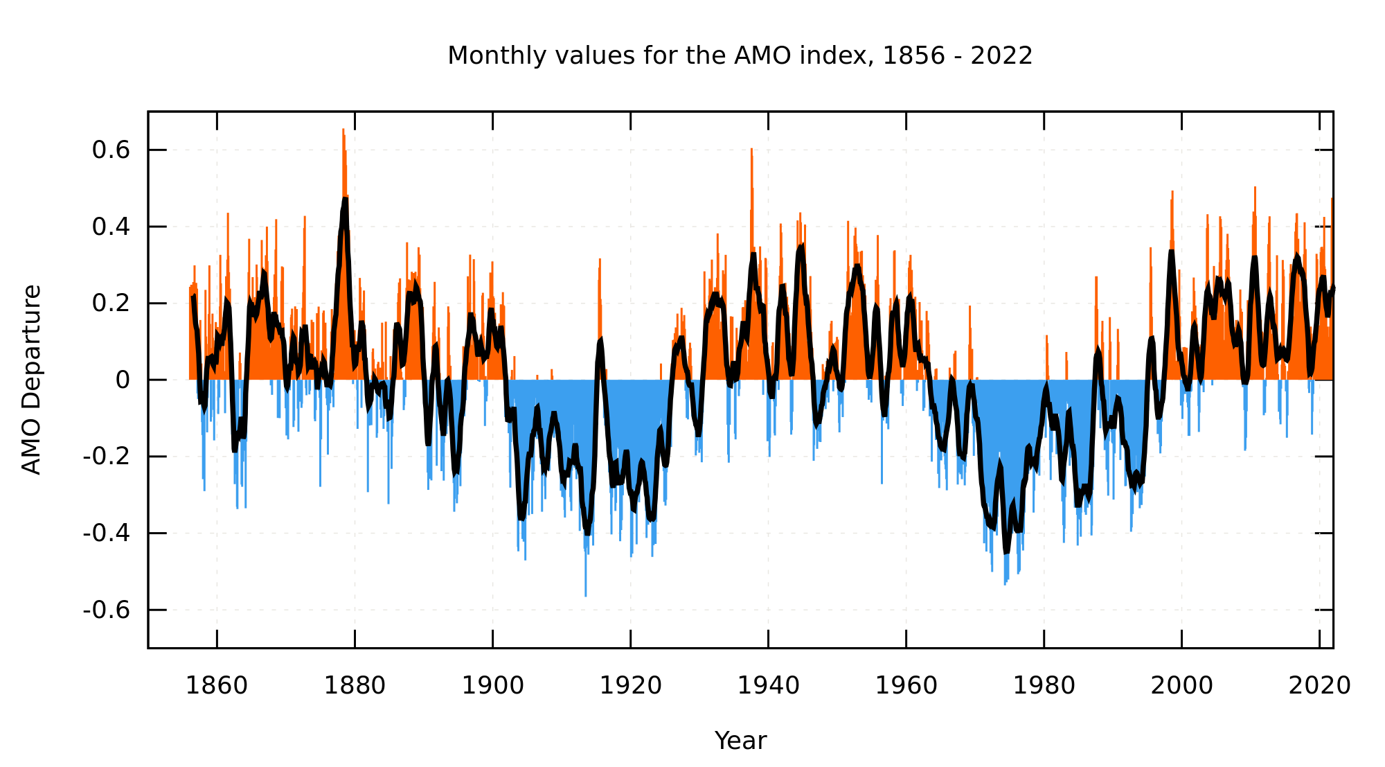
The three variables controlled for in the Foster and Rahmstorf model are the two known natural forcings plus the major component of natural variability. The resulting adjusted temperature therefore reflects not the temperature influence of CO2, but of the sum of all anthropogenic forcings. It may interest you to note than in discussions on his blog, Grant Foster indicated that he had tried variations of his model which also adjusted for the Pacific Decadal Oscilation and the (from memory) the Atlantic Multidecadal Oscilation and found that they had no appreciable impact (but also that you could use the PDO instead of ENSO with no appreciable impact). It is possible that the AMO was near linear over the time period dictated to Foster and Rahmstorf by their data, in which case the adjusted temperature series also includes an AMO component, but that does not sit well with measured values of the AMO:
Alternatively, you could argue that variations in the AMO closely mirror those of ENSO, and that as a consequence the ENSO adjustment in the Foster and Rahmstorf model incorporates an AMO signal into its ENSO adjustment. That being the case, the adjusted temperature series still represents the influence of the sum of anthropogenic forcings.
Finally, you could argue that there is a significant natural forcing in addition to the solar and volcanic forcing and which is not a linear function of either. In that case, the impacts of that natural forcing would also be included adjusted temperature. However, to my knowledge, no such natural forcing has been identified, and certainly no such natural forcing has been identified by the IPCC in any of their assessment reports - so Foster and Rahmstorf cannot be faulted for neglecting this purely hypothetical possibility.
Given all of this, I can see no basis for your accusation of cherry picking against Foster and Rahmstorf.
-
Tom Curtis at 07:39 AM on 18 August 2016There's no correlation between CO2 and temperature
victorag @58, in Kevin Cowtan's model, the year to year change in radiative forcing for each component is provided by estimates of the historical values. You can use one of two estimates, the default Meinhausen (2011) estimates, or those GISS (2011). If you leave all weightings at 1 and look at figure 3 (scaled forcings) you will see they vary year by year. What the weightings allow you to do is adjust the relative strength of the forcings if you think one or more of those forcings have been significantly under or over estimated, or if you think the impact of one or more of the forcings significantly differs from what you would expect from their radiative forcing. To take a common "skeptical" line of thought, for example, if you think the effect of WMGHG and aerosols are one tenth of that which we would estimate by radiative forcing alone, and that the solar forcing has been underestimated, we could adjust the former three (WMGHG, aerosol direct and aerosol indirect effects) to 0.2 and the latter to 2. Doing so, however, drops the coefficient of determination from 0.932 to 0.807 (and does worse things to the RMSE, although the model does not directly calculate that). That suggests that this popular 'skeptical' theory does appreciably worse at explaining the 20th century warming than does the standard IPCC account, in addition to facing significant theoretical difficulties.
As I understand it, the default (2 box) variant of Kevin Cowtan's model is a variation of that described in section 3 of Cawley et al (2015). The only significant difference as I understand it is that the model in Cawley et al uses only one time constant which makes it closer to the 1 box variant. A more complete explanation of the model as presented can be found in the Skeptical Science online course which started on Aug 9th.
-
MA Rodger at 07:37 AM on 18 August 2016Climate urgency: we've locked in more global warming than people realize
Digby Scorgie @5.
You say "Now at last I am told that 400 ppm is equivalent in the short-term to 1.5 degrees of warming and in the long-term to about 3.0 degrees above the pre-industrial level. (Please correct me if I've misunderstood.)"
There is some in what you say here that I'm not happy with.
If we take 400ppm CO2 to represent rougly half the forcing that would result from a doubling of CO2, and if we take climate sensitivity (ECS) to be 3ºC, and if we assume other positive & negative forcings roughly cancel each other out, then 400ppm would result in 1.5ºC rise above pre-industrial (which is -0.31ºC on HadCRUT4, so 2015 was +1.06ºC on pre-industrial): 1.5ºC rise reached 100 years after reaching (& maintaining) 400ppm.
The warming described in the OP resulting from feedbacks beyond the mechanisms deal with in ECS I see as being twice what it should be. The OP says "The Earth’s surface would keep warming about another 1.5°C over the ensuing centuries as ice continued to melt, decreasing the planet’s reflectivity." This is surely wrong. The OP cites Hansen & Sato (2011) but that paper suggests the slow feedbacks would only add 50% to the ECS warming. So it would be another +0.75°C.
That then tots up to +2.25ºC rise but occurring over centuries.
So it really comes down to how quickly mankind can reduce CO2 emissions, the target being zero. I would be surprised if this cannot be done by 2060. And a thought. Consider how much of the technology available to mankind today was an impossible dream only 50 years ago. Without wanting to trivialise the task required to transform technology, I feel I am on quite solid ground arguing that in a couple of centuries (and before those slow feedbacks have the time to bite) mankind will have the technology to adjust global CO2 to a level that they consider to be convenient and one which will go a long way to preventing further damage from AGW.
-
victorag@verizon.net at 06:32 AM on 18 August 2016There's no correlation between CO2 and temperature
#60 No, it looks to me, Tom, as though Grant and Rahmstorf were doing the cherrypicking. What cherries do you think I picked?
Moderator Response:[PS] Tom does not accuse you of cherry-picking. He disputes your logic by pointing out what the study sought to achieve and as such used the data available for that purpose. To continue, please state which forcings you think are missing. I would also note that a similar statistical approach was used by Benestad and Schmidt 2009 with full forcing set. That paper points out the limitations on a statistical approach as well and I would suggest a look at the larger literature on attribution as other commentators have suggested.
I would also note that taking the non-statistical approach - directly account for forcing - is what models do and you have runs covering centuries as well as studies on say ice terminatation or initiation. However, such approaches do not directly reveal CO2 influence on simple graph but as a climate sensitivity number.
-
victorag@verizon.net at 06:30 AM on 18 August 2016There's no correlation between CO2 and temperature
Thanks for the advise, KR. But I am at a loss to find a term characterizing those I've referred to as "warmists." I'm tempted to use "alarmists" but that's much worse, no? What would you suggest?
Moderator Response:[PS] Lets not get offtopic with fights over labels. And in particular I would remind all parties to avoid provocative labelling. Victor I would note that "warmist" in your use would "climate scientist".
-
There's no correlation between CO2 and temperature
Victorag - See the numerous attribution studies listed here. As to your yearly variations issue, that's a matter of measuring the forcings and applying them with either a derived (attribution study) or best estimate (projections) of their efficacies. There is extensive literature detailing estimated forcing levels, see the information on the GISS model forcings here.
Incidentally, the use of the term "warmist" on your part leads to the perception that you frequent denial sites, and aren't really looking for the science - just so you know.
-
RedBaron at 04:34 AM on 18 August 2016Climate urgency: we've locked in more global warming than people realize
@saileshrao,
I agree. My main issue with your posts isn't the current problem with the current wasteful systems. My issue with your posts is the dogmatic view that the solution must be no domestic animals at all.
As an analogy look at it differently. Your dogmatic solution is to analogous to proposing to eliminate all children because some children are abused. No, it is just as wrong. You eliminate abused children by not abusing them anymore. In agriculture animal husbandry is both cruel to the animals and harmful to the environment, including one source for AGW. But it isn't the cows fault. In my opinion the solution is not to eliminate cows. The solution is to raise those cows properly with respect to both the cows and the environment. Same goes for pigs chickens etc.
You said, "As scientists, it is disingenous to pretend that we don't know how to do that." And I would say the same. You are being disingenous in pretending we don't know how to raise domestic animals as part of an AGW mitigation plan. Of all possible solutions to AGW, your fixation to eliminate domestic animals is based on your religious Vegan dogma, rather than the rational scientific side. As I said, you are more than welcome to continue your Vegan boycott of all domestic animal products. I will help by boycotting CAFO products. But as a policy to restore ecosystem services to agricultural land, the vegan dogma is unworkable.
-
Tom Dayton at 04:16 AM on 18 August 2016There's no correlation between CO2 and temperature
victorag, your logic behind your cherrypicking claim about Foster and Rahmstorf is invalid. The goal of Foster and Rahmstorf was to remove the influences of non-CO2 factors, to better reveal the effect of CO2. That is a straightforward procedure and logically airtight. Your claim that removing other factors somehow would hide rather than reveal CO2's effect is nonsense.
-
victorag@verizon.net at 04:09 AM on 18 August 2016There's no correlation between CO2 and temperature
I must add that I find Cowtan's graphs fascinating. Is there a paper that goes with them?
-
victorag@verizon.net at 03:58 AM on 18 August 2016There's no correlation between CO2 and temperature
Tom Curtis @56. Thanks for the link. Cowtan has been providing some very useful services at his websites, I must say. I find this one very interesting, but it has me puzzled. We are expected to provide a weight for each forcing, but how could one be expected to know that without being able to quantify the effects of each, and on a year by year basis. For example, the weighting for volcanic aerosols would be different from year to year, depending on volcanic activity during each year. And one would have to have access to some very reliable studies in which such year by year effects are measured. And the measurements would have to be made compatible somehow with similar year by year measurements for all the other forcings. His results seem to depend on an equal weighting for each forcing for every year, which makes no sense.
What am I missing?
-
victorag@verizon.net at 03:42 AM on 18 August 2016There's no correlation between CO2 and temperature
Yes, I'm very well aware of the Foster/Rahmstorf study. The problem is that it looks very much as though they carefully selected their forcings to provide the results they needed, and appear to have applied them to a time period also predetermined to give the desired results. While a great many forcings affecting climate over the last 120 years or so have been noted in various studies, they chose to include only three, over a period of only 30 years or so. The implication is that if they included more than the carefully selected three they would not have gotten their desired result.
The only way to conduct a scientifically viable test of CO2-temp. correlation would be by systematically eliminating ALL the forcings identified over the entire period in question, i.e. at least the beginning of the 20th century.
Now if you want toclaim that CO2 is responsible for all the warming since 1975, that's a totally different matter. Are you implying that there was some sort of tipping point reached at that time, prior to which the effects of CO2 emissions were negligible? If that's the case then it would not be proper to talk about a long-term warming trend due to CO2, would it? In that case you'd be talking about a period of 25 years when temperature did in fact shoot up in tandem with CO2 emissions. But after those 25 years, the temp. increase slowed while CO2 continued to soar. How do you account for that?
I see no alternative other than the elimination or "attribution" study I suggested, where ALL forcings are taken into consideration over the entire period in question. As it seems to me such studies so far have been conducted on a piecemeal rather than comprehensive basis.
Moderator Response:[TD] All data and code for Foster and Rahmstorf (2011) are public, so you are free to scrutinize those and run the code yourself. You are also free to modify and run their code with additional forcing data. The links I provided describe multiple other studies that you have ignored. Please read those before claiming that they do not exist. For a very thorough review, read the IPCC's AR5 Chapter 10 on Attribution.
-
PluviAL at 03:22 AM on 18 August 2016TV Meteorologists Warm to Climate Science
This is really important. These people are at epicenter of the controversy, not of the science, but the popular mind; long deceived by the disinformation industry into comfortable denial. They will receive the brunt of disapproval from the public, as they also form the engine of growing awareness. There is hope for civilization, when this problem can finally be addressed with the seriousness it requires. Hopefully the next president can build momentum to finally tackle the problem with the full support of congress, instead of kicking the can down the road. The opinion of popular weather-people, if their corporate minders don't expel them, is key to getting a functional congress too. So, this is a very hopeful development. As a member of AMS too, it is good to see this development.
-
saileshrao at 03:04 AM on 18 August 2016Climate urgency: we've locked in more global warming than people realize
RedBaron,
Ecosystems need animals to thrive, but not necessarily domestic animals. 35% of the land area of the planet is currently used for grazing domestic animals and that is a tremendous waste of precious carbon sequestration resources, where we could be "pulling a significant amount of atmospheric carbon and storing it safely".
As scientists, it is disingenous to pretend that we don't know how to do that. -
RedBaron at 02:19 AM on 18 August 2016Climate urgency: we've locked in more global warming than people realize
@Zoli While Tom Curtis has posted a good diagram of the long carbon cycle, he has left out the impact of the biosphere on that cycle. During most the Pliocene The grassland/savanna ecosystem did not exist. During the Cenozoic, climate-wise, the Earth began a drying and cooling trend as grass/grazer biomes evolved and gradually spread forcing a drop in CO2 and CH4 levels, culminating in the glaciations of the Pleistocene Epoch.
Here is a good paper on it.
Cenozoic Expansion of Grasslands and Climatic Cooling
It has almost become a denialist mantra that CO2 was higher in ancient prehistoric times. While this is true, it is also true that the planet was warmer with much higher sea levels and vast swamps (which has now become coal) and much of the land not swampy was deserts. If we should return to similar conditions, civilization would very likely collapse. Probably actually long before reaching those conditions. Not to mention that the sun is actually warmer now than it was back then.
So the available land that is in the sweet spot between not swamps and not deserts and available for agriculture would shrink dramatically. It would be hard to concieve of a way modern civilization could thrive under those conditions, although I must admit I am not a futurologist. Maybe there might be some small remnant of civilized humans left.
-
Tom Curtis at 02:16 AM on 18 August 2016There's no correlation between CO2 and temperature
victorag @55, I recommend you run Kevin Cowtan's 2 box model in the default settings and look at figures 4, 5, and 6. Unfortunately the data terminates with 2010, but the extra five years will make little difference.
-
victorag@verizon.net at 01:09 AM on 18 August 2016There's no correlation between CO2 and temperature
If the signal of CO2 is obscured by other forcings, then it should be possible to calculate the effect of these other forcings and remove them. What remains should be the CO2 signal (plus the signal of whatever other forcings exist that we don't know about). Cowtan's presentation does something like that for the last 20 years or so, but he says nothing about the effect of the same forcings since, say, the turn of the last century (20th century). If the warmist theory is correct, the same forcings should have been in effect for this entire time and removing them should reveal the CO2 signal. At that point one would want to look for a steady upward trend from roughly 1900 to 2015, to match the steady upward trend in CO2 emissions. Has this ever been done? And if so, where can we find the result? Thank you.
Moderator Response:[TD] Foster and Rahmstorf created such a graph for around 1980 to 2010 (maybe it's a bit longer period than that). The general topic is called "attribution" of warming. Other studies covering the period starting around 1950 have their results shown in a bar graph on that same SkS post. See also A Comprehensive Review of the Causes of Global Warming. For details, see in the IPCC's latest report, the chapter on attribution. Humans have had a significant influence from at least 1850 to the early 20th Century, a dominant influence from then until around 1950, and have caused all the warming since at least 1975 and possibly earlier.
[TD] El Nino is removed from around 1955 through 2015, and also some other influences removed from 1970 through 2015, by Tamino.
-
Tom Curtis at 23:47 PM on 17 August 2016Climate urgency: we've locked in more global warming than people realize
Zoli @17, here is a schematic of the long term carbon cycle:

As you can see, CO2 enters the atmosphere through volcanic activity, and is drawn down out of the surface system by rock weathering bringing the carbon into the ocean as Calcium Carbonate (CaCO3) which then falls out as sediment and is taken into the Earth at subduction zones. Over the long term, there is an approximate balance between the rates of these two processes. If volcanism increases, or the rate of rock weathering decreases, however, that balance will be disturbed and CO2 will build up in the atmosphere until a new equilibrium is reached. If volcanism decreases or the rate of rock weathering increases, the reverse will happen and the new equilibrium will be established with a lower CO2 content.
Several things effect the rate of rock weathering including the amount and elevation of exposed rock, the rate of rainfall, and temperature (with warm temperatures accelerating rock weathering). The first is primarilly effected by the rate of mountain building (orogeny). Thus, when the Indian sub-continent collided with the Asian continent, pushing up the Himalayas, that also increased the rate of weathering, thereby drawing down CO2.
-
Aaron S at 23:46 PM on 17 August 2016CERN CLOUD experiment proved cosmic rays are causing global warming
I sincerely do appreciate such a thought out and well written response by Tom Curtis and others. So I want to reply with my concerns.
1) You are correct- the correlation is poor since about 2000. However, if you factor in this was a massive solar max based in isotopes and SSN and if you consider lags in the system associated with oceanic circulation (like AGW theory does for the delay in Antartic warming or PDO and the Hiatus) then you could increase stored heat and continue to even warm beyond the decrease in forcing when stored heat is realeased later. I have zero issue with the PDO storing heat for an entire negative positive couplet and there are much longer circulation cells. Let us remember to- I do believe in AGW and CO2 as a GHG- I just think ignorming solar activity and cosmic rays is not valid based on existing data. Also there is the obvious- the correlation between slope of warming trend in Hadcrut and A2 model warming has poor correlation over the same duration (The Hiatus is Real- Roberts et al. Nature CC 5, 2015). So correlation in this case is not a good argument either way as we are both aware climate is a complex system with feedbacks and lags.
2) Maunder minimum to modern maximum is a totally different situation than a Schwabe 11 yr minimum during a max or a decent from a max and we have not observed the impact from direct obserbations; the isotope record (Steinhilber et al) shows the intensity of the dipole is about the same (a little less for the dipole) as the intensity during the change from the Maunder to the modern max. Furthermore, the Maunder-scale cycles have much higher periodicity than the dipole- which means the wave has more energy given about the same amplitude. Period is important and if I speculate and dream a bit perhaps there is a dynamic equilibrium reached with longer duration changes related to the dipole that minimizes the impact. So I don't get your argument or suggestion that it is 17x the strength because isotopes (only data we have) say otherwise and the higher frequency change also supports more energy for the Sun. So considering that you don't have direct measurments to address anything but the interval during a solar max it seems a rather biased evaluation to me, but perhaps I am missing something as this is a stretch for my understanding. Thanks for making me think about this- it was a pleasant challenge and good learning.
3) Short term solar storms may not be long enough duration to trigger a response. The causal relationship between CR and intra annual solar activity is weak, but they are related to intra-annual events not short pulses.
4) The Earth's magnetic field is dynamic and dominates the Tropics- Agreed. Thanks for sharing that data. I think you need to add "during a solar max" because we don't know what the Maunder looked like- but it did likely impact Northern latitudes. Perhaps this explains the regional nature of the Little Ice Age.
5) You do not address the very strong correlation between the monsoon and cosmic ray intensisty. Correlation requires caution, but each vary greatly in time with a significant decadal scale lag of climate behind magnetics. THis pattern supports causation rather strongly. Nor do you address the quantified causal relationship at the intra-annual period in the other paper. Also, there is data from other proxy that climate responds to the sun's magnetic field. Each support the point in a independent way.
I am fortunate- I am arguing that there is now sufficient evidence to include a stronger sun scenario into the climate models. It is much more difficult to defend than your position to not consider the data validn. Your data is to short (during the max) or to long (100k yr doesn't have century scale resolution) for me to say it meets this threshold. Cosmic rays need included in the models.
Thanks for the opportunity to learn- you are a good teacher.
-
Zoli at 17:45 PM on 17 August 2016Climate urgency: we've locked in more global warming than people realize
The video says half of the CO2 increase would disappear within 20 years without further emissions. How was possible in the past to have high CO2 levels on the long term like in the Pliocene and earlier?
-
RedBaron at 15:41 PM on 17 August 2016Climate urgency: we've locked in more global warming than people realize
Willi,
You are right, and yet drew a different conclusion. Rainforest destruction is primarily for lumber. Crops come next until the soil deteriorates so badly no crops will grow. In those soils that doesn't take long. Once unfit for crops, then comes grazing, because that can restore soils.
While it is true that rainforest destruction is at least partly due to animal ag, in this case the real destruction aside from the timbering to start the process comes when it is cropped with corn and soy for supplying CAFOs. Grazing actually can be the first stage in ecosystem restoration if done properly. Once soil health is improved enough, then either let the ecosystem revert to jungle then forest. Or even plant.
The other point you may not know, is that on prime agricultural land, one can actually produce as much or more meat per acre at far less cost than growing commodity crops to feed animals.
The CAFO system does not actually increase meat produced per acre, comparing like to like. Not only can you produce animal foods where the conditions are unfit for crops, a similar advantage in food per acre happens on that prime land too. Whereas the meat industry has managed to propagandize people thinking that we don't like CAFOs but it is the only way to meet supply for a growing population, the truth is it actually is the opposite.
So yes, we certainly need to stop slash and bun of the forests, But if what you say is true, and we need to actually produce more on less acres without clearing forest, the solution is instead of clearing forest, to convert the prime acreage that supplies CAFOs to prairie again. The prime soils are NOT clear cut forests. The prime soils are plowed prairies.
-
wili at 15:10 PM on 17 August 2016Climate urgency: we've locked in more global warming than people realize
RedBaron, good points, but looking at this in absolute terms is not useful. The whole planet does not have to (and is not going to) turn vegan. So there will always be grazing use for those lands that are not well suited for other ag.
The problem is that, right now, more and more people are eating higher and higher levels of meat, and that is simply unsustainable, and is also contributing to global warming.
The are many pieces to the puzzle, and one of them is certainly reducing (and avoiding increasing) the amount of meat and dairy consumed, since most of this is now produced in ways that greatly increases GHGs in various ways, including rainforest destruction (especially in the Amazon).
-
One Planet Only Forever at 14:10 PM on 17 August 2016Climate urgency: we've locked in more global warming than people realize
tonychacher@10,
I am quite certain (almost 100%) that the evidence available to everyone following what is going on globally leads to a more correct version of your statement "Humans are not going to give up cheap, reliable power."
The statement that better explains the observations is: "Some Humans are not going to willingly give up trying to get away with obtaining personal benefit any way they can get away with, including trying to make burning fossil fuels be perceived to be a cheap, reliable power source."
The solution is social and political change of the economic game. It requires actual effective blocking of such unacceptable pursuits of personal benefit. The level of protest globally against industrial extractive unsustainable pursuits of benefit is proof that not all humans are like that more callous greedy group of deliberate cheating trouble-makers.
And a major part of the basis for that solution is the continuing effort to develop and communicate the best understanding of what is going on with the objective of advancing humanity as part of a lasting constantly improving future for a robust diversity of all life on this amazing planet.
Those who declare they will behave better when someone makes it easier and cheaper for them to behave better are part of the problem. And they deserve to be disappointed and ignored when they complain about efforts to make the damaging ways of living they developed a taste for more expensive and ultimately shut down. Hopefully, they will not respond violently to losing the freedom to continue to do whatever they please (some of them have influence over leadership of nations with nuclear first strike capability).
-
scaddenp at 12:20 PM on 17 August 2016Climate urgency: we've locked in more global warming than people realize
Tony, this site does occasionally blog on solutions eg (its too hard) but for a better source, try Jacobson et al.
There are many resources out there, but this site is primarily about responding to denier myths concerning the science.
Studies such as the Stern report dispute whether FF really are cheap - they have the appearance of being cheap because externalities like the damage to the climate are not currently factored into the price a consumer pays at the pump or on electricity bill. Puts those costs in and see if they are still cheaper than non-carbon sources. Sooner or later, humanity will have to move to other energy sources as stocks of FF become exhausted. I think future generations would prefer we move sooner.
-
RedBaron at 11:21 AM on 17 August 2016Climate urgency: we've locked in more global warming than people realize
saileshrao,
While I certainly sympathise with your choice to be Vegan, I do believe tonychachere is correct. I look at veganism as a boycott on current harmful methods of animal husbandry. Do doubt that must end, and if your boycott helps it end, I applaud you.
Do not be confused though. All the ecosystems on the planet evolved with animals. Not just animals but specifically a herbivore/predator relationship. That is why any attempt to restore agriculture to ecosystem services function again must include animals. You are welcome to boycott those animals as food too if you wish, but the farmer does need them to both feed the population and regenerate soil health (which is a mitigation solution to AGW) Without that animal impact carefully managed, yields drop and agrichemicals are needed to boost yields back up again. Then you end up back on that slow downward spiral were are on now. You might delay it a bit because the part of the industrial ag that is worst in the CAFO system. But being less bad for the biome is not the same as being good.
-
saileshrao at 10:30 AM on 17 August 2016Climate urgency: we've locked in more global warming than people realize
Tonychachere,
The data is consistent with my assertion. Please see my post on the Stanford MAHB blog here:
http://mahb.stanford.edu/blog/vegan-metamorphosis/
Prev 488 489 490 491 492 493 494 495 496 497 498 499 500 501 502 503 Next


