


 Arguments


Recent Comments
Prev 560 561 562 563 564 565 566 567 568 569 570 571 572 573 574 575 Next
Comments 28351 to 28400:
-
MA Rodger at 18:32 PM on 4 July 2015Cracking the mystery of the corrosive ocean
I do wonder if a quick lesson in what pH actually measures would be worthwhile. There is no "neutral" pH as such. Water is famously H2O. However, the hydrogen in H2O isn't as sticky as it could be so pure water also contains H1O and H3O. pH is actually a measure of the stickiness of hydrogen within a solution. (It's actually hydrogen ions. There's an electrical charge involved +H.) In pure water one-in-10million mollecules are H30, a ratio which can also be expressed as 1:107. This 7 is the measure of pH, the equilibrium stickiness of hydrogen in pure water. Change the solution by adding stuff with different stickiness and the stickiness will obviously change.
So something with a low pH has more +H flying about which makes it more acidic than something with a high pH where the hydrogen is stickier so doesn't fly about so much. But with high pH there is still some unstuck +H. Thus there is no "neutral" as such. The popular idea that alkali is the opposite of acid is a bit of a nonsense. But explaining that is a whole lot more complicated.
-
Tom Curtis at 11:37 AM on 4 July 2015Cracking the mystery of the corrosive ocean
Sinbod @15:
"Is it fair to say that anything outside the prefered Ph level is "corrosive"?"
Probably not. Low pH (or insufficient aragonite) will result in more difficulty building and maintaining shells. High pH will probably result in either wasted metabolic energy (ie, the shell building process is not as efficient as it could be in the conditions), and/or excess calcium deposition. The later may deform shells or result in depositions in otherwise harmfull locations (ie, the mollusc equivalent of gout or kidney stones). Both the metabolic inefficiency and excess deposition may make species vulnerable to displacement by invasive species better adapted to the new conditions. Other than that, however, neither will cause short term problems SFAIK.
-
michael sweet at 11:37 AM on 4 July 2015Cracking the mystery of the corrosive ocean
Sinbod,
The issue here is calcium carbonate dissolving due to lower pH. An increase in pH, while it would be harmful to animals, would not dissolve the shells of shellfish and corals. Therefor an increase in pH would not be corrosive in the way acidic water is. I think corrosive is being used because it is a description of the action of the acidic water.
-
Sinbod at 11:22 AM on 4 July 2015Cracking the mystery of the corrosive ocean
Excellent explanation. Various species of organisms have there own sweet spot and anything outside that range is potentially quite harmful to development. In theory stomach bacteria would find a neutral Ph environment quite distasteful. Is it fair to say that anything outside the prefered Ph level is "corrosive"?
Moderator Response:[Rob P] - No. See my previous comment. Whether or not seawater is corrosive to calcium carbonate shells and skeletons depends on the calcium carbonate saturation state which decreases with geologically-rapid injections of carbon dioxide into the atmosphere.
On the left-hand column of the page is a series called OA not OK. It was written by experts in this field and goes into quite some detail. The answer to many common myths about ocean acidification can be found there.
-
michael sweet at 11:20 AM on 4 July 2015Cracking the mystery of the corrosive ocean
Sinbod,
Googling "Washington oysters pH" gives many hits on problems with pH in the Washington oyster aquaculture program. Most are newspapers but this one is from NOAA. When I Googled "Washington Oysters parasite" I got no hits. Can you cite a reference for your claim that the problem was parasites?
There are several articles that detail acidic water killing the oyster spat. They monitor the pH of the incoming water at the hatcheries and have resolved the issue for the present. Washington is first affected because upwelling water there is from further north and is not very old. Others will be affected as the acidic water moves south on currents. As CO2 concentrations in the air increase, pH will decrease more and more.
As Tom said, some species will be affected earlier than others. These oysters are vulerable when they are very small. Other species will be affected differently (although young animals are often less resilient than older animals).
Freah water species have evolved to survive in lower pH. The biggest problem is not the absolute pH but the change from what the animals are adapted to. It is very damaging for most animals to have change from optimal conditions.
-
Tom Curtis at 10:53 AM on 4 July 2015Cracking the mystery of the corrosive ocean
Sinbod @12, generating shells requires energy. How much energy will depend on the availability of the base materials in the environment, and the corrosivity of the environment to the shell. Because in most circumstances these will be fairly stable features, animals with shells will evolve specific mechanisms to generate shells in their particular environments, tending towards the least metabolic cost pathway available. As a result, we would not expect corrosivity to be an equal factor across species regardless of the background pH in their normal environment. Further, some species may be robust to change in pH within a range because that range of pH is the normal in their environment. Further, some species to be more robust to change in pH outside the normal range in their environment, not due to evolved capability but just by chance, depending on the specific mechanism of shell generation they use.
The issue, therefore, is not whether there is some magic number which is corrosive for shell fish. Rather, for all shell fish there will be a pH range (different for different species) which represents the mean and deviation normally experienced in their environment, and pushing the pH range below the range of variability will be deleterious to the species. At a minimum level it will be harmful by either/or increasing the metabolic cost of maintaining the shell or thining the shell resulting in it being less protection against predators. At the high end, the species will be unable to grow shells at all. The greater the decrease in pH the greater the risk of a high end response. Further, the more rapid the change in pH (and hence the less time for an evolved response), the greater the risk of a high end response.
Finally, as I understand it, the real issue is aroganite saturation, rather than the pH itself, with pH being a good proxy for aragonite saturation (but chemistry is not my strong suite so don't quote me on that).
-
Sinbod at 10:19 AM on 4 July 2015Cracking the mystery of the corrosive ocean
Thanks, the relativity of the material, understood.
Note, I live in the northwest. I was concerned about the shell fish issue however when I read the acidification paper in detail it was clear that the results were ambiguous with some species unchanged, some worse and some better off. I also reviewed the oyster issue which was a problem with parasites... Have you read the details?
Since there are fresh water shellfish, is 8 some kind magic Ph bad spot for a specific type of shellfish?
Note, not denying anything - just like to understand what on the surface seems contradictory.
Moderator Response:[Rob P] - The die-off of larval oysters in the hatcheries was due to the intake of corrosive (carbonate undersaturated) sea water. See my SkS post: Corrosive Seawater, Not Low pH, Implicated As Cause of Oyster Deaths.
It's not pH per se that is the issue, as the oceans will remain alkaline, but rather the decline in carbonate ion abundance that results when more carbon dioxide is dissolved into the oceans. As carbonate ion abundance decreases so does the carbonate saturation state. When undersaturation is reached seawater becomes physically corrosive to calcium carbonate forms.
-
michael sweet at 09:49 AM on 4 July 2015Cracking the mystery of the corrosive ocean
Sinbod,
The pH at which water is corrosive depends on the reactivity of the material. For sodium, pH 14 water is severely corrosive.
For this discussion the question is at what pH is sea water corrosive to calcium carbonate. It turns out that pH is about pH 8.0. Since the current average pH of the ocean is only slightly above that, it only requires a small amount of acidification to affect shell forming animals.
In high latitudes, carbon dioxide is more soluble in the ocean becasue the temperature of the water is lower. In some of these locations the ocean is already becoming corrosive to shell forming animals. Oregon and Washington have observed die offs of oyster larve from acidified sea water.
-
Sinbod at 09:33 AM on 4 July 2015Cracking the mystery of the corrosive ocean
My point isn't about the term acidification, it's about claiming that a slightly less alkaline ocean is somehow going to be more corrosive. If PH is heading towards neutral that doesnt make sense. In order for the oceans to become more corrosive, the PH level would have to go either somewhat higher a lot lower (at least below 7) - in 300 million years the oceans have been alkaline. So what gives with the corrosive statement.
Moderator Response:[JH] Pease read the intermediate version of the SkS rebuttal article, Ocean acidification: global warming's evil twin.
-
Bob Loblaw at 09:31 AM on 4 July 2015Cracking the mystery of the corrosive ocean
Sinbod:
To follow up on Rob Honeycutt's comment, you are still allowed to say "I'm going south for a holiday this winter", even if you are only going from New York to Miami. You don't have to pass into the southern hemisphere before you are "going south".
-
Rob Honeycutt at 09:25 AM on 4 July 2015Cracking the mystery of the corrosive ocean
Sinbod... No, "acidification" does not require that you be on the acid side of the scale. It merely requires that you're moving the pH in that direction.
-
Sinbod at 09:01 AM on 4 July 2015Cracking the mystery of the corrosive ocean
"But our findings suggest other factors made the Atlantic far more corrosive than the rest of the world’s oceans. This means that sediments in the Atlantic Ocean are not representative of worldwide CO2 concentrations during the PETM."
"Corrosive" - I don't understand, the oceans are alkaline, if they are moving towards the acid side of the PH scale, wouldn't they first have to become more neutral to get there? Aqueous solutions are corrosive at either end of the PH scale but the middle of the scale is the least corrosive. Are you claiming that the oceans actually crossed into being on the acid side of the PH scale like fresh water?
-
Evan Jones at 07:56 AM on 4 July 2015Watts' New Paper - Analysis and Critique
[PS] Hypothesizing about an unseen future paper is fruitless and frankly offtopic. I would strongly suggest that no further discussion happen on this subject until there is an actual paper to discuss.
I don't see why. But as you wish.
Moderator Response:[RH] ***Note to all.*** This conversation has to stop until an actual paper is provided. All follow up comments will be deleted until such time Evan produces a paper for us to read.
-
Evan Jones at 07:54 AM on 4 July 2015Watts' New Paper - Analysis and Critique
Tamino and Ramsdorf have both put out blogs that show there are no cooling (or flat) periods in the global record for the past 50 years.
There is perceptible Tmean cooling in the US from 1999-2008.
Class 1\2 (Raw+MMTS adjustment): -0.135C/decade
Class 3\4\5 (Raw + MMTS adjustment): -0.309C/decade
Class 1\2 (NOAA-adjusted): -0.232C/decade
Class 3\4\5 (NOAA-adjusted): -0.398C/decade
As you can see, the cooling is exaggerated by poor microsite and made worse by adjustment. Same happens the other way around, which is most of the time.
-
Evan Jones at 07:23 AM on 4 July 2015Watts' New Paper - Analysis and Critique
If you draw a trend from 1998-2008 the 'heat sinks' react one way, but if you draw the trend from 1998-2015 they react differently?
The trend from ~2001 to 2015 is flat. Therefore, there will be no divergence over time for that period. What we want to examine is if there is a divergence during a strong cooling period and if so, how much that divergence is. Including a long string of flat data on the end muddies the signal and places 2008 near the middle, which washes out the slope.
For that reason, we also supply 1979-2008 data in order to show a warming-only period.
I repeat, we are not trying to say that our 1999-2008 series is representative of the US or global longterm trend. We are only using it to demonstrate the effect of heat sink during a period of significant cooling.
How can a heat sink react to a trend line? A trend line isn't a physical thing. It's an exploratory tool. There is no way a heat sink can be reacting to temps a decade ago.
A heat sink's effect on any datapoint is relevant in relation to its given place in a given series. Start point, end pont, trend. If a relatively cooling period occurs near the start of the time series, the trendline is increased. If it occurs duing the end of the time series, it decreases the trendline.
If a blip occurs smack in the middle of a time series, it doesn't affect the trend a hoot in hell no matter how high or how low it is. But a step change has the greatest effect in the middle of a time series and the smallest at either end.
It's not about a sensor, or even a datapoint. It's about what point the datapoint occurs in the series, be it running warm or cool.
During a warming phase, the heat sink's temperature rises dispropotionately. It is a function of that difference over time that is the spurious amount added to the sensor reading from the start to end point. If it is a cooling trend, the effect works in reverse.
Moderator Response:[PS] Hypothesizing about an unseen future paper is fruitless and frankly offtopic. I would strongly suggest that no further discussion happen on this subject until there is an actual paper to discuss.
-
Evan Jones at 06:57 AM on 4 July 2015Watts' New Paper - Analysis and Critique
Yes indeed. Anthony Watts has made a career of finding the mud an wallowing in it.
He found this mud. Makes very good wallowing. I've been doing that for the last five years, so I should know.
-
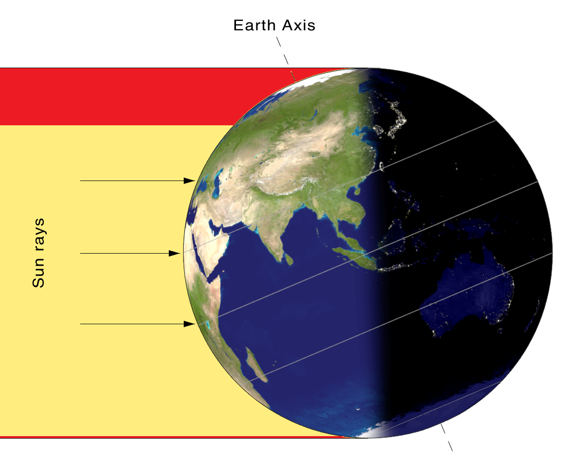
dcpetterson at 05:27 AM on 4 July 2015Arctic sea ice loss is matched by Antarctic sea ice gain
I got into an argument recently with a denier who is convinced the gain of seasonal Antarctic sea ice compensates for the loss of Arctic sea ice, because the increased albedo in the south substitutes for the loss of albedo in the north. I worked up a graphic to show why that doesn't work.
Below is a picture of the Earth in northern hemisphere summer. This is the time that the Arctic ocean under the collapsing northern sea ice is absorbing the most heat from the sun. This is also the time of the greatest extent of Antarctic sea ice, since it is winter in the southern hemisphere. This is the time of year when deniers claim the minor increase in seasonal Antarctic sea ice somehow compensates for the loss of permanent northern sea ice.
The red streak at the top of the picture shows the amount of sunlight falling on the vanishing northern ice cap. The thin red line at the bottom of the picture shows the amount of sunlight falling on the “increased” southern hemisphere sea ice. Both are approximations. In the north, I enclose the entire ice cap, not just the parts that have vanished, because in a very few years the Arctic will be virtually ice-free in the summer. Likewise, I made the southern line about three times thicker than it should be, to allow for three times as much Antarctic seasonal sea ice gain than we’ve seen so far, so that deniers don't think I'm ignoring the possibility of more growth there.
As you can see, the two red patches are not anywhere near the same size. The loss of Arctic sea ice cannot be compensated for by a gain in Antarctic winter sea ice, unless Antarctic winter sea ice begins to reach to Madagascar and to southern Australia.
This graphic is only approximate. It may be more useful (and more complete) to do a series of more carfully-made graphics, starting with polar views that show both the average and the current extent of Arctic summer and Antarctic winter sea ice, and then probably a picture showing where the sun rays fall in September when the Arctic is at its minimum and the Antarctic is at its maximum. Probably also, the final graphic should be from the sun's point of view, showing the vast areas of now-open ocean lit by the sun in the north, and the thin sliver of arc where the Antarctic "increase" is located.
If this does seem to be a useful approach, feel free to either adapt this graphic, or to request the series.
All this ignores, of course, the fact that whatever happens near the South Pole can't possibly undo the changes to northern hemisphere climate (wind and ocean currents, loss of habitat, etc.) that the loss of Actic ice causes.
-
John Hartz at 04:24 AM on 4 July 2015Watts' New Paper - Analysis and Critique
While we wax eloquently on comment threads such as this, thanks to AGW, the Earth’s climate system is going to hell in a handbasket at an accelerating and alarming rate.
In an editorial published today, Marcia McNutt, Editor-in-Chief Science Journals, eloquently states our predicament in a single paragraph:
In Dante’s Inferno, he describes the nine circles of Hell, each dedicated to different sorts of sinners, with the outermost being occupied by those who didn’t know any better, and the innermost reserved for the most treacherous offenders. I wonder where in the nine circles Dante would place all of us who are borrowing against this Earth in the name of economic growth, accumulating an environmental debt by burning fossil fuels, the consequences of which will be left for our children and grandchildren to bear? Let’s act now, to save the next generations from the consequences of the beyond-two-degree inferno.
The beyond-two-degree inferno, Editorial by Marcia McNutt, Editor-in-Chief Science Journals, July 3, 2015
-
michael sweet at 03:44 AM on 4 July 2015Watts' New Paper - Analysis and Critique
Evan Jones,
Tamino and Ramsdorf have both put out blogs that show there are no cooling (or flat) periods in the global record for the past 50 years. There cannot possibly be a statisticly significant cooling or flat period in the US record which is noisier. You are fooling yourself. Your claims will not stand an unbiased review. Fortunately, you have Watts new "journal" to publish in and do not need peer review.
This discussion is a waste of time. I have given you feedback and you assure me that you have covered the bases without showing me any data or analysis. Your claim at 99 of 0.00000% chance of overlap cannot be true. Such data is un-natural for climate. No-one has that many significant figures. You must find someone who is qualified to analyze your data correctly.
I am no longer going to respond to your posts. Please go somewhere else and waste their time.
-
MA Rodger at 03:44 AM on 4 July 2015Watts' New Paper - Analysis and Critique
Evan Jones @107.
Okay. Your stated purpose here at SkS? "To elicit independent review. To answer all questions and field valid questions."
So let us have a sight of what the dickens it is we are supposedly reviewing and asking questions about!! While the suggestion of Rob Honeycutt @108 would be "consistent with (the) scientific method," I'm sure even on planets like Wattsupia or Climateetcia that indulge in trial-by-numpty, the folk are allowed a sight of the object under discussion.
-
John Hartz at 03:40 AM on 4 July 2015Watts' New Paper - Analysis and Critique
Evan:
Can you tell us what "game", Anthony Watts is going to change with this paper?
-
John Hartz at 03:37 AM on 4 July 2015Watts' New Paper - Analysis and Critique
Tristan:
Yeah, Evan appears to be a straight shooter. It's a shame that he's working with people who are not.
-
Rob Honeycutt at 02:49 AM on 4 July 2015Watts' New Paper - Analysis and Critique
Evan Jones @107... An internet comments forum is a perfectly awful and inefficient way to have a fully substantive discussion on a research paper.
My suggestion would be for you to send John Cook a full copy of your paper and ask if the SkS team will review it. If accepted, we would review it privately and send back our comments.
-
Evan Jones at 02:39 AM on 4 July 2015Watts' New Paper - Analysis and Critique
Given this record you have of filling up comment threads to no purpose, can you make clear your purpose here? Are you just after a bit of a chat? Are you here to announce the imminent pre-release of Watts et al.(unsubmitted) for a second time? Do you wish to share some specific aspect of its content with us denizens here at SkS (& if so, we would benefit from knowing what)? Or are you just trolling it?
My purpose here is as stated. To elicit independent review. To answer all questions and field valid questions. When the boyz on the panel present the snappy questions, I'd just as soon have the snappy answers. That is the benefit I accrue.
Your benefit is that you get to know the current state of the paper. You share in those snappy answers and can come up with snappy rebuttals. Define the weak points. Be a constructive part of the process. I find always learns more from one's critics than from one's clique. A sword that cuts both ways, but consistent with scientific method.
When I corresponded with Doc. VV, whom I highly esteem, I got to know how/why homogenization can bomb. He got to know we were for real and is aware, at least, of a potential red flag. (though he is putting his stock in step jumps). We both got what we were after. We both profited from the exchange.
-
Rob Honeycutt at 02:34 AM on 4 July 2015Watts' New Paper - Analysis and Critique
Evan Jones @82... "That is exactly what our "purposes" were, and that is exactly what we did. And I have been addressing the resulting (exraordinarily valuable) independent review ever since. It takes time."
This strikes me as a post hoc rationalization. Your example would be a researcher sending out pre-press copies to colleagues, not a public press release stating your earth-shattering research is about to be published.
Perhaps the problem here is that you're trying to produce a research paper with a specific conclusion that the surface station data is wrong. You even say as much @81 where you state:
"I claim...that [US adjustments are wrong] — with very strong evidence — but WITHOUT the conspiracy theories. I do not think this is fraud, merely an error. An understandable one, one I might easily have made myself."
You're starting from a conclusion that you clearly could not prove before and now have spent 4 years and many thousands of hours attempting to locate something that very likely is incorrect. If there was "very strong evidence" then it wouldn't take 4 years and thousands of hours!
-
Evan Jones at 02:23 AM on 4 July 2015Watts' New Paper - Analysis and Critique
1999-2008 is too short a time to obtain significant differences with a truncated data set without strong statistical analysis. Eyeballing a graph does not count. You will be strongly criticized for too short a period of time.
We do that strong statistical analysis. The divergene shows in our subsets as well as in our full sets. Actually, the graphs look much the same — until you drop in the trendlines. That is because the divergence is gradual over time, not a result of jumps in the data. The bar graphs show it "all at once", and therefore more starkly. Some are sown in the figures, all of it will be archived, and review is welcome. As far as I am concerned, the archive will be considered to be a living document, at least by me. There are always a few more stations to be found (perhaps 1/3 of them unperturbed and therefore "valid", if the past is any guide).
There is also the added advantage that a much larger number of stations are unperturbed for that period. For example, a station that moved in 1995 would not be eligible for the full set but could be included in the 1999 - 2008 set. So the shorter interval is compensated for by the larger sample size. And, as I say, since we are not in any way trying to extrapolate from that interval that AGW is not occurring, the 30-year rule does not apply.
We use the only two intervals available to us (reasons in pervious comment). We address the CRN vs. COOP issue. I can answer criticisms regarding not using a longer set. In order to assess microsite, one would have to split it all into warming, cooling, and flat intervals, being careful to pick the correct start and end points (always a reality MoE and always a point of argument).
FWIW, regarding the flat trend since CRN went official, I consider the "pause" to be an artifact of CO2 pushing up and negative PDO pushing down. But the period we picked was 1979-2008, which is nearly all positive PDO. That was the point, though. We want to measure the effects of warming on stations. To do that, one would naturally want to select a period of maximum warming. Both CO2 and positive PDO piled into one. We also include a 1979-1998 version. Warming/Cooling is the primary indicator, and the greater the trend, the better one can generally measure effects upon it. And I dug up a nice distinct cooling period (shorter but more sample sixe) to observe the effects of cooling. Also primary. A non-divergence in a flat trend is secondary, although important because it is consistent with and important to the hypothesis.
This is not cherrypicking because we are not in any way saying that our findings for these intervals are in any way typical of the whole. In a sense, these intervals are selected precisely because they grant a maximum play for heat sink effect on the sample to be measured, and are therefore — not — typical of the whole, by design. But it important to note this and not claim any of these intervals as "typical".
Our sample size is lower than our 2012 set. We don't have the quite same subsets (but using the archived sheet, you could run them up). Our results for microsite are a bit warmer than in 2012. Anomalizing the data was a large factor in this, as was dropping TOBS-biased stations. Moves were pretty much a push, so far as I could tell.
-
Tristan at 01:22 AM on 4 July 2015Watts' New Paper - Analysis and Critique
John, I don't believe Evan is trying to deceive.
I believe he is trying to do something without any of the multi-disciplinary background generally required to do such a thing (he's stated that he's self-taught) and therefore doesn't recognise that he's come-a-cropper. I admire his efforts, but he needs to realise that his interpretation of the data has lead to some unphysical conclusions. The response to that is not "invent new physics", which seems to be what he has done, but rather "figure out why my sampling is spitting out these results".
-
BBHY at 01:01 AM on 4 July 20152015 SkS News Bulletin #6: Pope Francis & Climate Change
If we seriously want to make progress then we should have a plan for the coal miners. It is entirely reasonable for them to be concerned about their jobs and livelihood. Nobody should expect miners to suddenly want to protect the climate without some compensation in return.
I would suggest a five part plan to help the miners while we transition away from coal:
1) Miners above a certain age would be offered an early retirement package.
2) Training programs would be available for younger miners to assist them in finding a job in another field.
3) Those who want to start their own small business could enter a program where they would train in how to do that, and upon graduation could apply for small business starter loans/grants.
4) Incentives would be setup for businesses to move into mining areas to provide alternative jobs.
5) Those who want to move to another area of the country could get a grant to pay for moving their families and re-establishing themselves.
I wouldn't expect this to suddenly turn all miners into climate hawks, but it would go a long way to softening their collective resistance to change.
PS: #3 should probably be implemented in many depressed parts of the country, not just coal mining areas.
-
John Hartz at 00:34 AM on 4 July 2015Watts' New Paper - Analysis and Critique
Tristan:
Think "smoke and mirrors".
-
Tristan at 00:10 AM on 4 July 2015Watts' New Paper - Analysis and Critique
I'm afraid I still don't understand.
If you draw a trend from 1998-2008 the 'heat sinks' react one way, but if you draw the trend from 1998-2015 they react differently?
How can a heat sink react to a trend line? A trend line isn't a physical thing. It's an exploratory tool. There is no way a heat sink can be reacting to temps a decade ago.
-
John Hartz at 23:58 PM on 3 July 2015Watts' New Paper - Analysis and Critique
Evan Jones @87 states:
For much the same reason that a general gets the credit for winning (or losing) a battle. Although I have refined the hypothesis somewhat and slogged through much mud, he (Anthony Watts) is the one that found the mud in the first place. I am just the infantry. And he has also done much heavy lifting of his own in this, as well.
Yes indeed. Anthony Watts has made a career of finding the mud an wallowing in it.
-
Evan Jones at 23:55 PM on 3 July 2015Watts' New Paper - Analysis and Critique
1999-2008 is too short a time to obtain significant differences with a truncated data set without strong statistical analysis. Eyeballing a graph does not count. You will be strongly criticized for too short a period of time.
We do that strong statistical analysis. The divergene shows in our subsets as well as in our full sets. Actually, the graphs look much the same — until you drop in the trendlines. That is because the divergence is gradual over time, not a result of jumps in the data.
We use the intervals available to us (reasons in pervious comment). I can answer criticisms regarding not using a longer set.
-
Evan Jones at 23:50 PM on 3 July 2015Watts' New Paper - Analysis and Critique
Someone will check to see if the data changes with the full record. You are open to accusations of cherry picking.
True. (We welcome that.) Note, however, that we are not directly measuring global warming. We are only addressing the effect of heat sink on sensors. A 30-year intervaal is necessary for assessment of global trend, yes. But when we use the 1999-2008 series, we are not saying that implies that we are not warming overall or that there is actually global cooling. We use that interval to only to demonstrate the spurious cooling effect of poor microsite during a cooling period.
Differences are expected in small data sets (like yours) due to random variation, you are responsible for showing the changes are statisticly different (generally two sigma).
Well, J-NG has run a preliminary set of Monte Carlos and for our full set he shows chance of overlap at 0.00000% between the Class 1\2s compared with both Class 3\4\5, and the fully adjusted data for all classes. So our results appear to be robust.
-
Evan Jones at 23:36 PM on 3 July 2015Watts' New Paper - Analysis and Critique
Your time period of analysis (1979-2008) is unusual. Why do you truncate the data at 2008 when it is readily available to 2014. (Matching old data analysis is not a good excuse, they previously did not have the additional data).
We have a number of reasons.
We require a period of unequivocal waming. We need to do that in order to demonstrate what occurs during warming (or during the 1999-2008 interval, cooling). For the HSE hypothesis to be consistent, it has to work both ways.
For my money, I'd have prefered 1977-2006, as this excludes the 1998-1999 drop. But we wanted to match with the onset of satellite data, and we wanted a 30-year interval for our main series. (We do include a 20-year set from 1979-1998 to show a warming-only interval.)
The recent data (to 2014) is flat, and therefore not as (directly) useful to our purposes. There will be little or no trend divergence between well and poorly sited stations during a flat period. (We do compare the wonderfully well sited CRN with COOP from 2005-2014 to demonstrate this non-effect.)
We needed to find an interval of warming and cooling where there was a sufficient number of eligible (unperturbed) stations) and sufficient metadata. 1920 - 1950 would have done just as well but for the lack of metadata.
The 1979-2008 period was the only stretch that had both warming and sufficient metadata. And the (short) 1999-2008 period was the only interval of definite cooling when the required metadata is available. We were lucky to come up with even that much.
In short, for the period when there was warming, the welll sited stations warmed less. For the interval of cooling, the well sited stations cooled less. And for the flat trend after, there is no divergence. All of which is consistent with the HSE hypothesis. It appears from the data that we are solid three ways from Sunday.
-
Evan Jones at 23:17 PM on 3 July 2015Watts' New Paper - Analysis and Critique
BEST's analysis is similar: they separate stations into two records when they detect a change. BEST matches NOAA. You will have to show why your approach is better.
BEST coincides well with Fall (2011). But both of those studies use the obsolete Leroy (1999) rating system, whixh accounts for distance-to-sink only. We use the upgunned Leroy (2010), whxich includes the area covered by the heat sink as well as the distance. We had a joke back in the Fall (2011) days that all Class 4s are equal, but some Class 4s are more equal than others. Leroy (2010) resolves this .
Fortunately for us, we are dealing with the data- and metadata-rich USHCN. That allows us to avoid the can-'o-worms of trend-splitting: We merely drop those staions that would require a split. The number remaining is more than sufficient to demonstrate statistical significance at the 95% confidence level.
Mosh and Zeke have no such luxury. They can't drop those. USHCN is dense and rich. Outer Mongolia, not so much.When BEST makes a split, they are doing pairwise with stations with artificially high trends. That will tend to skew their results. This can be corrected by using only unperturbed Class 1\2s for pairwise adjustment. It will be interesting to see the results of BEST applied to our "unperturbed" set using Leroy (2010) parameters.
In short, our method (dropping) is "better", but Mosh is doing the best he can with what he has. He can't drop. We can and do. In future, I will be looking at methods for adjustments for perturbed stations based on the empirical results of this study. Only after all such adjustments are made will pairwise (including homogenization) yield valid results. -
Evan Jones at 22:56 PM on 3 July 2015Watts' New Paper - Analysis and Critique
Not by any definition of "heat sink" that I'm familiar with. I sincerely hope you have properly defined the terms you are using.
I think we have. We use the term to distinguish it from waste heat. A heat sink absorbs and re-emits heat. Even the normal environment is a bit of a heat sink, which is why Tmax occurs hours after the maximum solar input. Excess heat sink (such as a paved road) in close proximity to the sensor increases this effect.
-
Evan Jones at 22:48 PM on 3 July 2015Watts' New Paper - Analysis and Critique
Your listed changes all seem to be by deleting stations from your analysis. Since you have a small sample to start with (and are using only US staions 4% of the globe) you will have to show that you have not deleted all your signal from the data (or added false signal through deletion of other data). You will have to be careful to avoid charges of cherry pickig. It is possible to obtain a graph you want by trying enough combinations of data until you get the one you want, especially with a small, noisy data set.
Quite correct. Indeed we will have to demonstrate that. In order to avoid cherrypicking, we use many graphs with many combinations and binnings and show them all. All of them show Class 3\4\5 stations warming faster than cooling stations. (This shows up in the regional data as welll as nationally.)We also show the data for the stations we dropped so as to deflect suggestions of cherrypicking. The dropped stations (both compliant and non-compliant) show substantially less warming than the ones we retained.
I put all the data up on a series of excel sheets to be used as a maleable tool for further study. This enables a reviewer (hostile or otherwie) to re-bin, add, or drop stations as one desires, either to expand on the hypothesis or if one thinks we did the binning wrong or in a prejudiced manner. You don't like our MMTS jumps? Replace them with your own. You think we unjustifiably dropped a station? Just drop it back in. Think a station we included should be dropped? Do that.This will all be archived and easily accessible once we publish.
-
KR at 22:41 PM on 3 July 2015Watts' New Paper - Analysis and Critique
"Heat sinks become disproportionately warmer as the ambient temperature rises..."
Not by any definition of "heart sink" that I'm familiar with. I sincerely hope you have properly defined the terms you are using.
-
Evan Jones at 22:26 PM on 3 July 2015Watts' New Paper - Analysis and Critique
I'm not sure I understand the notion of 'trend exaggeration', Evan. Whether you get a positive or negative trend depends on where you start counting from. How can a microsite heat sink influence in 2008 (or whatever) go from doing nothing to doing something if you change whether the trend line starts at 1995 or 1998?
It very much does depend on where one starts and where one ends. Heat sinks become disproportionately warmer as the ambient temperature rises. If there is a warming trend during the interval, waming will therefore be exaggerated by a funcrion of the amount of the disparity.
If it is a cooling trend (e.g., CONUS 1998 - 2008, the process reverses and the poorly sited stations cool more rapidly than the well sited stations.
For the period from 2005-2015, the trend is essentially flat. That is why the CRN (all well sited) trends do not diverge from COOP on a year-to year basis. In order for HSE to exaggerate trend,there must first be a trend to exaggerate.But HSE even does show up internally in the CRN vs. COOP data — COOP shows slightly warmer summers and slightly cooler winters than CRN. That is consistent with the HSE hypothesis. Both warming and cooling are exaggerated.
-
michael sweet at 22:25 PM on 3 July 2015Watts' New Paper - Analysis and Critique
Evan Jones,
Thank you for the brief description. Since details are lacking it is difficult to respond in detail.
Your listed changes all seem to be by deleting stations from your analysis. Since you have a small sample to start with (and are using only US staions 4% of the globe) you will have to show that you have not deleted all your signal from the data (or added false signal through deletion of other data). You will have to be careful to avoid charges of cherry pickig. It is possible to obtain a graph you want by trying enough combinations of data until you get the one you want, especially with a small, noisy data set.
BEST's analysis is similar: they separate stations into two records when they detect a change. BEST matches NOAA. You will have to show why your approach is better.
Your time period of analysis (1979-2008) is unusual. Why do you truncate the data at 2008 when it is readily available to 2014. (Matching old data analysis is not a good excuse, they previously did not have the additional data). Someone will check to see if the data changes with the full record. You are open to accusations of cherry picking. While you have a 30 year record, generally the minimum needed to see global climate changes, your use of such a truncated time period (combined with your truncated site data and very small geological range) greatly increases the time needed to see significant changes. Claiming that 30 years is typically used is not enough when you limit your other data. You need to get an unbiased statistician to check if your very small data set is still significant. I doubt your time period is long enough to be significant with your truncated data set (I am not a statistician, but I have 20 years of professional data analysis). Differences are expected in small data sets (like yours) due to random variation, you are responsible for showing the changes are statisticly different (generally two sigma).
1999-2008 is too short a time to obtain significant differences with a truncated data set without strong statistical analysis. Eyeballing a graph does not count. You will be strongly criticized for too short a period of time.
-
MA Rodger at 20:25 PM on 3 July 2015Watts' New Paper - Analysis and Critique
John Hartz @85.
There was another odd aspect to the authorship of Watts et al. (unsubmitted). The listing of the four authors (Watts, Jones, McIntyre, Christy) was followed by the following "plus additional co-authors that will be named at the time of submission to the journal". While at the time it appeared very odd, in the circumstnces it presumably will be a list of all the folk who identified and corrected all the mistakes in the original draft (if they care to be so named).
Tristan @90.
I think the source of that Evan Jones quote you present and what it is allegedly answering should be made a little more clear. It is from this 2014 HotWhopper comment thread (or threads - there was a previous one that it transferred from) which was exceeding long and didn't get very far (or questions such as that @90 would have been resolved).
One of Jones' final comments said "... But we cannot address all of this at once in one paper. I look forward to examining all of these issues." All rather ominous.
Evan Jones.
Given this record you have of filling up comment threads to no purpose, can you make clear your purpose here? Are you just after a bit of a chat? Are you here to announce the imminent pre-release of Watts et al.(unsubmitted) for a second time? Do you wish to share some specific aspect of its content with us denizens here at SkS (& if so, we would benefit from knowing what)? Or are you just trolling it?
-
Philip Shehan at 16:42 PM on 3 July 2015The Skeptical Science temperature trend calculator
Thank you MA Rodger.
-
Tristan at 16:30 PM on 3 July 2015Watts' New Paper - Analysis and Critique
As it warms (or cools), the Δtemp between the heat sink and the air surrounding the sensor diverges. Therefore, at Tmin the release of heat is proportionately greater (or lesser) and also earlier (or later) in the heat sink release process at Tmin by the end of the study period than it was at the start. This produces a disproportionate trend effect.
Therefore, a 1C offset in 1979 becomes a 1.5+ offset by 2008.
In a cooling phase, the process reverses itself, and cooling is exaggerated. That is demonstrated by the data from 1998 to 2008.
I'm not sure I understand the notion of 'trend exaggeration', Evan. Whether you get a positive or negative trend depends on where you start counting from. How can a microsite heat sink influence in 2008 (or whatever) go from doing nothing to doing something if you change whether the trend line starts at 1995 or 1998? -
Evan Jones at 15:17 PM on 3 July 2015Watts' New Paper - Analysis and Critique
So would anyone in their right mind describe the hammering the paper has received since the press release as a "final polish"?
Ayup. Finestkind. -
Evan Jones at 15:03 PM on 3 July 2015Watts' New Paper - Analysis and Critique
About the UHI issue:
We find that UHI has little effect on trend. The main driver appears to be heat sink on the microsite level. Well sited urban station trends run much cooler than poorly sited urban station trends.And after dropping the moved airport stations, we are left with very few, and they do not show an elevated trend, either.
Mesosite issues do not appear to have a significant effect on trend. it all comes down to microsite.
-
Evan Jones at 14:58 PM on 3 July 2015Watts' New Paper - Analysis and Critique
Since you are doing all of the heavy lifting on this paper, why is Watts listed as the lead author?
For much the same reason that a general gets the credit for winning (or losing) a battle. Although I have refined the hypothesis somewhat and slogged through much mud, he is the one that found the mud in the first place. I am just the infantry. And he has also done much heavy lifting of his own in this, as well.
-
Evan Jones at 14:52 PM on 3 July 2015Watts' New Paper - Analysis and Critique
Now now, folks.
THANK you for that. Yes, we did not withhold our findings even though they disputed our hypothesis. One of the casrdinal rules of science is that one must never withhold one's findings.
I apprecite that you withhold judgment untill you have an opportunity to read the new version of the paper and carefully examine the supporting data.
We do drop all the NOAA major-flagged datapoints. Raw data has issues and is insufficient to our task. Even after bypassing the issue for moves and TOBS, we still must apply MMTS conversion adjustments. Our results are therefore not rendered in raw data. Also, we anomalize all data (which workes "against" us, overall, BTW). -
John Hartz at 14:45 PM on 3 July 2015Watts' New Paper - Analysis and Critique
Evan Jones:
Since you are doing all of the heavy lifting on this paper, why is Watts listed as the lead author?
-
John Hartz at 14:41 PM on 3 July 2015New study warns of dangerous climate change risks to the Earth’s oceans
Recommended supplemental reading:
New report: the chance to rescue the world’s oceans from climate change is drifting away by Ove Hoegh-Guldberg, The Conversation, July 2, 2015
-
Evan Jones at 14:37 PM on 3 July 2015Watts' New Paper - Analysis and Critique
You are claiming major changes have been made. You ask for feedback, but you have not shown what the major changes are.
Fair enough. I will go into some detail. The three major issues are addressed:
1.) MMTS Adjustment: All MMTS station data is jumped at (and after) the month of conversion according to Menne (2009) data: Tmax: +0.10C, Tmin: -0.025C, Tmean: +0.0375C. (There is also an issue with CRS, per se., which I'll discuss if you wish.)
2.) TOBS: Stations with TOBS flips from afternoon to morning (and a small handful vice-versa) are dropped. This avoids the issue of TOBS adjustment while still maintaining a robust sample.
3.) Station Moves: Any station that has been moved after Apr. 1980 is dropped unless both locations are known AND the rating remains the same. Also, if the rating changed during the study period (1979 - 2008), we dropped the station even if the location(s) was known. It is not controversial that a change in site rating will likely affect trend (by creating a jump). But what we want to demonstrate, unequivocally, is that trends (either warming or cooling) are exaggerated by poor microsite even if the microsite rating is unchanged throughout the study period.
4.) In addition, we provide data during the cooling interval from 1999-2008. A ten-year period is obviously not sufficient to assess overall climate change (and we are not trying to do that). But it is quite sufficient to demonstrate that during that period that the badly sited stations cooled more quickly than the well sited stations.
Heat Sink Effect works both ways. It exaggerates trend in either direction, warming or cooling. What goes up must come down. The only reason that poor microsite has exaggerated warming is that there has been real, genuine warming to exaggerate in the first place.
Our hypothesis does not dispute global warming — it requires it.
Note: After dropping stations as per the above, we are left with a sample of 410 unperturbed stations (both well and poorly sited). However, we are not cherrypicking: the sataions we dropped have substantially cooler trends than the ones we retained.
Prev 560 561 562 563 564 565 566 567 568 569 570 571 572 573 574 575 Next


