


 Arguments


Recent Comments
Prev 570 571 572 573 574 575 576 577 578 579 580 581 582 583 584 585 Next
Comments 28851 to 28900:
-
ubrew12 at 04:57 AM on 10 June 2015Factcheck: Is climate change ‘helping Africa’?
So, if you live in the Sahel, you get to live in the American MidWest, and if you live in the MidWest, you get to live in the Sahel (ucar world map of future pdsi). My, my, that is good news indeed...
-
jgnfld at 04:51 AM on 10 June 2015Factcheck: Is climate change ‘helping Africa’?
Even if true it's an ill wind that blows nobody any good.
-
shoyemore at 04:06 AM on 10 June 2015What you need to know about the NOAA global warming faux pause paper
ryland, #22,
Professor Murray Salby was dismissed by MacQuarie University for "not fulfilling his contract obligations", and for repeated overseas travel when he had been asked to stay and teach. Salby would still be at the University, climate views and all, if he had played ball with the administration.
FWIW, it subsequently emerged that in 2005, the US National Science Foundation opened an investigation into Salby's federal funding arrangements and found that he had displayed "a pattern of deception [and] a lack of integrity" in his handling of federal grant money.
-
Tom Dayton at 03:33 AM on 10 June 2015What you need to know about the NOAA global warming faux pause paper
ryland, the problems with Spencer's and Christy's aggressive public statements include very vocal, horribly biased, unjustified and even outright wacky claims about what their own peer-reviewed publications say.
-
ryland at 03:29 AM on 10 June 2015What you need to know about the NOAA global warming faux pause paper
Thanks for your comments Tom Dayton and Simon Baines. I too was a tenured University professor at an Australian univesity where similar rules apply but not always as there have been professors notably Murray Salby who have been sacked for views not thought suitably concordant with mainstream climate science. Tom Dayton I was surprised at your statement "Both Christy and Spencer do some good work. In particular, what they write in their peer-reviewed publications tends to be reasonable" as most pieces commenting on these scientists rarely say any such thing. And Stephen Baines I thought your statement "For me, the problem is not Spencer and Christy per se, but rather the apparatus that exists to amplify their more contrarian views beyond their actual influence within the climate science community" showed far more insight than that shown bny many others who comment on Christy and Spencer.
-
Stephen Baines at 02:57 AM on 10 June 2015What you need to know about the NOAA global warming faux pause paper
Ryland...Tenure is there to protect free speech from exactly this kind of threat. You want free speech so there is a battle of ideas that eventually leads to the truth. There will always be contrarians in any field — they serve a useful purpose by keeping ideas alive that may still be useful or injecting new ideas. To silence such voices would have a chilling effect on discourse over all.
For me, the problem is not Spencer and Christy per se, but rather the apparatus that exists to amplify their more contrarian views beyond their actual influence within the climate science community. That amplification brings in a lot of voices that do not have perspective and context to understand information, and who consequently interpret information to match their own fears, predipositions and narrow vested interests and political aims.
It ends up distorting the debate entirely. It ends up being about who has the power rather than who has the most rational argument. Look at attempts to cut Geosciences funding within NSF with the current House and Senate budgets, for example.
-
Tom Dayton at 02:38 AM on 10 June 2015What you need to know about the NOAA global warming faux pause paper
ryland: Christy has tenure, so he can do and say nearly anything without any effects on his employment. Both Christy and Spencer do some good work. In particular, what they write in their peer-reviewed publications tends to be reasonable. It's what they write and say outside of those peer-reviewed publications that is the main problem. Contrast their behavior with that of RSS's Carl Mears.
-
ryland at 02:15 AM on 10 June 2015What you need to know about the NOAA global warming faux pause paper
The general tenor of the comments about Dr Christy, UAH and RSS is hardly complimentary and in my opinion some, in particular that from Dana, come close to accusations of malpractice. Why therefore is Dr Christy and for that matter Dr Roy Spencer, still employed at UAH in a fairly high profile and senior position if he is as scietifically unsound as has been claimed? (http://www.skepticalscience.com/examining-christys-skepticism.html). Does UAH have particularly low standards for their climate scientists? It also seems surprising that Dr Christy is still able to publish in the peer reviewed literature if his reputation is as poor as is implied here.
Moderator Response:[PS] This site exists to debunk misinformation by fake skeptics. You have been pointed to the exactly what has been claimed and what the science actually says. What is your opinion?
-
MA Rodger at 02:11 AM on 10 June 2015The Skeptical Science temperature trend calculator
KR @68.
It is here.
Of course the numpties there have yet to feed the period 1979-95 into the SkS trend calculator to demonstrate that even prior to the famous faux pause, the warming was also statistically insignificant, thus completing their myth-making.
I am myself employing the SkS trend calculator sparing with a numpty at CarbonBrief, one of may denialists that invaded the site to comment on their Karl et al. item. Mine insists most strongly that HadCRUT4 2003-2015.04 is almost statistically significant at 1%. There's always one!
-
KR at 01:26 AM on 10 June 2015The Skeptical Science temperature trend calculator
Philip Shehan - "Have been getting all sorts of grief over at Bolt..."
Link?
-
KR at 01:24 AM on 10 June 2015Spoiled ballots, spoiled views: an election snapshot from Powys, Wales, UK
Langham - By MacKays analysis, tidal and wave power can (with full utilization) at best supply perhaps 5-8% of the UKs energy needs. Offshore wind could supply another 25%. Tidal and sea-based supplies just aren't going to cover it alone.
Note that land-based wind power is estimated to have about a 10% potential, greater than that of tidal and wave. The biggest potentials are from solar, at perhaps 33%.
The best energy strategy is to use a lot of strategies - diversify the supply with wind, solar, tidal, biomass, onshore, offshore, etc. Not only does it greatly ameliorate intermittancy (wind blows stronger at night, solar not so much, for example), but it takes the best advantage of available energies.
As to siting issues - in the US, Western Pennsylvania where I grew up, there's a site where on one side of the highway are a bank of 1.4MW wind turbines. On the other side is a large coal strip mine, a vast pit which even with the best reclamation practices will still poison the water table for centuries. Personally, I prefer the turbines.
-
Philip Shehan at 00:50 AM on 10 June 2015The Skeptical Science temperature trend calculator
Here is another (Sorry if I am a little robust in my comments here, but I get tired of the abuse over thereand unfortunately respond in kind):
I thought that the entirely inconsistent use of statistical significance by Michaels, Lindzen, and Knappenberger to suit their argument was bad enough, but Singer’s performance here is utterly amazing.
Singer objects to non satellite data “with its well-known problems”.
OK. Lets restrict ourselves to satellite data then:
Here are the graphs for UAH and RSS respectively. [Links to Wood for trees graphs in the original]
Since 1979
0.139 ±0.065 °C/decade
0.121 ±0.064 °C/decade
Statistically significant warming trends in agreement with the non satellite data.
Singer writes:
“the pause is still there, starting around 2003 [see Figure; it shows a sudden step increase around 2001, not caused by GH gases].”
2003
0.075 ±0.278 °C/decade
-0.031 ±0.274 °C/decade
So UAH shows a slight warming trend and RSS shows a slight cooling trend but unsurprisingly, for a 12 year time frame, you can drive a bus between the error margins.
As for the step claim. Nonsense, aided by selecting a colour coded graph that foster that impression. No more a step than plenty of other places on the non-colour coded graphs.
And note the excellent correlation between temperature and CO2 rise for the statistically significant section of the graphs. (And please, spare me the ‘correlation is not causation’ mantra. I know. Singer is talking about correlation.)
He then turns to this period:
1979-2000
0.103 ±0.163 °C/decade
0.145 ±0.158 °C/decade
Warming trends, though not statistically significant.
Now I just have to comment on the text here:
“Not only that, but the same satellite data show no warming trend from 1979 to 2000 – ignoring, of course, the exceptional super-El-Nino year of 1998.”
Gobsmacking.
“Skeptics” have been cherry picking the exceptional el nino of 1998 to base on which to base their “no warming for x years” claim for years.
But because it does not suit his argument, Singer wants to exclude it here.
Then Singer decides that non-satellite data is kosher after all because it suits his argument.
How can he pull this stuff without a hint of shame?
And this guy is supposed to be a leading “skeptic”.
-
Langham at 00:42 AM on 10 June 2015Spoiled ballots, spoiled views: an election snapshot from Powys, Wales, UK
KR, I did look at the MacKay papers I was directed to by the previous poster, but they seem far from compelling in any respect - they struck me as methodologically freeform and improvised, and in any case not very relevant to the point I was making.
I was indeed objecting to the siting of wind turbines on land, when there are other (and better) alternatives.
At this stage, surely no serious person can expect all of the UK's energy needs to come from renewable sources, and given the quite poor efficiency of wind generation, even if the entire country was carpetted with wind turbines, the UK would still need to import energy in various forms.
My point is that we should be concentrating our research on tidal and sea-based renewable energy, which have various practical advantages over land-based alternatives, rather than polluting the countryside with inefficient, subsidy-dependent wind turbines.
-
Philip Shehan at 00:38 AM on 10 June 2015The Skeptical Science temperature trend calculator
Have been getting all sorts of grief over at Bolt for pointing out a number of problems with "skeptics" use of temperature data, and using the trend calculator for this purpose.
I am told that I should contact directly the people whose interpretation I criticise and offer tham right of reply. Just like the "skeptics" do with scintistrs they bucket on blogs. (Yes, sarcasm.)
Actually I have on occasion have failed to do so in the case of Fred Singer, David Whitehouse and Patrick J. Michaels, Richard S. Lindzen, and Paul C. Knappenberge
I have told one critic, on numerous occasions that i have checked the trends with those produced by , among others, Monckton, McKitrick, and those who leapt on Jones' "admission" that a 15 year warming trend was not statistically significant, but nearly so, and the trend calculator results match theirs. I have also explained repeatedly the necessity for autocorrelation to be used with temperature data and referred him to this link.
Yet he wrote today.
The calculation that he [that is me] uses is a method written by a shill that just doesn’t make sense and comes out two to three times larger than you would get if you treated the noise as just random.
I will encourage him to represent his argument here.
But thank you for this valuable tool
Of interest this week are the following posts of mine;
On Anthony Watts blog, Patrick J. Michaels, Richard S. Lindzen, and Paul C. Knappenberger dispute a recent paper by Karl et al which questions whether there has been a “hiatus” in global warming.
This new paper, right or wrong, does not affect my primary argument on claims of a “hiatus”.
Which is that such claims do not meet (in fact do not come within a bulls roar of) the criterion of statistical significance.
What is of interest is that the criticisms of Michaels, Lindzen,and Knappenberger again demonstrate the way that skeptics apply totally different standards of statistical significance depending on how they want to spin the data.
The critique of the paper says:
“The significance level they report on their findings (0.10) is hardly normative, and the use of it should prompt members of the scientific community to question the reasoning behind the use of such a lax standard.”
True, the usual standard of statistical significance is the 0.05, 95% or 2 sigma level. The 0.10 level means that there is a 90% probability that the trend is significant
Yet further on Michaels, Lindzen,and Knappenberger claim:
“Additionally, there exist multiple measures of bulk lower atmosphere temperature independent from surface measurements which indicate the existence of a “hiatus"…Both the UAH and RSS satellite records are now in their 21st year without a significant trend, for example.”
Here are the trends for UAH, RSS and Berkeley data (the most comprehensive surface data set ) from 1995 at the 0.05 level
0.124 ±0.149 °C/decade
0.030 ±0.149 °C/decade
0.129 ±0.088 °C/decade
The Berkeley data shows statistically significant warming trend, as do 5 other surface data sets, with mean trend and error of
0.122 ± 0.093 °C/decade
So, Michaels, Lindzen, and Knappenberger object to statistical significance at the 90% level used by Karl et al.
Yet they base their claim of “multiple measures of bulk lower atmosphere temperature independent from surface measurements which indicate the existence of a “hiatus” on two data sets which have a probability of a “hiatus” or a cooling trend of 4.8% (UAH) and 34.5% (RSS).
I mean, these people have the chutzpah to write “the use of [a confidence level of 90%] should prompt members of the scientific community to question the reasoning behind the use of such a lax standard” yet pin their case for a “hiatus” on such a low statistical probability for two cherry picked data sets.
-
KR at 00:23 AM on 10 June 2015Spoiled ballots, spoiled views: an election snapshot from Powys, Wales, UK
Langham - I would join in suggesting you read David MacKays work on sustainable energy. He specifically and in detail discusses renewable options for the UK, with numbers, and finds that offshore wind (deep and shallow waters), tide, and wave power could supply perhaps 30% of UK energy needs. Helpful, but not sufficient. The UK in particular is too small, too energy intensive, and with too few sources/sites to really be energy independent on renewables alone. UK options for energy supplies are a significantly increased nuclear fraction along with more renewables and/or remaining, as it is now, a net energy importer like so many other countries. It can only be hoped that those imports shift from the present coal basis to wind/solar/etc from North Africa or Europe over time...
I will point out that decrying "...an objectionable and rather totalitarian assumption that we have to sacrifice our views and rural amenities for the good of all..." does indeed appear to be an objection to siting, despite your disclaimers.
-
BC at 23:41 PM on 9 June 2015What you need to know about the NOAA global warming faux pause paper
Thanks for the explanation (Scaddenp @12 and Tom Curtis @ 15) for outlining this difference between surface temps and satellite readings and why 2014 wasn't a record year according to satellites.
Also, because satellite readings are more sensitive to the El Nino and volcano contributions they'll show up more of a hiatus than the surface readings, which would be why Monckton is using them.
-
MFreeman at 22:31 PM on 9 June 2015Antarctica is gaining ice
(Apologies, just realised with changing pages to create an account, I ended up posting on the Antarctic comment thread rather than the Arctic thread I was reading. However I can't see a delete comment button?)
-
MFreeman at 20:54 PM on 9 June 2015Antarctica is gaining ice
There's an interesting time-series of models of ice thickness and other information here:
http://www7320.nrlssc.navy.mil/hycomARC/arctic.html
There's only the last 5 years of thickness represented, but it would be interesting to see a specific date animated as a gif (as opposed to the changes over a year), particularly at minimum and maximum days?
-
Langham at 19:12 PM on 9 June 2015Spoiled ballots, spoiled views: an election snapshot from Powys, Wales, UK
Scaddenp, you have slightly missed my point, which is to do with the siting of turbines etc - I was not arguing for or against the contention that we must reduce our use of fossil fuels. My point is specific to maritime countries such as the UK, where there are many more, and better, ways of generating power in coastal areas and at sea than on land. For one thing, tides are more reliable than wind; and wind at sea is stronger and more reliable than on land. The costs are higher, of course, but advocates of land-based turbines can hardly point the finger of blame on that count, since the economics at present hardly stack up in any case. There seems to be an objectionable and rather totalitarian assumption that we have to sacrifice our views and rural amenities for the good of all, when that is not the case.
-
Bernard J. at 17:20 PM on 9 June 2015What you need to know about the NOAA global warming faux pause paper
I'm curious to know if Karl's et al corrected data will be available as an option on the SkS trend calculator?
-
Tom Curtis at 15:41 PM on 9 June 2015What you need to know about the NOAA global warming faux pause paper
dana @13, I believe the SkS tool still uses v5.6 of the UAH TLT pseudo channel. As you know Spencer and Christy are in the process of developing v6, which in beta release far more closely matches RSS. As presumably Spencer and Christy would claim that v6 is superior to v5.6, I don't think we should be using v5.6 to argue what "Christy's own UAH data" shows.
-
Tom Curtis at 15:35 PM on 9 June 2015What you need to know about the NOAA global warming faux pause paper
BC @11, one of the features of satellite (and radiosonde) data is that it responds far more strongly to ENSO effects. It also responds more strongly to volcanic effects, and may also respond more strongly to other short term fluctuations but I have no data on that. The upshot is that satellite and radiosonde data is far more noisy, resulting in a greater standard deviation of the data. That in turn requires a larger underlying trend for it to be considered statistically significant over short periods, or (alternatively put), for given trend, it requires a longer period of data before it is statistically significant. Given that the denier test for "no warming" is "the trend is not statistically significant from zero" regardless of whether it is statistically significant from IPCC projected warming, it becomes almost a gimme for satelite data to show "no warming" in the deceitful terminology of deniers.
All that is basic. Less frequently commented on is something very interesting that has been happening with the Southern Oscillation Index (SOI). The SOI measures the pressure difference between Darwin and Tahitti. Because winds flow with pressure differences, that makes it a good proxy of the strength of the Walker Circulation, which drives the El Nino Southern Oscillation (ENSO). Essentially, if the pressure is greater in Tahitti than in Darwin, the Walker circulation blows surface Pacific waters towards the Pacific Warm Pool in waters near Indonesia. If they are only slightly stronger, the Walker Circulation is weak and you have normal conditions. If the pressure in Tahiti is much greater, you have an unusually strong Walker Circulation and a strongly positive SOI, and a La Nina results. In contrast, if the pressure falls in Tahiti relative to Darwin, the Walker circulation stops and you have strongly negative SOI values, along with an El Nino.
The interesting thing that is happening in the SOI is that it has been systematically increasing since the early 1990s. Because the SOI sign is the reverse of the global temperature effect, and because the peak temperature effect is felt about six months after the peak SOI effect, I have graphed the inverted, seven month lagged SOI below. (Seven month lagged rather than six as that allows me to include a full 2015 value.) The result should show the sign and relative magnitude of ENSO effects on global temperature over the years since 1950:
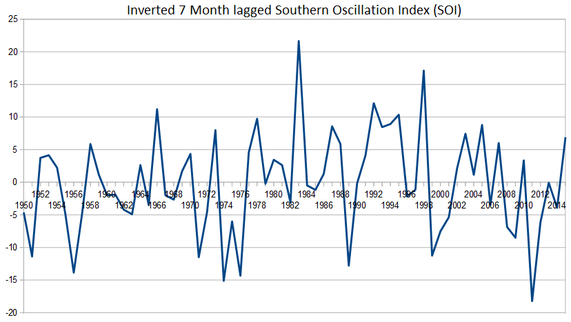
Another way of putting that is that if ENSO was the only factor affecting the Global Mean Surface Temperature (GMST), a scaled version of the above graph would show the actual fluctuations in GMST.
Obviously ENSO is not the only thing effecting GMST. For instance, in 1982 the El Chichon volcanoe erupted in Mexico, the effect of which reduced 1983 to an average year rather than the warmest on record (to that time). Likewise the Pinatubo eruption in 1992 cooled what was otherwise going to be a very warm year in 1992. Pinatubo's effect had largely dissipated by 1995, however, which had the 13th strongest ENSO warming effect since 1877, and the 4th warmest in the satellite era. Notably, every year in the 21st century has had a lower ENSO warming than 1995, and there is a consistent downward trend in that warming from 1998.
Absent global warming and volcanic effects, the various years in the satellite era would have ranked as follows for warmth:
Year SOI rank (inverted)
1979 21
1980 13
1981 15
1982 26
1983 1
1984 22
1985 24
1986 17
1987 7
1988 11
1989 35
1990 20
1991 12
1992 3
1993 8
1994 5
1995 4
1996 25
1997 23
1998 2
1999 34
2000 32
2001 29
2002 16
2003 9
2004 18
2005 6
2006 27
2007 10
2008 31
2009 33
2010 14
2011 36
2012 30
2013 19
2014 28You will notice that 2014 (a tied record year in GMST) would have only ranked 28th absent the effect of global warming and volcanoes. 2010 ranked 14th on ENSO warming, and just four years earlier, was also a statistical tie with 2014. Both years were warmer than the denier poster year, 1998 (ranked 2nd on ENSO effect, or first if we include volcanic effects as well).
Finally, the point of all this is that satellite record are (as stated at the beginning) far more effected by ENSO warming than are the surface records. Because of the radical difference between actual warmth as measured by GMST and ENSO only rankings, we therefore expect a significant disparity in ranking between surface and satellite records. In particular, early strong El Nino years will rank far higher relative to the later weak El Nino's that have been breaking records due to global warming.
-
Glenn Tamblyn at 14:42 PM on 9 June 2015What you need to know about the NOAA global warming faux pause paper
To compare satellites, radiosondes and models you need an apples with apples comparison.
I believe he reversed applied the weighting functions used for the satellite channels to convert model output to 'what a satellite would have seen'. Hopefully he did the same with the radiosonde data. If he had tried to match to the lower troposphere channel (TLT) he would have also had to reverse apply the off-nadir readings and differencing algorithm used to synthesis TLT from the TMT channel - TLT isn't a direct measurement but one derived from extra processing of the TMT channel.
-
dana1981 at 14:42 PM on 9 June 2015What you need to know about the NOAA global warming faux pause paper
SkS has a useful temperature trend tool for just this sort of thing. Using Christy's own UAH data, and cherry picking 1998 as the start date, there's still a postive trend (most likely 0.072°C/decade). If we instead choose 1999 as the start date, the trend is twice as big, at 0.145°C/decade.
So, all I can say is that Christy is spouting nonsense (that's about the nicest way to put it), and as one of the keepers of the UAH data set, he should know that it's nonsense.
-
scaddenp at 14:14 PM on 9 June 2015What you need to know about the NOAA global warming faux pause paper
RSS and UAH attempt to measure lower troposphere temps (the lower 4km approx of atmosphere) rather than surface temperature. These temperature parameters shows a much stronger response to ENSO than surface temperature does (colder in La Nina, hotter in El Nino). 1998 and 2010 were El Nino years and 1998 was a monster. You would not expect a record in RSS or UAH unless El Nino is present (there is a few months of lag). El Nino is building. I would expect a new record at a smaller ONI value than 1998. 2015/2016 might be that year.
-
BC at 13:19 PM on 9 June 2015What you need to know about the NOAA global warming faux pause paper
As part of the Denial 101 MOOC course I had to select a myth to write an article about. I picked a Christopher Monckton article on WUWT about the pause.
wattsupwiththat.com/2015/06/03/el-nino-strengthens-the-pause-lengthens/
It wasn't a problem debunking the myth - I mainly used info from the Kevin Cowtan video shown on SKS in Dana's post of 3 June. However I was surprised at one aspect of the RSS satellite data shown by Monckton. While 2014 is recognised as the warmest year so far an eyeball of the RSS data shows it quite low, much lower than 1998 and 2010 and probably down to about number 5 or 6. I looked on an RSS site but couldn't find much of use. Can anyone explain this please? Maybe he's using the TMT data too.
BTW the MOOC course was great!
-
KR at 12:27 PM on 9 June 2015What you need to know about the NOAA global warming faux pause paper
Scaddenp - Yes, I found that a rather curious choice as well, given the _known_ mixing of cooling stratosphere signal in TMT. But consistent with all the other issues with those graphs that IMO add up to a misrepresentation of the data.
-
scaddenp at 12:22 PM on 9 June 2015What you need to know about the NOAA global warming faux pause paper
Well Glenn, at least he didnt use the upper atmosphere satellite record (which of course shows substantial cooling because of GHGs). What was his rationale for using TMT instead of TLT?
-
Glenn Tamblyn at 11:38 AM on 9 June 2015What you need to know about the NOAA global warming faux pause paper
Just to add some extra information regrding whether John Christy has been selective:
"The six bulk-atmospheric temperature datasets agree that essentially nothing [no warming] has happened since the big El Niño of 97-98"
Firstly, there are seven datasets. Christy is using the mid-troposphere satellite data usually referred to as TMT. But he only uses UAH and RSS, ignoring the third series calculated by Zou et al at STAR/NESDIS. This shows a significantly higher temperature trend than UAH or RSS.
Next he doesn't mention the signficant differences between the radiosonde datasets with some known to have a cool bias due to.
And by simply averaging datasets together he hides the range of results they produce.
-
BBHY at 10:38 AM on 9 June 2015What you need to know about the NOAA global warming faux pause paper
I find it interesting that the coolest year of the 21st century, 2008, was still warmer than all of the years of the 20th century except for everyone's favorite outlier year, 1998.
Consider the implications; in the 21st century, when supposedly we didn't have any warming, what counts for a "cold year" is actually in the 99th percentile when measured against the warmest years of the 20th century.
Does that sound to anybody like there hasn't been warming in the 21st century?
-
scaddenp at 08:12 AM on 9 June 2015Spoiled ballots, spoiled views: an election snapshot from Powys, Wales, UK
Langham, given the numbers presented in MacKay's "Sustainable Energy - without the Hot Air" (full text on web here, here for renewable discussion), I do not think your proposition is true. Do you have numbers to support your contention (and can show where MacKay got it wrong)?
Travelling in Germany, I noticed that there was nearly always a wind turbine to be seen and I guess that would indeed upset people used to a more open landscape. However, what it seems is that many people wish things to stay the same as they are used to (or that changes happen somewhere else). The ugly issue is that things cannot stay the same. Either we get used to adapting to a warming world (which would include taking responsibility for those in say Bangladesh, who will pay the price for our fossil fuel use) or we get off fossil fuels. MacKay's analysis for UK is not rosy if you choose not to use nuclear. And face it, you will sooner or later have to get off fossil fuel as reserves are exhausted.
-
PhilippeChantreau at 08:02 AM on 9 June 2015What you need to know about the NOAA global warming faux pause paper
Ryland, you asked a rather popinted question to KR about Dr Christy making unsupported claims. Fair enough, it is a rather serious matter.
So I am asking you a couple of questions in turn: KR provided documentation that Christy indeed has repeatedly made unsuported statements, most notably to the representatives of the people of the U.S.. Your last post seems to be changing the subject of your previous one so let's get back on track. Do you acknowledge that Christy has repeatedly made unsupported statements?
You said something about cherry-picking. Do you acknowledge that the non-existent pause depended exclusively on cherry-picking the year 1998 has a starting point, despite that year being as far off an outlier as can possibly be? If you disagree with that point, could you calculate trends from the years 1997 and/or 1999 to support your argument?
-
ryland at 07:31 AM on 9 June 2015What you need to know about the NOAA global warming faux pause paper
In similar vein there have been a number of explanations from climate scientists for the so called hiatus as I am sufre you recall. Use of the term denier invariably taints what one would hope would be a civilised discussion of the science. As I expect you know there have been comments from other climate scientists noting that there are flaws in the data and some cherry picking has occurred (http://mashable.com/2015/06/04/global-warming-hiatus-study/)
Moderator Response:[PS] Fixed link. This discussion would be greatly improved if members would acknowledge which points raised they agree with and concede, and which they still dispute and why. Avoiding an issue and sliding to another topic smacks of rhetoric and high-school debating tactics rather an investigation of the truth. Ryland, you will notice that KR's original points were about dubious presentation techniques by Christie, not about the development of the UAH dataset.
-
KR at 06:34 AM on 9 June 2015What you need to know about the NOAA global warming faux pause paper
ryland - Dr. Christy has made any number of unsupportable claims, see here and here for documentation of his Congressional testimonies alone. I won't claim knowledge of what he's thinking, but rather go by his _quite_ public record in this regard.
Yes, corrections and improvements in calibration and consistency continue to be made in all the temperature records. But UAH (Christy and Spencers work) is the only one where the corrections were so large as to reverse recent trends from negative to positive. Quite a distinction. I suggest you look at the comparative scale of those corrections.
The corrections discussed in Karl et al are really quite small in their effects on recent trends. And yet the so-called 'hiatus' vanishes, demonstrating that it wasn't a statistically robust element of the data - rather it appears to be part of natural climate variation. And, I'll point out, entirely consistent with the rest of the evidence, such as ocean heat content and changes in the cryosphere.
---
When you look at the entirety of the evidence, warming and AGW is quite clear. But one of the hallmarks of climate denial is selective evidence, in this context of which temperature record (or which poorly measured portion of the atmosphere) to highlight. It was UAH, then (after they corrected it) HadCRUT3, then UAH again, now RSS, cycling back and forth between tropospheric and surface - whichever temperature record shows the least trend at that moment. That's not skepticism, not a proper consideration of evidence - that's denial.
-
ryland at 06:01 AM on 9 June 2015What you need to know about the NOAA global warming faux pause paper
KR Are you suggesting that Dr Christy is deliberately makig unsupportable claims regarding the RSS data? As for your final point "That ongoing work on the satellite records will turn up additional corrections to the many that have already been made." That is equally applicable to the many corrections made to temperature measurements. Such corrections are central to this current discussion a point, of course, that will not have escaped your attention. Should these corrections also be taken "with a wee grain of salt"? If not, why not?
-
Langham at 05:48 AM on 9 June 2015Spoiled ballots, spoiled views: an election snapshot from Powys, Wales, UK
With regard to landscape-blighting wind turbines, I think the author has reached the wrong conclusions. There is no need at all for our countryside to be disfigured in this way when there exist more efficient ways of generating electricity by harnessing tidal and wave power, or wind power offshore.
The author is too swift to dismiss the misgivings of rural dwellers in this matter, rather in the dogmatic manner of a dinner table bore.
-
KR at 05:32 AM on 9 June 2015What you need to know about the NOAA global warming faux pause paper
ryland - Christy has a history of, shall we say, interesting graphic decisions, including non-standard and short term baselining that just happens to maximize divergence, averaging UAH and RSS data with 3-sigma differences in trend, not showing state of the art in the difficult to calibrate radiosonde data, testifying in Congress with un-normalized or completely irrelevant data implying conclusions that aren't in the data, ignoring the fact that satellite based mid-tropospheric data has much higher variance (and therefore uncertainty) than surface temperatures, on and on and on. Some of his Congressional testimonies read like the SkS denier myth list - I've highlighted a few of them here.
Having investigated a few of his graphs and opinions (here and here, for example), I take his comments with a wee grain of salt. Your mileage, of course, may vary.
On the other hand, current work such as Sherwood and Nishant 2015 indicates that tropospheric warming is indeed occurring much as predicted. If that work holds up I would expect two primary results:
- Denial memes such as the mid-troposphere hot spot divergence will fade considerably. They never completely vanish, but actual dta tends to take the wind out of them.
- That ongoing work on the satellite records will turn up additional corrections to the many that have already been made.
-
ryland at 04:22 AM on 9 June 2015What you need to know about the NOAA global warming faux pause paper
John Christy states "“The six bulk-atmospheric temperature datasets agree that essentially nothing [no warming] has happened since the big El Niño of 97-98,” Christy said in an email. “If Karl’s work holds up…, this will only add to the puzzle of diverging surface and atmospheric temperatures which stands in contrast to model expectations". (http://tinyurl.com/qa747cs).
Why the divergence? Which data set is the more correct?
-
BBHY at 21:57 PM on 8 June 20152015 SkS Weekly Digest #23
The so-called "hiatus" only appeared if you used 1998 as the starting point. Starting with 1997 or 1999 gave completely different pictures of the warming trend. That's why I never bought into it.
To me the 1998 starting point was always a big sign in glowing neon letters reading "Phony Hiatus".
-
bozzza at 14:55 PM on 8 June 20152015 SkS Weekly News Roundup #23B
The application of science is engineering. Infact to conduct science we must apply science and such is the complexity of measurement and the uncertainty and therefore politics that surrounds its results.
Science is simply method and cannot be at fault.
Words are fanstastic things but they don't contain the truth- fascists wield guns and make decisions that hold tribal politics together and we all stand behind it without batting too many eyelids.
Saying money-makers want a low cost solution to everything really betrays the subtle fact that the system of capitalism sets up a value-for-money solution. All systems are corruptible... some have even said that "system corrupts man" as opposed to the more well worn version that alleges "man corrupts system".
Go complexity...
We all know what limits are and diminishing returns are coming home to roost if we don't start realising Hollywood is aka the illusion of Mara!
-
scaddenp at 14:46 PM on 8 June 2015New research suggests global warming is accelerating
Your link is "interesting". Looks to be self-published ebook-only by someone using "Polar Vortex" as a pseudonym. Now why would that be? Someone shy of showing their credentials in climate science?
-
scaddenp at 13:54 PM on 8 June 2015New research suggests global warming is accelerating
Victorag. This seems to be a piece of pure sloganeering without the slightest supporting evidence. Indeed, rather than look at what is interesting about surface temperatures and climate, it appears to be just political pandering.
Perhaps you could explain why you apparently find the statement convincing? What I would like to see is what definition of "pause" is being used, (it is very ill-defined) and what "contradictory" papers are being published in line with this definition. Without examples of this contradictory science, it is hard to evaluate your comment. I struggle to see anything going one which make a "mockery" of science as I understand and practice it. And by the way, it would be probably best if you post links to papers that you have actually read and found contradictory rather than what some political hack has told you about them.
-
victorag@verizon.net at 13:07 PM on 8 June 2015New research suggests global warming is accelerating
The latest in a long string of similar attempts. Each contradicts all that came before, making a mockery of "the science." The only difference: this one was accompanied by a huge media blitz.
"But this situation is nothing new, as so much of the considerable effort devoted to “explaining” the hiatus has been enacted independently, with little or no attempt to reconcile methods or results with anything that’s come before. If all the various explanations offered over the last 5 years or so were to be combined into one grand scheme, the upward trend would be so extreme as to break the thermometer. Any hope of establishing a correlation would be lost in the opposite direction: too much, rather than too little warming."
From "The Unsettled Science of Climate Change":
http://www.amazon.com/dp/B00YOARTPQ
-
rkrolph at 12:50 PM on 8 June 2015Real-world measurements contradict paper claiming little global warming
to all responses at #5 thru #11:
Thanks for answering and clarifying for me.
It sure makes me realize how data can be misrepresented to easily mislead people to the wrong conclusions, especially if you are not an expert in the field.
-
Tom Curtis at 08:54 AM on 8 June 2015Real-world measurements contradict paper claiming little global warming
Tristan @9, Monckton et al say of their Fig 6:
"If, for instance, the observed temperature trend of recent decades were extrapolated several decades into the future, the model’s output would coincident with the observations thus extrapolated (Fig. 6)."
Thus they claim that the model output in Fig 6 are extrapolated in the same way as observations in Fig 6. Ergo, it is not correct to simply take the 2050 projections. Rather, the model projections to 2012 should be extrapolated to 2050 in the same way as are the temperature projections. So, Monckton et all's technique of extrapolating the 1996-2025 mean temperature increase exagerates the model trends relative to the observed trends. Using temperature increases to 2050 exagerates it even more, something I suspect they have done for all stated trends prior to AR5. (Their final version AR5 trend is not the model trend, contrary to their claimed technique, as previously noted.)
On this point, I digitized the Hansen 88 Scenario A temperatures from 1988-2012 from this graph:

The trend over that period was 0.293 C per decade. That is substantially less than the trend to 2050 as used by Monckton et al (and calculated by you), yet following their stated method it is the value they should have used. (That leaves aside the point that forcings have in fact been less than those of scenario B, so that using scenario A rather than scenario B or even C is itself a gross misrepresentation.)
For what it is worth, digitizing the first decade of temperature increase from HK's graph @10 yields a temperature increase of 0.23 C/decade.
-
One Planet Only Forever at 08:09 AM on 8 June 20152015 SkS Weekly News Roundup #23B
The Ideas program includes clarification tat science has no political ideology. Therefore, any disconnect between power and science that leads to the downfall of a society is due purely to the politiocal ideaology of the powerful.
From my perspective that clearly identifies the current socio-economic-political system as destined for failure because of two powerful motivations:
- Lower cost appeals to buyers and investors. And the lowest cost or maximum benefit is obtained by those who get away with the least acceptable actions. The ones among the population who are willing to try to do something tyhat can be understood to be unacceptable will have a competetive advantage as long as they can get away with it.
- Marketing science enables such people to drum up popular support for their desired unacceptable pursuits. And that popularity can be business or political.
Those two points indicate that the free-market and libertarianism will be destined to develop an endless stream of damaging unsustainable development that only benefits a few for a short time. Any attempt to develop a lasting better future for all would be at a significant competetive disadvantage.
That means that the future for humanity on this amazing planet requires science to continue to advance the best understanding of what is going on, and for leaders who will apply that science in policy-making contrary to potential short-term popularity and profitability.
A better future can be developed. But it has to be at the expense of the hoped for unacceptable opportunities of those who do not care about that type of development.
-
HK at 04:25 AM on 8 June 2015Real-world measurements contradict paper claiming little global warming
This is the figure I was talking about in my post #7 (top):

-
Tristan at 04:02 AM on 8 June 2015Real-world measurements contradict paper claiming little global warming
Hansen88 has Emission scenario A going from ~+0.44c at 1990 to +3.4c at 2050, for a ~.49c/dec trend, so the number itself is 'accurate' in some sense.
Of course, it's still an egregious misrepresentation to include it on that graph. -
Tom Curtis at 00:40 AM on 8 June 2015Real-world measurements contradict paper claiming little global warming
Tristran @5&6, HK @7, Monckton determines the trends from Fig 11.25 of AR5 in the published edition, and the corresponding Fig 11.33 in the 2nd Order Draft.
In Fig 11.25, the mean temperature for 2016-2035 is given as 0.3 - 0.7 C above the 1986-2005 mean. That represents a 0.5 C median increase over three decades, giving a trend of 0.167 C per decade. In Fig 11.33 of the 2nd order draft, the mean temperature for 2016-2035 is given as 0.4 - 1 C, giving a trend increase of 0.233 C per decade. Monckton states that these graphs are the source of his estimates in a blog post that preceded his paper on WUWT (dated Jan 1, 2014). On the blog post he produces the following graph, which is an obvious precursor of Fig 6 in his paper (the third figure in the OP).

I do not know why he switched from the marginally justifiable 0.17 to the totally unjustifiable 0.13 C shown in the paper.
As a side note, the final version of AR5 shows a lower trend solely because they start the predicted trend from 2012 rather than from the mean of 1986-2005. As such, the difference does not represent a disagreement about the trend which is the same in both cases. Rather it represents a preference for using the most recent historical value (at time of publication) as the start point of the trend prediction rather than the mean over a 20 year period. Monckton is wrong, therefore, to represent it as a different predicted trend. In fact, of the two factors that determine the mean predicted temperature for 2016-2015 (ie, stard point and trend) he ascribes it to exactly the wrong cause.
That point speaks to rkrolph's question (@4). Specifically, there is no difference between the predicted trend between the 2nd order draft and the final version of AR5. Rather, there is a difference in start point in predicting a mean value that Monckton misrepresents as a difference in trend. From past performance, it is likely that Monckton also misrepresents the trends on earlier IPCC reports (and Hansen scenario A), but he does not detail how he determined the values, and he is not worth the leg work to try and work out how he did it.
-
HK at 23:40 PM on 7 June 2015Real-world measurements contradict paper claiming little global warming
#4 rkrolph:
If figure 3 is from the Monckton paper, it seems that they have misrepresented IPCC, because figure (a) on page 11 in IPCC’s Summary for Policymakers tells another story.In the most extreme emission scenario (RCP8.5) the estimated warming in 2050 (average for all model runs) is about 1.75°C relative to the period 1986-2005. If we use 1995 as a midpoint, this gives a warming rate of 0.32°C per decade, or 2.5 times more than 0.13°C. Even the most moderate emission scenario (RCP2.6) gives a warming of about 1°C in total or 0.18°C per decade until 2050 – nearly 40% more than Monckton’s number.
In the RCP2.6 scenario the temperature is estimated to level off and stay nearly constant after 2050, so we will get 0.13°C of warming per decade if we extend the period to about 2070. It’s worth noting that the RCP2.6 scenario requires the CO2 emissions to peak within 5 years and gradually drop to zero within the next 50-60 years. (see figure a on page 9)
Prev 570 571 572 573 574 575 576 577 578 579 580 581 582 583 584 585 Next


