


 Arguments


Recent Comments
Prev 823 824 825 826 827 828 829 830 831 832 833 834 835 836 837 838 Next
Comments 41501 to 41550:
-
John Hartz at 10:23 AM on 7 October 2013Why Curry, McIntyre, and Co. are Still Wrong about IPCC Climate Model Accuracy
@Klapper #70:
Is that why the Arctic sea ice is disappearing? Is that why alpine glaciers are melting? Is that why the Greenland ice sheet is loosing mass?
-
Klapper at 10:03 AM on 7 October 2013Why Curry, McIntyre, and Co. are Still Wrong about IPCC Climate Model Accuracy
@ John Hartz #66:
Yes, I do have a point to make: the models run too hot.
Moderator Response:[DB] As others have already pointed out to you, the actual evidence is to the contrary. Thus, you merely express your opinion. Please characterize it as such in the future. Or else moderation for sloganeering will ensue.
-
Tom Curtis at 09:37 AM on 7 October 2013Why Curry, McIntyre, and Co. are Still Wrong about IPCC Climate Model Accuracy
As a follow on from my post @68, below is the inverted, lagged Southern Oscillation Index (SOI):

For the purposes of the discussion in 68, the important thing is that the El Pinatubo erruption coincided with an El Nino event that was almost as strong as, but more sustained than, that in 1997/98. The prior, El Chichon erruption also coincided with a strong El Nino event (in fact the strongest on record based on the SOI). These ENSO events may explain part of the weak response to those volcanoes in the observational record relative to the models.
In respect to the 1992-2006 trend, it is particularly important to note the relative strength of the 1992-95 El Nino event to the conditions in 2006, which exhibit weakly positive SOI conditions (ie, neutral to a mild La Nina). Thus, to the extent that the 1992-95 ENSO event is not consistent across all models, we would expect modelled trends over that interval to be significantly greater than observed trends. On that basis, the CMIP3 ensemble mean shows too little trend over that period, even though it gets the prediction almost perfect. CMIP5, with a greater apparent divergence is more likely to better model the ENSO neutral (because not consistently timed across all ensemble members) conditions.
Of course, there is a possibility that the ENSO conditions were induced by the volcanoes; and that this behaviour shows up in the models. Therefore this analysis should be treated with caution.
-
Tom Curtis at 09:10 AM on 7 October 2013Why Curry, McIntyre, and Co. are Still Wrong about IPCC Climate Model Accuracy
Michael Sweet & Albatross, the mean trend for the CMIP5 81 member ensemble from July 1992-June 2007 is 0.413 C per decade (as calculated by me, today from data downloaded from KNMI. The observed trends lie within 1.1 (HadCRUT4, NOAA) or 0.91 (GISS) standard deviations of that value, but below that value in each case. In contrast, for the 54 member ensemble of CMIP3 (AR4), the mean trend is 0.297 C per decade over that period, with observations falling within 0.1 standard deviations (HadCRUT4 and NOAA below the ensemble mean, GISS above it).
This is largely irrelevant to the discussion. Tamino compared a trend resulting from variability that is modelled to one that is not. Therefore we expect the former divergence to also show up in the computer models, while the later does not. It does not alter the fact that we have two significantly different trends from the long term trend as a result of short term variability in the climate system. It would be inappropriate to use the 1992-2006 interval to suggest warming is much greater than we expect from the long term ensemble mean trend (ie, the one that is actually projected into the future). Likewise it would be inapproprate to use the later to suggest it will be much less.
Nor is it particularly illuminating to compare the 1992-2006 observed trend to the modelled trend for that period. It does illustrate that the computer models over predict global cooling due to volcanoes, but that was something already well known. To take that fact and try and finesse it into a claim that the models are wrong long term trends is dubious at best. If, however, Klapper does want to make that argument, he ought to do so explicitly rather than taking short term trends impacted by that known flaw and pretend that they demonstrate some other flaw by the expedient of not mentioning the impact of the known flaw.
-
Albatross at 09:08 AM on 7 October 2013Why Curry, McIntyre, and Co. are Still Wrong about IPCC Climate Model Accuracy
Klapper,
You admit then that your posts are essentially off topic, especially those referring to McIntyre's blog posts. Let us focus on the actual post above.
1) Do you agree that Curry's claims quoted above were incorrect for the reasons stated?
2) Do you agree that the initial problem with the draft figure 1.4 for AR5 has now been corrected?
3) Do you agree that McIntyre's and Mckitrick's accusations of foul play regarding figure 1.4 are incorrect?
We'll take it from there. Right now I have to be somewhere for the evening with friends and family.
-
John Hartz at 08:56 AM on 7 October 2013Why Curry, McIntyre, and Co. are Still Wrong about IPCC Climate Model Accuracy
Klapper:
Do you have a point make, or do you just enjoy engaging in a never-ending discourse with people like Rob Honeycutt, Michael Sweet, and others?
-
Klapper at 08:42 AM on 7 October 2013Why Curry, McIntyre, and Co. are Still Wrong about IPCC Climate Model Accuracy
@ michael sweet #62:
"...numbers that are wildly different from those posted on scientific blog posts"
The numbers I've posted are correct. If they are not then will someone here please tell me what the correct ones are. If the CMIP5 model ensemble warming trend between 1990 and 2013 is not 0.29C per decade then what is it?
-
Klapper at 08:28 AM on 7 October 2013Why Curry, McIntyre, and Co. are Still Wrong about IPCC Climate Model Accuracy
@Albatross #60:
"...But that rate is for CMIP3 not CMIP5..."
I checked my work on the CMIP5 SAT warming from 1990 to mid 2013 for the model ensemble for the RPC45 scenario and the rate is 0.29C/decade. The data I downloaded the first pass were the "One run per model tas rpc45". I also checked the "all runs per model tas rpc45" but the number is the same at 0.29C/decade. Of course 2013 is not done yet and I wanted to compare apples to apples so my comment references the mid year since both CMIP5 and HadCRUT4 are available monthly.
I think CMIP3 is for 4AR not TAR as you suggest. My point in #36 was to check the most recent data (5AR) against what Tamino had done for FAR, SAR and TAR. As for your comment on "...Then one should be using a common baseline.." that is not applicable to the comparison of linear regression trends which only compare the rate of change not the absolute averages.
Both you and Rob Honeycutt have confused my references to McIntyre's work as something to do with his recent post on the 1990 baseline issue. My references to McIntyre relate to his earlier "2 minutes to midnight" post and the analysis comparing CMIP5 model experiments to the observational trend. If you think there is something wrong with his comparison of 1979 to 2013 trends, models to observations, then what is it?
-
Rob Honeycutt at 07:35 AM on 7 October 2013Why Curry, McIntyre, and Co. are Still Wrong about IPCC Climate Model Accuracy
Klapper said... "It seems a reasonable approach to comparing the models to observations to me."
That's because you're looking for a specific conclusion. Confirmation bias.
-
michael sweet at 07:28 AM on 7 October 2013Why Curry, McIntyre, and Co. are Still Wrong about IPCC Climate Model Accuracy
Klapper,
Looking back through this thread I see that you have provided not a single citation or reference, not even to a blog post. You provide only your unsupported assertions with numbers that are wildly different from those posted on scientific blog posts. It is impossible for me to continue an argument with you since you refuse to support your data.
Moderator: I am sorry for the strong language, I was tired of Klapper's unsupported claims. I will not use such langusge in the future.
Moderator Response:[JH] Thank you.
-
Albatross at 07:17 AM on 7 October 2013Why Curry, McIntyre, and Co. are Still Wrong about IPCC Climate Model Accuracy
Just a point of clarification. Of course, my reference to the baseline is with respect to McIntyre's and McKitrick's confusion about the draft figure 1.4 in AR5.
Hey that reminds me, since you are such a fan of Steve and Ross, maybe you could ask them who leaked the draft report, and if they do who that person was. Thanks.
-
Albatross at 07:11 AM on 7 October 2013Why Curry, McIntyre, and Co. are Still Wrong about IPCC Climate Model Accuracy
Klapper @36,
Following your posts is like playing a game of find the pea under the thimble. Talk about obfuscation ;)
You agree though that the observations lie within the envelope of possible model outcomes. Good. So I'm not sure why you wish to keep arguing moot points.
That said, there is obviously something wrong with your calculated trend in your post. The maximum rate of warming for TAR for 1990-2012 comes in at near 0.29C/decade. But that rate is for CMIP3 not CMIP5. Anyhow, your rate is clearly way too high. If one's calculation is an outlier it is time to consider that your result is the one that is most likely in error. You also say you have calculated the rate through 2013, a little odd given that the year is not done yet ;)
Regardless, you and McIntyre are not evaluating the model output correctly. First, and foremost you should be only comparing those gridpoints at which one has both observations and model output. Then one should be using a common baseline; a term and concept that McIntyre does not appear to understand except when attack scientists Marcott et al., ironically the choice of baseline period was then central to his whole uncertainty argument ;) Also, ideally you evaluate the models when they have been driven using the best estimates of the observed forcings.
Last, but not least, the ensemble mean model estimate can be misleading and is not necessarily the best metric to use for evaluating the models.
Oh well, at least while Steve McIntyre is very busy trying to figure out what a baseline is (allegedly) he is not attacking, smearing and stalking climate scientists :) Small blessings.
-
Klapper at 06:34 AM on 7 October 2013Why Curry, McIntyre, and Co. are Still Wrong about IPCC Climate Model Accuracy
@ Rob Honeycutt #57:
My references to the trends calculated by McIntyre are from his "2 Minutes to Midnight" post, not the one on Figure 1.4. He calculates the SAT warming trend for multiple runs of different CMIP5 models and then all 109 runs and compares them against the actual warming trend in a "box and whiskers" plot. It seems a reasonable approach to comparing the models to observations to me.
-
Klapper at 06:30 AM on 7 October 2013Why Curry, McIntyre, and Co. are Still Wrong about IPCC Climate Model Accuracy
@ Rob Painting #55:
We are not comparing observation trends vs. model trends since 2000 are we? The data since 2000 are only relevent to longer trends starting in 1979 or 1990 if they represent a longer term secular trend in the impact of aerosols. We know from the Solomon et al 2011 paper the impact might be -0.1W/m2. That's not significant for the longer term trends that McIntyre compared where the CO2 forcing was 8 times that magnitude.
If you can make a point there is a long term trend in the background of the impact of aerosols, that the models don't capture, then put if forward. If the background aerosols in the '80s were no different than the last decade, then the net impact on an observations trend spanning the last 30 years is probably nil.
-
Rob Honeycutt at 05:30 AM on 7 October 2013Why Curry, McIntyre, and Co. are Still Wrong about IPCC Climate Model Accuracy
Klapper... The difference here is that McIntyre/Tisdale are doing a lot of hand waving and Tamino is actually testing the claims with analysis.
The point is quite clear that 1990 is an anomolous warm year in the trend. Anyone honestly interpreting the data would look at that simple explanation and conclude that it would be better to use a longer term baseline.
It's just fascinating to me how people like McIntyre and Tisdale will scream at the top of their blogger lungs about tiny nuances in climate science they find objectionable, but they completely ignore when someone shows them missing such simple points.
-
Klapper at 04:44 AM on 7 October 2013Why Curry, McIntyre, and Co. are Still Wrong about IPCC Climate Model Accuracy
@ michael sweet #54
None of the graphs in the OP are peer-reviewed. Tamino is cited in this blog and comments and none of that analysis is peer-reviewed. The CMIP5 data methods/review are in fact not peer-reviewed although they form the basis for much comment and many graphs in the AR5 IPCC report.
The surface warming rate of 0.43C/decade from 1992 to 2006 is correct for the CMIP5 ensemble of experiments from different models for the RCP4.5 scenario. These data are freely available at the KNMI data explorer website. I'll withdraw the number if you can tell me the correct one.
-
Rob Painting at 04:30 AM on 7 October 2013Why Curry, McIntyre, and Co. are Still Wrong about IPCC Climate Model Accuracy
Klapper - you misunderstand, this is not a matter of belief, that is simply what the evidence is - stratospheric aerosols blocked more sunlight from reaching the Earth in recent times. Neely et al (2013) show that since the year 2000 these sunlight-blocking sulfate particles have offset some 25% of the effect of the extra greenhouse gases. In their study abstract they write:
"Observations suggest that the optical depth of the stratospheric aerosol layer between 20 and 30 km has increased 4–10% per year since 2000, which is significant for Earth's climate. Contributions to this increase both from moderate volcanic eruptions and from enhanced coal burning in Asia have been suggested. Current observations are insufficient to attribute the contribution of the different sources. Here we use a global climate model coupled to an aerosol microphysical model to partition the contribution of each. We employ model runs that include the increases in anthropogenic sulfur dioxide (SO2) over Asia and the moderate volcanic explosive injections of SO2 observed from 2000 to 2010. Comparison of the model results to observations reveals that moderate volcanic eruptions, rather than anthropogenic influences, are the primary source of the observed increases in stratospheric aerosol."
Rather than rely on some climate science contrarian blogger, as you do, do you have any peer-reviewed literature to support your claims? As you know anyone can write anything they like on the internet, but we here at SkS rely upon the work of actual experts in the field of climate science whose ideas and research is subject to the scrutiny of other experts. That would be the peer reviewed literature.
-
shoyemore at 04:02 AM on 7 October 20132013 SkS Weekly News Roundup #40B
Incidentally, the report of the Irish Met Office (Met Eireann) Ireland in a Warmer World can be found here:
-
shoyemore at 03:56 AM on 7 October 20132013 SkS Weekly News Roundup #40B
chriskoz #1
Commiserations ... in the Proportional Representation system (auch as we have in Ireland), voters express preferences in descending order. If no candidate (for 1 seat, say) gets more than 50% first preferences, then the candidate with the lowest number of first preferences is eliminated, and his/ her 2nd preferences is divided among the others. And so on, until there is only one candidate left with a clear margin of victory.
It is a bit more complicated with n seats per constituency - a "quota" is calculated by the Total Valid Poll divided by (n+1), and votes are counted and candidates eliminated until there are n candidates left standing. PR is much beloved by math anoraks because of its complexity - the purpose is supposed to ensure that the total number of seats held by a party is proportional to the number of votes it received. A first-past-the-post system can skew results.
It is popular in continental Europe, where it ensures small parties at least some representation. At its best it opens the political system to minority views, at its worst it leads to factionalism and paralysis.
For example, the German PR system ensured the Greens would sit in parliament while the anti-renewable energy Free Democrats would not. Here in Ireland we had a small group of Greens in government up to 2011 thanks to PR - but they all lost their seats (due to the country's fiscal crisis, for which they were not to blame - just caught in the crossifre). However, at least some should re-gain seats at the next election.
Sometimes PR can work for you, sometimes against. Best roll with the punches.
-
michael sweet at 01:53 AM on 7 October 2013Why Curry, McIntyre, and Co. are Still Wrong about IPCC Climate Model Accuracy
Tamino got a high warming when he cherry picked the start date. Deniers currently pick the strongest El Nino of the 20th century as their start date, obviously as much a cherry pick as Tamino's. It is up to you to provide data to support your cherry pick.
Please provide a citation to your bullshit number of 0.43C/decade. Your claim of 30 years of errors that I previously cited is also bullshit. Provide a peer reviewed reference to this wild claim or withdraw it. Provide a link to McIntyres peer reviewed analysis. The OP shows using peer reviewed data that the IPCC has been accurate, you must provide links that support your wild claims in the face of this peer reviewed data.
When you make claims that are directly contradicted by the peer reviewed data in the OP and you provide no citations you are comparing your unsupported opinion against peer reviewed data. That has no place in a scientific discussion. Although the denier blogs encourage unsupported argumentation, this is a scientific blog. You must provide links to peer reviewed data or you are dealing in bullshit. If you link to a non-peer reviewed blog it will carry no weight in a scientific argument.
Moderator Response:[JlH] Please cease and desist from using the word, "bullshit" in future posts. It is inflamatory and uncivil to do so.
This is warning #2.
-
MA Rodger at 00:23 AM on 7 October 2013Residence Time and Prof Essenhigh
Leto @21.
That's a lot of question you present in 21 ranging from the basic to the quite technical. I will not address most of it.
CO2 is being absorbed by the oceans and the biosphere. For a long time that was but an inference based on ocean & atmosphere measurement & data for fossil fuel use. The biosphere absorption was not measured and assumed to be the sole missing CO2 sink. However, I hear the biosphere can now be assessed (estimated) as a sink.
These two sinks were always predicted although it took some time to fully understand why oceans didn't absorb much more CO2 than they actually did. The oceans can now be modeled with some confidence as a CO2 sink (See the Archer link @15 or AR4 for instance.) The net effect of the biosphere is not something that can be predicted so easily. Plants will absorb more CO2 at higher levels up to a point but such absorption depends on the type of plant involved and relies on climate providing the environment to maintain such growth. This reliance on climate extends to carbon within soils which can also become a significant source/sink with changes in rainfall or temperature (eg the permafrost melting). Thus predicting future biosphere absorption is only for the brave.
The amount of our emission that are presently absorbed is about 43% if changing land use is accounted for. This value waggles about with ENSO but has remained reasonably constant over the last half century. The value is simply the result of the rate of increase of our emissions. So far there is no obvious indication of changes in absorption in oceans or biosphere. Although saying that, the last 18 months has seen inceases in atmospheric CO2 higher than I would have expected during ENSO-neutral periods. Is it a marker of things to come? We will have to wait and see.
-
Klapper at 00:06 AM on 7 October 2013Why Curry, McIntyre, and Co. are Still Wrong about IPCC Climate Model Accuracy
@ michael sweet #50
I'm not sure which Tamino graph you are referring to but the second Tamino graph does not compare observations to the models, which is the point of discussion here. The second Tamino graph compares one observation trend vs a second observation trend.
Taminos choice of a random trend starting in 1992 and going to 2006 (the red trend line) is a very poor one if you want to demonstrate the validity of the model predictions against the observations. His intent was to show a "hot" trend in the observations, hence he started the trend in the Pinatubo global temperature slump.
So he got a very warm 15 year trend in the GISS dataset, 0.29C/decade to be exact. However the SAT trend in the latest model experiments, the CMIP5 ensemble, is even warmer, substantially so at 0.43C/decade over the same period. I think the reason for the extreme warming trend in the models 1992 to 2006 is mostly that they overcool in the episodes of major vulcanism, and in this particular interval, starting as it does in one, the temperatures at the start of the model run are too low accentuating the warming rate.
As for your claim that my numbers are "bullshit", be specific as to which of them are wrong. McIntyres choice of a trend period 1979 to 2013 to compare model trends vs observations should be above reproach since the period is 34 years, above the defined 30 year length needed to capture the climate signal. My analysis of the 1990 to 2013 period using CMIP5 (5AR) was just to compare to the above FAR, SAR, TAR graph of 1990 to now.
-
Klapper at 23:20 PM on 6 October 2013Why Curry, McIntyre, and Co. are Still Wrong about IPCC Climate Model Accuracy
Rob Painting @#50
McIntyre analyzed trends in the models from 1979 to 2013, a period over which the theoretcial forcing from increasing CO2 is about 0.8Wm2. If you believe stratospheric aerosols have played a role in suppressing warming in the observations, then ask yourself: What is the secular trend in aerosols over that period? (if any). Looking at Solomon et al 2011's Mauna Loa charts there is no secular trend in background transmission values from the late 70's to now. If there is no secular trend in background stratospheric aerosols over the analysis comparison period, then that can't be the reason for the difference between models and observations, no matter how strong the effect of aerosols.
The other point is that the observations are less responsive than the models to stratospheric aerosols if we compare the response of the observations to El Chichon and Pinatubo to the models, global SAT-wise. So not only is there no secular trend in background stratospheric aerosols, but they don't seem to have any more leverage over SAT in the real world than the model world.
-
Leto at 22:28 PM on 6 October 2013Residence Time and Prof Essenhigh
Could someone please explain what is known about the dependence of the fluxes upon the amount of CO2 in each compartment of the system? That is, which fluxes are proportional to the concentration of CO2, which fluxes have a rate-limiting bottle-neck that is indifferent to the concentration, which have a combination of these (saturable kinetics), and so on? How would the magnitudes of the fluxes change, for instance, if atmospheric CO2 was 200 ppm (or 600 ppm) instead of 400 ppm?
The mass-balance argument suggests that nature has obligingly absorbed some of our excess CO2, with natural processes acting as a net sink, but is this something that could have been predicted from first principles, or is it simply an observation after the fact? To me, it suggests that sink fluxes are more active when there is more CO2 around, which is what I would have expected intuitively, but what does the evidence suggest?
Note that I'm not talking about potential positive feedbacks from permafrost melting, and so on, just the main fluxes at work now.
Thanks in advance for any clarification.
-
michael sweet at 21:51 PM on 6 October 2013Why Curry, McIntyre, and Co. are Still Wrong about IPCC Climate Model Accuracy
Klapper:
In post 45 you say:
"I don't think a negative forcing of 0.1W/m2 over 4 or so years at the end of an analysis period is enough to explain the large errors in the model trends over the last 20 to 30 years compared to observations."
The Tamino graph in the opening post shows that in 2007 the models were statistically much too low. Did you complain then that the models should be raised to compensate for their low errors? Scientists at the time said that it was probably due to natural variation. More data has shown this to be the most likely explaination. What is your response to the extreme warming from 1992-2006??? Your claim of 20-30 years is bullshit and should be withdrawn. Over the past 20-30 years the models have been accurate. Read the opening post so that you stop making such wild, demonstratably inaccurate claims.
Moderator Response:[JH] Please cease and desist from using the word, "bullshit" in future posts. It is inflamatory and uncivil to do so.
This is warning #1.
-
Rob Painting at 20:27 PM on 6 October 2013Why Curry, McIntyre, and Co. are Still Wrong about IPCC Climate Model Accuracy
Klapper - your reading skills are inadequate. Here's what Solomon et al (2011) state in their study abstract:
"Recent measurements demonstrate that the “background” stratospheric aerosol layer is persistently variable rather than constant, even in the absence of major volcanic eruptions. Several independent data sets show that stratospheric aerosols have increased in abundance since 2000. Near-global satellite aerosol data imply a negative radiative forcing due to stratospheric aerosol changes over this period of about –0.1 watt per square meter, reducing the recent global warming that would otherwise have occurred. Observations from earlier periods are limited but suggest an additional negative radiative forcing of about –0.1 watt per square meter from 1960 to 1990. Climate model projections neglecting these changes would continue to overestimate the radiative forcing and global warming in coming decades if these aerosols remain present at current values or increase."
The Mt Pinatubo eruption was (more or less) a single eruption which substantially lowered global temperature , whereas the changes in moderate volcanic activity shown by Solomon et al are persistent. Sulfate particles can remain in the upper atmospheric circulation for up to two years, but most of them fall back to Earth much sooner than that. Persistent volcanic activity, despite being smaller in intensity, provides an ongoing source of reflective sulfate particles to bounce incoming sunlight back out to space before it can warm the Earth.
These group of researchers, however, claim this small global dimming trend is the result of moderate tropical volcanic activity, rather than increased sulfate pollution from industrial growth in China & India. This is at odds with other research groups.
Even leaving aside a potential negative contribution by sulfate particles, there's no way that the models can successfully predict the switch in phase of the wind-driven ocean circulation - which buries heat into the subsurface ocean and therefore temporarily lowers global sea surface and air temperatures. It would be nice if they could.
Based on these considerations, it's not surprising that the observations are currently below the multi-model mean, but as the figure (above) from the final AR5 draft shows, they are still within the envelope. So the climate models still seem to be doing a reasonable job. The years ahead will be interesting.
-
Bob7905 at 20:03 PM on 6 October 2013Why Curry, McIntyre, and Co. are Still Wrong about IPCC Climate Model Accuracy
First of all I want to make it clear that I am not the Bob who has posted above. Is it possible for different users to have the same name or have I been hacked?
Second, I did actually come here to ask a question. I have seen a couple of comments from 'skeptics' to the effect that, while Tamino may have been technically correct, the corresponding comparisons of models vs observations in earlier ARs used the actual 1990 temperature as a baseline - i.e. had made the same mistake. The implication being that the adjustment in AR5 is moving the goalposts. I'm dubious about this but I don't know my way around the reports and have not been able to find out whether there is any truth in these assertions.
Moderator Response:[DB] When users sign up to post comments, they are assigned unique user ID's. While externally some users may appear to be the same person if a commonly-used user name is selected, internally they are differentiated. You may wish to change your user name to something more unique.
Having unique user names is a feature being discussed.
-
Leto at 17:45 PM on 6 October 2013Why Curry, McIntyre, and Co. are Still Wrong about IPCC Climate Model Accuracy
Stealth@39
I have no dispute with the text of this post, but I agree that the colour bands of the right-hand graphic in the original post are not particularly clear. I suspected that the graph had been truncated to allow the two graphs to be placed side-by-side, and found a more complete version at Climate Audit:
climateaudit.files.wordpress.com/2013/09/figure-1-4-final-models-vs-observations.png
(The CA post has nothing else to commend it, by the way. McIntyre does not seem to understand the need for an appropriate baseline; he does not argue against the new choice of baseline, just skirts around the issue. Search his post for the word 'baseline' and you will not even find it.)
Dana, could the original post please be modified to include the right-most legend of the draft-final version, where the different projection bands are shown without the confusing overlap?
-
gpwayne at 15:34 PM on 6 October 2013Why Curry, McIntyre, and Co. are Still Wrong about IPCC Climate Model Accuracy
I'd just like to add my own view: Nice post Dana...
That is all...
-
RogerDty at 15:23 PM on 6 October 2013Why Curry, McIntyre, and Co. are Still Wrong about IPCC Climate Model Accuracy
bouke @ #4
While this "anomaly" scaling is a trivial issue, it is a precious gift to those who would muddy the waters. This whole thread is really nothing more than arguing about the global cooling that took place when temperatures moved from fahrenheit to celsius!
I understand that it makes good sense to report in units of anomaly but it is just adding another layer of complexity to the communication task where you can't buy a thermometer with the "anomaly" scale and minor errors are quickly exploited.
I agree its a nice explanation of "Taking the Earth's Temperature" at the American Chemical Society, also Berkeley Earth but some simple examples could well illustrate the process and the arithmetic for primary school level scientists (hopefully already been done?).
A better explanation of these steps is preferable to "trust us, we're scientists" or other irrelevant appeals to authority or consensus.
-
Klapper at 13:42 PM on 6 October 2013Why Curry, McIntyre, and Co. are Still Wrong about IPCC Climate Model Accuracy
@ #42 Rob Painting
From the Solomon et al 2011 paper the negative forcing from volcanic stratospheric aerosols in the period post 2005 is maybe -0.1W/m2 compared to the baseline forcing from stratospheric aerosols. These eruptions had maybe 1/20 the impact of Pinatubo. Pinatubo's effect maybe lasted 3 years, and didn't impede warming much in the period 1975 to 2000.
I don't think a negative forcing of 0.1W/m2 over 4 or so years at the end of an analysis period is enough to explain the large errors in the model trends over the last 20 to 30 years compared to observations.
You're arguing the effect of aerosols is much stronger than the modelling demonstrates but I have a hard time believing that since the models already overcool during big volcanic episodes like Pinatubo.
-
chriskoz at 11:45 AM on 6 October 20132013 SkS Weekly News Roundup #40B
For those interested in australian politics or who understand their voting system (honestly beyond my grasp, definitely the most complex in the world), a piece of bad news came from the latest senate results:
The "Palmer United Party" candidate has unexpectedly won the WA senate seat, beating Green party candidate, despite receiveing less votes (9.48% GRN vs 5.0% PUP). Due to some unexplained, whacko "preference distributions" series of steps, a PUP candidate was pushed ahead of GRN. At some step, only 14 votes have decided the outcome. Even with such narrow circomstances, the electoral law does not allow for recount, I imagine to an even bigger frustration of Greens.
palmer-united-candidate-to-represent-wa-in-senate
The important and bad aspect (good for climate change denialists) is that the ALP + GRN senators are currently holding the new PM Tony Abbott's "bloody" attempt to "repeal carbon tax". When the new senate takes seats on July 2014, ALP + GRN numbers will dwindle and they may not be able to oppose Abbott's attempt anymore. That extra one seat loss by GRN may tip the ballance of that opposition: a PUP senator is likely to support Abbott. Analysts are now saying Abbott will be able to do the deal with the new senate about cabron tax repeal in July 2014 while previously they've been saying the deal will be hard to achive.
So, in short, this election event may decide that Australia, so far playing decent role in climate change mitigation, will be going backwards in July 2014. That's the bad news. To those interested how it happened that a party receiving 5.0% of popular vote can beat that of 9.48%, go figure:
WA senate federal-election-2013
For me, it's not worth it, as the system should be thrashed in many opinions. Climate science is much much easier and better to spend time on.
-
Matt Bennett at 11:10 AM on 6 October 2013Why Curry, McIntyre, and Co. are Still Wrong about IPCC Climate Model Accuracy
Ok Bob (@26),
Now that you've been shown Tisdale was completely wrong (yet still being published as a reliable voice by The Australian, a hot-bed of misleading climate drivel if ever I saw one), could you please acknowledge this before posting any further points? And moderators, can you hold him to this?..
(this is what really gets me about pseudo-skeptics and the nonsense they expound)
Moderator Response:[DB] "And moderators, can you hold him to this?"
Affirmative.
-
grindupBaker at 09:47 AM on 6 October 2013IPCC model global warming projections have done much better than you think
@sereniac #81 Yes. At least theoretically and trivially simple using plain logic. I don't know the practical odds because my knowledge of ocean circulation is minimal (I just started). If ocean depths absorb a chunk of heat from their upper part then surface temperature is decreased, reducing outgoing radiation to space and therefore "global warming" (the heat coming in) increases. In fact, that's almost what Balmaseda, Trenberth & Hallen ORAS4 reanalysis claims has happened ~10 years past, a significant increase in "global warming" due to surface temperature rise being reduced while the atmospheric conditions that "trap heat" pertain and even increase. Converse would pertain, if El Ninos were to boost surface temperatures then this would slow or stop "global warming" as you suggest. In general, provided that atmospheric conditions for "global warming" or "global cooling" remain essentially unchanged (aerosols, volcanoes and so having no big change) then any surface temperature sudden increase has reduced or stopped "global warming" and a sudden (in terms of the topic, just a few years) drop in surface temperature must imply an increase in "global warming".
-
grindupBaker at 09:28 AM on 6 October 2013IPCC model global warming projections have done much better than you think
@sereniac #102 " climate models...smaller geographic grids" is discussed in one or more of some University of California Television climate modelling lectures by Prof Inez Fung inc. "Anatomy of a Climate Model: How Robust are Climate Projections?" per my #77. Good stuff. I've not had time yet to finish listening. 15-minute time slice used in climate simulation "model" (I used 0.1 second time slice in my elevator simulation Java software I wrote but don't need that fine dicing for climate). Was 1 degree latitude/longtitude grid but Prof Fung tells what it is now & vertical digitizing & hence total box count for the ecosystem simulation "model".
-
Jim Eager at 04:20 AM on 6 October 2013Why Curry, McIntyre, and Co. are Still Wrong about IPCC Climate Model Accuracy
Bob @ 26, Tamino shreds Tisdale's underlying assumption here tamino.wordpress.com/2013/10/05/bob-tisdale-pisses-on-leg-claims-its-raining/
-
Rob Painting at 04:17 AM on 6 October 2013Why Curry, McIntyre, and Co. are Still Wrong about IPCC Climate Model Accuracy
Klapper - there is large uncertainty over the negative forcing by aerosols. Indeed, there is evidence that the observations imply a stronger negative forcing than that adopted in the CMIP5 simulations - see Shindell (2013). Other researchers may disagree, however that merely underlines how uncertain the negative aerosol forcing is.
And your comment about Pinatubo is misplaced. SkS has frequently mentioned research indicating an increase in emissions from moderate tropical volcanic activity through the 21st century - Solomon (2011), Vernier (2012).
-
r.pauli at 03:03 AM on 6 October 2013Why Curry, McIntyre, and Co. are Still Wrong about IPCC Climate Model Accuracy
"Men argue, nature acts" Voltaire
-
Klapper at 01:27 AM on 6 October 2013Why Curry, McIntyre, and Co. are Still Wrong about IPCC Climate Model Accuracy
@ #37 Rob Painting:
The CMIP5 models use actual inputs up until 2005 as far as I know.These model experiments only started 2009 so the RCP runs had no reason not to use actual data up until 2005. There have not been any major volcanoes since Pinatubo so I don't think that is a relevant issue to the "hiatus".
Steve McIntyre graphed some CMIP5 model trends of SAT from 1979 to 2013 with a box plot (against the HadCRUT4 trend over the same period). Considering the lower bound error bar on the box with all model runs (109 in all) barely overlaps the HadCRUT4 trend, it seems the models are biased warm and this is over a period where the main warming took place and the models are using mostly actual inputs for aerosols and CO2.
-
Jim Hunt at 01:22 AM on 6 October 2013Latest myth from the Mail on Sunday on Arctic ice
The Mail on Sunday's erroneous Arctic sea ice headlines were repeated by The Sunday Telegraph, amongst numerous others. We have now extracted a similarly grudging "correction" from The Telegraph too:
http://GreatWhiteCon.info/2013/10/will-the-telegraph-print-the-truth-in-the-cold-light-of-day/
However we are far from satisified with the responses we have elicited thus far. Watch this space!
-
StealthAircraftSoftwareModeler at 21:11 PM on 5 October 2013Why Curry, McIntyre, and Co. are Still Wrong about IPCC Climate Model Accuracy
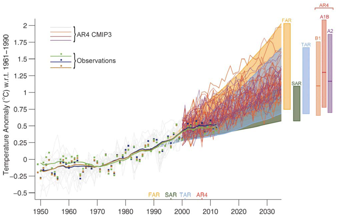
In the comparison of the draft version (the left chart) and the final version (the right chart), why did the IPCC change the scale of the chart? The dates along the X axis on the left chart range from ~1990 to 2015, or a span of 25 years; the dates on the right chart range from ~1950 to 2035, or a span of 85 years. The temperature scale on the Y axis on the left chart spans 1.6 deg C; on the right it spans 2.5 deg C. The really interesting part of the information that would show recent model accuracy in the final version is only 1/5th the area of the draft chart, making it much harder to examine ((1.6/2.5)*(25/85)=.188, which about 20%, which is 1/5th). Most of the final IPCC chart is uninformative empty white space. Furthermore, what does the spaghetti add to the information? It doesn’t appear to add much, but it certainly clutters up the chart, making it nearly impossible to see the actual temperature plot. The simple banded range of model projections in the draft image make it easier read the chart. Can some here redraw the IPCC final chart clearer, properly baselined, without the spaghetti lines, and zoomed in around the last 25 years (i.e., about the scale of the draft chart)?
Moderator Response:[DB] Try reading the OP again.
-
Rob Painting at 20:37 PM on 5 October 2013Why Curry, McIntyre, and Co. are Still Wrong about IPCC Climate Model Accuracy
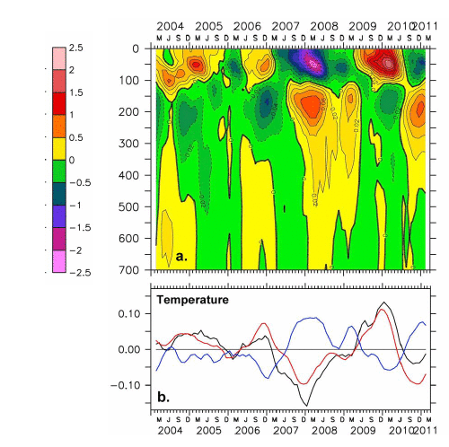
KR - although only a short period of observation, the ARGO network does show that heat is stored in the subsurface ocean during La Nina, and rises to the surface during El Nino - hence the effects on global surface air temperatures. Image from Roemmich & Gilson (2011) - The Global Ocean Imprint of ENSO.
-
Rob Painting at 20:26 PM on 5 October 2013Why Curry, McIntyre, and Co. are Still Wrong about IPCC Climate Model Accuracy
Klapper - there is no reason why observed temperatures - equivalent to one climate model run - should match the multi-model mean. Climate models cannot predict tropical volcanic eruptions, the wholesale shift of global manufacturing to China, and any effects it may have had on sulfate burden in the atmosphere, nor changes in the phase of the wind-driven ocean circulation.
There may be something amiss, only a handful of the climate models accurately simulate the changes in winds which alter the wind-driven ocean circulation for instance, but it's bit early to make that call. The observed temperatures are still within the envelope and may move upwards sharply with a shift in the ocean oscillation. Time will tell.
-
sereniac at 19:56 PM on 5 October 2013IPCC model global warming projections have done much better than you think
I have used multiple regression in the past (mostly on census data- which is inherently noisy) and something that is very apparent is how the degree of data aggregation can dramatically inflate correlations and subsequent R squared values. For example if data is at household level and is aggregated upward to say local council or even higher to city or state level, correlations steadily increase as the natural variability is removed.
When I saw the R squared values associated with climate models- in the order of 0.97 or so, I nearly fell off my chair. Obviously physical systems have less instrument error associated with their measurement but even so I wondered to what level data aggregation is done in climate models (I originally thought the opposite was happening i.e. smaller and smaller geographic grids were being applied) and whether it is potentially problematic in these analyses.
Thanks again
-
OPatrick at 18:24 PM on 5 October 2013IPCC model global warming projections have done much better than you think
sereniac @81 - I'm genuinely curious - when you asked the question
In other words, if the climate has large scale regulatory properties, of which ENSO
looks be one and it is inherently unpredictable, then could it (or other processes)
kick in to dampen the warming trend at some point.
was there a reason why you didn't say "... to dampen or increase the warming trend ..."?
-
Klapper at 17:47 PM on 5 October 2013Why Curry, McIntyre, and Co. are Still Wrong about IPCC Climate Model Accuracy
I downloaded the CMIP5 model ensemble mean for the RCP4.5 scenario and checked the projected warming rate 1990 to 2013 to compare with your graph above of projection warming since 1990. The warming rate of the model mean is 0.29C/decade over the 24 years the trend was calculated. That's pretty much double the actual SAT warming rate.
You might be right the observations are still "within the error bars" but it seems pretty clear the models are running too hot.
-
IPCC model global warming projections have done much better than you think
sereniac - Regarding your question on ocean data, I believe (IMO) that the observational uncertainties in OHC make it difficult to clearly examine ENSO changes. While I'm sure there are papers out on that topic, I don't know of any off hand. OHC is usually reported in five year running means as a result.
However, many of the global circulation models (GCMs) with sufficiently detailed ocean dynamics do produce ENSO style variations, with the rate of heat transfer to/from the deep ocean changing surface atmospheric temperatures. A recent paper by Kosaka and Xie (discussed on SkS here) ties model ENSO style variations to recorded ENSO indexes, and finds that the model accurately matches observed temperatures including the recent 'hiatus'. That is driven by a period starting with a large El Nino (1998) and ending with several La Ninas. So yes, these variations are incorporated in the models. In fact, they emerge from detailed physics - they are not 'programmed in'.
Note that the ENSO is probably best described as an aperiodic variation, somewhat chaotic and quite sensitive to starting values - which is why different models and different starting conditions will result (unless otherwise constrained) in a variety of modelled ENSO patterns.
-
Why Curry, McIntyre, and Co. are Still Wrong about IPCC Climate Model Accuracy
Extending a bit on the leaked and draft figure, the uncertainty bands are actually rather interesting. The caption for that figure states "The 90% uncertainty estimate due to observational uncertainty and internal variability based on the HadCRUT4 temperature data for 1951-1980 is depicted by the grey shading."
Most depictions of the variability, such as the yearly updates at RealClimate, display a 95% range of the model results. This figure instead shows the projected trend ranges +/- variation of observations, and should in fact be a more accurate range. Models vary considerably in how well they deal with internal variability (ENSO and weather, for example), but the observations themselves should encompass all sources of variation from the trends. And, with or without proper baselining, observations fall well within that envelope.
While not the most common depiction of potential variations around the energy bounded trends of climate change, I would (personally) consider it a very useful view to consider.
-
IPCC model global warming projections have done much better than you think
sereniac - There is an excellent and very simple analysis by John Nielsen-Gammon, expanded upon here, on this very subject, which was discussed on SkS as well. He classified years as El Nino, La Nina, or neutral, lagging those classifications by a few months for the variations to take effect (as supported by Foster and Rahmstorf 2011), and found the following:

GISTemp global temperatures, with trends for El Niño, neutral, and La Niña years computed separately. Pinatubo years are excluded.
He notes that "The spacing between the lines is a good measure of the impact of El Niño and La Niña. All else being equal, an El Niño year will average about 0.2 C warmer globally than a La Niña year. Each new La Niña year will be about as warm as an El Niño year 13 years prior." (Emphasis added)
The trends of all three categories are all about 0.14-0.16 C/decade, depending on how you assign ENSO years, with variations superimposed on an underlying warming trend.
-
Tom Curtis at 11:35 AM on 5 October 2013Why Curry, McIntyre, and Co. are Still Wrong about IPCC Climate Model Accuracy
Out of interest, here is the procedure for making figure 1.5 from the second order draft (I do not include the discussion of the uncertainty band):
"AR4: The data used was obtained from Figure 10.26 in Chapter 10 of AR4 (provided by Malte Meinshausen). Annual means are used. The upper bound is given by the A1T scenario, the lower bound by the A1B scenario.
Observations
The observations are shown as annual means relative to 1961-1990. No smoothing is applied. Whiskers give the 90% uncertainty range of the Morice et al. (2012) dataset. These include the combined effects of all the uncertainties (measurement and sampling, bias and coverage uncertainties).
ProjectionsThe projections have been aligned to match the mean observed value (averaged over the three observational data sets) for year 1990."
And here is the equivalent discussion from the draft report:
"AR4: The temperature projections of the AR4 are presented for three SRES scenarios: B1, A1B and A2. Annual mean anomalies relative to 1961–1990 of the individual CMIP3 ensemble simulations (as used in AR4 SPM Figure SPM5) are shown. One outlier has been eliminated based on the advice of the model developers because of the model drift that leads to an unrealistic temperature evolution. As assessed by Meehl et al. (2007), the likely-range for the temperature change is given by the ensemble mean temperature change +60% and –40% of the ensemble mean temperature change. Note that in the AR4 the uncertainty range was explicitly estimated for the end of the 21st century results. Here, it is shown for 2035. The time dependence of this range has been assessed in Knutti et al. (2008). The relative uncertainty is approximately constant over time in all estimates from different sources, except for the very early decades when natural variability is being considered (see Figure 3 in Knutti et al., 2008).
Data ProcessingObservations
The observations are shown from 1950 to 2012 as annual mean anomaly relative to 1961–1990 (squares). For smoothing, first, the trend of each of the observational datasets was calculated by locally weighted scatter plot smoothing (Cleveland, 1979; f=1/3). Then, the 11-year running means of the residuals were determined with reflected ends for the last 5 years. Finally, the trend was added back to the 11-year running means of the residuals.
Projections
For FAR, SAR and TAR, the projections have been harmonized to match the average of the three smoothed observational datasets at 1990."As can be seen:
1) In both figures observational data is baselined to a common 1961-1990 mean. The difference between them lies in the addition of the smoothed observational data sets in the final (Draft) version.
2) In both figures, projections from the First, Second and Third Assessment Reports are baselined to the single year of 1990. The difference lies that in the final (Draft) version, they are baselined to the mean of the smoothed observational data sets in 1990 rather than the mean of the 1990 values. This has the effect of raising the projections with respect to observations by 0.13 C.
3) AR4 projections are treated entirely differently between the two versions. In the 2nd Order Draft, they are treated in the same way as the projections from the other assessment reports. In the final (Draft) version, the individual model runs are shown, all baselined to the 1961-1990 period.
It is important to note that in the earlier version, and the final (Draft) version, observations and models (other than AR4 in the final version) are baselined differently - something Dana did not pick up in the article above.
Turning from what was done to whether it was appropriate, I first note that in the final (Draft) version, AR4 model runs and observations are all baselined on the same period, where that period is not the period we are comparing. That means it represents a perfectly valid comparison. That the baselining period (1961-1990) is different to that actually used in AR4 (1980-1999 according to Lucia) is of little consequence. The effect of the earlier baselining is to allow a slightly greater spread in the models, which is matched by allowing a slightly greater divergence between models and observations. Using the later baseline period would have (conversely) both reduced the spread and the divergence. The net effect of the choice should be negligible.
Second, the baselining of model mean projections on the smoothed observational data in a single year is also appropriate. Because short term variations (other than from volcanism) do not appear at the same time in model runs, model means are smoothed data. Consequently the final (Draft) method for comparisons with the First through Third Assessement Reports is also appropriate. (It should be remembered that none of the three earlier Assessment Reports included historical forcings after 1990.)
Finally, as Lucia agrees, baselining the model data against a single unsmoothed years data, as done in the Second Order Draft version is inappropriate. Unless you are very fortunate, it will introduce artifacts into the comparison, and in this case tended to show the observations as falling further behind the projections than was actually the case.
Prev 823 824 825 826 827 828 829 830 831 832 833 834 835 836 837 838 Next


