


 Arguments


Recent Comments
Prev 826 827 828 829 830 831 832 833 834 835 836 837 838 839 840 841 Next
Comments 41651 to 41700:
-
michael sweet at 01:20 AM on 24 November 2013Death in Jurassic Park: global warming and ocean anoxia
As I understand the issue that has been raised about ocean anoxia causing widespread extinction on Earth it is not that all the oxygen is used up. This article (with 243 cites!) says that if the ocean becomes sufficiently anoxic at the bottom, it releases hydrogen sulfide (a poison gas) into the atmosphere at a high enough rate to cause extinction of vertebrates on land. It is not necessary for all the oxygen to be used up to poison the vertebrates. The release of hydrogen sulfide must be high enough to overcome the reaction with oxygen using up the hydrogen sulfide. Data is provided asserting that past mass extinctions have been caused by this effect. There are locations in the current ocean that outgas H2S in sufficient quantities that if they expand enough this could become a problem. It is believed that the H2S mechanism can start if the ocean becomes warm enough . (a google search of "ocean releases hydrogen sulfide extinction" gets a lot of scholarly hits, I took the first interesting one). This might make an interesting article for SkS, but it would take some research to write.
-
DSL at 01:05 AM on 24 November 2013Will extreme weather like super typhoon Haiyan become the new norm?
Oh - I guess we also need a new thread for the "It's God's fury" myth.
Very few understand, WP? And one of those few is undoubtedly you, yes? The world-renowned tornado expert WP Sokeland, with his one floppy publication and general unwillingness to describe any actual physical mechanism. Oh, and general unwillingness to address criticisms of his basic physical model (e.g. ocean-atmosphere energy transfer as spatial and temporal constant).
I'm not just taking your word for it, WP. Expert schmexpert. Cough up the physical theory and observational evidence. Or is the whole thing simply you noticing that, sometimes, tornado outbreaks and solar flares occur in time near one another?
Moderator Response:[JH] Please dial down the sarcasm.
-
wpsokeland at 00:05 AM on 24 November 2013Will extreme weather like super typhoon Haiyan become the new norm?
Tom Curtis was kind enough to read my peer reviewed articles that state severe weather is incoming due to explosions on the sun and solar storms impacting earth. It is very difficult to state that 50 years of PhD level research is wrong, but very few understand the physics of a tornado or a hurricane and experts are still looking for their Genesis or beginnings. If you do not understand the physics of the storm, you cannot defeat its destructive power. Recall project STORM FURY. The hurricane experts who believed that energy release from the oceans fueled hurricanes tried to use that theory to reduce the power of Wilma. They failed because their theory was incorrect.
Matthew 16:3 And in the morning, It will be foul weather today: for the sky is red and lowering. O ye hypocrites, ye can discern the face of the sky; but can ye not discern the signs of the times?
Check out thr solar storm that occurred a day and one half at the ACE spacecraft before our last tornado outbreak, if you know how.
-
Tom Curtis at 17:08 PM on 23 November 2013How we discovered the 97% scientific consensus on man-made global warming
barry @18, Richard Tol was certainly included, as he has himself confirmed. Unfortunately self rating authors are entitled to anonymity and Cook and his co-authors have done their best to ensure it. Therefore they cannot answer with regard to the others unless they voluntarilly permit their names and self ratings to be released; or themselves volunteer the information as to whether or not they respond, and if so how they responded. I suspect they will not volunteer that information because, if they do, it will be obvious that their disagreement is unusual among respondents. They are angling to be considered representative when they know full well from the self rating survey that they are not.
I will add that there claims about their papers being incorrectly rated in the abstract ratings, are not, in all cases, what they are cracked up to be.
-
Tom Curtis at 17:00 PM on 23 November 2013Global Warming Paws Fails to Materialise: Earth Still Warming and Global Sea Level Rising Like Gangbusters
fulvus & chriskoz, I have attempted to answer some of your questions on a more suitable thread.
-
Tom Curtis at 16:59 PM on 23 November 2013Death in Jurassic Park: global warming and ocean anoxia
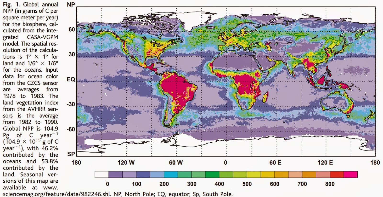
fulvus raises the issue of whether global warming induced anoxic (low oxygen) conditions could suffocate land animals, thereby leading to a near total extinction of life on Earth, including all higher vertebrates (ie, in particular, us). To set this question into context, it is estimated that 104.9 billion tonnes of carbon are fixed annually by photosynthesis, of which 46.2% (48.5 billion tonnes carbon) is fixed in the oceans, primarilly by phytoplankton, and 53.8% (56.4 billion tonnes carbon) is fixed by land plants, primarilly in tropical rainforests:
For each carbon atom fixed by photosynthesis, one oxygen molecule (O2) is released into the atmosphere. Conversely, and at approximately the same rate, O2 is converted to CO2 by respiration, decomposition and combustion. For comparison, human emissions from transport, energy generation deforestation amount to about 9 billion tonnes of Carbon per annum or about 8.6% of net primary productivity.
As indicated in the article above, increased warmth and ocean acidification have lead to extreme anoxic conditions in the past; and such conditions are also implicated as a major factor in the Permian mass extinction, again brought on by rising CO2 levels and temperatures. It is not clear that this was from the reduction in massof phytoplanckton. Rather, the primary mechanism is that warmer and more acidic waters simply hold more less gasses in solution, and hence less oxygen. In other words, oxygen currently dissolved in the ocean will difuse into the atmosphere, increasing the amount of oxygen in the atmosphere. (The same will also happen to nitrogen and CO2.) Indeed, Chavez et al (2011) indicate that oceanic primary productivity tends to increase with rising temperatures, so that more oxygen is produced even if it is not retained in the water as well:

So on balance, I do not expect wide spread suffocation of land animals as a result of oceanic anoxic conditions. Of course, the situation is quite different in the ocean.
Finally, just for the fun of it, if all oxygen production ceased, it would take nearly 4000 years to use up all the Earth's atmospheric oxygen at current rates of consumption including by the combustion of fossil fuels.
-
barry1487 at 16:25 PM on 23 November 2013How we discovered the 97% scientific consensus on man-made global warming
Question:
Of the scientists that were surveyed to rate their own papers, did you include Alan Carlin, Craig D. Idso, Nicola Scafetta, Nils-Axel Morner, Nir J. Shaviv, Richard S.J. Tol, and Wei-Hock "Willie" Soon?
I ask because Anthony Watts, referring to a PopTech article regarding those scientists' comments on the paper, says that they were not contacted. But the scientists themselves say nothing about that.
Do you have a list of the scientists you attempted to contact, perhaps in supplementary material?
Any leads appreciated.
Barry.
-
wili at 14:49 PM on 23 November 20132013 SkS News Bulletin #17: Cowtan and Way (2013)
Ha! Thanks for the correction. I of course meant .85C.
-
chriskoz at 14:44 PM on 23 November 2013Global Warming Paws Fails to Materialise: Earth Still Warming and Global Sea Level Rising Like Gangbusters
fulvus@10, I appologise for a typo of your name in my post @11 - I cannot correct it now, unless mods can help me (thanks).
-
chriskoz at 14:08 PM on 23 November 2013Global Warming Paws Fails to Materialise: Earth Still Warming and Global Sea Level Rising Like Gangbusters
fulvus@10,
Please provide the refeence suporitng your claim "that phytoplankton produces 60% of the oxygen in the atmosphere".
According to my knowledge, the amount of oxygen we are a currently having (21%) is the result of a Gy-long evolution of biosphere, in particular a balance between photosynthesis and fires. Entire plant kingdom contributes to the release of O2.
Fossil fuels, even if all of them burned, cannot realisitcally take more than some say 0.1% of it (if CO2 increases by 1000ppm which is 1/1000 of total air volume). I don't know of any processes that would negatively alter the biosphere's photosynthetic ability in Anthropocene. Rather opposite is taking place - the terestrial biosphere is responsible of drawdown of about 20-30% of anthropogenic CO2, releasing some of that O2 that used to burn FF back to the atmosphere.
-
YubeDude at 12:52 PM on 23 November 2013Will extreme weather like super typhoon Haiyan become the new norm?
Tom @10
I think you may have made some mistaken inferences regarding my message.
I have long held that diagnosis and prognosis have to be separated to avoid any attempts at clouding the diagnosis with emotion or a fear of the cure. The science of the storm and AGW inputs that are suggested by the intensity of the storm are valid points to consider and investigate and fall within the guidelines of SKS; including the video and making the link to “human tragedy” as part of the message disrupts the flow of science and has no place when determining the diagnosis.
I was lobbying for a removal of the video and did so by mentioning that if you are going to shed tears over the pain and suffering than a little perspective is required otherwise this connection of diagnosis and prognosis is low hanging fruit for the “blame the victim” crowd as you mentioned.
I find that straight forward hard science does establish the realities and adding the “human” factor only muddies the waters and turns the discourse away from the metrics and PR and starts to introduce suffering as an offset that has to be taken into consideration when weighing the science.
That was all I was saying about this post… -
Tom Curtis at 12:15 PM on 23 November 2013Will extreme weather like super typhoon Haiyan become the new norm?
wpsokeland @34 draws attention to the "peer reviewed" article he had published in the "Journal of Meteorology", now the International Journal of Meteorology, an article so groundbreaking that it does not appear on Google Scholar save as a single cite.
That is probably par for the course in the Journal of Meteorology. In 2005, 18 of the 33 articles in the journal recieved no citation. Of those that were cited, 10 of the 16 citations recieved were self citations. Doing the maths, only one article recieved more than one citation, and it recieved only 2. This low citation rate and high self citation rate has led the Journal of Meteorology to recieve a very low impact factor. Unsurprisingly, it lies in the bottom quartile atmospheric science journals. As it happens, Sokeland's (almost certainly) single cite was almost certainly a self cite, given that he published SOLAR PILLARS OF FIRE: Part 2 the following year in the same journal.
What is the point of this? Getting a journal through peer review requires convincing (typically) just three people that the paper does not make an obvious blunder. It does not mean it did not make an obvious blunder. It only means the editor and peer reviewers of the paper did not spot it. This very low bar is made easier if you submit multiple times. The more often you submit, the more likely you will find an editor and peer reviewers who themselves blunder by not picking up your blunder. It is made easier again if you submit to a low impact journal, which by its nature will not attract high quality editors and reveiwers, and will be more willing to accept low quality papers.
This low standard is why I have a certain contempt for those who publicize their ground breaking discoveries on blogs, but never get around to submitting for peer review. If they are afraid to face even that hurdle, just how confident in their argument can they be?
In any event, congratulations are in order for Sokeland for having the courage of his convictions, and submitting his ideas and getting them published. However, that is in no way an indication of quality in an argument. At most it indicates a lack of obvious blunders - but in very low impact journals such as the International Journal of Meteorology or Energy and Environment (which appears to have a slightly higher impact rating than the Journal of Meteorology) it does not even indicate that.
So, rather than being published, the true indication of quality in an article is the frequency with which it is cited by others - and the period over which they do so. A poor quality paper might attract a small number of citations from refutations published shortly thereafter - but papers with many citations and which are cited years after publication have indeed been judged by the experts to be of high quality (which is not the same as being judged correct).
Having pointed that out, what of the actual science in Sokeland's papers?
I think his proposal of the existence of invisible tornadoes and hurricanes in his second paper sums it up. It is nonsense, pure and simple.
-
fulvus at 12:15 PM on 23 November 2013Global Warming Paws Fails to Materialise: Earth Still Warming and Global Sea Level Rising Like Gangbusters
Tom Curtis, thank you for response and the reference to the article on the dire state of our oceans, and the implications for marine species survival and indirectly impacts on humans.
However, this article does not answer my question. Nowhere does it mention phytoplankton and therefore doesn't address the fact that phytoplankton produces 60% of the oxygen in the atmosphere, and that combined with deforestation there is a real chance that terrestrial lifeforms too will suffocate.
We talk a lot about rising sea levels, wild weather, drought and so forth, but no one seems to be addressing the primary issue that none of this will matter to us because we will be asphyxiated, dead, finis! The end of oxygen breathing life in the oceans is discussed in the article, but it doesn't address the end of oxygen breathing life on land as well. Even the cockroaches will die.
-
DSL at 11:54 AM on 23 November 2013Will extreme weather like super typhoon Haiyan become the new norm?
WP, did you just say that total solar irradiance was constant? Did you just strongly suggest that the oceans transfer energy at a constant rate? I looked for your paper on the internet. Google found eight hits.
Why don't you take your argument to an appropriate thread.
Regulars, wasn't there a "It's solar flares" myth once upon a time. Can't find it. -
Tom Curtis at 11:43 AM on 23 November 2013Global Warming Paws Fails to Materialise: Earth Still Warming and Global Sea Level Rising Like Gangbusters
fulvus @8, try this article.
-
fulvus at 11:17 AM on 23 November 2013Global Warming Paws Fails to Materialise: Earth Still Warming and Global Sea Level Rising Like Gangbusters
I continue to be mystified that in all the news I read, not necessarily in the MSM but also on sites like this one, I have never seen an article addressing the possibility that through deforestation, and acidification of the oceans, thereby killing phytoplankton, we are destroying the sources of our atmosphere's oxygen. There are two possible reasons for this that I can think of: 1) not being a climate scientist, I don't understand enough to realize that I'm overstating the problem or even creating a bogus scenario, and 2) I am on the right track but the scenario, which should be our #1 concern re climate change, is just too scary for people, even climate scientists, to look at. I would certainly appreciate feedback from anyone qualified to give it succinctly and clearly, or direction to another source where I could find this discussed.
It's a matter of the demise of almost all lifeforms on the planet. How many organisms do not breathe oxygen besides anaerobic bacteria, tubeworms at ocean floor volcanic vents, etc.? PLEASE RESPOND!
-
wpsokeland at 09:30 AM on 23 November 2013Will extreme weather like super typhoon Haiyan become the new norm?
The average trmperature of our globe is varying over the past 30 years with swings of 0.1 to 0.2 degrees centigrade -- up and down. The general overall trend is upward. Since the solar constant, your only energy source ts constant and, if greenhouse gases were continually increasing via human input, the average temperature of our globe would be continually increasing. There would be no temperature swings as seen in the data. Any PhD in heat transfer would know that a different energy source is active in the real temperature variation.
My published peer reviewed paper on the subject of incoming severe weather from outer space is:
Sokeland, W. P. (2005) SOLAR PILLARS OF FIRE: Part 1: Tornadoes from the Sun, Journal of
Meteorology, UK, 30, 298
Energy is incoming via solar storms. In the case of melting northern sea ice, tropical cyclones in the Atlantic know as hurricanes have been increasing and decreasing at various times over the last 30 years. When the hurricane activity goes to a maximum, the North Atlantic Current convects increased temperatures by 1 degree centigrade to the Arctic seas due to the energy deposited in the tropics by the hurricanes and the sea ice melts. The reverse is true when Hurricane activity is a minimum. Hurricane activity hit a minimum in 2013 and the Arctic sea ice is increasing in area. The changing global average temperatures has very little to do with the concentration of greenhouse gases in our atmosphere.
-
Tom Curtis at 09:25 AM on 23 November 2013Most of the last 10,000 years were warmer
steven foster @34, where you to take the effort with the actual data, a very useful graph would be the full holocene record from Alley et al overlaid with the 100 year average from Kobashi et al for the last 4000 years, and with an inset or second panel showing the last 2000 years from Kobashi et al overlaid with the 10 averages from Box (2009). That would display the full range of data with a minimum of visual clutter and with appropriate resolutions for comparison. The first graph could also have modern temperatures marked on the graph for comparison with the full holocene record.
-
Tom Curtis at 09:14 AM on 23 November 2013Clouds provide negative feedback
Licorj @250, by "estimate", it is meant estimate based on empirical observations and predictions from models. Both, separately, suggest that a small positive cloud feedback is more likely than not. The uncertainty is large so that negative feedbacks are not excluded, but neither are large positive feedbacks excluded.
You say that to get the true cloud feedback, we need lots of measurements around the world. Those measurements have been done. Three examples of such measurements are linked to in the OP. Unfortunately the measurements do not tightly constrain the result because the feedback is complicated and the observational data is noisy.
Of course, it is always possible to avoid the whole issue by looking at empirical estimates of the net feedback from historical and paleo data. These overwhelmingly suggest a large net positive feedback. As these are estimates based on what has actually occured on the Earth, they of necessity include all feedbacks. Therefore, if the cloud feedback does in fact turn out to be negative, that merely means that some other combination of feedbacks is more strongly positive than currenly estimated.
-
danielc at 05:39 AM on 23 November 2013Will extreme weather like super typhoon Haiyan become the new norm?
There's another factor of anthropogenic global warming that I have not seen mentioned, which is lapse rate, i.e. the temperature gradient between sea level and tropopause.
One of the key factors identifying AGW as distinct from milankovitch or solar-flux-driven global climate change is the fact that the earth is warming "from the inside out" -- specifically, the troposphere is warming at the same time that the stratosphere is cooling.
this change increases the gradient between warm floor (ocean and land) and cold ceiling (tropopause or base of stratosphere).
That increased gradient should cause increased rates of updraft, lower surface pressures, higher/taller storms with greater lateral extent, and stronger surface winds as a result of all of the above.
One thing I do not know is how well constrained are measurements (if any) of lapse rate change, specifically in the tropics.
Anyone know?
-
Clouds provide negative feedback
Licorj - I would suggest following the links in the opening post; there is considerable evidence for a small positive cloud feedback based on observations, on constraints from other forcings and feedbacks, from paleo evidence, etc.
Not a "game", not a guess - a small positive feedback comes from the best estimates of the various evidence available.
-
steven foster at 05:12 AM on 23 November 2013Most of the last 10,000 years were warmer
Yeah the resolution is really low because all I did was capture Easterbrook's graph and use photoshop to clone the entire thing over by 50 years so it correctly ended at 1855, and then I added the modern part by plotting about 30 data points from GRIP, and then played connect the dots with photoshop. I'm thinking of redoing it by plotting all the data on a spread sheet, but there is a lot of work involved.
Yeah, the rise is so steep you can't really see the sawtooth pattern from the falling temps and rising again, which happens twice, first from around 1850 to 1910, then from 1942 to 1975 (steep rise 1780 to 1850, 1910 to 1942, and 1975 to 2000).
To be useful and scientificaly rigorous I should replot all the data, with all the GRIP data in a different color, with the y axis marked on the right side with actual GRIP temperatures, and GISP2 temperatures marked on the left side, lined up so the 1855 data in both sets was the same on the y axis. For this discussion, I thought what I did was good enough, because everything is so compressed.
Moderator Response:[JH] Duplicate post deleted.
-
Licorj at 04:48 AM on 23 November 2013Clouds provide negative feedback
Dear KR,
First, thank you by attention, even after long time past from publication of this post. I just have realized it, after my post was sent.
I have read the post, and a lot of very interesting comments. "Clouds are estimated be small positive feedback". Ok. Estimated to be, but could be estimated to not to be... It is a game.
Excuse me by error on "INFINITE WARMING". It is clear that is not possible, otherwise, we would have free energy generation.
Backing to the clouds: I believe, of course, with less scientific based knowledge than you, that the choice on small positive feedback for cloud, taken by climate scientists was just a choice, with high level of uncertainty. So high, that choice would be NEUTRAL, or small negative feedback. In order to get the true cloud feedback, it would be need a lot of measures taken around the world, on entire troposphere, entire world, during long time. Of course it is very expensive and hard to do, maybe impossible.
Even assuming my mistake on INIFINITE WARMING, I still believe that oceans would be expected to dry, because of positive feedback, in any level.
Other expected result from feedbacks for, aerossols, cloud, water vapor, CO2, CH4, etc, would be the accuracy of models on recreating paste climates. They are all wrong, on this task. Somethings are very wron with them, and nedd to be fixed, before can tell us how will be the climate after 100 years from present day.
Why we see tomorrow's weather forecasts, and believe on it ?
Because they are correct on vaste majority of times. It is not the same case for climate models, at least, untill now.
But, this is off-topic.
Moderator Response:[JH] Since you have provided absolutely no specific evidence to substantiate your sweeping assertions about global climate models, your assertions are merely your opinion - which carries virtually no weight on this site.
If you post similar comments in the future, they will be summarily dismissed for violating the SkS Comments Policy re sloganeering.
Please read the SkS Comments Policy and adhere to it.
-
rocketeer at 03:19 AM on 23 November 20132013 SkS News Bulletin #17: Cowtan and Way (2013)
@will If we were at 8.5C above pre-industrial half the planet would be dead. We are about 0.8C above pre-industrial so 0.07C is a pretty significant (additional) increase over a 15 year period.
-
Tom Curtis at 23:33 PM on 22 November 2013Most of the last 10,000 years were warmer
steven foster @32, the problem is that the GRIP temperature you plotted onto GISP2 is that from Box (2009) as displayed by Kobashi et al. So, when we compare Box (2009) in Kobashi et al (middle panel, black) with your extension of GISP2 we see the uniform rise in temperature is not a feature of the data, but only a consequence of the very low resolution of your graph. The data clearly shows a rise in temperature to mid twentieth century, a fall, then a rise again, details that are missing from your graph. Therefore your extension does not show the details significantly better than the straight line, and the supposition that it might is deceptive.
And that is why there is no substitute for showing the "chicken scratch graphics". They actually show the data accurately. If you want to trim it down, show only the middle panel, but don't pretend that showing a less accurate ice core temperature series together with an instremental based series at two low a resolution to show relevant detail is a substitute for showing an accurate graph. It isn't.
-
steven foster at 21:32 PM on 22 November 2013Most of the last 10,000 years were warmer
I see a significant difference in that in my chart, we can see the slope of the line in the 1700s and 1800s is equal to that in the 2000's. Your chart merely connects 2 points and has a straight line from 1855 to 2009, the slope in each century not being discernible.
I already addressed Kobashi et all in post 30, when I mentioned useless chicken scratch graphics.
Moderator Response:[JH] Please lose the snark.
-
Dikran Marsupial at 19:35 PM on 22 November 2013Global warming since 1997 more than twice as fast as previously estimated, new study shows
SASM wrote "Dikran @54: What are the “other issues” with UAH and RSS?" Thes issues are well documented, for example see the ReadMe file provided with the dataset. If you look at the Wikipedia page for the UAH dataset you will find a section on the corrections that have been made. There comes a point where you need to take some time to investigate these issues for yourself after they have been pointed out to you (as I did here), Google is a useful research tool (especially Google Scholar).
SASM then goes on to write "...I’ve researched the difference between UAH, RSS, GIS, HADCRUT, and for the most part the plots are all very similar..." in which case why should C&W just use satellite data?
SASM wrote "You mention surface temperatures versus lower troposphere air temps, but what about ocean temperatures (surface and deep) -- which one is most important or the most meaning with respect to AGW?"
This is evasion. You asked why satellite data is not used, and I answered your question, yet rather than acknowledge your question had been answered you change the topic. This is trolling.
As to why near surface air temperatures are important, well that is where most of us tend to live, and our crops etc. Again this is just another example of goal-post shifting that we have seen rather too much of from you.Lastly SASM writes " But clearly, the Artic has warmed way more than the Antarctica region. I just find that very curious. I wouldn’t expect CO2 to cause such asymmetrical warming, so it seems to me that something natural phenomenon is occurring. Perhaps this is support for Judith Curry’s Stadium Wave theory?"
So you completely ignored the reason for the assymetry that I explained in my posts. Frankly that is pretty shabby behaviour on your part, and I will continue the discussion no further and I suggest others do likewise.
-
Tom Curtis at 18:30 PM on 22 November 2013Most of the last 10,000 years were warmer
steven foster @30, I did not suggest you counted pixels. Rather, I did, and by doing so showed the difference to not be appreciable. For those unsure on that point, here is the graph with the data misplaced on the x-axis as noted by Foster @27:

And here is Foster's version:

Can you see a significant difference?
That aside, you (Foster) do not address my point (2) above, ie, that we should be using Kobashi et al (2011) for investigating north central greenland temperatures.
-
ajki at 18:19 PM on 22 November 2013Global warming since 1997 more than twice as fast as previously estimated, new study shows
"Issues" /wrt satellites:
A good starting point to explore issues with satellite data is provided right here on SkS:
Satellite measurements of warming in the troposphere (last update 24 March 2011 by Glenn Tamblyn)
The sections named "Further reading" should be noted.
-
ajki at 17:55 PM on 22 November 20132013 SkS News Bulletin #17: Cowtan and Way (2013)
re: "Media ignore study...", Media Matters, Nov 18, 2013
I don't think this is true. In a way it is "faux news" as in "Faux pause: Media ignore study..." (as the complete title of that article tells). John Hartz wrote in a comment: "The [cited] articles contained in this bulletin are only the tip of the iceberg..." and he is more than just right on that one. In Germany, mainstream media (including Radio/TV features) did report about the findings of the study - e.g. Süddeutsche Zeitung Nov 15, Der Spiegel Nov 15, Berliner Morgenpost Nov 14, T-Online News Nov 16, Telepolis Nov 20 and many, many more (not even mentioned are Blogs). As it needs just one (big) News Agency (Reuters, AFP or the like) and one short news snippet there to get a news item into the worldwide news flow, it is highly unlikely that US media did not cover this.
One part of the general problem regarding AGW is that it is just so easy today to get a message into the media and this is a well known and heavily (mis)used fact from the Denialistas. Media outlets are quite happy to push any news in "controversial" areas (that is, content generating furious reactions from readers) and they will not let down on that.
Moderator Response:[JH] The Media Matters analysis focused on the MSM coverage of Cowtan and Way (203) within the U.S.
-
steven foster at 16:55 PM on 22 November 2013Most of the last 10,000 years were warmer
I assure you I didn't count pixels or use a graphics program. I plotted GISP2 for the whole Holocene and plotted GRIP on a uniform timeline from 1855 to 2009 by simply starting with the 1857 GRIP temp which was quite a bit warmer than the 1855 GISP2 temp, and plotted from there. I generally don't like to splice different data sets together but this is only a blog so who can it harm? The resolution is low and this is not publishable but gives us something better than the useless chicken scratch graphics I've seen elsewhere. This differs little from what you did on post 15. My attempt at doing the same thing.
https://imageshack.com/i/05m9hzj
-
One Planet Only Forever at 15:56 PM on 22 November 20132013 SkS News Bulletin #17: Cowtan and Way (2013)
This 'better understanding' has prompted new attempts to discredit the science and anyone who tries to more fully present it. These attempts to discredit also help 'better understand' who is genuinely interested in 'better understanding this issue' and who would prefer to have people 'maintain certain popular beliefs so that gambles on damaging and unsustainable pursuits can get maximum payout'.
The popularity of benefiting from burning fossil fuels, something that clearly can't be continued by future generations for the few billion years humanity could enjoy life on this planet, makes this a significant public perception battle ground issue. There are many other pursuits that are similarly damaging or not sustainable. If this incredibly popular unsustainable and damaging pursuit, burning fossil fuels, actually loses the public opinion war among those who benefit most from it, then the rest of the unsustianable and damaging pursuits that many among the most fortunate have gambled on getting away with would likely fall as well.
The result would be a massive change of the global socioeconomic system. It would be a change for the better, except for those who only care about getting the most benefit they can for themselves. There would be massive 'disappearances of unjustified wealth related to unsustainable and damaging pursuits'. That is the clear motivation of the attacks on the science's implications that the burning of fossil fuel must be dramatically reduced.
Keep up the good work that helps everyone better understand this issue. It makes it harder for the uncaring to excuse their attitudes and actions. However, the will to fight against the required change is clearly very strong. Some people will never accept a 'better understanding if it means they can't benefit as much as they wish to'.
-
2013 SkS News Bulletin #17: Cowtan and Way (2013)
The total change in temperature is very small - the Cowtan and Way data remains within the 95% uncertainty range of HadCRUT4. Changes in yearly variations, though, do affect extremely short term trends.
All of the 'skeptic' noise about the "hiatus", discussions of "16 years", and in fact any trends derived from start points in the 1998 El Nino, deliberate selections of periods just short of statistical significance - are simply noise about noise. Trends over that time, as the authors of this paper point out, are just not statistically significant and don't have enough data to separate between short term variations and any change in climate trends.
That said, the Cowtan and Way paper makes the various skeptic/denier claims about slowdowns even less sensible. Which is why the 'skeptics' are up in arms (WUWT has something like 8-9 posts on the subject) - the paper removes one of their favorite misleading rhetorical points.
-
Tom Curtis at 14:36 PM on 22 November 20132013 SkS News Bulletin #17: Cowtan and Way (2013)
wili @1, you have it exactly right. This is, at most, a minor adjustment on the long term surface temperature trend. It only appears consequential when you look at very short term trends, such as that from 1998. Looking at such short trends is largely meaningless in science because the trends do not statistically differ from the long term trend, and any adjustment that makes a noticable difference only to those short term trends will be largely inconsequential to the overall science.
The problem is, in order to avoid the implications of the science, AGW deniers have been focusing heavily just such short term trends. That focus of theirs is shown by C&W to be misguided in that the phenoman they purportedly draw attention to largely disappears with just a minor correction. Indeed, they are in a cleft stick if looked at logically. If they draw attention to the minor nature of the correction, they at the same time draw attention to the unscientific nature of their focus on short term trends. Alternatively, if they draw attention to the short term trend, C&W shows their argument to be based on using only restricted data.
Of course, AGW deniers are not logical. So, whether C&W punctures their rhetorical bubble remains to be seen.
-
scaddenp at 14:34 PM on 22 November 2013Will extreme weather like super typhoon Haiyan become the new norm?
CSIRO researchers Church and White have long publishing history from analysis of worldwide tide gauge and satellite sealevel. See for instance here for "Sea-Level Rise from the Late 19th to the Early 21st Century". I would imagine it comes from that group.
-
wili at 14:25 PM on 22 November 20132013 SkS News Bulletin #17: Cowtan and Way (2013)
Wow, lots on the C&W paper here. The main thing I would like to know (so I can clearly and accurately convey it to others) is: Exactly how much additional warming does the study suggest we have experienced.
In the fifth paper cited, the quote: " 0.12 degrees Celsius between 1997 and 2012 (see the bold "Global" line in the graph above) -- two and a half times the UK Met Office's estimate of 0.05°C" suggests that there is an additional .07 degrees of warming we should add to the total. But that seems more like a rounding error than a major adjustment. Had we been at 8.5 Celsius above pre-industrial, or so before this reanalysis? So are we now acutally closer to 8.6? Or is there something more dramatic that I'm missing?
Moderator Response:[JH] The articles contained in this bulletin are only the tip of the iceberg so to speak. Similar articles have been written and published in many languages other than English throughout the world.
-
Tom Curtis at 14:04 PM on 22 November 2013Will extreme weather like super typhoon Haiyan become the new norm?
Terranova @29 you cannot tell how high the storm surge was just from one video. You have no idea how close the house shown was to the shore, nor how far above the waterline. Nor, for that matter, do you even know which city it was in; nor the state of the tide at the time it hit. The numerical information I have been able to find puts the storm surge at Tacloban at 6 meters (19.7 feet) in one instance, 17 feet (5.18 meters) in another, and at 5 meters (16.4 feet) in a third. That compares to predictions of up to 7 meters (23 feet). These figures, however, are hardly authoritative.
Further, your appoach to estimateing the impact of global warming on storm surges is dubious. Landfalling tropical cyclones make a sparse and noisy data set. As the increased height of storm surges due to global warming will just be the increase in sea level due to global warming, it is far better to just use estimates of that increase, either observational (for current data) or predicted (for the future). Predicted sea level rise is going to be around 750 mm (2.5 feet) with no mitigation. That is the global average, and will be significantly greater in the tropics. The effect of an additional 2.5 feet on top of the Haiyan storm surge would depend on your exact location. Where the land has a shallow gradient, it will greatly increase the area effected. For those near the shore, it may make no difference at all, in that dead is dead. For those at 4.5 meters above sea level, it may turn a dangerous and damaging flood into a life threatening torrent that destroys all before it. In no case is it a good thing.
-
Will extreme weather like super typhoon Haiyan become the new norm?
wpsokeland - Your claim that tropical storms "...put energy into the oceans rather than take it out" is utterly wrong, and in fact backwards. I would suggest you look at any reference on tropical storms, such as this one, and read about what really happens - heat from the oceans drive the storm, moving energy into cooler air above:
"...warm, moist air from the ocean surface begins to rise rapidly, where it encounters cooler air that causes the warm water vapor to condense and to form storm clouds and drops of rain. The condensation also releases latent heat, which warms the cool air above, causing it to rise and make way for more warm humid air from the ocean below."
The rest of your post is equally baseless. I am puzzled as to what you thought to accomplish by posting such nonsense.
-
Terranova at 12:23 PM on 22 November 2013Will extreme weather like super typhoon Haiyan become the new norm?
SCADDENP - Thanks for the info. I have not been able to find that. Do you know where CSIRO mines their data from?
ALBATROSS - Thanks again for another excellent graphic. As a survivor of Hurricane Hugo in 1989 with its 18 ft storm surge, I will not diminish the impact of any tropical storm. I do want to see the official data on the storm surge. The best I can tell is that it is less than 6 feet. Again, that is preliminary. Also, has anyone considered the subject of subsidence in the region? Look up the work of Dr. Lagmay Investigating ground deformation and subsidence in northern Metro Manila in that region of the world.
My overall point is literally: how much SLR has occurred (whether a combination of SLR and subsidence, or not), and what was the realistic storm surge? Once we know those numbers we can input the data and begin to compile data over a period of time to determine any statistical signficance of any of these events.
Before we begin any "immediate action", we need to make sure we are doing it for the right reasons.
-
Tom Curtis at 12:07 PM on 22 November 2013Most of the last 10,000 years were warmer
steven foster @27 & 28:
1) The chart in my post @ 15 does in fact place the end of the GISP2 data in 1874 (based on pixel count), or five pixels prior to 2010. Placing it six pixels prior to 2010 would have placed it in 1847, a little more accurate but hardly consequential. I doubt it makes any visual difference.
2) I am not sure why you are making this point on the original Alley et al (2000) data when we have the Kobashi et al (2011) data from the same ice core that is:
- Carried through to a more recent date;
- At a higher resolution;
- Includes reconstructed site temperatures from nearby instrumental readings back to 1840
- Includes on site instrumental readings back to 1985
- Is correctly alligned.
Using the Kobashi data we see the warming at the GISP2 site started circa 1750, and was quite slow till the early twentieth century. It then shows a rapid increase, and decline, followed by another rapid increase of equal size.
3) All of this is largely irrelevant because local proxies are not global proxies. Anybody using the denier talking point you mention must be ignoring that basic fact. What the Kobashi reconstruction shows us are the temperatures at one site in Greenland. The do not show us Arctic temperatures in general, and certainly not NH or global temperatures in general. In fact, we do in fact have NH and global temperature reconstructions over that period, which show the twentieth century warming to be much faster than the prior warming as the Earth exited the LIA.
Faced with that fact, the question those rejecting AGW need to ask themselves is, why, after the Earth warmed enough to exit the LIA did it keep on warming? Indeed, why did it not only keep on warming, but warm faster? If the late twentieth century just represented a "recovery from the LIA", why did it not slow down as it approached the prior equilbrium level, but instead accelerated past it?
-
Tom Curtis at 11:42 AM on 22 November 2013Global warming since 1997 more than twice as fast as previously estimated, new study shows
It is astonishing that people persist in vaunting the accuracy of satellites temperature data relative to surface temperature data. Satellite temperature data does not suffer from urban heat island effects, for example, but it does suffer from instrument heat island effects. It needs numerous corrections for change of instruments having gone through multiple satellites over the years. It also requires a set of very difficult calculations to convert instrument readings of microwave radiation from O2 into temperatures. There are no a priori reasons to assume that satellite temperature data is more accurate than surface data. Indeed, as it involves more corrections, and more processing than does the instrument record, the opposite is true.
-
Tom Curtis at 11:34 AM on 22 November 2013Will extreme weather like super typhoon Haiyan become the new norm?
chriskoz @11, the situation with regard to bush fires is complicated. First, there is no doubt that one (at least) of the recent fires in NSW was lit by an arsonist, and another by the Army in a live fire excercise. Absent such human activity they would not have occurred. Of course, most fires in Australia prior to white settlement were lit by humans as part of Aboriginal land management. Further, there is little doubt that increased habitation in the blue mountains increases the risk to property and lives from bush fires. Against that, past equivalent fires were not combated by tenders, fire retardant chemicals and helicopters, or large scale back burning. Overall, not climate anthropogenic factors have probably decreased the risk of fire at any given location, although that is far from clear.
What is clear is that if you increase rainfall in wet periods, and decrease rainfall and increase tempertures in dry periods, you will get more fuel for fires, which will be in a drier more ignitable state come fire season. That is what happened this year, and is a prediction for the east coast of Australia - ie, that part of Australia most influence by ENSO. I don't think the science supports any stronger claim with regard to bushfires in Qld, NSW and Victoria. It is also probable that bushfires will decline in the top end (NT, norther WA) as stronger monsoons coming further south green the environment; and decrease also in southern WA where overall drier conditions will support less plant life (not many bushfires in a desert). Bushfires will likely increase in Tasmania as it also dries, but not sufficiently to remove fuel.
In any event, the bushfire debate was not like the flood debate in that in the Brisbane flood, victims were being blamed despite an overwhelming preponderance of measures taken to mitigate floods. Indeed, even residents of Toowoomba (on top of the range) were blamed for choosing to live in a flood plain (!?!). In contrast, some anthropogenic activities beyond climate have increased the risk from bushfires in Australia, and it is reasonable to point that out. It is not reasonable to insist that the impact of climate (as in the bolded sentence above) is not occurring; or to insist that it is immoral to mention it (the first response when the issue was raised). In fact the vehemence with which public figures from the PM on down repudiated that obvious fact surprised me. That they cannot concede something so obvious, and insist on vilifying those who say no more than that bodes ill for Australia.
-
scaddenp at 11:20 AM on 22 November 2013Will extreme weather like super typhoon Haiyan become the new norm?
Lets break this down:
"TC have nothing to do with global warming". This article presents a case, backed by references for way GW impacts on cyclones and there effects. What is the basis for your assertion?
"The put energy into oceans" - This would be contrary to both physics and measurement overs decades. Please back the extraordinary assertion.
"High activity has melted sea ice". Actually both are just result of global warming. By what physics do you propose that TCs melt arctic ice? Your evidence?
"Low TC activity in 2013". I think you mean low Atlantic TC activity. But if you assertion is correct, then shouldnt sea ice increase in every low TC year and not just 2013?
"Solar storms create TCs". Just got to supporting evidence for this!
"We are going to have a cold winter". Who is we? With ENSO still neutral, I wouldnt bet of a NH cold winter, but its a fair bet that jet stream behaviour will give some unusually cold and some warmer. On other hand, more arctic sea ice might bring back some normality to the jet streams.
-
Tom Curtis at 11:15 AM on 22 November 2013Will extreme weather like super typhoon Haiyan become the new norm?
William @18, it is more complex than that. Extreme events of similar magnitude will, above a certain threshold, cause more expensive property damage in industrialized nations than in the third world. They will, however, cause fewer deaths and injuries, and less disruption of services. The threshold exists because, in simple terms, a wind that will demolish a corrugated iron shanty shack is likely to leave a brick house undamaged. Indeed, there will always be less property damage in the industrialized world for equivalent storms, but the property damage that occurs will cause greater financial losses. Personally, I think the industrialized world wins on that equation. So do most storm survivors, who are oftern heard saying "You can rebuild houses, you can't rebuild lives."
-
Tom Curtis at 11:08 AM on 22 November 2013Will extreme weather like super typhoon Haiyan become the new norm?
wpsokeland @22, cyclones take energy out of the ocean, as is proved by how quickly they dissipate over dry land or cold water. Beyond the first sentence of your post you disappear into pure gobbledigook. As it all depends on the false first claim, there is no need to respond in detail.
-
Tom Curtis at 11:05 AM on 22 November 2013Will extreme weather like super typhoon Haiyan become the new norm?
Agnostic @20, the Barrow Island wind gust occurred during a tropical cyclone, but was an individual gust, not a sustained one minute gust as recorded on the chart. On the other hand, the gust recorded in Oklahoma was from a tornado.
-
Philippe Chantreau at 10:39 AM on 22 November 2013Will extreme weather like super typhoon Haiyan become the new norm?
wpsokeland, you may not have read the comment policy or perhaps you're not familiar with this site. Assertions must be backed up, peer-reviewed science articles are best for that. A statement of fact like "High activity since 1974 has created the warming trend an melted the Arctic sea ice" has no value unless it is backed up by science. Same applies to bascially every sentence of your post. You also need to make an argument that is internally consistent: the first sentence of your post is in contradiction with the third one.
-
wpsokeland at 10:26 AM on 22 November 2013Will extreme weather like super typhoon Haiyan become the new norm?
Tropical cyclones, TC, have nothing to do with global warming. They put energy into the oceans rather than take it out. High activity since 1974 has created the warming trend an melted the Arctic sea ice. This year, 2013, we had low TC activity and the Arctic sea ice increased fast enough to trap some pleasure vessels. Solar storms create TCs. They come from the sun. We are probably going to have a cold winter. If the sunspots dissapear on the sun, we will have less TCs and overall colder weather.
-
Philippe Chantreau at 10:24 AM on 22 November 2013Will extreme weather like super typhoon Haiyan become the new norm?
Agnostic, these numbers seem very unlikely to be corresponding to any kind of tropical low pressure system. Small scale phenomena can muster violent winds but the total energy contained in a system thatnears 1000km in diameter is what is at issue here.
-
Riduna at 10:11 AM on 22 November 2013Will extreme weather like super typhoon Haiyan become the new norm?
The list of the 13 strongest tropical cyclones at landfall appears to be incomplete, since it does not include either of the following, which incidentally are the highest wind velocities ever recorded:
407 kph recorded at Barrow Island, Australia, Apr. 1996
484 kph recorded in Oklahoma, USA, May 1999.
Prev 826 827 828 829 830 831 832 833 834 835 836 837 838 839 840 841 Next


