I started the “Global Warming Basics” posts specifically to help people who are interested in what’s going on, wondering whether we should do something about it and what, but want to keep things simple. My purpose isn’t to turn you into a scientist — it’s just to give you enough information to make sense out of what you hear about the subject. Alas, that can be all too difficult, because so many people, and politicians, are willing to distort the truth.
Perhaps the most basic question for a lot of people is “What has changed?” Has climate changed already? In what way? What have we seen in the last few decades that concerns us? What did we see last year? Last month? What’s been going on, really?
Let’s take a look.
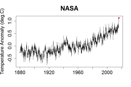
The most obvious answer to the question “What’s Up?” is: temperature. Here’s the global average temperature each month from January 1880 through January 2016, according to data from NASA:
The red dot marks the most recent value, January 2016. It’s the hottest yet.
The graph actually shows temperature anomaly. That’s the difference between a given month’s average temperature, and what’s usual for that month. That way, we can remove the seasonal cycle. After all, a hotter-than-normal January isn’t going to be as hot as a colder-than-normal July — but it still means hotter than normal, i.e. that we’ve warmed up.
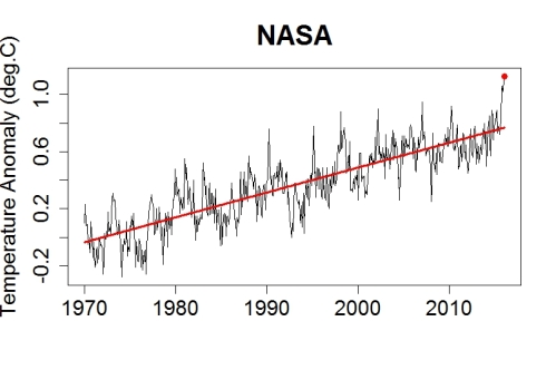
Here’s the same data from 1970 to now, a period during which Earth has warmed steadily:
The red line is the trend. That’s extremely important because it helps us understand what to expect.
It’s obvious from looking at the graph that temperature fluctuates — a lot, and in mainly unpredictable fashion. But there’s more going on than just the fluctuations; there’s also a trend. On the planet we call Earth, that trend lately has been steadily upward. The fluctuations have most decidedly not been steady! And we can’t expect them to be, ever. But we have every reason to believe — from theory, from computer simulations, and from observations — that the trend will continue. Upward.
There’s a very powerful consensus among scientists, especially those who specialize in climate, that it’s really happening and it’s because of us. The world has already warmed 1C (degree Celsius, equal to 1.8 degrees Fahrenheit) above what it was before the industrial revolution, usually called “pre-industrial.” The prevailing view is that warming by 2C above pre-industrial means dangerous climate change, although lately many are coming to believe that even going 1.5C above pre-industrial is dangerous. Even less warming is trouble — but 1.5C or 2C is a real danger.
Even more than 2C is even more danger; some would warn that it brings disaster. But we’re already half-way there, and at the rate we’re going we’ll reach 2C before this century is out, well within the lifetime of people living today.
NASA isn’t the only organization that tracks global temperature. There’s also the National Climate Data Center, the Hadley Centre/Climate Research Unit in the U.K., a modified form from the Univ. of York in the U.K., independent data from a team organized by researchers from Berkeley Univ. in California, and the Japan Meteorological Agency, just to name the best-known. It would be redundant to show you data from all these organizations, because they all tell the same story: lots of fluctuation, record hottest recently, and most important: the trend is going up.
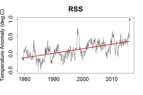
Those temperature estimates are for surface temperature, i.e. what’s happening near Earth’s surface. That’s particularly relevant because it’s where we live. But there’s also data, from both satellites and from balloon-borne instruments, of temperature in the atmosphere above the ground. Here’s the data for the lower atmosphere, called the troposphere (where most of our weather happens), from satellite data according to Remote Sensing Systems, an organization usually just called “RSS” (it’s the data for the middle-troposphere):
Again, the red dot is the latest value (February 2016), and it’s the hottest yet. Again, the red line is the trend, and it’s upward. Again, there’s plenty of fluctuation (a really big one in 1998, a really big one last month), lots of jiggling around, but again, the trend is a clue what’s to come.
The satellite data for temperature in the troposphere is what senator Ted Cruz likes to use when he claims global warming isn’t happening. But he doesn’t show all of it — just the part after 1997. That way, he can start his graphs with that big fluctuation in 1997-1998, so that fluctuation will look like it’s part of the trend. It isn’t. But Ted Cruz wants you to think it is, so he won’t show you what happened before that — proper context would reveal how shallow his argument is.
Of course, now that we’ve got another big fluctuation (the most recent month) it’s a lot harder to give the false impression of no warming. The fluctuation right now is big, about the same size as the fluctuation was in 1998. But the trendvalue is significantly higher than it was, so the temperature — trend plusfluctuation — is the hottest we’ve seen yet.
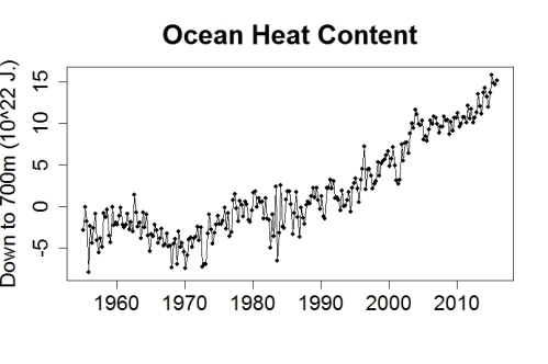
We’re seeing increased heat, not just at Earth’s surface and in the atmosphere, but in the oceans as well. Scientists don’t usually report deep-ocean temperature, instead they report the heat content itself, something called (appropriately) “ocean heat content.” Here’s what they get for the top 700 meters (about 2300 feet) of the ocean:
These aren’t averages for each month, they’re for each quarter-year. Again we see constant fluctuation, but again we see a trend — and it’s upward.
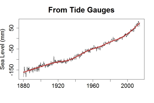
Yet another rising trend is of the height of the ocean itself: sea level. The melting of land-based ice puts more water in the oceans, and heating the oceans causes thermal expansion of seawater; both effects have caused the sea to rise. Here’s sea level since 1880, based on measurements by tide gauges around the world:
In a now-familiar story, you can see fluctuations but there’s also a trend. Upward.
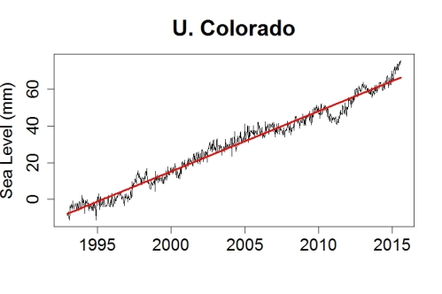
Note that the trend doesn’t follow a straight line. Sea level has risen sometimes faster, sometimes slower, but it’s faster now, and in fact is faster than it has been for at least 2500 years (perhaps a lot longer). Since 1993 we’ve been measuring the height of the sea surface with satellites, which tell this story:
Fluctuations. Trend. Upward.
The effect of sea level rise is already being felt. Coastal cities are now prone to flooding, not just because of storms and torrential rainfall, but simply because of a very high tide. Miami has already spent hundreds of millions of dollars trying to combat it. They’re also threatened by seawater intruding into groundwater supplies, making them unfit for drinking and agriculture. And it’s not just Miami, flooding has increased all up and down the U.S. east coast, from Boston …
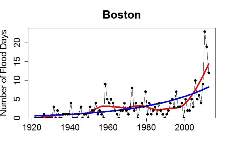
… to Atlantic City …

… to Texas.
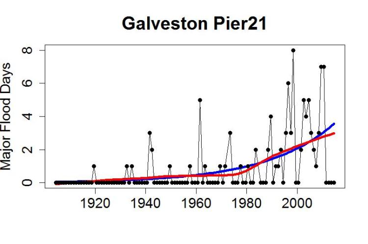
What’s more, when storms and torrential rainfall do happen, sea level rise makes the flooding at coastal regions worse. A lot worse. The folks who live near the coast in New York, New Jersey, New Orleans, know what I mean.
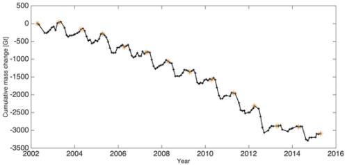
Not everything is up; some things are down. Most notable is the amount of ice in the world. Most of that is in the great ice sheets of Antarctica and Greenland, but they’ve been losing many billions of tons of ice each year. Here’s the change in the amount of ice in the Greenland ice sheet, measured by a satellite mission called “GRACE” (for “Gravity Recovery And Climate Experiment”):
It’s not just the great ice sheets that are melting, so are the world’s glaciers. Notall of them are wasting away, you can find a few that are actually growing … but the vast majority are disappearing right before our eyes. A recent survey by the world glacier monitoring service produced this summary for different regions of the world:
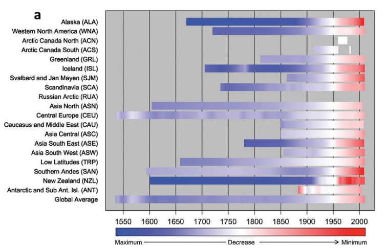
Not only are the vast majority of the world’s glaciers melting, they’ve recently been shrinking even faster.
Earth doesn’t just have ice in the great ice sheets and thousands of glacier, it also has sea ice, areas (mostly in the Arctic ocean and around Antarctica) in which the sea surface is frozen over (some places just during winter, in some places year-round).
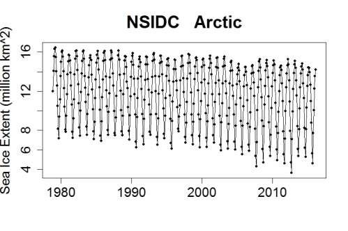
Sea ice is one thing for which the seasonal cycle is obvious. Here’s the extent of sea ice in the Arctic:
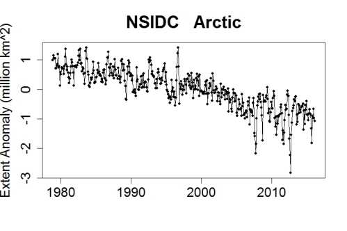
It peaks around March and bottoms out in September. Even with the seasonal cycle so obvious, it’s also obvious that Arctic sea ice is in decline. We can isolate the changes from the seasonal cycle by once again computing anomaly, the difference between each month’s value and what’s average for that month. That gives this:
It makes the decline even more obvious. Lots of fluctuation, but also a sizeable trend, downward.
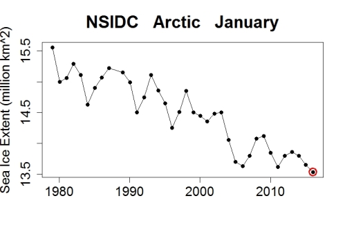
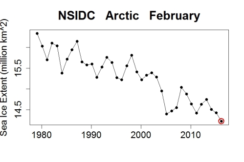
For many years the most startling thing was the end-of-summer decline in September Arctic sea ice. But it’s been declining year-round, and this year (2016) brought the lowest sea ice extent on record for the months of both January and February:
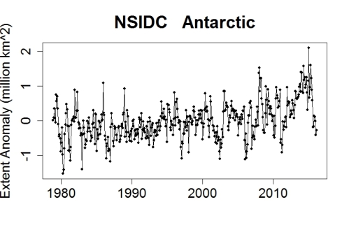
The southern hemisphere, Antarctic sea ice, tells a different story. If we plot sea ice extent anomaly (to shed the seasonal cycle), we can see that in the early 2010s it actually increased, although it has recently come back down:
There are many theories about why this might be happening. One (probably at least part of the reason) is the melting of the Antarctic ice sheet! That dumps more fresh water into the ocean around Antarctica, and fresher water freezes more easily than saltier water. In any case, sea ice in the Antarctic has “bucked the trend” shown by the Arctic. It illustrates that, even in a rapidly warming world, things aren’t always quite so simple.
Many other changes have been seen. Species are migrating to higher latitudes and elevations because areas that used to be the right temperature for them, are no longer. Plants are blooming earlier than before. Heat waves have increased dramatically in some regions, too often exacting a heavy death toll. Some places have become more prone to severe drought, while others are more prone to severe flooding. The list goes on and on; the changes I’ve shown include many of the most important, but really only represent the “tip of the iceberg.”
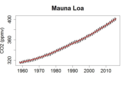
In case you’re wondering why all these changes are taking place, there are many reasons. But the most important, by far, is the fact that we’re adding greenhouse gases to the atmosphere. The one we’re having the biggest impact on is carbon dioxide (CO2). Here’s the concentration of CO2 in our atmosphere, in “parts per million by volume” (ppmv), measured at the atmospheric observatory at Mauna Loa in Hawaii:
There are fluctuations, which are dominated by a seasonal cycle. But again, there’s also a trend. This particular trend isn’t following a straight line; the rate at which CO2 is increasing has been getting faster and faster.
Atmospheric CO2 is now higher than it has been in at least 800,000 years, possibly as long as 20 million years. CO2 is rising because we’re burning fossil fuels. It has carbon that’s been buried underground for millions of years, but now we’re digging it up and burning it, which results in CO2 that gets dumped in the easiest and cheapest way possible: in the atmosphere.
Despite certainty about why CO2 is on the rise, there are those who will dispute anything and everything, and a handful have even disputed that the atmosphere’s CO2 increase is because of us! There are a lot of crackpot ideas floated in the public discussion of climate change, but this is perhaps the crackpottiest of all. You can’t dig up billions of tons of carbon, burn it, dump all the CO2 into the air, then say that the rise of CO2 has nothing to do with us — unless you’re just not willing to accept the truth.
The more you investigate climate change, the more you’re bound to hear contrary claims. There are those who will tell you that global warming stopped, or that it’s about to stop, or that it never happened at all. Some will say it’s happening, but it’s not because of us. Others will admit it’s happening because of us, but insist it isn’t dangerous and won’t be. Every bit of evidence, including all that I’ve shown you, will be disputed by those who simply don’t wish it to be true. You’ll often hear the scientists who uncover this evidence accused of fraud — because attacking the messenger is an all-too-effective way to undermine the message.
But probably the most pernicious lie about global warming is the false claim, the scare tactic, that doing anything about it will “ruin the economy.” In truth, the surest way to ruin the economy is not doing anything about it.


 Arguments




The trend may be up but global temperature has not risen steadily since 1880. There were pauses in temperature rise from about 1880 until about 1910 and from about 1945 until about 1974 and now since about 2002. If this pattern continues then there will only be a steady rise in warming from about 2030 until 2060 and then again from 2090 until 2099 in the current century. The warming trend will continue, however, until about 2350 if the climatologists are correct in saying the Earth began to experience a 500 year warming period around 1850.
Sigh...
Climate isn't the stock market and economics (both only constructs in the human mind), climate science is real billev.
In the second chart labled NASA a line is drawn from the 1970's to the present. If the line were drawn from the temperature at 1880 to the present the line would show a warming trend through the period it covered. It would also show that there was not constant warming throughout that same perod. If you alter the line shown in the second NASA graph to pass through the temperature for 2002 (what I believe was the end of the warming period that started around 1974) you will observe that most of the temperatures after 2002 fall below the altered line.
Trends don't have to be linear. When I look at the graphs for shortish periods, the trend seems linear. When I look at the graphs for really long periods, the trend looks to me to be following a curve with gradually increasing slope.
Just for Billev's (@1 and @3) benefit, here are the NASA GISTEMP annual values detrended to make the trend from 1880-1945 zero, and with the 1974-2002 trend line of the adjusted data shown:
First, you can see quite plainly that while 7 out of 13 years after 2002 do indeed fall below the 1974-2002 trendline, that is not because of any evident reduction in the trend. There is no more basis for assuming a reduction in the trend then there would have been in the 13 years after 1984. Indeed, with an odd number of years in the interval, of necessity the number of years below the trend cannot have equalled those above the trend. If we included 2002 so that we had an even number, we would have equal number under and over the trend. Further, with the monthly value for January and February of 2016, it is almost certain that the 2016 temperature will be at least near that of 2015, and hence over the trend, again leading to equal numbers over and below.
Further, the 1974-2002 trend is exagerated by the near record breaking La Nina of 1974/5, and the near record breaking El Nino of 1997/98. In contrast the period after 2002 has (until now) not experienced a strong El Nino and has experienced near record breaking La Nina's in 2008 and 2012/13. The slight deviation from the 1974-2002 trend in nearly fully accounted for by short term ENSO fluctuation. It is fully accounted for when changes in forcing are included. In contrast, Billev's nascent theory would predict the data, having been adjusted for the trend over a full cycle, should show a strongly negative trend after 2002.
Second, it should be noted that the data, having been adjusted for the trend over a full cycle, does not show significant similarity between phases of the purported cycle. Neither the slope nor temperature pattern from 1880-1910 matches that from 1945-1974. Nor do slope or pattern match between 1910 to 1945 and 1974-2002. Nor to the periods of the half cycles match , with respective half cycle lengths of 30, 35, 29, and 28 years. If you look at longer temperature records you also find the purported cycle disappears prior to 1880, or at best halves its period.
In all, Billev's ad hoc theory has nothing to support it. It is based on an interpretation of only 1 and a half cycles, which is a very statistically tenuous projection; is falsified in its first actually predictive interval; does not have a clear cycle and has no physical basis. Even the half periods are ad hoc, as can be seen by the fact that the 1974-2002 trend fits the data quite will for several years before 1974, which is (as previously mentioned) a near record La Nina year.
I don't have a theory. I only have an observation. That observation, based on observing the NOAA furnished temperature history chart, is that the warming experienced since 1880 has not been continuous. I am not talking trends I am talking temperature history. I also believe that the significant imbalance between the scale of the presentation of the years on the horizontal axis versus the temperature anomalies on the vertical axis diminish the ability to read the charts accurately. One thing I have noticed in various comments on the charts is a desperate attempt to mask the probable beginning of another pause in continuous warming that began (in my opinion) in 2002 or 2003. I think that those observing the temperature charts over the next 10 to 15 years will probably see that a pause in warming has occurred.
billev @6, you can only "only have an observation" if you make no projection. You, however, make projections out to 2099 unconditionally, and to 2350 conditionally. Ergo, you have a theory about the observations, which in fact happens to be false. It does not fit the observations even over the period 1880-2015 unless your terminology is so loose as to make your claims void of meaning, as shown above.
billev,
You are quite right that the long-term record has intermittent temp rises over multidecadal time scales, with a mid-century period relatively flat.
First thing to note is that the overall trend is upwards.
Second thing to note is that all sorts of factors affect surface temperatures and their evolution, and over different time scales.
Third thing to note is that CO2 warming effect was less in the early part of the 20th century than the latter. Often this is used to argue that CO2 increase can't be the cause, or the primary cause.
Early 20th century warming has been attributed to combination of strong solar and weak CO2 (volcanism plays a part, too). Let's plot solar and temps together. I had to match phase in solar cycle - peak to peak in this case, which forces me to start in 1907 and finish in 1946. Plotting a trend with solar beginning and ending in different phases would give spurious results.
There is some contribution from solar (but solar effect is meant to be quite minimal). There is also a warming from volcanism. 3 factors (at least) contributed to warming in this period (sorry, volcano data is not available at the website I'm using)
How about solar vs recent warming?
Again, I had to make sure phases were matched in the solar cycle, so the post-1974 warming trend has to begin in 1982 and finish in December 2014. I also want to use at least 30-year periods to avoid short-term natural phases (like el Ninos) skewing the results. Note that I have excluded the warm years and months of 2015/16. Though I was forced to in order to match solar cycle phasing, I'm actually glad because I prefer conservative results.
This time, solar is a negative contributon. (Volcanism has been fairly steady for this period)
Now let's compare rates of warming for the first period you indicate, and then the recent period from 1975.
1911 - 1945 rate of warming is 0.138C/decade (+/- 0.045 uncertainty)
1975 - 2015 rate of warming is 0.175C/decade (+/-0.033 uncertainty)
Both trends are statistically signficant (trends since 2002 are not). The more recent mean trend is higher than the earlier one, BUT... the uncertainties overlap, so we can't honestly say that these trends are statistically distinguishable. We can't say that the recent warming rate is faster, slower or the same as 1911-1945. However, this is only one of many statistical tests we could run.
By the same token, we can't claim that the similarity relative periods 'disprove' CO2 contribution. We need attribution studies for that - the graphs above are just a beginning.
One thing that we can definitely not claim is that the future evolution of temp trends will match the previous. We are kind of designed to see patterns whether or not they are actual. If one wants to claim that there is some kind of cycle in climate evolution, one has to deterine a physical mechanism. Attempts have been made to do just that with mixed results.
Whatever natural multidecadal cycles may be present in the long-term evolution of climate, they are not sufficient to explain the long-term (centennial) trend. There are longer temperature cycles (ie the ice ages) but these are at a much slower pace than current.
This is not so much as to finalise an answer, but to get you thinking. If this stuff is well-known to you, hopefully you'll forgive an unnecessary post.
[RH] Reduced image size to 500px wide to prevent breaking page format.
Slight amendment:
"If one wants to claim that there is some kind of mulitdecadal cycle in climate evolution, one has to deterine a physical mechanism. Attempts have been made to do just that with mixed results."
Thanks mod. I hoped the insert format would do that auto. Width=500 for next time.
[RH] No problem!
I am neither a scientist or a statistician so there is much I do not understand. In my original post i said that the NOAA temperature chart shows an overall upward trend in temperature. I think that use of the period 1974 to 2002 compared to the period 1911 to 1945 would be a more appropriate comparison rather than 1975 to 2015. I also think that years that feature unusually large temperature spikes either up or down associated with short term climate events should be ignored. I have a difficult time believing that carbon dioxide at one part in 2500 parts of atmosphere has any role that influences the global temperature. There is just not enough there there.
[TD] Please read "CO2 Is Just a Trace Gas."
billev-
You admit that there is much you don't understand so that's a start. Just because something doesn't make sense to you doesn't mean it isn't real. If you are really serious about climate science, you should try to educate yourself and understand what the scientists are saying and why. Then you can come back and ask intelligent questions about the subject once you are more informed.
billev - Short term variations (such as ENSO and volcanic activity) are part of the data as well, and if you are actually trying to establish the long term trends they have to be accounted for in some fashion or another.
2002 to now (just 13-14 years) is far too short for statistical significance given the underlying climate trends and short term variability; I'm afraid your claims in that regard aren't supported by the numbers.
As to the amount and effect of CO2, I suggest reading the SkS article on the 'CO2 is just a trace gas' denial myth - doubling one of the few IR active long term greenhouse gases certainly has an effect. Arguments from personal incredulity (your 'difficult time believing') are a farily common logical fallacy.
billev @11 states that:
It is very obvious, however, that he does not practise it. For example, if we determine the GISSTEMP trend from 1910-1974, and take the residuals to that slope over the entire record, there is an obvious "unusually large temperature spikes ... associated with short term climate events":
The spike spans only a single decade(1936-1946) so is obviously short term. Its cause is likely primarilly an artifact of the large change in SST measurement methods coupled with larger changes in typical ocean routes (and hence areas of the ocean SST frequenlty measured), but the large 1939-1942 El Nino was no doubt also a major contributor. (A greater than expected forcing from black carbon cannot be excluded either). Although I used GISSTEMP, the spike is also evident in the NOAA record which billev prefers.
Of course, had the spike been excluded, as billev claims should be done with such spikes, his temperature record would be a slight downward trend from 1880-1910, reversed by a slight upward trend from 1910-1970, and a strong upward trend thereafter.
Why 1970 and not 1974? Well, 1974 was the start of a very strong La Nina of record breaking length, and hence of a large downward temperature spike such as he says should be ignored. Rather than ignoring it, however, as with 1945, he turns it into a breakpoint.
Even worse is his insistence on a breakpoint in 2002. As it happens, a 1974-2002 trend is less than the 1974-2003 trend, less than the 1974-2005 trend, less than the 1974-2006 trend, and even less than the 1974-2007 trend. Only for years after 2007 is the trend from 1974 less than that from 1974-2002. Why then is 2002 chosen in preference to 2007 and the breakpoint? As it happens, 2008 was a strong La Nina year (along with having the lowest solar activity since 1910). And 2012 had the second strongest La Nina year since 1876 when the SOI records begin. If he truly excluded "unusually large temperature spikes", billev would have needed to exclude 2008, 2012 and 2013 from the data - something using a 2007 breakpoint makes altogether to obvious. So instead he shifts the breakpoint back to 2002, but must still retain the years he claims should be excluded in order to get his "pause".
Without those three strong La Nina years, there is no pause in the 21st century. Indeed, even including them and the (so far) tied eigth strongest El Nino on record results in no pause, with the cherry picked 2002-2015 trend being nearly the same as the cherry picked 1910-1945 trend. Indeed, that was the point of billev's comment. He needs to exclude 2015 to maintain a case, so he drops in a throw away rational to do so, while not noticing how damaging it is to his case.
billev states "I am neither a scientist or a statistician", and as can be seen above, nor does he have more than a superficial knowledge of the data. And on this foundation of expertise, he disputes the conclusions of people who are scientists and statisticians, and how know the data like the back of their own hands. Despite that, he is too arrogant to consider the possibility that it might be he who is mistaken.
billev,
I think that use of the period 1974 to 2002 compared to the period 1911 to 1945 would be a more appropriate comparison rather than 1975 to 2015.
Why? The more data, the less uncertainty. What's so important about 2002? Do you think it marks a transition point or something?
he is too arrogant to consider the possibility that it might be he who is mistaken.
Not necessarily. He declared his lack of expertise. His statements seem confident, but that doesn't mean he's close-minded. Let's reserve judgement.
Ah, billev, I re-read your first comment.
There were pauses in temperature rise from about 1880 until about 1910 and from about 1945 until about 1974 and now since about 2002
The mean trend estimate since 2002 is positive (but see below). You can check for yourself at this easy-to-use app on the web. Just type 2002 in the start year box, select whichever data set and hit 'calculate'.
www.ysbl.york.ac.uk/~cowtan/applets/trend/trend.html
The uncertainty is larger than the trend, but that doesn't mean there isn't one. It does mean that the time-period is too short to confidently claim a pause, cooling, warming or whatever. Way too short. You need longer time periods for this data. 30 years is a good minimum standard.
barry @16, as you have now read his billev's first comment, and will get to his second and third comments shortly, no doubt, you will be aware that billev is not in fact open to persuasion.
I read his first few yesterday and responded to them yesterday. Don't have a photographic memory, unfortunately.
I have read the referenced CO2 paper and am not impressed. To maintain that CO2 levels have increased while global temperatures have increased thus the rise in CO2 has caused the rise in global temperature is a weak argument. It dismisses all other possibile causes for the global warming without so much as a discussion and it does not address the fact that while CO2 has steadily increased there has not been continuous warming. It also does not contain any references to testing to see how much radiated heat the current level of CO2 in the atmosphere is, in fact, retaining.
[TD] The greenhouse gas effect of CO2 is based on fundamental physics knowledge. Read "How Do We Know More CO2 Is Causing Warming?" Read the Basic tabbed pane, then the Intermediate one, then the Advanced one. Don't just skim. If you have questions about that post, ask them there, not here.
CO2's effect on global temperature was projected many decades before it was even technically possible to measure the global temperature, and then was confirmed by observations. So the correlation came after the projection. You really need to get a grounding in the foundations. I suggest you read physicist and science historian Spencer Weart's Discovery of Global Warming, which is available online for free.
Regarding other influences on temperature, see CO2 Is Not the Only Driver of Climate. Read the Basic and the Intermediate tabbed panes.
billev @20.
When you tell us "I have read the referenced CO2 paper and am not impressed," are you referring to the SkS 'CO2 is just a trace gas' item? If so, do be aware that it's not really a "paper" and its purpose is not to set out the relationship between CO2 and warming. Rather its purpose is to demonstrate that a small proportion of something like a 'trace gas' can have a big impact. You were referred to this particular SkS item specifically because you proclaimed @11 "I have a difficult time believing that carbon dioxide at one part in 2500 parts of atmosphere has any role that influences the global temperature. There is just not enough there there." So so, if it was the 'trace gas' item you read, are you now happier with the idea that trace elements can be powerful?
billev @20 ignores the substance of the article to which he was referred, concentrating instead on a single paragraph which mentions what we know rather than presenting evidence for it. Again, this is an attempt by him to protect his beliefs from evidence. His specific claim was that:
The argument that "x exist only in trace amounts, therefore x has no influence" that he relies on is rebutted by numerous counter-examples in the "CO2 is a trace gas" article. Those counter-examples show that his conclusion does not follow from his premises, and that his argument simply amounts to an argument from personal incredulity. The use of such an argument, and his response to its clear rebutal shows yet again that he is not open to changing his mind.
For the open minded, the fact that CO2 influences the Earth's climate is sufficiently well established that doubting it is the intellectual equivalent of considering the Earth to be flat. That is because it is known for a fact that CO2 alters the rate at which energy can escape to space across certain frequencies. Because of that, and because the energy escaping to space must equal the energy ariving from space for equilibrium, that means either that the Earth must be warmer to increase the energy escaping in other frequencies, or that the Earth's albedo must increase to reduce incoming energy to match the reduced outgoing energy. As it happens, the former is the easier to achieve, and what in fact happens.
As noted, the reduction in outgoing energy is a fact, observed in downward looking IR observations such as this one, observed over Texas in 1969:
billev's argument from personal incredulity amounts to the claim that the large, CO2 induced reduction in outgoing emissions around a wavelength of 15 microns does not exist because 'there is just not enough there there'. Or perhaps he believes that conservation of energy only applies to effects caused by compounds that exist in greater than trace amounts.
As a side note, I recently calculated the mass of the CO2 in the atmosphere. Currently it is approximately 848 billion tonnes, having increased by 254 billion tonnes since the preindustrial due to human activity. Thus I can rephrase billev's argument. It is that 848 billion tonnes of a compound obviously cannot influence the climate because 'there is just not enough there there'. LMAO
This discussion about irreversible rapid climate change and ocean acidification and warming is misleading because it conveys the impression that it is the result of human activity. The reality is that it is the result of the operation of the technical systems of industrialized civilization. These systems are irreversibly using up the limited natural material resources and are irrevocably aging. Climate change is a serious consequence of that process but it is not the only one that society will have to try to deal with as the natural resources run out.
I did not introduce CO2 into this discussion so I would like to return to my original point. first, though, I would like to say that providing the tonnage of CO2 in the atmosphere might make that presence seem large and significant but not when you cmpare that figure to the tonnage of the atmosphere. Then the small presence of CO2 becomes clear. My original idea was to state that the global temperature history, as presented in the NOAA graphs, appears to show that there has not been continuous global warming since 1880. Also that there appears to be a discernable pattern in the temperature change in the form of similar length alternating periods of continuous warming and pauses in warming. I then have concluded that if this pattern were to continue then tentative predictions of future temperature change could be made. My point about ignoring temperature spikes and drops associated with short term events considered the fact that including these events in temperature assessments could cause confusion. For example, there were those that argued that there had been no rise in temperature since 1998, an El Nino year that appeared as a temperature spike on the graph. However, I believe that the continuous warming period that began around 1974 actually continued until about 2002 and this can be more easily seen if the temperature sapike of 1998 is ignored. I further think that a propensity to try to mask the pause periods by drawing trend lines from various years to various years in an attempt to indicate that global warming is continuous is harmful to climate science. I am also suspicious of the motivation of government climate scientists who publicly focus on the temperature of individual years or small groups of years, particularly when the temperatures for these years are those influenced by a short term climate event like El Nino. This appears to me to be an attempt to mislead not inform.
[TD] Your comments here about the amount of CO2 being too small are out of place. You need to put those comments on the CO2 Is a Trace Gas thread.
Your other comments seem to be mere repetition of your earlier assertions, without any indication of you having read any of the comments responding to you, nor you having read the other posts you were pointed to. The Skeptical Science comments are for discussion. If you continue to fail to actually discuss, your comments will be deleted for violating the commenting policy's prohibition of "sloganeering."
billev - "...there appears to be a discernable pattern in the temperature change in the form of similar length alternating periods of continuous warming and pauses in warming. I then have concluded that if this pattern were to continue..."
You see a cyclic pattern, those who actually investigate the physics see that the various forcings have changed over the last 1.5 centuries, with temperatures following those forcings with some weather variability. See CO2 is not the only driver of climate, as you were referred to some time ago, and read it. Actual physics rule climate, billev, not numerology.
"I believe that the continuous warming period that began around 1974 actually continued until about 2002 and this can be more easily seen if the temperature sapike of 1998 is ignored."
Statistical analysis of the trends, not to mention changepoint analysis, show that you utterly wrong on this point. There is _no_ statistically significant change in trend around 2002. And making claims from such a short period simply demonstrates that you aren't using any statistical analysis whatsoever.
" I am also suspicious of the motivation of government climate scientists... This appears to me to be an attempt to mislead not inform."
And... now the conspiracy theories. Sorry, billev, but I consider you a hopeless case of climate science denial.
billev
Temperature measurements are not the only indicator of global warming. You seem to ignore the other indicators of warming and together they indicate that there is a problem. Some fo these other indicators have also been presented with proper scientific detail in this article. I will try to make it simpler, although I fear it is a lost cause.
Globally, over the last century, there has been a reduction in the amount of ice worldwide. You don't even need to trawl vast amounts of data to understand. If you don't believe the data collected by glaciologists and polar scientists, then there are plenty of now and then photos of glaciers that indicate that ice is retreating. Also, there are plenty of satellite photos over the last thirty years that also indicate that polar ice is also retreating. Although, I am not a climate scientist responsible for collecting and analysing primary data, as a mathematician, I can understand it. But I don't need to, the photographic evidence of ice retreat is pretty compelling that the planet is warming.
Now with regard to the 20 cm sea level rise over the last few centuries, you don't need to trawl through and analyse copious amounts of data to understand that either. It can be fairly easily verified from the historical high tide marks at various places around the world. For instance, at Port Arthur in Tasmania, which was a prison for highly recalcitrant convicts during Australia's convict era during the late 18th and early 19th century, current high tides at Port Arthur are about 20 cm higher than the high tide marks of 200 years ago. The same is true in many other places around Australia. This article indicates that this has happened at several places in the US and any investigation of other historical ports around the world would also indicate the same thing. Now you may be able to obscure the temperature analyses by cherry picking baselines and ignoring basic statistical methodology but you cannot ignore the physical evidence of ice retreat and sea level rise that also indicate that warming has occurred over the last few hundred years.
As for CO2 being the driver, well considering that there has been no evidence to indicate a significant increase in the Sun's radiant output in recent times, then the only other reason for warming would be a significant increase in greenhouse gases, even though they are only a small part of the Earth's atmosphere. Not sure how you would explain why the sudden significant increase of greenhouse gases levels over the last 200 years (over 400 ppm) from the typical level of the last million years (280 ppm) has occurred. Now there has been no sudden increase in vulcanism worldwide that would explain it, so it must come from another source, i.e. burning fossil fuels perhaps? We actually know this from studying ice-cores that have preserved the last 800,000 years of the Earth's atmosphere. Now all this is pretty simple, and you don't need to be a climate scientist to undertstand it. So trying to prove that global warming isn't happeneing by selectively sniping at temperature records over several years really doesn't really cut it as valid argument.
billev @24 completely confirms the fact that he is not open to being persuaded by evidence, a fact even more evident if you can see his snipped comments on CO2.
For those open to evidence, however, it is interesting to see what actual statistical analysis has to say about billev's central contention in this thread. For that purpose, there is no better source than Werner et al (2015), "Study of structural break points in global and hemispheric temperature series by piecewise regression"
Werner et al use several statistical tests. First they test slightly obsolete versions of the three oldest temperature series (HadCRUT3, NCDC, and GISTEMP) with data from 1880-2012 by checking for break points within 10 years locations chosen by visual inspection:
The datasets were 'slightly obsolete' in that they do not include the most recent improvements on adjustments for different methods of determining SST.
They find that:
The locations of the breakpoints come with an uncertainty range, specified in their table 1.
It is noteworthy that none of the breakpoints fall on the years specified by billev, although with current data sets some of them may have. It is particularly noteworthy that no breakpoint was found in the 21st century, even though the algorithm was encouraged to find one.
Not content with that, the authors then forced the algorithm to find a set number of breakpoints, with the number required ranging from 1 through to 8. The results were published on figure 3:
You will notice that no breakpoint is found in the 21st century until the algorithm is forced to include 7 breakpoints, at which point one is found in 2005 (not 2002). That breakpoint vanishes, however, with 8 points, in favour of breakpoints in 1996 and 1998. A 1975 breakpoint occurs at n=1, 3, and 4, but it switches to a 1978 breakpoint at n=2, and to a 1965 breakpoint for n>4.
The relative merit of the different breakpoint patterns is shown in figure 4:
The highest LWZ score (a bayesian version of the Akaike Information Criterion) is found for three breakpoints, but it is not greatly preferable to n=2 (or 4, 5, or 6 come to that). As it happens, the recent improved adjustment to SST has exacerbated the slope from the mid-1930s to 1945 in both GISTEMP and NCDC, and would consequently decrease the difference between 2 and 3 breakpoints, and may possibly even make 2 break points preferrable. Likewise, it may favour a 5 break point analysis with breakpoints at (approximately) 1906, 1935, 1945, 1955, and 1978, as should be apparent from the first graph @14 above. (Certainly it would be hard to justify a 1950-55 breakpoint while excluding a 1935 breakpoint on that data.)
In any event, objective analysis may favour three breakpoints (something that is arguable with the improved data), with a 1945 breakpoint brought about primarilly by the Atlantic Multidecadal Oscillation (AMO), but it certainly precludes a breakpoint in the early twenty first century. Further, if the 1945 AMO break point should be included, that allows no projections into the future given that the period and amplitude of the AMO has been highly variable over the last few centuries, with the cycle from 1910-1970 representing atypical values for both cycle length and amplitude (see panel b of figure below, and discussion in the paper). That variability in the cycle means no expectation about future changes can be reliabily projected.
Getting a handle on the various points you've brought up, billev, would require a reasonable (layman's) grounding in the science. I'm not sure if your views allow room for that kind of patience, or if you are entrenched in them. If the former, there is an excellent site that gives a historical overview of developments in climate science, and gives a good grounding in the fundamental concepts (barring statistical analysis, which you'd need to get info on elsewhere).
https://www.aip.org/history/climate/index.htm
This site isn't polemic, just the course of science over the last couple hundred years, condensed and made understandable by a science historian.
Some of the questions you pose can't be answered in a sentence or two without having a handle on some fundamentals. But if those questions are led by genuine curioisity, there are few better sites to get a grounding on climate science and the history behind the discovery of modern global warming (and past climate changes).
What I see when I observe the available temperature history charts is an upward trend in global temperature but not continuous warming. There appear to be significant periods of pause in temperature rise. I think the pesence of these pauses is an obvious feature in these graphs. Yet in the several responses to my original comment I have seen no acknowledgement of the pauses. What I have seen, in fact, is a determined effort to make the pauses disappear. I have also been cautioned not to focus on too short a period of years while watching some of the responses use the higher temperatures of the most recent couple of years to support their point.
billev - "... No acknowledgement of the pauses..." Nonsense.
You have been _repeatedly_ pointed to the thread on 'CO2 is not the only driver of climate', where it is clearly shown that the nonlinearity of climate change follows the ensemble of forcings, short term variations, and their summed nonlinearity. There is no reason whatsoever to expect monotonic warming. Your (repeated) claim otherwise is really quite disingenuous.
billev
"There is just not enough there there."
Quoting the percentge of CO2 isn't the relevant point. It is how many CO2 molecules are present, not the proportion.
A cubic meter of air, at sea level, contains around 8.5 thousand million, million, million CO2 molecules.
Still sound insufficient.
Yet in the several responses to my original comment I have seen no acknowledgement of the pauses.
Say what? I wrote in the first line of my first response to you, comment number 8 in the thread:
You are quite right that the long-term record has intermittent temp rises over multidecadal time scales, with a mid-century period relatively flat.
Current understanding is that the warming caused by CO2 in the 3 decades post WWII - at that time not rising as fast as now - was offset by aerosols from industrial emissions and volcanism, which cool the surface. During the 70s and 80s various Clean Air acts and environamental policies around the developed world reduced aerosol emisions (smog etc), and the underlying warming continued. Also, this mid-century flatline or slight cooling is prominent in the northern Hemisphere, but not noticeable in the Southern Hemisphere, lending credence to the notion that aerosol emissions from heavily industrialized countries that are mostly located in the NH were in part responsible for the flattish global trend.
Everyone dismises the notion of a 'pause' from 2002, including me, for the reasons given. The uncertainty in such a short data stream preclude any confirmation of whether the surface has been warming, cooling or flat. But I certainly acknowledged the mid-century flat period in my first comment to you.
Here's the trend + uncertainty estimate from Jan 2002 to Dec 2015.
The mean estimate is an upward trend, but, the uncertainty of +/- 0.145 means the trend could be slightly cooling, flat, or strong warming. To put it in numerical terms, the trend is anywhere between -0.012C to 0.278C per decade (95% confidence intervals).
That's a proper reading of the trend estimate. No one can claim a 'pause,' warming or otherwise from such a short data set.
NASA and the other data sets produce different trend estimates but they all have a larger uncertainty than the trend.
Here are the other trend estimates for the various data sets.
NASA: anywhere between -0.03 to 0.27 C/decade
UK Meteorological Office: -0.07 to 0.23 C/decade
Here are the global satellite data sets:
Remote Sensing Systems: -0.25 to 0.21 C/decade
University of Alabama, Huntsville: -0.14 to 0.31 C/decade
The uncertainty estimates are larger for the satellite data sets because their data have more variability. You can't determine a trend or 'pause' from data sets as short as these. You need longer time frames.
(For all of the data sets, including more data backwards from 2002 reduces the uncertainty until it is eventually smaller than the trend, and every one of them shows statistically significant warming once that threshhold is reached)
To compare, here is what a trend estimate that shows warming looks like. Note that the trend is positive (warming), and the uncertainty is smaller than the trend. In other words the uncertainty is only to do with the degree of warming - it doesn't include a zero (or negative) trend estimate.
Full time period for Remote Sensing System - Jan 1979 to Dec 2015:
Now the trend is anywhere between 0.06 and 0.19 C/decade. The uncertainty does not include zero or negative values, only positive. We call this a 'statistically significant' trend.
Let's do the same for NASA, same period.
Trend is anywhere between 0.12 and 0.20 C/decade. The uncertainy doesn't include zero or negative values. The trend is statistically significant, unlike the trend estimates in the previous post.
belliv, you can do a test for whether there has been a pause in warming by comparing the uncertainty estimates for various periods (ie, prior to and after 2002). If you understand me so far regarding the uncertainty estimates, I'll lay out a fairly easy test you can do with apps available on the web, such as the one I used to generate these graphs.
Here's the link to the graph generator if you want to have a look at that.
http://www.ysbl.york.ac.uk/~cowtan/applets/trend/trend.html
You can access the same app near the top of the left hand side side bar on this page, labeled 'Trend Calculator'.
belliv,
Here are a couple of references examining mid-century flat/cool trend.
https://www.skepticalscience.com/global-cooling-mid-20th-century-advanced.htm
http://web.archive.org/web/20080501064616/tamino.wordpress.com/2007/08/17/hemispheres/
And a more technical commentary on one paper, adding background detail:
http://www.realclimate.org/index.php/archives/2009/04/yet-more-aerosols-comment-on-shindell-and-faluvegi/
There are many factors affecting climate on various time scales. The questions you pose about fluctuating climate over the last 150 years or so have been long investigated. I hope you're not close minded as some here have suggested, and that you're curious enough to learn more about that aspect.
(Excuse the lengthy response/s. Answers to your questions may be given in a paragraph, but probably not to the satisfaction of a truly skeptical mind. Each of us has to estimate how much detail is helpful)
barry,
I don't think you should take the words of belliv too literally. Rather you need to take his entire set of comments as a whole.
Perhaps the most telling of his comment is @6 where he says "I am not talking trends I am talking temperature history." His comments are redolent with talk of "pauses" and these he contrasts with the "spikes" which he sees correctly as being of no long-term relevance. But he also talks of "pattern" and it is this "pattern" of "pauses" (a 30 year pause which is inevitably followed by 30+years of warming and then another pause) which he sees as compelling, as the main feature of the entire temperature record (which he restricts to the years since 1880). Thus he is armed with the insight to predict that the period 2002-2032 will deliver the world another "pause," that any warming since 2002 is but a "spike," that any trend calculated over less than 60+ years is fradulent and that any physical basis for the way the universe works is but hokus pokus.
It is safe to say that there is no arguing with that.
Maybe, MA. There are upsides to giving someone the benefit of the doubt. They may deserve it and you were too quick to judge. You get better at explaining things with practise, and at judging the level at which to pitch the explanation. Other people who bother to read the comments may learn something new or useful.
Perhaps the most telling of his comment is @6 where he says "I am not talking trends I am talking temperature history."
That told me that he doesn't know much about trends and how important it is to analyse them properly. Seems to me (right or wrong) he's read a few items on temp history, isn't too familiar with the general debate or the details, and might learn something useful through discussion. If not, no matter. Someone else may get some use out of the chat.
Unless the only people reading down this far are belliv and the locals... but it's a big world and SkS is a fairly prominent cli-sci blog.
billev,
I have a difficult time believing that carbon dioxide at one part in 2500 parts of atmosphere has any role that influences the global temperature. There is just not enough there there.
1 in 2500 parts arsenic to body weight would kill you. Pretty much instantly. Small changes can produce large effects. The 'hole' in the ozone layer was brought about by CFCs and other halocarbons that in sum increased by a few parts per billion.
Most of the gases in the atmosphere are not greenhouse gases. So take out all the gases that do not contribute to the greenhouse effect. This is the effect we're concerned with. Now the amount of CO2 compared to the other GHGs is a much larger fraction. Not to mention that CO2, molecule for molecule, is a strong greenhouse gas. Different gases have a different 'power' as greenhouse gases. Takes quite a bit of work to lay all that out and figure CO2's relative contribution to the greenhouse effect - about 9% to 26%.
Here's a figure worth incorporating. The concentration of CO2 in the atmosphere has increased by more than 40% from the time human industry began pumping it out since the industrial revolution. And there is no doubt that that increase is entirely anthropogenic.
I'm very happy to see that the classical mistake of assuming that a non-significant trend is evidence of there being no trend (i.e. the null hypothesis fallacy) has been avoided. Barry explained that quite clearly.
To recap, null hypothesis tests are assymetric. We can prove the presence of a trend (that is significantly different from zero), but not the absence. The test can only say "yes" or "I don't know".
So here's the next step. If we look at the trend since 2011 (in this case in GISTEMP, some other datasets and periods also work), we see a 5 year trend which statistically significantly different from zero.
As the period gets shorter, it gets harder and harder for the significance test to give a 'yes' - it almost always says 'I don't know'. But in this case it says 'yes'.
In this case our intuition would probably tell us that this is not compelling evidence of a global warming trend. For a start, it is more than 4 times the expected global warming signal. So how do we interpret this result?
Good question. If this were all the data we had we might be misled. But because it's not all the data we have, we don't interpet just from this subset, we use more to test it.
Having limited stats skill, I'd test with incrementally more annual data to see if the trend changed much and the statistical significance wavered. If so, I'd say that the period selected had spurious statistical significance.
I'd also make sure that I only used complete years, in case there's a residual annual cycle that, despite anomalising, could skew the results for such a short time period. As it happens, Jan 2011 - Dec 2015 also produces a stat sig trend for that data set. (You also get one for 2008 to present, but not to Dec 2015)
I'd also regress that period (and a longer period), detrend and look for outliers, which I'd see in the last months of the analysis. Then I'd explore the possibility of a physical explanation (internal variability) to explain the jump at the end.
I'm not sure that answers your question, though. I'd guess there is a different, perhaps more sophisticated statistical analysis that could demonstrate that the statistical significance for that period was probably spurious.
I have read the thread about CO2 and have read all of the comments in answer to my last comment. Nowhere have I found any measure of how effectively CO2 captures and retains the heat radiating from the surface of the Earth and solid objects on its surface. I do know that the difference between daytime and night temperatures is significantly different in arrid areas than more humid areas indicating that water vapor may play a role in heat retention in the hours of darkness. The NOAA temperature charts clearly show me that while the Earth is warming, the warming is not continuous. If this is not the case then the charts are misleading so why are they provided to the public? There is a determined attempt to argue that there has been no pause in continuous warming in this century even though the chart shows there to be. I have previously stated that the presence of a current pause in temperature rise will probably be more evident in another ten or fifteen years, toward the end of the pause. Also, comparing a small amount of arsenic with a small amount of CO2 is meaningless. It also is an argument that can be taken two ways. A one inch thick steel sheet can, no doubt, stop a pistol bullet fired into it. But a sheet of steel 1/2500th of an inch thick would probably not even slow the bullet as it passed through. Finally, where is there any physical manifestation in our daily life that shows the heat retention powers of CO2. If we stand on the hot sand of a beach the bottoms of our feet are most uncomfortable but the tops of our feet, only an inch from the sand, are not. If the heat retention power of CO2 is enough to drive the air temperature on Earth why does it appear so ineffectual at preventing such significant heat loss so close to the source. Since that heat loss increases as distance from the surface increases is there any evidence that the current level of CO2 has any measureable effect on temperature?
[JH] You are now skating on the thin ice of sloganeering which is prohibited by the SkS Comments Policy.
Please note that posting comments here at SkS is a privilege, not a right. This privilege can be rescinded if the posting individual treats adherence to the Comments Policy as optional, rather than the mandatory condition of participating in this online forum.
Please take the time to review the policy and ensure future comments are in full compliance with it. Thanks for your understanding and compliance in this matter.
billev @42.
I will take just one of the questions you pose and provide an answer, in exchange for an answer from you.
When you stand on that hot sand, the reason the blood above the soles of your feet does not freeze in your veins is because there is an insulating atmosphere above you preventing the low temperatures of outer space from sucking the heat from your body. That atmosphere above you stretches eight miles up to the stratosphere and up beyond that as well. Over that eight miles the temperature drops about 70ºC, less that 10ºC per mile, a rate of temperature reduction not noticable over a few feet. It is the accumulative effect over the whole height of the atmosphere that does the job. So most of that insulating air is well over a mile away. At such a distance, why would it reflect back the heat from hot sand and toast the top of your foot at the same time as the bottom? Simply, it would not because it is almost entirely far too far away for to catch anything significant of the heat emitted by the sand and return it to the top of your foot.
And my question to you - You say "I have previously stated that the presence of a current pause in temperature rise will probably be more evident in another ten or fifteen years, toward the end of the pause." We know day follows night, winter follows summer and that they recur at fixed intervals. What mechanism is it that makes you think that your "pauses" recur at a fixed interval?
billev - Your last comment is really just a Gish Gallop, a collection of slogans, anecdotes, and nonsense. I suggest reading:
Seriously, your post is nothing but a bag of sloganeering nonsense, the errors of which has already largely been pointed out to you.
billev @42:
Nobody here has argued the warming is continuous. What has been argued is that your choice of breakpoints for long term trends are arbitrary, that there is no justification for seeing them as a repeating pattern, and that there is no breakpoint in 2002.
What the charts show after 2002 is a continuing positive trend that is not statistically significant only due to the small duration of the period. Further, the slope is lower than that of the trend of the preceding 30 years only because of strong La Ninas in 2008, and 2011/12. You argue that unusual peaks should not be factored into determining trends, but insist on including those in your trend calculation while refusing to acknowledge they are the impact of a short term effect.
What is worse, since this has been clearly pointed out to you, you have introduced no new evidence, made your claims vaguer and simply repeated the claims with no attempt of justification. Your argument has reduced to the repetition of a slogan.
You have similarly studiously ignored the refutation of your claim that CO2 has not effect @22 above. Once again, the graph shows the IR spectrum at the top of the atmosphere, plotted so that equal areas under the graph represent equal amounts of total energy transmitted. The large trough due to CO2 therefore implies a large reduction in energy transmitted to space due to CO2. That in turn requires that the surface of the Earth be warmer to drive greater energy transmission away from the CO2 trough to compensate, and bring the total energy transmission up to levels that match input of solar energy.
That is a very simple, very direct proof of the impact of CO2 on climate. It is based both on direct observations, and on models based on direct laboratory observations of the radiative properties of gases. In this instance, theory matches observations to an astonishing degree. Your commentary on the topic since has shown that you are determined to avoid evidence you do not like. If you are going to simply avoid evidence that challenges your views (as clearly you are) it will be much more convenient for both you and us if you do it elsewhere.
billev,
No one expects a long-term warming trend to follow a straight line year after year. There are long and short-term spikes, dips, flat periods etc. If someone was trying to pull the wool over your eyes than those temperature graphs from NASA and other groups would look like a straight line.
I don't know why you expect the warming from CO2 to be represented as a straight line going from cooler in the past to hotter. I don't know why you think the variation that we see means something important about CO2 warming. As we all agree, there are other short term and long term factors that influence temperature. That's why we see the variation, the spikes and dips and flattish periods. The long term signal doesn't dominate at short time scales. It is, however, more persistent. We're going to see more warmth in the future, with spikes and dips and flattish periods. The signal is clear.
For most of your other points, the list of links in KR's post answers them well.
I tried to explain why no one can claim a pause, warming or cooling from short data sets (like since 2002). I can only link you back to the explanation.
http://www.skepticalscience.com/gw-basics-what-has-changed.html#116608
When you say 'pause', you are instantly in the domain of trend analysis. You need at least a basic understanding of that to make any kind of claim, or to have an understanding of the claim you are making. Eyeballing a graph isn't good enough.
But if you are only going to use your eyeball, then I showed you the results since 2002 for a bunch of graphs, all but one of which showed a warming trend. The line went from lower temps in 2002, to higher temps at the end. A naive reading is that this is a warming, not a flat trend. If you are going to stick with a naive reading, an eyeball assessment, then you must conclude that there is no pause since 2002?
I even linked you to the application where you can check for yourself. It's very easy to use.
http://www.ysbl.york.ac.uk/~cowtan/applets/trend/trend.html
If you want NASA's trend, then click on GISTEMP (GISS is the acronym for the department of NASA that does the temperature records), type 2002 in the 'start date' box and click 'calculate. Then look at the trend you get.
Tell me what you see for yourself. A pause or a warming trend?
Here is an eyeball test of whether or not there has been a pause since 2002.
Frist line is the trend 1970 to December 2001.
Second line is the tend 2002 to december 2015.
Doesn't look like much of a pause to me.
How about if we include January and February of 2016?
Doesn't look like a pause since 2002.
Now, that's just the 'eyeball' analysis. It's totally insufficient. But if you are not interested in doing it properly, billev, if you're just going to go with what your eyes see, then you have to agree that there's been no pause since 2002, right?
Here's the link to that web page, too, so you can check for yourself.
[Link]
I think Tom Curtis has it right. Billev has been provided with more reading than he even had time to do before responding with again the same objections, indicating that he has either not attempted to understand the material, failed to do so, or has no interest in anything that deviates from his already held belief, regardless how invalid that belief is. This seems to be a waste of time. Perhaps there should be a quick test to pass on suggested reading before one can post again...