IPCC graph shows accelerating global warming trend
What the science says...
All of the statements made in the IPCC report regarding the figure in question are correct and supported.
Climate Myth...
IPCC graph showing accelerating trends is misleading
"The IPCC’s Fourth Assessment Report, 2007, carries in three places a graph in which the Hadley Center’s global mean surface temperature anomaly dataset from 1850-2005 is displayed with four arbitrarily-chosen trend-lines overlaid upon it. At each place where the altered graph is displayed, the incorrect conclusion is drawn that because trend-lines starting closer to the present have a steeper slope than those starting farther back, the rate of warming is accelerating and that we are to blame." (Christopher Monckton)
Some 'skeptics', most vocally Christopher Monckton, have taken issue with this figure from the 2007 IPCC report:
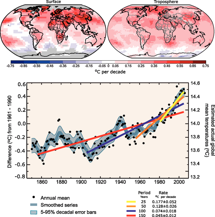
Figure 1: Depiction of various long-term global temperature trends in the 2007 IPCC report
The figure is used in FAQ 3.1 and the Technical Summary of Working Group 1. Monckton asserts that this graph uses a "fraudulent statistical technique" and
"At each place where the altered graph is displayed, the incorrect conclusion is drawn that because trend-lines starting closer to the present have a steeper slope than those starting farther back, the rate of warming is accelerating and that we are to blame."
This is simply a misrepresentation of the IPCC report. The IPCC makes the following claims using this figure:
1) The pace of warming accelerated over the course of the 20th Century. Notice the past tense. Here is the specific claim (from the caption for Figure 1 of FAQ 3.1, emphasis added):
"Linear trend fits to the last 25 (yellow), 50 (orange), 100 (purple) and 150 years (red) are shown, and correspond to 1981 to 2005, 1956 to 2005, 1906 to 2005, and 1856 to 2005, respectively. Note that for shorter recent periods, the slope is greater, indicating accelerated warming."
2) That the pace of warming over the last 25 years is greater than that in preceding years on the record.
3) That the "... global average temperature has increased, especially since 1950."
All of these statements are true. The IPCC does not state that the rate of warming continues to accelerate, and does not use this figure to claim that humans are to blame for the accelerated warming, although in the FAQ 3.1 figure caption, the IPCC does explain how we know humans are the cause of the acceleration:
"From about 1940 to 1970 the increasing industrialisation following World War II increased pollution in the Northern Hemisphere, contributing to cooling, and increases in carbon dioxide and other greenhouse gases dominate the observed warming after the mid-1970s."
Monckton's claims of a "fraudulent statistical technique" are without merit, and a misrepresentation of the IPCC report's actual content.
Last updated on 9 February 2012 by dana1981. View Archives
Here are two assertions :
Linear trend fits to the first 20 (1860-1880), 40 (1860-1900), 100 (1850-1950) and for the full 150 years (1860-2010)are shown. Note that for periods ending closer to us, the slope is smaller, indicating decelerated warming.
The pace of warming over the full 150years (1860-2011) has been slower than during the first 20, 40, and 100 years of the instrumental record.
Are those two assertions wrong ?
If they are not, will we get a chance to read them in the next IPCC report ?
And in the SPM which also had a sentence comparing the linear warming trend over the last 50 years with the linear trend for the last 100 years and did not put it in perspective with the first 20 years (for example).
Of course you cannot compare trends on different time periods.... !
On any given day, the trend from midnight to midday is about 1°C/hour (+/-0.5), which far exceed any global warming trend over any time period you want [1].
I can give show you global cooling too if you want.
[1] 1°C/hour = 87 600°C/decade
"That the pace of warming over the last 25 years is greater than that in preceding years on the record."
How does the trend of the last 25yrs compare with the trend between 1915 and 1940 ? (same 25yrs basis)
Even if I plot from the cherry picked start point of 1860, except for 1860-1880, the later the end point of the trends examined, the larger the trend. Again this clearly does not show deceleration. What is more, even the 1860-1880 trend is inconsequential. The data for that period comes almost exclusively from Europe, the North Atlantic and the Eastern US. As such it represents a regional rather than a global temperature, and regional temperatures have larger trends than global temperatures. (Note I used the period 1860-1960 for the 100 year trend to keep the cherry picking to a minimum.)
So, contrary to your apparent claim, it is not possible to pick arbitrary end points mimicking the IPCC graph, and to show a deceleration over the temperature record as a result. You have no counter example to the IPCC's procedure.
More importantly, your argument entirely misses the more important point that Monckton completely misrepresents the nature of the IPCC's argument premised on the graph in question.
Note: trends simply cut and paste from Wood for Trees, and the number of "significant figures" in no way represents a claim of statistical significance. Graph of the trends can be found here.
Before I answer on point 1, the tool you used allowed me show that point number 2
""That the pace of warming over the last 25 years is greater than that in preceding years on the record.""
is wrong :
link
He seems to be changing his angle of attack and trying to trick his audience into thinking that the reason he is right and the IPCC are wrong, is that we are going to see a cooling period.
And you miss the most important point that you cannot compare trends over different time periods. It's all i aimed to show (with wrong numbers possibly, but i gave you a simple counterexample with the midnight thing).
Take for endpoint today at midnight, and you'll see that you have a cooling trend over the past 12h but a warming trend of the past 30years.
By the way, isn't it weird that IPCC represents 25, 50, .., 100, and 150 ?
They're missing 75 (and 125).
Well, that's because with 75 (1930-2005), it doesn't work :).
link 2
- I did find a counterexemple, that is say if you start in 1910 you can find that the first 25yrs trend is higher than the first 50yrs trends which is also higher than the full 100yrs 1910-2010 trend.
- The IPCC picture does not work if you take the 75yr trend (1930-2005) that they don't depict (they skip from the 50yrs to the 100yrs) : the 75yrs trend is smaller than the 100years trend.
How is taking the 75yrs chery picking, as you are stating yourself that it is based on 25years intervals ?
- But maybe you think 75yrs is cherry picked and the 25yrs of your 2nd point applies to any 25yr-period ? Then I also showed you that the past 25yrs (1980-2005) have been warming at the same rate as the 1915-1940 25yrs period.
So, what you have shown is not that point number 2 is wrong, but merely that you are prepared to assert that it is without properly checking the data.
Uhh i didn't know you could get the raw data, nice tool.
Well, then i switched to to the 1917-1942 25yr-period.
slope = 0.0178289 per year
For the 1980 to 2005 period :
slope = 0.0180092 per year
And don't tell me error bars are smaller than 0.0002 °C/decade !
PS : How can the last point on the IPCC graph be 2006 as 2005 is not even depicted ?
And the last datum on the IPCC graph is 2006. However, having just checked FAQ 3.1, I notice the IPCC calculated trends terminate in 2005. So, comparing the 1981-2005 trend (0.0188397 C per year), to that for 1917-1941 (0.0171067 C per year) and 1918-1942 (0.0171202 C per year). The difference is approximately 0.002 C per year. (Please note that 1980-2005 is a 26 year period.)
Finally, with regard to your post 5, 12 hours is not a period long enough to represent a climatology. Therefore your analogy is specious.
Well i guess you're right if we stick to semantics, not to science rigor as the statement seems very much sensitive to error bars and to endpoints (ironically the statement would be wrong in AR5 as 1987-2011 is 0.0155809 per year).
What about the 75yr trend i was talking about ?
And the 1910 thing ?
"Finally, with regard to your post 5, 12 hours is not a period long enough to represent a climatology."
You know as much as i do that 30yrs it nothing more than a convention.
Of course daily temperatures don't define a climatology, but 25year periods don't define one either (except by convention) and you cannot prove that the impossibility to go from hours to 25 years is qualitatively different than the one going from 25years to 150years.
That's the whole point i'm making : having similar time periods is the minimum required (but not sufficient) when you compare trends !
Really? 150/25 = 6:1
25 years = 219150 hours. Your examples of comparing temperatures 12 hours apart to temperatures 25 years apart yields 219150/12 = 18262.5:1
Comparing temperatures (and temperature trends) over short time frames to long time frames is qualitatively different - and extremely misleading.
Well, in the same way, the assertion by the IPCC that the increasing slope for the linear trends over the last 25, 50, 100 and 150 years *indicates* accelerated warming is also untrue.
Moreover, as shown above, the linear trend for the last 75 years goes in the wrong direction, so at the very least it should be considered as cherry picking the trend baseline to pick only the trends that agree with what you want to assert.
This has nothing to do with climate science or denying that the world is warming (it is), it's just scientific rigor.
Muoncounter @15 : Sorry but i am asking for qualitative reasons, not quantitative ones. "Short" and "long" are quantitative assessments : of course there are order of magnitudes of difference between the two timescales, but that's the whole point of my example.
You cannot just say that because there are orders of magnitude of difference, the system has qualitatively a different behavior.
Here is an analogy :
From 101°C and orders of magnitude up, water is qualitatively the same : vapor.
But from 99°C to 101°C, it is qualitatively different (phase transition) even though the temperature changes very little.
The underlying question is : in a complex system, how do you know the timescale (if any) over which you can say that "internal variability" (to be defined) is filtered out.
But that's out of topic here.
Nothing you are saying makes any sense... or bears out, when I look at the actual data. Up is up, no matter how you try to stand it.
Please produce a graph (use woodfortrees.org if you like) that clearly proves your point.
And try to do it without cherry picking end points and ranges.
1) Nobody who is arguing a case that depends critically on choosing just one of two available temperature indices should be talking about "arguing mere semantics". The Gistemp Land Ocean Temperature Index (LOTI) shows a trend of 0.0169576 C per year from 1981-2005, a trend of 0.0139565 C per year from 1917-1941, and a trend of 0.0134231 C per year from 1918-1942. For what it is worth, HadCRUT4 also shows a reduced trend over the 1910-1940 period, and an increased trend over the 1970-2010 interval, although obviously I do not have precise trends.
2) The 75 year trend is 0.00650795 C per year, compared to 0.00722857 C per year for the 100 year trend. The difference, less than 0.001 C per year is less than the difference in trend you dismiss as merely semantic when it suites you. It is certainly not enough to alter the visual impact of the graph, or to alter the conclusions of the IPCC.
3) The 50 year trend from 1910 is 0.00761979 C per year; the 100 year trend is 0.00749844 C per year. The difference is just over 0.0001 C per year. What was that you said about merely semantic differences again? More importantly, the pattern is not preserved in Gistemp, in which the 50 year trend is greater than the 100 year trend.
Clearly, therefore, you do not have an example showing deceleration in which successive trends from the start point are less than each other by a large (although not quite statistically significant in one case) margin. The reason is that you are, fairly obviously, cherry picking artifacts of noise in an accelerating temperature trend.
What are you talking about ?
I did provide graphs (cf previous posts)
Tom @19
1/ As i said, that merely shows that uncertainties on the trends are quite large.
2/ So you do agree with me that the 75yr trend goes against the picture presented of increasing trends, right ?
You said yourself : "It is not necessary that the error bars be miniscule for the purported IPCC claim to be correct. It is only necessary that the measured trend be greater."
Therefore, according to your own standards, i did show that the measured trend for the 75yr trend was not greater, and that had the IPCC been consistent and depicted all 25yr periods without leaving out the 75yr trend (cherrypicking ?), the IPCC assertion would not have been possible.
According to my standards, all i am doing here is pointless because, as i said, comparing trends of different lengths is meaningless. You can find any result you are looking for.
3/ You challenged me by saying "it is not possible to pick arbitrary end points mimicking the IPCC graph, and to show a deceleration over the temperature record as a result. You have no counter example to the IPCC's procedure. "
I found the counterexample with an arbitrary starting point (1910) and decreasing trends mimicking the IPCC graph (25, 50, 100yr trends).
Again, according to your own standard and following IPCC procedure where, as you say yourself "it is only necessary that the measured trend be greater", i've succeeded. Now that you have it you seem unhappy that it exists.
"The reason is that you are, fairly obviously, cherry picking artifacts of noise in an accelerating temperature trend. "
Of course I am cherry picking the starting point ! You challenged me by saying that i wouldn't be able to find an arbitrary point and mimick the IPCC procedure with decelerated trends. So i looked for it and found it.
Now let's get back to what it all means :
what the ipcc says is that their increasing trends (-snip-) accelerated warming.
Clearly that statement is wrong.
Increasing trends don't (-snip-) an accelerated warming, and decreasing trends (my example) don't (-snip-) a decelerated warming.
They don't (-snip-) anything.
I don't understand that you guys can defend such a graph. Isn't it easier to just admit that it was not the best chosen graph to depict that warming is accelerating ?
[DB] Please acquaint yourself with this site's Comments Policy (link next to every comment input box). It is noted that, more than anything, you are simply being argumentative for its own sake.
Multiple usages of all-caps snipped.
Anyway, on your message 20, here we are merely discussing communication skills and scientific rigor, not the reality of warming.
Anyone who looks at the temperature trend see that it is warming.
I've read KR response on the other thread about linear increase or acceleration in temperature trend and exponential CO2. What he says is not entirely correct, the exponential of the CO2 is taken care of by the log of forcings, it doesnt really play there (the exponential, not the CO2 !).
What matters (in a simplified version) is the relaxation time. That tells you whether the response will be linear or quadratic.
But it's out of topic here.
Anyway, i'll just wait a few mins see if my post stays, then gotta go.
Thanks for the discussion.
Cheers
Sorry for the all caps.
That has to be a new highpoint in doublespeak. Changing trends don't indicate anything? That requires that 'there's been no warming since xxxx' doesn't indicate anything; nor is there anything indicated by 'there is no scientific basis for saying that warming hasn't stopped'.
I suppose 'concave up' doesn't mean anything either. Do we really need trends to see what's been happening?
I did look at your links and graphs, and what I'm saying is that they don't show what you claim they show.
Let's try it this way... list the ranges of years, and the slope. Just do that.
Let's see you cherry pick the years to make this work.
It's really a pain to understand what you're looking for.
Everything is done on woodfortrees with HadCRUT3 variance adjusted global mean.
First my homework : what i showed, responding to Tom's challenge :
"it is not possible to pick arbitrary end points mimicking the IPCC graph, and to show a deceleration over the temperature record as a result. You have no counter example to the IPCC's procedure. "
is that there exist a common start point for which it works : 1910-1934 > 1910-1959 > 1910-2009 gives a decreasing trend as you get closer to present :
25yr trend
#Selected data from 1910
#Selected data up to 1934
#Least squares trend line; slope = 0.013717 per year
50yr trend
#Selected data from 1910
#Selected data up to 1959
#Least squares trend line; slope = 0.00773312 per year
100yr trend
#Selected data from 1910
#Selected data up to 2009
#Least squares trend line; slope = 0.00742333 per year
The closer you get to present, the smaller the trend.
Uhhhhhhhhhh
Back to IPCC graph. The second thing i showed it that the not depicted 75yr period 1931-2005 is > the 100yr period 1906-2005, which goes against the increasing trend assertion by the IPCC.
100yr
#Selected data from 1906
#Selected data up to 2005
#Least squares trend line; slope = 0.00724928 per year
75yr
#Selected data from 1931
#Selected data up to 2005
#Least squares trend line; slope = 0.00659195 per year
50yr
#Selected data from 1956
#Selected data up to 2005
#Least squares trend line; slope = 0.0124017 per year
muoncounter26 : concave up would be correct. Nobody is saying it didn't warm here. Had it been the statement written in the IPCC, i wouldn't be here discussing it with you.
The problem is the IPCC saying that linear trend fits to the last 25, 50, 100 and 150 years indicate warming. You can easily imagine records where linear trend fits to the last 25, 50, 100 and 150 years (and even 75 :) ) increase but where the is no warming.
I really don't understand how you guys can defend the idea that the IPCC trend graph & statement support or indicate anything.
"Do we really need trends to see what's been happening?"
I agree with that. But you should tell that to IPCC. I'm the one criticizing their (mis)use of trends to support a statement.
"You can easily imagine records where linear trend fits to the last 25, 50, 100 and 150 years (and even 75 :) ) increase but where the is no warming." Again the issue is acceleration of warming, not simply "warming". The IPCC caption is
The IPCC graphic is overly simplistic (IMO) since it does not discuss the extent of natural acceleration and deceleration that could lead to a superimposed natural and manmade acceleration. That would require a paper. But the IPCC claim is that there is acceleration of warming (unattributed) and that the acceleration is current (as of 2005).
We're just discussing the IPCC graph and their use of trends as an indicator of accelerated warming or to support their specific statement.
[DB] Actually, most of what Eric has stated is on-topic and germane to this discussion. You are tortuously arguing against a very simple point:
Using Woodfortrees, this is easily seen, thusly:
[Source]
Or just the trends themselves:
[Source]
Where is the disagreement from the statement to the graphics? It really is that simple.
Second, you can easily imagine a temperature record with, as shown by IPCC, a greater slope for shorter periods indicating accelerated warming but where the temperature is in fact cooling.
I didn't follow the discussion but at a cursory reading of your claim I find it like a world upside down. You start at an early time and go forward while the IPCC goes the other way around. Are you surprised that you get different or even opposite results? The problem is the meaning and that's what (it seems to me) your're missing.
And therefore what the IPCC shows as an indicator of accelerated warming is merely a statistical artifact.
They start with a long trends small slope and end up with a small trend large slope (accelerated warming).
I start with a small trend large slope and end with a large trend small slope (decelerated warming).
long trend = trend over a long time period
"you did not show that "on a very general basis, longer trends tend to have smaller slopes." "
I did not *show* that because the fact that trends over long time periods generally imply smaller slopes is a simple statistics, especially for a physical phenomenon like temperature. Of course you can find punctual counterexamples, but they are punctual.
Just think about it : let's say, i'm sure you'll agree, over the past millenium, global temperature was constrained between 0 and 30°C (so we make it very very general). That means that the largest linear trend you can find if you look for the trend over the last 1000 years is 0.3°C/decade.
Now let's look on year to year basis, and let's assume that the maximum year to year variation for global temperature is 0.3°C/yr.
That's 3°C/decade, already ten times more than the millenium one (which was calculated supposing a 30°C variation !!!).
Anyway, i guess you get it : long time trends are much more constrained that short time trends, and therefore you get on average more big trends on shorter times than on longer times.
Are you convinced ?
Actually, Helena, Tamino has demonstrated that CO2 forcing is increasing at a rate greater than exponential, meaning that CO2 forcing is increasing at a rate greater than linear. Meaning that the CO2 forcing component is accelerating.
However, the core of your posts here have been nit-picking, and incorrect, complaints that the IPCC graphic shown in the opening post is somehow proven wrong by cherry-picked short term trends, or by wordplay with longer terms.
Your arguments have the appearance of someone torturing the data to support a favored point, rather than considering the data for it's worth - I sincerely hope that's not the case.
On the second point, don't you agree with me with the fact that, on average, slopes for longer trends are smaller that slopes for shorter trends, no matter whether you are in a warming or a cooling world, but because it's a simple statistical result ?
The only data i have been torturing is when i answered Tom's challenge (proving you can have decreasing 25-50-100 year trends). My torturing of the data was the same that the one the IPCC used for their graph.
Therefore i guess we'll agree that what i did for Tom is at the same level as what the IPCC did : poor scientific rigor !
This is in reference to a graph presented without any selective trend calculation. I note that you did not challenge the accuracy or applicability of the BEST temperature anomaly vs time graph, so we must take that to mean you accept it's use in this context.
So let's go to yes/no questions. You have already agreed that the graph in question is concave up:
-Do you agree that concave up is defined by a positive second derivative?
-If yes, do you agree that when both first derivative (slope) and 2nd derivative (rate of change of slope) are both positive, the graph describes a function that is accelerating?
-If yes, do you agree that an increasing and accelerating function is correctly described by "trend-lines starting closer to the present have a steeper slope than those starting farther back"?
Yes
Yes (in general, you can find punctual counterexamples but that's not what we're talking about) but what's important is that the converse is not true i.e you can have "trend-lines starting closer to the present have a steeper slope than those starting farther back" and an underlying function that is not "an increasing and accelerating function"
And it is the converse that the IPCC is saying.
They say : "Note that for shorter recent periods, the slope is greater" ==indicating=>> "accelerated warming"
That is NOT true.
And that's because steeper slopes for short period trends and smaller slopes for long period trends is a general statistical fact.
"Note that for shorter recent periods, the slope is greater" can also indicate a cooling trend if you want.
You cannot deduce anything from the fact that "for shorter recent periods, the slope is greater", it's just a general statistical fact.
Your entire argument hinges on cherry-picking a well-known, very short period (25 years) with a very rapid temperature increase, the 1910 to 1934 period, and then supplementing that with a similar period ending in 1959. No one is arguing that you can't cherry pick ranges to give the appearance of a decelerating trend.
What we can point out is that your method requires cherry picking, while the IPCC method simply and logically says "from X years ago to now".
Sorry maybe it was obvious for you, but not for Tom, as he is the one who said that contrary to my apparent claim (and now also yours), it is not possible to pick arbitrary end points mimicking the IPCC graph, and to show a deceleration over the temperature record as a result. Glad to see you agree that it's possible.
"while the IPCC method simply and logically says "from X years ago to now"."
Again, the fact that the IPCC method finds smaller slopes for longer trends has nothing specific to an accelerated warming, therefore it cannot "indicate" an accelerated warming.
Helena's cherry picked example:
IPCC example:
Her insistence that the two are equivalent merely shows, IMO, that her reasoning is driven by the conclusions she wishes to draw rather than by the facts on the ground.
"...the fact that the IPCC method finds smaller slopes for longer trends has nothing specific to an accelerated warming..."
Shorter terms will certainly have higher variances, but absent an underlying change in rate, randomly selected time periods and lengths would statistically average out to the same trend. Your assertion is quite incorrect.
The first graph shows that, over the 1910-2010 the trend was steep at the beginning of the century, and as we were advancing in the century, it has been decreasing.
Do we agree that all of these statements in this sentence are true ? (Please answer yes/no + comments if you wish)
But maybe you do realize that it's not such a good idea to compare a short trend to a long trend ?
:)
KR46 :
No, it is not on the point, and no it's not incorrect.
You can have a global cooling and still have increasing slopes as depicted by IPCC.
But i think you don't understand what we are discussing. We are not discussing whether temperature is accelerating or not. We are discussing whether the IPCC trend torturing supports the accelerating temperature statement.
In contrast, in the IPCC example, the differences in trend are large relative to the error margin of the trends, and with one exception, they all show the consistent pattern.
The size of the effect relative to the error margin is a critical factor in determining whether or not a statistical inference is warranted. You choose to ignore that factor simply because it suites your argument. However, I will not. The difference in visual impact between your cherry picked example and the IPCC example comes primarily from the relative magnitude in the changes in the slopes, which is the critical factor on whether the inference is valid or not.
Your argument, in the end comes down to just three points:
1) Ignore the magnitude of effects, thereby assuming that the magnitude of the effect has no consequences for statistical inferences;
2) Assume that any noise in the data automatically invalidates any statistical inferences (as when you argue the 75 year trend to 2005 invalidates the overall pattern, while scrupulously ignoring the fact that the 125 year trend reinforces the pattern); and
3) Assume that the possibility that a statistical inference can reach a false conclusion proves that the statistical inference is invalid ,ie, that the fact that inductive arguments are not deductive arguments proves that they are not valid inductive arguments (as when you argue that the 1910 example invalidates the IPCC inference, and even then you must assume that the size of effects is irrelevant to begin with).
Good: we are now talking about the underlying function (temperature anomaly vs. time), which gets us away from the artifice of choosing time intervals for 'trend' calculation.
You've agreed that the underlying function is increasing and accelerating: that's what is relevant. Describing that function by selecting 10 year, 20 year or 100 year intervals does not change the function.
#47: "We are not discussing whether temperature is accelerating or not."
This isn't a forum for semantics and tautology. The statement in the OP is "the incorrect conclusion is drawn that ... the rate of warming is accelerating". Questions: Do you agree that the rate of warming is accelerating? If so, do you agree that an appropriate description of a graph representing that behavior is 'increasing and concave up'?