">

Climate Science Glossary

Term Lookup

Enter a term in the search box to find its definition.

Settings

Use the controls in the far right panel to increase or decrease the number of terms automatically displayed (or to completely turn that feature off).

Term Lookup

Settings


All IPCC definitions taken from Climate Change 2007: The Physical Science Basis. Working Group I Contribution to the Fourth Assessment Report of the Intergovernmental Panel on Climate Change, Annex I, Glossary, pp. 941-954. Cambridge University Press.

Home Arguments Software Resources Comments The Consensus Project Translations About Support

Twitter Facebook YouTube Mastodon MeWe

RSS Posts RSS Comments Email Subscribe


Climate's changed before
It's the sun
It's not bad
There is no consensus
It's cooling
Models are unreliable
Temp record is unreliable
Animals and plants can adapt
It hasn't warmed since 1998
Antarctica is gaining ice
View All Arguments...


Username
Password
New? Register here
Forgot your password?

Latest Posts

Archives

How does Ljungqvist's reconstruction compare to others?

What the science says...

Ljungqvist's millennial temperature reconstruction was very similar to Moberg et al. (2005) and Mann et al. (2008). It also concludes that current northern hemisphere surface air temperatures are significantly higher than during the peak of the Medieval Warm Period (MWP). Further, arguing for a hot MWP is also arguing that climate sensitivity is not low - which undermines a critical argument for "skeptics".

Climate Myth...

Ljungqvist broke the hockey stick

"[Ljungqvist 2010 shows that] there is nothing unusual, nothing unnatural or nothing unprecedented about the planet's current level of warmth, seeing it was just as warm as, or even warmer than, it has been recently during both the Roman and Medieval Warm Periods, when the atmosphere's CO2 concentration was more than 100 ppm less than it is today. And this latter observation, together with the realization that earth's climate naturally transits back and forth between cooler and warmer conditions on a millennial timescale, demonstrates that there is absolutely no need to associate the planet's current level of warmth with its current higher atmospheric CO2 concentration, in clear contradiction of the worn-out IPCC and climate-alarmist claim that the only way to explain earth's current warmth is to associate it with the greenhouse effect of CO2" (NIPCC)

Fredrik Ljungqvist created a 2000-year temperature history of the extra-tropical portion of the Northern Hemisphere (30-90°N) based on 30 proxy records.  Certain "skeptics" have argued that his reconstruction shows greater natural variability than previous reconstructions, and that it shows the peak of the Medieval Warm Period (MWP) hotter than today's surface air temperatures.

Ljungqvist Compared to other Reconstructions

However, Ljungqvist's reconstruction is not substantially different from the many other millennial northern hemisphere temperature reconstructions, as the author himself states in his paper:

“Our temperature reconstruction agrees well with the reconstructions by Moberg et al. (2005) and Mann et al. (2008) with regard to the amplitude of the variability as well as the timing of warm and cold periods, except for the period c. AD 300–800, despite significant differences in both data coverage and methodology.”

Indeed by plotting Ljungqvist's data along with Moberg et al. (2005), Mann et al. (2008), and the surface temperature record, we can confirm that the three reconstructions are very similar (Figure 1).

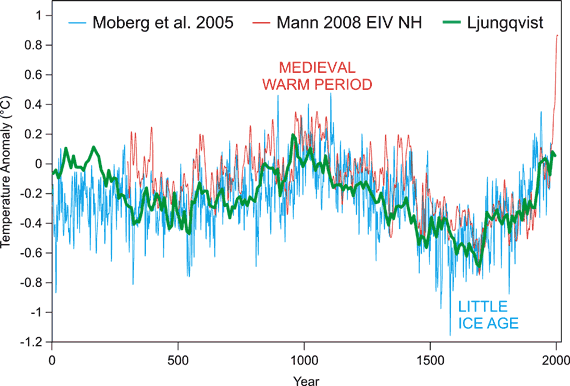
Figure 1: Moberg et al. 2005 NH (blue), Mann et al. 2008 EIV NH (red), and  Ljungqvist 2010 NH (green).  Courtesy of Robert Way and John Cook.

MWP Peak vs. Current Temperature

Contrary to "skeptic" claims that his reconstruction shows the peak of the MWP as hotter than today's temperatures, Ljungqvist says the following when combining his proxy reconstruction with recent instrumental temperature data:

“Since AD 1990, though, average temperatures in the extra-tropical Northern Hemisphere exceed those of any other warm decades the last two millennia, even the peak of the Medieval Warm Period”


Figure 2: Ljungqvist (2010) 30-90°N decadal averages (black) vs. HadCRUT land-ocean 30-90°N decadal averages (red).   Courtesy of Robert Way.

What Reconstructions Tell Us

The NIPCC also claims that if the MWP was as hot as today (which it wasn't), that means that current global warming and climate change could be natural.  It's true, hypothetically, the current warming could be natural, if there were a natural mechanism causing it.  However, there is no such known mechanism.  There is a measured energy imbalance caused by the increase in atmospheric greenhouse gases.  We know that this energy must cause the planet to warm, and how much it warms depends on the climate sensitivity to the energy imbalance.

In fact, the hotter the MWP, the more sensitive the climate is to these energy imbalances.  So arguing for a hot MWP is actually arguing that greenhouse gases must be causing significant global warming - the NIPCC has it exactly backwards.

Summary

Despite the different methodologies and data coverage used in Ljungqvist (2010), his reconstruction is consistent with previous peer-reviewed northern hemisphere temperature reconstructions, and like all previous peer-reviewed reconstructions, concludes that current temperatures are higher than the peak of the MWP.  Claiming that the MWP was hotter than today is also counter-productive for "skeptics", because a hotter MWP means climate sensitivity is high.

Intermediate rebuttal written by dana1981


Update July 2015:

Here is a related lecture-video from Denial101x - Making Sense of Climate Science Denial

Last updated on 9 July 2015 by pattimer. View Archives

Printable Version  |  Offline PDF Version  |  Link to this page

Argument Feedback

Please use this form to let us know about suggested updates to this rebuttal.

Comments

1  2  Next

Comments 1 to 25 out of 32:

  1. Why no comments? This slaughters the hockey stick, without nitpicking the 20th century rise is on par with the MWP. And look at Mann's line flying off into blue sky late 20th century, Ljungqvist's does nothing of the sort. Originally Mann's HS didn't even recognize the MWP and him and others attempted to downplay it in other ways. A truely skeptical science site would hold that up as a discussion point.
  2. So what you are saying is that you didn't actually read the article. If you had you'd likely have seen the part about Ljungqvist conceding that current temperatures being higher than any other point in the last 2000 years. The reason that Ljungqvist's reconstruction doesn't show the "line flying off into blue sky" late in the 20th century is that... his reconstruction doesn't include the late 20th century. It stops before 1950. Figure 2 above shows the late 20th century warming from the instrumental record added on to the end of Ljungqvist's results in red.
  3. 1) Science moves on. This is a fact hated by deniers because it robs them of talking points. (Talking points, of course, because they lack valid arguments.) Thus in 1998, Mann, Bradley and Hughes pioneered an innovative technique to reconstruct past temperatures. It was innovative, so they had nobodies mistakes to learn from except their own, so they made a few minor errors. Further, they had limited data to work with, which also created problems. As a result they produced a reconstruction with insufficient multi-decadal variability. The scientists picked up on the mistakes (the scientists, not McIntyre and McKittrick whose criticisms where mostly either trivial, or wrong), and have produce better recent reconstruction, such as Mann 2008 shown above. Clearly the denier talking point that RyanStarr wants to ressurect doesn't fit well with that graph, so he goes on about it because talking points is all he has. 2) The original MBH 98 graph did not even cover the medieval warm period. Their follow on MBH 99 did, and shows medieval temperatures approximately equal to those shown by Lungqvist. It then followed a more or less straight line, with decadal but not multidecadal variation to approximately the temperaure shown by Lungqvist in 1850. Consequently it was not the MWP that was supressed by the limitations in MBH's first time efforts, it was the Little Ice Age. That, of course does not fit the denier narrative, so RyanStarr ignores it and goes on about the MWP. 3) As noted above, and by Lungqvist in his paper, Mann et al 2008 shows a very similar curve to Lungqvist. Indeed, Mann 2008 shows a slightly warmer MWP (0.32 vs 0.29 11th century mean) and a very slightly colder LIA (-0.18 vs -0.17 in the 17th century), thus showing greater variability than Lungqvist, and two years before him. Therefore if Lungqvist "slaughters" MBH 99 (the hockeystick), he arrives late on the scene and only manages to slay a corpse. The real action came two years before, when Mann "slaughtered" MBH 99. Again, that doesn't fit the denier narrative, so only Lungqvist gets credit in the denier rant. This of course beautifully illustrates my first point. Scientists, because they pursue truth, move on. Deniers because they are only using talking points to sow confusion, cling to those talking points regardless, leaving them not only wrong, but ten years out of date to boot. Cue more empty denier talking points from RyannStarr ...
  4. The rules forbid me from saying what I would like to say. The Hadcrut overlay is... not right. The abstract of the paper itself only suggests the late 20th century is likely the warmist. How does the author here then manage to show recent years as being > 0.5 C above the highest Ljungqvist peak. I've googled and found other overlays too, they don't even come close to this result. Decadal mean temperatures seem to have reached or exceeded the 1961-1990 mean temperature level during substantial parts of the Roman Warm Period and the Medieval Warm Period. The temperature of the last two decades, however, is possibly higher than during any previous time in the past two millennia, although this is only seen in the instrumental temperature data and not in the multi-proxy reconstruction itself.
    Response:

    [dana1981] The figure in the post is correct.  Ljungqvist terminates the data in his paper at 2000, so that's probably where the overlays you found on Google terminate as well.  However, NH land temps did not stop warming in 2000.  Our figure is up-to-date and uses the correct data, as other commenters have noted.

  5. RyanStarr wrote: "I've googled and found other overlays too, they don't even come close to this result." Well, without you citing these other overlays we can't really determine what they did differently. One possible explanation might be that they could have used global temperature anomalies rather than just the 30 to 90 degree range of the Northern hemisphere like Ljungqvist and the HadCrut data in figure 2. Or they could have stopped the data in the 1980s. Or mixed up the baseline values the anomalies were computed from. Et cetera. None of which changes the fact that even Ljungqvist concedes current temperatures are higher than the MWP. Further, his results are largely within the error bounds of the original 'hockey stick' and thus confirm rather than 'slaughter' it's findings.
  6. RyanStarr, just looking at the Hadcrut site shows that the difference in temperatures for the whole northern hemisphere over the last 100 years is over 1 degree. Robert Ways graph shows the 30-90°N decadal averages in the 1.1 degree range. The Hadcrut data is available if you wish to do your own graph.
  7. @dana1981 (+others), as you say Ljungqvist ends at 2000, I thought roughly that but with such a long time frame it's hard to be sure (so not 1950 CBD). At the year 2000 it's just a smidgeon above 0, close to 0.075. The Hadcrut overlay, for the next 10 years, rises a further 0.7 degrees, in 10 years it rises 0.7 degrees! Something has to be in error here. OK Ljungqvist is a reconstruction so we expect the accuracy of that to fall well below an instrument record, are we saying Ljungqvist's late 20th century result is in error by up to 0.7 C?
    Response:

    [dana1981] The error is that your "10 years" is more like 30 years.  Each yellow dot represents a new decadal average.  Some of the red data is included in Ljungqvist's study, but he omitted the final data point.

  8. Well I checked the Ljungqvist data at noaa and its definitely through to 2000. The overlay doesnt match HadCrut NH 2000-2010 but you expect extratropical to be higher. I cant find an easy way to extract that time series.
  9. Looking at those noaa data...The proxy values and the measured temps agree up until the last point when the reconstruction underestimates the measured temps extratropical temps by >0.3 C! Evidence of proxies failing now in the face of warming? There was also a 0.2C jump from 1990-2000 (the last year of shared record) to 2000-2010 in HadCrut NH. The fact that the extratropical data will have larger anamolies than the NH data contributes even more to the discrepancy. In any case, the current measured decadal NH anomalies (>0.5C) are clearly well above any reconstructed values. And the extratropical values will differ even more. I don't see what RyanStarr is complaining about.
  10. RyanStarr @7, if you look closely at the red line on the graph, you will see small circles indicating each decadal average. The 10 year difference, and the additional extension on the graph compared to that printed by Lungqvist is the range between the last circle, and the second last circle, or about 0.35 degrees C. The error in Lungvist's reconstruction in the final decade, as is easily determined from the NOAA data, is only 0.332 degrees. It should be noted that the upper limit of the 90% confidence interval peaks at 0.377 in the middle ages (950-959). That is 0.011 degrees less than the instrumental record for the 1990s, and over 0.4 degrees less than the instrumental record for the 2000s. Even allowing an allowing an error in the 950s as large as that in the 1990s, the temperature anomaly (reconstructed plus 1990s error) is still only 0.528 degrees, still around 0.3 degrees below the level of the 2000s. The probability that any decade in the last 2010 years has been hotter than the 2000s is very remote. I do not know where to find the Hadcrut 90 to 30 degree index, but out of curiosity I compared the 1990-1999 average with the 2000-2009 average. The difference is 0.243 degrees. As that includes the tropics, which are noted for much lower increase in temperature, the 0.35 degree increase for the extratropics is very plausible. If you doubt it, the onus is on you to look up the extratropical data and make a comparison.
  11. I understand the red HadCrut line starts rising above the blue prior to its (the blue's) conclusion. However if we presume that the overlay has been performed correctly through the time axis (and I don't presume otherwise) then the point remains that Ljungqvist concludes at 0.07'ish degrees in 2000 and the HadCrut overlay concludes 10 years later at 0.8. Of course we expect some disagreement here, proxy vs instrument, but lets put this difference into some perspective. In the space of 2000 years the Ljungqvist reconstruction hits a low of -0.7 and a high of 0.2, suggesting a range of 0.9 for that period. That is to say, taking this as an arbitrary (though recent) climate window suggests min/max extents 0.9 degrees apart. Allow via subtraction 0.2 degrees for the 10 years and the difference is still 58 % of the 2000 year min-max range. HadCrut plots http://www.skepticalscience.com/news.php?p=4&t=168&&n=394
  12. RyanStarr @11, I am uncertain as to what you are trying to point out. Before examining that, however, let's get the facts straight: a) The range of temperatures between the highest reconstructed temperature (0.196 for 950-959) and the lowest reconstructed temperature (-0.692 for 1690-1699) is 0.888 degrees C; b) The difference between the instrumental value for the decade 1990-1999 (0.388 degrees C) and the reconstructed temperature for the same decade (0.056) is 0.332 degrees C; and c) The increase in the instrumental temperature record over the last three decades has been very large compared to the range of temperatures shown in the reconstruction, with a total increase over the three decades of 0.883 degrees over the three decades, or 99.4% of the reconstructed range of temperatures over the preceding two thousand years, and an increase of 0.4 degrees C in the last decade, or 45% of the range of temperatures over the last two thousand years. The first thing I thought of when you started comparing the appropriate figures above is that it highlights how extraordinary has been the increase in temperatures over the last three decades. What is more, this increase comes from a high base with final reconstructed decade only exceeded by eight other reconstructed temperatures out of 200, or just 4%. This absolutely underlines how implausible are claims that recent temperature increases are due primarily to natural variability, both because of the extreme temperature rise in so short a time, and because the temperature has risen in just three decades to exceed the previous highest value by approximately two thirds of the range of variability over the last two thousand years, with no indication that the temperatures will not continue rising. Now, knowing you, I'm sure that is not your point. It escapes me how you can avoid noticing the implications of those facts, however. Thank you for bringing it to my notice. Knowing you, I believe that you are attempting to cast doubt on either the reconstructed temperatures or the instrumental temperatures (or both) based on the discrepancy. I do not know which, so you will have to elucidate. However, in doing so, please confine yourself to the relevant facts. Specifically, it is irrelevant how high the instrumental value for 2000-2009 is above the reconstructed value for 1990-1999. There can be no discrepancy between the two because they do not cover the same period. The discrepancy between the 1990-1999 reconstructed and instrumental values, on the other hand, is relevant. It amounts (as noted) to a difference 0.332 degrees, or 37.4% of the total range of the reconstructed value.
  13. As user 'protestant' pointed out in the other thread the comparison was already made in the original paper. "...from the various adjusted CRUTEM3+HadSST2 90-30ºN record (black dotted line showing decadal mean values AD 1850-1999)" ( -Accusations of deception, fraud, dishonesty or corruption snipped- ).
    Response:

    [DB]  Please note that posting comments here at SkS is a privilege, not a right.  This privilege can be rescinded if the posting individual treats adherence to the Comments Policy as optional, rather than the mandatory condition of participating in this online forum.

    Please take the time to review the policy and ensure future comments are in full compliance with it.  Thanks for your understanding and compliance in this matter.

  14. RyanStarr @13, there can be no question as to the appropriateness of including 2000-2009 instrumental data on the graph. Failing to do so when the data is available only tends to understate the modern warming contrary to the evidence. In other words, only if you have an objection to people knowing the truth about how warm the modern era is in comparison to the MWP is their any objection to including that data. Given that, unless you have substantial reasons to think Dana has misrepresented the instrumental data (and the way you have futilely flayed around seeking anything to latch a criticism on strongly suggest you do not), then your suggestions of dishonest manipulation ("a manual adjustment") are out of order. Rather than playing true to the denier stereotype, how about allowing the data to actually influence your opinion for a change?
  15. @ Tom, are you telling us that the smoothed HadCrut plot for the next 10 years would add another 0.4 degrees to the dotted line on Ljungqvist's chart?
  16. RyanStarr @15, No. I am saying that the last ten years of instrumental data (2000-2009) added 0.4 degrees to the preceding ten years (1990-1999), ie, the last 10 years actually plotted by Lungqvist. I strongly suspect that the next ten years in the sequence (2010-2019) will add a similar amount, but I don't know the relevant data to make a forecast for 90 to 30 degrees North (ie, the area covered by the data).
  17. I looked at the Hadcrut data graph at cru.uea.ac.uk/cru/data/temperature/ and I didn't see a hockey stick. I did see that the temperature is higher for the last 30 years and has leveled off at about 0.35 of a degree higher.
  18. Then I looked at the Ljungquist pdf at http://agbjarn.blog.is/users/fa/agbjarn/files/ljungquist-temp-reconstruction-2000-years.pdf Indeed he does say that when you combine the instrument readings with his proxy reconstruction then the temperatures are higher than in the Medieval warming period. Since there were no instrument readings in the MWP this is comparing apples to oranges n'est pas. Looking at his graph I notice there is a hockey stick around 1700.
  19. I like how we are comparing Ljundqvist to Mann 2008, and Moberg. Just for fun I'm linking the GISP2 data. It seems to agree fairly well with the others.

    GISP2 data

    http://www.hyzercreek.com/hockey3j.jpg

    Because the GISP2 data only go up to 1900, I attempted to splice the last century of thermometr data (GISS) onto it to bring it up to 2013

    GOSP2 data

    http://www.hyzercreek.com/hockeysplice.jpg

    I hope people enjoy my splice

    Response:

    [RH] Fixed image widths.

  20. Morgan,

    Have you spliced the GISS world wide temeprature record onto Ljundqvist's Northern Hemsiphere only data?  Please provide citations for how you have concocted this graph.  Why don't you compare the price of oranges to the price of gold?  The OP shows that it is currently much warmer in the Northern Hemisphere than it ever was during the medieval warm period.  Your post should be deleted as off topic.  If you want to impress people you need to cite peer reviewed data, not graphs you make up after your frisbee golf tournaments.

  21. Morgan...  You do realize, don't you, that you are splicing a global record (GISS) onto a regional record (GISP2) of temperature... right?

  22. And not only that, you're splicing a global record onto a very high latitude temperature record.

  23. At risk of dogpiling - but Morgan, have you considered putting modern greenland temperature at the GISP2 site instead of a global average? (and I think the last record in GISP2 is 1855) . Don Easterbrook is the specialist in this nonsense. See here for more (including putting the modern temperature on).

  24. As some may not want to trouble themselves following links, here is the GISP2 data with the difference in temperature between the end of the data and 2010 at the site appended, for comparison with Morgan Wright's effort @9:


    That, however, is not the last word. Since the GISP2 data was analyzed by Alley et al, Kobashi et al (2011) analyzed the same ice core at higher resolution, and to a more recent date.  The higher resolution shows some greater temperature excursions in the past.  Kobashi et al also directly compare the proxy data with the reconstruction of modern temperatures at the site by Box et al (2010), and to the actual recent instrumental record at the site:

    You will notice that the recent temperature was just, and briefly exceded during the MWP, and significantly (approx 3 C) exceeded around 750 C.E. (ie, prior to the commencement of the MWP).  That, of course, is of little relevance except as regards temperatures in Greenland.  A single site is not the globe.  It is not the Northern Hemisphere.  It is not even the extra tropical Northern Hemisphere.  Pretending that it is, ie, that a single local proxy can substitute for a multi-proxy reconstruction is (at best) incredibly foolish.

    An argument that such a local proxy is acceptably representative because "it seems to agree fairly well with the others" is jaw-dropping in its audacity.  Such an appearance of similarity is, in fact irrelevant and gives no basis to trust the local proxy in prefference to the reconstruction - especially where they disagree.  When the argument is backed by simple errors of fact (the original GISS2 reconstruction extends only to 1855, not 1900), and is followed by appending global temperatures to a local proxy to represent changes in extra-tropical NH temperatures, it is evidently an invitation to inaccurate analysis.  The only thing correct in Morgan Wright's analysis is that he did in fact show the GISP2 data from Alley et al. 

  25. I just put the GISP2 chart here to show how it compares to the other 3 data sets. Looks like a nice fit. It also looks like some people are having a bad Monday. 

    Scaddenp that is a great idea, splicing modern Greenland Summit Station temps onto it. I probably should have done that. My bad.

    Not a dogpile, more like puppies untying shoes.

1  2  Next

Post a Comment

Political, off-topic or ad hominem comments will be deleted. Comments Policy...

You need to be logged in to post a comment. Login via the left margin or if you're new, register here.

Link to this page


The Consensus Project Website

THE ESCALATOR

(free to republish)


© Copyright 2024 John Cook
Home | Translations | About Us | Privacy | Contact Us