Climate Science Glossary

Term Lookup

Enter a term in the search box to find its definition.

Settings

Use the controls in the far right panel to increase or decrease the number of terms automatically displayed (or to completely turn that feature off).

Term Lookup

Settings


All IPCC definitions taken from Climate Change 2007: The Physical Science Basis. Working Group I Contribution to the Fourth Assessment Report of the Intergovernmental Panel on Climate Change, Annex I, Glossary, pp. 941-954. Cambridge University Press.

Home Arguments Software Resources Comments The Consensus Project Translations About Support

Bluesky Facebook LinkedIn Mastodon MeWe

Twitter YouTube RSS Posts RSS Comments Email Subscribe


Climate's changed before
It's the sun
It's not bad
There is no consensus
It's cooling
Models are unreliable
Temp record is unreliable
Animals and plants can adapt
It hasn't warmed since 1998
Antarctica is gaining ice
View All Arguments...


Username
Password
New? Register here
Forgot your password?

Latest Posts

Archives

Still Going Down the Up Escalator

Posted on 3 February 2012 by dana1981

The Escalator, originally created as a simple debunking to the myth "Global warming stopped in [insert date]", turned out to be a very popular graphic.  Going Down the Up Escalator, Part 1 recently surpassed 20,000 pageviews, Part 2 has an additional 4,000+ views, and the graphic itself has been used countless times in other blogs and media articles.  Due to its popularity, we have added a link to The Escalator in the right margin of the page, and it also has its own short URL, sks.to/escalator.

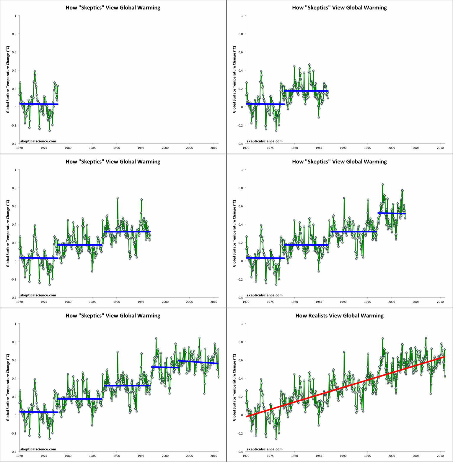
The popularity of the graphic is probably due to the fact that (1) it's a simple, stand-alone debunking of the "global warming stopped" myth, and (2) that particular myth has become so popular amongst climate denialists.  As The Escalator clearly illustrates, it's easy to cherry pick convenient start and end points to obtain whatever short-term trend one desires, but the long-term human-caused global warming trend is quite clear underneath the short-term noise.

The original Escalator was based on the Berkeley Earth Surface Temperature (BEST) data, which incorporates more temperature station data than any other data set, but is limited to land-only data; additionally the record terminates in early 2010.  We originally created the graphic in response to the specific myth that the BEST data showed that global warming had stopped.

It is interesting to apply the same analysis to a current global (land-ocean) temperature record to determine whether short term trends in the global data can be equally misleading. A global version of the Escalator graphic has therefore been prepared using the NOAA NCDC global (land and ocean combined) data through December 2011 (Figure 1).

ncdc escalator

Figure 1: Short-term cooling trends from Jan '70 to Nov '77, Nov '77 to Nov '86, Sep '87 to Nov '96, Mar '97 to Oct '02, and Oct '02 to Dec '11 (blue) vs. the 42-year warming trend (Jan '70 to Dec '11; red) using NOAA NCDC land-ocean data.

The Predictable Attacks

On 31 January 2012, John Cook emailed me about several recent uses of The Escalator, including an inquiry from Andrew Dessler, requesting to use it in one of his lectures.  In the email, John suggested that the graphic had gained so much popularity, it would likely soon be the target of attacks from fake skeptics.

As if eavesdropping on our conversation, the first such attack on the escalator came the very next day, on 01 February 2012.  The graphic had been publshed nearly 3 months earlier, and John predicted the fake skeptic response within a day's margin. 

The Escalator was recently used by a number of sources in response to the denialist plea for climate inaction published in the Wall Street Journal, including Media Matters, Climate Crocks, Huffington Post, and Phil Plait at Discover Magazine's Bad AstronomyStatistician William Briggs took issue with Phil Plait's use of the graphic.  Specifically, he criticized the lack of error bars on the data used in The Escalator, making some rather wild claims about the uncertainty in the data.

"...the models that gave these dots tried to predict what the global temperature was. When we do see error bars, researchers often make the mistake of showing us the uncertainty of the model parameters, about which we do not care, we cannot see, and are not verifiable. Since the models were supposed to predict temperature, show us the error of the predictions.

I’ve done this (on different but similar data) and I find that the parameter uncertainty is plus or minus a tenth of degree or less. But the prediction uncertainty is (in data like this) anywhere from 0.1 to 0.5 degrees, plus or minus."

As tamino has pointed out, calculating an area-weighted average global temperature can hardly be considered a "prediction" and as he and Greg Laden both pointed out, BEST has provided the uncertainty range for their data, and it is quite small (see it graphically here and here).  Plait has also responded to Briggs here.

The Escalating Global Warming Trend

Briggs takes his uncertainty inflation to the extreme, claiming that we can't even be certain the planet has warmed over the past 70 years.

"I don’t know what the prediction uncertainty is for Plait’s picture. Neither does he. I’d be willing to bet it’s large enough so that we can’t tell with certainty greater than 90% whether temperatures in the 1940s were cooler than in the 2000s."

It's difficult to ascertain what Briggs is talking about here.  We're not using the current trend to predict (hindcast) the global temperature in 1940.  We have temperature station measurements in 1940 to estimate the 1940 temperature, and data since then to estimate the warming trend.  Once again, we're producing estimates, not predictions here. 

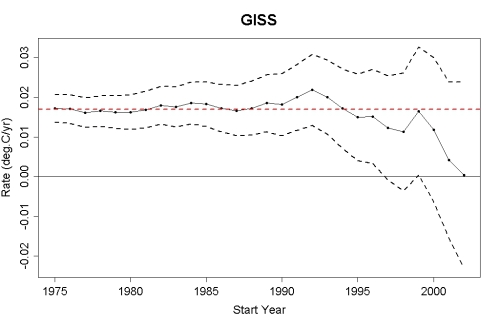
Moreover, the further back in time we go and the more data we use, the smaller the uncertainty in the trend.  For example, see this post by tamino, which shows that the global warming trend since 1975 is roughly 0.17 +/- 0.04°C per decade in data from NASA GISS (Figure 2).  The shorter the timeframe, the larger the uncertainty in the trend.  This is why it's unwise to focus on short timeframes, as the fake skeptics do in their "global warming stopped in [date]" assertions.  As tamino's post linked above shows, when we limit ourselves to a decade's worth of data, the uncertainty in the trend grows to nearly +/- 0.2°C per decade (Figure 2).
GISS trend uncertainty

Figure 2: The estimated global temperature trends through July 2011 (black dots-and-lines), upper and lower limits of the 95% confidence interval (black dashed lines), and the estimated trend since 1975 (red dashed line) using GISS land and ocean temperature data (created by tamino)

Foster and Rahmstorf (2011) also showed that when the influences of solar and volcanic activity and the El Niño Southern Oscillation are removed from the temperature data, the warming trend in the NCDC data shown in the updated Escalator is 0.175 +/- 0.012°C per decade.  Quite simply, contrary to Briggs' claims, the warming trend is much larger than the uncertainty in the data.  In fact, when applying the Foster and Rahmstorf methodology, the global warming trend in each of the major data sets is statistically significant since 2000, let alone 1940.

Ultimately Briggs completely misses the point of The Escalator.

"...just as the WSJ‘s scientists claim, we can’t say with any certainty that the temperatures have been increasing this past decade."

This is a strawman argument.  The claim was not that we can say with certainty that surface temperatures have increased over the past decade (although global heat content has).  The point is that focusing on temperatures over the past decade (as the fake skeptics constantly do) is pointless to begin with, and that we should be examining longer, statistically significant trends.

Briggs' post was of course hailed by the usual climate denial enablers (i.e. here and here), despite the rather obvious inflation of the data uncertainty, and utter lack of support for that inflation.  Despite the fake skeptic struggles to go the wrong way down, The Escalator unfortunately continues ever-upward.

0 0

Printable Version  |  Link to this page

Comments

Prev  1  2  3  Next

Comments 51 to 100 out of 131:

  1. dana, your graph is popular because it is funny :-D at a glance it shows the desparate contortions needed to produce the denier arguments. and it moves! woo!
    0 0
  2. I was just sent this cartoon by Josh. What is he going on about? I see the SKS graphic of the the skeptic and realist view of the temperature from 1973 with his snarky, text got that. So what is he on about with the third graphic? I see the trend for 25, 50, 100 and 150 years. I see the individual years. Where is the scandal?
    0 0
  3. Sphaerica, My cherry-picker spreadsheet for UAH shows slight negative slopes ending in 2011 December, for the following begin dates: 1997 July, 162 months 1997 June, 163 months 1997 May, 164 months ** 1997 April, 165 months 1997 March, 166 months 1997 February, 167 months 1997 January, 168 months The May (**) has the most negative slope. There are probably longer ranges out there too, but my program only goes 14 years max.
    0 0
  4. Oh, sorry! I did not give the link. Here it is: Cartoon by Josh.
    0 0
  5. Trent - Josh is apparently trying to argue that looking at trends over 25, 50, 100, and 150 years is exactly the same as looking at trends over 10 years. He has apparently entirely missed the point, which was about short-term cherrypicking, not about looking at different trends. There's nothing wrong with looking at trends over various timeframes, as long as those trends are statistically significant, which all the trends in the IPCC figure are.
    0 0
  6. @ Trent, dana - for some reason, in the context of the "escalator", they are recently fixated on pointing to that 3rd graph. I saw it on twitter and elsewhere in the last few days. I don't see the point either. But is that the IPCC and/or Pauchuri graph that Monckton cried "fraud" over? He made some arcane argument about how "you must never do this", but I recall that was nonsense...
    0 0
  7. "My cherry-picker spreadsheet for UAH shows slight negative slopes ending in 2011 December, for the following begin dates: ...1997 January, 168 months" WoodforTrees gives a warming of about .14C for that time period. "1997 February, 167 months" .13C of warming "1997 March, 166 months" about .12C of warming "1997 April, 165 months" About .11C of warming "1997 May, 164 months **" .09C of warming "1997 June, 163 months" .09C of warming "1997 July, 162 months" about .09C again of warming. None of the starting dates you picked shows a negative slope.
    0 0
  8. Well, I guess there are three types of people in the world: those that can count, and those that can't. Those numbers end in December 2010, not December 2011. Sphaerica is right: there is no negative slope ending in December 2011 in the UAH data from any point. But take heart, cherry pickers! Dr. Roy is promising a version 6 of the UAH data, which is cooler during the past few years.
    0 0
  9. rust @57 - yes, that's the graph Monckton cried foul over, though for no good reason. As I recall, Monckton's criticism was not of the graph itself, but rather his interpretation of what the IPCC was using the graph to try and argue. It was very convoluted. Coincidentally we may have a post in the works addressing that very subject. On second thought, it's probably not coincidental. Josh probably got the idea from Monckton. The cartoon still makes no sense whatsoever though.
    0 0
  10. "But take heart, cherry pickers!..." You cherry pick some start dates, calculate incorrectly and claim a negative slope when there is none, but have the nerve to call us cherry-pickers? Now that's chutzpah.
    0 0
  11. @59 "Those numbers end in December 2010, not December 2011" The slopes ending in December 2010 are a bit larger than those ending in December 2011 (2010 was warmer). Want to try that again?
    0 0
  12. Tom @23, I think Briggs' point in the temp proxy link is that the dark tan band (confidence interval for the regression line) is often conflates for the 'uncertainty interval' given for the unobservables. And I wasn't attempting to defend Briggs by arguing that he was too precise, nor do I think that precision in terminology necessarily makes one's argument any good. I think Briggs could be far more clear with his writings. My point was that many of his critics simply did not understand what he was getting at, primarily because Bayesian predictive statistics and it's associated terminology isn't common to climate science, or the physical sciences in general. So folks assumed his word choice was some form of "novice sophistry."
    0 0
  13. Sorry - "uncertainy interval" should read "predictive interval".
    0 0
  14. Robert: keithpickering was creating a verion of the "Down the Up Escalator" using the UAH data. He is most definitely not accusing anyone at SkS of cherry-picking.
    0 0
  15. @64 Oops. My apologies. I completely misread what he was saying. And I can't even use lack of caffeine as an excuse. <<< smacks head.
    0 0
  16. Sphaerica, 1987 to 1997 is a positive slope in your RSS Escalator graph. You can get a negative slope to December 2011 starting from 1998 and 2001, too. Here's my bash at getting a clean looking Escalator.
    0 0
    Moderator Response: [RH] Fixed image width.
  17. Let me rephrase the first paragraph of my post @62 since Briggs did use confusing terminology here. When he used the term "classical parametric prediction interval" he means the confidence interval for the regression. He chose to use the former because this interval often (improperly) conflated with the predictive interval, and views the confidence interval as far less informative of the actual error in "predicting" unobservables.
    0 0
  18. Okay... This is really silly. Skepticsville is claiming the IPCC is doing the same as Dana's escalator graph. Only every trend picked by the IPCC is a statistically significant trend and the shortest is 25 years. Fake skeptics create the escalator effect by choosing short trends that are NOT statistically significant. Trends that are rarely more than 10-12 years long. If they can't see the difference I would suggest it's due to willful blindness.
    0 0
  19. A trend over 25 years is statistically significant, and 50, 100, and 150 years are likewise. Here's the same 150, 100, 50, and 25 year trends display for: HadCRUT3: 0.049, 0.076, 0.13, 0.16C/decade BEST: 0.071, 0.097, 0.22, 0.30 C/decade GISTEMP: (from 1880) 0.06, 0.073, 0.14, 0.18C/decade So: steadily increasing trends as time goes on when looking at sufficient data for statistical significance. As opposed, of course, to 'selected' 10 year time periods, where variability is such that you can find almost any slope you want to...
    0 0
  20. Re the IPCC graph above, it's worth noting that the IPCC gives error bars on the figure showing that each of these trends is statistically positive. Maybe the "escalator" graph could come with error envelopes on the "cooling" trends?
    0 0
  21. Dana, I don't have your email address, but I have uploaded my spreadsheet to google docs: Spreadsheet
    0 0
  22. 66, barry, Yeah, jeeze... I never knew being a "skeptic" was so hard! I guess I'm just not cut out for it. :)
    0 0
  23. Rob Honeycutt, the periods that IPCC are showing in the graphic you posted in #68 imply acceleration which has now ended. The chart should be updated to reflect the fact that the acceleration has ended or it should be withdrawn. Where is the 75 year trend line and why was it left out of the original chart? Same question for 125?
    0 0
  24. RobertS @62 and 67 So basically, Briggs criticism rests on an obvious confusion of regression intervals (uncertainty around central tendency) and prediction intervals (uncertainty around individual point)? If so, I fail to see what relevance this point has to do with detection of temperature change. That's a first year stats mistake. To imply it is a common mistake among those doing analyses of temperature patterns is downright puzzling.
    0 0
  25. Eric @73: what is your basis for claiming what the graphic in question "implies"? What is the context in which it's presented? I take serious issue with these assumptions (started by Monckton) about what the IPCC graphic is meant to "imply". The IPCC is not responsible for (mis)interpretations of its graphics.
    0 0
  26. The figure caption, among many other statements, says "Note that for shorter recent periods, the slope is greater, indicating accelerated warming." I don't particularly like fitting linear trends to the longer-term data which clearly isn't linear. Some sort of exponential fit would be preferable, but of course that would also support the 'accelerated warming' conclusion. I fail to see what the issue is with this graphic. Eric claims the acceleration has stopped - based on what? The short-term data in the 'skeptic' Escalator view?
    0 0
  27. Dana, the caption says "(Top) Annual global mean observed temperatures1 (black dots) along with simple fits to the data. The left hand axis shows anomalies relative to the 1961 to 1990 average and the right hand axis shows the estimated actual temperature (°C). Linear trend fits to the last 25 (yellow), 50 (orange), 100 (purple) and 150 years (red) are shown, and correspond to 1981 to 2005, 1956 to 2005, 1906 to 2005, and 1856 to 2005, respectively. Note that for shorter recent periods, the slope is greater, indicating accelerated warming." in http://www.ipcc.ch/pdf/assessment-report/ar4/wg1/ar4-wg1-faqs.pdf
    0 0
  28. Dana, sorry I didn't see your last post. I basically agree that a longer term trend is not a good linear fit. But that also begs the question of why a 25 year linear fit is significant in the context of long term natural variations and cycles.
    0 0
  29. Eric (skeptic) - If you follow the links I gave here you can take a look at the 125 and 75 year trends as well. But since you didn't make that effort, here it is. The trends for 125 and 75 are closer to 150 and 100 years (respectively), but the trend increases for each shorter time period. "The chart should be updated to reflect the fact that the acceleration has ended or it should be withdrawn. Where is the 75 year trend line and why was it left out of the original chart? Same question for 125?" Eric, I hope I'm incorrect, but are you implying that there is some deception here? Note that the statistically significant 17 year trend (as per Santer 2011) is also 0.16C/decade, almost identical to the 25 year trend - and that's with the late '90's El Nino and 2000's La Nina's. There is no statistical support for claiming that acceleration has now ended - and unless you're willing to also include insignificant periods like the 2x "acceleration" in the late 90's (which I quite frankly hear very little mention of by skeptics), I think your rather accusatory tone is unwarranted.
    0 0
    Moderator Response: [DB] Fixed link and text per request.
  30. Eric (skeptic): On what evidentiary basis do you make this claim?
    the periods that IPCC are showing in the graphic you posted in #68 imply acceleration which has now ended. The chart should be updated to reflect the fact that the acceleration has ended or it should be withdrawn.
    0 0
  31. mc @ 47 I agree that more uncertainty in observations leads to more uncertainty in estimates. But I don't see how Brigg's can use this basic observation to critique analyses (like Dana's) showing increasing temp as naïve and misleading. In fact, I think taking account of observational uncertainty it would cut the other way. Let me explain. First, the prediction of individual points is really not of interest to us, so that's a red herring. No one in their right mind would use a simple linear extrapolation to predict temperature for other than heuristic reasons- that's what physics is for. What is of interest in this case is the slope parameter that allows us to make the best predictions of the data in hand. If we have confidence that the slope parameter is positive, we can say confidently that temperature has increased. Second, the error in estimation of yearly means is already implicit in the spread of the data. That error was not removed when the means were calculated. In the simplest model one can imagine, the variance around the predicted line should be equal to the sum of the variance associated with the central tendency (intercept and slope) and the variance in the yearly means associated with observational uncertainty. Suggesting that the existence of variance about the yearly means adds to variance already observed in the data is a form of double-counting, as far as I can see. Now often one does not often have the wherewithal to decompose the variance about a trend line into separate components related to the line parameters themselves, and the observation error. But in this case, the information to do so exists...and in spades. A fully Bayesian model would use the observed errors around individual yearly means to estimate a probability density function (pdf) for the measurement error...and would use this information and the residual errors to estimate pdfs for the slope and intercept parameters. Those parameters pdfs would be constrained to have less variance than would be inferred simply from the total variance of the residuals. The only way that wouldn't be true is if there were some strange positive correlation between the parameter and the observation error pdfs.
    0 0
  32. Eric (skeptic): But that also begs the question of why a 25 year linear fit is significant in the context of long term natural variations and cycles.[Citation required]
    0 0
  33. Composer99, the latest 25 year linear trend (1985 - 2010) is not significantly different from 1975 - 2000. See (wood from trees graph). Your second question can be answered without a citation. Imagine a sinusoid of period 1000 time units; a linear trend of 100 units or even 10 units may be statistically significant in the linear portion of the sinusoid curve. Thus it all depends on what we are testing for. A linear temperature response to CO2 is reasonable in 25 years considering weather such as ENSO, but may not be sufficient in the presence of long term natural fluctuations.
    0 0
  34. KR, thanks for the link to wood for trees. Sorry about the accusatory tone, but it is clear that the assumption that warming is accelerating has been disproven, at least based on 25 year linear trends: (wood for trees graph) Do you think that the claim made in the FAQ should be withdrawn?
    0 0
  35. Eric, statistically insignificant differences cannot be said to disprove the existence of an increasing trend in warming, or anything else for that matter. They simply tell you you can't detect a difference that may or may not exist. If you go a step further, you could do a power analysis and determine the probability that an accelaration parameter is >0, or you can say that the acceleration is not likely to be above or below a certain value, given a specific model. That's about it.
    0 0
  36. That final step could have been lengthened to 14 years and still have been -neg or flat, which would make it the longest such period in that whole chart. Obviously longer is more significant. It could stay flat for the next 100 years and the linear overlay would still be positive. Question is: how long does the final step need to be flat before we conclude global warming has not lived up to modelled expectations? And as with cricket where the required run rate is not met it further blows out. (I expect most of us can deduce the relevance)
    0 0
    Response:

    [dana1981] I don't think your assertion is true.  Even cherrypicking the peak of the 1997-1998 El Niño, the trend through December 2011 is positive.

    To conclude that global warming has not lived up to modeled expectations, we would first have to see evidence supporting that conclusion.  Thus far there is no such evidence.  The rate of warming is consistent with model projections.

  37. Eric (skeptic) - No, Eric, I cannot agree that the claim (of continued anthropogenic global warming) should be withdrawn. Why? Look at Foster and Rahmstorf 2011, or Lean and Rind 2008. There are attributable short term variations in the solar cycle and the ENSO - accounting for those clearly shows that the global warming trend has not stopped.
    0 0
  38. Eric (skeptic) - My apologies, an incomplete answer in my last post. Acceleration: 10-25 year trends, in the presence of noise, are not going to have the statistical significance to clearly identify acceleration. They are sufficient to identify linear trends, but more questionable for more complex fits. However, based upon the physics, based upon the greater than exponential growth of CO2 levels - we have a great deal of evidence supporting a greater than linear warming. We also have a huge amount of evidence for greater than linear cryosphere melt (as just one example). There a great deal of evidence supporting > linear warming, very little otherwise. If you have such evidence, please point to it so it may be considered.
    0 0
  39. KR, I agree global warming has not stopped, I said so here a year ago and nothing significant has changed since then. Thanks for the clarifying post on acceleration which I basically agree with.
    0 0
  40. Robert S, I went over to William's site and followed links to http://wmbriggs.com/blog/?p=4368#comments but was not able to comment. This is what I wanted to say and perhaps you want to address the comment here: **** If our goal is to find the average of all of those points, I did not see a rationalization (or math) here showing that the tighter interval isn't a good fit ("good" meaning say that 95% of the time we should expect the average of those points to fall within these bounds). In fact, the example you give suggests that the average of those points does in fact lie in the narrow bound. So if you are after a set of yearly averages in order to try and identify trends and make predictions, why should be ignore a tight bound that appears to be correct a high percentage of the time? For example, as a way to answer my question, can you show that the tight bound does not identify the average of those points a large number of the times. If you can't prove this, then I don't see why you would be confident that the wide bound is needed for that 95% prediction level. Note that I am not ever suggesting that 95% of the points lie within the band but rather that the average of the points lies in that band. Why are yearly average global surface temperature values useful to know? I am not sure, but those with more experience in climate, biology, etc, likely have reasons to believe that is a useful metric (eg, to help identify trends useful in improving models or making predictions). FWIW, I arrived at this page from climate change discussion taking place elsewhere, and I want to know what math you use to rationalize that the BEST plot of yearly temp values and similar such plots (1850-present) require drastically wider error margins. Let me say that I understand that a temp of 100 C here and 0 C over there won't lead to the same exact effect as 50 C everywhere, but that is an issue for relevant scientists to debate and outside the purview of a statistician determining whether the values they are using in their debate can be reasonably trusted to lie within the given calculated error bounds. ****
    0 0
  41. Eric (skeptic): This is not the thread for further back-and-forth, but what I'm hoping for is a reference to the existence of any natural variations & cycles not already widely known to climate scientists. As far as I can see, you have not provided any reason to conclude that any such cycle exists. I propose if you have any further comments specifically relating to cycles that you follow them up here.
    0 0
    Moderator Response: [DB] Fixed html-fu.
  42. @Composer99-91 The latest greatest unknown, that may be a natural variation or cyclical, is the methane releases from the floor of the Arctic shelf and the possibly-related co-incidental freshwater bubble centred in the Beaufort Gyre. The potential repercussions are very serious.
    0 0
  43. Ultimately Briggs completely misses the point of The Escalator. "...just as the WSJ‘s scientists claim, we can’t say with any certainty that the temperatures have been increasing this past decade."
    This is a fairly obvious bait-and-switch, too. WSJ didn't say "maybe no warming", they said "hey, no warming, guess the models are wrong!". This is inconsistent with Briggs' own position.
    0 0
  44. Please forgive me for going slightly off topic (is claiming AGW is itself a conspiracy off-topic?), but Rev Philip Foster (retired) has just kindly alerted me to, amongst other things, (Chartered Accountant) Andrew Monford‘s new paper "Conspiracy is green/The Propaganda Machine" downloadable as a PDF here. As I said to Rev Foster, I am not qualified to rip this apart but, I am sure I know people who are! Over to you...
    0 0
    Moderator Response: [DB] Fixed URL.
  45. Dana - where exactly does this graph come from?
    0 0
  46. Martin, Montford is not worth reading. Tamino and RC have already sounded the depth of Montford's skill, and they found it quite shallow. Motivation to read a book with a title like that probably comes from already being a member of the choir.
    0 0
  47. curious george - not sure what you mean, it came from my computer. The details are in the caption.
    0 0
  48. Too many people completely miss the point about the escalator graph. It doesn't actually matter what the graph represents; it's just highlighting the point that when there's a lot of spurious noise, it's possible to zoom into a graph and find periods when one can be deceived about the actual pitch of the slope. It's only when we zoom out to look at a longer time period that the overall pitch becomes apparent. It's a bit like climbing up a rocky mountain in a fog. Have we reached the top, or is it just a false crest? It's only when we start to climb down for a while that we can say for certain that we reached the peak a while back. Even then, until we're back at the same altitude as the starting point can we say our climb is over.
    0 0
  49. Apologies for the slightly off-topic (but hopefully not *too* much off-topic) post here. I had a bit of spare time, so I dug out my "quick and dirty" temperature code and hacked at it a bit to process a very small number (45 or fewer) rural temperature stations, distributed approximately evenly around the Earth. Wanted to see what sort of results that would produce: Well, here's a quick-n-dirty plot of my results (with the NASA global land-temperature index for comparison): Sparse station results vs. NASA/GISS results As you can see, the global-temperature record is incredibly robust with respect to the global-average temperature trend. My results track the official NASA results pretty closely except for the 1880-1885 period. A quick investigation showed that only 12 of my 45 selected stations reported any data for that time period. Since not every station reported data for every year, the results for most years were based on fewer than 40 of the 45 selected stations. I posted more details about my processing approach here. Also have a draft blog post stashed with my account here. If the skepticalscience managers think that this would be worth turning into a short article, that would be no problem -- most of the work has already by done.
    0 0
  50. Here in lies the problem of climate science, it relies on inaccurate data to come up with suspect data which are fed in to dodgy models.
    That would be more convincing if it hadn't followed caerbannog's post proving pretty conclusively that claims of inaccuracy in the surface temperature record are nonsense.
    0 0

Prev  1  2  3  Next

You need to be logged in to post a comment. Login via the left margin or if you're new, register here.


The Consensus Project Website

THE ESCALATOR

(free to republish)


© Copyright 2024 John Cook
Home | Translations | About Us | Privacy | Contact Us